| Author |
Message |
 |
|
|
|
|
Advert
|
Forum adverts like this one are shown to any user who is not logged in. Join us by filling out a tiny 3 field form and you will get your own, free, dakka user account which gives a good range of benefits to you:
- No adverts like this in the forums anymore.
- Times and dates in your local timezone.
- Full tracking of what you have read so you can skip to your first unread post, easily see what has changed since you last logged in, and easily see what is new at a glance.
- Email notifications for threads you want to watch closely.
- Being a part of the oldest wargaming community on the net.
If you are already a member then feel free to login now. |
|
 |
2014/10/22 01:28:48
Subject: Rollin' All Ones -- Problem in Pink (10/21/14)
|
|

Decrepit Dakkanaut
|
I think you need to finish this one completely before you do *anything* drastic. Once you finish the black areas I strongly suspect it'll look a lot better. You'll never know unless you try.
|
|
|
|
 |
|
2014/10/22 01:44:26
Subject: Rollin' All Ones -- Problem in Pink (10/21/14)
|
|
Incorporating Wet-Blending
|
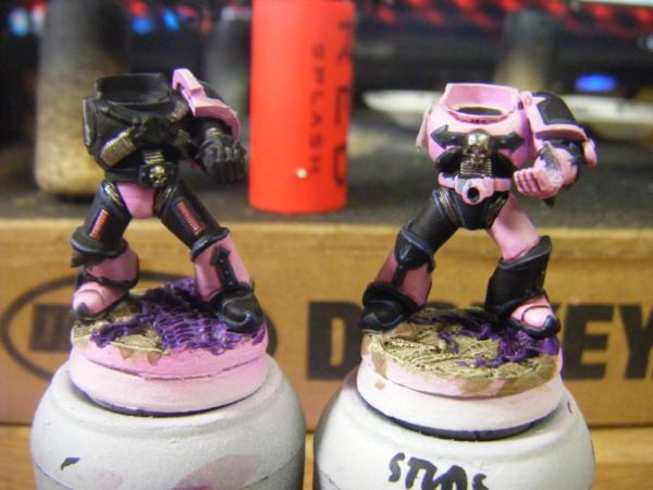
I dunno, Gits... I just really have that feeling. I know what you mean, but I think part of my fears are that these are test minis for a larger force, and I want it to be replicable without too much hassle or variation. As it is now, this has a margin of variation due to the airbrushed shading. Theres also my "I want it perfect the first time" attitude :/ Plus I already botched certain parts, like the pauldrons are supposed to be the other way around, black inside pink outside. I also have no idea if I want to try and gear it towards the first pic, where its mostly pink, or the second example where there are areas of black everywhere. EDIT: Sorta like this, but less extreme with the pink shading 
|
|
This message was edited 1 time. Last update was at 2014/10/22 01:47:03
|
|
|
|
|
2014/10/22 01:51:15
Subject: Rollin' All Ones -- Problem in Pink (10/21/14)
|
|
Decrepit Dakkanaut
|
Well, if you've got solid reasons for not proceeding than I guess your set. I just thought you'd learn more about what didn't work on the piece if you finished it completely. That way you might get a better handle on what needs to change. The shoulder pad thing is an issue though, especially since it was airbrushed.
|
|
|
|
|
|
2014/10/22 02:26:45
Subject: Rollin' All Ones -- Problem in Pink (10/21/14)
|
|
Incorporating Wet-Blending
|
I get whatcha mean, and I appreciate the advice. Had I not been an idiot and screwed up the pads, I mighta continued on xD
I did at least learn a little bit more what didnt work, primarily that the pink needs more color to it. Its a lovely color, but just has no power whatsoever. I need boost the color with deeper pockets of stronger pink.
Ahhh well.... its just airbrushing, right? Hopefully after work tomorrow Ill get that taken care of.
|
|
|
|
|
|
2014/10/22 03:16:26
Subject: Rollin' All Ones -- Problem in Pink (10/21/14)
|
|
Decrepit Dakkanaut
|
Live and learn my friend... live and learn. 
|
|
|
|
|
|
2014/10/22 13:55:53
Subject: Rollin' All Ones -- Problem in Pink (10/21/14)
|
|

Mastering Non-Metallic Metal
|
 Ramos Asura wrote: Ramos Asura wrote:I think i might have a problem with that as there will be areas of true black on the model, pauldron insets, etc, that I dont think could be a dark gray without looking out of place. Having them black with the rest gray would look awkward too, i think.
Ahh, I see.
The added shading on the pink works well though. Get the right balance between that shading and the light pink and it'll be perfect. Not easy though with such a pale colour. Good luck.
I think with larger areas of black the balance of the whole model will be better. As you have it there, it's a mostly light colour which has stripes of high contrast across it, breaking it into small areas of pink, giving it a fractured appearance. With the areas of black you will get to the kind of balance that a quartered colour scheme has, large areas of contrasting colours that balance each other. You may even be able to keep the pink quite light.
Experimenting is the only way to find out though. Keep at it and report back what you find. 
|
     Mastodon: @DrH@warhammer.social Mastodon: @DrH@warhammer.social
The army-                   ~2295 points (built). ~2295 points (built).
 
* -=]_,=-eague Spruemeister General. * A (sprue) Hut tutorial *
Dsteingass - Dr. H..You are a role model for Internet Morality! // inmygravenimage - Dr H is a model to us all
Theophony - Sprue for the spruemeister, plastic for his plastic throne! // Shasolenzabi - Toilets, more complex than folks take time to think about! |
|
|
|
|
2014/10/22 20:10:08
Subject: Rollin' All Ones -- Problem in Pink (10/21/14)
|
|
Dangerous Outrider
|
I would help, but I have no experience painting pink.
HAHAHA!
Hope you are highly anticipating the booty shot from down under.
DON THE MOTLEY!
|
The pink army always wins. You beat the pink army? Go ahead and brag about it. You lost to the pink army? Well, then....
moonpie's P&M blorg |
|
|
|
|
2014/10/22 20:16:53
Subject: Rollin' All Ones -- Problem in Pink (10/21/14)
|
|
[SWAP SHOP MOD]
Robot Cat
OH-I Wanna get out of here
|
That's true. You have been painting green and yellow marines all these years. We just didn't have the heart to tell you.
|
|
|
|
|
2014/10/23 03:05:31
Subject: Re:Rollin' All Ones -- Problems in Pink (10/22/14)
|
|
Incorporating Wet-Blending
|
Thats exactly it, Doc! Thats EXACTLY it!! Brilliant!!
I've been thinking of this thing in areas of pink and black trim, when I should be thinking "quartered". The scheme really is one that toys with that balance, and it took your comment for me to have that epiphany.
Ok, so from all the references I've found, the chest piece is usually black, as is the backpack (from what I can tell) and the inner areas on the pauldrons... That gets us a very dense visual center. One leg from the Knee down is usually painted black, same with the arms. I want to include a little more pink, but I think thats a good initial thought. (Or a good random jumble of thoughts.... ymmv)
So today I got home from work and resprayed the previous marine using new paints (Vallejo Game Air- pretty neat stuff )
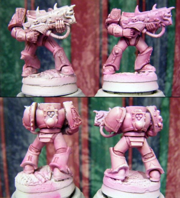
One figure kept the same creamy pink as my initial test, but I sprayed thinned magenta ink over certain areas in order to shade it. [left] The other was completely resprayed using a Zenithal technique. [right] I started with VGC Squid Pink, then progressed through P3 Carnal Pink until I had nearly pure white at the topmost areas. Both minis were washed with a blend of Secret Weapon Washes to bring out the darker lines and bring the colors together.
Close up of the new style:
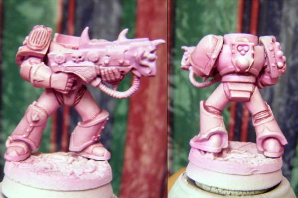
This got me a little more of a vivid pink than originally planned, but maybe thats what I need.
What do we think? Better one or better two?
|
|
|
|
|
|
2014/10/23 03:58:49
Subject: Rollin' All Ones -- Problem in Pink (10/21/14)
|
|
Dangerous Outrider
|
@Whale: Wow. Snap. Making fun of me for being colorblind.. That's new territory for me. Hurts me feelings.
How about I'm colorblind and you aren't and we have a painting contest, see who wins?
@Ramos: Glad to help however I did. I really can't tell much difference at all between the two. Maybe that's cause, as Whale likes to point out, I'm color recognition deficient.
Whale also likes to throw crippled people on the ground and tell them to run. Hyuck.
|
The pink army always wins. You beat the pink army? Go ahead and brag about it. You lost to the pink army? Well, then....
moonpie's P&M blorg |
|
|
|
|
2014/10/23 04:19:42
Subject: Rollin' All Ones -- Problem in Pink (10/21/14)
|
|

Yu Jing Martial Arts Ninja
|
Lovely shades of pink! They both look good but I think I'll have to go with the right.
|
|
|
|
|
|
2014/10/23 15:26:41
Subject: Rollin' All Ones -- Problem in Pink (10/21/14)
|
|
Phanobi
|
Thats a good pink
|
http://www.dakkadakka.com/dakkaforum/posts/list/463976.page (Space Sharks and Tau)
DJ @ http://www.rockindocradio.net
Mon, Thursday+Fri 06am - 09am EST
We refuse to take sides in this anymore. And we refuse to let you turn us against one another. We know who we are now, we can find our own way between order and chaos...
It's over because we've decided it's over. Now get the hell out of our galaxy! Both of you.
"Whoever takes purple sash is purple, and follows purple leader." I follow purple tau. Theophony
|
|
|
|
|
2014/10/23 16:13:28
Subject: Re:Rollin' All Ones -- Problem in Pink (10/21/14)
|
|
Speed Drybrushing
|
I love my Slaanesh models but I hate the Post-heresy Emperor's children scheme, which is why I intend to do my slaanesh units as either pre/slightly after heresy or as Flawless host.
I don't doubt with a bit of work it can be made to look good, but I have my reservations past anything infantry sized.
|
|
|
|
|
|
2014/10/23 16:47:03
Subject: Rollin' All Ones -- Problem in Pink (10/21/14)
|
|
Mastering Non-Metallic Metal
|
Glad to have helped out, one way or another.
Pink is looking good. I'm leaning towards the right one as the left one looks a little dirty in comparison. I say in comparison, as it may just be the photo if that is the same pink as it was before.
|
Mastodon: @DrH@warhammer.social
The army- ~2295 points (built).
* -=]_,=-eague Spruemeister General. * A (sprue) Hut tutorial *
Dsteingass - Dr. H..You are a role model for Internet Morality! // inmygravenimage - Dr H is a model to us all
Theophony - Sprue for the spruemeister, plastic for his plastic throne! // Shasolenzabi - Toilets, more complex than folks take time to think about! |
|
|
|
|
2014/10/23 18:16:21
Subject: Rollin' All Ones -- Problem in Pink (10/21/14)
|
|
Incorporating Wet-Blending
|
Another lunch hour gone, another several dozen green lines on an annihilation Barge....
Alright, then. Sounds like the "new" pink is the winner. Chatted with the client a bit too, and he echoed all your thoughts.
@moonpie: Hahah! Your contribution was definitely your pink blending- Helped me figure how to darken mine and still have it in the same neighborhood of color. The quartered scheme was a good bonus to my thought process, too!
@ IG: Oooohhhh I do like the look of the Flawless Host... One of these days I need to do something like "Paint a new CSM a day" or something. So many cool schemes outside the normal vanilla ones.
As to painting bigger stuff in this scheme.... I'm gonna have to learn how to sooner or later xD If we do decide on doing the whole army, I believe my client said he has a pair of Rhinos and a Land Raider to paint..... 
@DrH: The left one is indeed the same one as above, however I hit it with another, slightly darker wash of pinkinsh purple to boost some of the shadows. Thats probably whats making it look dirty.
|
|
|
|
|
|
2014/10/23 19:13:48
Subject: Rollin' All Ones -- Problem in Pink (10/21/14)
|
|
[SWAP SHOP MOD]
Robot Cat
OH-I Wanna get out of here
|
 moonpie wrote: moonpie wrote:@Whale: Wow. Snap. Making fun of me for being colorblind.. That's new territory for me. Hurts me feelings.
How about I'm colorblind and you aren't and we have a painting contest, see who wins?
@Ramos: Glad to help however I did. I really can't tell much difference at all between the two. Maybe that's cause, as Whale likes to point out, I'm color recognition deficient.
Whale also likes to throw crippled people on the ground and tell them to run. Hyuck.
Pfft, don't be silly, you don't have feelings.
I'd just pay someone to paint it for me, you'd never have a chance! 
|
|
|
|
|
2014/10/24 14:02:15
Subject: Rollin' All Ones -- Problem in Pink (10/21/14)
|
|
Dangerous Outrider
|
Instead of doing the "Ice Bucket Challenge" Whale just challenged people with ALS to ping pong matches.
I should probably comment on topic, so big bad MOD doesn't ban me.
Highlight up to white on the pink...and the black. Of course, that's always my advice, so...
The base paint that GW has for their pink range is what I mix with Lahmian medium and don't pay someone to shade my marines with, but rather actually do myself. I do my whole army in their colors, because it is standardized and hard to screw up. I absolutely adore Fulgrim Pink. VMC has Old Rose, which I tried on a marine. I kind of liked it, but didn't know what to use as a shade or highlight. So, I just got mad and only did one.
|
The pink army always wins. You beat the pink army? Go ahead and brag about it. You lost to the pink army? Well, then....
moonpie's P&M blorg |
|
|
|
|
2014/10/26 02:18:08
Subject: Re:Rollin' All Ones -- Getting Noisy (10/25/14)
|
|
Incorporating Wet-Blending
|
YEah I really do like the GW paints for consistency and standards. My biggest problem is that in their switch to the new stuff, colors changed and most became a lot thinner. Plus I haaaaate the new pots!!
Ive been slowly moving a lot of my stuff to Vallejo Game Color. Dropper bottles are quickly becoming a favorite around here.
=============================
Saturday means that I had the whole day to paint!
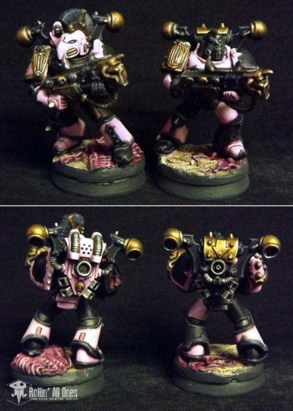
Noise marines are progressing smoothly- Just need to final highlight the pink, wash and highlight the silvers, paint the gold areas and the eyes and theyre done. I deepened a lot of the shadows on the pink armor with the addition of some SWW Ruby, a very nice black-red wash that I really like using!
Painted up the bases too. Not super sold with purple as a color for the creeping gooey stuff... May very well redo those particular areas.
The Necron Lord is moving along as well, and is now sporting his new gold-tinted bones. They just need a little mythril silver to brighten the edges a bit.
Having a bit of an annoying day with painting... more specifically, a problem with supplies. I was going to do a bit more of the Barge today, but quickly came to realize that I'm pretty much out of Snot Green... Also, my only size "00" S7 brush is really showing its age, and the place I usually buy them from around here has been out for a week and a half!!
Have to find replacements for both of these before too much more work can progress on the Barge. I really screwed myself with this little bit of planning! Bah... well I suppose if I finish these minis, I can always switch to assembly of some Relic Knights.... 
|
|
|
|
|
|
2014/10/26 12:20:49
Subject: Rollin' All Ones -- Getting Noisy (10/25/14)
|
|
Mastering Non-Metallic Metal
|
Good work Ramos. The pink and black are working well on those. 
|
Mastodon: @DrH@warhammer.social
The army- ~2295 points (built).
* -=]_,=-eague Spruemeister General. * A (sprue) Hut tutorial *
Dsteingass - Dr. H..You are a role model for Internet Morality! // inmygravenimage - Dr H is a model to us all
Theophony - Sprue for the spruemeister, plastic for his plastic throne! // Shasolenzabi - Toilets, more complex than folks take time to think about! |
|
|
|
|
2014/10/26 17:37:25
Subject: Rollin' All Ones -- Getting Noisy (10/25/14)
|
|
Fixture of Dakka
|
That pink and black looks spot on Ramos, if you get the commission you have to do some with black flames as well.
|
|
|
|
|
|
2014/10/27 03:32:20
Subject: Re:Rollin' All Ones -- Getting Noisy (10/26/14)
|
|
Incorporating Wet-Blending
|
Thanks guys! Finally found the right blend, so i think I can definitely replicate these guys in the future. Shouldnt take me near as long either!
@Gir: Definitely planned. I kept these guys a little bit simpler to start out and get a feel for em. Black flames and other freehand are gonna be a great way of making every member of the force unique.
Speaking of.... The Noise Marines are done! (barring any sort of shoulder icon.... I dunno what ECs have on theirs xD )
Necron Lord is nearly done as well, but just needs a touch more color to him. Hopefully tomorrow!
As always- Thanks for reading, and happy painting!!
|
|
|
|
|
|
2014/10/27 10:38:29
Subject: Rollin' All Ones -- Getting Noisy (10/26/14)
|
|
Decrepit Dakkanaut
|
Wow... those look really good Ramos! Outstanding work!
|
|
|
|
|
|
2014/10/27 14:11:40
Subject: Rollin' All Ones -- Getting Noisy (10/26/14)
|
|
Never Forget Isstvan!
|
Good save!.. they look great. I imagine pink is a difficult color to do, so I'll stick to yellow.
|
|
|
|
|
|
2014/10/27 17:06:46
Subject: Re:Rollin' All Ones -- Getting Noisy (10/26/14)
|
|
Speed Drybrushing
|
Yeah I've got to admit you're making me like the EC scheme, that's totally not allowed.
For Icon it's pretty much their pre-heresy one, eagle wing with a claw, the claws usually a little more vicious looking on artwork of the pre-heresy models but the actual decals and metal pads show no changes at all. Guess keeping the symbol the same comes from the same vaguely mocking place that led them to keep the name 'Emperor's Children'.
|
|
|
|
|
|
2014/10/27 17:54:49
Subject: Rollin' All Ones -- Getting Noisy (10/26/14)
|
|
Longtime Dakkanaut
|
So much eye candy has popped up in this thread since my last visit. Great to see you still cranking them out, RA. EC's look really good.
|
|
|
|
|
|
2014/10/28 02:46:19
Subject: Re:Rollin' All Ones -- Enter the Overlord! (10/27/14)
|
|
Incorporating Wet-Blending
|
@Gits: Thanks!! Looking forward to doing more, actually... Its surprisingly fun to paint! I think its because its such a vivid color, and those have always been my flavor, so to speak.
@ SL: I dunno. Ill still take Pink over yellow, and BOTH over white! Maybe even go so far as to rather paint both in some kind of quartered scheme rather than white
@ IG: Hehehe... The Slaanesh taint is spreading! And thank you! I think I got something along those icon lines that I can be happy with.
@Moltar: That's the aim of my game- Popping up eye-candy!! Many thanks for the complement. Hopefully there will be much more to come!
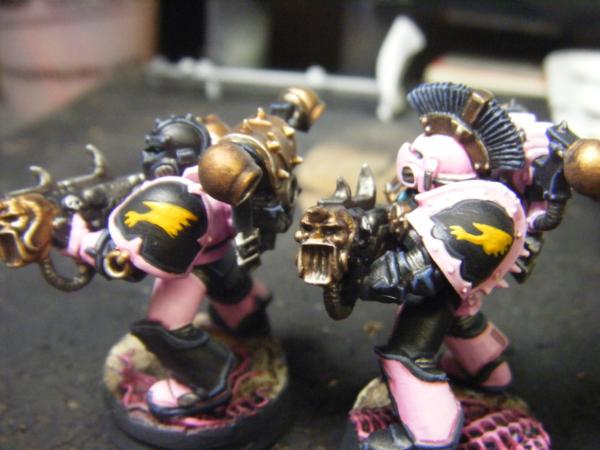
Ok so progress today! The noise marines got their very bizarre for chaos icon. I do love their mockery of the Imperial Creed angle, though. Flavorful!
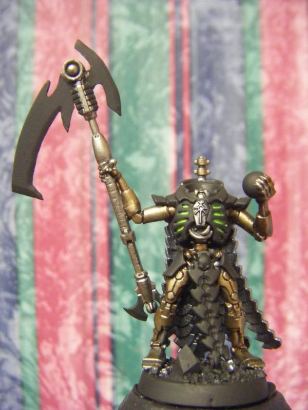
I also completed the Overlord for my Necron Client. Unfortunately my brother has the "Good" camera, so these are shots with the crappy wip camera xD Once I get a hold of it, Ill take better shots!
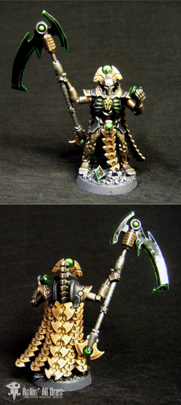
The gloss varnish seems to catch the light a little oddly in the rear pic. In reality its not nearly so uneven!
|
|
|
|
|
|
2014/10/28 02:57:01
Subject: Rollin' All Ones -- Enter the Overlord! (10/27/14)
|
|
Decrepit Dakkanaut
|
Very exciting minis Ramos. Like them all.
|
|
|
|
|
|
2014/10/28 13:47:02
Subject: Rollin' All Ones -- Enter the Overlord! (10/27/14)
|
|
Decrepit Dakkanaut
|
Dude, are you drinking the paint so it just flows out of every pore? Seriously good work! Especially the Necron. I'm even praising your Marines (and I never do that).
|
"dave you are the definition of old school..." -Viktor Von Domm    My P&M Blog : My P&M Blog :
It's great how just adding a little iconography, and rivets of course, can make something look distinctly 40K-adamsouza
"Ah yes, the sound of riveting.....Swear word after swear word and the clinking of thrown tools" "Nope. It sucks do it again..."- mxwllmdr
"It puts together more terrain, or else it gets the hose again...-dangledorf2.0
"This is the Imperium, there is no peace, there are only rivets" -Vitruvian XVII
"I think rivets are the perfect solution to almost every problem"- Rawson
More buildings for the Building God! -Shasolenzabi
  |
|
|
|
|
2014/10/30 16:03:06
Subject: Re:Rollin' All Ones -- The Week of Assembly (10/30/14)
|
|
Incorporating Wet-Blending
|
@Gits: Thank you! I still want to enter your Mantis Maker comp... Just need to find out where I hid all of my marine bitz... Coming up with an idea might be good too
@stein: You know, I was starting to wonder why my tea was tasting a little weird. And why it was blue. And red. And why I was dipping my brush in it. Come to think of it, I'm starting to think that wasn't tea.
Thank you very much, though, Stein!
=======================
"Hey Ramos, aren't you supposed to be working?"
Quiet you! I'm taking a break from staring at my computer screen so I can... er.... stare at my computer screen...
Erm... Well, anyways...
Because I ran out of supplies, I was left with an unusually open schedule. I couldn't jsut let it go to waste, thogh- Time is too precious nowadays! And so i set to working on assembling some new projects.
First, I cracked open the billion and a half boxes of Relic Knights stuff WM had sent me.
First impressions were mixed: I really enjoy the anime-esque aesthetic they went with, and the concepts are awesome. Where it starts to fall apart, though, is the translation of concept art to miniature.
The details just arent all there sometimes, especially on the faces. Edges arent super crisp, and it actually looks like a lot was softened in the transition of 2d to 3d. However, by far my biggest issue is the material. Restic, I think Ive heard it called? I dont really know. Its curiously hard to remove mold lines (not for the least reason that they tend to go right across details). The stuff soft enough to pick up the crape marks from a knife blade if you arent careful, but so hard that removing mold lines is difficult. It also has a good bit of elasticity to it (poor term, but thats what comes to mind), so its just as likely that the mold lines will roll over themselves and form to the mini, making you scrape a bit more than you might want to.
Assembly isnt too hard, though there are gonna be a number of gaps to fill before priming. Some parts need a bit of trimming here and there, and some things (like the Pacer's "arms") end up needing a bit of re-bending before they fit right. Nothing too unusual for resin minis.
So far I have a Pacer (Tachikoma-looking robot, not pictured), And Betty & Lug:
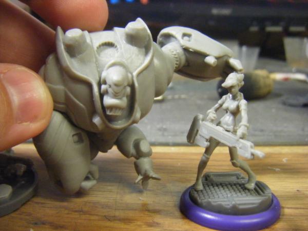
Lug (the big ol' robot) is a fun little mode. Very heavy, and hilariously top-heavy looking. Anime influences, after all, and I appreciate that.
Betty, on the other had is absolutely tiny! Ill try to get a scale shot next to some Marine minis, but keep in mind that thats a standard infantry base shes on!
Her face is ok-ish. Rather flat, but with defineable facial features (Ive been told the worst is yet to come), so with some paint you wont even know.
Shes also incredibly skinny, to the point that she looks very nearly like an armature for other bulkier figures!
Then yesterday, I recieve a package from RiTides with a couple test models from Dropzone Commander. From what Ive read of it, it seems pretty neat, and if these examples are any indication, they know what tehy're doing with their minis!
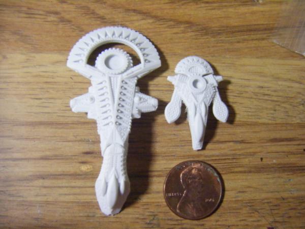
Yes, thats a penny next to them (banana for scale would simply dwarf these!)
These things are a complete opposite to the RK minis- even though they are incredibly tiny, they are absolutely COVERED in details! Its almost so much that I worry about scraping off some as I clean moldlines (of which there are actually quite few!) Hopefully the P3 Primer I have won't fill in too many of the smaller details. Suppose Ill find out- thats what test minis are for, eh?
Tonight is our Bi-weekly Deathwatch Game, so Ill finally be able to pick up some more green paint, thereby letting me work more on the Annihilation Barge!
For now, I work. Hoping to meet with the Big Boss sometime this week/next week to discuss my future here, sooooo.... fingers crossed
Til next time!!
|
|
|
|
|
|
2014/10/31 01:39:52
Subject: Rollin' All Ones -- The Week of Assembly (10/30/14)
|
|
Old Sourpuss
|
Note: DZC is a very very solid game. It deserves all of the hype it gets.
I would love to make DZC my weekly game.
|
DR:80+S++G+M+B+I+Pwmhd11#++D++A++++/sWD-R++++T(S)DM+
 
Ask me about Brushfire or Endless: Fantasy Tactics |
|
|
|
|
|
|