Switch Theme:

Dakka Painting Challenge: Two Tickets to Paradiso  [RSS] Share on facebook Share on Twitter Submit to Reddit
»
Poll
Who are your favourites?
Entry 1 - PanOceania Knight Hospitaller 3% [ 35 ]
Entry 2 - PanOceania Knight Hospitaller 6% [ 77 ]
Entry 3 - Yu Jing Keisotsu Butai 7% [ 95 ]
Entry 4 - Ariadna Para-Commando 1% [ 13 ]
Entry 5 - PanOceania Jotum 13% [ 172 ]
Entry 6 - Yu Jing O-Yoroi Kidobutai 1% [ 9 ]
Entry 7 - Yu Jing Sun Tze 2.0 15% [ 201 ]
Entry 8 - Combined Army Drones 4% [ 51 ]
Entry 9 - Ariadna Para-Commando 8% [ 111 ]
Entry 10 - Ariadna War Correspondent 7% [ 95 ]
Entry 11 - Mercenary Valerya Gromoz 2% [ 31 ]
Entry 12 - Haqqislam Ghulam Infantry 11% [ 144 ]
Entry 13 - Combined Army Treitak Spec-Ops 14% [ 190 ]
Entry 14 - Ariadna Intel Spec-Ops 1% [ 7 ]
Entry 15 - Yu Jing Oniwaban and Aleph Achilles 1% [ 10 ]
Entry 16 - Yu Jing Aragato Senkenbutai 1% [ 19 ]
Entry 17 - Ariadna Para-Commando 2% [ 31 ]
Entry 18 - Yu Jing Domaru Takeshi "Neko" Oyama 3% [ 37 ]
Entry 19 - Haqqislam Djanbazan 2% [ 21 ]
Total Votes : 1349
Author Message
Advert


Forum adverts like this one are shown to any user who is not logged in. Join us by filling out a tiny 3 field form and you will get your own, free, dakka user account which gives a good range of benefits to you:
  • No adverts like this in the forums anymore.
  • Times and dates in your local timezone.
  • Full tracking of what you have read so you can skip to your first unread post, easily see what has changed since you last logged in, and easily see what is new at a glance.
  • Email notifications for threads you want to watch closely.
  • Being a part of the oldest wargaming community on the net.
If you are already a member then feel free to login now.


Made in us
Martial Arts Dāturazi


Philadelphia, Pensylvania

 junex wrote:
Congratulations to all who entered, specially the top 5!

My personal favorite to win was entry no. 3, but that's just me, go figure.
.


I really liked your model too the base is simply awesome! and the facial features were great as well I remember telling my family to look at it, I was like IT HAS EYEBROWS! AND A BEARD!@#!@#!! lol The gun is my favorite part of it though not sure why.

Yeah I agree my base could use more composition too, I wanted to give a scene but not over do it and that's where I decided to leave it on the last ish day. I never do scenery or bases or anything so I was kinda looking for something simple, and water sounded easy lol


Made in ph
Utilizing Careful Highlighting


Manila, Philippines

Onto the comments! Note that these are all opinions that are mine and mine alone, and are meant to improve the quality of your work and not to lambast people without reason. Hopefully this would be helpful in some way to you guys.

Entry 1: It's solid work. Unfortunately, it ends there. Of course one should take into consideration how hard it is to paint white and this is some really solid work, but it doesn't have any wow factors for me. And the wow factor is almost always a must in competitions since you want to get the attention of both the judges and the ones who are voting.

The white is a bit too flat and adding a bit of shading would dramatically improve this model. Also presentation-wise it could be better: you can see that the background has two different "whites" because the cropped picture is overlayed on a white background, plus the model is also white (one could've used a dark background to make it stand out more).

Entry 2: Unlike bou, I think the color scheme could work It's just that the implementation of it doesn't have impact. Like in Entry 1 it is a solid piece but it doesn't scream "vote for me!"

Entry 3: One of the ones I voted for (I voted for 4). It's more than solid: it's phenomenal. My theory as to why it didn't garner votes is that it doesn't grab the viewer's attention (mainly because the model is also supposed to blend in the background, therefore mitigating contrast). I talked to junex about this model and I told him it would also had more impact if it tells a story: make the Keisotsu hide with the tree on his back, his eyes looking over the other shoulder scanning for enemies.

Again, junex never failed to amaze me with his blending. Another important note is that this entry is one of those who embraced the theme.

Entry 4: A bit flat. Nothing really noteworthy: it's above tabletop standard. Sadly, in contests like this we need to be a lot higher than that.

Entry 5: Another one I voted for. Great colors and solid airbrush work (I'm assuming you used an airbrush, bou). Great NMM and he fully embraced the high contrast highlighting without looking jarring. My only comment on this one is that the base is a bit too boring: it might've placed higher if it was in a diorama-like base of snowy, treacherous terrain.

Entry 6: I like the EVA-01 homage. Paint is too thick, though, and the extreme highlights are uneven. The presentation also suffers from using the camera's built-in flash, and using a blank table. The table's horizon distracts the viewer from looking at the model.

Entry 7: Superb blending and colors. Like the previous entry it suffers from the table/desk and would've been better served if the background color is darker since it's predominantly light-colored. Also voted for this one.

Entry 8: The paintjob is good. I do have a pet peeve with aquarium plants but that's just me (mostly because aquarium plants look too fake).

I find this a missed opportunity for storytelling and a more interesting entry. A big base can be a playground for various ideas: the drones might be hiding for an ambush, or there's one destroyed drone with the other looking at it, whatever floats your boat. Instead, we got two drones standing there doing nothing, like the display base is just an afterthought.

Entry 9: I didn't vote for this one because I absolutely hate the model but that's personal preference. Objectively this entry is the one that really tells a story AND embraces the theme of the contest. Sure, I think entry 3, 5 and 10 are better when it comes to actual painting skill but all three are a miss when it came to what a diorama should be: a mini tableau of something happening.

Entry 10: My favorite in terms of paintjob (I also voted for this one). The base is okay but it could've been more interesting. It would've also helped if there are more close-up photos to show the details. Maybe just one big photo of the whole thing and a close-up of various angles? We really didn't need to have a full shot of the base's back angle.

Entry 11: Another solid work that falls a bit flat when you look at the competition. Good tabletop quality just doesn't cut it when you're fighting painters like bou or junex.

Entry 12: Well-painted, but it suffers from 2 things. First, is the presentation: the cropped left photo looks awkward, while the close-up of the face features a background of... something (I'm guessing paint or acrylic medium?). Second, while the paintjob of the face and body is technically good (except for the gun. It could use more highlights), I find the face too manly and uneven. But that is mostly nitpicking on my part because I have painted this model (and saw others painting the same model) with the results of having a more feminine face.

Entry 13: Great paintjob. I personally don't like the color scheme but I can see that it could work.

Entry 14: This one is of tabletop quality. Good, but could be loads better.

Entry 15: The idea of a duel is great and those two are perfect for the idea. The implementation, however, could be improved. The paintjob is just okay, for one, and it would dramatically improve if it's neater. And they could be closer to each other.

And, aquarium plants again. There are loads of companies out there that produces cheap and realistic plants and foliages (Woodland Scenics comes to mind) and the more we use those products instead of cheap, obviously fake plastic plants, the better. Or at least, try tinting the aquarium plant leaves or paint them up to look less plastic-y.

Entry 16: I think this one suffered presentation-wise, and I'm assuming that's a reddish brown sepia filter, or is the whole thing really painted that way? I will hold my judgement paintjob-wise until I see the entry without filters.

If you will look closely, though, there are conversions in there. That's the Ghulam girl's head! That's awesome.

Entry 17: Not a lot to comment on this one, really. I think with some tweaking on Photoshop the camo pattern on the pants would've stood out more. Paintjob is really good but again lacking in the wow factor.

Entry 18: This one suffers from pixelitis. I won't comment on the paintjob because of that (but it does look decent at the very least and insanely good at the very most. We can't really tell). The diorama base is quite good and this could possibly win... if only it was not pixelated.

Entry 19: This one really tells a story, even if it's just one model nd just a slightly bigger base. Paintjob is also good, but not superb. Great idea, though.


Made in au
Ragin' Ork Dreadnought


Albany, Australia

 heartserenade wrote:
Entry 16: I think this one suffered presentation-wise, and I'm assuming that's a reddish brown sepia filter, or is the whole thing really painted that way? I will hold my judgement paintjob-wise until I see the entry without filters.

If you will look closely, though, there are conversions in there. That's the Ghulam girl's head! That's awesome.

There is an alternative presentation here Arakasi's Dakka Painting Challenge Entry - What went wrong? and here Arakasi vs Infinity (same pic in each). That's not a sepia filter - thats just poor lighting/photography/incompetence/ran out of time.

   
Made in ph
Utilizing Careful Highlighting


Manila, Philippines

Yeah, that's loads better!


Made in us
Martial Arts Dāturazi


Philadelphia, Pensylvania

never mind, I don't know how to delete. -.-

This message was edited 2 times. Last update was at 2013/07/15 17:29:10


Made in us
Longtime Dakkanaut


I think heartserenade was saying that he hated the model, not the work you did with it.
   
Made in es
Fresh-Faced New User


 junex wrote:


Figure was mounted on it's gaming base which was then mounted on a display plinth. Plinth was carved in several places, using a Dremel, to add interest. Glued on roots and bark plus the usual PVA glue + soil/sand mix.
The plants were hand-cut from acrylic paper (commercial wet palette paper), reinforced with a coat or two of matte medium, then some sloppy wet blending for the colors. They were then glued on the base using superglue. The grasses and tree leaves were commercial basing products.

.


Yes it was your entry!!

I found it amazing how you work out the idea and I was curious about it.

A hard work you do there and you explain it like it was easy XD. If you do someday a step by step of that let me know!

Congrats again for the result
   
Made in gb
Camouflaged Zero


Totes congratz to all the winners! Woooh, cheer etc!

The Para of the Pond was one of my choices; brilliant use of the model's own pose!
The judges' choice in the form of the Keisotsu was also one of my choices so I'm glad to see it gaining the recognition I feel it deserves.
These are entries that I feel both look great and meet the theme!

   
Made in gb
Fixture of Dakka


Half way through writing up my commentary on the whole thing, I hope it's some use to someone.

   
Made in es
Inanimate Ímetron


Spain

 Casey's Law wrote:
Half way through writing up my commentary on the whole thing, I hope it's some use to someone.


Sure it will be!

Who let the pretas out!? 
   
Made in it
Fresh-Faced New User


Thanks to judges and sponsors and congratulation to the winners!

It was really nice to be able to partecipate, this challenge pushed me to paint my first futuristic looking model (in particular my first from Infinity), since i was used to paint Warhammer and Hordes miniatures, and I enjoyed it so much!

I'm really thankful for every constructive criticism my entry recived because of that I hope i can improve and try to be a better painter :3

P.s.: I'm sorry for my bad english ^^"

   
Made in gb
Fixture of Dakka


Hey everyone!

I haven't been saying much but it's about time I piped up! I'm going to give a bit of feedback on each miniature but bare with me through my overview first. Firstly I think the competition went really well! We had some great and very generous prize support and 19 entries that you guys lovingly laboured over. You should all be proud of your work no matter how well you did in the poll, there isn't a bad entry amongst you. The winners should be especially proud of their efforts as this was a really tough competition.

I do feel like I need to stand up and take something on the chin though: the theme was a mess. This is all on me, I put serious consideration into it but a lack of experience bit me hard. I naively thought the vagueness and scope of the theme would encourage creativity and get more people involved, in actuality it I think it was overwhelming for contestants and skewed the voting. Don't get me wrong here, the winners more than deserve their accolades but there were entries that got far less votes than they deserved because the theme wasn't clear to the voters. I hope those that put in a lot of time to embracing the theme don't feel too burnt that this wasn't really acknowledged. I'm hoping to run the DPC again in future if you'll all have me but I'll do so with lessons hard learned. I have had a long think about the entire process now and I know how to avoid the pitfalls I stepped into this time. I also have ideas to streamline the process and make the whole thing easier and better, I'll be sending a private message to yakface to discuss these ideas. If he likes my ideas I'm hoping to give the DPC a bit of a makeover and maybe we can get something a bit more regular going. While I'm on the topic, I'd like to give a big thanks to yakface, and legoburner too, for hosting this awesome opportunity for us all.

Okay, so moving on, my individual feedback is almost here but first here are just some general thoughts on how I voted. I very much focussed on theme for my own votes, it quickly became clear that most people were voting based solely on painting(my fault, see above) so I wanted to balance that a bit with my votes. I started by choosing those who I felt had most embraced the theme firstly and then I further refined that list based on which entries I felt were technically more proficient. I won't say which entries I voted on but I decided on six favourites, two of which ended up winning prizes. Don't get me wrong though the other winners had beautifully painted entries and definitely deserve their achievements, I'm just giving a different point of view here since I have an interesting vantage point.

Right, onto the bit you actually want to read!

Entry 1 - Knightley - PanOceania Knight Hospitaller

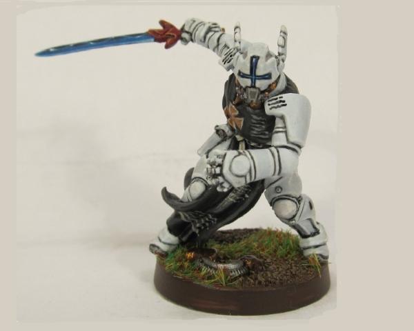
This entry is classic Knightley, it's the crisp and, well, the white we all know and love! As always execution is technically wonderful and it's nice to see you working on even smaller details than your Grey Knights allow. If you haven't checked out his blog you should do so, you'll also see what I consider to be the reason this entry didn't do better! What's the reason? You painted it to be part of your Grey Knight army! They are beautifully painted well above tabletop and I'm still amazed at how many you have painted to that quality but I do wish you had worked outside the box on this one. The level of this competition really requires entrants to push the envelope of their capabilities and strive for something really difficult. I think you know this though and I'm really glad you took part, I hope you join us again in future and that next time holy really go for broke and show us the amazing things you are capable of.

Entry 2 - Marco_Emerald - PanOceania Knight Hospitaller

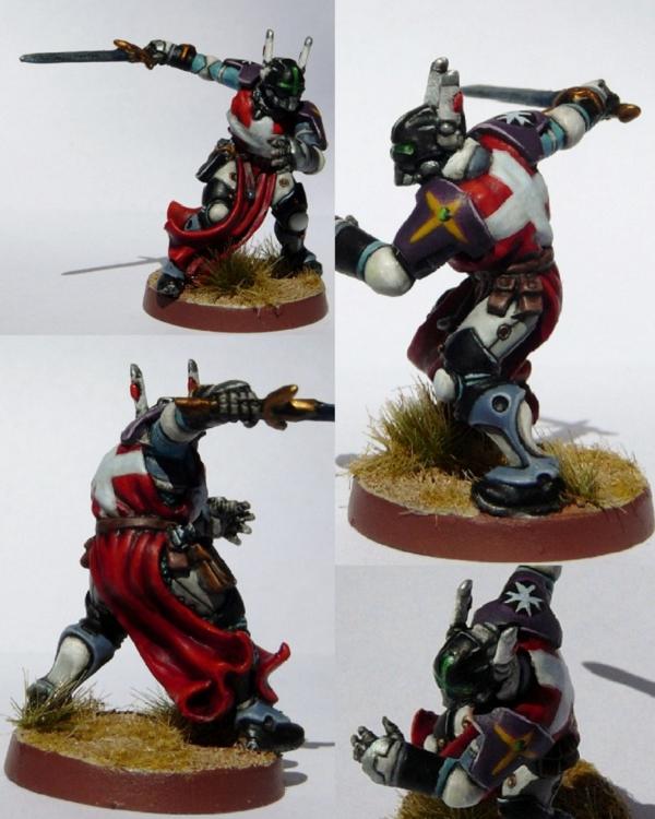
I really enjoyed this entry and found it on par with Knightley's, and not because you used the same miniature! Where this fell down for me was the colours, it's a personal preference but I found the miniature too busy for me to digest properly. Based on this I think that you would have done much better with a different colour scheme and the same level of execution.
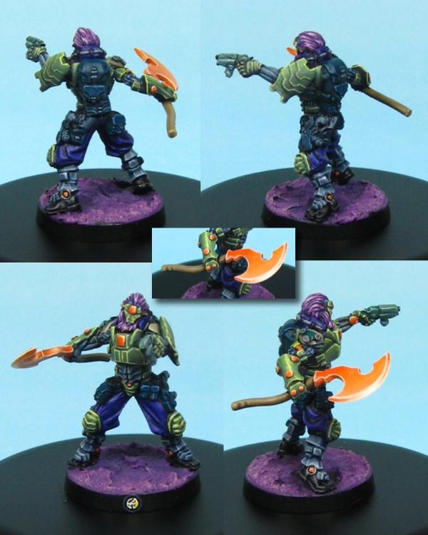
Entry 3 - junex - Yu Jing Keisotsu Butai

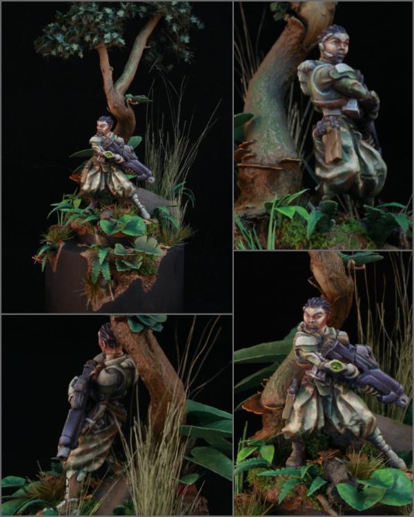
Congratulations on winning the Judges Choice Prize! The decision was made to award you this prize as we felt your entry had not only embraced the theme fully but was technically excellent, presented well and was overall ticking the most boxes in each category. You should be very proud! If I was forced to pick a hole in it somewhere I'd suggest that the miniature sinks into the background quite a lot and could use some pop. However! I can also see this as a positive aspect pertaining to the theme where the miniature is partly camouflaged into the dangerous terrain. As you can see this is one of my personal favourites, there is always space for each of us to improve in all aspects but I wouldn't pick out anything in particular here.

Entry 4 - 
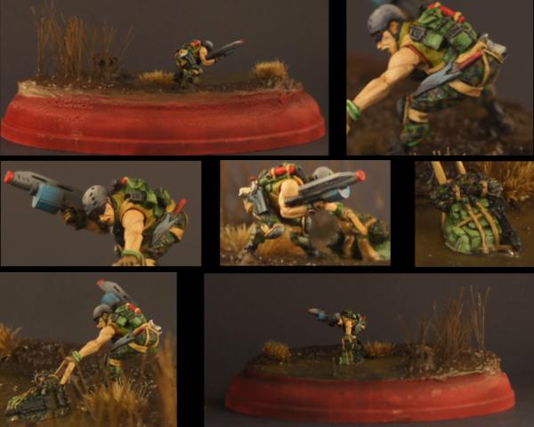
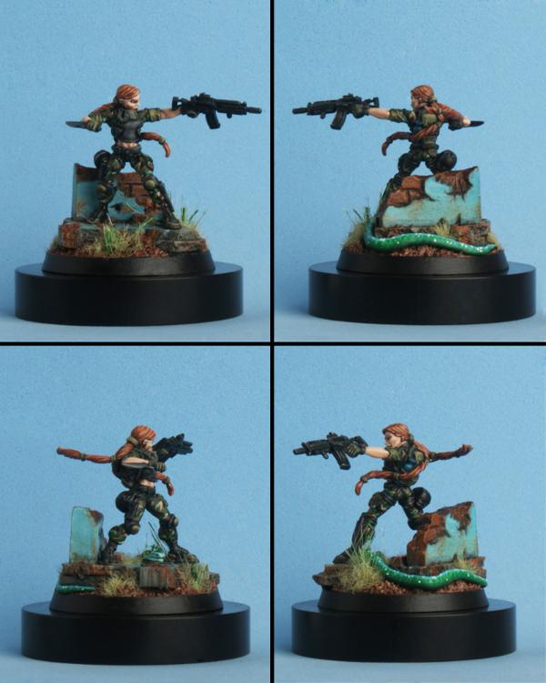
bbb - Ariadna Para-Commando

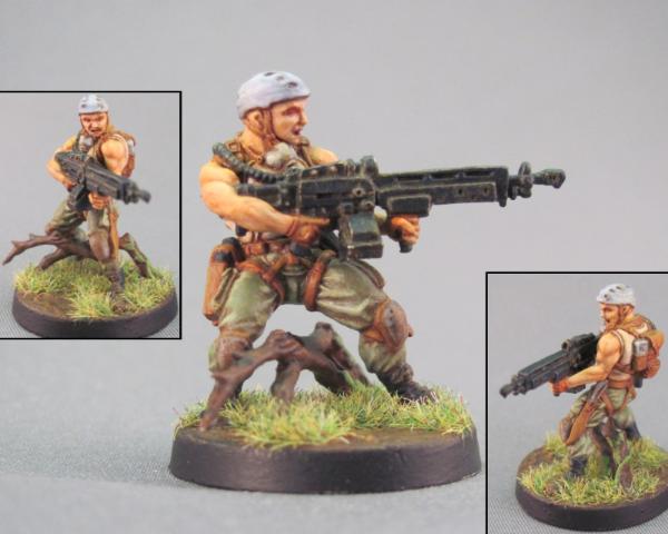
This is a nice entry that picks up points in all categories but I think the issue here is that the miniature doesn't pop. Particularly when it comes to voting you need to get people's attention and this miniature does a very good job of blending in. This might have been rectified by having more contrast between shading and highlights.

Entry 5 - bou - PanOceania Jotum

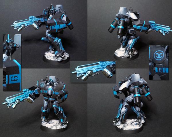
Another winner! Congratulations on coming in fifth! I would really have liked to see more effort put into the theme here and I think the black was a little on the flat side but your award is very well deserved. As always, your painting skills are brilliant, your technical ability astounding. I think, if you had, had the time, a diorama base and maybe a second miniature would have skyrocketed this entry up the poll. I hope we see you again next time, it's always exciting to see what you come up with!

Entry 6 - motyak - Yu Jing O-Yoroi Kidobutai

It's always nice to see a nicely painted TAG but I think as an entry this needs a little work, work that you are entirely capable of, I'm sure of that. The photography let's down your entry quite a bit, as I'm sure you are aware. You don't need a lightbox right away but the Dakka Photography Articles are worth reading to pick up some tips, I think you'll be surprised how massive a difference it makes, it would definitely have won you more votes. I believe you've put effort into capturing the theme on the base but again the photographs hide this. Apart from that I think you did a really good job though! The large panels of colour on the TAG could have used breaking up so they weren't quite so flat too, something to consider for next time.

Entry 7 - Raqui - Yu Jing Sun Tze 2.0

A well deserved second place, sir! I would have really liked to see the theme adhered to in some way but I can't argue with the level of painting. This is technically painted to an extremely high standard! Apart from the theme, I found that the colours didn't appeal to me personally but that's just a matter of personal taste.

Entry 8 - 
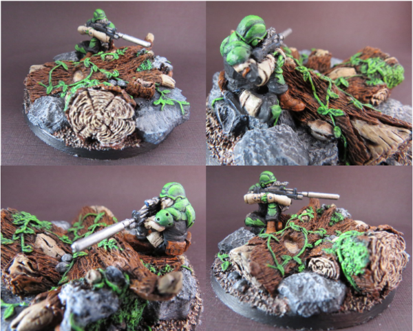
bantha_beast - Combined Army Drones

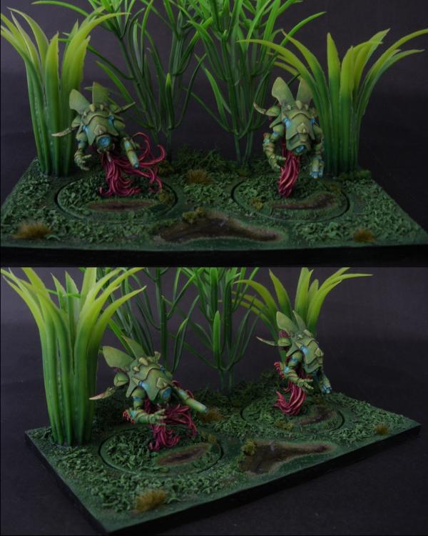
I really liked the drones here and the set up of the diorama. I get the impression that they have just drifted out of the dense alien jungle. As much as enjoyed the paint job on the miniatures themselves I feel like the diorama didn't do them justice. The ground has some nice detailing and water effects but is quite flat overall and the plastic plants let you downs bit. I think that because fish tank plants are so obviously fake people are automatically put off by them, sadly I think they probably did more harm than good to your votes. So next time I think the main consideration to make would be to get your basing up to the same level as your miniatures.

Entry 9 - Victor.Drellings - Ariadna Para-Commando

Congratulations on winning Victor! And a well deserved win it was. I think the key here is that you struck a balance between what the voters were looking for and what the judges were looking for. Not only that but you produced an all round excellent entry, you captured the theme, told a story and executed a really lovely paint job. What more could we ask? I think another string to your bow is your presentation which has proven to be a deciding factor in the public votes.
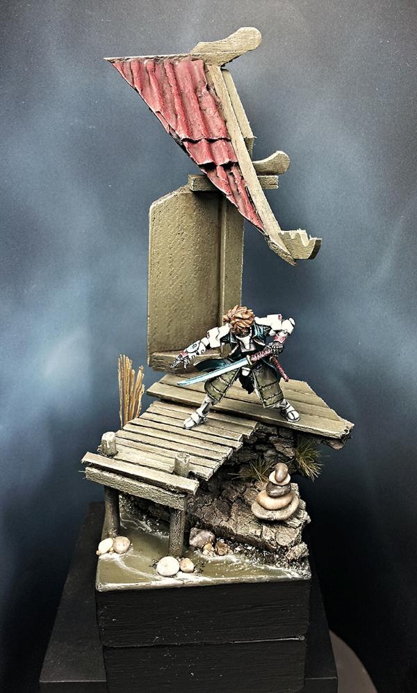
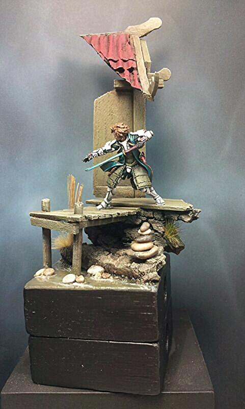
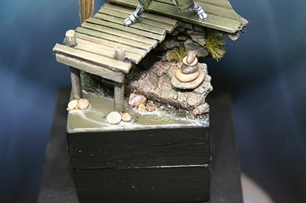
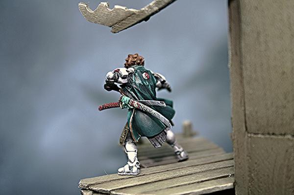
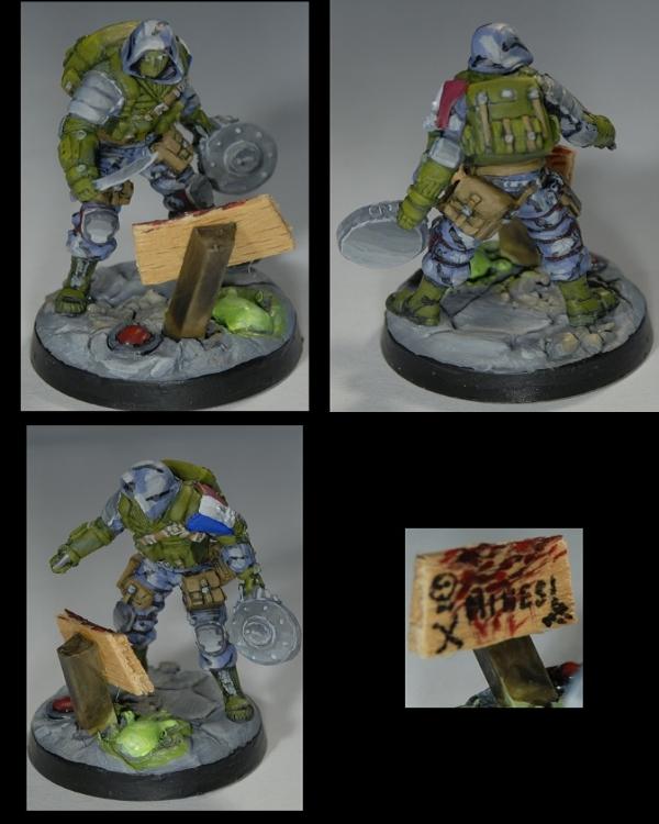
Entry 10 - Century1 - Ariadna War Correspondent

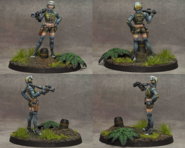
This is definitely one of my favourites, it's a beautiful paint job and it captures the Infinity universe and the theme very well. Apart from possible being one of the entries burnt by my mistake I think that it was hurt in the poll because a lot of the voters won't know about the Infinity universe and the WarCors. For those of us that know the background, this is an extremely cool entry. I also think that you could have done more to present the details better which were wonderfully painted. I am sure many of the voters don't open up the images for a better look so you would really have benefited from some close ups.

Entry 11 - weetyskemian44 - Mercenary Valerya Gromoz

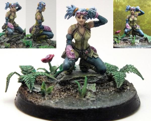
We discussed your entry a little in your blog but I'll expand on it slightly now. I think the presentation might have been improved overall and I know you weren't happy with your photographs. You mentioned that you wanted to depict that she had just stopped to take in her surroundings in a moment of peacefulness. I think you could have captured that more successfully had you had more time, building up the shrubbery a little thicker and taller plus adding a backdrop of a tree and bushes would have created a sense of peaceful seclusion. Again if you had, had more time it would have been a nice addition to have her holding a flower or something to move her away from the assumption that she was in combat of some kind. With even more time it would have been really cool to see a bigger piece with someone lurking in the shadows, preying on her. Since you suggested you might repaint her, it could be an opportunity to add things as well! Overall I really liked your entry though, it was a nice break in pace and it adhered to the theme well.

Entry 12 - Estetioeslaostia - Haqqislam Ghulam Infantry

Another winner! Congratulations! You painted your entry up wonderfully but I would really have liked to see you represent the theme much more. I think your presentation and the painting on the face were the key factors to your success. Really nice job!

Entry 13 - Albreck - Combined Army Treitak Spec-Ops

A well deserved winner too! Again, I would really have like to see you embrace the theme but you did a lovely job on the painting and presented your miniature excellently. It's hard to say more since what you've done is so nicely executed but if you enter again in future, and I hope you do, I would just suggest you do more in capturing the theme given. A diorama base like Victor's could well have got you a win!


Entry 14 - Alathia - Ariadna Intel Spec-Ops

I can see you really pushed yourself with your entry which is awesome and I always try to do the same when I enter a contest. I think future improvements will mainly come down to practicing these techniques. I also think you could use some experience in colour theory as the miniature fails to 'pop', as we always say, and the colour of the base clashes quite heavily with the other greys. Keep at it and you'll keep doing better in the polls!

Entry 15 - Von Skyfury - Yu Jing Oniwaban and Aleph Achilles

I'm really happy with the way you embraced the theme wholeheartedly and set up a cool story in your diorama. The plastic plants really hurt you here I think and although you've done a good job of breaking up the base something about all that flock is quite off putting at first glance. And first glance is probably all you get from most of the voters who drop by, again this is a situation where presentation is a key factor in grabbing people's attention and getting you their votes. Apart from that I think the painting and colour choices could be improved by practicing. I've said it many time before but I really think you should get a blog rolling, you have a really good output and it would be nice to see you improve over time and get advice from the great Dakka knowledge base. Really nice entry, mate, keep at it!

Entry 16 - 
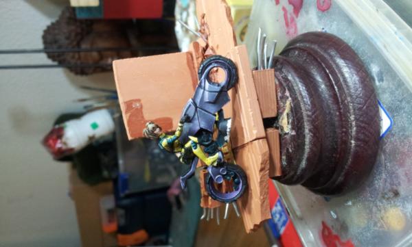
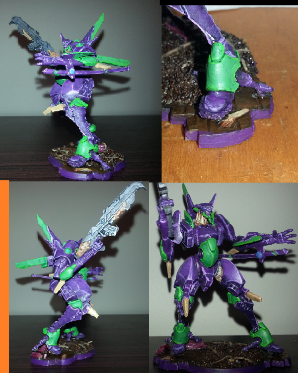
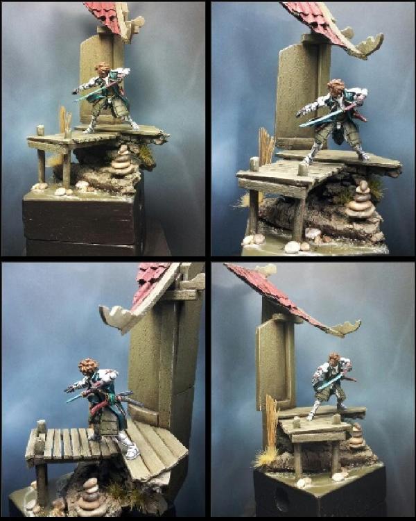
Arakasi - Yu Jing Aragato Senkenbutai

Obviously you've had a lot of feedback between your two threads and I'm really not going to be able to add much more. I think you were heavily stung by my mistakes in the theme, probably more than most. I think the biggest issue was presentation though which you are addressing well already. The picture is extremely saturated(Is that the right word?) which really washes out your details which you clearly laboured over intensely and it ruins what is actually a much more delicate paint job. I think the colour palette could be improved even in the new images as the elements could use a little more of that ellusive 'pop' we all crave. I think of your entry as a soup, I'm really enjoying it but I can't seperate all of the exciting elements that went into it. Or maybe I'm just hungry! Anyway, you put in a tonne of effort, I love what you did and you are addressing the issues that stung you. There is no doubt in my mind that you'll nail it next time.

Entry 17 - jah_joshua - Ariadna Para-Commando

I'm a big fan of this piece and I know for a fact the other judges are equally hugely impressed by it. Because of that I can really only address what went wrong in the polls. If you could have got the public votes you would have been a big challenger to the winners. Like Arakasi I think you were the two worst hit by my vague theme and I'm really sorry about that, there is nothing you can do about that. I think two or maybe three of those images would have been enough, plus a couple of close ups to present your model in an eye grabbing way for the voters. I think that's all you really needed to grab more votes in the end. I was particularly impressed with the way you captured the theme in a relatively small area. All round a very impressive miniature that you should be extremely proud of.

Entry 18 - 
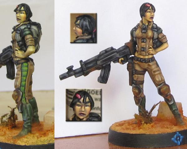
marco kodayo - Yu Jing Domaru Takeshi "Neko" Oyama

This entry has quite a story behind it that I touched on earlier. The entrant really struggles with English which was the first hurdle. He emailed me a WIP which he had begun working on about a week before the competition, it was a mindblowingly cool, sure fire winner but obviously I couldn't accept it. I managed to get that across to him and about a week passed before I got another email saying he had managed to get another miniature sent out to him, which had been difficult since he is posted at a military barracks on an island somewhere, he included a new WIP of this miniature and again I new we had a winner on our hands. After that I didn't really hear much until the competition deadline was coming around. I got an email with 10-20 really huge images of the finished piece, another language barrier issue where the rules had been misunderstood. I advised what was required and the current entry arrived a couple of days later but it was less than 50% of the required size. I also found out that he didn't really have access to a PC often or for long, there was only about a day left when I asked for a bigger image and he couldn't do it in time. I said I'd hang on as long as possible and I'd stretch it to fit if I had the time before posting the poll. Obviously that's what happened in the end and it hasn't gone well for him. I'm not going to analyse the entry because obviously the presentation killed it. I really hope the entrant comes back to posts up more, larger images as this is really an astounding piece of work, as was the first piece he did.

Entry 19 - ProfessionalAmateur - Haqqislam Djanbazan

This is a really cool entry but I think the issue was it's simplicity. The colours, while well painted, are bold and unrealistic. I understand the idea of him being camouflaged but I think the colours are actually too similar, the base would have benefited from a slightly more realistic paint job. If I remember correctly this is a cast resin base, it is possible that this is off putting on a subconscious level as the mind recognises a lack of natural shape that you get from flock or sand. I think the trick with a camouflaged entry is to get the whole thing to jump out while allowing the miniature to recede, I think this entry is missing that element that makes it explode off the screen, possibly something that could have been found with a different paint scheme. What you did was really well executed and enjoyable so maybe all that's required next time is more planning.


Okay so that's me folks. I hope my humble little opinions are of use to someone and maybe give some insight into what it takes to put together a winning entry or improve your work for next time. I really honestly, enjoyed everyone's entries and I hope you come back and join us for the next one. My apologies one last time for the mistakes I made with the theme, I've learned a lot from this competition too as I'm sure the entrants did.

   
Made in ph
Utilizing Careful Highlighting


Manila, Philippines

Entry 18 has got me thinking: maybe I should make a tutorial on how to better present photos of your models using Adobe Photoshop. It'll include basic stuff like how to crop images, editing, and resizing without pixelating the image. I really feel that 18 is such a huge waste: it looks incredibly good from here and was really hurt by its presentation.


Made in us
Longtime Dakkanaut


So...I need to work on making my minis pop. I'll have to see what I can do. There are highlights and such on the arms and pants, etc, but they don't have a lot of contrast because I like smoother transitions.

So when's the next painting comp
   
Made in us
Martial Arts Dāturazi


Philadelphia, Pensylvania

I would be pretty excited about another DPC casey, what kind of crazy theme would it be? o.o

Absolutely love the armor on number 7, and number 3 is still my favorite. His base was just awesomely done, hand cut plants too!


Made in us
Stern Iron Priest with Thrall Bodyguard


Redondo Beach

thanks for taking the time to write up critiques bou, heartserenade, and Casey's Law...

as has been said by all three of you, my photography (entry 17) really let me down...
that's always the case, though, as my minis looks so much better in hand:(...

here's the main problem i ran into once the voting started and i had time really look at my pics...
it's the "wow factor", which my mini didn't have...
being confused between wether we were in a painting contest, where technique is king like Century's piece (the WarCor, which is the best paintjob of the lot as far as technique goes), or a themed contest...

i chose to go with theme over "pop"...
the idea was to paint the Para-Commando as if she were a Delta Force Operator, stealthy and dangerous...
the camo, the webbing, and the gear all blending instead of standing out...
i had hoped that the colors of the base would provide the "pop", since that was the main part of the theme...

lots of lessons learned with this paintjob, and it's presentation for votes, so all in all not a wasted effort...

once again, good job to everyone involved, painters and organizers...
thanks...

see you next round!!!

cheers
jah

Paint like ya got a pair!

Available for commissions.
 
   
Made in gb
The Hammer of Witches


cornwall UK

Thanks for all the feedback. I feel that the winners all deserved their win. Obviously or we wouldn't have voted for them. Its taught me a lot about competitive painting. One's entry has to shout out from the page "look at me! aren't I beautiful" and on that score I was halfway there.

I think my downfall (entry11) was that having spent days carefully assembling the base I then rushed through the paintjob and photography, thinking it would be good enough and not quite realising how damn good at painting you all are.

I knew the moment I saw the pics who was going to win a prize. It just seemed obvious when you saw them all together that some looked just so and others weren't quite there.

War Cor is my fav.


Automatically Appended Next Post:
Oh and I would love to take part again. When's the next comp? This time I will try extra specially hard.

This message was edited 1 time. Last update was at 2013/07/20 06:09:17


Made in au
[MOD]
Not as Good as a Minion


Brisbane

Thanks for the breakdown bou and Casey, I hadn't really tried to photograph miniatures nicely before this, so it was always going to be an issue, thanks for the help on what to do better. And the painting, well, that'll come with time and practice. Yeah the foot picture was an attempt to show the base (which was meant to be the rainforest reclaiming a wooden floor and bricks and stuff) but it was pretty hard to see thanks to my photography skills. And I do need to learn how to thin my paints down a bit, as well as neaten up my highlights/figure out how to break up large panels. So thanks for all the pointers guys, next time I'll place higher

And yeah it was eva-01 bou, I really quite enjoy the show.

I wish I had time for all the game systems I own, let alone want to own... 
   
Made in gb
Fixture of Dakka


Well I'm glad that's been some use! By the way, if I seem at all like I'm being very negative about any entries it's not because I don't like them, they're all great. I was trying to nitpick and find the weakness in order to suggest improvements so I likely failed to mention what it was I did like in many cases.

I couldn't begin to say when the next DPC will be or what the theme or game system would be. I'll definitely talk to yak about it though and the best thing to do would be to keep your eyes peeled!

I'm not sure if marco kodayo, entrant 18, will be back due to the language barrier but I dug out some of the original images he sent me and here is a link to what I believe to be his blog: http://houseofruano.blogspot.co.uk/p/galeria.html

Disqualified first WIP:


Larger images of entry:


Made in ph
Fresh-Faced New User


Manila, Philippines

Thanks for the feedback bou, heartserenade and Casey's Law!

It was a fun project and I learned a few things. The feedback helped in pointing out a few things I need to improve on.

Overall, I'm happy with the results and like I said it was a fun project. I don't mind doing something like that again.

The devil is in the details.

Doveryai, no proveryai. 
   
Made in gb
Fixture of Dakka


I think this wrapping up nicely now. Thanks again to everyone who was involved, sponsors, organizers, entrants and voters!

It doesn't have to end here though, if you'd like to continue your experience of Infinity you may want to check out these threads:
Infinity for Beginners
Infinity: Find a Game
Community Showcasing
Community Pledging
O-12 Operative Program
Infinity: Terrain
Campaign: Growing Our Community


Forum Index » Painting & Modeling
Go to: