| Author |
Message |
 |
|
|
|
|
Advert
|
Forum adverts like this one are shown to any user who is not logged in. Join us by filling out a tiny 3 field form and you will get your own, free, dakka user account which gives a good range of benefits to you:
- No adverts like this in the forums anymore.
- Times and dates in your local timezone.
- Full tracking of what you have read so you can skip to your first unread post, easily see what has changed since you last logged in, and easily see what is new at a glance.
- Email notifications for threads you want to watch closely.
- Being a part of the oldest wargaming community on the net.
If you are already a member then feel free to login now. |
|
 |
2016/03/15 17:02:11
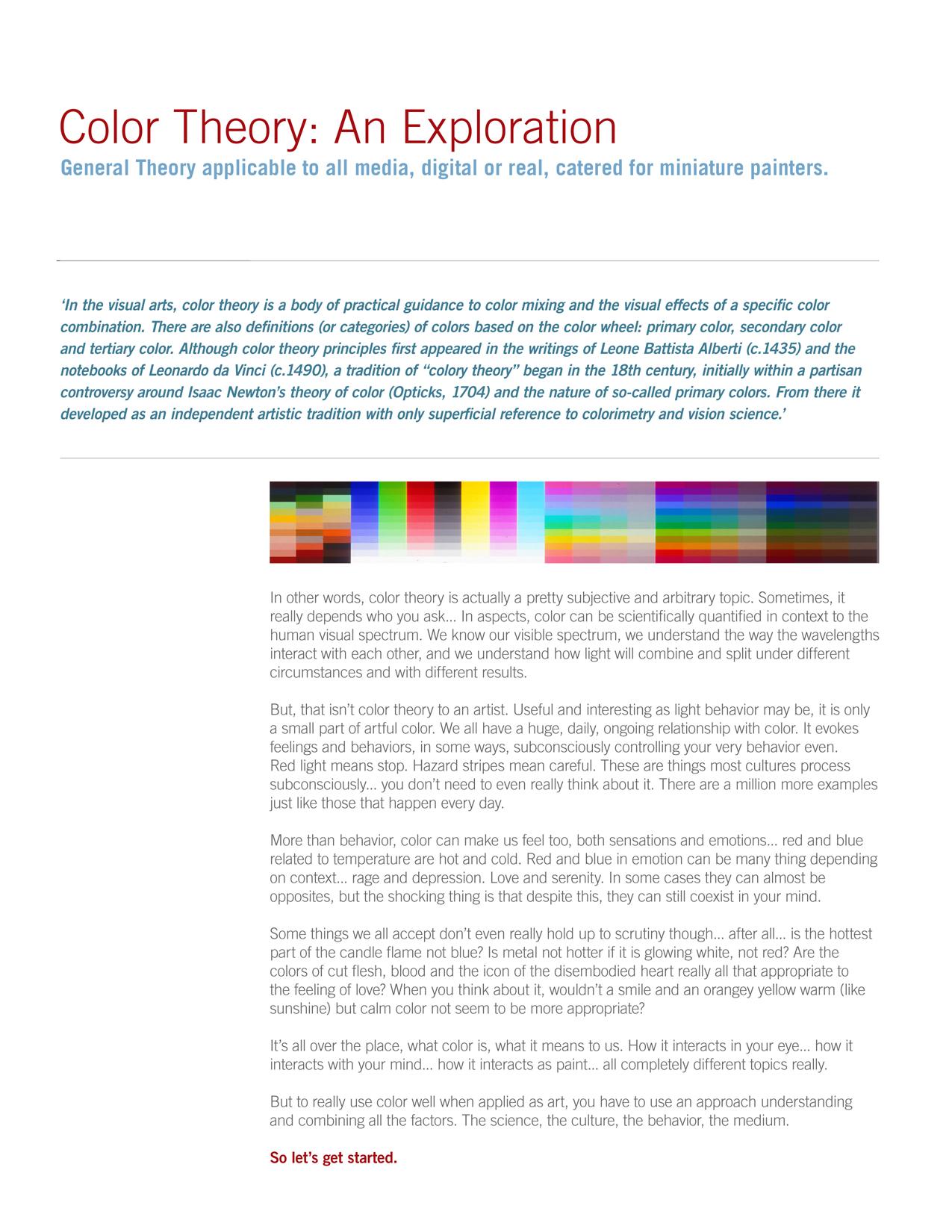
Subject: Color Theory for Miniature Painters
|
|

[DCM]
Acolyte of Goodwin
|
|
|
|
|
 |
|
2016/03/15 20:38:06
Subject: Re:Color Theory for Miniature Painters
|
|
Buttons Should Be Brass, Not Gold!
|
Thanks for posting this as its very informative.
|
|
|
|
|
2016/03/15 21:31:10
Subject: Color Theory for Miniature Painters
|
|

Regular Dakkanaut
|
I consider myself a person who enjoys learning. I read books and watch documentarys on things and yet for the hobby i love and put a lot of time into getting good at, i read about color theory and just refuse to sit down and understand it. I really need to though as surely this could take my stuff to the next level.
I wish I knew someone In real life who was that good. That farseer is something I "looked up to" too, god that stuffs so damn good
|
My trader feedback on other websites
http://www.overclock.net/u/193949/eosgreen
http://www.ebay.com/usr/questionmarks
|
|
|
|
|
2016/03/15 23:20:21
Subject: Color Theory for Miniature Painters
|
|
[DCM]
Acolyte of Goodwin
|
Thanks for reading! It is worth absorbing, it can help with literally any artistic endeavor, photography, painting canvas, drawing, digital work... it all applies. Hope there was something new in there for ya -
|
|
|
|
|
|
2016/03/17 18:49:11
Subject: Color Theory for Miniature Painters
|
|

Calculating Commissar
|
Really interesting read and some great pointers, thanks!
|
|
|
|
|
|
2016/03/17 21:31:48
Subject: Color Theory for Miniature Painters
|
|
Rogue Daemonhunter fueled by Chaos
|
This was a fantastic article. I felt like I learned more about color theory from reading it than I have from years of science classes.
I'm interested to see how I can apply this without necessarily learning new technique. I think it would help with creating color schemes that pop.
|
|
|
|
|
2016/03/17 21:52:04
Subject: Color Theory for Miniature Painters
|
|
[DCM]
Acolyte of Goodwin
|
Thanks P -
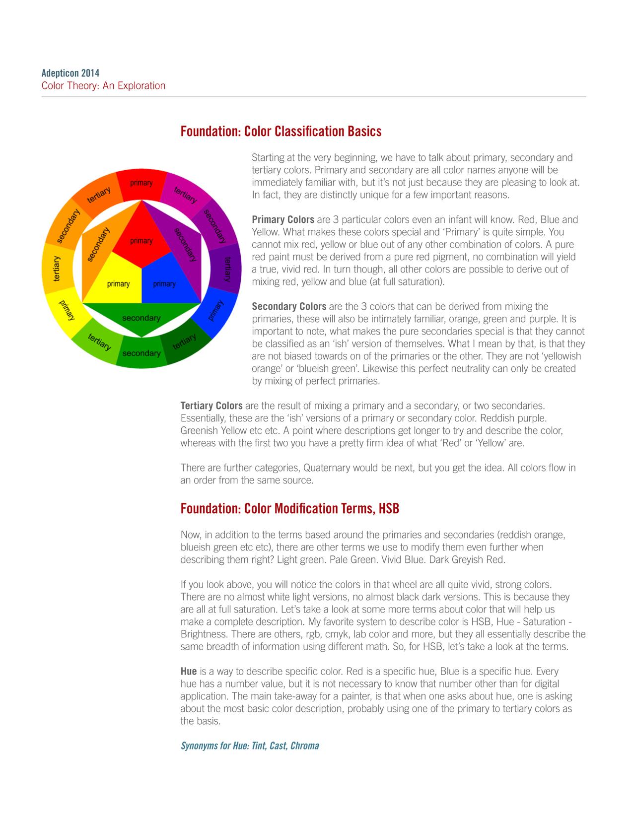
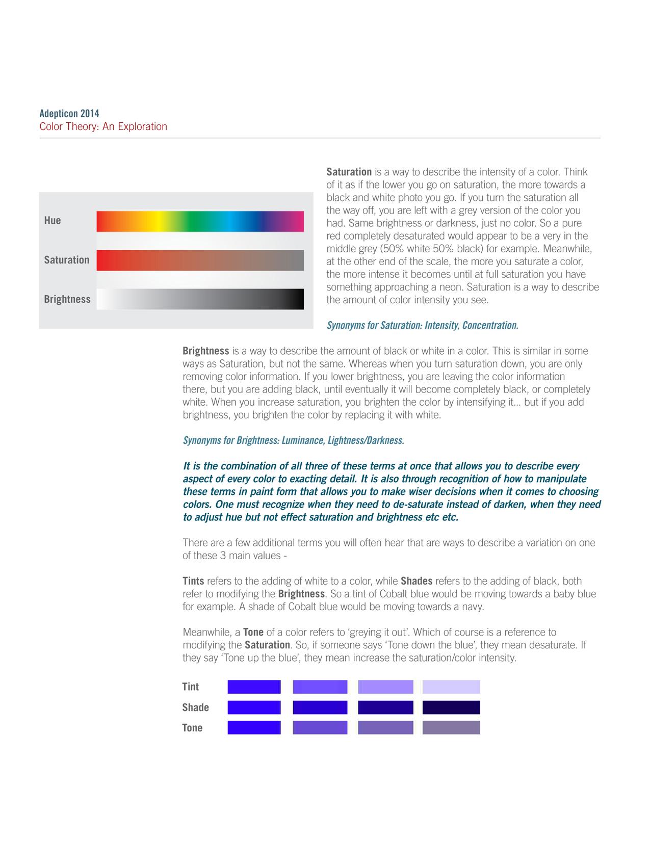
The biggest thing I would want anyone to take away from this is understanding the difference between additive (color created by light) and subtractive (color created with physical pigments/objects). Everything else is important too, but this is the least known factor I feel and the one that leads to the most mistakes by painters of all stripes.
|
|
|
|
|
|
2016/03/17 21:59:02
Subject: Color Theory for Miniature Painters
|
|
Rogue Daemonhunter fueled by Chaos
|
I used to work in a print shop, so I have a bit of a layman's understanding of subtractive color, at least from the CYMB perspective.
I'm going to reread the stuff on Saturation vs. Brightness, and the temperature stuff.
|
|
|
|
|
2016/03/18 23:33:43
Subject: Re:Color Theory for Miniature Painters
|
|
Grumpy Longbeard
|
The additive vs subtractive thing is something that I (I think most people) was aware of I just didn't quite know what or why it was. Finally understanding is eye opening, thank you.
|
 Nightstalkers Nightstalkers  Dwarfs Dwarfs
  GASLANDS! GASLANDS! 
 Holy Roman Empire Holy Roman Empire |
|
|
|
|
2016/03/21 15:26:14
Subject: Color Theory for Miniature Painters
|
|
[DCM]
Acolyte of Goodwin
|
Happy it helped bud  , it is the key take away for me from the whole thing, so glad it resonated.
|
|
|
|
|
|
2016/03/21 19:30:14
Subject: Color Theory for Miniature Painters
|
|
Tough Traitorous Guardsman
London, England
|
thanks for posting this. it's dead interesting and i think i learnt something!
|
|
|
|
|
|
2016/03/24 09:58:33
Subject: Re:Color Theory for Miniature Painters
|
|
Crafty Bray Shaman
Anor Londo
|
Great article Major Tom, very well written. Thanks for taking the time to create and share it.
|
|
|
|
|
2016/03/24 10:34:41
Subject: Color Theory for Miniature Painters
|
|
[ADMIN]
Decrepit Dakkanaut
|
Careful with colour theory though - it is a gateway drug to appreciating modern art like Piet Mondrian!
|
Check out our new, fully plastic tabletop wargame - Maelstrom's Edge, made by Dakka!
|
|
|
|
|
2016/03/24 16:02:19
Subject: Color Theory for Miniature Painters
|
|
[DCM]
Acolyte of Goodwin
|
Piet Mondrian... Overrated frippery I say! lol
|
|
|
|
|
|
2016/03/25 04:49:04
Subject: Color Theory for Miniature Painters
|
|
Combat Jumping Ragik
|
How about Josef Albers? Although he was more an educator than an actual *artiste*
|
|
|
|
|
|
2016/03/25 16:30:22
Subject: Color Theory for Miniature Painters
|
|
[DCM]
Acolyte of Goodwin
|
Josef Albers is legit, he gets a pass -
|
|
|
|
|
|
2016/03/27 13:50:25
Subject: Color Theory for Miniature Painters
|
|
Maniacal Gibbering Madboy
|
This helps a lot, thanks for posting it.
|
|
|
|
|
2016/03/28 01:24:23
Subject: Color Theory for Miniature Painters
|
|
Bounding Assault Marine
|
This got a lot of gears turning for me. Thanks!
|
|
|
|
|
|
2016/03/29 03:37:40
Subject: Color Theory for Miniature Painters
|
|

Unstoppable Bloodthirster of Khorne
|
Great article, and excellently written and illustrated.
|
|
|
|
|
|
2016/03/29 05:05:30
Subject: Color Theory for Miniature Painters
|
|
Bounding Assault Marine
|
 MajorTom11 wrote: MajorTom11 wrote:Hey guys,
Some people have been asking for class notes from some of my Adepticon Seminars, so I figured I would share for those who may find it useful.
I think that I can safely speak for everyone here, when I say we find this very useful. Do you have any more like this you wouldn't mind sharing? If so I think we'd all love to see them.
|
|
|
|
|
|
2016/03/29 15:46:41
Subject: Color Theory for Miniature Painters
|
|
[DCM]
Acolyte of Goodwin
|
Thanks guys!
Webofiles, you can see a variety of my tutorials in my signature, covering a wide range of topics -
Cheers!
|
|
|
|
|
|
2016/04/19 21:53:20
Subject: Color Theory for Miniature Painters
|
|
Snotty Snotling
|
My brain hurts. That was awesome though.
Automatically Appended Next Post:
Forgive me if I missed it, but how do you work in metallics with this such as going from nearly black to like a platinum silver
|
|
This message was edited 1 time. Last update was at 2016/04/19 22:10:37
When in doubt, kick the nearest grot. 
Have a good night everyone. |
|
|
|
|
2016/04/22 16:09:08
Subject: Color Theory for Miniature Painters
|
|
[DCM]
Acolyte of Goodwin
|
Treat them exactly the same... People often make the mistake of thinking of metallics as: gunmetal > silver, Gold > Silver being the scope of the 'metallic spectrum'. But you can go from black to brightest silver, black to gold... and you can glaze temperature into the metals just as you would glaze a flat color too, there is no difference practically speaking, other than to say be careful to leave enough metallic showing to 'convince' the viewer that the object is indeed metal.
As an example I just did this dude,
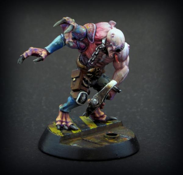
If you look at the pick, it is dominantly black, by a large margin, and there is actually less brass/tin than silver, but the small amount of brass is enough to establish the color of the metal is brass or at least 'off-white'.
So, in short, you can treat metals just as you would regular colors for the most part. You can mix in colors by glazing anywhere on the gradient, though you probably want to leave a bit of the extreme dark and light parts un-tinted.
|
|
|
|
|
|
2016/04/22 16:33:46
Subject: Color Theory for Miniature Painters
|
|
Dakka Veteran
|
Thanks heaps for posting! A whole side of painting that I need to learn and it's so good to have the examples with the descriptions all in one place!
|
|
|
|
|
|
2016/04/24 23:58:00
Subject: Color Theory for Miniature Painters
|
|
Bounding Assault Marine
|
That genestealer cultist is phenomenal. The veins painted into the shoulder and gratuation of skin tones are beautiful!
|
|
|
|
|
|
2016/04/25 12:51:01
Subject: Color Theory for Miniature Painters
|
|

Storm Trooper with Maglight
|
MajorTom11 wrote:Treat them exactly the same... People often make the mistake of thinking of metallics as: gunmetal > silver, Gold > Silver being the scope of the 'metallic spectrum'. But you can go from black to brightest silver, black to gold... and you can glaze temperature into the metals just as you would glaze a flat color too, there is no difference practically speaking, other than to say be careful to leave enough metallic showing to 'convince' the viewer that the object is indeed metal.
As an example I just did this dude,
If you look at the pick, it is dominantly black, by a large margin, and there is actually less brass/tin than silver, but the small amount of brass is enough to establish the color of the metal is brass or at least 'off-white'.
So, in short, you can treat metals just as you would regular colors for the most part. You can mix in colors by glazing anywhere on the gradient, though you probably want to leave a bit of the extreme dark and light parts un-tinted.
That's actually really good idea for painting metallics. Thanks
|
|
|
|
|
2016/09/29 19:43:34
Subject: Color Theory for Miniature Painters
|
|
Fixture of Dakka
|
Great article man. Thank you for posting it. I have been reading some books on color theory here and there, but haven't had time to really apply them lately. I think that when I do have time, this article will be the reference open while I paint!
|
|
|
|
|
|
|
|


 Imperial Fist, IG and GK WIP: