| Author |
Message |
 |
|
|
|
|
Advert
|
Forum adverts like this one are shown to any user who is not logged in. Join us by filling out a tiny 3 field form and you will get your own, free, dakka user account which gives a good range of benefits to you:
- No adverts like this in the forums anymore.
- Times and dates in your local timezone.
- Full tracking of what you have read so you can skip to your first unread post, easily see what has changed since you last logged in, and easily see what is new at a glance.
- Email notifications for threads you want to watch closely.
- Being a part of the oldest wargaming community on the net.
If you are already a member then feel free to login now. |
|
 |
2016/07/18 03:18:50
Subject: WORST 40k artwork thread
|
|

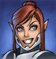
Trigger-Happy Baal Predator Pilot
|
So, I'm sorry if a thread like this has ever been attempted before, and I'm sorry if this in the wrong spot, but, I'm trying to get a laugh here.
Can you guys post the worst 40k artwork you've ever seen? From an official source please! I'm not talking 40k porn from someone's deviant art page.
I'll start with two examples:
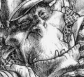
Night Lords!
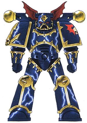
I showed this piece of 3rd edition era artwork to a buddy of mine and his immediate critique was "this looks like a space marine from a haunted house. It looks like something a 12 year old would draw. "
Good thing forgeworld made them look actually menacing.
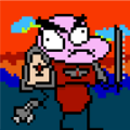
Bomb Squigs!
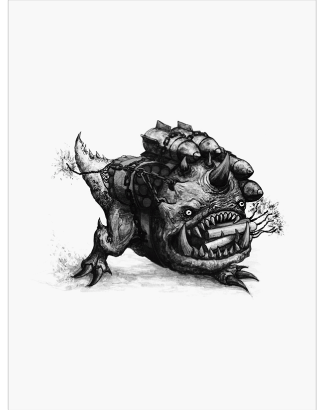
This is from some a data slate I believe. I showed it to a buddy of mine who has played orks since the 90s and he just goes "this is the worst drawing I've ever seen in my life." And this is coming from a dude who used to be a preschool teacher.
Well, there ya go, what artwork has made you go wth were they thinking?
PS, not trying to burn on any individual artists. I'm a total nobody, and part of the fun of the 40k universe is how ridiculous it is! 
|
|
|
|
 |
|
2016/07/18 03:44:12
Subject: Re:WORST 40k artwork thread
|
|

Commander of the Mysterious 2nd Legion
|
I'm gonna say, by and large, the art inKhorne Deamonkin. I don't own the book, so can't think of any examples, but I remember when I saw it thinking the art was of lower quality then you normally saw in a 'dex
|
Opinions are not facts please don't confuse the two |
|
|
|
|
2016/07/18 05:29:18
Subject: WORST 40k artwork thread
|
|

Longtime Dakkanaut
|
Whut those aren't bad at all night lords really look like that and that squig is cool. I would like to see you do a better job.
|
|
This message was edited 1 time. Last update was at 2016/07/18 05:29:29
Inactive, user. New profile might pop up in a while |
|
|
|
|
2016/07/18 08:53:02
Subject: Re:WORST 40k artwork thread
|
|

Alluring Sorcerer of Slaanesh
|
I like the two images. I think this might be an age thing or something. Images like this are what got me into 40k and I love this style to this day. I would pick some of the newer CG images, a lot of them just seem to lack soul to me.
I know this is 30k but this is one that I think is pooopie
|
No pity, no remorse, no shoes |
|
|
|
|
2016/07/18 09:33:55
Subject: Re:WORST 40k artwork thread
|
|

Crushing Black Templar Crusader Pilot
|
The first image is a bit meh to say the least if you ask me. The bomb squiq pic is cool!
I actually like this pic. Personal preference, I guess. My contribution is not so much a bad picture (it's actually decent artwork), but for reasons I can quite put to words it annoys the feth out of me:
|
|
This message was edited 1 time. Last update was at 2016/07/18 09:34:42
|
|
|
|
|
2016/07/18 09:37:20
Subject: Re:WORST 40k artwork thread
|
|
Shas'o Commanding the Hunter Kadre
Missouri
|
The squig is kinda cute, I think. I don't see what makes it "the worst drawing in the world", would like to hear more of an explanation for why your buddy thinks that way. "lol it sucks" isn't much of a critique.
The Night Lords image I can see, because personally I'm not a fan of these cartoony-looking color plates in the GW books anyway, and the design of the Night Lords in 40k is kinda silly with the bat wing "ears" and painted-on lightning.
|
 Desubot wrote: Desubot wrote:Why isnt Slut Wars: The Sexpocalypse a real game dammit.
"It's easier to change the rules than to get good at the game." |
|
|
|
|
2016/07/18 09:44:39
Subject: WORST 40k artwork thread
|
|

Regular Dakkanaut
Dublin
|
The Pask vs Longstrike page art from the Mont'ka book was crispy fried buttholes but I can't find it on the net.
|
40k Armies :   
Fantasy Armies:
DA:90SG+M-B--I+Pw40k99#--D++++A++/wWD232R++T(M)DM+
"We of the bloody thumb, salute you" - RiTides, Grandmaster of the Restic Knights |
|
|
|
|
2016/07/18 09:54:42
Subject: WORST 40k artwork thread
|
|
Longtime Dakkanaut
|
Every time someone says bad art this is all I can think. As for artwork from 40k I hate? I think In the Kauyon book the Ta'unar art is just ugly as sin. This is one picture in particular that looks like a bad anime drawing and I doesn't fit any 40k book or setting.
http://www.progressiveboink.com/2012/4/21/2960508/worst-rob-liefeld-drawings
|
|
|
|
|
2016/07/18 14:03:53
Subject: WORST 40k artwork thread
|
|
Ultramarine Master with Gauntlets of Macragge
|
The worst art is the stuff they've been using for color plates in recent GW codices. They look like basic lineart that was drawn in Flash and colored in with stock gradient fills. It's super static, basic art, that doesn't hold a candle to even the old color plates or anything I'd expect to see in a professional publication:


They also have some artists who just trace the models, and it looks pretty janky to me:

It's models influencing the art as opposed to the other way around, which I always found more inspirational as a hobbyist. Most other "bad" art can be pretty wholly attributed to its time (the scratchy, 2000AD ink lineart from Rogue Trader, the X-TREEM hard edges of Wayne England's stuff in the late 90s) but the stuff I posted is mostly just really lazy artwork.
|
Check out my Youtube channel!
 |
|
|
|
|
2016/07/18 14:08:31
Subject: WORST 40k artwork thread
|
|
Trigger-Happy Baal Predator Pilot
|
 oldzoggy wrote: oldzoggy wrote:Whut those aren't bad at all night lords really look like that and that squig is cool. I would like to see you do a better job.
Ahah, I actually have a real soft spot for the bomb squig, just my friend's gut reaction to it KILLED me.
|
|
|
|
|
|
2016/07/18 14:33:03
Subject: WORST 40k artwork thread
|
|

Hallowed Canoness
|
I like the squig bomb!
I tend not to keep copies of the terrible artwork so I don't have much to post here :(.
|
"Our fantasy settings are grim and dark, but that is not a reflection of who we are or how we feel the real world should be. [...] We will continue to diversify the cast of characters we portray [...] so everyone can find representation and heroes they can relate to. [...] If [you don't feel the same way], you will not be missed"
https://twitter.com/WarComTeam/status/1268665798467432449/photo/1 |
|
|
|
|
2016/07/18 15:20:01
Subject: WORST 40k artwork thread
|
|

Executing Exarch
|
 Brother SRM wrote: Brother SRM wrote:They also have some artists who just trace the models, and it looks pretty janky to me:
Agree with the static unit-marking images, they feel so lazy,even when they are useful. I got the Index Astartes (or whatever it was called) book and it was just page after page of this, instead any meaningful explanation on the markings.
With the spoilered image, what annoys me most is the CSM with the 'chainsword' - it's so clearly done by someone who's seen the model, but isn't sure what it's meant to represent.
|
|
|
|
|
2016/07/18 15:27:27
Subject: WORST 40k artwork thread
|
|
Regular Dakkanaut
|
I would probably pay a lot of money for a very detailed picture of Nemesor Zahndrekh dabbing hardcore like hes in a rap video. Cup of drank in his outstretched arm.
If you're a talented artist hit me up I'm only half kidding. Every time I look at his model I just want to see him dab.
|
|
|
|
|
2016/07/18 15:54:03
Subject: WORST 40k artwork thread
|
|
Alluring Sorcerer of Slaanesh
|
I love the Dreadnoughts er .. windows. The CSM shooting at the Dreadnoughts power fist must have some kind of funky bolter, the trajectory of the shell seems off to me.
|
|
This message was edited 1 time. Last update was at 2016/07/18 15:58:16
No pity, no remorse, no shoes |
|
|
|
|
2016/07/18 16:53:22
Subject: WORST 40k artwork thread
|
|
Glorious Lord of Chaos
The burning pits of Hades, also known as Sweden in summer
|
I strongly agree with Brother SRM.
Compare the Space Marines with the equivalent art from the FW HH books.
|
|
This message was edited 1 time. Last update was at 2016/07/18 16:53:42
I should think of a new signature... In the meantime, have a |
|
|
|
|
2016/07/18 17:08:48
Subject: WORST 40k artwork thread
|
|
Trigger-Happy Baal Predator Pilot
|
Brother SRM wrote:The worst art is the stuff they've been using for color plates in recent GW codices. They look like basic lineart that was drawn in Flash and colored in with stock gradient fills. It's super static, basic art, that doesn't hold a candle to even the old color plates or anything I'd expect to see in a professional publication:
Oh god yes!! The clip art marines! And that boxy dread looks like he's even less able to function than a model dreadnought is, which is a bold statement. Slight props on drawing up the terminator suit so that it looks like a person could actually fit inside it though! The shoulders are lower than the head! Amazing! Automatically Appended Next Post:  Quanar wrote: Quanar wrote:
With the spoilered image, what annoys me most is the CSM with the 'chainsword' - it's so clearly done by someone who's seen the model, but isn't sure what it's meant to represent.
Didn't even notice that!! Harrible! 
|
|
This message was edited 1 time. Last update was at 2016/07/18 17:10:19
|
|
|
|
|
2016/07/18 17:28:03
Subject: WORST 40k artwork thread
|
|
Oozing Plague Marine Terminator
|
The Kauyon book had alot of Nathan Explosion from Deathklock in Power Armor.
If I knew how to post photos I would.
|
|
|
|
|
2016/07/18 19:18:15
Subject: WORST 40k artwork thread
|
|
Trigger-Happy Baal Predator Pilot
|
 Nightlord1987 wrote: Nightlord1987 wrote:The Kauyon book had alot of Nathan Explosion from Deathklock in Power Armor.
If I knew how to post photos I would.
Too bad! Want to see!
|
|
|
|
|
|
2016/07/18 19:46:39
Subject: WORST 40k artwork thread
|
|
Powerful Phoenix Lord
|
Can someone explain how this made it onto a codex cover?

Another issue for me is pinhead Space Marines. I'm okay with Space Marines being gigantic. They are. But at some point the head is connected to a neck...then the body/shoulders...leading to the arms. How does that happen in a picture like this?
A lot of space marines are pictured with legs twice as thick as their torso as well.
|
|
This message was edited 1 time. Last update was at 2016/07/18 19:50:38
|
|
|
|
|
2016/07/18 20:05:31
Subject: WORST 40k artwork thread
|
|
Rampaging Carnifex
|
I always imagine that the body of the man inside the armour is pretty much completely contained within the torso of said armour. His feet would probably end up near the buttocks of the suit, with arms down along the inside of the breasptlate. He just controls the suit with his mind. This is probably not how it works in the fluff, but it's how I rectify the impossibility of a person actually filling up the inside of the armour like that.
|
|
|
|
|
2016/07/18 20:58:15
Subject: Re:WORST 40k artwork thread
|
|
Esteemed Veteran Space Marine
|
This:

This:

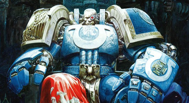
I like Grimaldus.. but not so much the 2D marine behind him, who's knee cap is at a full 90 degrees to the direction the rest of his body is taking...
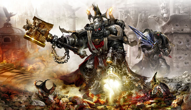
So many kinds of nope in this one:

Technically, they are all pretty good, certainly better than I could do, but it's just the artists seemed to have struggled with either the proportions of the armour of the proportions of the human inside and small things ruin the overall effect.
|
|
This message was edited 1 time. Last update was at 2016/07/18 21:26:49
|
|
|
|
|
2016/07/18 21:09:14
Subject: Re:WORST 40k artwork thread
|
|
Stoic Grail Knight
|
I do hate the pinhead-ness of Space Marines in some drawings. Really, the gulf between marines in different media- books, art, and miniatures- has always been annoying to me.
Beyond, the color palette images shown above are some of the worst offenders, particularly because they take up so many pages in the "premium" $50 books...feels like they just slapped them in to hit page quotas (especially with how they're spaced).
|
|
|
|
|
2016/07/18 21:35:45
Subject: WORST 40k artwork thread
|
|
Trigger-Happy Baal Predator Pilot
|
Oh yeah! Marine proportions!
Woof.
Like look, marines are not humans. You don't have to look a the armor and go 'how the hell would a human fit inside that'. I'm very okay with them having different proportions to say, a human basketball player who is 7'6", but the wild inconsistency that sometimes results in pinhead marines! Re-dic.
Of course this isn't a new GW problem, let's not forget that all the minis from the 80s / early 90s essentially have heads coming out of the center of their chests with shoulders higher than their ears (like, not armored shoulders, but where their physical shoulders would fit inside their armor). Even current marines have torsos that are wayyyyy too stubby and gorilla arms that hang to their knees. I raise the torsos and heads on all marines I build. Makes them look way better. Automatically Appended Next Post:  Elbows wrote: Elbows wrote:Can someone explain how this made it onto a codex cover?
Aww man, that's actually one of my fav pieces of 40k artwork! A relic from the days where space wolves just looked and felt like high-tech spec ops future soldiers with a touch of nordic influence. Here and there you'd have some runes, and braids, and fangs and some axes. Awesome.
A far cry from where they're at now where they fight with wolves and ride wolves and turn into wolves and wolves pull them on sleds and even their robots carry shields. Fething stupid and cartoonish even by 40k standards!
|
|
This message was edited 1 time. Last update was at 2016/07/18 21:38:23
|
|
|
|
|
2016/07/18 22:53:30
Subject: WORST 40k artwork thread
|
|
Powerful Phoenix Lord
|
But as art...it's terrible. Weird perspective which doesn't work at various distances (the guy in the back doesn't visually fit on the weird ice bridge). The Orks have red blood? Always been black/green in the fluff to my knowledge. Orks appearing as emerald green small humans by comparison etc. Don't get me wrong, I vastly prefer 2nd edition Space Wolves...and I get the Lord Wolfram Wolfy McWolfinson crap...it's awful.
But the picture...the suck! 
|
|
|
|
|
2016/07/18 23:17:00
Subject: WORST 40k artwork thread
|
|
Longtime Dakkanaut
|
Wow I like most of the art in here. Almost all of them are iconic art pieces of a certain GW art era, this alone should make them interesting. You guys are some nasty critics I would not want to be one of those artists in here.
Now there is some art that I dislike but that is mainly modern AoS stuff that tends to run into some issues when they try to translate existing models into drawings.
|
Inactive, user. New profile might pop up in a while |
|
|
|
|
2016/07/18 23:45:02
Subject: WORST 40k artwork thread
|
|
Powerful Phoenix Lord
|
All of these pale in comparison to some nice evocative black and white Mark Gibbons pieces...for me personally. We all understand GW's models have gone for 11...very over-the-top as the years progress. I don't need the artwork to also.
|
|
|
|
|
2016/07/19 00:03:59
Subject: WORST 40k artwork thread
|
|
Storm Trooper with Maglight
|
Elbows wrote:But as art...it's terrible. Weird perspective which doesn't work at various distances (the guy in the back doesn't visually fit on the weird ice bridge). The Orks have red blood? Always been black/green in the fluff to my knowledge. Orks appearing as emerald green small humans by comparison etc. Don't get me wrong, I vastly prefer 2nd edition Space Wolves...and I get the Lord Wolfram Wolfy McWolfinson crap...it's awful.
But the picture...the suck!
Origionally orks were extremely stunty prior to their new 3rd ed kits coming out. I personally still like the old Gorkamorka plastic models, their weapons just look more ramshackle! I always liked the idea of freshly spawned orks being quite stunty though I suppose...... 
|
 2000 2000
 1500 1500
Astral Miliwhat? You're in the Guard son! |
|
|
|
|
2016/07/19 00:50:16
Subject: WORST 40k artwork thread
|
|
Fixture of Dakka
|
GW art has gone down hill big time. I have been complaining a lot about it in Age of Sigmar. Sadly GW is outsourcing their art work and basically getting what they pay for.
Pay crap, get crap. A lot of the art coming out of GW is just what you would find as amateur art on the net. Now if GW went to Heavy Metal art especially for Age of Sigmar instead of this crap they are using now, then they can say they have a premium product. This new artwork is not premium at all.
|
Agies Grimm:The "Learn to play, bro" mentality is mostly just a way for someone to try to shame you by implying that their metaphorical nerd-wiener is bigger than yours. Which, ironically, I think nerds do even more vehemently than jocks.
Everything is made up and the points don't matter. 40K or Who's Line is it Anyway?
Auticus wrote: Or in summation: its ok to exploit shoddy points because those are rules and gamers exist to find rules loopholes (they are still "legal"), but if the same force can be composed without structure, it emotionally feels "wrong". |
|
|
|
|
2016/07/19 03:14:11
Subject: WORST 40k artwork thread
|
|
Trigger-Happy Baal Predator Pilot
|
Yeah, I second what's been said about the size of the orks, around the time that piece was commissioned, big ork models had juuuust been introduced.
Elbows wrote:All of these pale in comparison to some nice evocative black and white Mark Gibbons pieces...for me personally. We all understand GW's models have gone for 11...very over-the-top as the years progress. I don't need the artwork to also.
Oh yeah! I love Mark Gibbons. His Mephiston drawing is what got me into Blood Angels, and 20 years later I'm still here
Although, if you're talking over the top artwork, let's not forget he did this

|
|
|
|
|
|
2016/07/19 05:12:56
Subject: WORST 40k artwork thread
|
|
Consigned to the Grim Darkness
|
 Walnuts wrote: Walnuts wrote:This is from some a data slate I believe. I showed it to a buddy of mine who has played orks since the 90s and he just goes "this is the worst drawing I've ever seen in my life." And this is coming from a dude who used to be a preschool teacher.
Clearly this heretic needs to be executed for the good of humanity, and to purge his soul of the taint of sin.
|
The people in the past who convinced themselves to do unspeakable things were no less human than you or I. They made their decisions; the only thing that prevents history from repeating itself is making different ones.
-- Adam Serwer
My blog |
|
|
|
|
|
|


