Forum adverts like this one are shown to any user who is not logged in. Join us by filling out a tiny 3 field form and you will get your own, free, dakka user account which gives a good range of benefits to you:
No adverts like this in the forums anymore.
Times and dates in your local timezone.
Full tracking of what you have read so you can skip to your first unread post, easily see what has changed since you last logged in, and easily see what is new at a glance.
Email notifications for threads you want to watch closely.
Being a part of the oldest wargaming community on the net.
If you are already a member then feel free to login now.
Don Savik wrote:While you could argue the majority of the AoS art is low quality, I think its a vast improvement as far as basic skill is concerned.
Spoiler:
Here's one that wont garner a lot of praise, but I see
A. normal proportions
B. looking at their enemies
C. distinct color palletes
D. they look like their respective models
E. a background that while a simple storm, doesn't make my eyes bleed
Most of the AoS arts aren't very atmospheric I'll agree with that.
Sadly that is one of the better ones. Also why are ALL the beats smiling? WTF?!
Gamgee wrote:I don't personally like the style for 40k. It's too kiddy for what is supposed to be a very dark setting.
Very kiddy. I guess that is another reason why I don't like it. At least it's better than American cartoons who try to be anime.
Then again this all goes hand in hand with them wanting to broaden 40k's appeal. Hence the hearsay and rumors that Slaanesh is being ousted for the Eldar god of death.
You mean try to get into a market that is less cynical or doesn't know how much GW fracked up? They killed the adult market. They killed the teenage market. No they are working on little kids who don't know better.
Agies Grimm:The "Learn to play, bro" mentality is mostly just a way for someone to try to shame you by implying that their metaphorical nerd-wiener is bigger than yours. Which, ironically, I think nerds do even more vehemently than jocks.
Everything is made up and the points don't matter. 40K or Who's Line is it Anyway?
Auticus wrote: Or in summation: its ok to exploit shoddy points because those are rules and gamers exist to find rules loopholes (they are still "legal"), but if the same force can be composed without structure, it emotionally feels "wrong".
Don Savik wrote: While you could argue the majority of the AoS art is low quality, I think its a vast improvement as far as basic skill is concerned.
Spoiler:
Here's one that wont garner a lot of praise, but I see
A. normal proportions
B. looking at their enemies
C. distinct color palletes
D. they look like their respective models
E. a background that while a simple storm, doesn't make my eyes bleed
Most of the AoS arts aren't very atmospheric I'll agree with that.
Wow, that is effing horrible art work. I dislike AoS. I dislike what they did to the old world. I dislike the way AoS is set up. I dislike the way the game plays (and yes i've played it ).
I dislike the fantasy space marines.. I mean for feth sakes hes even firing a bolter. They just tossed the end of a crossbow on it to 'fantasy it up".
I HATE not dislike but actively HATE pretty much all of Wayne Englands 2nd and 3rd edition art work. While at the same time I LOVE Mark Gibbons 2nd and 3rd edition art work.
John Blanche well...some of his stuff is right out there and VERY disturbing...but that's a good thing in 40k. This universe is so fethed up that when we see some of the mundane, everyday stuff that inhabitants of the 41st M take for granted, we SHOULD feel repulsed, upset, disgusted, horrified, As long as we get some kind of reaction either positive or negative then artwork is doing its job.
When we just go meh, like that horrible,soulless AoS picture, then well it's not doing its work.
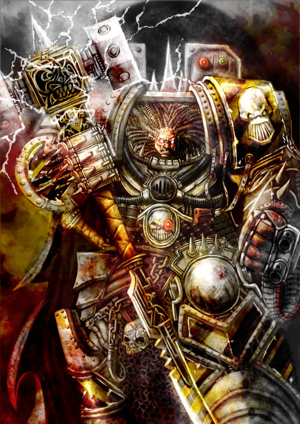
It sadness me how much decent artwork is being mocked here. Like the Space Wolves art... I've had this Leman Russ image on the Planet of Magnus for months on my desktop. Whining about having too much cables and pins... in warhammer? Really? Isn't 40K all about pins and tubes bulging from everywhere and lots of cheesiness?
Even the worst images have some charm in them and the art reminds me of the Fighting Fantasy books from the old days.
This message was edited 2 times. Last update was at 2016/07/23 01:20:11
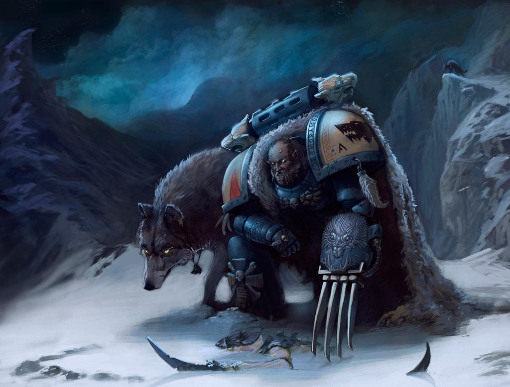
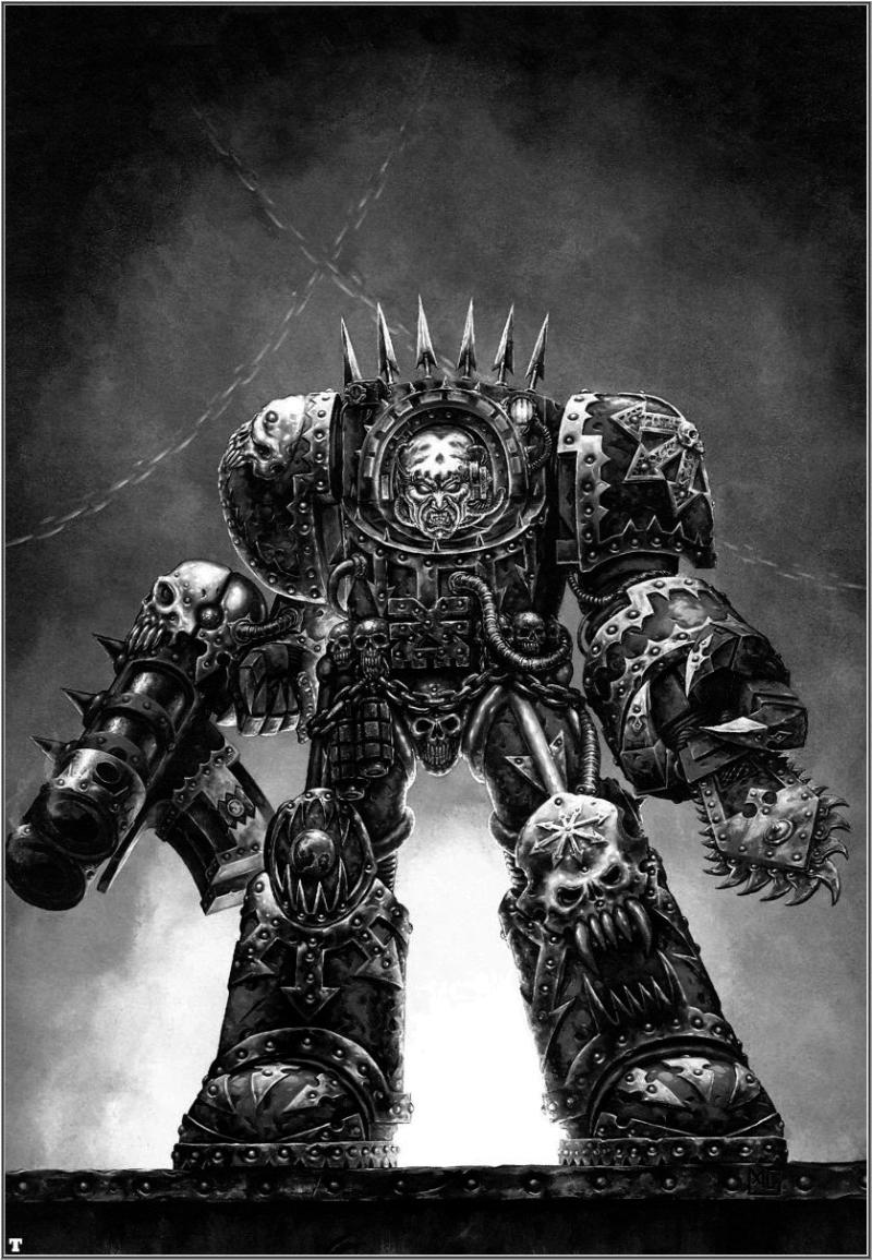
Whats funny is that all this bad art runs side by side with stuff like this.
This is the sort of art that makes me stick around regardless how bad the game has become. I guess I'm just living in the past, I still play 4th edition rules after all. LOL.
This message was edited 1 time. Last update was at 2016/07/23 01:31:58
See pics of my Orks, Tau, Emperor's Children, Necrons, Space Wolves, and Dark Eldar here:
I used a subpar AoS art to show that even the worst ones are an improvement in overall quality.
There are some fantastic ones as well.
Spoiler:
But there are equal amounts of garbage. This one is just....yikes. Too flat and vibrant. If the artist can't keep the same visual tone then his work shouldn't be used in my opinion. They need to keep their style consistent, like what MTG is doing with their art design.
Spoiler:
The difference in quality is there in 40k but I feel like colored pictures tend to make us notice it more. Lots of 40k is black and white.
edit: as for what they did with the old world, frankly I wasn't invested in it. It was basically dungeons and dragons with the 4 chaos gods. It felt uninspired and derivative of other fantasy settings to me. I like the new high fantasy setting as it opens up opportunities for creative and breathtaking visuals (ie the ghoul picture above). I get that people are sad about it being gone because discontinuing games sucks. As for myself I prefer the otherworldly nature of it. Different strokes I guess.
This message was edited 1 time. Last update was at 2016/07/23 09:11:13
"People say on their first meeting a Man and an Ork exchanged a long, hard look, didn't care much for what they saw, and shot each other dead."
Bottle wrote: Anyone putting John Blanche in here has horrendous taste in my opinion. Art should be inspiring and atmospheric- Blanche's work oozes with both
My personal most hated piece is this:
Badly drawn all around and so terribly flat and unexciting.
What bothers me most with this picture is the fact that it is a straight depiction of existing miniatures (or so it seems to me). Not that that's necessarily a bad thing but in this case it gets boring and bland.
I am not overly keen these days on the 'painterly' look of the art work. Showing my age again but some of the Paul Bonner (I think that was his name) tonal pencil drawings in old WD was top notch, did a great Howling Banshee and Ork Nob.
Please note, for those of you who play Chaos Daemons as a faction the term "Daemon" is potentially offensive. Instead, please play codex "Chaos: Mortally Challenged". Thank you.
Looking up at the Dreadnought with the assault cannon and power claw...it strikes me that the artist (while good) has no idea how a gatling-style weapon works. He has drawn rounds flying out of all of the barrels...
I think one huge difference you'll find in the older artwork (beyond the quality of the artists) is that the game was smaller and the world was just as big. As such you had a lot of miniatures derived from art and not the other way around.
The artists were creating the world of Warhammer 40K just as much as the sculptors. If we look at John Blanche's art for the Imperium - it's almost entirely stuff he just made up. It's not based on a miniatures line, etc.
The artists were not beholden nearly as much to what miniatures were available or what units existed - they frequently were creating fluff simply by doing art in the way they wanted to. You'll see all manner of war machines, fliers etc. in the background of pictures which didn't (and still don't!) "exist" in the 40K tabletop game.
I get an overwhelming feeling of "look at the miniatures...create some rather soulless computer artwork to sell them" approach from a lot of the newer stuff. The older art comes across more often as "fanboy" art. Ie. artists who were really enthused with the world they were portraying.
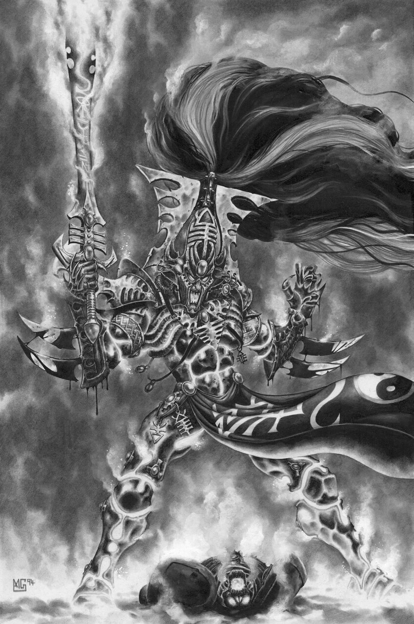
My personal favourite artist of the time was Mark Gibbons. He developed immensely from his early work. While he gave into some of the pin-head sizing and the somewhat comic-driven proportions his art work was really fantastic.
The below is an excellent example. Doesn't exist as a model. It's just a piece of fluff art 100%. I don't even like Chaos stuff but Mark just had a visual style I really, really like. It doesn't hurt that this was pre-computer art.
A lot of his work become iconic...this simply was "The" Avatar picture...for a decade or more.
While I understand that art has changed and public consumption has changed, some of the older stuff really is stand-out artwork.
PS: There was an artist who did some black/white art in some of the early 2000 Fantasy books I believe, had some incredibly gritty awesome looking dwarves. Anyone know who that artist was?
This message was edited 1 time. Last update was at 2016/07/23 18:10:22
I think one huge difference you'll find in the older artwork (beyond the quality of the artists) is that the game was smaller and the world was just as big. As such you had a lot of miniatures derived from art and not the other way around.
The artists were creating the world of Warhammer 40K just as much as the sculptors. If we look at John Blanche's art for the Imperium - it's almost entirely stuff he just made up. It's not based on a miniatures line, etc.
The artists were not beholden nearly as much to what miniatures were available or what units existed - they frequently were creating fluff simply by doing art in the way they wanted to. You'll see all manner of war machines, fliers etc. in the background of pictures which didn't (and still don't!) "exist" in the 40K tabletop game.
I get an overwhelming feeling of "look at the miniatures...create some rather soulless computer artwork to sell them" approach from a lot of the newer stuff. The older art comes across more often as "fanboy" art. Ie. artists who were really enthused with the world they were portraying.
My personal favourite artist of the time was Mark Gibbons. He developed immensely from his early work. While he gave into some of the pin-head sizing and the somewhat comic-driven proportions his art work was really fantastic.
The below is an excellent example. Doesn't exist as a model. It's just a piece of fluff art 100%. I don't even like Chaos stuff but Mark just had a visual style I really, really like. It doesn't hurt that this was pre-computer art.
A lot of his work become iconic...this simply was "The" Avatar picture...for a decade or more.
While I understand that art has changed and public consumption has changed, some of the older stuff really is stand-out artwork.
PS: There was an artist who did some black/white art in some of the early 2000 Fantasy books I believe, had some incredibly gritty awesome looking dwarves. Anyone know who that artist was?
I believe you're thinking of Adrian Smith. Perhaps?
Yeah, looks like something out of WoW, rather htan something out of 40k.
But from a quality standpoint, it's still better than Blanche's. It just needs more grimdarkness and less cartoon.
This message was edited 1 time. Last update was at 2016/07/24 17:34:19
The people in the past who convinced themselves to do unspeakable things were no less human than you or I. They made their decisions; the only thing that prevents history from repeating itself is making different ones.
-- Adam Serwer
My blog
This is turning out to be a pretty interesting thread rather than the usual snark and b#$%^-fest.
On pin-heads, I think it's the artist attempting to address the 'problem' that on most marines models the bare head is the same size as a helmet. GW does this on purpose (they know that helmets take up space) so the model looks right, even if the biology/science is wrong. Artists try to show that in 'real life' marine heads are small and only look right with a helmet on. I see the logic, but I think they're better off following the aestetic route rather than the correct one.
On Blanche, I love his stuff, sad to see people hating it bascially for not being photo-correct.
And yeah, the worst art is the ones where every figure looks like a GW model built with stock parts. It turns artists into tracers and does nothing to enrich the world.
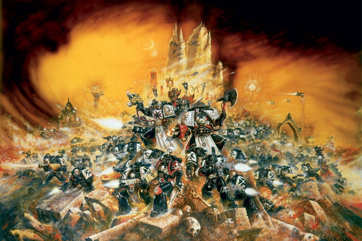
I guess at the end of the day I don't have much to contribute (other than the Ork Codex) because IMHOGW art has always been head and shoulders above everyone else's. Compare Rogue Trader or Warhammer RPG to their contemporaries from TSR, White Wolf, FASA, West End or Steve Jackson and it's hard to look down on them now. The quality of the art and art direction is what drew me towards GW in the first place.
This message was edited 1 time. Last update was at 2016/07/25 07:16:14
Xathrodox86 wrote: The new Wulfen still give me nightmares, but this artwork takes the cake.
This is the picture that personifies the wrong direction 40k and AoS art is going in. Clean-looking WoW-inspired biceps the size of Bournemouth, I get they're trying to appeal to kids to a larger degree, and it may make sense financially, but it is such a leap from the previous darker styles.
Don Savik wrote: While you could argue the majority of the AoS art is low quality, I think its a vast improvement as far as basic skill is concerned.
Spoiler:
Here's one that wont garner a lot of praise, but I see
A. normal proportions
B. looking at their enemies
C. distinct color palletes
D. they look like their respective models
E. a background that while a simple storm, doesn't make my eyes bleed
Most of the AoS arts aren't very atmospheric I'll agree with that.
Don Savik wrote: I used a subpar AoS art to show that even the worst ones are an improvement in overall quality.
There are some fantastic ones as well.
Spoiler:
But there are equal amounts of garbage. This one is just....yikes. Too flat and vibrant. If the artist can't keep the same visual tone then his work shouldn't be used in my opinion. They need to keep their style consistent, like what MTG is doing with their art design.
Spoiler:
The difference in quality is there in 40k but I feel like colored pictures tend to make us notice it more. Lots of 40k is black and white.
edit: as for what they did with the old world, frankly I wasn't invested in it. It was basically dungeons and dragons with the 4 chaos gods. It felt uninspired and derivative of other fantasy settings to me. I like the new high fantasy setting as it opens up opportunities for creative and breathtaking visuals (ie the ghoul picture above). I get that people are sad about it being gone because discontinuing games sucks. As for myself I prefer the otherworldly nature of it. Different strokes I guess.
I don't like any of these as there's a complete lack of atmosphere, which is why I guess I'm such a fan of Blanche. They simply look boring. It's got nothing to do with realism; it's the emotions and atmosphere it evokes. The modern D&D/WoW styles just don't do anything for me, though I do like some of the D&D art from the 80s.
For me, these from John Blanche truly convey the grim darkness of the far future in its majestic horror.
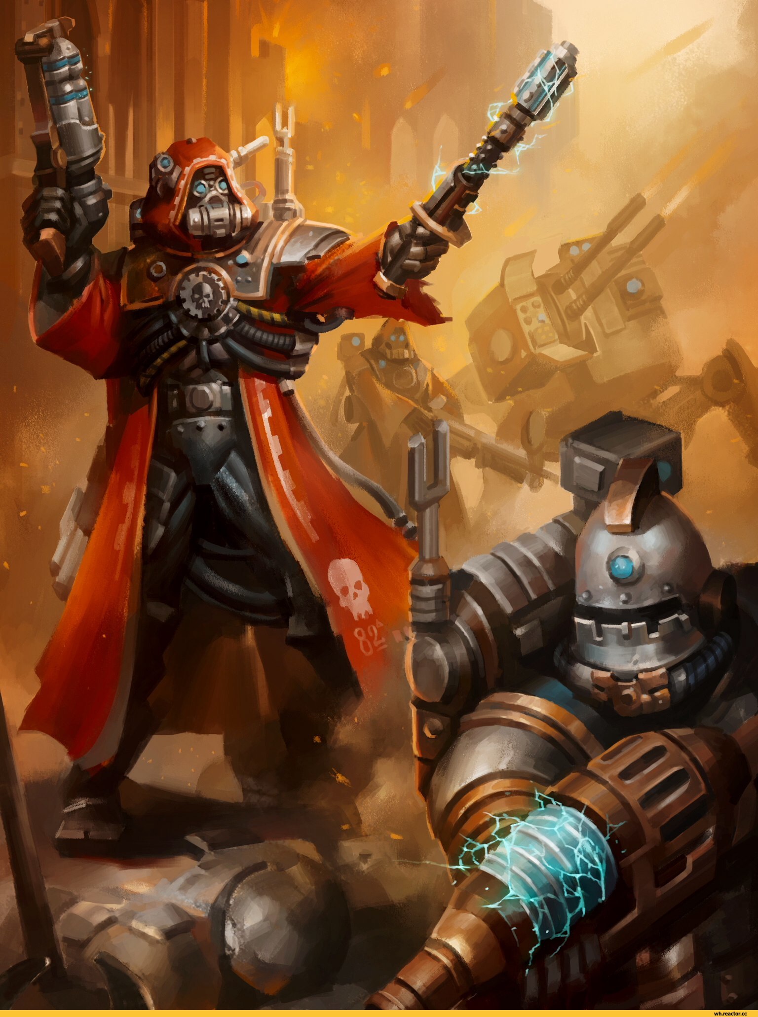
As far as realism is concerned, I'd appreciate it more if they could do a style more similar to this.
Brother SRM wrote: The worst art is the stuff they've been using for color plates in recent GW codices. They look like basic lineart that was drawn in Flash and colored in with stock gradient fills. It's super static, basic art, that doesn't hold a candle to even the old color plates or anything I'd expect to see in a professional publication:
Spoiler:
Holy Hell, those two are embarassing. B&C's online painter is better.
The marine in the front needs some help with his neck! The helmet looks TERRIBLE.
The one in the back seems to be missing a leg. At least the proportions in general look possible, but still...
That neck is bizarre.
This message was edited 2 times. Last update was at 2016/07/26 08:37:55
Kid_Kyoto wrote: On Blanche, I love his stuff, sad to see people hating it bascially for not being photo-correct.
I hate it because it has crappy composition, bland coloring, inhuman and absurd proportions on human characters, lazy facial features, and is just downright awful in pretty much every regard.
There's literally no reason for me to like his garbage. He is, at best, a step above Rob Liefeld in quality, and that's being generous.
This message was edited 1 time. Last update was at 2016/07/27 02:50:02
The people in the past who convinced themselves to do unspeakable things were no less human than you or I. They made their decisions; the only thing that prevents history from repeating itself is making different ones.
-- Adam Serwer
My blog
To me, Blanche's art is the spirit and soul of 40k.
You see bad proportions, I see a surreal nightmare world. Almost correct but horribly off.
You see a focus on detail, ignoring the bigger picture. I see a skewed view that showcases the "wrongness" that is the heartbeat of the setting.
PourSpelur wrote: You see bad proportions, I see a surreal nightmare world.
You don't need to have gakky art in order to have a surreal nightmare world. You don't need to make excuses for bad art.
This message was edited 1 time. Last update was at 2016/07/27 13:35:44
The people in the past who convinced themselves to do unspeakable things were no less human than you or I. They made their decisions; the only thing that prevents history from repeating itself is making different ones.
-- Adam Serwer
My blog
PourSpelur wrote: You see bad proportions, I see a surreal nightmare world.
You don't need to have gakky art in order to have a surreal nightmare world. You don't need to make excuses for bad art.
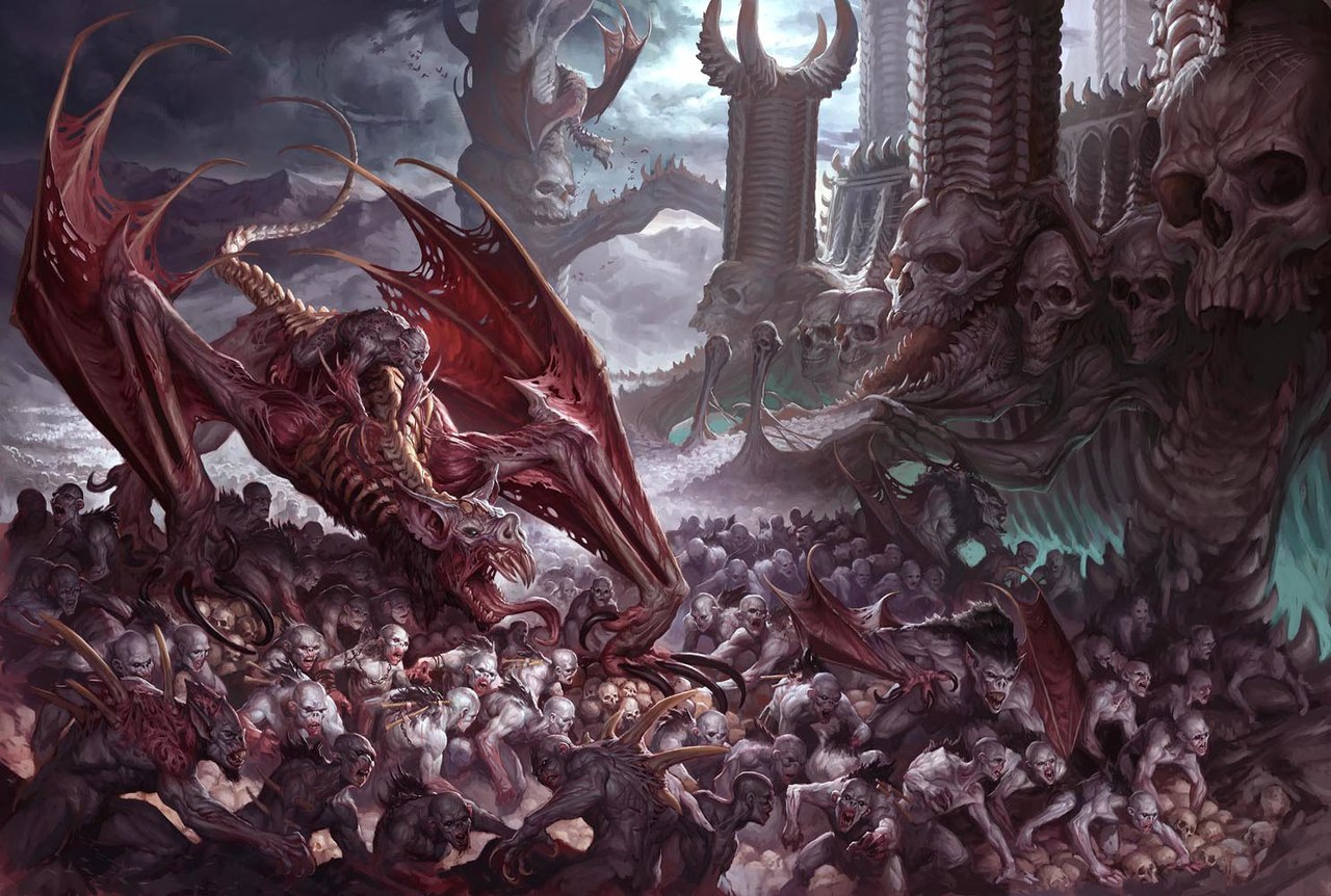
For example;
Not quite got the thematics of 40k, but they both show some dark and creepy themes while retaining proportions and a sense of style.
While I quite like those, I absolutely HATE blurred imagery when trying to make something dark and creepy. It's much creepier to show crystal clear images of spooky crap. If you blur it out it just looks murky and boring.


 Legion: Dark Angels


 4000 pts
 4700+ pts
 2500 pts Hive Fleet Gungnir


 I dislike
  ).
).


 ~1.5k
~1.5k