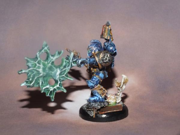
Ah, I see you lot are as conflicted on the wings as I! What I think I'm going to do is add some marbling to them.
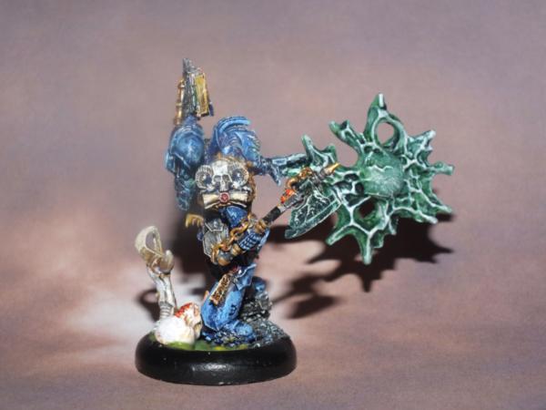
@ GiraffeX: yay! So glad you mentioned the crozius, I was convinced that it was a mistake so that is a relief for it to get a "Like", as it were.
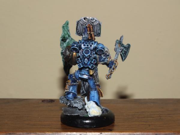
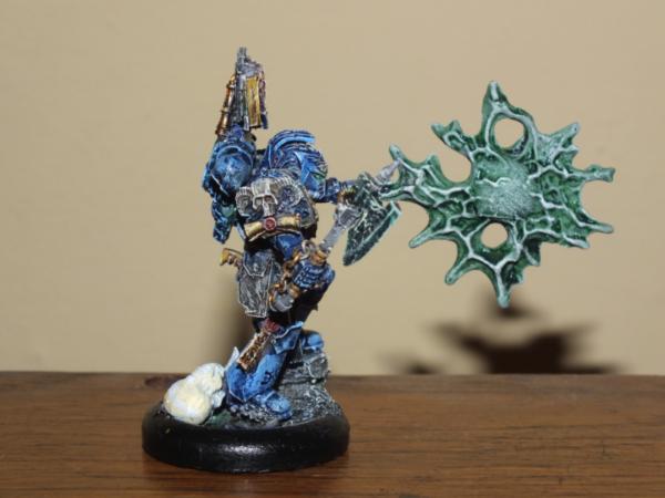
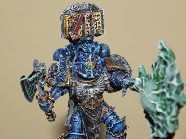
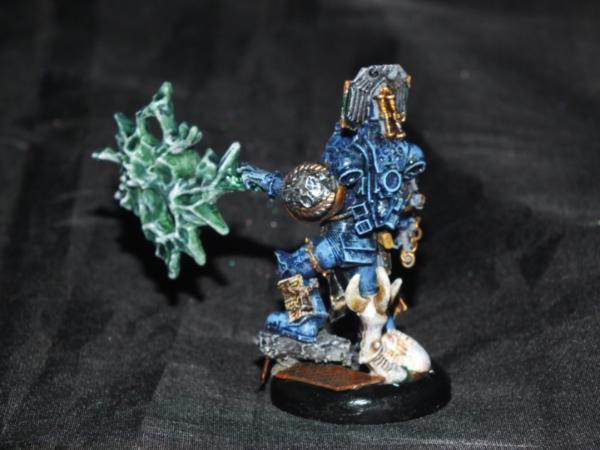
Quick Pics, wip'ing the white and the Blade Runner text on the scrollwork.
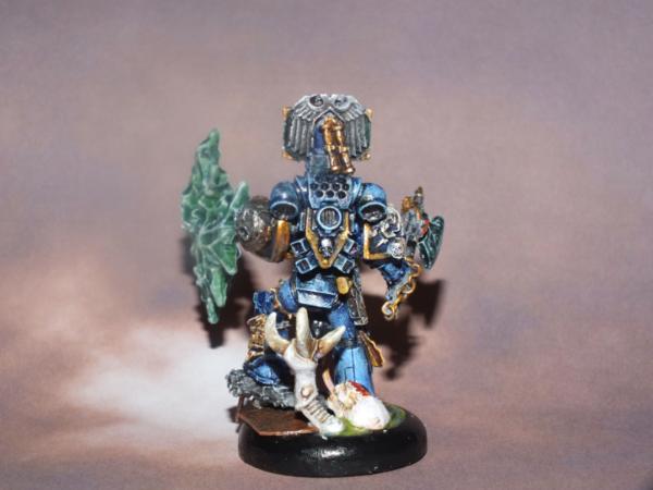
Side:
Back:
I have found most of a box of DC in bits in the old glory box, so expect some builds to follow (although they won't be jumpers at this stage, as that would mean finding a box of sanguinary guard to dissect).
November madness continues with much cake and #1's birthday. I'll post when and what I can!
Huzzah, etc,
Graven
That's coming along very nicely graven. The gold and chains really work well with the green of the jade. Skull on the jump pack is very cool too. Happy Birthday wishes to #1!
All I mean by that is adding some lighter veins, though I'm not sure whether that really shows up in the photos. Speaking of which:
Not really sure on what a decent DC build is, especially as allies. Any ideas? I'm also wondering whether to use gk teleporter packs as these Blink
Hmmm, think i can see some lighter areas on the feathers (am i right?), but if im honest i would highlight it up even further. I know im the one that posted the marble pic, but that effectively is 'highlighted' (naturally) all the way up to white and the contrast is so beautiful to me....Dont get me wrong though, the wings look excellent, and the subtle variations of the deep green sing to me (im sleep deprived, dont judge me....)
Saying that, i really like where you have gone with the PF, looking lighter than even the highlighted areas really makes it look good, like it gets lighter the more it gets used...
EDIT: cant comment on list building im afraid, might be a thread for WH40k Tactics i guess....sorry.
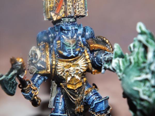
The censer? i cant see anything wrong with it, it looks great! Could do with being a bit shinier (ironic considering the photo-shine problems with the rest of the armour....) but the colour is spot on...
Man, you got that right. Fargin bastige Atlantic Ocean. Hopefully, graven's image (pun intended) will be with us at Adepticon so perhaps we can include him in our loyalists vs. rebels game!
There's always room in the baggae allotment for miniatures. And if not, plenty of us can host a game and provide a spare army or two for folks on their holidays.
If you're ever in Scotland, come see us at Glasgow Gaming Group. Give us enough notice and someone wil bring in an army for you.
But, you have a set goal, so that's all good Just checking that it wasn't a euphemism for never - as in I'll row across the Atlantic once I've finished my cyborks
Thanks for the kind words rm2020 -good to cya again!
L
@dee:rasp:
@briancj - make it over here, you'll be sure of game and a half, sunshine
Nothing to report on the p&m front. Zip. Nada. Ze-ro. Birthday week for #1, plus other cakes to pay for their Xmas, plus crazy workload, makes graven a dull boy. Although I've been up to something in the dcm forum, but hey, that's like secret stuff
Technically, I suppose, I have been building - avengers Lego from us, Kreo Optimus vs Megatron from my folks, with the lil dude. My bro-in-law also got him a nerf longshot, which is bigger than he is
And there was cake:
Not sure why it's upside-down...
And bonus points if you can guess what this one will be by the weekend:
It's, like, a cake that's still on sprue...
Mmmm more tasty cakes for my eyes to feast upon.....ninja cake=epic, WM360 cakes (minus the glasses) are also excellent, im with holding my judgement on the sprue cake for now (although, cake on a sprue!)
that reminds me, theres cake in the office and its lunch time...win!
c'mon dude it totally looked like a tugboat at the start :-) I didn't want to *ahem* jump the gun, but i will be interested to see how 'ol Oppy turns out!
Haha tugboat! O nerdfest.....(i will admit to it being rather shiplike to start however....)
looks good graven, waiting for the rest of the paintjob now....Did you know that the designers of Optimus in the first Transformers film had to put the extra bit on the front (engine...?) because they wanted his mass not to randomly increase when he transformed....trivia ftw!
It was height iirc, actually, so that he'd stand 8m rather than 7. Amused by vw, note us cars are autobot and German/Japanese decepticon (at least in first 2 movies!)
It helps my wife is a geek. She is, believe it or not, really unhappy with it just now.
Oh my! that is wonderful! does Mrs Graven have a facebook page with pics of all the wonder she produces? I would love to show my Nerdwench and have a look myself! :-)
Sideways was an Audi R8 in RotF, Soundwave was an Mercedes sls amg in DotM, though Wheeljack was a Mercedes E550 and Mirage was a Ferrari 458, which are not us cars.
Automatically Appended Next Post: Also cake looks the business!
Also, made progress on the structure of sanctum. Getting there, finally!
Added oil/water stains and light effects. Really progress, actually, next stage is the banners. Note that a home has been found at last for the EC termie!
Automatically Appended Next Post: @reiko: ooooh! Burn!
Sideswipe was the vette concept, Sideways was the R8.
Point, didnt even realise the R8 was named....(and yes, i totally missed thats the car you were talking about, i just saw the seeming name-swap and my brain immediately ordered 'CORRECT HIM! And dont read what he wrote, that's for sissy girls!'....my bad )
Cheers bud. I steal old cake boards off the boss, and build up with my usual mix of railway ballast, plaster bricks and chunks of plaster, along with other odds and ends. Wanting to add some broken glass somehow...
No wiring, lights have self-contained batteries that last 15 hrs. Well, actually, so far test light from Tardis has lasted for 7 weeks! Dissecting light-up balloons is fun, kids.
Happy thanksgiving!
All pretty busy-busy here, only a micro update on details of the sanctum:
Regular programming will resume after the weekend, hopefully!
@gits - right back at ya. My whole car smells of left-over turkey, it's amazing. This year I am thankful for my family's health - having seen two friends lose their mothers to cancer, and lost a friend of mine to cancer also, I count our blessings and then some.
@Reiko - thank ye kindly sir.
Right, well, hopefully better pics of the Sanctum. I'll let them speak for themselves largely:
Do love how the lights turned out
I think I'll call him... Vlad.
Still WIPs, but we are approaching the home straight. Like WWI, it'll all be over by Xmas.
Thanks guys. I know what you mean Yggs but as you say I want it to be really playable. I do feel like there should be more roof debris in particular. However I like the idea of being able to clutter it if I wish:
This has actually got me thinking more generally about a modular cathedral... Oh dear
Very nice work, the extra little bits of rubble give a nice feel, as do the 'battle remains'....a whole cathedral now as well eh? I bet your wallet loves you....
Knick the edges.. metal and structures never really break off cleanly. Straight lines in steel beams and pipes are almost non- existent. An occasional hole in the pipe is a good effect as well. This also gives you a good surface to dry brush for effect ( either bright metal or very rusted – depending on time)
Take a heat gun to the banner so that it becomes soft and fold it down over thte pipe. It shouldn't be sticking up ( wind?) Destress it a bit more to look like its been through hell! Be very careful as you can end up melting it. ( and the heat makes it hot so don't burn yourself or anything else for that matter)
Lastly -- stain the area at the ends of the pipes as it may at one time contain ( or does ) some liquid or residue.
Anyhoo my 2 cents worth. I do like that the board is playable - sometimes they are to detailed to play on.
Cheers mate!
Addressing your points:
Edges - I agree, there are way too many smooth lines! Watch this space - it's actually informing my plans for the bigger cathedral (the lack of roof debris also bothers me...)
Banner - I was indeed thinking of the wind catching it. Not sure if it works though.
Pipes - have started that on some, though not clear from these pics.
Thanks again for the extensive feedback!
Automatically Appended Next Post: @leadlegion: well I've used a lot of the 28mm plaster bricks, but I may well add some sprue debris also.
Banner - no it works , otherwise it wouldn't have popped in my tiny brain! Tatter that badboy up ..there re loads of historical flags and banner that really show they were used. (u live in a country that has a great historical record of it's culture)
I look forward to the Grand Cathedral for inspiration.
Thou I agree the limited lack of debis is good thing for a playing board. If your doing a display ( non playing then that is a different process)
Lastly .. put some claw marks int he wall with the dead termi. Like he clawed it in pain! Little but subtle touches. My friend!
Its nice to have nice terrian. And its important to have corpses - lets not tell any lies about war - that was the only thing wrong with the A-team. They had special bullets that always miss.
Sanctum's looking great there graven Really looking forward to see how you deal with the cathedral
The extra detailing has been worth it, it's all the little things that make terrain come to life in a believable fashion once the basics are in place.
weety - it was just that they couldn't afford real bullets because they kept refusing payment for their help, they just carried little tape machines loaded with gun noises so that the bad guys got scared
Yeeeeeeah nice! Those little details youve added are definitely worth it (thanks for the phrase monkeytroll, me brain no work today ), they are really adding character and a unique feel to the build without being overwhelming...
Gitsplitta wrote:You're having way too much fun with this!
This is very true!
eldartau1987 wrote:I like how this has developed. What is next on the block? Are you going to take a bit of a break for the winter holidays?
Thanks! Well I'll have the boys as the wife's got a lot of shifts (yay health service) but I'm sure I'll come up with something. However the lack of roof - or evidence thereof - is really bugging me...
weetyskemian44 wrote:Its nice to have nice terrian. And its important to have corpses - lets not tell any lies about war - that was the only thing wrong with the A-team. They had special bullets that always miss.
Nice terrain is nice indeed. And the a team were just cheeky that way. You fire enough special bullets and build a shiny kitbash tank bad guys just run away. Glad you swung by, too, btw!
monkeytroll wrote:Sanctum's looking great there graven Really looking forward to see how you deal with the cathedral
The extra detailing has been worth it, it's all the little things that make terrain come to life in a believable fashion once the basics are in place.
weety - it was just that they couldn't afford real bullets because they kept refusing payment for their help, they just carried little tape machines loaded with gun noises so that the bad guys got scared
Thanks mate! You are a master of weathering so high praise indeed, colour me chuffed (with some paint chipping, of course).
Revenent Reiko wrote:Yeeeeeeah nice! Those little details youve added are definitely worth it (thanks for the phrase monkeytroll, me brain no work today ), they are really adding character and a unique feel to the build without being overwhelming...
Cheers mucker. Cathedral's a coming, next modular section a planning.
So yes no pics but some ideas. First up, I think I'm going to add some of the cod flying buttresses as (broken) roof supports to the top level. I'm also thinking of getting a second Honoured Imperium to cut up - I can imagine the aquillae as roof decor so one completely smashed, and one "as is" works for me. I've picked up a couple of random cod sprues and, coupled with my bits box, I think I'll build a shrine for one side, possibly roughly L-shaped - interesting for gameplay, and fits this idea in my head that the whole thing will be a giant fleur-de-lis. Thoughts?
What have I been up to? I hear you not cry...
Well, a very hectic weekend - Ben Folds 5 gig, had dinner out with friends without kids for first time in 5 years, saw other friends, saw santa, had a family birthday, etc, etc - left me pondering about what to do while I await bits for terrain work. The answer? Back to grey knights!
Actually, I thought I'd lost my mojo (such little that I have) as things were not working at all for me - then I realised my old standard brush was gubbed and switched to another, and all was well with world again. I've just touched up whites, and started adding orange - next will be an ogrun flesh wash and a final set of highlights in eyes, whites, and metals. Nice to be back on project.
Some pics, from phone and thus ever so rubbish:
[edited for rubbishness, better added below]
More generally, I have been thinking about allies for GKs. It seems to me that the real challenge is really long range (and indeed REALLY long range). So I'm thinking devastators, specifically lc and ml, and ways to get them in. The mighty gitsplitta is making me a lcDW mantis, so that's a starting point. I wonder whether one could feasibly run DW as counts-as SW (there's too many acronyms here...), and thus heavies as long fangs? Thoughts?
inmygravenimage wrote: What have I been up to? I hear you not cry...
Well, a very hectic weekend - Ben Folds 5 gig, had dinner out with friends without kids for first time in 5 years, saw other friends, saw santa, had a family birthday, etc, etc - left me pondering about what to do while I await bits for terrain work. The answer? Back to grey knights!
Graven
How was the show? I haven't seen Ben Folds in about three years (the tour where Jukebox the Ghost opened for him). "The Luckiest" was the song for my first wedding dance with the mrs.
As far as game play goes I'm afraid I'm not much help. I don't play that often and I always considered a Grey Knight long range weapon to be 24". Why would you let your opponent get farther away?
Looking forward to seeing some higher quality photos. Between the dark background and focus challenges I can't see to much. Are you planning on leaving them very dark / black or are highlights still comning?
Ah yes... and you've discovered the other method by which your work can be improved... Take blurry pictures! That way no one can see all the mistakes on the minis!
Also been thinking about a small contingent of deathwatch, running them as counts-as Space Wolves: DW Chaplain (Wolf Priest) leading a squad of elite deathwatch (grey hunters packing plasmas), backed up with heavy weapon specialists (long fangs) and a Kill-marine (Lone Wolf) operating behind enemy lines. A more logical fit than adding some weeping/ blood angels (don't really need more assault!) and I think I nice way of doing DW.
eldartau1987 wrote:Nice idea, I saw you had posted that earlier. I am sceptical of running anything with GK. I am a purist and nothing sounds fun with anything really.
Well, there are holes, tactically, in a TACGK build, so I'm thinking about how I could do DW in interesting and fluffy ways. Also, my Ordo Xenos have not been getting much love, so time to redress the balance (cue: vindicator)
Gitsplitta wrote:Congrats on 75 pages of grateness graven!
*bows* As ever, you serve as inspiration
Quick micro-update, back in the gms habit. Beginnings of a possessed (I'm being mysterious I am):
And what will be, once daemonworld based, 1-i's gms
And hey: fun with rivets!
And in situ:
Adios!
Mrs G finally approves (phew!) that we have the suggestion of a roof.
Not quite out of his chest, bit bursting through the side of his armour. They've got a daemon ripping its way out of them, and I wanted to try to represent that. Planning on a grater daemon head, and maybe a csm termie left arm. Thanks though, glad it prompts some ick factor! And kind of you to day about pg 75
Automatically Appended Next Post: Glad y'all like the avatar too, btw. Blame Ouze.
Found this through gits blog. must say that the few days i have read over this has been a real inspiration. Everything about you touch seems to turn to gold. good job on that.
monkeytroll wrote:Roof support looks good - nice to see some riveting action going on
GMS for I-1 looks cool, and nice start to the base
Love the possessed, some kind of evil Slaine thing going on there
I know you love a bit of rivet action. Some how that sounds smutty...
Warp-spasm was exactly where I was going with this in my head so pleased that's what you get from it!
Gitsplitta wrote:Man... that Possessed is a real mess! (just as he should be)
Whew! At first I thought your comment was negative and then my brain registered the brackets. It is difficult to get the right balance with possessed of craziness and recognisable Csm.
alabamaheretic wrote:Found this through gits blog. must say that the few days i have read over this has been a real inspiration. Everything about you touch seems to turn to gold. good job on that.
That's made my day that has. Glad to have you aboard!
albinoork wrote:Is that a gloss varnish on the demonworld base?
Nope, Vallejo Game Color Black - naturally very high gloss sheen to it. I use it as a base for my obsidian nemesis weapons and paint base lips with it too. I'm going to layer thinly over it here, too, probably with vgc red.
See that's how terrain gets built.. you do one thing and then justa add one more thing, then how about 1 more thing and soon its covering your whole table.
Nice exterior shots, if a little over-exposed (the strip connector we run the light box lights off has been annexed by xmas)
A view taking in the new-old roof struts:
A sense of the playable surface:
Slain o' Slaanesh:
& Corpse o' Khorne:
And a faded banner in the corner that's not really been seen thus far:
And finally a modular piece for breaking up the open space, from Honoured Imperium:
Thanks for all your comments along the way guys. Terrifyingly that's now 1000 images in my dakka gallery; I'm sure some of them are of something other than the Sanctum! C&C mes amis,
graven
That is excellent! The coloring really draws me, can't explain it specifically, just really like it a lot. Maybe it's an etherial look. Anyway, it's very well done.
Was really hoping this:
... was Space Nun. Oh well. Khorne cares not from whence the blood flows...
monkeytroll wrote:Well, looks good to me - but I'll take another look in a day or so, and see if eyes not 'enhanced' by booze agree with me
Thanks, drunkytroll
Revenent Reiko wrote:Looks excellent graven, finally finished and well worth the effort IMO, nice work!
Yeah, it's been a slog but definitely worthwhile.
Skalk Bloodaxe wrote:That is excellent! The coloring really draws me, can't explain it specifically, just really like it a lot. Maybe it's an etherial look. Anyway, it's very well done.
Was really hoping this:
Spoiler:
... was Space Nun. Oh well. Khorne cares not from whence the blood flows...
Cheers mate! Appreciate your swinging by (Skalk hassled me into finishing this after not touching it in over a year! ) The colour is VJ Turquoise, which I'm crazy fond of.
Yeah, a space nun would fun, but I have precious few as it is. I do have an idea using the harbinger of menoth from warmachine for a defiled section of chapel at some point.
Next up will be finishing bases on tagk (pics over the weekend, hopefully) and some work on figs for trade. Here's a wip of 1-i's:
Where do my obsidian nemesis weapons come from? Why they're carved from the surface of daemon worlds!
I really love the color and rust effect you put on that building, What color did you use for it? and the hint of a big roof adds alot of grandeur to it too. great job!!!
mayajid wrote: I really love the color and rust effect you put on that building, What color did you use for it? and the hint of a big roof adds alot of grandeur to it too. great job!!!
The colour's Vallejo Turquoise layered over grey primer, drybrushed VJ polished gold and washed with ogryn flesh. Glad you like it! I'm very happy with how the roof-suggestion turned out, too
Some updates:
1-i's Weeping Angel, on its daemonworld base, is done! Went for purple eyes.
Not sure about the gather on the cloth at the bottom of the tabard; might benefit from another wee highlight? Pic is oddly grainy, too.
And a Techmarine with c-beamer for my GKs, just for variety.
Osl looks really flat in this pic, and I can't work out why; oddities of macro photography I guess.
Better pics will follow if I can steal the light box again. I'm getting to the end of the termies too - just bases to finish - and so tweaks on the above may get done with that lot. Then got the DW vindi, and Red Skullz possessed, to crack on with.
Hey ho,
graven.
Automatically Appended Next Post: Ooh - almost forgot in over-excitement - found 6 DW heads in bits box - it's a sign!
Termies would've been finished tonight but for3 things:
1) minor invasion by members of wife's family
2) small child refusing to go to sleep for 2 1/2 hrs 3) dropping entire pot of Druthi Nightshade on paint station where said termies were. FML. Serves me right for playing with corpses of chaos...
After recovery operation, all pretty much salvaged bar shade and dignity. Just have faces on half a dozen unhelmed left though. A job for tomorrow...
Nothing major just a PITA. Hope I have enough left for the possessed night lord! I do love nightshade, it may be my new best friend. Need to redo flesh tones on the termies, and in light of day think the base gravel needs another highlight as it's a bit flat. I've also realised that I've added orange bricks - which look great, but the sanctum had grey ones. Must... Leave... Sanctum... Alone!
I like how the end of one project has forced your hand into starting/finishing another...
1-i's GMS looks superb, agree on the extra highlighting, just to bring it all out a bit more...but youve already done it so ignore me...
The Techmarine is awesome, i love that axe too, and the c-beamer OSL is looking pretty spiffy too! Is there a view from above to see the 'source'? As i was thiknig that a small/tiny bit of near-white would help make it more apparent where the OSL is coming from, but i dont know if youve dont that already as well...
Shame on the paint spill, ive been there and failed to recover anything from it, so glad you managed better mate!
Tech Marine is excellent! The conversion is very dynamic and the paint scheme is solid. Really enjoy that one a lot.
I didn't make it to my FLGS for VJ Turquoise ( was physically barricaded from town by 120,000 cars all trying to go downtown to shop... I loathe this season) so I picked up some from my local (and so very much more easily accessed) craft shop instead. Gave it a run on a few test pieces I keep around for just that purpose (each based a bit differently) and I really pulled on the 'ethereal' look. Will be offering up credit due when I get to building the Shrine (which isn't on the Project shelf yet, it still under the bench)
Revenent Reiko wrote:I like how the end of one project has forced your hand into starting/finishing another...
Revenent Reiko wrote:
1-i's GMS looks superb, agree on the extra highlighting, just to bring it all out a bit more...but youve already done it so ignore me...
The Techmarine is awesome, i love that axe too, and the c-beamer OSL is looking pretty spiffy too! Is there a view from above to see the 'source'? As i was thiknig that a small/tiny bit of near-white would help make it more apparent where the OSL is coming from, but i dont know if youve dont that already as well...
Shame on the paint spill, ive been there and failed to recover anything from it, so glad you managed better mate!
I shall try to get a top shot later. Many cake pics to do Recovery was a pain, but could've been far worse
Skalk Bloodaxe wrote:Tech Marine is excellent! The conversion is very dynamic and the paint scheme is solid. Really enjoy that one a lot.
I didn't make it to my FLGS for VJ Turquoise ( was physically barricaded from town by 120,000 cars all trying to go downtown to shop... I loathe this season) so I picked up some from my local (and so very much more easily accessed) craft shop instead. Gave it a run on a few test pieces I keep around for just that purpose (each based a bit differently) and I really pulled on the 'ethereal' look. Will be offering up credit due when I get to building the Shrine (which isn't on the Project shelf yet, it still under the bench)
Thanks matey! He was a lot of fun to do. I never really felt him as a libby, but he seemed to come together here. Really, really looking forward to your efforts!
So the first in a number of huge updates, as that's 20-odd TAGK now done.
First batch:
Dude with a halberd:
And his boss...
2nd Apothecary:
TAGK Banner bearer:
Halberdier with flamer:
TAGK with NDH
And a fiery Paladin for afters:
That'll have to do you for now! Still to come: more TAGK, kitbashed Librarian & Mordrak, and a selection of corpses...
Till later,
graven
Automatically Appended Next Post: Oh well, as it's nearly Xmas...
Libby, heavily kitbashed.
I freely admit I love this guy
One more...
Better view of the base, although I'm not sure you can tell his right foot is off the ground.
More later!
Woof, theres an update for you! Beautiful work as ever graven....
I am also in love with the kitbashed Libby, apart from the gorget (sorry), he is gorgeous...
no worries on the OSL shot, my mum makes cakes as well so i know EXACTLY how much time/space they take up in the house (o you wanted food? no im sorry, the kitchen is out of bounds...for the whole weekend...)
weetyskemian44 wrote:Love the tiny writing - these are really good - you do the best grey knights. Very grimdark compared to other examples I've seen.
You flatter me! Not that I mind. I must admit I'm not a fan of super shiny knights, but Knightley's pale grey Gray Nights and albinoork's pink Knights of Flaming Cheddar are particularly cool also. Glad you like the writing, micron pens are my friend.
Revenent Reiko wrote:Woof, theres an update for you! Beautiful work as ever graven....
I am also in love with the kitbashed Libby, apart from the gorget (sorry), he is gorgeous...
no worries on the OSL shot, my mum makes cakes as well so i know EXACTLY how much time/space they take up in the house (o you wanted food? no im sorry, the kitchen is out of bounds...for the whole weekend...)
It's a funny thing. The gorget is there to hide some chaos iconography, which it does admirably, but I can understand you not being a fan. I was trying to echo mk3 helms and Ven dreads.
Gitsplitta wrote:How on earth do you get so many figures done to such a high standard so quickly??? It's.... demoralizing.
Well, it's just that I batch paint units 1 colour at a time. You of all people shouldn't be demoralised!
albinoork wrote:Nice greens and white on the apothecary.
Is it white over Dheneb stone or some other combination?
Thanks! It's layered white and alternate sepia/flesh washes, progressively thinner.
Let's start with the rest of the halberdiers:
Eldarised base, just for variety.
Love the pose on this guy, combining mostly old metal with some new placcy.
No two icons will be the same!
And the first of the bare headed wonders:
I hate doing faces...
Weird shadow over this one's left eye. Hmm.
For variety, stern:
I really dislike this model tbh, but it was a present from the boss, so what can you do eh?
A finished version of my second take on Mordrak (the first being the guy with the boarding shield)
And some details.
Very silly but I do like the =][= impression! Props to my mate Dougal for the seed of the idea.
He really is a crazy fusion of bits with the csm belt details and the cape of the master of the ravenwing:
On the subject of crazy use of parts, lots of csm bits here:
Not happy with the eyes :(
Hey look! A corpse!
I wondered whether to add some red in but I like him very muted.
With this guy, really nailed my gk look I think:
Extinction Angel corpse is a bonus:
Skulltaker?
Skull Taken.
The resin bases used are from Fenris Games, btw.
I feel violated...
Meant to have his helm around somewhere. Ah well. Still love his noisener...
I dislike the csm's kneecap on this one, in the pic it just looks like a blob.
I like the glow from the plasma here:
And finally (phew!), a Fallen Angel:
I had a neat pic showing how deftly his throat had been slit, but seemed to have failed to upload it! Ah well, that's going to have to be your lot. Shucks. Thanks for your patience!
graven
Ahhhhh OK, i see the need for it, and i totally got where you were coming from with the gorget, its just a tad on the large side imo (of course, that is my nonmodelling opinion so please ignore me ), still looking good.
I dont even have words for the new stuff...man o man thats some great work!
They all look really good. It's nice to see some grey knights that aren't a flavour of silver. You have a really good take on them.
The little details here and there make the models.
And the faces look good to me...for what it's worth.
I shall take your Huzzah! as compliment. Would that there were an orkmoticon of a dancing, oo-ga-cha-ka-ork.
Revenent Reiko wrote:Ahhhhh OK, i see the need for it, and i totally got where you were coming from with the gorget, its just a tad on the large side imo (of course, that is my nonmodelling opinion so please ignore me ), still looking good.
I dont even have words for the new stuff...man o man thats some great work!
Hey, your opinion is both valid and valued, my friend. I can happily concede it's a bit chunky. Chuffed you like the new guys
Dr H wrote:They all look really good. It's nice to see some grey knights that aren't a flavour of silver. You have a really good take on them. The little details here and there make the models. And the faces look good to me...for what it's worth.
Thanks Doc. If folk like the faces, then that's a good sign - one is always one's own harshest judge. Cheers mucker!
GiraffeX wrote:Wow Graven those are fantastic, really love the imprinted hammer on the daemons head.
Thanks buddy. Yeah, it's very silly. I did a Paladin with NGH early on with a KoS head on his base, and my pal said, "Hey, wouldn't it be cool if you carved out a chunk of the metal where it'd been caved in..." genius.
alabamaheretic wrote:wow echoing what the others have stated your actually making me want to pick up some grey knights and start doing them I did just get the codex hmmmm
They are fun, especially to model. I would argue that in 6th they are top flight (maybe 3rd?) but by no means unstoppable, crons cause them all sorts of problems. Not as broken as they were once perhaps, though still perceived thus.
Yellowbeard wrote:These guys are awesome, Graven. Well done!
Cheers matey!
Skalk Bloodaxe wrote:Can't even think of something pertinent to say, except that you are a machine and must be on the Ordo Malleus payroll.
Been found out...
On a festive note, I got a glorious mysterious package from Gymnogyps:
And lovely toys from WM360:
Yay DW! This BT bad boy's going to be my sergeant for my DW counts-as Long Fangs.
Plus some transformers for the boys (yassssss...)
Also started wash layering gms for red Skullz: Trying a different approach for this, pretty much all washes and glazes. If nothing else, it's let me quickly block in the main colours to better visualise it!
Starting to feel very festive (or deranged, marking 100+ jotters from under 14s will do that to you...), wrapped wife's prezzies and feel like xmas is coming! Wifey is building a cake of doom (yes... building) - Tangled tower. It's a foot and a half of white chocolate, sugarpaste and rice krispie treats. Not even on the cake yet... She's stealing my damn hobby, building terrain.
Until next time, Graven
Automatically Appended Next Post: Woot! Just topped 100k views!
Hey, your opinion is both valid and valued, my friend. I can happily concede it's a bit chunky. Chuffed you like the new guys
Thanks man, thats very much appreciated, nice to know that when i start spouting complete tripe you will still read it The new guys look excellent, you should feel chuffed!
Hmmm, why does it not surprise me that WM360 has transformers....hahaha Great looking dread though mate, the hair under the left arm is a bit out of place, but otherwise it brings a nice (shiny) good looking new toy for your GKs...Man i like that BT's shield, i am all over that!
Bright red possessed at Christmas....i see a white bobble being added to that tentacle
The dread is getting stripped; WM's a way better painter (and less hairy) than that! Not sure how best to strip resin mind you. Possessed, well, they call him Sandy Claws, right?
Gitsplitta wrote:You're awesome. And huzzah was definitely a compliment.
Thanks my friend. Huzzah indeed. Gosh, we sound like Calvin and Hobbes in the clubhouse.
An amazing amount of progress my friend. Now will have to start seeing some battle reports so we can learn what to avoid against GKs.. ( mostly everything still works)
Not sure I want to know any details on why you felt the need to comment on WM hair volume. Somewhat disturbing.
More concerning is how he knows the amount of hair...
The shield is from the DA upgrade kit. If you need any RR, get at me. Curious, did the dude break at all? Could figure out how to pack him safely. Looks like he may be without backpack. I didn't have a d style base to put him on, so I left that one up to you
Thanks man, thats very much appreciated, nice to know that when i start spouting complete tripe you will still read it The new guys look excellent, you should feel chuffed!
Hmmm, why does it not surprise me that WM360 has transformers....hahaha Great looking dread though mate, the hair under the left arm is a bit out of place, but otherwise it brings a nice (shiny) good looking new toy for your GKs...Man i like that BT's shield, i am all over that!
Bright red possessed at Christmas....i see a white bobble being added to that tentacle
The dread is getting stripped; WM's a way better painter (and less hairy) than that! Not sure how best to strip resin mind you. Possessed, well, they call him Sandy Claws, right?
Having now looked at his gallery, so he is! Sorry WM I also want t know how you can comment on the hairyness....
Sandy Claws! I think that may have to be painted on his base...
The first and second Grey Knights books....not the 3rd one as that goes off into a whole world of BS, but the first and second are good (i liked them)...
Gitsplitta wrote:No offense intended my friend... but I think Mrs. Graven's got the lion's share of artistic talent!
Your kids are really going to have some right-brain action going on, given both their parents' artistic abilities!!
It's ok, she's fiendishly talented. It's irritating but there we are.
alabamaheretic wrote:Looking good man. THat cake is awesome too who ever is getting it is going be very happy with it.
Any way Happy holidays man.
The wee girl was thrilled, they're old friends and were blown away - and the boss was a bit overwhelmed by all the attention!
Merry festmas to you and yours too!
monkeytroll wrote:Edible terrain...bloody fantastic...adds a whole extra layer of fun to planetstrike games
Like the way there's not much happening...just a Land Raider planned for a couple of days
She LOL'd at that mt!
Revenent Reiko wrote:O yeah, not planned much over the Christmas weekend, while the rest of us are out shopping graven knocks out a Landraider.....its just not fair...
GiraffeX wrote:That cake is fantastic, not sure your going to top that with your LR
LR? Well if I'm doing one, you know, might as well do 2...
More dakka indeed.
Yup. There's a DW vindi on the way too! The whites got done on them today.
Revenent Reiko wrote:O you.... They look great mate, well done!
'Edible Terrain' should be your missus' hook to lure in unwary wargamers and then mesmerise them with her beautiful creations....
Ta. Women already possessed of hypnoboobs, siren cake would just be over kill.
Skalk Bloodaxe wrote:You should hand Mrs. Graven a paint brush and tell her to have at it.
No! MY toys! Won't share! Shan't!
I have actually suggested it to her; she's just content to make comments. She's the one, for instance, who first spied that turquoise when I was doing a test with the honoured imperium statue.
A good geek haul thus far. Tons from secret santa, some welsh levy from friends, and a furioso and a chappy from the wife - score! Merry Xmas y'all,
Graven
Wifey and I open on Xmas eve night, so we get 2 mins together!
Kids had a blast, house is like a toyshop Today, post kill-a-Texan-with-turkey day (I gave him the meat sweats!), I am tidying bits boxes:
I am finding all kinds of weirdness. It's awesome. If anyone needs anything, do ask. You never know, and tis the season!
Heres hoping your new PC lasts longer than mine (a couple of the parts have broken already and its only 6 months old....luckily replacements have been forthcoming from where i bought it from)
Well a fairly productive year has seen the Knights Carnelian nearly finished! Remarkable. I foresee next year being a year of counts-as - weeping angels, deathwatch and maybe some =][= too.
With that in mind, something totally different to end on: Weeper fluff.
Weeping Angels
The origins of these eerie, stone clad astartes are unclear. There is considerable disagreement amongst scholars as to their exact provenance, though it is clear they belong to a successor chapter of the Blood Angels. The majority of records would indicate that they are are a successor of the Lamenters, though there is compelling research that indicates they are entirely comprised of Lamenters rather than from its gene stock. There are those within the Administratum also that maintains they are Lamenters but from the Battle Cruiser LACRIMOSA, which never participated in the Badab conflict as it was lost in a warp storm following the destruction of an Exquisition Hell Barge. Still others point to the Lamenter custom of a white-garbed death company, further noting that it is almost unheard of for any other than their Death Company to take the field.
Whatever the truth in the mysteries, there is agreement:
They are possessed of a beauty more radiant, more savage, than even Sanguinus's first born;
They arrive, and strike, with a speed that almost defies belief;
They cry tears in battle. for the fallen some say, though none know truly for whom;
And all shouls heed their chapter motto: Ne Nicte - Don't blink.
CSM possessed wip for Red Skullz, all done with washes and highlighted with the new edge paints. Hopefully, general progress will pick up from tomorrow as my parents are off.
Thanks chaps. It's quite tough, I think, to make a possessed that doesn't look daft. I really tried to capture the whole "daemon bursting out of csm" thing. The new edge paints are really nice for highlighting very subtly. £35 is pretty steep for the set mind. However, I made a point of using all 9 on this guy. I want to wash and dot the eyes and add some brassy tones to the metal, but I think he's pretty much there.
Not done much, still tidying and sorting bits, mostly. Had a couple of nephews over to stay - pretty horrid time with my folks staying, so spending done quality time with the wife's family. Built a wooden castle with my older boy and his cousin - impressive for 5 yr olds - and gave my other nephew (12) a classic '99 Ork warbike to build, which was jolly. He then raided my bits box to start building random orky drones. Like the name says, moulding them in my graven image
I'm sorely tempted to enter. It's really got to be something to kick off my Year of the Ally - so an hq for my dw. I'm going to go for largely unconverted, I think, and focus on the paint job.
Really the choice is between:
1) Rune Priest, aka Sevrin Loth. Conversion here will be in psychic energy blast from hand. Oh, and custom =][= pad.
2) Wolf Priest, aka Chaplain. Conversion element will be his pack, an apothecary backpack with SW banner, plus =][= symbol.
I value your thoughts here gang! Definitely moving towards SW-DW, I have plans of DW Keepers counts-as Wolf Guard, using Loth's retinue as base minis. I do forsee some major gs work there, though. I think I'll also do a dread, not sure if I can do a SW dread that fills a hole in gk armoury, or at least a loadout that's cheaper than gk equivalent. Funny how classic vanilla sm have now also been reduced to ally status!
Revenent Reiko wrote:Hmmmm, How confident are you in GSing the psychic blast? I reckon you could pull it off, and that would look truly amazing...
Saying that, i can see the Chaplain looking really good as well, what colour scheme are you going for with him?
Well, you tell me what you think not gs, but still :
Probably the Obsidian I used for my Reclusiarch on this bad boy:
whalemusic360 wrote:I like the idea of Loth being DW. Great mini too.
You could use the GK dread I sent as a Bjorn in DW colors. Gives you a second HQ choice.
Indeed, Loth is awesome, and I can see his retinue as DW Keepers:
Good call on the dread as a Bjorn. I sense some kitbashing ahead! I have a spare metal dread kicking about somewhere, too, I can mix and match. Actually, I have Bjorn's left arm, come to think of it. Only thing is he can't be DP'd, but such is life.
I've also started a very heavily weathered DW Vindicator (Vindis should be beaten up to all heck, IMHO):
Bits clearout has unearth some other great odds and ends too, including a Misericorde from Confrontation which'll make a great saint statue for the Sanctum's Shrine.
The more I look at DW, the more I like them as count-as SW. Might even do my Storm Eagle up for them!
The apothecary backpack seems a bit strange on the chaplain, if I'm honest. Magic thing looks cool. Not sure I'd even paint it, looks pretty cool all clear blue.
whalemusic360 wrote: The apothecary backpack seems a bit strange on the chaplain, if I'm honest. Magic thing looks cool. Not sure I'd even paint it, looks pretty cool all clear blue.
Well, he's a counts-as Wolf Priest, and they are pseudo-apothecaries, so wanted to carry that across. I'm going to lose the helix and replace it with though. Yeah, blue is cool but I'd like to try to OSL from it, so it'll need paint alas!
O yeah wow! Thats an excellent find graven....and while i like the Chaplain the Libby just calls to me....
I think the obsidian colour scheme is going to look really great as well, good luck mate.
Vindi is coming along nicely as well, im totally with you on them beig all banged up, they are short-ranged assault vehicles with a giant gun..nuff said
Well, you tell me what you think not gs, but still :
Ah, I've always looked at your works and wondered, but never actually worked up enough courage(?) to ask. How exactly do you get your paint to look like that? They look amazing!
It's called Gravenizing,, it's purchased at Gravenmart!
ok .. back to the serious.. I like the effect. The Seven figure is one of the nicest Libby out there.The only thing I dislike is the PA. I'm thinking a spear or glave would have been better.
Thanks for posting the http://www.dakkadakka.com/dakkaforum/posts/list/498307.page#5138419 link, I joined up. I have no expectation to even place in the 'honorable mention' category but it will give me a boot to finish the Chaos Lord of Khorne I've been thinking about for a long time and also give me a break from terrain. I'm not officially shifting gears, I just want to make an awesome HQ to lead my CSM force.
Revenent Reiko wrote:O yeah wow! Thats an excellent find graven....and while i like the Chaplain the Libby just calls to me....
I think the obsidian colour scheme is going to look really great as well, good luck mate.
Vindi is coming along nicely as well, im totally with you on them beig all banged up, they are short-ranged assault vehicles with a giant gun..nuff said
I think that Loth has it tbh. I'm not sure how Xenos-ize his base though. That's a toughie. I had planned a Deldar corpse for the chappie, but for Loth I'm more limited space-wise. Having said that ik not shy about my figs extending over the base's 4th Wall...
Thoughts?
Well, you tell me what you think not gs, but still :
Spoiler:
Ah, I've always looked at your works and wondered, but never actually worked up enough courage(?) to ask. How exactly do you get your paint to look like that? They look amazing!
I'm really flattered mate and thanks for taking the time to post here! I was really inspired by the amazing skills of weetyskemian44, her stuff is stunning. It's just washed over prime then layered drybrushing alternated with further washes. Here, Loth is grey prime, black wash, white drybrush. Next will be blue glaze, nightshade wash, and blue edge highlight. The green will get a layer of Vallejo black (very gloss) over it probably, followed by gold trim.
Solar_lion wrote:It's called Gravenizing,, it's purchased at Gravenmart!
ok .. back to the serious.. I like the effect. The Seven figure is one of the nicest Libby out there.The only thing I dislike is the PA. I'm thinking a spear or glave would have been better.
Are you planning to paint the effect?
Wher did you get the doors for your Vindi?
@ gravenizing, love it. Glaive might've been cool I grant but that can be a counts-as Frost Axe more readily and this is ultimately a playable build. Also, I think that the hand is remodelling enough. Yes, plan to paint it and (gulp) osl. Probably purple or green rather than blue though, as it'd get lost on a blue Libby. Doors are standard from plastic kit, the great big skull is one from a glorious random bits bag, with a fw brass =][= added.
Skalk Bloodaxe wrote:Thanks for posting the http://www.dakkadakka.com/dakkaforum/posts/list/498307.page#5138419 link, I joined up. I have no expectation to even place in the 'honorable mention' category but it will give me a boot to finish the Chaos Lord of Khorne I've been thinking about for a long time and also give me a break from terrain. I'm not officially shifting gears, I just want to make an awesome HQ to lead my CSM force.
It's nice to have a bit of variety eh? although I need to get red Skullz possessed done soon as!
No considerable progress - back to work + massive bust up with my parents which is messy and very tough on me and mine - but I have added some layers to La Cucaracha the gargantuan Squiggoth:
Will try to get back in the habit soon as,
Gravenizer
inmygravenimage wrote: I think that Loth has it tbh. I'm not sure how Xenos-ize his base though. That's a toughie. I had planned a Deldar corpse for the chappie, but for Loth I'm more limited space-wise. Having said that ik not shy about my figs extending over the base's 4th Wall...
Thoughts?
Agreed, i think Loth has it as well, while the Chappie is great, theres just something about Loth...
Hmmmm, youre right, tough question, its a tiny base for the size of the model.....You want to make it look natural but theres so little room to work with, even adding in your lack of shyness with the 4th wall (i like how you describe that btw, and that you arent afraid to do it )...With the addition of the (amazing) psychic attack, he is already hanging quite far over the base, how adverse are you to potentially making a larger base that the base he is on slots in to....? Possibly oval in shape allowing you to have something for the psychic attack to hit? also allows you to extend the rubble he is on....Could work quite well...oooo, or a tower....OK, ill stop now
Otherwise, hmmm, is there any space at the back of the base? or how difficult would it be to separate his left foot from the terrain and insert the head of a Fire Warrior (just to be different, i think you should save the deldar for the Chappie if you already have an idea for it) or something?
Apologies for all the questions my friend.
Sucks to hear about the bust up, hope it all gets sorted soon (or that its not so hard on you and yours). squiggoth is coming along nicely!
inmygravenimage wrote: I'm really flattered mate and thanks for taking the time to post here! I was really inspired by the amazing skills of weetyskemian44, her stuff is stunning. It's just washed over prime then layered drybrushing alternated with further washes. Here, Loth is grey prime, black wash, white drybrush. Next will be blue glaze, nightshade wash, and blue edge highlight. The green will get a layer of Vallejo black (very gloss) over it probably, followed by gold trim.
Ah, cool! I think I'll go give a model a try at this. Hopefully it'll look as awesome as yours.
@Reiko: I think fish-heads may be the way to go. It's a theme I was planning for my flyer bases (storm eagle/talon) anyway. I think I'm going to try something... tricky! Take a helm, carve out one side, and add exposed tau head. Worth a try...
@KnowNoPear: be sure to post your experiment here! Looking forward to it!
Bit bummed at the mo cos getting no hobby time at all really. My monthly rpg group's up and running again though, and it's nice not be the regular GM for the first time in 5 1/2 yrs!
I have added Loth's first ink layer:
Classic GW blue ink. VJ is good, also very rich, but can't beat this, it's like undiluted Windsor and Newton! I think the psychic blast will be green, ultimately, as will eyes. I think gold trim on pads, black loincloth, and some black armour detail. Sound reasonable? Left arm, btw, has a sculpted dw pad but I'm not 100% on it yet.
I really want, also, to get red Skullz gms done - and a further apology to anyone I'm supposed to be sending stuff to, you'll need to wait till end of month as am flat broke just now. Sorry y'all.
Hey Ho,
graven
That's loking very nice, Graven. I've benn looking for acway to due a nice dark blue/al,ost black for my own librarian, and this may be the way to go. I look forward to seeing how he develops.
By the way, how did you do the psychic effect? Is that a Vallejo Water Effect or somethin similar?
Know No Pear wrote:Haha, I will! Maybe I'll start a blog or something! Mm what's the difference between inks and paints? Are inks more of a clearish type of liquid?
That's a great idea! Short answer on ink - yes, basically inks give you very intense colours; gw's new glazes are similar. Washes are thinner still.
Gitsplitta wrote:I like the effect of the ink graven... gives it kind of a shiny metallic look to boot. Cool idea.
Yeah, it's really intense! A good base to start from anyway.
Yellowbeard wrote:That's loking very nice, Graven. I've benn looking for acway to due a nice dark blue/al,ost black for my own librarian, and this may be the way to go. I look forward to seeing how he develops.
By the way, how did you do the psychic effect? Is that a Vallejo Water Effect or somethin similar?
Nightshade may be a better bet for you then, as it's very dark over grey primer - that's what I used on red Skullz's possessed (which, by the by, is now done, and I hope to get decent pics up of over the weekend).
Psy effect is another bits scrounge, from an old SW mini iirc.
Colours progressing, no idea still how to do pack!
Looks like the original artist ran out of ink before he was able to finish the drawing and future generations of lazy, copy-cat artists just kept replicating the error.
Gitsplitta wrote: Looks like the original artist ran out of ink before he was able to finish the drawing and future generations of lazy, copy-cat artists just kept replicating the error.
Besides... the blue is cool.
I'm not sure if you're playing this for laughs, or are serious, Gits.
A little of both. I think the silver arm looks odd and more than a bit incongruous. A silver pad with graven's beautiful blue colored arm below it would look much better (as would every one of these other examples if the color were carried through).
inmygravenimage wrote: @Reiko: I think fish-heads may be the way to go. It's a theme I was planning for my flyer bases (storm eagle/talon) anyway. I think I'm going to try something... tricky! Take a helm, carve out one side, and add exposed tau head. Worth a try...
Good plan! Looking forward to how it comes out! Have you decided whether or not to have the third (closed) eye on the dead tau? As iirc there is no evidence on whether or not non-ethereal tau have them or not....again, thats if i remember correctly....
Yeah i remember you saying you were going to use Tau for something else later on, but with Chaos being used on your GK, and Deldar used for the Chappie, the only options 'left' are orks (too big to go on that itty bitty base imo ) and Tau...so it fits....
I would have liked the arm left silver......but the blue ink looks so good i like it this way too And that gold is masterful!
Dead tau is proving... problematic I have a new plan though, that involves a genestealer... And modifying his base somewhat.
Quick wip: Stealer will be emerging from the oily water
Skalk Bloodaxe wrote:Sorry man, I just could not resist this:
Papa Nurgle loves you!
Legion Of The Damned wrote:
Brilliant
Skalk most certainly is that
And you're going to love sneeze wip2:
Still blocking in. Inks are much less forgiving than paint, pooling in surprising and frustrating ways. But still, progress.
Finished up the metals on the night lord possessed. Not 100% but it's been an interesting and informative experiment.
Got some primer on remaining PAGK, and might have another look at my =][= goons.
Gitsplitta wrote:Nice progress my friend! Chosen is looking quite grim (in a good way).
Grim AND dark!
Yellowbeard wrote:Very nice, Graven.
At this point, how many layers of wash-highlight have you got on Loth?
Thanks mate. Um... Lemme see...
Prime grey
Wash black
Drybrush white
Dark green
Blue wash
Colours blocked (psy primed grey, inked green)
Gold, red, bone and parchments washed sepia
I can imagine that a fishhead wouldnt be the easiest thing to hollow out, but i applaud the ambition Genestealer out of a pretty spiffy looking oily pool? Hell yes! And if your new work with inks is anything to go by, i cant wait to see that Stealer....
The more I look at this picture the more I find it puts me off.. scroll case in crotch area. Bad placement.. Magazine clip too small and the pistol grip is not quite sitting right. Neck cir. Breastplate opening is HUGE! But mostly it's the Poptart frosting squiggles on the PS. Otherwise cool! and he can always find his keys thou using them from where they are might prove intertaining
Brian, master of font sizes I actually found my brain yelling "Butt-scratcher! Get your butt-scratcher!"
Yellowbeard wrote:Fantastic!
Cheers bro.
Know No Pear wrote:Looking good here! I really like bases which have these tiny little dioramas in them, really makes for a characterful character(haha)
I got a bit carried away when I was doing my tagk and it seems to have a stuck.
funkyh wrote:
Gitsplitta wrote: OK, just because someone else did it wrong is no reason for you to do as well! *grin*
So if GW does it "wrong" does it give hime reason to do the whole arm silver?
Solar_lion wrote:I'm in agreement with the arm being the right color. I think it trrow the model off.. Yes even the Above GW painted ones!
One mans opinion. Keep on Gravening!
funkyh wrote:
Solar_lion wrote: I'm in agreement with the atm being the right color. I think it trrow the model off.. Yes even the Above GW painted ones!
One mans opinion. Keep on Gravening!
Two... My Dw will only have a silver pad. Still loving the blog man.
Oh gawd, this way madness lies. Each to their own I guess! The hobby involves so much reinterpretation of established paintjobs that, in that regard, I'm not overly concerned with GW "standard" as long as it still feels just about right. Thanks for support either way chaps.
Thatguy91 wrote:Man this is absolutely awesome! Its not often I go through a long thread like this page for page. Keep it up!
Well I'm mighty obliged for you trawling through the random rubbish that pours out of brain! Glad to have you aboard.
The more I look at this picture the more I find it puts me off.. scroll case in crotch area. Bad placement.. Magazine clip too small and the pistol grip is not quite sitting right. Neck cir. Breastplate opening is HUGE! But mostly it's the Poptart frosting squiggles on the PS. Otherwise cool! and he can always find his keys thou using them from where they are might prove intertaining
Yeah, it IS pretty silly, but it was handy as a starting point for balancing Libby colours with any kind of chapter detailing - which in my case extends to gold wheel arches.
So here's what you get for your patience... A crappy photo! Sorry, I've been marking essays sitting on my little one's bedroom floor with the help of beer (better than dartboard marking - occasional kid gets 60 out of 50...), wife's been ill lady last couple of days, and I'm basically whacked. Still:
First and second stage highlights. Axe will be obsidian, hence blacked out just now. Eyes will begin at green like the blast. Started marking in osl though not sure how clear that is. Oh, and stealer will be done like night lord's flesh I think, so... fleshy. Yeah. Armour to be rewashed blue, before adding in lighting bolts and sunbursts gold, retouching other golds, and rewashing sepia. I have completely forgotten to add a brass =][= below my sculpted skull and not sure what to do there. I'm also finding his pack itself a little plain - purity seals maybe, even?
Your thoughts, views and support as ever appreciated,
graven
Definitely, its a great bit of modelling to convey the movement/feel of the model, well done mate!
I really like the gravenised Libby armour as well (gravenising is going to become a 'thing'.... ), the light/washed out blue contrasts beautifully with the gold but still has a depth of colour to it....impressed. Cant see the OSL markings myself, but theni dont necessarily know what i am looking for, so i will await final results...otherwise the green inks have pooled rather nicely in the recesses of the blast, it looks great already!
Revenent Reiko wrote:Definitely, its a great bit of modelling to convey the movement/feel of the model, well done mate!
I really like the gravenised Libby armour as well (gravenising is going to become a 'thing'.... ), the light/washed out blue contrasts beautifully with the gold but still has a depth of colour to it....impressed. Cant see the OSL markings myself, but theni dont necessarily know what i am looking for, so i will await final results...otherwise the green inks have pooled rather nicely in the recesses of the blast, it looks great already!
Gravenised... Makes me think of...
I've come to terms with the fact that I have a very... idiosyncratic style of painting. It's not your conventional GW style, but it works for me.
I like the green ink pooling, although Mrs G thinks it should look either wetter or lightning-er. By OSL I just mean a bit of glow around the eyes and hand. I'm not big on crazy osl (although the xmas malifaux winner was just about the most impressive thing I've ever seen) but I like a bit of glow now and then.
Somehow that sounds rude. Anyway, like a well-fitting bra, thanks for your support mate!
Skalk Bloodaxe wrote:Wow. That is looking excellent!
Question- does the psychic blast stuff make the model off-balanced?
Thanks bud. I really hope I can get the treadplate on the base up to a weathering standard remotely nearly the likes of you and monkeytroll.
The balance, not so much actually. The genestealer head at the back is pretty much a perfect match on the weight and the base is one of Fenris Games' excellent plain recessed d-style bases so it's got a flat, relatively thick bottom that distributes the weight overall fairly evenly.
Here's some progress shots, anyhoo.
Yes, there is now writing. Woo. I've gone with greek, repeating the phrase "Aien Aristuein" (always be the best - Illiad Bk 6). It's fairly tiny, and looks magicspacefuture script-y. plus he has greek letters on his greaves, so why not eh? Gold needs layered next. Also, need to do the axe's shaft, and not sure where to go with this. Did find a mould line all the way down it so filed that away with a sigh. Loincloth's looking messy right now but that's mostly drybrush splatter, easily fixed and haven't even gone there yet. Underside of the wreath on the pad needs a black wash and all those lightning bolts are still switching in my head between gold, silver and pure white. Thoughts?
Need to white spot the eyes too, of course. Hopefully this view gives a proper shot of the sculpted skull pad. Does it need a in the mouth?
I'm so underwhelmed by the back, but of course at the same time I want the genestealer to be the focus here. Should I do stuff to the backpack, or leave well alone?
Actually my favourite shot! This really confirms in my head that green psy blast was the way to go, and it complements my classic obsidian-style weapons really nicely, imo.
A close-up. The $64,000 question is: does gravenising just look messy at this resolution?
Hey ho, and thanks for your continuing forbearance,
the graveniser.
YES! I love that song! This is now your themetune....
Definitely, but then its not about copying someone else, even the company that makes the models, its all about doing your own thing finding something that works for you (and it does!)...
I see what you mean on the OSL, i can see it in the eyes now, looks good, subtle but effective. I kind of agree with Mrs graven on the blast, it needs to be a bit lighter on the lighter bits, and a shade darker on the darker bits (so,.....with just more contrast really ) Havent seen the Malifaux comp, will look it up if i can.
Hahaha a bit of glow eh? Pretty sure thats illegal in this country...
Hmm, may now become a DCM just to change my rank to 'like a well-fitting bra' no problem mate, thank you for producing so many good things for me to ogle!
and I too agree with Mrs G, More lightningefied. Maybe a layer or two around the light bits to make them look like they are the origin of the light and the darker, green bits are just the glow.
At the mo it looks a bit too solid.
Does that make sense? I know what I mean.
YES! I love that song! This is now your themetune....
I'm actually not much of a Chem Bros fan - more of a rocker - but this does have a certain charm
Revenent Reiko wrote:
Definitely, but then its not about copying someone else, even the company that makes the models, its all about doing your own thing finding something that works for you (and it does!)...
Well I appreciate that, truly. Hard to trust one's own judgement in that regard sometime.
Revenent Reiko wrote:
I see what you mean on the OSL, i can see it in the eyes now, looks good, subtle but effective. I kind of agree with Mrs graven on the blast, it needs to be a bit lighter on the lighter bits, and a shade darker on the darker bits (so,.....with just more contrast really ) Havent seen the Malifaux comp, will look it up if i can.
Actually, that's a really helpful way of explaining it - raising the contrast will really make it pop I think. Maybe then the green gw shade next?
Revenent Reiko wrote:
Hahaha a bit of glow eh? Pretty sure thats illegal in this country...
Hmm, may now become a DCM just to change my rank to 'like a well-fitting bra' no problem mate, thank you for producing so many good things for me to ogle!
Do it! DCM! DCM!
Dr H wrote:Looks good. I like your painting style.
and I too agree with Mrs G, More lightningefied. Maybe a layer or two around the light bits to make them look like they are the origin of the light and the darker, green bits are just the glow.
At the mo it looks a bit too solid.
Does that make sense? I know what I mean.
Thanks mate, and yes totally makes sense. It's kinda back to front but does help me visualise where to go from here! Your point about the origin being the lighter parts is especially useful.
Btw, I've gone with gold lightning. This is in no way because I had a gold paint spill
inmygravenimage wrote: The $64,000 question is: does gravenising just look messy at this resolution?
I think it looks like OSL. A bit chalky in places, but totally sells the idea and at 3 ft away where most people will see it from it's going to look brilliant.
The important thing is that you are brave enough to try techniques like this. You'll notice that none of my models have OSL, or highlights, or blending, or any of that. And when something like that does happen, it's 100% pure happenstance with no intent on my part to make it happen.
YES! I love that song! This is now your themetune....
I'm actually not much of a Chem Bros fan - more of a rocker - but this does have a certain charm
Im a bit.....weird with my music taste, rock, drum and bass, dubstep, bit of pop....anything with a good beat that is generic rubbish now i come to think about it!
Definitely, but then its not about copying someone else, even the company that makes the models, its all about doing your own thing finding something that works for you (and it does!)...
Well I appreciate that, truly. Hard to trust one's own judgement in that regard sometime.
You're more than welcome i know what you mean, sometime you need an outsider's perspective (so to speak), glad i can be the one to tell you...
Revenent Reiko wrote: I see what you mean on the OSL, i can see it in the eyes now, looks good, subtle but effective. I kind of agree with Mrs graven on the blast, it needs to be a bit lighter on the lighter bits, and a shade darker on the darker bits (so,.....with just more contrast really ) Havent seen the Malifaux comp, will look it up if i can.
Actually, that's a really helpful way of explaining it - raising the contrast will really make it pop I think. Maybe then the green gw shade next?
Happy to help. Definitely, its got good contrast at the moment, but a bit more will really make it stand out i think. sounds good, just make sure to bring the highlights back out afterwards (as Dr H has said)
Hahaha a bit of glow eh? Pretty sure thats illegal in this country...
Hmm, may now become a DCM just to change my rank to 'like a well-fitting bra' no problem mate, thank you for producing so many good things for me to ogle!
Do it! DCM! DCM!
Hahaha, i will, i think im going to wait until the first day of my new job (got the acceptance call on Monday, have to go into London to let them take a photocopy of my passport in the morning and then all ive gotta do is wait for the background check to come back clear and im good to go ) and then i will finally take the leap....so 6 weeks and counting really i guess...
Thanks for your support, faith and encouragement guys. Reiko, grats on job! What is?
A little base wip:
Yes I am doing a white stealer. I am that nuts.
Thanks! Its basically what i am doing now, but permanent (fixed term) instead of Temp work, so i am going to be a Data Manager for the Clinical Trials Unit working for the Medical Research Council....(or DM for CTU in MRC....stupid acronyms.... ). Not sure what trial(s) yet, but should be oncology (cancer studies, which is what ive been doing already) so im really looking forward to it....
Also, first (real) interview and i got a phone call with an offer straight after the last person was interviewed....man did i feel good on Monday!
Loving the base mate, when that PVC dries it is gonna look immense...did you think of adding ink(s) to the glue btw? to try and get a dirty/murky look going on?
Looks great, Graven. I've always liked your unique style. Some colors might not work as well gravenized as others, but I like how Loth looks. It does give an almost antiquated feel, like your Weeping Angels, but I like that. (And I still love how the Last of the Star Scorpions came out.)
As for the back, is that a kull on the pack? You should do that. Maybe some metal bits to match the gold on the rest of the model?
Librarian is looking sweet. Gravenizing produces an appropriate weathered look, particularly with golds.
The OSL around the eyes looks a bit ... unfinished. The source should be brighter than the glow. Can you see it from three feet away?
Good luck with the glue. I found it is easier to let the first layer cure and than paint, ink, or wash it. Follow that with another layer of glue and wham-o, instant depth.
Revenent Reiko wrote:Thanks! Its basically what i am doing now, but permanent (fixed term) instead of Temp work, so i am going to be a Data Manager for the Clinical Trials Unit working for the Medical Research Council....(or DM for CTU in MRC....stupid acronyms.... ). Not sure what trial(s) yet, but should be oncology (cancer studies, which is what ive been doing already) so im really looking forward to it....
Also, first (real) interview and i got a phone call with an offer straight after the last person was interviewed....man did i feel good on Monday!
Loving the base mate, when that PVC dries it is gonna look immense...did you think of adding ink(s) to the glue btw? to try and get a dirty/murky look going on?
Sounds cool, these medical types have all the fun acronyms (wife's a BMS). Ink into the PVA (not PVC, that's something quite different ) dind;t really work, alas.
Yellowbeard wrote:Looks great, Graven. I've always liked your unique style. Some colors might not work as well gravenized as others, but I like how Loth looks. It does give an almost antiquated feel, like your Weeping Angels, but I like that. (And I still love how the Last of the Star Scorpions came out.)
As for the back, is that a kull on the pack? You should do that. Maybe some metal bits to match the gold on the rest of the model?
Love the white Stealer.
Thanks mate. The skull on the back is silver, though not obvious. Some gold trim may be the answer indeed! Yeah, I'm actually really pleased with stealer, though I'm tempted to add some red striping to his cranium.
Dr H wrote:
HELP ME, I'M MELTING...MELLLLLTINGGGGG...
Couldn't resist that.
Looking good.
Love it.
Solar_lion wrote:I thing the SL figure is a must, It has to be one onf the best FW has put out.
Good job mate. As for style .. you are the only person who has to be happy with it. The rest of us are spectators to your hobby!
Absolutely, and the honour guard are bits-tastic. Thanks for the support mate!
albinoork wrote: Librarian is looking sweet. Gravenizing produces an appropriate weathered look, particularly with golds.
The OSL around the eyes looks a bit ... unfinished. The source should be brighter than the glow. Can you see it from three feet away?
Good luck with the glue. I found it is easier to let the first layer cure and than paint, ink, or wash it. Follow that with another layer of glue and wham-o, instant depth.
Looking forward to seeing the finished minis.
Be well and take care
Thanks man. Good point on the OSL! I shall work on that. Funny you mention that, that's exactly where I'm going with it (see below)!
So here's next stage:
The green is too dark around the hand as, unlike the rest, it hasn't had contrast increased (I detached the blast to reposition it slightly, so had to repaint). I've started to ink the goo, all though I'm tempted to go for really nuclear, day-glo green. Thoughts? I've add a metal spike jutting from the underside of the broken concrete, just cos, right?
Stealer's now in situ. I think it maybe needs a splash of colour (red?) to make it pop, and the back of the libby still needs something. Still, definite progress!
Revenent Reiko wrote:Thanks! Its basically what i am doing now, but permanent (fixed term) instead of Temp work, so i am going to be a Data Manager for the Clinical Trials Unit working for the Medical Research Council....(or DM for CTU in MRC....stupid acronyms.... ). Not sure what trial(s) yet, but should be oncology (cancer studies, which is what ive been doing already) so im really looking forward to it....
Also, first (real) interview and i got a phone call with an offer straight after the last person was interviewed....man did i feel good on Monday!
Loving the base mate, when that PVC dries it is gonna look immense...did you think of adding ink(s) to the glue btw? to try and get a dirty/murky look going on?
Sounds cool, these medical types have all the fun acronyms (wife's a BMS). Ink into the PVA (not PVC, that's something quite different ) dind;t really work, alas.
of course its PVA not PVC.....my bad....hahaha shame that adding some ink in didnt work, but it was onyl a suggestion, no harm done (i hope!)
It should be great, im really looking forward to it! (just found out my salary will be £2-4k higher than i was expecting as well....gotta love London!) i wouldnt call the acronyms fun all the time, its like another language, but one that has no rules or regulations but everyone expects you to already speak....(BMS? See, theres one i dont know...)
EDIT: REALLY Like the contrast on the blast now mate!Even just adding the ink on has made a huge difference...i like the idea of the day-glo green, a real neon colouring, but would be interested to see how you would get there from this as a base? Still, im really looking forward to it, and even now it looks great...
Red is a good choise, compliments the green on the other side of the model nicely...
Revenent Reiko wrote:
of course its PVA not PVC.....my bad....hahaha shame that adding some ink in didnt work, but it was onyl a suggestion, no harm done (i hope!)
EDIT: REALLY Like the contrast on the blast now mate!Even just adding the ink on has made a huge difference...i like the idea of the day-glo green, a real neon colouring, but would be interested to see how you would get there from this as a base? Still, im really looking forward to it, and even now it looks great...
Red is a good choise, compliments the green on the other side of the model nicely...
BMS=BioMedical Scientist. Nonono, ink in pva a great idea, always fun to experiment (as opposed to experimenting with PVC, that's a whole other bit of t'internet). I think getting up to a bright green with yellow at the top end is certainly doable. Yeah, I think orangey red head stripes are the way forward.
HAZZER wrote:looking good so far!!! love the libbs deathwatch guy!!! and the toy water thing coming out of his had is brillant!!!!
Thanks man. As a rule I'm not a fan of cinematics but this is just something a little bit different
I have an idea for the back: gold on the area around the centre vent, keeping the skull silver. That sound like a flan?
Automatically Appended Next Post: Oh! Re: Reiko's EDIT - ta! Yeah, I very very very carefully inked in the recesses with the green shade. Worked a treat.
Revenent Reiko wrote:
of course its PVA not PVC.....my bad....hahaha shame that adding some ink in didnt work, but it was onyl a suggestion, no harm done (i hope!)
EDIT: REALLY Like the contrast on the blast now mate!Even just adding the ink on has made a huge difference...i like the idea of the day-glo green, a real neon colouring, but would be interested to see how you would get there from this as a base? Still, im really looking forward to it, and even now it looks great...
Red is a good choise, compliments the green on the other side of the model nicely...
BMS=BioMedical Scientist. Nonono, ink in pva a great idea, always fun to experiment (as opposed to experimenting with PVC, that's a whole other bit of t'internet). I think getting up to a bright green with yellow at the top end is certainly doable. Yeah, I think orangey red head stripes are the way forward.
I have an idea for the back: gold on the area around the centre vent, keeping the skull silver. That sound like a flan?
Oh! Re: Reiko's EDIT - ta! Yeah, I very very very carefully inked in the recesses with the green shade. Worked a treat.
Ahh Ok, that makes more sense (Google fail....), what a cool job! Kind of wish i had done BioChemistry at Uni instead of straight Chemistry, but then i just remember all the extra classes/reports/allsortsofrubbish they had to do and breathe a sigh of relief... Agreed! And not a part of the internet that is for kiddies....lol theoretically, ink in PVA should work, but i can imagine its a bit of a pain...
Yeah that will work i think, just gotta be careful not to go too yellow overall, just a touch on the 'tips' would work well i feel...definitely, orangy red for the Stealer is a good plan mate!
it does indeed sound like a flan..... i kid, i kid.... yeah i think that sounds good, the other being the reverse of course, gold skull, silver background, either would work...
And it has worked GREAT! The little details you have picked out have really made it come alive....
Looks great, Graven! The bit of gold on the back looks nice. Like the OSL around the eyes and the gold and white chest plate. Yeah, and the Greek on the shin guard is awesome.
Gitsplitta wrote:That's looking really good graven. The changes you've made have had an impact to be sure. Well done mate.
Well your input was invaluable. I'm pretty close, I think, to leaving him as is, now.
Yellowbeard wrote:Looks great, Graven! The bit of gold on the back looks nice. Like the OSL around the eyes and the gold and white chest plate. Yeah, and the Greek on the shin guard is awesome.
Cheers man. It is, undoubtedly, one of the best figs FW have done.
Revenent Reiko wrote:Looks great graven, really coming together now...the little touch of red on the Stealer has worked wonderfully as well...
Cool. I wondered whether to add any more, to the inside of the arms on that ridging? Might be a bit much though.
GiraffeX wrote:Looking excellent so far Graven, the stealer looks great on the base. Maybe a purity seal on the backpack to break up the blue?
I agree, but the problem is where? About the only place it could viably go is on the middle-right of the pack, simply for space. An alternative is to add... something to his backside, such as a termie loincloth (the double purity seal one)... Hmm. Any thoughts, troops?
LeadLegion wrote:What can I say? The psychic blast looks great but I really love the Genestealer ambush-base.
Thanks bro. Sorry I can't make it to your leaving do btw.
Not much to report. I got an awesome DW RL dude from Red Skullz in the mail, so I'm going to post some pics of my DW so far, hopefully later on tonight. Progress is slow as work is mental (seriously, January never used to be this crazy), kids are loopy (much fun, but bedtime is not), and other stuff is going on in the background that is stressing me out.
Spoiler:
Some a-hole trying to claim I hit him and drove off; I didn't, and police are happy that my car is undamaged, but it's really dragging out with my insurance company AND I was planning on trading my car in at the end of the month becuase tax/mot/etc are up. Sigh. Oh, and my parents are still being a nightmare, but that's nothing new.
Yeah i think a touch extra of red coule work, not a great deal though if you do decide to add it, just a little. Realistically the Stealer isnt the main focus of the model, so he shouldnt be that...flashy, as it were, and he already balances well with the rest of the model (especially the front)....sorry for the slightly contradictory repsonse
Personally i would be hesitant to add actual substance to the back of the model at this stage, the Stealer is there to give some interest/contrast so i dont think the back needs extra....obviously, feel free to add to your heart's content and ignore me mate
inmygravenimage wrote:(seriously, January never used to be this snowy)
FTFY
Bad times on the homefront graven, hope it all gets better soon! Good luck with the insurance company, and if you ever manage to stop your parents being a nightmare please let me know how you did it cos i havent managed with mine.... chin up dude.


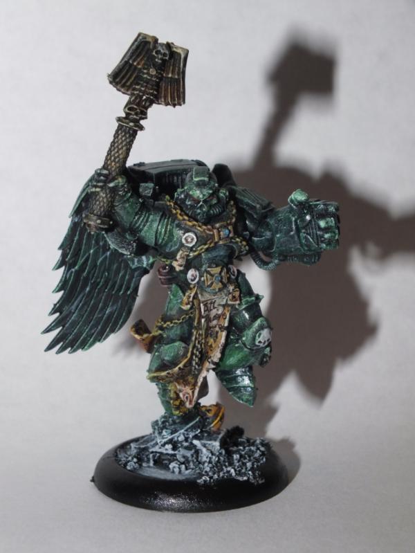
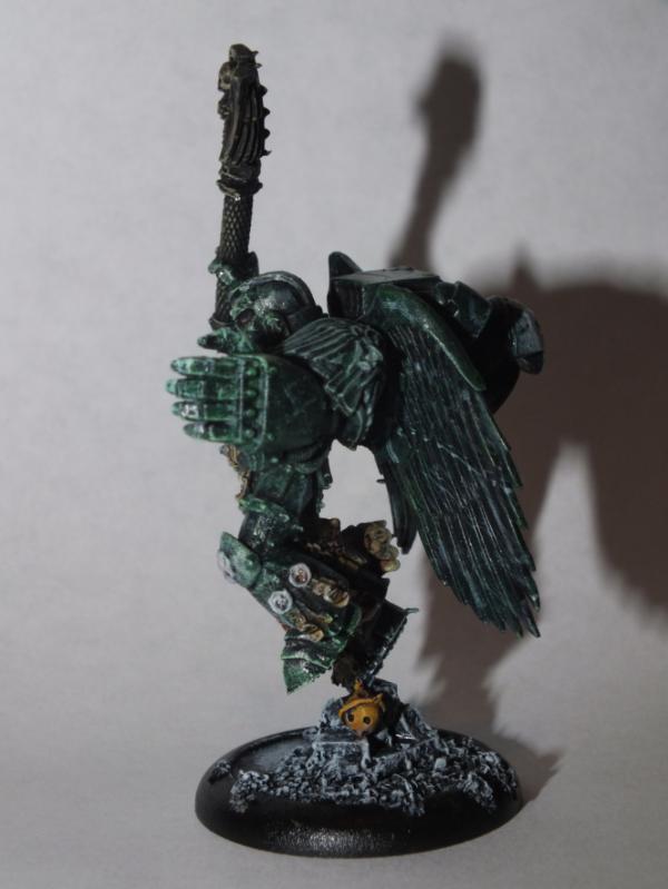
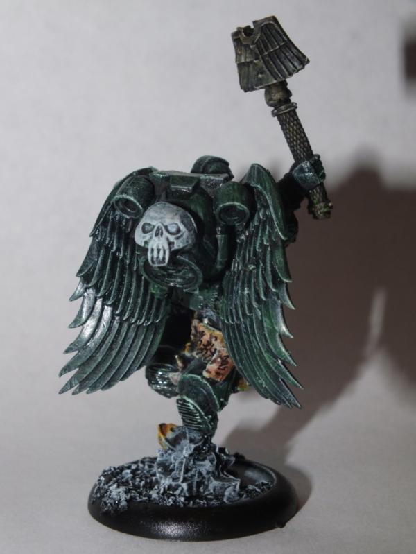

 )
)


 Just checking that it wasn't a euphemism for never - as in I'll row across the Atlantic once I've finished my cyborks


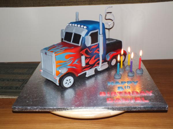

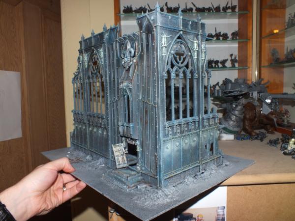
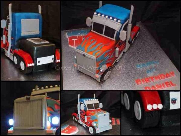


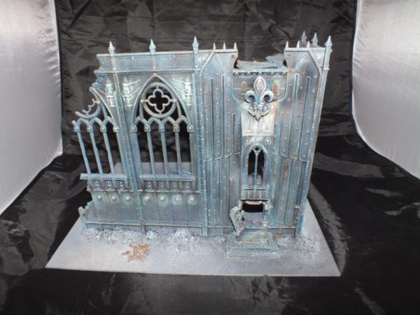
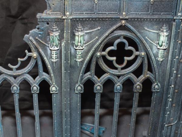
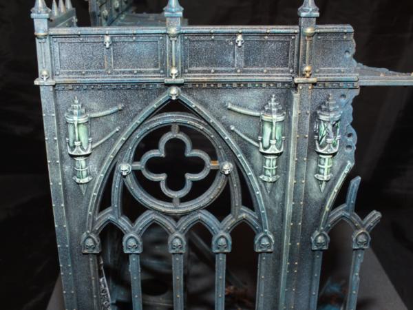
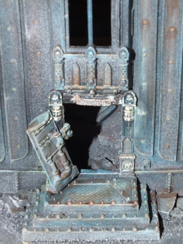
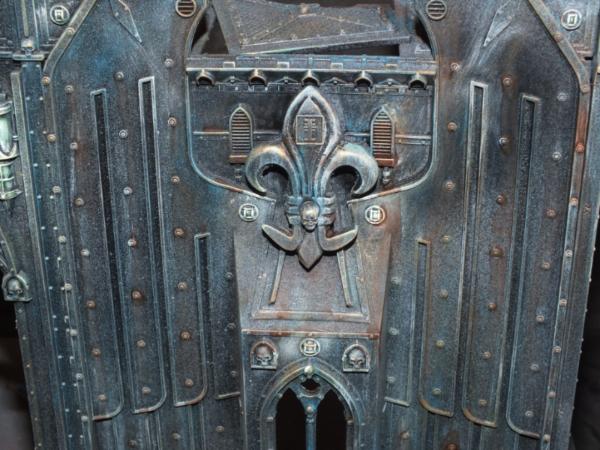
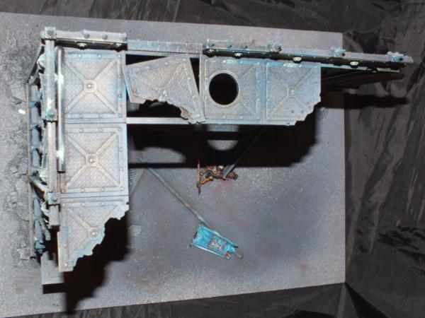
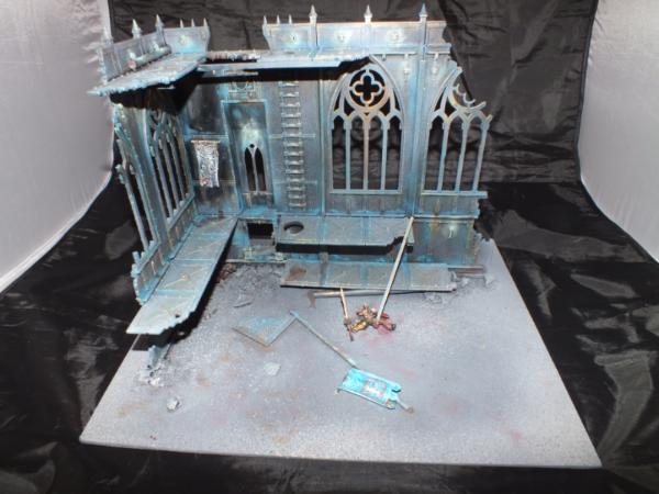
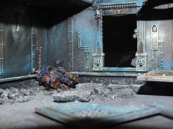
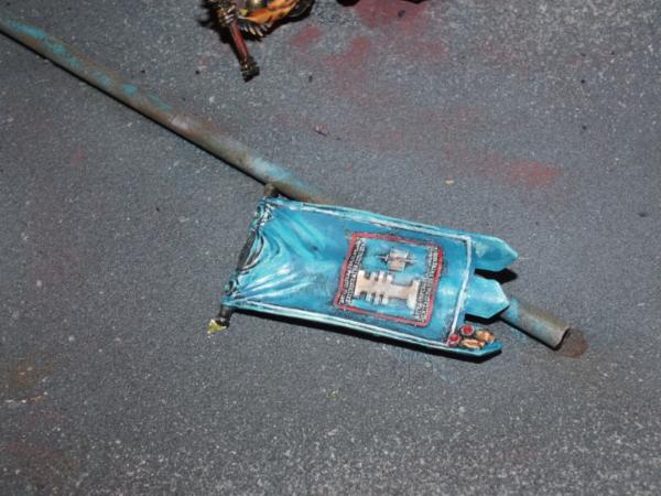
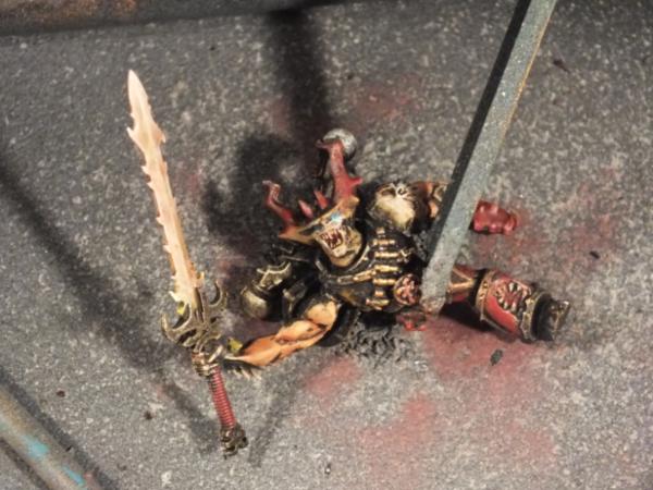


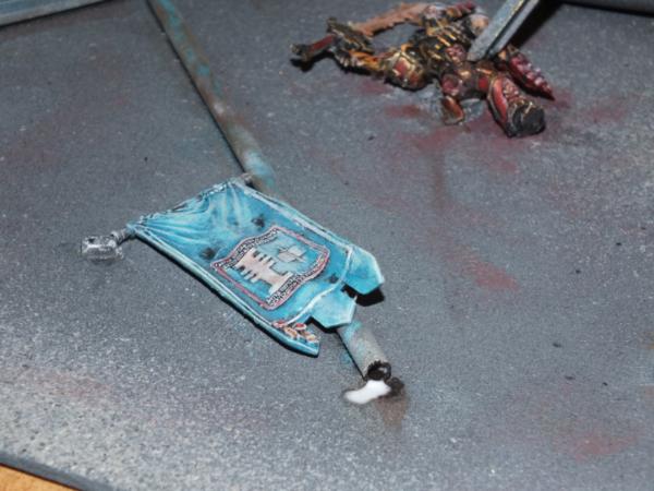
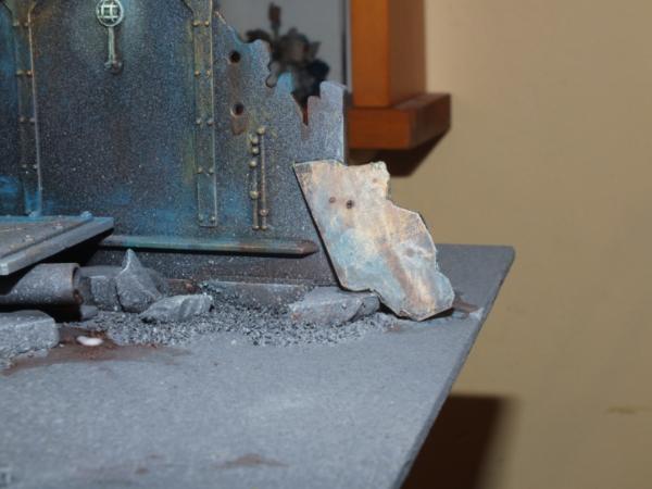

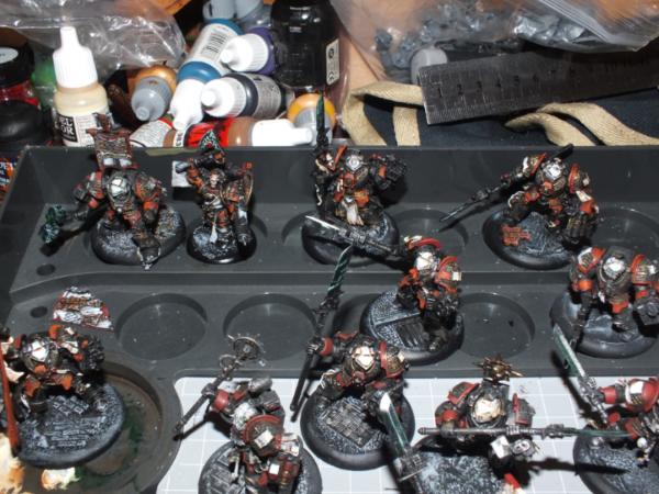
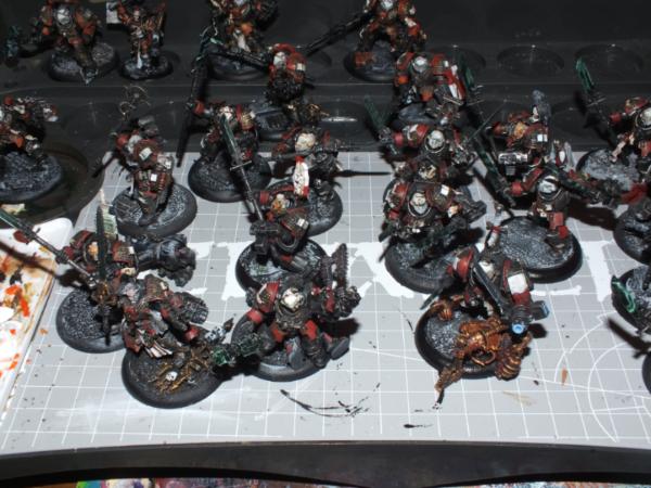
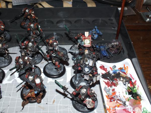
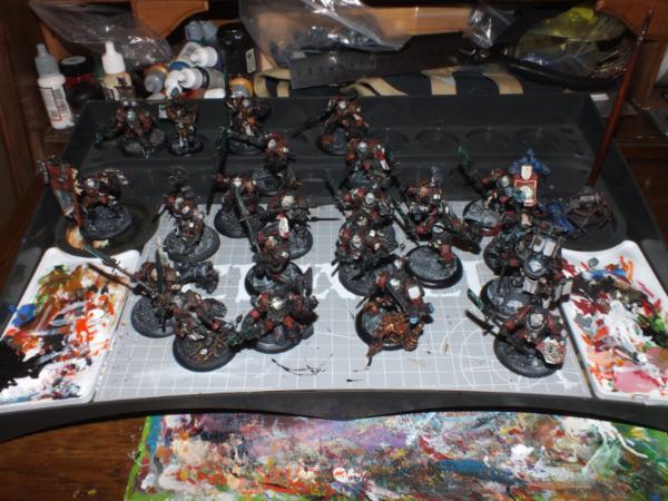


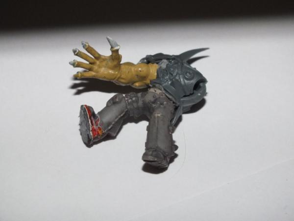
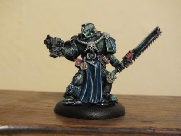
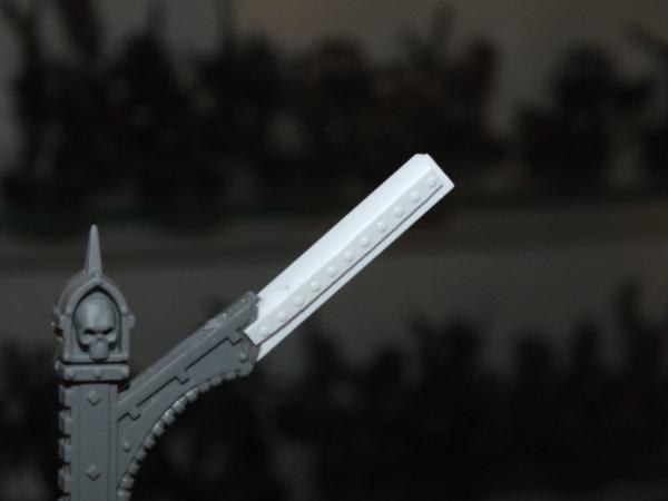
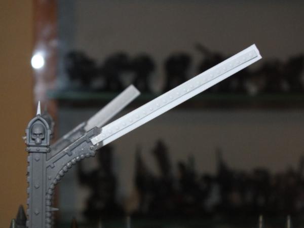
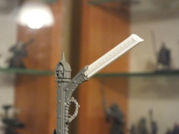
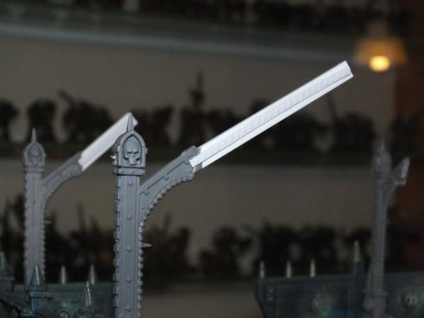
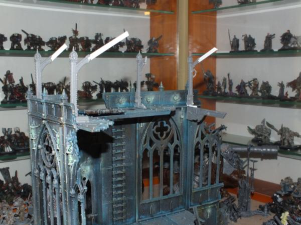
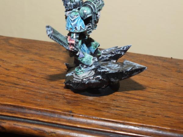
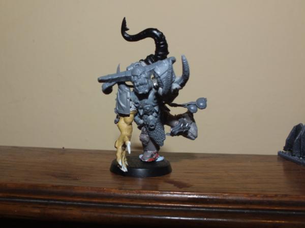
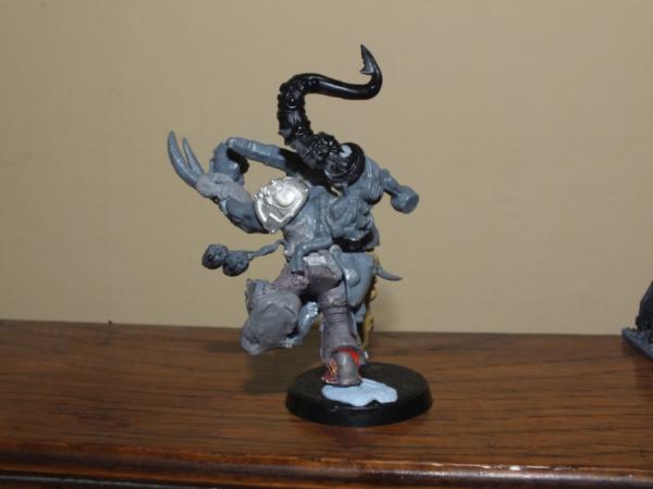


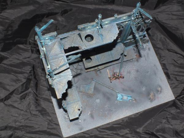
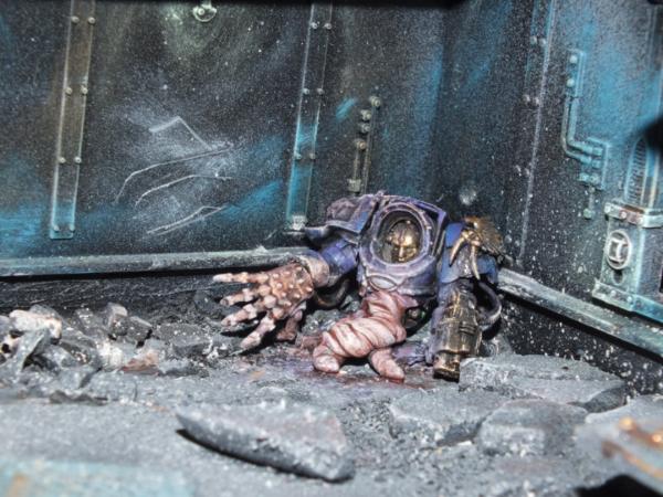
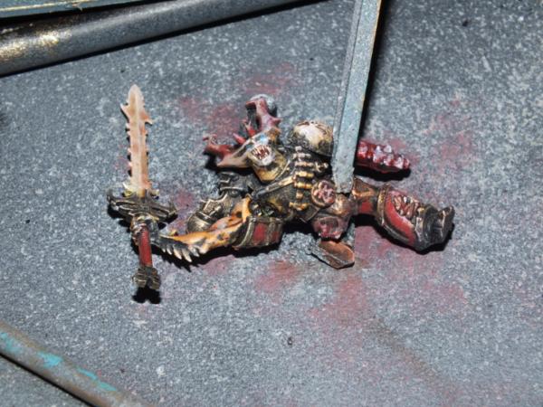
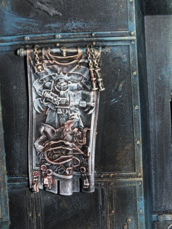
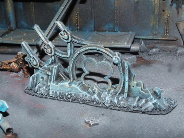


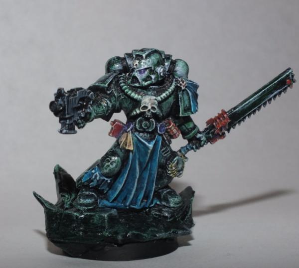
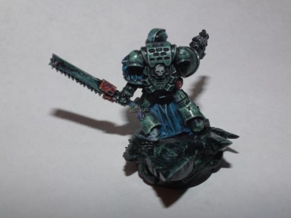
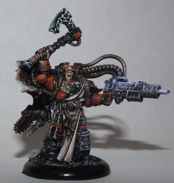
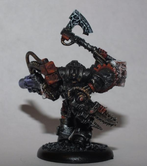
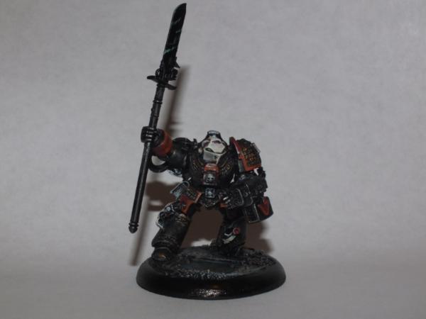
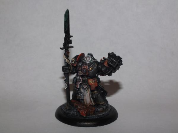
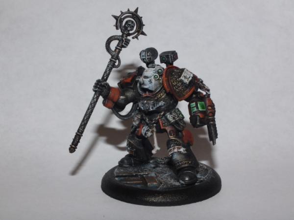
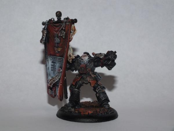
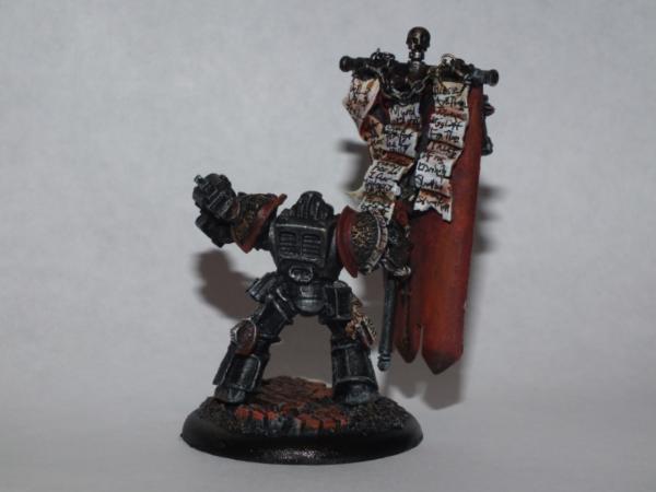
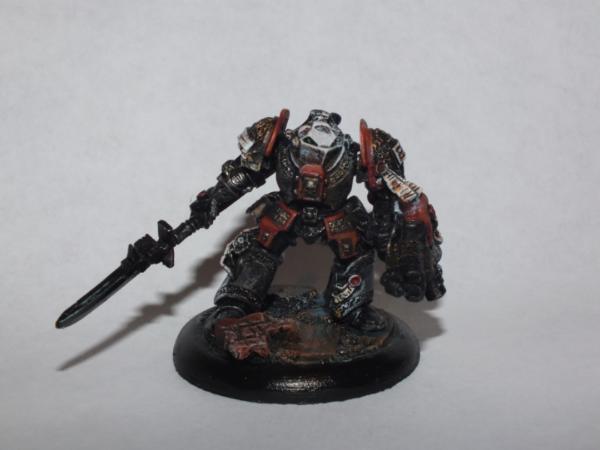
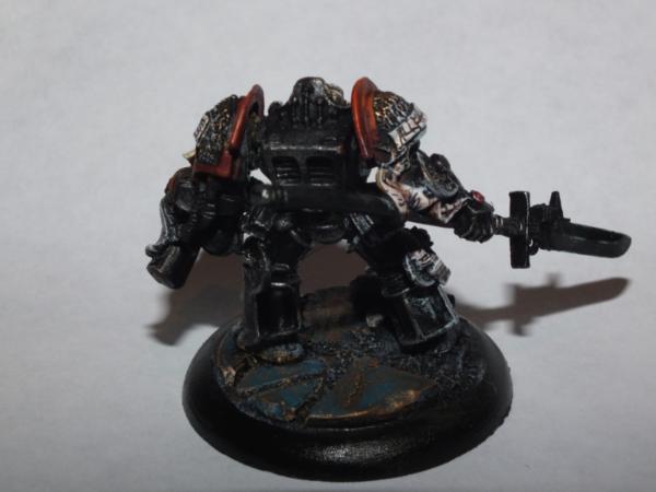
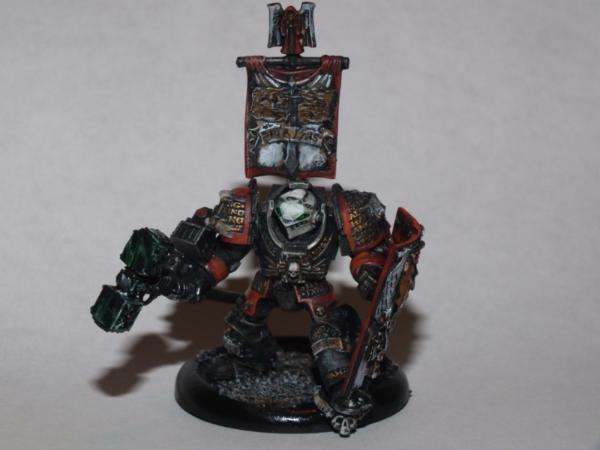
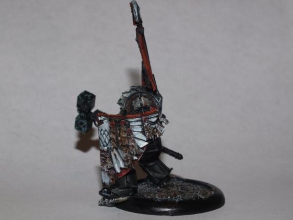
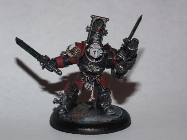
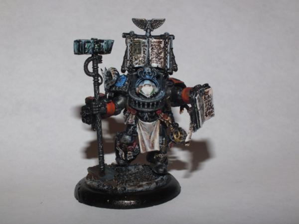
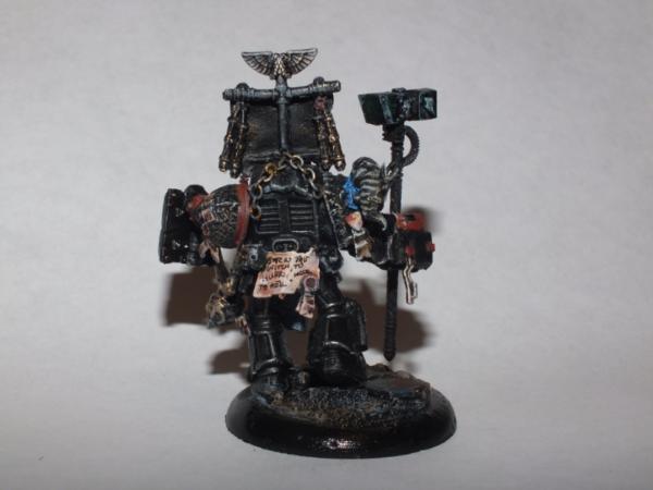
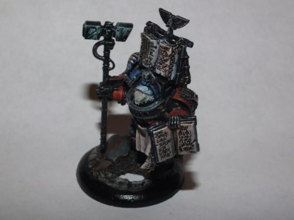
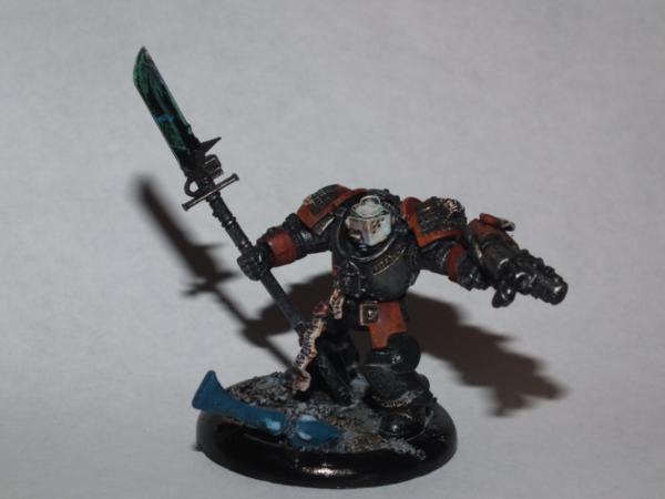
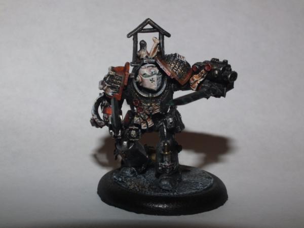
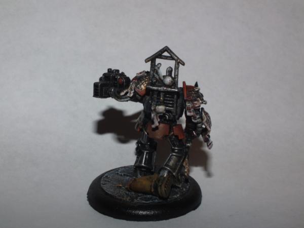
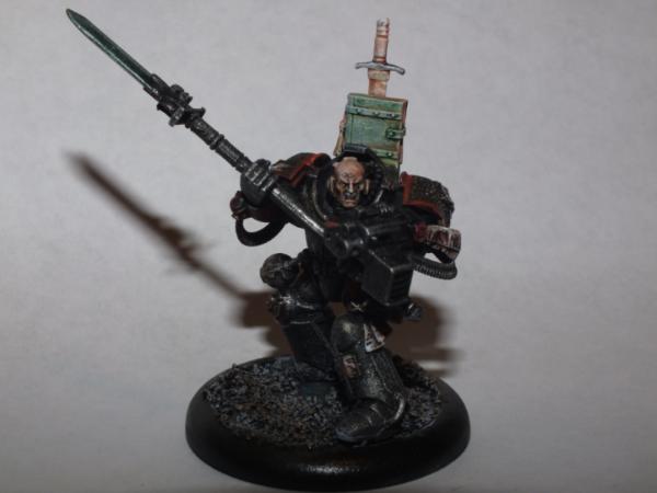
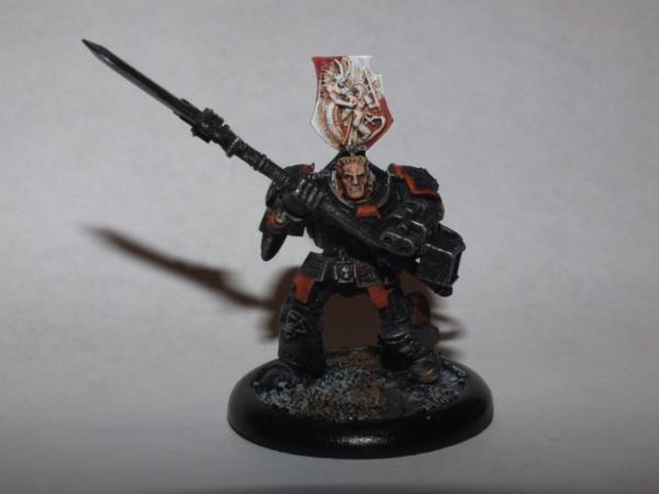
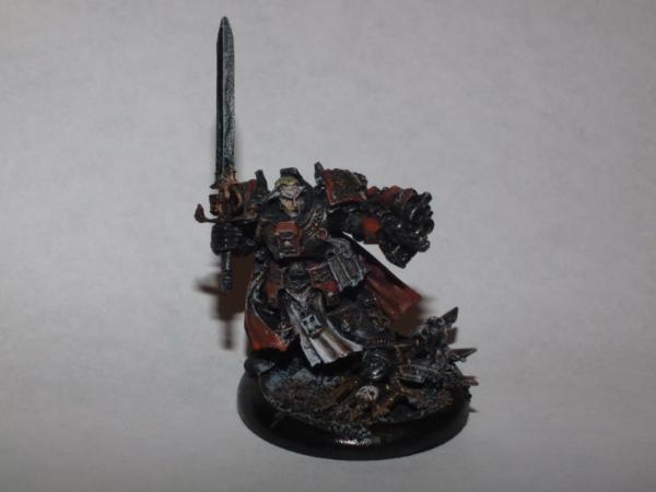
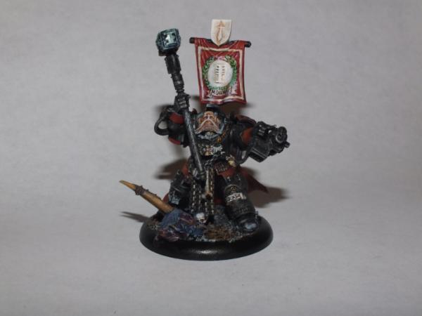
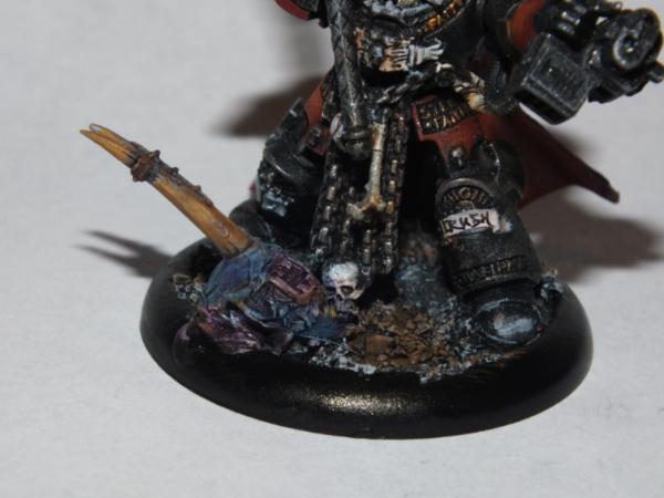
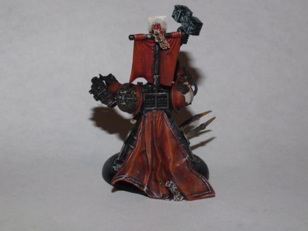
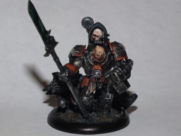
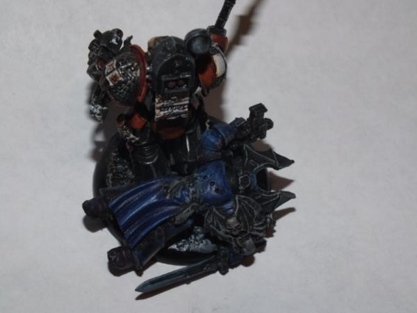
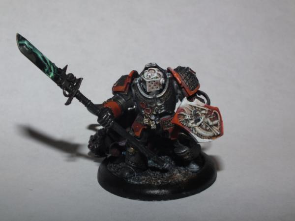
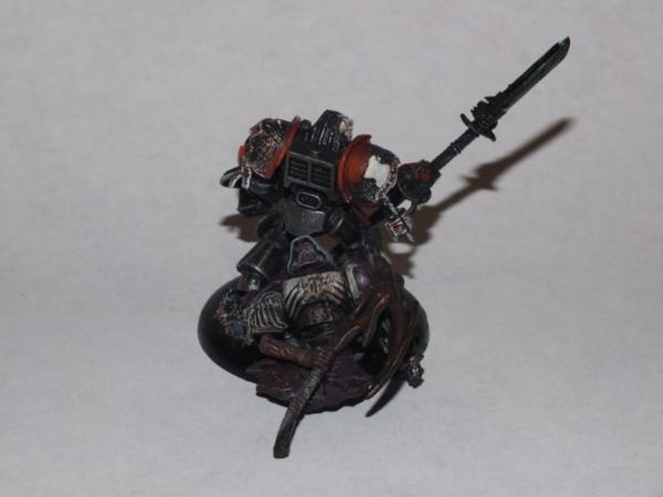
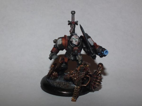
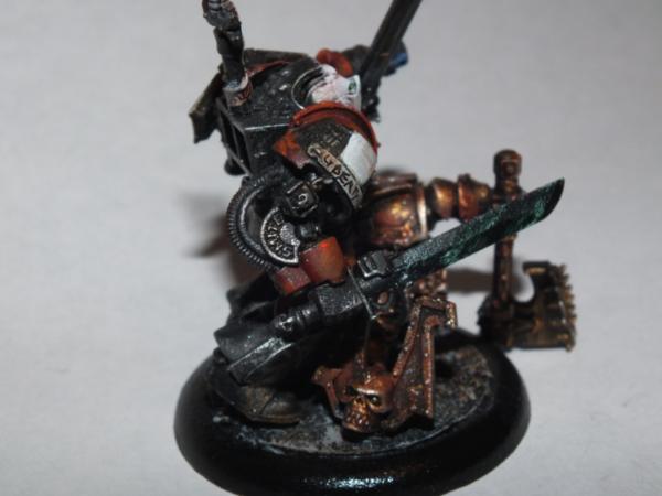
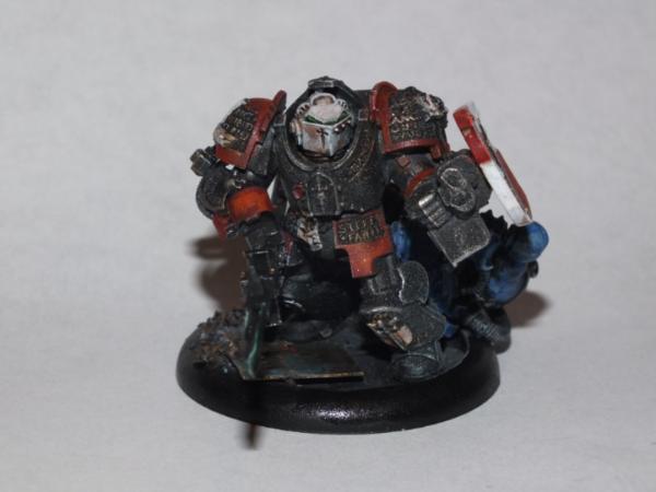
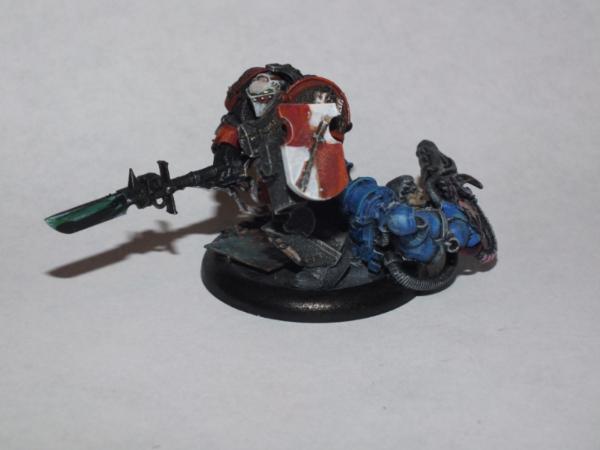
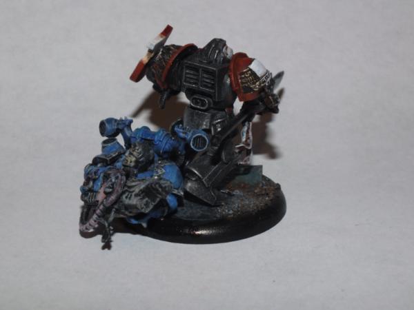
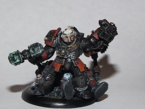
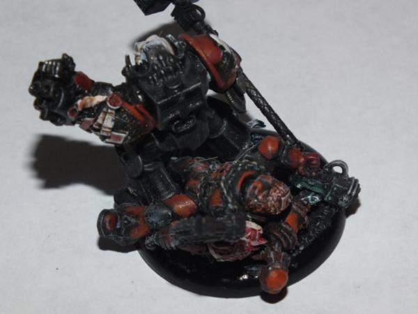
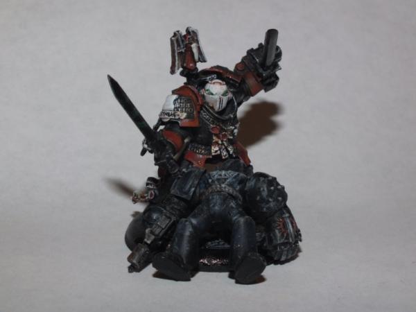

 genius.


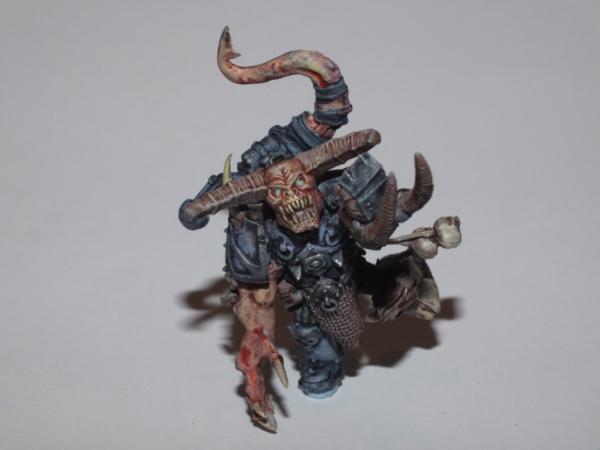

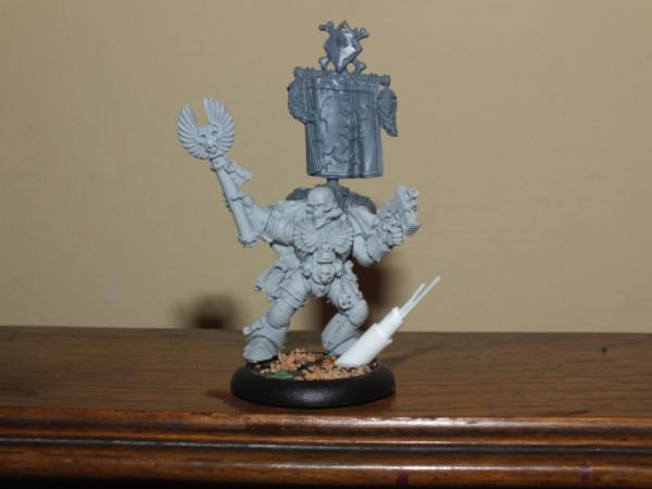
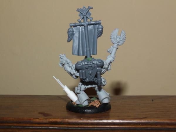

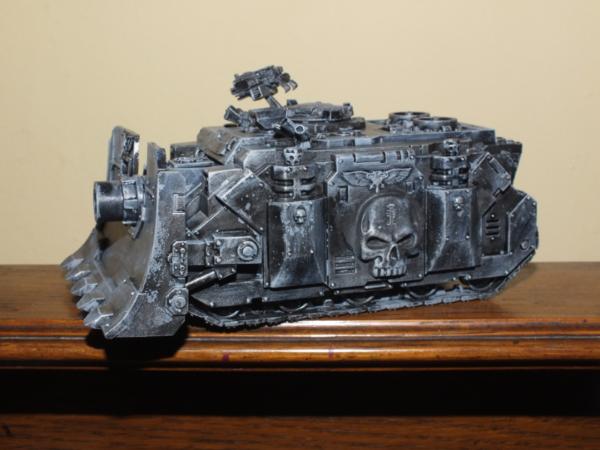
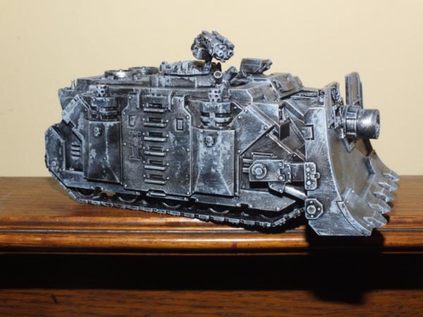
 though. Yeah, blue is cool but I'd like to try to


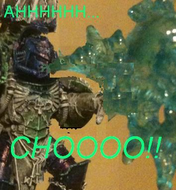

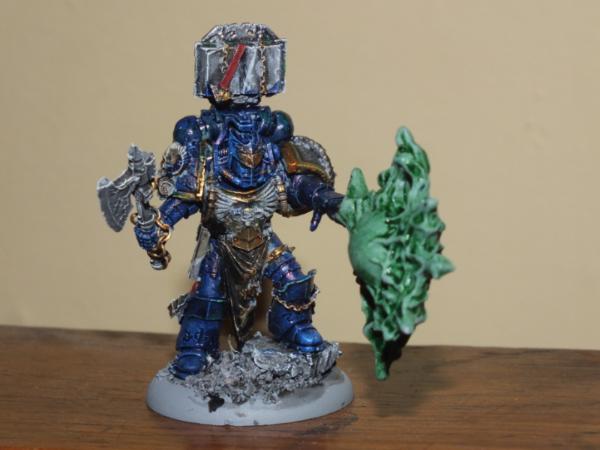
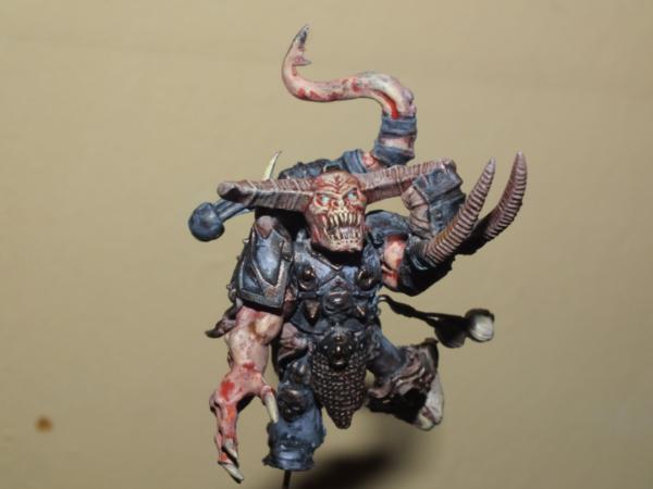
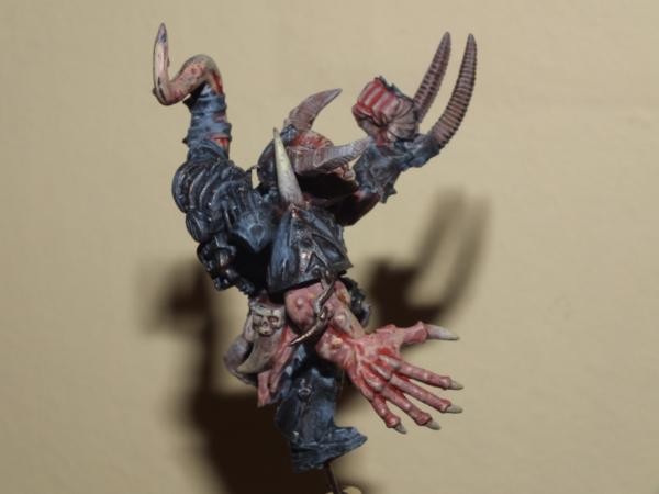


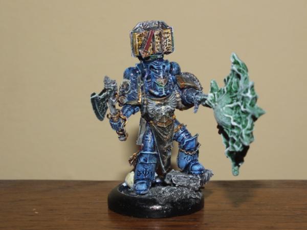

 in the mouth?