25853
Post by: winterdyne
My current commission is to do 2 Ultramarines Venerable Dreadnoughts (a chaplain and a support dread) and a Sicarius.
Anyway, the client has requested I go nuts (and I've quoted for a fair amount of time on these). The client is also OK with one of these being entered into GD before I hand them off.
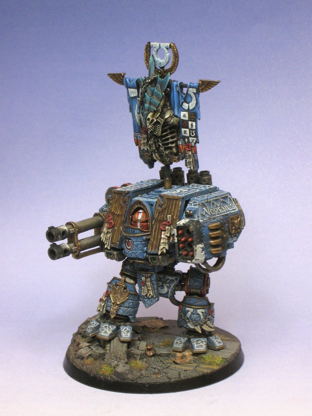
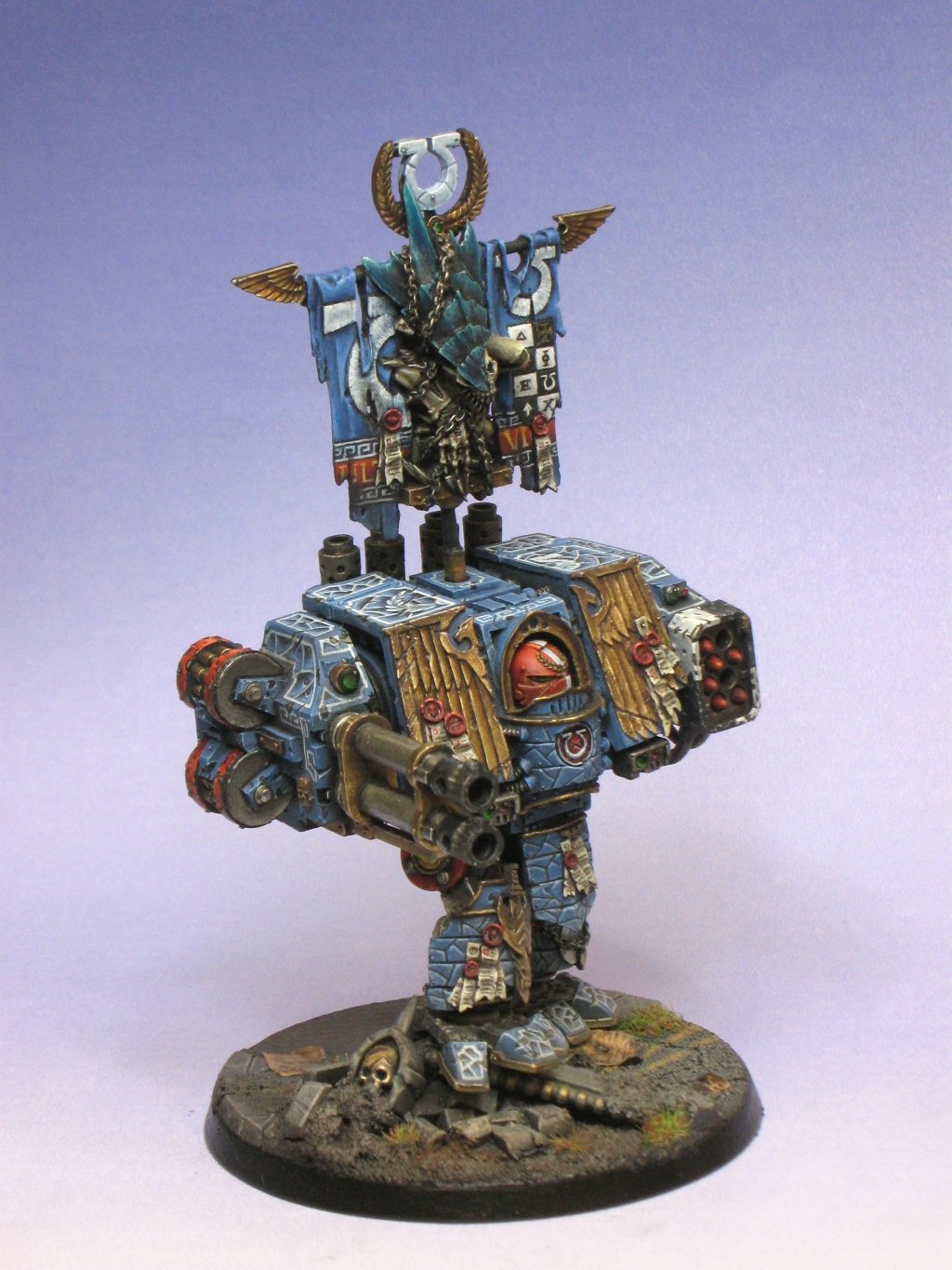
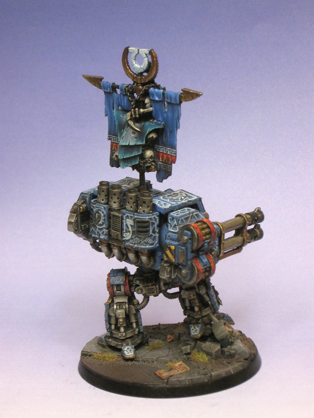
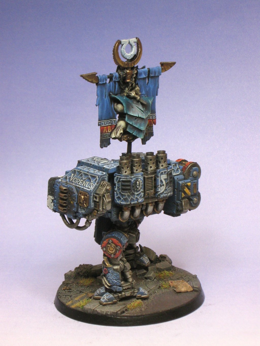
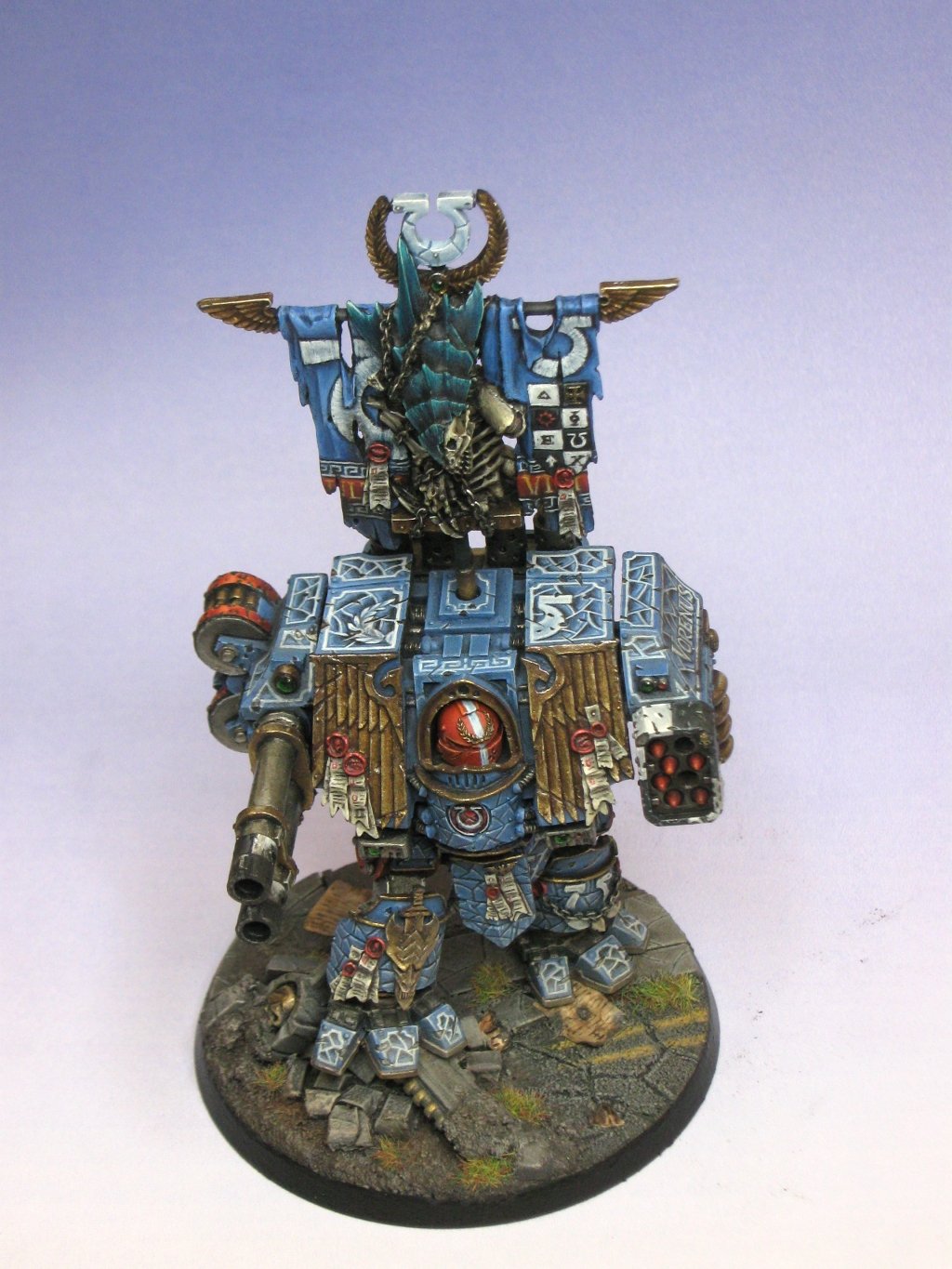
Here's the support dread - very little conversion work - just a repose on the toes, drilling out, and new collets on the exhaust system at the back, mostly because I managed to saw through the existing ones. Also ended up sculpting a new section of chain under the banner - much to my surprise chain is actually very easy to sculpt.

20867
Post by: Just Dave
This could be really good...
I'm not too sure about the pose tbh, but with your painting skills this could be AWESOME!! I look forward to seeing the progress.
25853
Post by: winterdyne
To be honest I've already been twisting out the right foot another few degrees. Looks better.
25853
Post by: winterdyne
25258
Post by: Collinsas
Can I ask sir; where the base is from or is it a work of your own?
31272
Post by: Battle Brother Lucifer
I want to see how this will look painted.
Subscribed
26790
Post by: Gitsplitta
I'm in! *subscribe*
25853
Post by: winterdyne
I made the base using my own recipe paving slabs - you like? I'm thinking of selling them as I'm making thousands for some urban boards I'm working up.
26790
Post by: Gitsplitta
They look beautiful. Do you mind sharing how you did the parchment?
28997
Post by: Alastergrimm
quick question, as I have only been in this hobby for a few months now, what is the Golden Daemon and how does one enter said tournment?
25853
Post by: winterdyne
The parchment is paper with PVA on the back, crumpled and stuck down. Stained with gryphonne sepia. Text in scorched brown / black. Scorching in black.
You enter golden daemon by buying a games day ticket and joining the entrants' queue, or so I am told. This'll be my first entry...
30038
Post by: vent
The Gamesday Ticket usually allows you to enter as many categories as you want, and comes with the Gamesday Mini (This year it's a Fantasy Chaos sorcerer apparently). Or you can choose to enter any of the individual categories and pay the fee... At least that's how I think it works...
If the base is any indication winterdyne, then this is going to be quite impressive. Are you going for the 40k Vehicle category with this?
25258
Post by: Collinsas
Well if you are a sell'en sir, well than I am a buy'en 
25853
Post by: winterdyne
Today's progress - the head airbrushed and finished by hand, the initial zenital coats (a few more than in my sternguard tutorial, and going to a lighter shade) on the blue. Started the extreme highlighting on the torso. Most likely a few days' work on that. Shouldn't take much more than a day or two for the metals, and then the freehand work begins... and yes, there will be a lot.


26790
Post by: Gitsplitta
winterdyne wrote:The parchment is paper with PVA on the back, crumpled and stuck down. Stained with gryphonne sepia. Text in scorched brown / black. Scorching in black.
You mean you made paper out of.... paper!?? Gods, what a concept... I'd have never thought of that! *grin*
Seriously... very nice, thank's for sharing your technique. I'll have to try it.
Dread is coming along very nicely... looking forward to seeing the process unfold step-by-step.
25853
Post by: winterdyne
Yeah, if you tear it (while moist) it separates the fibres, which when stained with black make most convincing cinders...
20867
Post by: Just Dave
Now that's looking really nice, I think the pose is much better and the head looks good. Keep it up!
22066
Post by: Acaddon
Looking forward to seeing how this turns out.
3488
Post by: jah-joshua
lookin' good so far...
it's gonna be nice to see if you take your game to the next level with this paintjob..
be sure to let me know if you are ever gonna start selling bases...
i hate making bases, and am always on the lookout for ones i like...
keep up the good work...
cheers
jah
15094
Post by: pixelpusher
winterdyne wrote:[…]mostly because I managed to saw through the existing ones.
Not only you. Suprisingly fragile, I think I managed to break all but one on mine.
Really looking forward to see the finished piece. 
15865
Post by: Da Big Mek
I must say that I am struck with jealousy that you had the money to get your hands on one of these stonking beautiful miniatures. I can't wait to see it fully painted and that dreads got plenty o dakka... ride on
25853
Post by: winterdyne
It's not mine - it's a commission piece. I've got buckets of my own stuff to paint, including some rare / lovely stuff (1991 GD Captain etc) that I just don't seem to find the time for.
Automatically Appended Next Post: Progress:


123
Post by: Alpharius
So far, so awesome!
I love the 'Codex approved veteran sergeant' helmet!
26697
Post by: Lt. Coldfire
Oh my, this is looking good!!
25853
Post by: winterdyne
Progress; not entirely happy with the freehand - think perhaps the U should have been on both sides. Still needs chipping / scratches like on the scrollwork above the helmet.

16966
Post by: pandaman
I'm lovin the freehand dont change a thing.
26790
Post by: Gitsplitta
Symmetry is over-rated.... Outstanding job on the lattice-work/stone-work. They have the same form as the stones below but the opposite visual effect (recessed rather than raised)... nice.
The closer I look at the aquilla the more impressed I am with it. The subtle shading and and highlights really stand out for a fine over-all effect and contrast well with the blue/grey of the basic figure.
Just really nice work all-round.
17349
Post by: SilverMK2
Very impressive.
20867
Post by: Just Dave
I think it looks awesome, the painting is so crisp and realistic and the free-hand looks really nice!
I wonder however if the golden daemon judges will be obsessing over NMM's this year??
23589
Post by: Sageheart
looks beautiful, cant wait to see finished product
21664
Post by: poipo32
Screw symmetry, that thing is awesome.
25853
Post by: winterdyne
20867
Post by: Just Dave
My god man, that really does look amazing! It's so smooth and the tones, highlights and free hand is just right! Great Work man!
17349
Post by: SilverMK2
Veeeeery impressive 
1635
Post by: Savnock
Awesome. Your texture and depth are just awesome: pretty much trompe l'oile (or however you spell it).
19982
Post by: jetjetex
that is amazing,keep up the awsome work!!!
22536
Post by: wargamingpitnick
This model looks amazing, the highlighting and look of dept on the freehand looks so nice, i sub'd i have to see more. Good work
504
Post by: kaiservonhugal
Scrumptious!!!
10339
Post by: tallmantim
Very cool - I had to check back to the early pics, as I couldn't remember there being cracks on the carapace originally - excellent!
25853
Post by: winterdyne
Moah progress, slowed a little by some hot weather that's made blending difficult (even with a wet palette). This'll probably be the last update for a couple of weeks as I'm heading down to the inlaws' in Sussex. I'll be taking some stuff down with me, hopefully I'll be bringing this and the Chaplain dread back pretty much finished. :-)
Anyway, pics:


26790
Post by: Gitsplitta
Coming along beautifully... enjoy your vacation!
25129
Post by: Trilobite
The cracked stone freehand is stonkingly good, as is the gold.
On the gold, I think it would look great on some lizardmen bits and pieces I got lying around, mind telling your recipe for this particular piece?
25853
Post by: winterdyne
The gold is:
Scorched Brown -> VMC Bronze -> VMC Old gold -> Mithril Silver
I used an NMM style shading pattern ie generally reverse highlights (light down) and then extreme highlight the shaded upper edges.
With gryphonne sepia and devlan mud glazes to shade down, and a badab black pin wash for edging.
28225
Post by: clevahname
SO BEAUTIFUL.... IT HURTS SO GOOOOOD
25853
Post by: winterdyne
Got basically nothing done in Sussex, so today I made a push to finish the legs and torso (less some final weathering).


504
Post by: kaiservonhugal
ohhh Hell Yeah!!
25129
Post by: Trilobite
Brilliant work
25853
Post by: winterdyne
Today's progress- pushed on with the weapons:

20867
Post by: Just Dave
Wow. That looks amazing! Great work!
I assume that 'vorenus' is free-hand as that looks awesooome!
Keep it up.
30283
Post by: marvlev
Though I don't like Ultramarines, this model rocks!
9220
Post by: madgrotbob
I was worried by the base coat that it wasn't very Ultramarine in colour, but the freehand makes the model perfect
26790
Post by: Gitsplitta
Tremendous! Wow...
11961
Post by: Ifalna
Absolutely stunning.
The illusion of depth in the freehand is mindblowing. Can't wait to see this as it finishes.
24247
Post by: Ambull
They're gorgeous, a very different style and it works so well, simply gorgeous.
2808
Post by: Task and Purpose
Clearly you have skill, but this model comes off more as a technique drill. The head is the focal point but the eye doesnt want to look there, its pulled to the whites.
The technique is busy/distracting to the eye and the breaks/cracks in the paint dont have the same color/depth.
Deamons are given to models whose paint jobs accent the models while the models tell a story.
Just trying to be constructive.
25853
Post by: winterdyne
Hmm. The general concept behind the piece is one of sensory overload (which'll only get worse once the banner's on)- pretty much every surface is crawling with freehand, and I was hoping the red helm would keep focus on the head, which by contrast is actually very smooth and clean. Maybe I need to bump the contrast on the highlights there a bit - I've also had feedback that seems to lean on the gold needing a bit of a bump on the feathers of the aquila in particular.
Not sure what you mean about the cracks being inconsistent? Could you highlight where you mean on a pic?
28104
Post by: vignor
I think its beautiful...
15310
Post by: Winter
Task and Purpose wrote:Clearly you have skill, but this model comes off more as a technique drill. The head is the focal point but the eye doesnt want to look there, its pulled to the whites.
The technique is busy/distracting to the eye and the breaks/cracks in the paint dont have the same color/depth.
Deamons are given to models whose paint jobs accent the models while the models tell a story.
Just trying to be constructive.
I am inclined to agree with the comment that the model is just too busy. I mean the techniques and the ability you have are stunning, but the model looks cramped and crowded, and to me the abudance of the design distracts from the overall model.
I am also interested to know why you didn't do the metallics in NMM?
29052
Post by: Xenon
Just awesome..
16335
Post by: Witzkatz
A beautiful dreadnought! While I can see where the argument about the too crowded look comes from, for me, it looks fitting for a venerable Dreadnought. An almost holy cyborg-machine thousands of years old has every right to be ornated and emblazoned as much as it wants to be. And I think the red helmet makes a nice focal point, because right now it's one of the only parts of the model where red is really extensively used.
As an idea, you could maybe try to make the eyes glow. Maybe a nice green, or a cold blue - eyes are something that always draw the attention, I think, by our nature.
Great work! I can only aspire to reach your level of skill.
25081
Post by: Lysenis
Simply amazing.
I will have to agree that it is a busy work of art but it still looks great.
25853
Post by: winterdyne
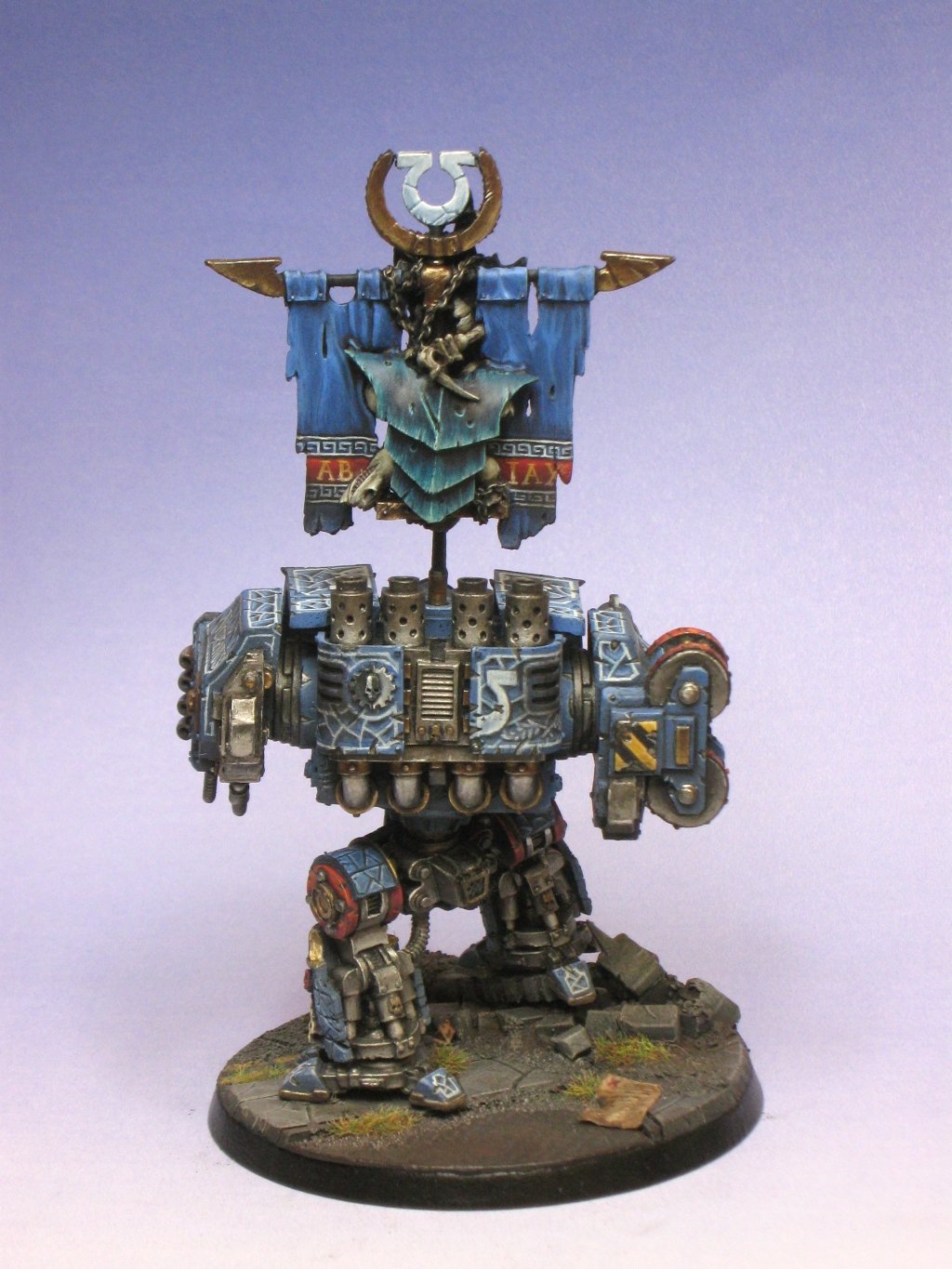
Today's progress:

6806
Post by: Gavin Thorne
Where's Pullo? 
Great model, I love the freehand, but the heavier and lighter white highlights are a tad busy compared to the more subtle blue/black areas. I'm loving the banner and you've done an excellent job on the metallics, great highlights. Can't wait to see more!
22066
Post by: Acaddon
It looks great, but I'm not sure if the colour you've chosen for the Tyranid's crest really works with the rest of the model.
32007
Post by: dreadanant
i see were your going with what every one is calling the busy areas, well my interpritation of it is that there the more un'noticed bits and your trying to make the whole modle interesting yea, well thats how it looks to me, amazing skill any which way you look at it
25853
Post by: winterdyne
29449
Post by: weetyskemian44
Good Sh*t dude.
26733
Post by: Wi1ikers
i dont like the white/black checkers thing on the guns. Other then that very nice paint job and free style
25945
Post by: Vlad Von Carstien
exelent job mate that is one very nice looking dred. looking forward to seeing the other one too.
6854
Post by: InyokaMadoda
Beautiful work - looking forward to seeing the rest of your work!
29403
Post by: Listrel
Did you lighten the gold on it ? or is just the picture ? If so it looks much better to me, not that it looked bad before though 
3488
Post by: jah-joshua
lookin' good, mate...
this will definitely be an eyecatcher for the judges...
should easily make the first cut, and get you a little pin...
lookin' forward to the finished product ...
cheers
jah
25853
Post by: winterdyne
Listrel wrote:Did you lighten the gold on it ? or is just the picture ? If so it looks much better to me, not that it looked bad before though
No, it's just facing the light there. The gold is all metallic, so if it's not facing the light it can look quite dark. This'll change a bit when it gets varnished - the matt spray will mean the metal looks lighter from more angles, hopefully that'll look alright.
@Jah-joshua: That's nice, man. I'll be happy as Larry (who the feck is Larry?) this time round with a pin...
33636
Post by: BlackMojo
untill somebody pointed it out, I thought the cracked stone was carved in with a knife. utterly stupendous.
2776
Post by: Reecius
Damn son, that there is an amazing piece of work.
22570
Post by: Mafty
how much is a commission of this detail worth? PM me if you dont want to publicly disclose.
3197
Post by: MagickalMemories
I've been looking at this thing since the beginning, and I just found what was bothering me.
Now, don't get me wrong... I think the model's turning out beautiful and will probably end up better than any model I have in my collection (re: painting).
Thing is, though... You're looking for Golden Demon level.
With that in mind, I think you should pay better attention to the base.
With all the blood, sweat & tears you're pouring into the model, the base is a detractor. For your everyday, gaming model, the base would be a very nice base. If you want one of those little statues, though... you're going to need more.
Eric
25853
Post by: winterdyne
Aye, the base is a bit meh IMO. I may redo it, or may add more detail. I'll think about it more as I do the final weathering powders to tie everything together. As for price (for a clone of this one), I'd think somewhere around £650 - £750 is about right by the time it's done. So far I've put somewhere around 80 hours solid into it, and I'm reckoning there'll be another 20 or so to go on.
Automatically Appended Next Post: Today's progress. As one of my kids managed to get run over by a car yesterday (he's ok, just bad bruising) things have been a bit, yeah... anyway, got the gold done, highlighted the metal on the AC's, chains on the nid, bit of highlights on the yellow stripes and some freehand, and the U's... I tried to go for an embroidery effect (big nod to giganticdark's excellent forgeworld UM redux's banner see http://coolminiornot.com/218198 ) and it's sort of working a bit. I'll probably add a border or some lining to it to allow some harder highlights, but some sort of design needs to go on the backdrop of the banner (and this'll also be embroidery styled).


23589
Post by: Sageheart
how did you get thet tyranid skeleton.
28688
Post by: Gathering Storm
That looks amazing, hope you get a high rank at GD this year (Bronze, Silver or Gold?).
@Sageheart: It comes as part of the FW Ultramarine Venerable Dreadnought's banner.
22687
Post by: MajorTom11
I hate to say it but I think the mini has way too much going on texture wise. There is one type of more subtle cracking on the chest and shins (which I like better), another NMM looking type on the free handed 'cracking parts' parts, the checkers are lost amongst the details. The things that aren't covered in free hand are highly textured physically, so in the end it is a bit overwhelming.The Tyranid also lacks contrast against the banner, and kind of blends into it.
I am a massive fan of your work, I just think in this case it is too much of a good thing. That being said, you aren't done yet, so I reserve my final opinion for the end! I am actually quite confident that most people would not share my design opinion on this one!
In any case, I always look forward to your work, keep it coming!
25853
Post by: winterdyne
And in case it wasn't busy enough already, today's progress:


Quite pleased with how the banner is now - I think the nid doesn't blend in so much...
Regarding the general business, tomorrow I should start the airbrush and pigment weathering passes which should tone everything down a touch. Should actually complete either tomorrow or Friday afternoon.
20867
Post by: Just Dave
I think it looks great!
The base is simple, but characterful and goes well with the model whilst the model, painting skills and banner are all very impressive!
However, like some I do believe that it should be either cracked/textured or have the white painted cracks/pattern on it, rather than both, but that's just me and it's not finished yet...
25853
Post by: winterdyne
3488
Post by: jah-joshua
well done, mate...
you really stepped-up the skills with this guy...
best of luck at GD...
cheers
jah
26790
Post by: Gitsplitta
Very nice work... good luck to you!
25853
Post by: winterdyne
Cheers guys! If you spot anything you think could be improved do mention it - I'm sure there's stuff to fix there, like the crux on the banner and skull on the back of the engine block...
31079
Post by: warspawned
Truly inspirational work on one of my favourite FW models. Thanks a lot.
123
Post by: Alpharius
Simply awesome!
And I love the base, actually.
Well done, but not overdone.
Great stuff, and good luck!
19398
Post by: Tim the Biovore
Un-freakin' believable. If that doesn't win Gold, or Silver at the least, then I can't tell my left from right.
20956
Post by: Empchild
Good stuff I will admit, but it may be the pics (they seem a little grainy on my comp) but the metalics seem to be lacking depth compared to the rest of the model. Easy first cut beyond that though it 's all about what shows up . Good luck and let us know how you do.
29979
Post by: Anthony_D
one thing i noticed, the lens glint is different on the bottom than it is in the eyes/targerter thingy. Is this intentional?
Automatically Appended Next Post:
but I have spent a while dribbing over the quality of the artwork. good job!
25853
Post by: winterdyne
Nope. That's on the fix list, along with some minor touches on highlights here and there.
20867
Post by: Just Dave
Looks great man! I'm not entirely sure how well it'll do though, but it deserves something! Good Luck.
29449
Post by: weetyskemian44
Good luck!
28141
Post by: fatty
not that i can match your skills but the checkers arnt working for me. i think checkers are more for orcs and the black and white doesnt make sense too me. considering the head i would have made it that effect but than red too offset the banner. dont take it the wrong way but thats my opinion. if i would judge i would ignore it because its so full but doesnt stand out because all is blue and well if a empeerors childeren landraider is parked next too yours you would have lost my attention.
but wow its freaking awsome
25853
Post by: winterdyne
Updated the pics with some minor tweaks.
33836
Post by: COMMANDER SUNTZU
Looks amazing well done!
6854
Post by: InyokaMadoda
Beautiful work! Good luck for the Demons, when are they? Also, have you started work on the other minis yet?
28688
Post by: Gathering Storm
I noticed the Dread is on the GW site (so I guess it made the cut).
Golden Demon UK 2010; Warhammer 40k Vehicle
25853
Post by: winterdyne
It did indeed. Got a nice shiny finalist's pin, which I'm pretty pleased with for my first time out.
6854
Post by: InyokaMadoda
Well done Winterdyne. You definitely deserved it. Which of the minis on the GW site took the gold in your category?
26142
Post by: HamHamLunchbox
those pics look horrible.
im glad gw didnt take your wip pics XD
25853
Post by: winterdyne
Uh, what pics are horrible?
28141
Post by: fatty
sir you failed too see the sarcasme
18253
Post by: SONS of ORAR
Empchild wrote:Good stuff I will admit, but it may be the pics (they seem a little grainy on my comp) but the metalics seem to be lacking depth compared to the rest of the model. Easy first cut beyond that though it 's all about what shows up . Good luck and let us know how you do.
this model is absolutely beautiful IRL i would say the same from the pics but the blending and tone are all but faultless! Well done
24505
Post by: Ruzto
Looking good indeed.
Just have to ask, what kind of magic you use?
34119
Post by: neil101
great paintjob. are you the same wynterdyne of the dogs of war modification for DOW?
25853
Post by: winterdyne
Yes.
25853
Post by: winterdyne
29403
Post by: Listrel
Like the base it's detailed yet simple at the same time.
26142
Post by: HamHamLunchbox
winterdyne wrote:Uh, what pics are horrible?
sorry you had to wait for a reply.
i saw gd pics of your dread and they were horrible(taken by gw)
25853
Post by: winterdyne
Oh god, those GD pics were horrid - every piece they showed looked so much better in the flesh. At least the winner's photos have come out alright...
123
Post by: Alpharius
I've a BIG fan of the Chaplain Dreadnought... and a BIG fan of your painting, so, needless to say, looking forward to this!
28688
Post by: Gathering Storm
Who actually won in the end? Just seems like GW just trying to keep the results secret from anyone who wasn't there at GD. All I know is who won the Slayer Sword, GW didn't see it as worth their while to actually give us the winners of induvidual categories. Great start on the Chaplain Dread BTW.
29403
Post by: Listrel
Gathering Storm wrote:Who actually won in the end?
Just seems like GW just trying to keep the results secret from anyone who wasn't there at GD.
All I know is who won the Slayer Sword, GW didn't see it as worth their while to actually give us the winners of induvidual categories.
Great start on the Chaplain Dread BTW.
The pictures on the big screen were flashed up really quickly as they announced the winners I think if memory serves the winner was one of the ork trukks.
25853
Post by: winterdyne
28688
Post by: Gathering Storm
Thank you winterdyne.
23589
Post by: Sageheart
love that blue!
23635
Post by: Pennywise
That venerable dread is amazing, I love your free hand.
25853
Post by: winterdyne
22687
Post by: MajorTom11
Looking very nice so far, I love the amount of WIP shots you always give in your projects so we can really get a sense of when and how you are doing things, fantastic to study!
Although I'll admit, I can't wait for you to get back to foottroops, the conversions and posing you do on those are totally inspiring!
25853
Post by: winterdyne
I have a character model to do for 'Deathwatch' coming up - a Black Templars Deathwatch member. The client's been waiting for longer than I'd have liked him to, so he's gonna get a little sumthin' sumthin' special...
25853
Post by: winterdyne
25853
Post by: winterdyne
31731
Post by: Agemman
My friend your'e work is stunning! However, I am going to critique it as best I can. The blending on the chap dread is skilled, but lacks direction, and lines can be seen as the colours change. I was similar to this when learning to blend and the problem will go away very soon. Congratulations on making the cut in the GD, thats a considerable acheivement. Also on that topic, the previous dread did have some problems with it that could have improved it. For example, the base was far too simple in comparison to the model. I would have liked to see a cusom made base attatched straight to a plain black plinth, instead of a GW base. Also, the chequer patterns, while providing a bit of spot colour, offbalanced the model in that they were too large. Next time, mud and samller chequers could help to make them less conspicuous. Keep it up. This is the best project log I have ever read on dakka!
25853
Post by: winterdyne
Aye, the blends are pretty quick work, only 2 transitions - for a proper smooth blend you need a lot more. I'll be adding a fair amount of freehand and weathering over the top, including a filter airbrush coat, so there wasn't really much point in getting it *too* smooth. I hope. ;-)
The bases are per client request - these are centrepieces for an army, so game-legal basing was required. I was considering making insert plinths for them, but went and finished the bases first, after which matching the groundwork for a plinth would have been a pain.
34119
Post by: neil101
thats a nice bright gold you have there, or is that the flash?
31731
Post by: Agemman
Fair enough mate. Doing what the client wants is primary. I hope he/she is paying through the teeth for your amazing work.
25853
Post by: winterdyne
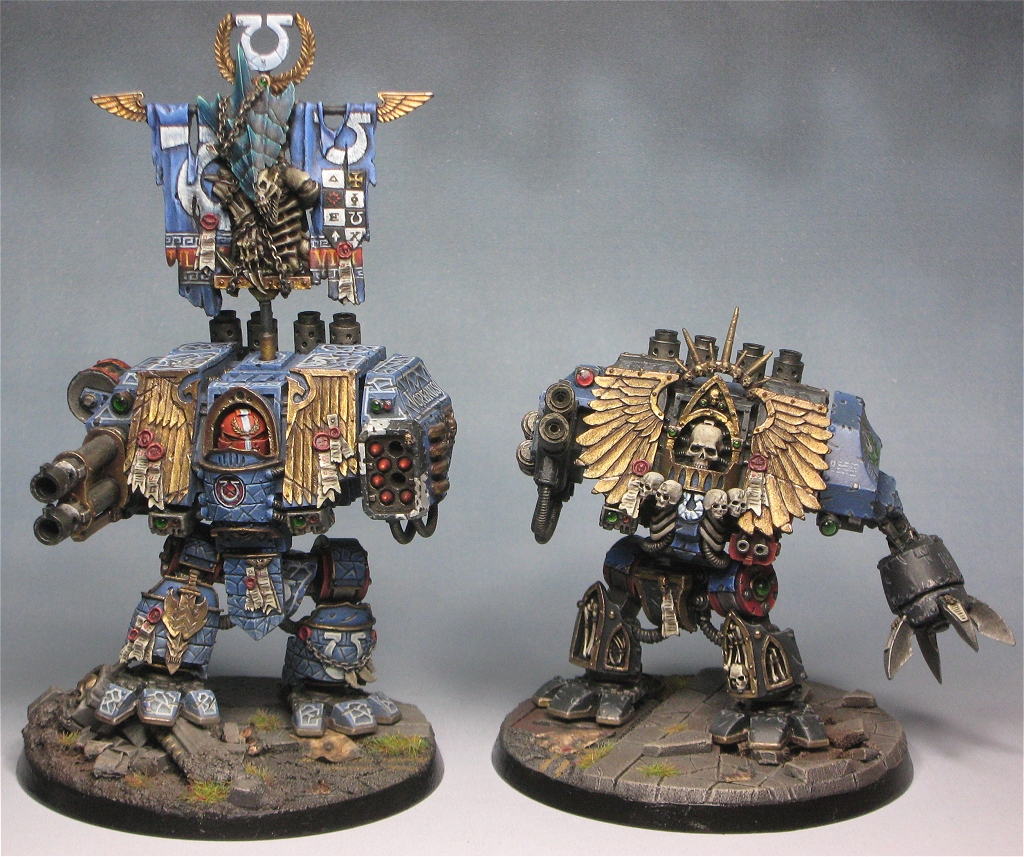
And I think I'm done on the chaplain:

And here's the 2 dreads together:
21071
Post by: kukuchik
Unbelievable... i will attempt weathering like that on my own dreads... but i don't think i will be able to make it look so real.
Great Stuff!
20867
Post by: Just Dave
That Chaplain Dread looks amazing, great work man! I do admit, I don't like the pose, however the painting is inspirational.
20956
Post by: Empchild
I will say I love the tie in with Army of Darkness.
14063
Post by: Roleplayer
My work feels so inferior to yours :(
Truly well done.
25853
Post by: winterdyne
Empchild wrote:I will say I love the tie in with Army of Darkness.
Eh, what tie-in?
13225
Post by: Bottle
Stunning, for a moment I thought it said "NMM" down the back of the power pack haha
25853
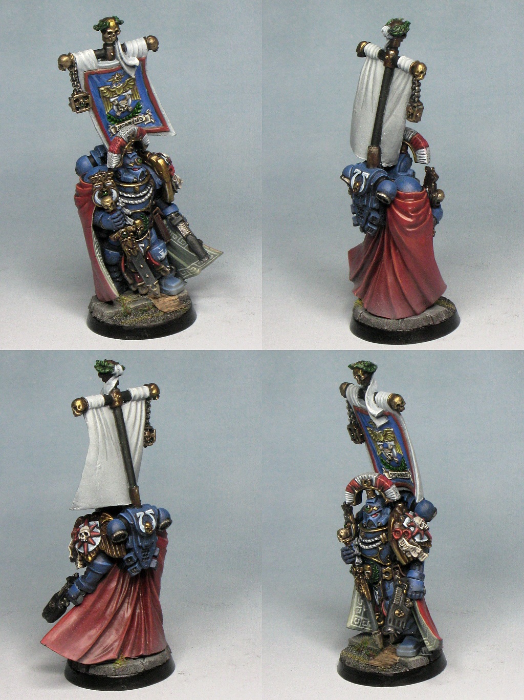
Post by: winterdyne
And Sicarius got done today (well, I airbrushed him yesterday). This is to 'tabletop' level (ie not competition standard):
32959
Post by: crimsonmicc
Maybe its the photo, but it looks like the back of the cape could do with a little bolder highlights.
26800
Post by: Commander Cain
Very impressive 'tabletop' painting! And the dreadnoughts look amazing.
25853
Post by: winterdyne
It's the photo. The varnish I use is not quite dead flat, and it's reflecting the light a bit.
29403
Post by: Listrel
Table top you say hmmmmm... Impressive none the less
25853
Post by: winterdyne
Yep. Pay me £60, give me a Sicarius, this is what you get. (I'll be charging £10 on top of the £50 basic character fee for backbanners like this). All in all it's about 8-9 hours work.
32007
Post by: dreadanant
thats insane for table top quality, do you live off your commissions? lol.
25853
Post by: winterdyne
Yes, I do.
32007
Post by: dreadanant
thats awsome, and yet some what obvious lol
33881
Post by: fasteddiexx1
That is awesome! Subscribed
|