ph34r wrote:The old art was for the most part totally awful.
As opposed to the current stuff that has skulls on skulls with skull-shaped eye-sockets, all covered in spikes.
All of the humour is gone.
All of the in-jokes are gone.
When did this absurd game get Americanised and get all po-faced serious?
(As in the USA are incapable of doing SF farce. US Red Dwarf bombed - the UK was legendary. US SF is all deadly serious nowadays. Bring back the Quark era.).
You hit it on the head.
The US stuff is homogenized PR speak. Which is dreadfully boring. Same for the art.
ph34r wrote:The old art was for the most part totally awful.
I think it was more the case with the first edition stuff, they had so many pieces of art to do to fill rulebooks etc. and had to draw in stuff from all different artists (hence the rather eclectic mix of styles and materials).
I agree that some of its not as technically 'perfect' as modern GW art, but it has a hell of a lot more character. Look at the cover of the 40k compendium (or it might be compilation? I always get confused - the one with BA fighting genestealers) and compare it to the new BA codex. Absolutely incomparable, although I recognise these things are subjective, I would put money on the 20 year old book cover trumping the modern one for most people.
And as Chromedog says, the modern stuff is all spikes and screaming bald men. I understand the need to keep the vision of the fantasy universe within tightly confined borders, but the downside of this is that it cramps the style of the artists, so we just end up with piece after piece which is just a slight variation of the previous one, and something instantly forgettable.
I'm tired of the Ultramarines getting all the cool rocket-lawn-chairs, when will GW quit stuffing those space-smurfs down our throat!
I remember when I actually still had that same model. It was the old metal Land Speeder form 2nd edition. When did the current style get released, 3rd or 4th?
Edit:
Found it:
Not quite as bad as the picture, but I liked it. I was mad when the new model came out.
Automatically Appended Next Post: Found the 1st Ed Land Speeder, compared to it the original picture doesn't look to bad:
Even if a lot of the old art wasn't as technically good as modern 40k art, it has a certain charm to it. I enjoy every period of GW art, from those old linedrawings straight out of 2000 AD to John Blanche paintings to the more realistic style we've got now. I even like that weird handful of pieces that are really obviously based on photographs, like the one with Space Marine Scarface.
Some people seem to be confusing content with style. I think the artists these days have a lot less control over the "look" than the artists in the early days of Warhammer.
ph34r wrote:The old art was for the most part totally awful.
Bravo!
Time has not been kind to most of the old art but the fantasy stuff can still hold its own and is more atmospheric and evocative. Like the minis, things have moved on.
ph34r wrote:The old art was for the most part totally awful.
[decent image]
ph34r wrote:most part
Good job on the reading comprehension guys. You never fail to impress.
Come on:
vs
Sure there were old gems, but most of it was just... uhg. A cursory glance through your old Rogue Trader or Chapter Approved may make you realize how low-qual most of the old art was.
A lot of the old stuff has vitality that can be found in outsider and underground art. It related to pulp fantasy and sci-fi punk comics like 2000 AD that inspired the tone of 40k in the first place. It's gritty, crude, and cartoony, and lively!
The super-detailed, technically accomplished illustrations are also great, though. The best ones are like old renaissance paintings, which contributes to the "ancient future" feel of the setting. Plus, you just don't see stuff that richly drawn very often. I've seen plenty of art direction that embraced a cartoon look to cut corners, rather than because it served the material.
ph34r wrote:The old art was for the most part totally awful.
[decent image]
ph34r wrote:most part
Good job on the reading comprehension guys. You never fail to impress.
Come on:
vs
Sure there were old gems, but most of it was just... uhg. A cursory glance through your old Rogue Trader or Chapter Approved may make you realize how low-qual most of the old art was.
The only difference is the colour....
The older art seems more spontaneous and honest a reflection of the 40k universe, as was. The newer stuff is just a tad too sterile (think advertising).
the old stuff looks god awful, next thing people will be saying how awesome blanche is, personally i think all blanches work looks like a childs drawing of a transvestite
This gallery is fairly good. Goes, near enough, from old through to new as you scroll right through the images. I'd say after going through that I like the new stuff better.
jamessearle0 wrote:the old stuff looks god awful, next thing people will be saying how awesome blanche is, personally i think all blanches work looks like a childs drawing of a transvestite
jamessearle0 wrote:the old stuff looks god awful, next thing people will be saying how awesome blanche is, personally i think all blanches work looks like a childs drawing of a transvestite
How does it feel to be wrong all the time?
I dunno, I kinda agree with him. I do like some of Blanche's stuff but certainly not all. And the old art was garbage.
Brother SRM wrote:How does it feel to be wrong all the time?
Art is subjective. However, if you honestly think that old 40k art is better in any way other than comedy value, your art opinion does not hold much weight.
Brother SRM wrote:How does it feel to be wrong all the time?
Art is subjective. However, if you honestly think that old 40k art is better in any way other than comedy value, your art opinion does not hold much weight.
If it is subjective, which i agree entirely that it is, then no one person's opinion holds more weight than any other.
The thing is, it's possible to cherry pick pieces of old art which were obviously done in a short peried of time, then put it next to that Horus/Emperor piece which is blooming fantastic and obviously had a great deal more time and effort on it. But, a couple of you guys are posting the awful stuff and selling short everything 'old' I feel. So, I would like to post a few of the better ones so the younger members on here don't get the conception that all of it was bad. And, like others have said there was a lot more freedom for the artists, so a lot of it was more memorable.
This was one of my favorite pieces of artwork when I was a kid, it's just so evocative.
Many old pieces had a great deal of feel and atmosphere. Sure, they were outnumbered by the "we need some art to fill the book" pieces, but they were definitely there. You posted some good examples.
whatwhat wrote:
ph34r wrote:
Brother SRM wrote:How does it feel to be wrong all the time?
Art is subjective. However, if you honestly think that old 40k art is better in any way other than comedy value, your art opinion does not hold much weight.
If it is subjective, which i agree entirely that it is, then no one person's opinion holds more weight than any other.
Though how much worth you attribute to a piece of art can be entirely subjective, you can say things like "I think this 5 year old's sketch is technically superior to this professional artwork" and be just wrong. There is some room for objectivity in art.
No. If someone thinks a 5 year old's sketch is better than a piece of professional artwork they are not wrong, as it is judged from their own perspective. The fact that you find their opinions awkward doesn't mean they are wrong.
I think the old art is more evocative than a lot of the new. They give a better sense of scale of things and the setting.
The new stuff, while technically brilliant sometimes feels a bit 'wooden'.
There are some gems from the new stuff though.
I do find some of the new art with tiny heads in a huge suit of power/terminator armour a bit disturbing. Or maybe it's not armour, and it's controlled by the wearer like a vehicle and he's actually really small.
whatwhat wrote:
No. If someone thinks a 5 year old's sketch is better than a piece of professional artwork they are not wrong, as it is judged from their own perspective. The fact that you find their opinions awkward doesn't mean they are wrong.
Opinions can be wrong. If they couldn't then conspiracy theorists would actually be on to something.
This is getting way off topic. Lets get back to posting awesome old artwork:
whatwhat wrote:
No. If someone thinks a 5 year old's sketch is better than a piece of professional artwork they are not wrong, as it is judged from their own perspective. The fact that you find their opinions awkward doesn't mean they are wrong.
Opinions can be wrong. If they couldn't then conspiracy theorists would actually be on to something.
Opinions on an objective issue can be wrong, of course. The only person who can determine whether a subjective opinion is wrong or not is the person who holds that subjective opinion.
Brother SRM wrote:This is getting way off topic. Lets get back to posting awesome old artwork:
The off topic part was turning this topic into an argument. Something which you yourself contributed to with lines like "How does it feel to be wrong all the time?" in response to something someone has clearly labelled as their own opinion. Art appreciation is subjective.
whatwhat wrote:
The off topic part was turning this topic into an argument. Something which you yourself contributed to with lines like "How does it feel to be wrong all the time?" in response to something someone has clearly labelled as their own opinion. Art appreciation is subjective.
There's a difference between saying "I like the new stuff better" and "the old stuff looks god awful, next thing people will be saying how awesome blanche is, personally i think all blanches work looks like a childs drawing of a transvestite" - the former is fine, the latter is what I was replying to and a quote from this very thread. Someone who posts like that obviously isn't here to have a coherent discussion.
I can not believe that some seem to be dimissing the allot of or all RT artworks as poor. I would suggest that the worst that can be said of allot of it was that it was of its time.
Anything after that is building on established mythos and themes for the most part and you would expect an increase in quality (though not necessarilty inspiration) from that original point.
How many clones of the original "last stand" RT cover have we seen adorn the cover of codeci over the years?
I liked how alot of the older stuff tended to have a lot more sense of humor to it compared to skulls spikes and more skulls.
but from then and now theres alot of good and alot of bad.
Haha great! For anyone sufficiently geeky, that 3rd one down is actually the background of the 4th edition BRB! Look closely
Got a few more, these are some of my personal favourites:
I'm pretty sure the original of this was in standard mono but the only one I could find was this one with a red hue.
This one I feel has got a certain 'sinister' aspect to it, I feel almost afraid for the Emperor in this drawing! For all it's brilliance, the modern painting is lacking this factor, instead it is more like a car showroom, with a ferrari and porsche displayed side by side and showing their wares. I think this has got much more of a 'diorama' feel about it.
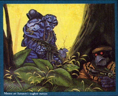
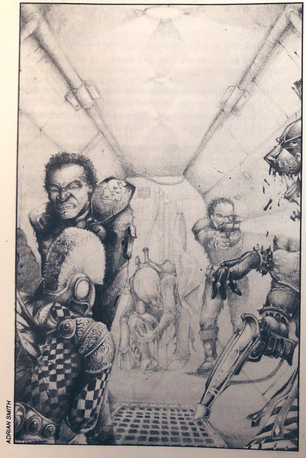
The original Space Marine box artwork. This was from a time when GW used to commission work from different artists, I think part of the reason there was such a divergence in the representation of the universe at that time. You can see how the conception of a marine has changed since that time - not a sword or look of righteous indignation in sight, these are the 'Sardakur' of 40k, desperately blazing away as they get blown to pieces.
I'm pretty sure this is one of Adrian Smith's early pieces. There was a ton of stuff that came out for the Tyranid Attack boardgame, with some of it making its way into the 2nd edition rule books. Again a really evocative piece of art, you feel really terrified for these scouts and what they had to face! The guys in this picture closely resemble the models of the time, even down to the sergeant (the guy with the pauldrons being waylaid on the floor!)
This kind of stuff doesn't age - you could put it in the next 40k eldar codex and it wouldn't look out of place. Simply beautiful in my book, this is the reason so many veteran collectors fell in love with the Eldar, and think WD127 was the best of all time. Again, I think Adrian Smith did this one.
Cover from 2nd edition Space Marine, sadly the resolution of this shot is much lower than the actual thing. I think it perfectly captured the scale of the combat going on, and what epic was all about!
I will post some more later on, as long as bandwidth allows!
Yep I like old art sometimes more feel to it and more inside jokes and really cool looking stuff, that I have to say is that the artwork of the olden days is good but compared to nowadays its actually more feel to it. More Personnel. I really wish GW got rid of the skulls and grim darkness. There isn't war everywhere GW Even that is theortically impossible. I studied Astronomy and most of the things in the 40k universe is ludicrous but still don't nail us down with skulls and such. Were talking about 800 billion square miles + thats A TON. Plus the milky way is just a dot compared to the rest of the gaxaly, this is related in depth and preception and geometrical figures, which is lacking in the newer 40k artwork.
Pacific wrote: The original Space Marine box artwork. This was from a time when GW used to commission work from different artists, I think part of the reason there was such a divergence in the representation of the universe at that time. You can see how the conception of a marine has changed since that time - not a sword or look of righteous indignation in sight, these are the 'Sardakur' of 40k, desperately blazing away as they get blown to pieces.
Haha yes that is well documented. But watch the movie - what is Al Pacino doing at this point? Desperately blazing away with his gun, and against overwhelming odds. You could say the artist chose the subject to copy well!
Well considering he's chose the most iconic image in a fairly iconic movie I'm not so sure it was a good choice. Unless his attention was for everyone to remember it as 'the boxart which ripped of scarface.' I litterally can't look at it without thinking "Say hello to my little friend!' A line which seems to have lost all sense of irony in the marine picture as the gun actually does look tiny.
But how many of the (especially younger) viewers would be aware that it's from a, what, 35 year old movie now? It's become wider knowledge now, but I remember some years ago on other forums that it had to be pointed out to most people about the resemblance.
And does it detract from what an awesome piece of artwork it is? (which I guess I am trying to say is the important thing!)
whatwhat wrote:Well considering he's chose the most iconic image in a fairly iconic movie I'm not so sure it was a good choice. Unless his attention was for everyone to remember it as 'the boxart which ripped of scarface.' I litterally can't look at it without thinking "Say hello to my little friend!' A line which seems to have lost all sense of irony in the marine picture as the gun actually does look tiny.
Personally I like how the artist got so caught up in copying the still frame that the marine has a bare right hand that is a careful copy of Tony's. There's no reason at all for him not to have a gauntlet there other than the artist going "Well...whatever, that's a quality hand, I'm keeping it in there!"
This is one of my favorite images of all time and is currently my desktop background. Fangorn was a sweet artist. Too bad they let him (and a lot of the other artists that really defined the game) go.
As for the trolls claiming that the older stuff sucks: At least each of the artists had their own distinctive style. Now all the gak looks the same except for Blanche's.
As you can see from my selections i am by no means a hater of the old art but i have to admit that the 'scarface dark angels' is one of the worst pictures from the past. It is completely artless, not only does he have to plagerise an iconic image but the proportions and perspective are atrocious and inconsistant with the hyper-real airbrush work. It is an example of how in the early days of 40k, blanche aside, the artists had no real idea of the setting and were just doing it (as tony montana would say) 'Forr de Maohnee'.
Perkustin wrote:As you can see from my selections i am by no means a hater of the old art but i have to admit that the 'scarface dark angels' is one of the worst pictures from the past. It is completely artless, not only does he have to plagerise an iconic image but the proportions and perspective are atrocious and inconsistant with the hyper-real airbrush work. It is an example of how in the early days of 40k, blanche aside, the artists had no real idea of the setting and were just doing it (as tony montana would say) 'Forr de Maohnee'.
I think you're wrong there.
What the artists were doing, was the style of the period.
Art evolves and styles change.
What they were doing was a lot closer to fantasy art, and I think more focused on the individual than on the greater picture.
That said, the perspectives were definitely off on a lit of things.
And one other big thing, is that while the old art made the universe seem gritty and dark, the newer art makes it feel GRITTY and dark in a completely different way. The old stuff had a note of light-heartedness to it and was brighter and almost cleaner. And the color was a lot more saturated. The new stuff really evokes the harshness of the universe and makes it all seem rather serious.
Not say one is better than the other, just interesting to see how its changed.
Brother SRM wrote:How does it feel to be wrong all the time?
Art is subjective. However, if you honestly think that old 40k art is better in any way other than comedy value, your art opinion does not hold much weight.
If it is subjective, which i agree entirely that it is, then no one person's opinion holds more weight than any other.
Though how much worth you attribute to a piece of art can be entirely subjective, you can say things like "I think this 5 year old's sketch is technically superior to this professional artwork" and be just wrong. There is some room for objectivity in art.
No. If someone thinks a 5 year old's sketch is better than a piece of professional artwork they are not wrong, as it is judged from their own perspective. The fact that you find their opinions awkward doesn't mean they are wrong.
Did I say "better"? No, I didn't. I said technically superior. As in, using advanced techniques, accurately portraying the subject, scale, shadows, etc. Please read more carefully next time!
You did however imply it by saying old art is worse for all but 'comedy value'. It's in your own multiquote.... You only took up the 'technically superior' argument AFTER being challenged.... Note: it is absolutely fine if that is not what you initially meant....
Perkustin wrote:You did however imply it by saying old art is worse for all but 'comedy value'. It's in your own multiquote.... You only took up the 'technically superior' argument AFTER being challenged.... Note: it is absolutely fine if that is not what you initially meant....
It's not what I meant. Some old pieces are pretty thematic. If you read my other posts this would be obvious. Most old art, however, is straight up hilariously bad. Really, just read through one of your old books. Don't cherry pick. Imagine how you would feel if a piece of art of that quality was in a modern warhammer book.
Sure perhaps I did misread that, but then it's a completely different point to what you were making before and doesn't really do much to defend your earlier statement.
I Like both, but what the old stuff lacks in granduer it gains in depth , the old pics told stories of nearly every kind of creature, Now the illustrations , as i wouldnt call it art , is technically immpresive to be sure , but its job now is not to create anything new just make the models look good and add abit of depth to the miniature range. The old stuff is not just illustrations for cash , its born out out pure love, its ART in the sense that its creating something absolutely pure and creative. Its job was to not just be DRAMATIC! like nearly every single bloody boring piece i see these days , it was themeatic, it created a universe , and its arguably one of the reason 40k is still around today, john blanche more than anyone created 40k with his Thousands of little drawings that went on to become actual charters or chapters or stories , then miniatures and more miniatures. Now when i see the hyper real pictures i think wow i wish i could draw like that, but not really , i prefer substance over style , and even though people like the kopinsky guys work is Amazing , its still a league behind , what blanche was doing, and maybe thats becuase he was artistic director and had more creaive freedom , but still , i think if i had to choose it would be the tiny cartoons preferably grimdark for the most part , with a few huge dramatice Paintings. and even though lots of the old art was not technically as acurate at anatomy or whatever , it was good enough for me .
I dont think white dwarf should replace their art with the ones shown here, but going back to the odd black and white\comical style from the odd page here or there couldnt hurt. Im sure they would use high quality artists to do it too.
Simon Bizley is well known to add that hardcore\awesome sci-fi with a mix of funny.
I think the consistancy and technical quality of the art has improved as GW has matured and become a more professional entity.
Thing is, thought, the old art was about stuff being made up right there and then. It wasn't yet decided that marines had only a thousand chapters of a thousand men each, they were just the guys in power armour, and artists drew things about that as the ideas took them. 40K developed, and they gave it greater consistancy and that was needed, you can't just keep making up new ideas and throwing them in there, at some point you have make the whole thing make some level of sense, you have to make good on the ideas you've already got. Otherwise you get Rifts.
But goddamn I remember studying every detail of those old pictures, prizing out every clue for what the 40K universe was really like. It's quite something to see an incredibly detailed world be invented right in front of your eyes. Sad really, but you can't ever go home again.
Some of that old stuff is fantastic. Some of it is awful. But I still love quite a bit of the RT and RoC era material.
There is a depth of character and atmosphere in the original w years of 40k art that many new pieces lack. They make up for that to some extent with superior composition and a consistent vision.
So it is a tradeoff. That said, the current crop of artists are phenomenally gifted, and new art is by far my favorite thing about new Codicies and Army Books.
As for Blanche...suck it. His Epic 40K and Sisters covers alone are worth every less detailed doodle. And some of those doodles are awesome. I was pretty stunned by his sketchbook this year at GD Baltimore. If being able to appreciate the frenetic detail and character of his art means I have no taste, then so be it. I have a feeling, based on anecdotal evidence, that actual artists are frequently impressed by what he does. If the cheap seats can't or won't see it, too bad for them.
whatwhat wrote:Sure perhaps I did misread that, but then it's a completely different point to what you were making before and doesn't really do much to defend your earlier statement.
My saying that they were *only* good for comedy value was a misrepresentation of my posts. That is why my next post reflects differently. Is that a problem?
Old 40k art had some character. Some of it was funny. Some of it was cool. Almost all of it was poorly composed, and a large amount of it was just overall awful.
Funny, I've always loved the way the old Marines were depicted. I love all the individualism they had. I was just looking at John Blanche stuff today I'm inspired to start a Marine army where there is a theme, but no 2 are painted the same. I'm really glad I found this post.
I like where the art started as well as where it's been developed to today. I'm an old school comic book fan (That's Kev O'Neil art OoieGoie, one of my faves along with The Biz!) and kinda getting old so I remember and appreciate that style. I'm lucky enough to come from an area that was a Comics Mecca at the time, The Words and Pictures Museum was 10 minutes away and I used to be a volunteer there So I got to meet a lot of people and just be surrounded by the art, it was great. I'm sure that's why I like the old style so much.
Ah I love that picture. It's worth pointing out as well to the younger viewers on here that some of these scans have lost a lot of their original resolution.
Here are a few more:
This one, from GW's own site, many will recognise as the cover to the Deathwing expansion for the original Space Hulk game. The two above are both Christopher Fangorn (he was also well known for doing the 'Redwall' fantasy series book covers). Deathwing also featured, IMO, the best short story ever written for 40k! It was republished in the 40k anthology of the same name several times, I'm not sure if it's available now?
Finally, Thrudd was always one of my favorite parts of WD when I was a kid. Not sure if it's possible to read this properly, you may need to zoom.
I cam in during 40K 2nd Edition so my art nostalgia is for that, especially anything painted by Mark Gibbons (still my favorite ever GW-associated artist).
The older stuff certainly had more character it, but the newer art is better quality. I like some of the quirkiness, and some of the technical detailing, but I feel that 2nd Edition was when they hit just about the right balance. (there's an image of a Blood Angel in the old Codex Imperialis that just scremed GW/40K tome)
Found it!
And later in the same book there was an Eldar Warlock with the 'MG" signature that all the best 40K art had
And while we're on the subject of art, I just want to say I've never understood the attraction of John Blanche's style. Sure, the subjects he depicts are inspiring and diverse and the very inspiration for many gw sculptors and artists, but the style is just a bunch of messy scribbles. I'd much rather have tighter and more focused art, as can be seen by my two examples above.
John Blance is an acquired taste I think. I used to hate his illustrations in my earlier years. But then something happened, I think I hit my head really hard or just realized what a great artist he is. I think it's the latter, since it was a couple of years ago and I realized that most JB-stuff were way more telling than the "show space marine doing something"-generic-art that was out there at the same time. John Blanche's artwork stood up to so much more analyzing than much other "technically good" 40K/Warhammer art during the late 90s.
Whoever posted those pics of horus and the emperor has a good point. The older one, the characters are posed to give a sense of confrontation and danger, in the newer one they're just fronting the picture, posed so you can see all their bling. Also, you guys notice that the backgrounds of the bigger pictures are all super-busy? There's very little empty space. Sometimes I think they over-do it a little.
Now, a selection of work from one of my favorite artists, Les Edwards. There is a ton more of his stuff at his website, see here http://www.lesedwards.com/index.php I used to have a book with his art in, GW released one with a selection of everything, not just the GW art (as well as another artist, I forget his name) but I left it in the store I used to work in but the dullard manager they had there later lost it :(
I love the style of this guy, you can tell it's late 80's from the use of oils, but it doesn't detract anything from the style.
Enjoy
Cover from an old WD.
As above, you can see how the conception of a marine has changed since this painting.
He did a selection of the Dark Future artwork.
This one was the actual cover from the game.
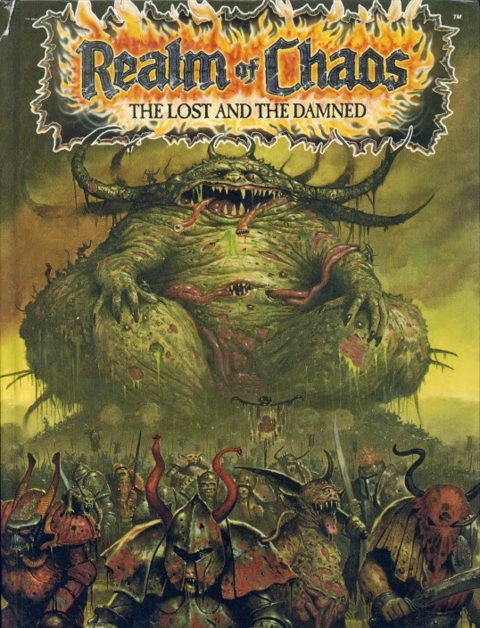
This one will be close to many hearts, the cover from the Realms of Chaos book.
The 'Heroquest' box game, another favorite of many people.
A cover from WD, I'm not sure if it was used on anything else?
I won't get into the believable representation vs. emotive expression argument... the art world has been inconclusively battling that one out for at least 2000 years.
I will say though that one thing I like about the older art that seems to have been lost (for at least 40K) is the way the old art wasn't afraid to poke fun at the "heroes" of the game. When you see Space Marines busting mohawked punks and Eldar as skinny glam rocker fans with stupid hair, that warms something deep in my crusty heart. These days, it seems that GW is so focused on making the enemies of Chaos so Mary Sue that they can't ever be less than the ultimate godlike saviors of the galaxy. Which is an odd way to portray factions that would readily commit genocide if it was convenient for them.
I shall sacrifice yet more bandwidth for a couple more pics
Cover from the Warhammer 40,000 Compendium, which was an addition to the original Rogue Trader.
Both of these really show the different conception of marines back then.
One big thing which you can notice the difference with: The dead marines! Modern artwork (I say 'modern' but really anything second edition onwards) seemed to make marines immortal. The 'dead' marines in most modern artwork look like they may be lying down to rest for the most part, and you could certainly not say conclusively that they are dead. Now look at the marines in the pictures above; those guys are fethed! Melted from the inside, or even a fire inside his skull. Ain't no way either of those guys are going to be getting up from that one, even the guy at the top is probably only being rescued by the medic so his progenoids can be harvested So 40k is indeed grimdark, and more in some ways nowadays, but not as much as used to be for the guys with large shoulder pads!
I prefer the older depictions of Marines as they seem more like space soldiers. Now they go in for this overblown super-human-gothic-space-monk-religious stuff, too many tabards and bling bits on their armour.
Someone posting earlier commented on how unkillable Marines are portrayed now, and they had a point. GW constantly push the Marines and being so tough and awesome now, to the point where the eclipse everything else. In the current art that are always colossally huge and tough looking to the point where they look silly with pea-sized heads poking out of huge armour, and often they are standing about just to show off their bling.
jamessearle0 wrote:the old stuff looks god awful, next thing people will be saying how awesome blanche is, personally i think all blanches work looks like a childs drawing of a transvestite
Wow really? Blanche is an extremely talented artist. Just because is stylized and gritty doesn't mean it's inferior to something "realistic". It's art.
Howard A Treesong wrote:I prefer the older depictions of Marines as they seem more like space soldiers. Now they go in for this overblown super-human-gothic-space-monk-religious stuff, too many tabards and bling bits on their armour.
Someone posting earlier commented on how unkillable Marines are portrayed now, and they had a point. GW constantly push the Marines and being so tough and awesome now, to the point where the eclipse everything else. In the current art that are always colossally huge and tough looking to the point where they look silly with pea-sized heads poking out of huge armour, and often they are standing about just to show off their bling.
I'm new to Warhammer. I'm 21 and have only been playing for about 7 months or so now, so the "new art" is what I started with.
Having said that. I love the old art. I think it's amazing in it's own way. It has a great feel to it and I can't help but feel an attachment to it
even though it's not familiar to me.
And to anyone who speaks poorly of the old art,
I have this to say:
Edited for content. MT11. Now they look alright but their coneheads made me get imperial guard instead. (Yes, I almost bought a bunch of Eldar but their cone head stormtrooper helmets turned me away.)
A few more, this time from John Sibbick, who painted perhaps one of the most famous 40k images of all time. For many people, I think this first image is a representation of what 40k is all about - the dark future, where mankind is fethed, but is going down fighting
A couple of the band 'Bolt thrower's' covers featured GW art
The original cover, but a minimized version of this guy stood next to the White Dwarf logo for many years after.
In the spirit of the thread, here are some of the older ones he has done and people might not be aware of:
Another pic from 'Tyranid Attack' (has anyone got a scan of that one with the RT style Nid warrior fighting the Striking Scorpions? The warrior is picking up one of them by the arm. I believe it was Adrian Smith also, but sadly I can't find it anywhere, and it's an awesome picture).
Orc Freebooters
Necromunda pic
From the days before photoshopped pictures with the weapons upside down, the old rhino box cover
Pacific wrote:Now, a selection of work from one of my favorite artists, Les Edwards. There is a ton more of his stuff at his website, see here http://www.lesedwards.com/index.php I used to have a book with his art in, GW released one with a selection of everything, not just the GW art (as well as another artist, I forget his name) but I left it in the store I used to work in but the dullard manager they had there later lost it :(
I love the style of this guy, you can tell it's late 80's from the use of oils, but it doesn't detract anything from the style.
Enjoy
A cover from WD, I'm not sure if it was used on anything else?
[
This is from one of the heroquest expansions as well, Kellars keep it was called.
Great art all round guys, having started 40k in 2nd ed I recognise and love alot of the old stuff, (I picked up a copy of rogue trader too) the new stuff is cool n all, but as a few people have stated its all bling and skulls and grim dark grim darkyness, not a whole lot of fun.
I also am a great fan of Mark Gibbons, so many of his pictures pop up in my mind as favs.
OK, here are some from Mark Gibbons - most of these go back to 40k 2nd edition (or from codex releases from that edition), and it's amazing how good they still look today:
I would thoroughly recommend a look at his website (he has done a great deal more art than just GW) and they even have some old GW pieces for sale (I would buy the avatar if it I had $1000 ) http://www.redknuckle.com/
This one is one of my favorite ever pieces, I played around with the resolution on these, but sadly I still couldn't get them close to the original.
Do you mean the one with the howling guy with crazy hair (I'm not sure if he was a bloodclaw?) or the space wolf terminator? Both pieces were by Mark Gibbons.
Pretty much everything Mark Gibbons did in the 2nd ed Wolf codex was golden, espicially Bjorn, the blood claw one, and Njal too, and the wolf guard, and not to forget the wolf scout one.
Hmmm if no ones got pics of those I might have to scan them and put them up.
John Gravato has done some dark and dynamic stuff. A lot of it dates back to the Dark Millennium card game, and the days when GW was being a little more prolific with the licensed products.
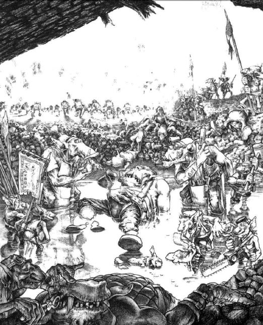
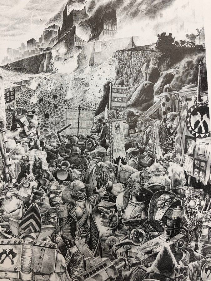
To resurrect this thread, here are some old pieces from the 1st edition epic game (where the whole 'Horus Heresy' concept was created). I love these, with oodles of little marines blowing each other up, and think they are wonderfully characterful!
I will see if I can get hold of my copy of the 2nd edition epic rulebook, that had some real crackers in it also.
There seem to be a lot of rose colored glasses running around in here. People just picking up the hobby today will probably feel the same way as a lot of you do 15-20 years from now.
For me personally, there were two pictures that defined 40k: the cover of the 3rd edition rulebook (with the black templars) and the cover of the old Sisters of Battle codex (the woman with the white hair and hazard stripes on her pistol).
If either of those pictures were published today (or pretty much any of the ones posted in this thread) they would probably be met with the same derision the current Blood Angels codex cover receives. And then later on, people for whom the BA codex was the first taste of the 40k universe will claim that it "had character." That's just how nostalgia works.
I liked all the artwork up to about 3rd edition, then I found the whole artwork theme of everyone look left...everyone look right...everyone look forward to get repetetive , boring and just stupid, I can't stand most of GW's art today because of that
bushido wrote:There seem to be a lot of rose colored glasses running around in here. People just picking up the hobby today will probably feel the same way as a lot of you do 15-20 years from now.
For me personally, there were two pictures that defined 40k: the cover of the 3rd edition rulebook (with the black templars) and the cover of the old Sisters of Battle codex (the woman with the white hair and hazard stripes on her pistol).
If either of those pictures were published today (or pretty much any of the ones posted in this thread) they would probably be met with the same derision the current Blood Angels codex cover receives. And then later on, people for whom the BA codex was the first taste of the 40k universe will claim that it "had character." That's just how nostalgia works.
You are correct on some counts (some of the old artwork was tosh, especially around RT) but I also think because GW used to outsource to professional artists the 'cream' of it, the examples I and other people have posted on here (cover of 1st and 2nd edition epic, the Christopher Fangorn Space Hulk stuff, Les Edwards' Heroquest stuff etc.), was better I think.
On your second point, you're right - although there wasn't the internet community around back then, I remember there was actually a bit of derision directed towards the 2nd edition boxset when it came out. It was certainly a busy piece of art, but technically it paled in comparison to some of the oil-based art that had come before it (if you remember it had come out just after 2nd edition Epic, with that incredible Ultramarine/Titan cover - really the scan below doesn't do this justice compared to how it looked on the box, the resolution was much higher). In that sense, people seemed to have warmed a bit to the 2nd edition boxset over time.
I would still argue that the old 1st edition Compilation cover was better than that of the new BA dex however
Would any of you be able to tell me which White Dwarf copy, or rulebook shows an Epic 40K scene of an Ork city being held siege by Space Marine titans. I had the mag ages ago and supidly gave it away:(
Is it perhaps in the 1st edition Space Marine Rulebook Compilation?
That's a great sire and love the scratch build imperial fortress. Hmm, don't happen to have done the old firebase as well? That was by far the scenery peice I have the most love for and I'm loving their temple of skulls just now. NOT LIKE THAT!!!! The plastic would be too cold to cuddle at night...
On about the artwork, I loved the old style. It fitted what other artists were doing for that section of art genre at the time either in comics like 2000ad or books like the Lone Wolf series. Yes a long time has passed and theres been advances in printing, how they can make the artwork etc. But I still believe that the RT stuff has an appeal to it, from either nostalgia or simply because often that artwork inspired a new model!
Oh and look at the old RT era craftworld eldar stuff. Only WD number I can ever remember correctly 127 That can still be used today and look great, in fact... some has been
Think 127 is possibly one of the greatest ever issues of WD, and that artwork is the reason that many began a lifelong love of Eldar and their imagery.
Vermillion wrote:That's a great sire and love the scratch build imperial fortress. Hmm, don't happen to have done the old firebase as well? That was by far the scenery peice I have the most love for and I'm loving their temple of skulls just now. NOT LIKE THAT!!!! The plastic would be too cold to cuddle at night...
On about the artwork, I loved the old style. It fitted what other artists were doing for that section of art genre at the time either in comics like 2000ad or books like the Lone Wolf series. Yes a long time has passed and theres been advances in printing, how they can make the artwork etc. But I still believe that the RT stuff has an appeal to it, from either nostalgia or simply because often that artwork inspired a new model!
Oh and look at the old RT era craftworld eldar stuff. Only WD number I can ever remember correctly 127 That can still be used today and look great, in fact... some has been
I do have a brand new firebase that I plan to get lasercut and built like the imperial commander tower on my blog.
*cries* My old one got left with friends along with a hell of a lot of scenery when I did a long distance move. Wouldn't mind seeing the results, just for you know, curiosity sake
The changing art of GW is an interesting example of how the company itself has changed, though. In the early days, GW's management used their networks and contacts to commission art from people like Les Edwards (this was before the Internet, remember?), and in-house art was often done by people doubling up jobs. Tony Ackland illustrated most of the first edition of Warhammer Fantasy Roleplay and contributed art throughout the range despite not being an artist but a game designer.
John Blanche worked with Ian Livingstone and Steve Jackson on their Fighting Fantasy books and got drawn across to GW that way. Adrian Smith is interesting for having been in the early studio and returned to it. Comparing old and new illustrations by him is fascinating - he's moved from pencil to paint and gained a superior grasp of perspective and the use of diminishing detail, but certain stylistic elements remain.
Dave Gallagher is remarkable for having hardly altered his style at all in nearly twenty years.
As for the marmite qualities of John B's art, I can recall finding his work quite repellent in my early teens, when I was reading Fighting Fantasy. I wanted my fantasy worlds to be shining and beautiful or at least attractively dark (I was a big Frazetta/Vallejo/Dean fan), but John illustrated (and still illustrates) a universe that is cruel, dirty and painful.
As I matured, I came to appreciate his work better and now recognize in him a master of conceptual expression. I recently had the opportunity to meet him in person - he's a lot shorter than I expected!
Put me as another in the category of people who found John Blanche's work less appealing and enjoyable when I was a teenager, but increasingly appealing and evocative as I grew and matured.
This guy right here misses old 70's art i have a stack of 70's white dwarfs and heavy metals my uncle handed off to me before he moved good stuff. My favorite old school images i have floating around on my computer
I notice a lot of people moaning about John Blanche's art. With the exception of that period where he was churning out incredibly poor inkwork in b+w as an "experiment", his artwork has remained consistently good, well-suited to "GrimDark". Ratspike (His shared art-book with Ian Miller) is my bible. Also, he and many of the other older artists have a considerable body of work that has nothing to do with GW.
There is a certain feeling of "rote" in the new art..as if they are all the same picture, and all one must do is change the colour of the armour for the next codex.
And that last Imperial Guard art is the whole reason I ever collected so many of them in the first place. An Epic regiments-worth in 28mm. A lot of people found a lot of inspiration in those pictures, pictures which share a great deal with many classical works in both scale and content.
I've never really liked Ian Miller's work.
But, since his LoTR stuff got used heavily in the LoTR movies, I've warmed to it a lot more.
Looking at these, and those in the little BRB, they're more in line with the Grimdark feel.
Ian Miller's illustrations for James Herbert's graphic novel continuation of the "Rats" stories, The City, are some of the most disturbing art I've ever seen.
precinctomega wrote:Ian Miller's illustrations for James Herbert's graphic novel continuation of the "Rats" stories, The City, are some of the most disturbing art I've ever seen.
R.
Amen to that. Though Millers style is hard to reproduce on a mini. All those thorns are more deadly than a fully ranked unit of plastic goblin spearmen.
I dont miss it, as i dont lived that "age". But they where better for sure... Not in the pure way, new art is tecnically superior, but soulless.
Those pics show you the grim dark future of 40k. The new art dont, the new art resemble pop epic sci-fi.
And it is very clear how space marines changed. They where real mans, just the better of the real mans. Now they are 2,5 metter tall piles of muscle and hardened bones...
Posts like this make me fell like i had born 20 years later than i should...
Some great pictures there MeanGreenStompa Totally know what you mean about the Les Edwards pic, some of his stuff was really disturbing, and absolute nightmare fodder for any 12 year old with an imagination!
Next up, here is some art from the 1st edition Space Hulk Expansion 'Genestealer', done by various artists
"I'm sorry, I forget you said you wanted it alive!"
Chaos genestealer cults, one part of the lore that didn't make the transition to the modern era.
There used to be a number of quite awesome genestealer cult armies in 40k, this shows the various generations of hybrid. A few dedicated enthusiasts even run them nowadays with home made rules.
Pretty sure this guy used to do 2000AD art as well.
d-usa wrote:I'm tired of the Ultramarines getting all the cool rocket-lawn-chairs, when will GW quit stuffing those space-smurfs down our throat!
I remember when I actually still had that same model. It was the old metal Land Speeder form 2nd edition. When did the current style get released, 3rd or 4th?
Edit:
Found it:
Not quite as bad as the picture, but I liked it. I was mad when the new model came out.
Automatically Appended Next Post: Found the 1st Ed Land Speeder, compared to it the original picture doesn't look to bad:
I loved those 2nd Ed speeders, but as a kid I couldn't spend the $30 to add any to my army. I got a pair of the old RT ones off of eBay (in 1996!). Very much a pair of flying lawn chairs and absolutely the worst models I've ever had to work with. None of the pieces fit together. Not one.
Genestealer cults are still in the canon (they appeared in Henry Zhou's first short story for BL in the Planetkill anthology*), but genestealer chaos cults... well, they haven't gone away, exactly, but they're certainly a lot harder to squeeze in to the canon now that Nid canon has been expanded a lot.
They were removed from the game (genestealer chaos cults, that is) for the simple reasons that they were absolutely and unbelievably broken beyond all reason!!
Man, that was an awesome game...
Anyway, @Ratius - Um... The graphic novel isn't bad per se, but it's much more an advert for Miller's art than it is for Herbert's writing. Let's leave it at that.
@Pacfic - Yes! Gary Harrod! I've been trying to remember his name since this thread started.
Yep you still see the occasional Genestealer cult army, and they haven't been 'squatted', it's just that there is no official rules representation for them any more. I think the last one was Gav Thorpe's set of rules going back to 3rd edition, although I may be wrong with that one.
A few years ago Games Day UK had a massive model display game with hordes of cultist troops (I think loads of GW stores had to convert models for it), so it is still definitely supported as a concept and an established part of the Nid background, even though you can't get special rules for Magus' driving around in limousines any more
I always like the old style sci fi that is depicted in Fallout 3. (for those of you who have played Fallout ) Classic sci fi, with a dark and gritty look.
Some great old stuff posted here. Brings back so many memories.
For my own two cents, I think every period has its great pieces of art and its stinkers, but I don't think the overall quality is as simple as 'One was mostly bad, the other was mostly good', rather I think the overall quality of art peaked between 3rd and 4th ed and has actually gone downhill a little now.
My justification for this is mostly the art in the section of the BRB where each race is detailed. Check out the tyranid warrior in the 4th ed book on their page, then compare it to the bland, uninspiring beastie in the current rulebook.
What I liked about 3rd ed was that a lot of the art still had the oldschool atmosphere, but the majority of the artists were technically accomplished.
Personally, I think GW should lay off that guy who did (amongst other substandard pieces of art) the current BA codex cover. On a side note, did he do the 3rd ed BA codex too? The art seems quite similar.
Isn't the BA codex cover a John Blanche piece? I don't think they're laying off the guy who's been their art director for decades, and who is responsible for the overacing "feel" of all of their art. Blanche isn't to everyone's tastes (and I think there are issues with the central figure on the BA codex cover), but overall he's an amazing artist and central to GW's art in general.
George Spiggott wrote:I love the old Ian Miller stuff.
I was actually hoping that this thread would be about stuff like this:
Ahhh yes a Melvyn painting, and a badass one at that! I own the entire series of Galactic Encounters and Terran Trade Authority books, as well as dozens of others including Jim Burns. Love all that stuff, it blew my mind when I was a kid, and still does to this day.
Peter Elson is my favorite.
Art in those days seems so boundless, so innovative. Those artists were pushing borders and influenced by the emergence of technology. There really weren't any rules or established parameters, they just painted directly from their imaginations.
Not saying that isn't still happening, mind you. The new artwork GW produces is pretty effing phenomenal, and as others have mentioned, technically perfected.
I wish GW would publish a comprehensive artbook, or hell, any artbook. I'd be so there and have to get it covered in plastic to prevent my drool from ruining it.
This iconic painting from Jim Burns...wow! My god it just makes me want to race into my painting room and start cranking out models!!!
From their imaginations and screenshots of Scarface.
Yeah I saw that, very funny. You could almost directly overlay them for a perfect match. But, doesn't change my opinion of the excellence of the painting or Jim Burns.
Pacific wrote:Ah thanks for posting that pic of the eldar and the nids Grim.Badger, I had asked if anyone had a scan of that earlier in the thread
Cool, glad to help! I haven't read much of the text in this thread as I don't like knowing too much about the origins of peices of art as occasionally it can somehow ruin/change the feelings I associate with it.
This piece though was one that really stood out to me as a kid
Here's some more:
An insane looking Runtherd:
Tech Priests discussing a sample:
A rather miffed beurocrat:
And probably one of the first group picture of Orks that fits the current IP:
Exalt from me - lovely jubbly. The older art looks more bleak but not in a GRIMDARK sort of way. And they're still using a lot of old art in the modern books from what I've seen. Also glad to see they've got Paul Bonner back doing artwork (did he ever leave?). He did so much to shape the early visions of the Orks from Waaagh and Ere we go. Quite a lot of it showed scenes of Orks in day to day life that you do rarely see these days. I Loved the picture of the Ork sitting on the snotroom "finkin'"!
zedmeister wrote:Exalt from me - lovely jubbly. The older art looks more bleak but not in a GRIMDARK sort of way. And they're still using a lot of old art in the modern books from what I've seen. Also glad to see they've got Paul Bonner back doing artwork (did he ever leave?). He did so much to shape the early visions of the Orks from Waaagh and Ere we go. Quite a lot of it showed scenes of Orks in day to day life that you do really see these days. I Loved the picture of the Ork sitting on the snotroom "finkin'"!
Zedmeister, don't suppose you know what artwork he is doing these days?
I agree about the change in fluff with regards to the orks. They used to be much more of a separate culture of their own, closer to brutish humans in some ways, with their own society and way of life. Now they are much more bestial, and in some accounts do little more than drop from a mushroom screaming and run towards an enemy and die. Certainly, the concept of them sitting still, or not killing each other, for long enough for them to board a starship and form any kind of organised attack seems more and more outlandish in the current background.
Although it's completely down to personal taste, I think I probably prefer the older background simply because there was a lot more depth to it!
He has credits in that book (including the poster) and I think he's done work for IA9 and 10. Certainly if you look at a lot of the Ork images in IA8 and compare them to the older ones in Ere We Go, there is a similarity in style. Personally, I think its a shame they can't make him the Ork visionary in the same way Jes is for Eldar!
I must admit that when looking at most of these images without the taint of nostalgia, they're just not very good.
A few of them are made by people with lots of technique, but no artistic ability. Most of the images just look like Rorschach ink-blots. A huge pile look like unfinished sketches where a cat tipped over the inkwell and had a stroll around in it. Almost all of them are very badly proportioned. The vast majority looks to be sketched by a small child, then shaded by someone who knows what they're doing.
There are a very few exceptions, where the images are very evocative and disturbing because they look like mutated images that salvador dali painted as a child. And there are a very few exceptions where the images are really very good, like the vampire coming in through the window for example, but these exceptions are few and far between. I'm glad I hadn't heard of WH40K when the art style was like this, because then I most definitively would not have got into it. It looks like children's horror picture-books.
I think that to miss the old art over the new art is a powerful case of nostalgia-bias, because any objective observer can tell that the quality, artistry and "soul" of the new artwork far exceeds the old stuff.
But to avoid this being a complete rant, and a waste of all of your time, here's some pics I can't say I've seen in this thread. Feel free to remove them if they've already been posted.
Searching here on Dakka I also found a thread called "the nostalgia thread". I don't know if it was for models or art (I didn't check), but there might be something in there.
I think that to miss the old art over the new art is a powerful case of nostalgia-bias, because any objective observer can tell that the quality, artistry and "soul" of the new artwork far exceeds the old stuff.
.
You should have been here a few pages ago
I would argue it is still deeply subjective (I mean, how can you say something has any kind of 'soul' and say it is an objective judgement??), but in any case thanks for the new pictures. And, fortunately enough people did like the artwork at the time that we still have a 40k around nowadays and even more artwork to enjoy
I think that to miss the old art over the new art is a powerful case of nostalgia-bias, because any objective observer can tell that the quality, artistry and "soul" of the new artwork far exceeds the old stuff.
.
I would argue it is still deeply subjective (I mean, how can you say something has any kind of 'soul' and say it is an objective judgement??),
I can tell that many things have "soul" even if I don't personally like it. Lots of music for example, and more related, visual art. In some works of art, you can tell that the artist "feels deeply" for the work he/she creates. I use the word "soul" for lack of a better one.
Looking away from the "soul", there's no doubt that there's a level of skill and quality which also figures into the comparison. Proportion and perspective is almost completely lacking in the earlier stuff, and that makes it look childish and unprofessional.
Your claim that a lack of perspective or proportion somehow invalidates the quality of the art is misguided.
Consider religious art from the medieval period. Perspective had yet to be invented and relative scale and proper proportion was rare. Do those factors make that art any less important than what came about during the renaissance and after? Of course not. The older works have an important task of conveying what the culture was like then.
I think it's very similar to the progression of the art that GW puts out. The early stuff was created by people, perhaps less talented, but those who had the vision, to get the larger moires of the fluff across and inspire future generations to create their own art and attract "better" artists.
That said, it's all subjective and everyone has an opinion. Some people hate this stuff. Others love it. For a lot of us, it encapsulates a time period and holds strong memories.
Your claim that a lack of perspective or proportion somehow invalidates the quality of the art is misguided.
I never said that. I said the lack of perspective and proportion made it childish, ugly and silly. I think it looks stupid when a space marine's individual boots are bigger than his entire torso. But that wasn't my only reason for not liking it. Not even the main reason.
92acclude wrote: Consider religious art from the medieval period. Perspective had yet to be invented and relative scale and proper proportion was rare. Do those factors make that art any less important than what came about during the renaissance and after? Of course not. The older works have an important task of conveying what the culture was like then.
Importance and quality are two different considerations. I never said the old art wasn't important. I said it looked silly and childish. Personally, I don't think old religious art is very good or of high quality. It may have been compared to other art at that time. But we're not at that time. We're now, and we have to compare it with what we have now. And compared to current warhammer art, the early stuff just can't compete. Unless you have nostalgia-bias, that is. Which was my entire point.
92acclude wrote: For a lot of us, it encapsulates a time period and holds strong memories.
Which is the very definition of nostalgia-bias.
Here are a few more images I found. Some of them will most likely have been posted before, but hopefully there's some that hasn't been as well.
It's a different style from GW's 'house style' but I've become kind of fond of the 60s/70s art by Ralph McQuarrie and others. McQuarrie is well known for doing concept art for the original Star Wars trilogy, but I believe he (or someone in a similar style) did some really neat illustrations of proposed colony cylinders (spinning 'tin-can' space colonies, like Babylon 5) and such that had a neat optomistic/realistic mindset.
Seeing all the RT era artwork really takes me back, since that was when i was first getting into the hobby, it does however make me wonder why i even got into it in the first place, never liked the artwork back then, and for my personal tastes it really seems to have aged badly, i prefer the crisper art you get now.
Importance and quality are two different considerations. I never said the old art wasn't important. I said it looked silly and childish. Personally, I don't think old religious art is very good or of high quality. It may have been compared to other art at that time. But we're not at that time. We're now, and we have to compare it with what we have now. And compared to current warhammer art, the early stuff just can't compete. Unless you have nostalgia-bias, that is. Which was my entire point.
I think you really have to look at some of the earlier pages in this thread (3-4): The earlier work by Adrian Smith, Christopher Fangorn, Mark Gibbons, Les Edwards etc. is technically excellent, and I would say better than most of the artwork coming out these days. GW used to spend a lot of money commissioning professional artists (like Edwards) to do art for them, and it showed. I'm not saying all of it, because a lot of it is somewhat lacking (especially in the RT rulebook for example, but then they were trying to collect enough imagery for a brand new rulebook so I think that explains it), in the same way some of the modern artwork (the BA codex, if we want to talk about awkward proportion, or the GK picture for the cover of WD) is not as good as some earlier work.
Not only that, but the older artwork was more prolific, GW employed a lot more artists than they do now, and made more use of new art in both publications and on box covers (I would say photoshopped models are a poor alternative to a well done piece of art, but they are obviously a great deal cheaper). Take a look through the new O&G army book and look for new artwork to see what I mean, it is nearly all regurgitated from previous books.
I admit that this is in some sense because the game universes are a lot more defined nowadays - the artists have less opportunity to break new ground, and GW can be more firm in what direction, and specific area, they want the commissioned artwork to fill. As someone said earlier, most SM art now is screaming bald men, and in that sense I miss some of the sense of wonderment created by those older pieces of art - that you looked at them and didn't fully understand them, and that was what drew you into the universe, and made you want to pick up the book and find out more. Although, this is not so much a criticism of the art itself, but rather the culture that surrounds its creation.
But, thanks again for your posts of artwork - only a couple of the ones you have posted have come up before.
There is another thread in the 40k discussion section talking about ork culture (or 'kulture' ) which made me think of the RT era ork supplements. These books were absolutely packed with information about orks, and I think are a big reason why so many veteran gamers still have a soft spot for orks today.
So, without further ado, here is a selection of art from the 'Waargh the Orks' book. I'm still going through it, so will post more over the next few days!
As a side comment, note the pwnd marine in the picture above. As I mentioned earlier in the thread, a dead marine is something you very rarely see in modern artwork.
Didn't read the entire thread, but if you like sci-fi B&W art like that in the original post, you should defintely check out the "Kryomek" rulebook. It's packed with that style art and fluff and since the rules are fiddly and outdated, it's often avaialble quite inexpensively.
http://www.nobleknight.com/ViewProducts.asp_Q_ManufacturerID_E_-1086169478_A_ProductLineID_E_-66308237_A_CategoryID_E_5_A_GenreID_E_
Pacific wrote:There is another thread in the 40k discussion section talking about ork culture (or 'kulture' ) which made me think of the RT era ork supplements. These books were absolutely packed with information about orks, and I think are a big reason why so many veteran gamers still have a soft spot for orks today.
So, without further ado, here is a selection of art from the 'Waargh the Orks' book. I'm still going through it, so will post more over the next few days!
Edited by Mannahnin. Please don't quote giant images.
Why hello nostalgia and orky lovin'!!!! Damn I miss those days where you had so much info packed into books the rules fought for space with them. And ofcourse bolter wielding BS3 standard orks!!
As for the dead marines used to be loads of them through the books, like "Sister Sin" meltaing/flaming some Ultramarine in preultrasmurf days
++EDIT++ guys if you quote images, please put spoiler tags around them so people viewing the thread don't have to see the same things more than once!
Some more pics in between more scans from the old ork books. These are some pictures borrowed from the FTW blog, I hope that's OK!
I have no idea why but many of the pictures have either a sepia or other coloured tint to them. The originals were not like that, and I have no idea why it has been done to them. Perhaps copyright concerns? (Just fishing here, really I have no idea).
A black and white copy from the cover of the boxed game 'Tyranid Attack'. This game was made along the lines of other GW boxed games of the time, and featured squads of scouts travelling through the inside of a Nid ship to destroy its internal organs! I remember it being pretty good fun although it has to be at least ten years since I played it last. If anyone has a scan of the colour version (which had lovely vivid colours) I would be very grateful if they could post it!
Also, Mohawks are awesome. 2 things modern 40k art lacks: Dead marines and mohawks
Does anyone have a credit for this painting? It's beautiful
One of said pictures with said tinting. I think the Eldar have had some of the most technically impressive but also evocative artwork over the years.
And it's been too many pages without dwarves in space, let's have some Chaos ones
the current artwork is terrible
if the marines looked like they did in rogue trader I would go out and buy an army right now lol I think the skulls everywhere is stupid, and GW seems to have a hard on for skulls
92acclude wrote:that used to fill the pages of White Dwarf?
Check out more on my blog.
That was like....ULTRA!
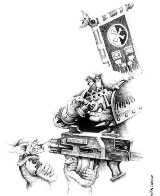
God I do miss the humour of old 40k. I think there are gems and stinkers in both the new artwork. Personally I love anything Steven Tapping did.
As to John Blanche, the guy can do amazing traditional art work, but most of his stuff is a.....aquired taste. I got a fever and the perscription is MORE COWBELL....I mean more Blanche. =o]
Sorry it has been a while but some more art from 'Waaarggh the Orks', this is a collage I have put together of Paul Bonner artwork which is found scattered throughout the book (and a lot of the books of this time)
I'm not sure why but the image has been shrunken when I posted it, the originals have got an amazing amount of detail and are higher resolution than this copy.
I think it's simply a case of both new and old art had their good and bad pieces.
Simple as that. I don't blame people for missing the old art, or preferring it over the new. Similarly, I don't blame anyone for preferring the new art. When I've got some more time, I would like to make a post compiling some pics that display how both the old and new had their good and bad artwork, but I think to flat-out say one era of artwork was bad is wrong.
Mannahnin wrote:Put me as another in the category of people who found John Blanche's work less appealing and enjoyable when I was a teenager, but increasingly appealing and evocative as I grew and matured.
I think it deserves mention that there is a large distinction between retro STYLE and *bad* artwork. It would be cool to get good artists to draw retro marines
As said, most of the RT art is just bad same with most of the RT models.. Some are good and retro, most are not
I really enjoyed Paul Bonner's work. It was a great bridge between the humorous but rough art from the beginning, and today's technically sound but overly-serious art. He had a lot of technical skill and a sense of humour.
Pacific wrote:Awesome stuff 92acclude, that's a much better resolution than the one I managed to find previously
Kirasu, I agree with you to an extent, although I would argue GW has not managed to match anything like that 2nd edition Epic cover box for instance
I agree with you, I loved both the boxed art for Space Marine (the scarface marine) and 2nd Edition Epic (the Ultramarine box). I believe it was Blanche who did the UM art for E:2nd ed.
I personally don't care for the 'huge armoured shoulders with tiny heads so you see how massive my armour is and how much blng I have on it' marine artwork of today. It was Mr Sibbings artwork of the Crimson Fists last stand artwork that drew me into 40k. I took one look at that cover art and said to myself "I must own this and find out who the hell these guys are!".
Unfortunately allot of it is too much humour...although that's probably due to me joining 40k in 4th...I think...
Anyway I found a picture ages ago...was a lovely piece of fan art that I think encapsulates the style of the old art...yet uses the more modern arts themes...it was a dead sob with an emperors prayer book open beside her...anyone know where I could find that again?
Or does anyone have it?
Sorry if that last bit was off topic :/
Hmm that last one is definitely the guy who used to do Kano and the comic strip 'Bad Company' in 2000AD in the early 90's, can't remember his name unfortunately.
2nd one down, I always though the Spider motif and black striped armour with grey fatigues was the Necomundan regiment? Guess I was wrong about that one
3rd one down was the cover from the 1st edition Terminators boxset. Used to be a bunch of termies in there for about 12.99, boy how times change
Great stuff anyway, I'll try and get the final scans from the 1st edition Ork books up soon.
Pacific wrote:Hmm that last one is definitely the guy who used to do Kano and the comic strip 'Bad Company' in 2000AD in the early 90's, can't remember his name unfortunately.
It's from Chainsaw Warrior, a single-player boardgame. The mid-game baddie was the Meat Machine, but I can't remember the end.
Pacific wrote:3rd one down was the cover from the 1st edition Terminators boxset. Used to be a bunch of termies in there for about 12.99, boy how times change
That box is the reason I restarted playing 40k. I found it in the loft, and bought the AoBR to add it to.
I sure as hell dont miss old Ork art. God they looked awful back then. Most art has only improved from edition to edition, how much better the DE look in the 5th vs 3rd Codex is a good example.
Harriticus wrote:I sure as hell dont miss old Ork art. God they looked awful back then. Most art has only improved from edition to edition, how much better the DE look in the 5th vs 3rd Codex is a good example.
I know this thread is too long now, but you don't have to read it, just look at the pictures posted over the last half dozen pages to see that there was some damned fine art earlier in GWs life, a lot of which has never been surpassed.
ph34r wrote:Many old pieces had a great deal of feel and atmosphere. Sure, they were outnumbered by the "we need some art to fill the book" pieces, but they were definitely there. You posted some good examples.
whatwhat wrote:
ph34r wrote:
Brother SRM wrote:How does it feel to be wrong all the time?
Art is subjective. However, if you honestly think that old 40k art is better in any way other than comedy value, your art opinion does not hold much weight.
If it is subjective, which i agree entirely that it is, then no one person's opinion holds more weight than any other.
Though how much worth you attribute to a piece of art can be entirely subjective, you can say things like "I think this 5 year old's sketch is technically superior to this professional artwork" and be just wrong. There is some room for objectivity in art.
In my opinion, some 5 year old's drawings ARE better than professional pieces of art. How much "artistic talent" can it take to paint a square on a canvas anyway?
I like the old 40k art. i wasn't alive when it was released, but I feel that most of the comedy value of the universe has been lost in transition to the 21st century. The only army that have sort of maybe possibly retained that original charm is the Orks, but they've always been a "not very serious" army. The fluff in their codex shows that the G-Dub creative team are still capable of having a laugh with it, they just choose not to because they prefer their fictional universe to be filled with Bruce Willis's in power armour shooting really big guns at evil Bruce Willis's in power armour.
Now what I really want to make a return, is the noise marines with guitars.
I think a lot of the discussion and points made here are rendered moot by the fact that many of the images posted would be better described as illustrations, not art. The main aim in many of these works which have been posted is not artistic expression, that becomes secondary when you have been contracted to illustrate according to a given brief. Critiquing the work of someone who has full creative control is completely different to critiquing the work of someone who had probably created several versions of the same image only for someone with no artistic talent to go "Could you make his hands a bit bigger."
I'm not saying all "art" involved with GW is produced in that context. But a significant number of what has been posted in this thread definitely is.
OK I have been a bit lax with posting stuff on this thread recently, so here are some scans from the old Realms of Chaos book, Slaves to Darkness Book.
These books were unusual at the time, as they served both WFB and 40k, and have lead to all the subsequent discussions (some of which still go on to this day) that there is crossover between the 40k and WFB universes. Of course, Citadel making chaos warriors with boltguns and the like did nothing to dispel this idea!
First of all, going back to when I was about 12 years old and first read this book with my friends, there is some seriously weird stuff in this book. The whole concept of 'chaos' absolutely blew my mind at the same time it creeped me out. This was no skulls on top of skulls with skulls in them (you get the picture), or screaming angry men. OK, well there was some of that, but primarily Chaos was just strange. It represents the concept of infinite possibility - the opening of a pandora's box that lets you know the secrets of the universe, but once opened there is a price to pay, and that price was one of these guys holding your eternal soul in a little cage around their neck, or worse.
I think somewhere along the way GW's background writers have lost that Moorcock and Neo-pagan-inspired concept of 'Chaos', of what it truly means, or perhaps have decided (rightly?) that the stuff in these books was a little too odd for most kids. Perhaps they don't think that much of the intelligence of those that play their games, and so have reverted to two-dimensional concepts of what 'chaos' is. i.e. evil for its own sake, and lots of cackling men with black circles around their eyes throwing bags of kittens into rivers.
Anyway! I talk too much, here are some pictures
Incidentally, I loved the older Keeper of Secrets model, even if the scale is a little small compared to stuff nowadays. I wish someone would re-do it.
What the hell is going on in this picture? It looks very chaotic..
One of the cool 2-page layouts of how a chaos champion could actually progress into a complete bad-ass.
What is going on with this picture? I have absolutely no idea, but it's disconcerting!
Just been scanning in some pics from all my 2nd edition stuff that I like.
Not all the old ork stuff was naff, this pic is my case'n point.
And this just becouse if any one need to see the armour threw the ages
Yes, actually I believe the first 2 were from Confrontation (although reprinted in 2nd edition 40k), the last one is one of John Blanche's much later ones for Necromunda.
This is by Brett Ewins. It's from the GW boardgame "Chainsaw Warrior". I had the three pack of minis for him at one stage. Yes, he did draw Bad Company (Kano and Bad Company II), Judge Dredd (Anderson as well), Rogue Trooper and a few others. He's not the only 2000AD artist GW have used over the years (they've also used Simon Bisley). A lot of the 2000AD crew got a lot better known once they started doing work for the yanks, though.
Been a while since I posted anything in this thread, and I know I said I would show some more stuff from the 1st edition Ork books, so here we go!
These are from 'Ere We go', which was the 2nd Ork expansion for 1st edition:
A large part of the book focused on 'Bionic bitz' for Orks, there were charts you could roll on during a campaign to see what parts wounded orks were 'blessed' with.
You had to roll a D100, and it could be anything from the arms and legs below, heads and hands and even a 'Doc's Surprise'! The mk1 'explodin leg' is indeed a bit of an internet tale (there was never ever such thing), although there was an explosive cranium and squig-brain transplant!
Should post some more stuff over the next couple of days!
Harriticus wrote:I sure as hell dont miss old Ork art. God they looked awful back then. Most art has only improved from edition to edition, how much better the DE look in the 5th vs 3rd Codex is a good example.
I know this thread is too long now, but you don't have to read it, just look at the pictures posted over the last half dozen pages to see that there was some damned fine art earlier in GWs life, a lot of which has never been surpassed.
And a lot of which has, to a substantial degree. Not all, but perhaps most. The following is a general statement not aimed at yourself;
One thing that has annoyed me while reading this thread is the constant assertion that the modern works are all "sterile" or they lack "character", which is a crock. They have a different character, not none, and frankly the sentiment smacks of bitter nostalgia more than anything else. Space Marines are not drug-addled criminal scum anymore, Orks have more to them than just comedy, and 40K has moved beyond being a poor amalgamation of 2000AD, Moorcock, and Lovecraft. Some may not like that, some may prefer they go back to glam-rockers, ripping-off movie scenes, and tiny little bodies with giant heads instead of tiny little heads on giant bodies, but trying to paint the modern works as being soulless and devoid of character just because they don't convey the sense you want them to convey is dishonest and petty.
One thing that has annoyed me while reading this thread is the constant assertion that the modern works are all "sterile" or they lack "character", which is a crock. They have a different character, not none, and frankly the sentiment smacks of bitter nostalgia more than anything else. Space Marines are not drug-addled criminal scum anymore, Orks have more to them than just comedy, and 40K has moved beyond being a poor amalgamation of 2000AD, Moorcock, and Lovecraft. Some may not like that, some may prefer they go back to glam-rockers, ripping-off movie scenes, and tiny little bodies with giant heads instead of tiny little heads on giant bodies, but trying to paint the modern works as being soulless and devoid of character just because they don't convey the sense you want them to convey is dishonest and petty.
Oh I agree with you completely! I think there is some absolutely fantastic artwork coming out these days, and like you say it is just a case of it being different in style rather than being better or worse (which can generally only be a subjective judgement anyway, based on people's own impression of what that universe should be like) or lacking character. I think a few of the more belligerent posts in the thread, specifically defending some of the older artwork, was a reaction to some of the 'old artwork was crap lol' posts that were made earlier in the thread - obviously an assertion made by someone with only limited knowledge of some of those older works.
I will say though that in the older days there was a lot more variety. Take the old Realms of Chaos/Slaves to Darkness books for instance, and compare it to the newer chaos or daemons codecies. It really has become so much more refined over the years as the boundaries of the 40k/WFB universe have been staked out and remarked upon. On the one hand that's a great thing as it has helped the universe to be fleshed out, and grow it's own identity, the negative side is that there is that much less room for imagination and random stuff on behalf of both the artist and reader.
The benefit of course is that threads such as these can let people see some great artwork, which perhaps they might otherwise have never been aware of!
I remember coming to 40k sideways from Space Crusade and Heroquest. The artwork in the books had a certain amateurish and accessible charm that actually was pretty cool.
Deathwing probably had some of the best Black & White drawings.
It all then went really professional and WD 100+ Covers were always pretty amazing.
In the modern era the last Blood Angel Codex with the Stretch neck, pin-headed and off centre head was an abomination that even in the 2nd Ed days wouldn't have been tolerated.
Edit: Just realised this is already on page 9 - I was responding to page 1.Never mind, here is pmy post in all its glory anyway!
Ironically, that colour pic of Horus and the Emperor that you post is based on a far superior, much older (early nineties, IIRC) piece of art...
I own a second, very battered copy of Slaves to Darkness that I bought specifically to be able to cut out The Bastion Stair, The Tree of Souls, etc, etc... Still haven't been able to bring myself to do it yet.
Now, I have to admit that the quality of the art may not be as good, but the appeal of it is far greater, even in those "bad" bits you post, as it has more vitality. I actually genuinely love that pic of the mutants you post.
mwnciboo wrote: In the modern era the last Blood Angel Codex with the Stretch neck, pin-headed and off centre head was an abomination that even in the 2nd Ed days wouldn't have been tolerated.
My "favourite" bit of the BA codex cover is that if you look closely at his cloak, Sanguinius is spelt as "Sangiunius"
Automatically Appended Next Post:
Fifty wrote: Edit: Just realised this is already on page 9 - I was responding to page 1.Never mind, here is pmy post in all its glory anyway!
Ironically, that colour pic of Horus and the Emperor that you post is based on a far superior, much older (early nineties, IIRC) piece of art...
LOVE that pic, and the short story that accompanied it in WD
mwnciboo wrote: In the modern era the last Blood Angel Codex with the Stretch neck, pin-headed and off centre head was an abomination that even in the 2nd Ed days wouldn't have been tolerated.
My "favourite" bit of the BA codex cover is that if you look closely at his cloak, Sanguinius is spelt as "Sangiunius"
I do miss the old style of GW artwork, then again I miss old GW. Just about anything from the realm of chaos books is gold. Steven Tapping was an amazing artist
Some of the older stuff is a bit to cartoonie for my taste, but some people like that. I enjoy the push towards realism and detail instead of the characteristic detail of the older stuff. All in all its just art for a game thats about YOU building your miniture's.
Lack of realism and detail in the old artwork you say?
Yes there was an awful lot of 'filler' in the old stuff, which I think is understandable considering they were in the process of trying to forge a fantasy universe. But, they hired some bloody successful and talented artists, and most of their stuff dumps on anything thats been done in house for at least the last decade or so.
I liked the picture of the Commisar standing by the Ork Warlord's throne with the accompanying explanation that the Imperium sends Commisars out to link up with Warlords and influence their campaigns.
Fifty wrote: Edit: Just realised this is already on page 9 - I was responding to page 1.Never mind, here is pmy post in all its glory anyway!
Ironically, that colour pic of Horus and the Emperor that you post is based on a far superior, much older (early nineties, IIRC) piece of art...
You know both pieces were done by the same artist, Adrian Smith? The black and white allowed for a more sinister Horus. Plus the less confident pose of the Emperor created a better narrative.
This thread got me to dig up some of my old White Dwarfs (early 100s) and all I can say, gah there was some horrible art back then. Yes there was some lovely art back then, but there was stuff that was truly amateurish. Still the far more characterful look of the late 80's and early 90's is missed. Though not of that period, my favorite artist that worked for GW remains Mark Gibbons. Ironically he is now the lead concept artist at Blizzard for World of Warcraft.
There is a lot of horrible art out now. While the technical standards have been set high, a lot of them artists don't know about proportions properly. I don't talk about those bald angry marines with shrink heads. I talk about arms and especially legs here. The pain to endure when looking e.g. at the legs of that captain in the DA codex pg. 13! (German language, I don't know if the pages are the same in all variants, but sadly I don't have the utilities to post pics; it's the captain facing three harlequins...) Where has the artist located his hip joint? Also too much marines and also, IG suffer from elephantiasis it seems. Those monstrous lower limbs! Seriously, folks, get you one of these fancy articulated puppets. NO, I DON'T MEAN GI JOE!!!
Not everything is garbage, mind you, it is now as it has been then, some folks have it, some folks don't.
But a difference I really feel: the old art work was a lot more sci-fi, The "grimdark" was there, but it had a lot more feeling of grimdark in SPAAAAAACE! Also marines depicted were a bunch of shellshocked combattants, they were heroes, not heroic, if you understand what I mean. You saw they were not just part of the horror like the title figure of DA codex, but the horror around them had impact.
That was the Warhammer 40k I went into, and that is the reason I have so much difficulties with that narrowing to "hellish heroic posers in gothic ruins".
I much prefer the older B&W artwork. Some of the new stuff is good (Wolves codex cover), but some of it is just as bad as the worst of the old stuff (Blood Angels codex cover).
Modern stuff seems to always have "someone shouting" & "large thing visible in the background"
Hruotland wrote: But a difference I really feel: the old art work was a lot more sci-fi, The "grimdark" was there, but it had a lot more feeling of grimdark in SPAAAAAACE! Also marines depicted were a bunch of shellshocked combattants, they were heroes, not heroic, if you understand what I mean. You saw they were not just part of the horror like the title figure of DA codex, but the horror around them had impact.
Absolutely, its been mentioned a few times already in the thread, but the aspect of 40k has changed somewhat over the years. Most notably, when was the last time you saw a marine getting killed or even grievously wounded in a piece of art? The cover of 1st edition has the marines fighting on in desperation, the rockets flying in towards them that will result in every one of them dying. But they are heroes, and they are still fighting on regardless in a galaxy that doesn't acknowledge their existence. Around 3rd edition onwards that aspect started to change, to the point where now very little of that remains.
You could make arguments for it being a good or a bad thing (its very subjective), but its undeniable that it has evolved substantially over the years.
I think a big issue with this thread is that it seems to not be "old style sci-fi art" but old GW art.
I like a lot of the sci-fi art from the 1970s and 80s - but a lot of the early GW artwork is not something I recall fondly.
Artwork from TSR's sci-fi games (Gamma World, Star Frontiers, Amazing Engine), ICE sci-fi games (Armored Assault, Spacemaster, Star Strike), GDW (2300 AD and Traveller) as well as what was used for cover art for various books and in magazines (Heavy Metal and Epic for example).
Some of the GW art is OK, but just not my particular taste stylistically. Some of it though shows significant gaps in understanding of anatomy and resembles something akin to an Egyptian tomb painting (without actually trying to, as they might get some parts right and other parts just very, very wrong).
You saw the same issues though with other companies like early FASA artwork, early R. Talsorian artwork and what not. Those companies would generally hire out an established artist to do cover work and perhaps a few color plates within the book - while the bulk would be done by newer artists who are still becoming technically proficient.
Of course it doesn't help too much when you have content which isn't very appealing (to me at least). The Hive War image linked to above is technically quite good - but the content is god awful. Especially if you compare it to contemporary artwork for comparable content (say the Kryomek rulebook - available for free from the Scotia Grendel website).
Though that is more a matter of preference as there are some people who seem to think that the old tyranids are great.
I feel like a lot of the love the new art gets is pretty misplaced. I've read people here talking about its "technical" superiority, and I honestly think a lot of the new stuff has just as many wonky problems from an artistic standpoint. The new stuff has fewer excuses too, considering that all of it is digitally manipulated.
Like, what the heck is going on here? On first blush, its a gorgeous and opulent image, with a lot to drink in. I love it, but when you look at it for more than a minute or so, its problems are glaring. What is the emperor doing with his bent leg? Resting it on the extreme outer edge of his boot? Did he break it? And why does Sanguinius start small and get smaller as you follow his body down the steps? This artist in particular (can't recall the name) is just totally egregious with the proportion screw-ups. He's worse than a Liefield. Does that mean it sucks? Hell no
Man, this is all so subjective. I like almost all of this stuff and for several reasons.
Nostalgia is a big part, when I was a kid, with no internet, all you had was in the few precious books you could afford with your paper route or beg your parents to buy or inherit from friends. It was all you could get, and if you're like me, you eagerly consumed every detail of every illustration.
Second was the wording and lore behind the illustrations, which I also consumed rabidly. It required imagination, and fertilized imaginations of kids like us in the 80s and 90s.
Now, I've got money, I could buy artbooks all day on Amazon if I wished. Or just download the pictures online. It somewhat cheapens the experience.
Computer illustration has also made this somewhat cheaper, but at the same time has allowed artists to reach new heights of technical perfection. There is no Ctrl-Z when you're making an oil/acrylic/airbrush illustration IRL.
I really, really, down to my core admire and am inspired by the old stuff just because of the skill level it took to execute imagery the likes of Jim Burns et al made in that heyday of sci-fi/fantasy illustration. Heady days, man. Peter Elson to this day is my favorite sci fi illustrator of all time. They were breaking new grounds and paving the way for future artists, and fueling all our of collective nerdy imaginations.
That being said, I bought the new Chaos Space Marines codex, and it has some artwork I've found to be very enjoyable, despite how many people lambasted it. It's not about the scale, or proportions. It's how the image makes you feel, and its atmosphere and ambiance.
A lot of that early artwork is not very good, but you can really feel the inspiration the artists had, and it's great fuel for the imagination. I get inspired by their inspiration and enthusiasm, even after all these years.
Oh and the Rob Liefield reference, hilarious. That guy always drew messed up ankles and tiny little deformed feet, still I enjoyed some of his comics. Guy could do no wrong in the 90s and had many imitators.
Now this thread is full of the stuff that originaly got me into playing 40k. The background fluff and art were mythic and pretty much seemed a labor of love.
Relapse wrote: Now this thread is full of the stuff that originaly got me into playing 40k. The background fluff and art were mythic and pretty much seemed a labor of love.
I must have missed that...
What attracted me to 40K back in the early 1990s wasn't the "fluff" or the "art". The fluff was all derivative and badly ripped from everything which was pop culture at the time (and since). The artwork was unimpressive (to me at least). The miniatures were uninspiring. What was nice though was that because it was so derivative - you could stuff pretty much anything into the system and it was fine. The rules definitely seemed to be written by people who had that same thing in mind (and in fact were based on the interviews done by people like Rick Priestly).
The problem with GW now though is so many of the true believers (both in and out of the company) seem to actually believe that 40K and Fantasy were unique in some way.
Maybe I just encountered it at the right time of my life, but that's the way it seemed. A good example of what I liked about the fluff are the stories if how the Death Guard and Legion of the Damned (originally the Fire Hawks)came into existance. Both encountered similar difficulties, trapped in the warp, diseased and dying but survived to become two very different types.
The Death Guard became slaves to Nurgle in exchange for their survival while the Fire Hawks held on to resist the effects of the warp enough
become saviours for those loyal to the Imperium when all hope was lost. Both chapters are condemned, but are opposite sides of a coin in the way they deal with it.
Relapse wrote: The background fluff and art were mythic and pretty much seemed a labor of love.
Look at our CGI culture, it happened mid-90's when Digital started taking over with things like Jurassic Park and Pixar etc, last week I saw a Kelloggs Crunchy nut cornflake ad
I remember being astounded by the Dinosaurs in Jurassic park, I didn't even bat an eyelid at this Advert. Commercialism destroys Art, it subverts it. Jurassic Park was a film, which is an art form, and yes it has to make money not unlike Early GW. Spielberg made what he wanted in his minds eye, then over time the amazing Art is made mundane, just like GW Art, once it was special and a labour of love. Now it's done simply because it is expected/ demanded by the fans, there is no creativity or innovation, it becomes Formulaic and rote. It becomes a mechanism for Sales men and advertisers and detracts from the merit of the Art by trying to make buy an unrelated product.
A modern Codex looks little different to one of previous editions, the art work is on the things that changes but never too much never outlandish change just small incremental, prosaic and dull evolutions. (and minor changes to points, equipment and fluff) . The Art work becomes Staid, lacks dynamism, and becomes mundane.
God, I just found this thread after googling for something else entirely and lost two hours. Bravo on all on the posts (old as they are).
I do hold a fondness for much of the old GW art, but as many have said some peices are better than others, as is still the case with the stuf GW puts out today. But for me what makes the older stuff stand out is the possibility they, and the world they represented, held.
Take this piece for example:
It holds a story, one to which we will never know, and therefore also a secret. The Rogue Trader era was so open and empty it could literally mean anything. GW and all its writers and artists have done a great job scultping 40K into what it is today, and I really like what Space Marines are now, but that nailign down of character comes at a price. What we see in 40k now is it. That's it, the story's been told and we're left to fight the same battles over and over ad infinitum, and by extension those battles mean nothing. It's a shame. It's still fun, but it's a shame.
Anyway, back to being mugged down memory lane. Who here played the Drachenfels WFRP expansion?
Here come the Dwarfs:
And much as been said of the Scarface face from Space Marine, but why has no one asked why Wesley Snipes is leading the Dark Angels?
I wouldn't go so far as to say all. Some of the recent GW output is awesome, the Prospero Burns cover for example. But for me too much of the recent batch is too clinical and soulless.
I'm also glad to see I'm not the only one who's not the biggest fan of John Blanche. At least, not post 40k 2nd ed. His early fantasy stuff is iconic, and so full of character, but his style didn't translate to the established 40k universe post 2nd ed.
Harriticus wrote: The new art is fine, actually one of the few things I don't mind from modern GW.
f
I don't think GW's 2D Art has EVER been a problem.
It has always been among the best art in the industry.
I think where the nostalgia plays such a big part is in being when the games were young, and GW and Citadel were seen as taking on the board gaming and RPG Giants of Avaon Hill and TSR, which both tended to "look down" on us miniature players.
I recall being told by Gary Gygax that he did not really care if D&D ever got a miniatures line, because he said "Most people don't really care about miniatures with their games."
And Avalon Hill.... Well, they just never bothered with the gaming industry at all, not even showing up at Gencon or Origins until they noticed that GW and Wizards of the Coast were kicking their F***ing asses.
So... Of course we have sentimental attachments to the art of GW at that period, because they were like the Punk Rockers of the game world.
.Mikes. wrote: Who here played the Drachenfels WFRP expansion?
I never played it, but the novel is one of the best Warhammer novels ever published. Nagash is just a pale imitation of the Great Enchanter. Sadly I've got the Boxtree reprint from 1993, not the slightly larger-format original from 1989, with all those illustrations.
Here come the Dwarfs:
Am I the only one who misses photo displays like that? This lazy modern way of having visible bases everywhere looks nasty. Forge World do it well, even if some of the shots look like they were set up by Rob Liefeld, and some of the AoS photos try to hide the bases with copious dry ice. Rackham removed the bases in their "action" shots, but other than that, ugly bases everywhere the eye can see. :(
Like the old miniatures it has that air of originality and character that later stuff lacks for me. Also its what drew me in as a kid and set my imagination alight...
Harriticus wrote: The new art is fine, actually one of the few things I don't mind from modern GW.
f
I don't think GW's 2D Art has EVER been a problem.
It has always been among the best art in the industry.
I think where the nostalgia plays such a big part is in being when the games were young, and GW and Citadel were seen as taking on the board gaming and RPG Giants of Avaon Hill and TSR, which both tended to "look down" on us miniature players.
I recall being told by Gary Gygax that he did not really care if D&D ever got a miniatures line, because he said "Most people don't really care about miniatures with their games."
And Avalon Hill.... Well, they just never bothered with the gaming industry at all, not even showing up at Gencon or Origins until they noticed that GW and Wizards of the Coast were kicking their F***ing asses.
So... Of course we have sentimental attachments to the art of GW at that period, because they were like the Punk Rockers of the game world.
MB
Yes and no. There was a period in the mid to late 80s when GW was a bit like that - they put out some cracking fun games back then too. By the time WotC was on the scene, GW was already seen by many in the UK scene as a soulless corporate entity. Their reputation for squeezing out small independent shops by pretty underhand means (usually combining their role as rival games shop, publisher and distributor) was bot undeserved.
As for the artwork, Ian Miller remains one of my favourites and I came across his work first in The Tolkien Bestiary. A bit like going through my bookshelf in 1983 and realising I had been reading Lovecraft for years before I played Call of Cthulhu.
A trawl through GW's Runequest 3rd Edition or WHFB 3rd (they share a lot of the same art pieces) reveals that when they were good they were very, very good, but...
Yeah I love that old style stuff, a sort of crazy 80s/90s sci fi look to it all, before the cgi polished look everything has now.
Fantasy has the same problems to me.
Which is why companies like Old Glory are my saviour in gaming lol.
.Mikes. wrote: Who here played the Drachenfels WFRP expansion?
I never played it, but the novel is one of the best Warhammer novels ever published. Nagash is just a pale imitation of the Great Enchanter. Sadly I've got the Boxtree reprint from 1993, not the slightly larger-format original from 1989, with all those illustrations.
Here come the Dwarfs:
Am I the only one who misses photo displays like that? This lazy modern way of having visible bases everywhere looks nasty. Forge World do it well, even if some of the shots look like they were set up by Rob Liefeld, and some of the AoS photos try to hide the bases with copious dry ice. Rackham removed the bases in their "action" shots, but other than that, ugly bases everywhere the eye can see. :(
That's actually a really nice component of the new Gates of Antares rulebook, all of the miniatures displayed in studio shots have their bases covered by the terrain. I really like it as well!
Perhaps not surprising though in terms of who is behind the book!
.Mikes. wrote: Who here played the Drachenfels WFRP expansion?
I never played it, but the novel is one of the best Warhammer novels ever published.
With you there. It was written under a pen name by Kim Newman, he of Anno Dracula fame, when the authors still had some creative elbow room. Shame those days are gone.
Though to be fair, one story revolved around a Dirty Harry rip-off with a Magnim (that's what it was called) silver throwing knife and another idea of his revolved around a not-Dirty Dozen.
While this thread is old, it's also awesome and due to its very nature, can't really go out of date
Love some of the art here! My favorite is always those epic "battle line" shots that fade into the distance... love the implied scale and almost a "space opera" feel (massive scale / events but focusing on a few key characters). I feel like we don't get that in current art as much.
Though to be fair, one story revolved around a Dirty Harry rip-off with a Magnim (that's what it was called) silver throwing knife and another idea of his revolved around a not-Dirty Dozen.
Beasts in Velvet is second only to Drachenfels. Dirty Harry is far from the only cop show shout out in it.
Can't believe how long it has been since this thread was updated, I'm hoping the content of it will stop it getting an auto-lock
Or could it be made into an article?
Some really old Ork artwork from 1st edition (before they got made into angry mushrooms that couldn't hold a conversation). In the background at this time Ork mercenaries used to fight as part of Imperial armies. I think this one is by Paul Bonner who illustrated a lot of the cool bits of art in both of the Rogue Trader Ork sourcebooks
Everyone I'm sure will know this is John Blanch's work, from the forerunner to Necromunda called Confrontation.
Not seen this one before and couldn't tell you the source - looks like Genestealer cultists fighting Harlequins? Must be a very early GW work by Adrian Smith
Not sure of the artist here, but looks damn similar to the work of an artist that used to do 2000AD/Judge Dredd

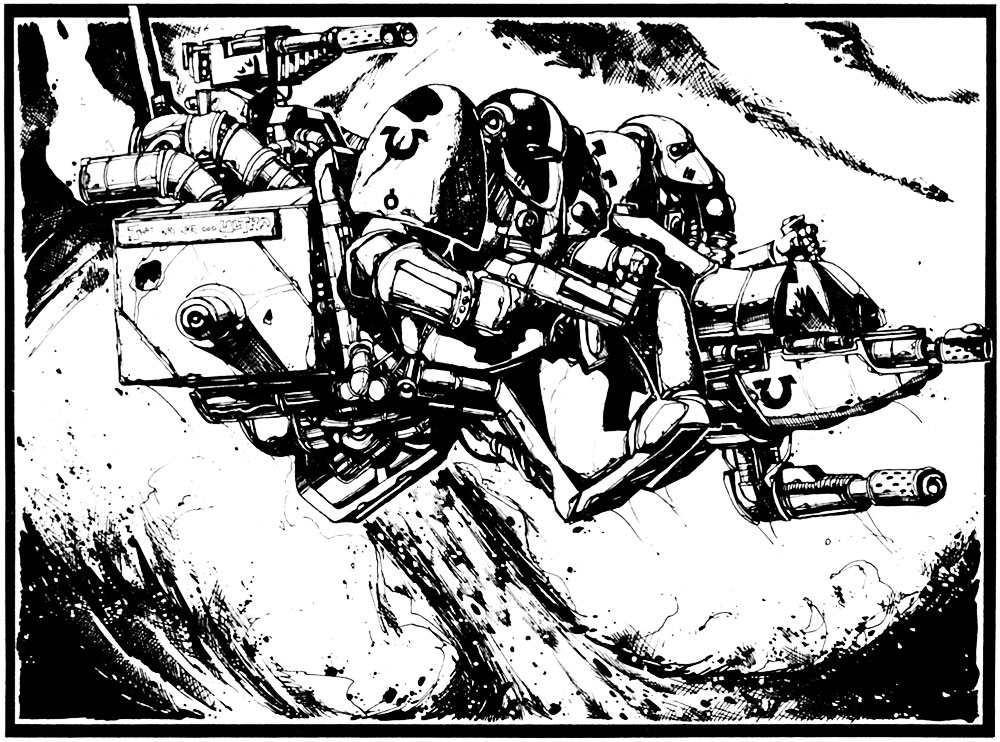

.gif)


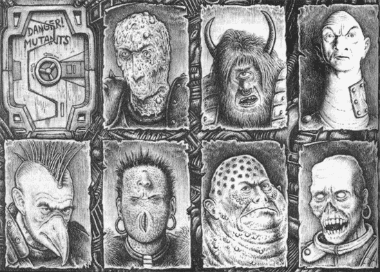


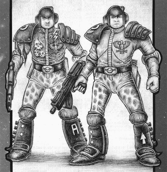

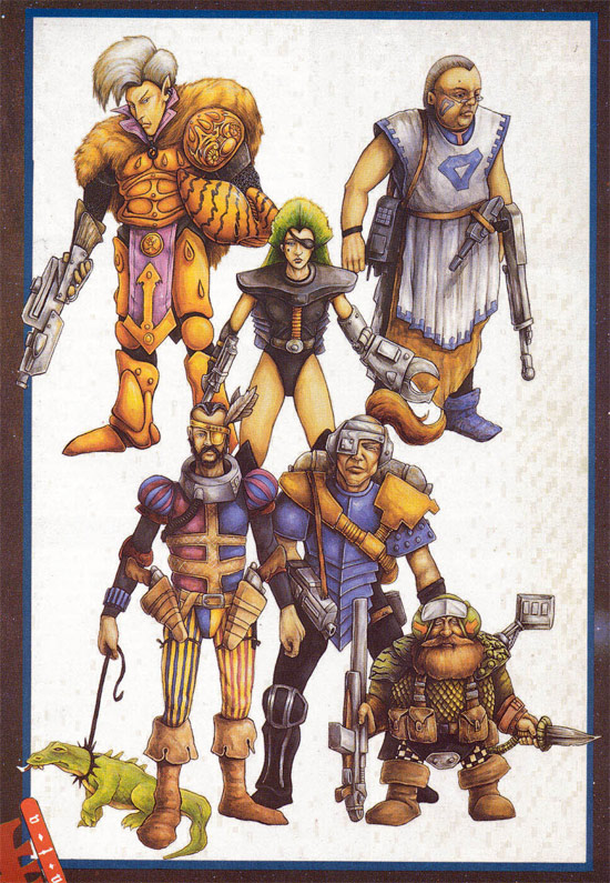


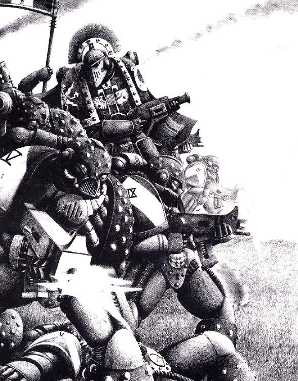
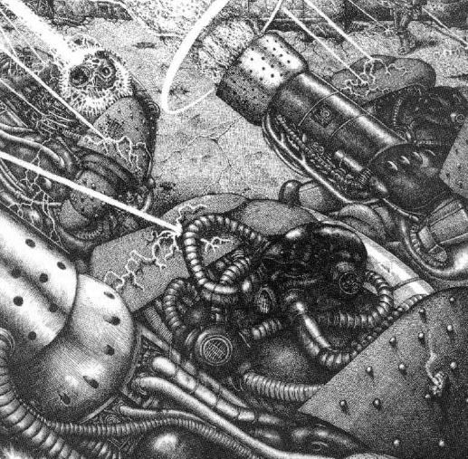
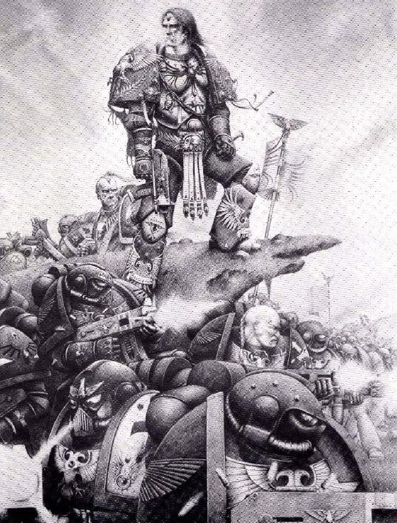
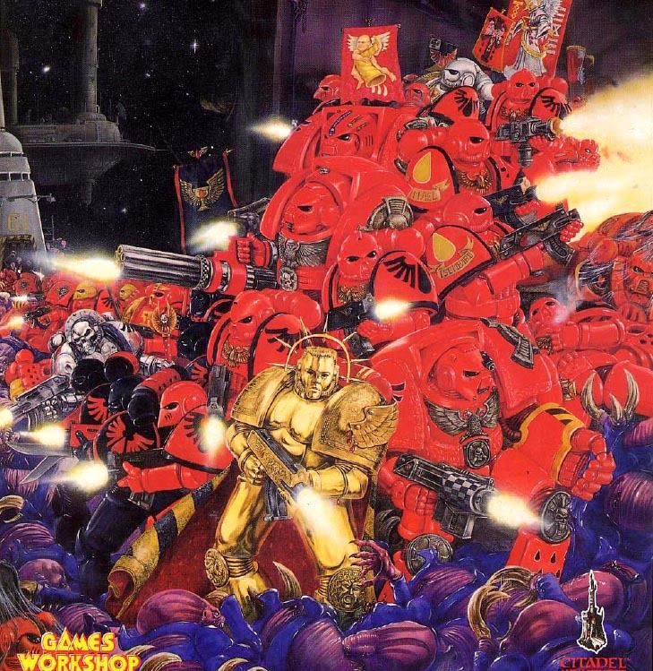


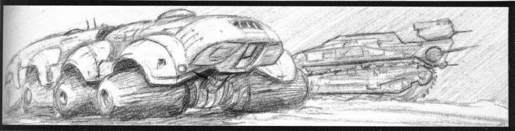
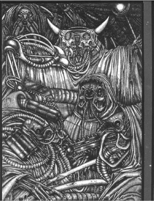
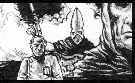

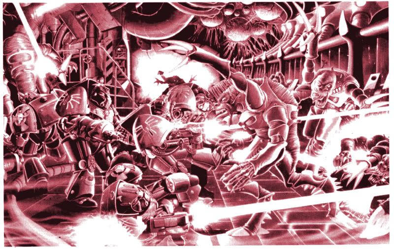
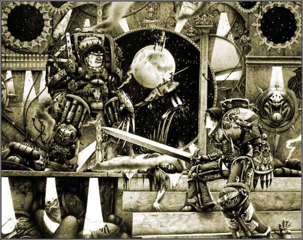
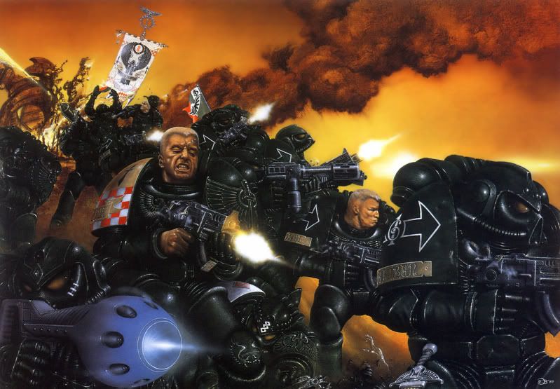
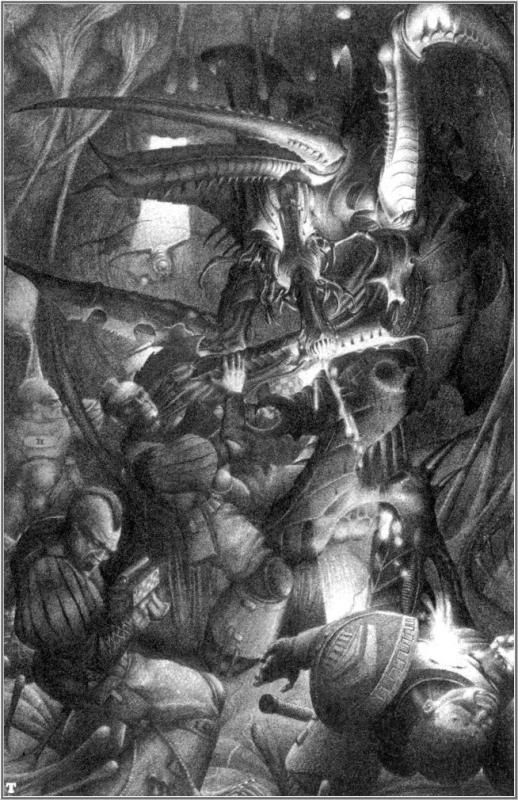
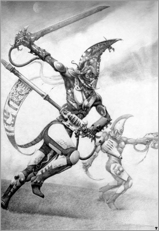
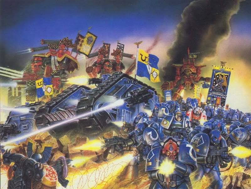


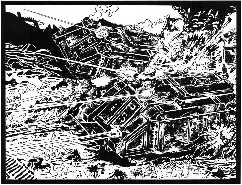
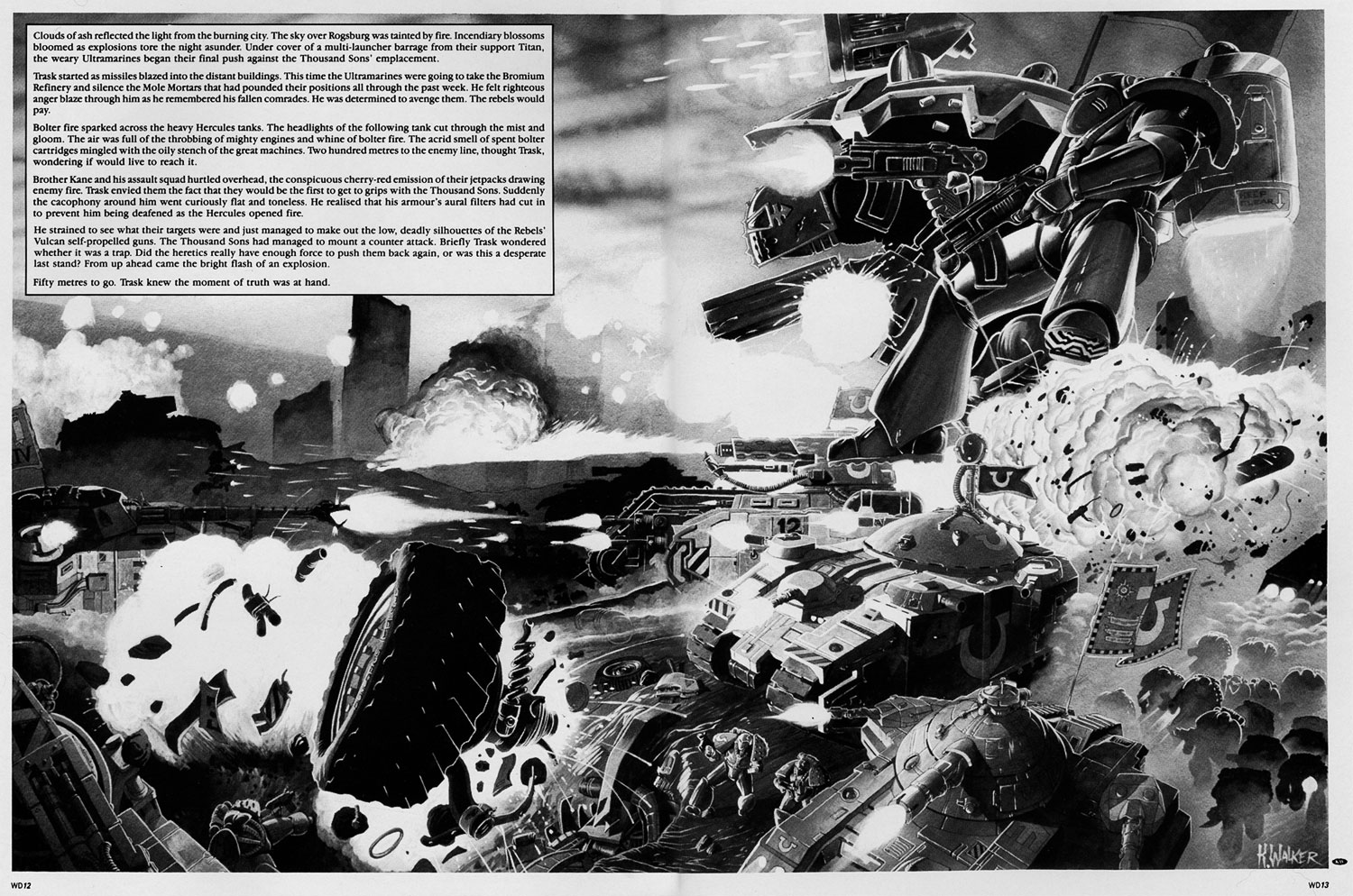
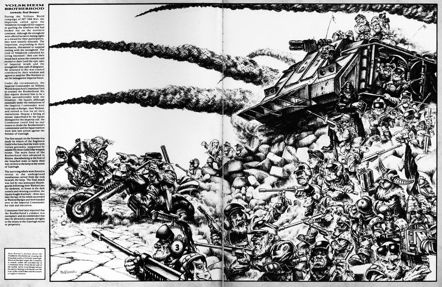


 I'm inspired to start a Marine army where there is a theme, but no 2 are painted the same. I'm really glad I found this post.
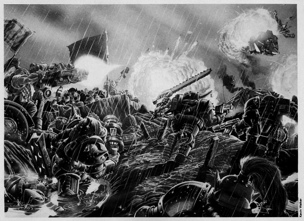
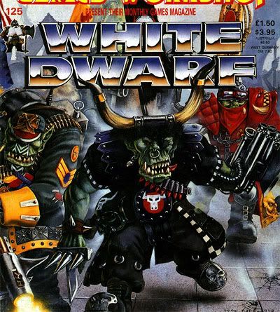
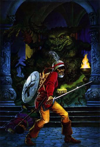
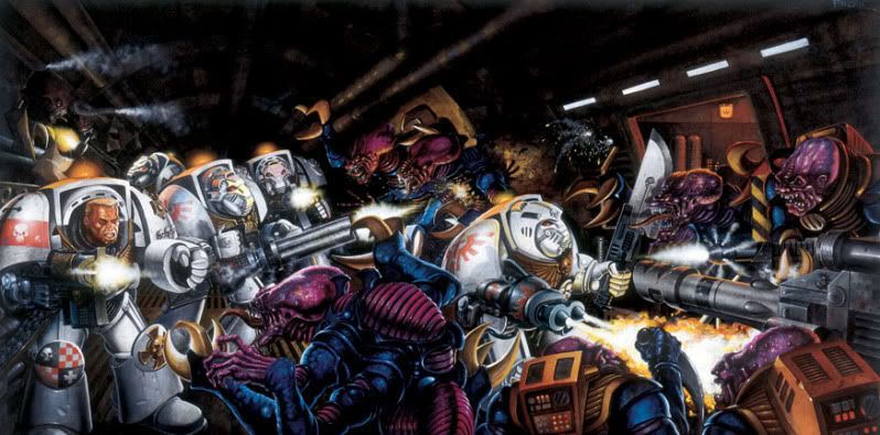


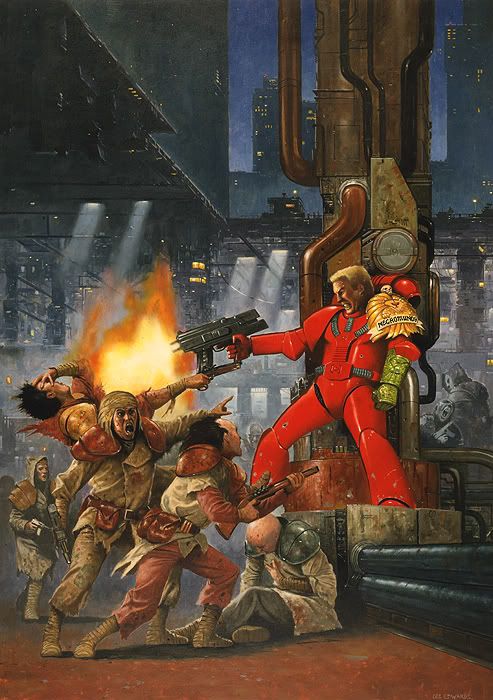
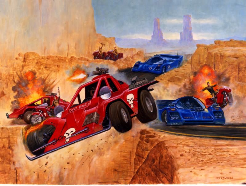
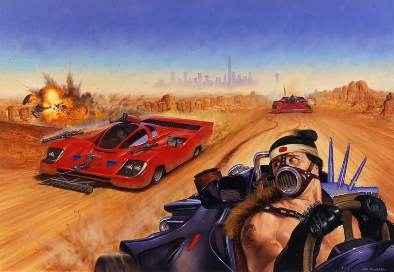
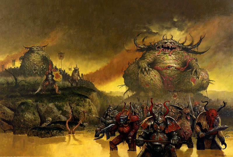
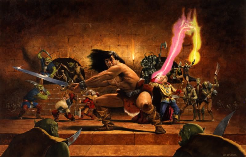
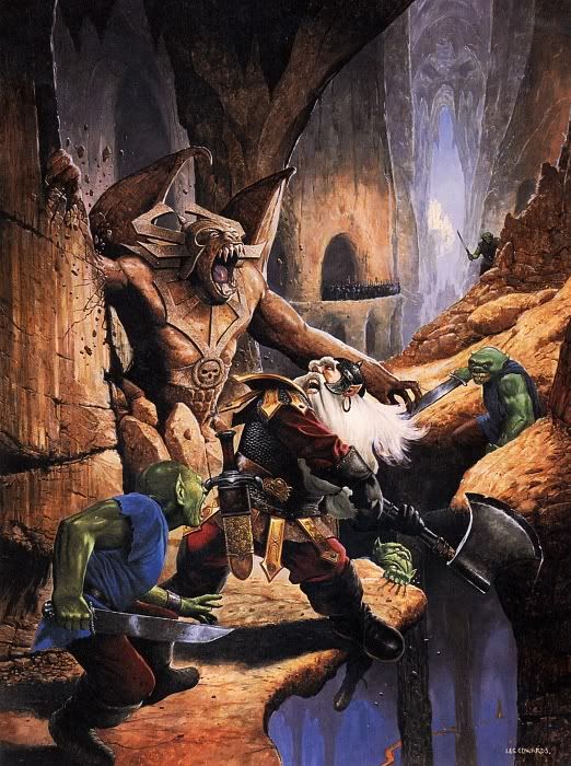
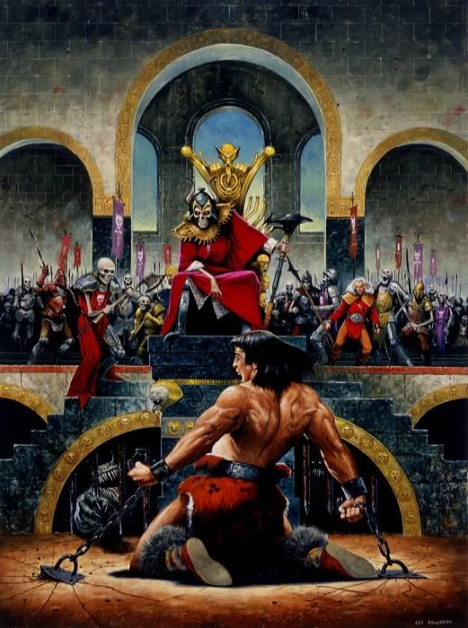
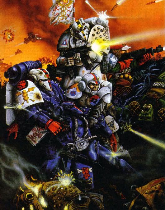
 Now they look alright but their coneheads made me get imperial guard instead. (Yes, I almost bought a bunch of Eldar but their cone head stormtrooper helmets turned me away.)

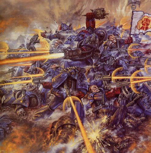
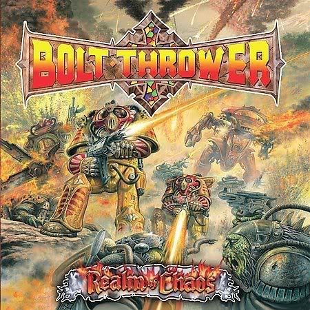
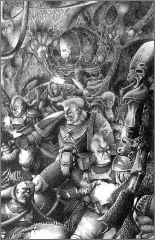
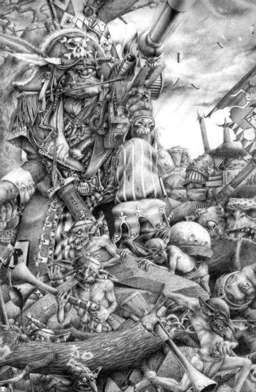
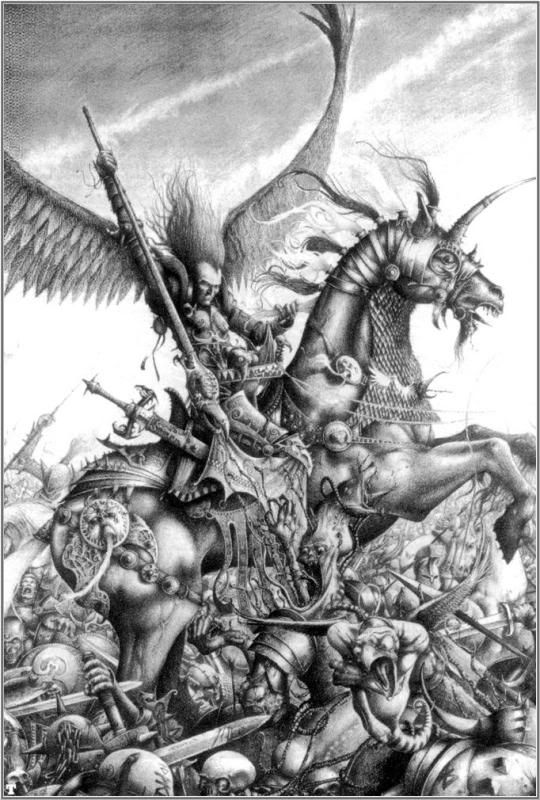
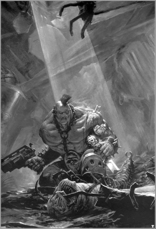
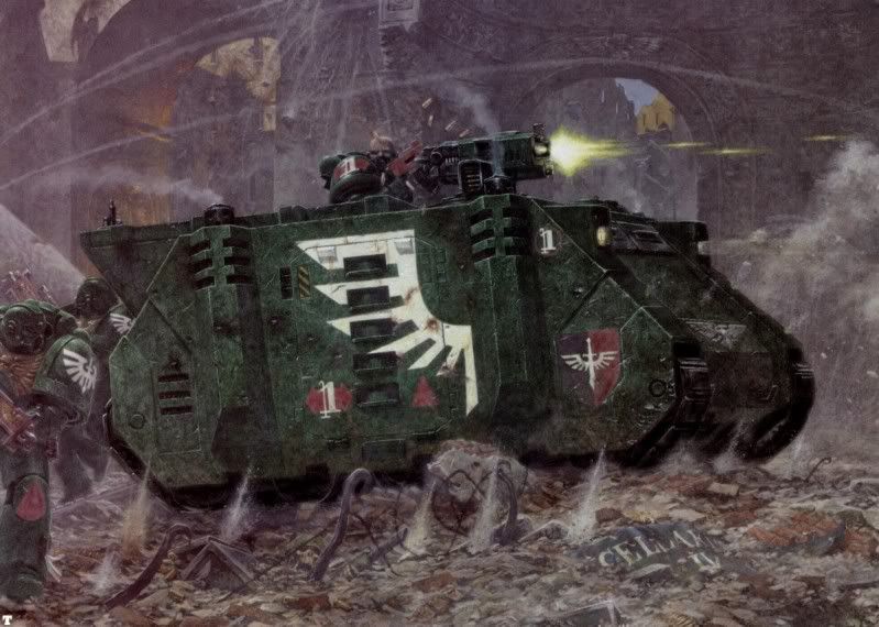
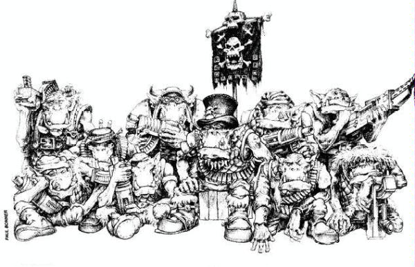
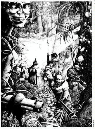


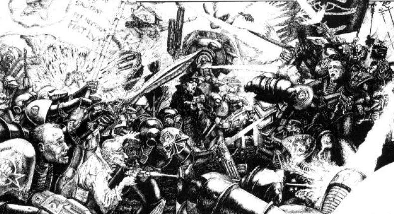

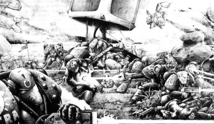
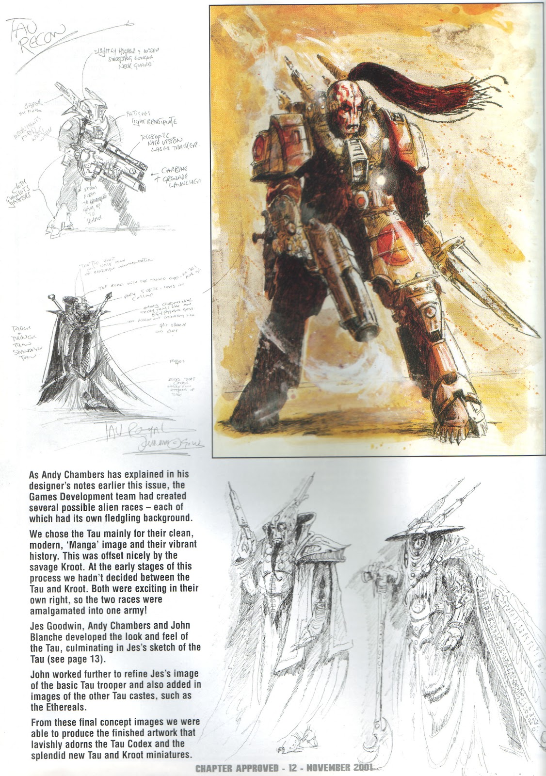
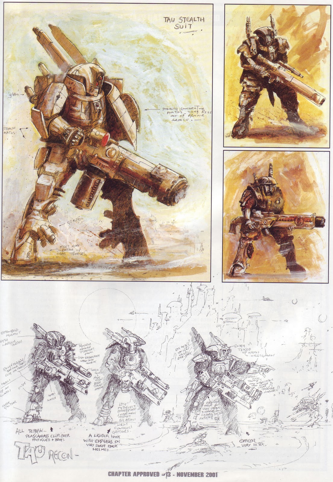
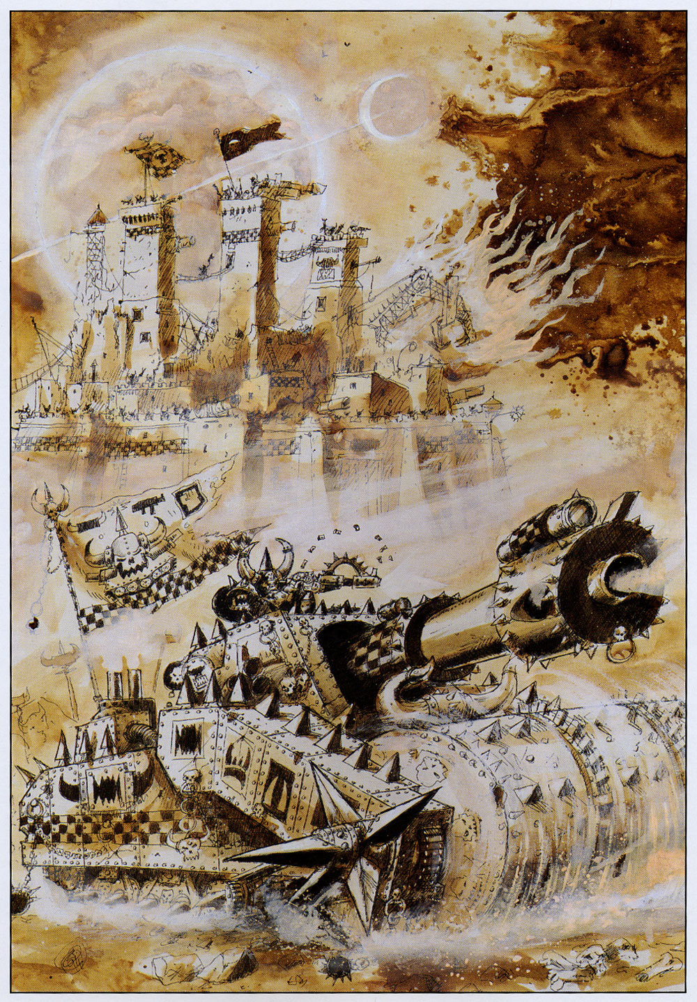
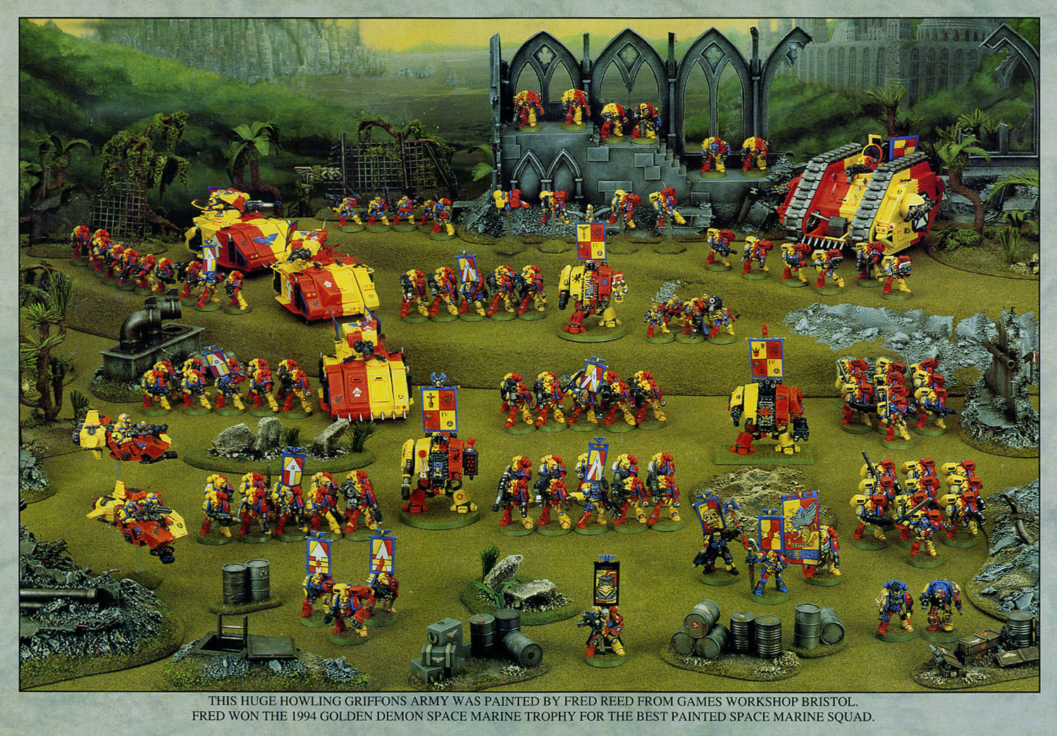

 That can still be used today and look great, in fact... some has been

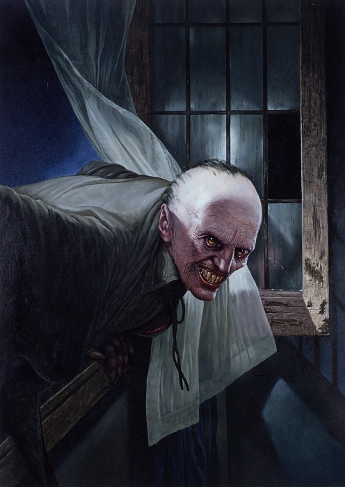

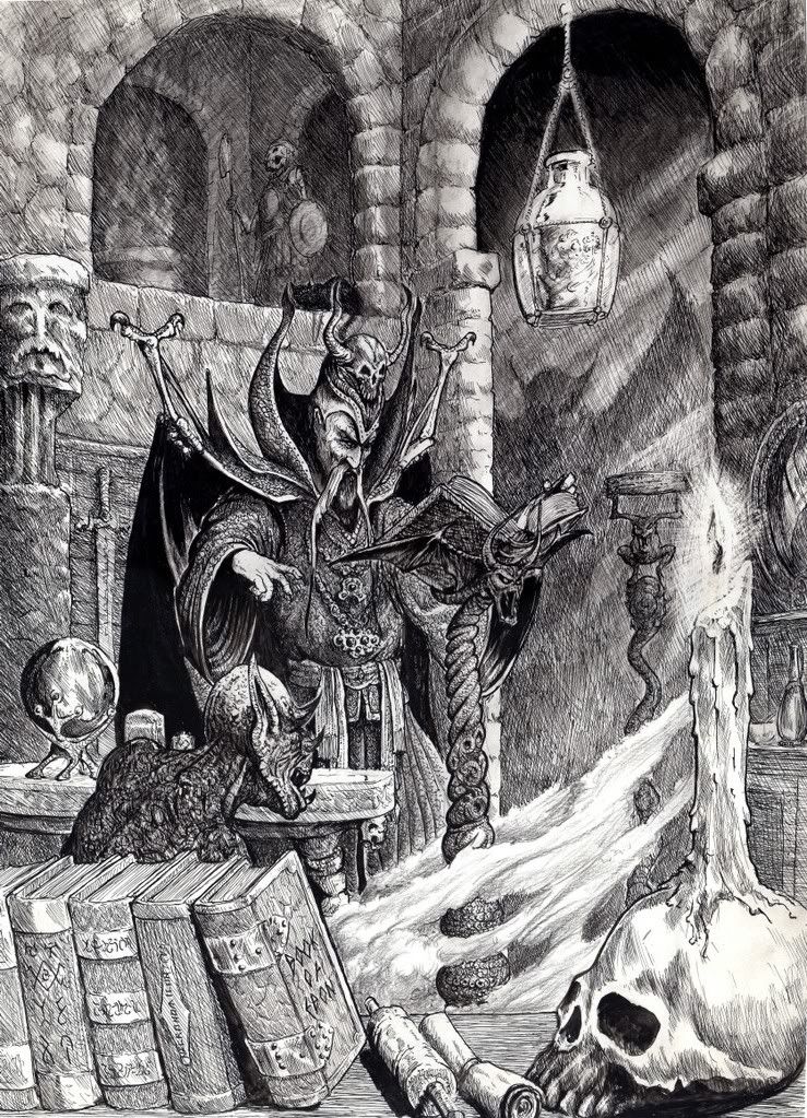
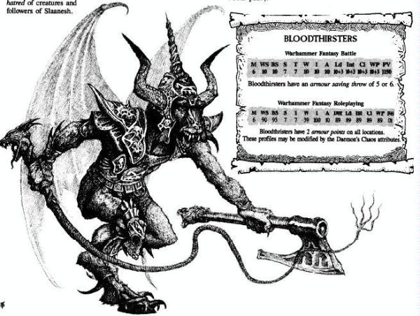


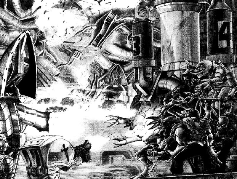
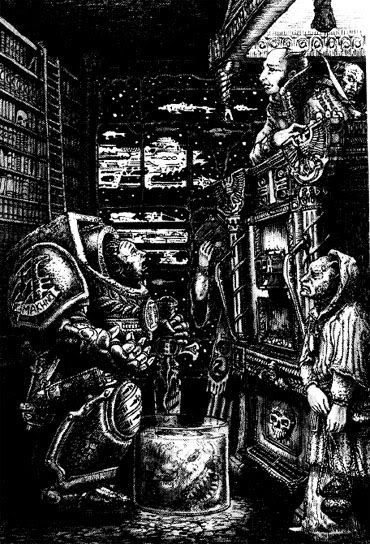
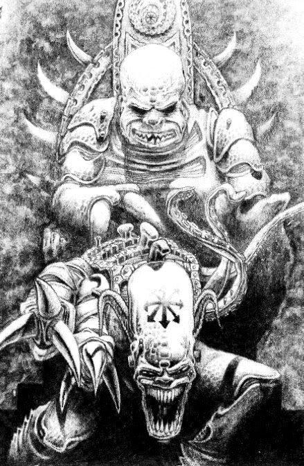
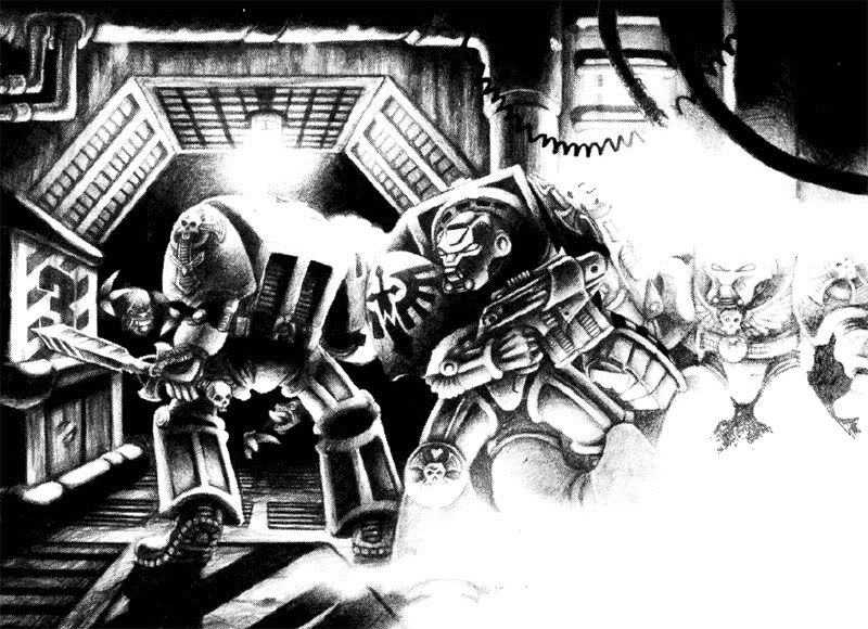
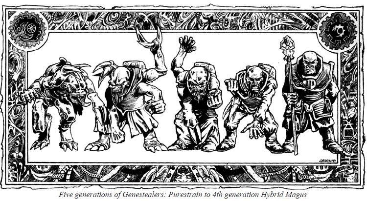
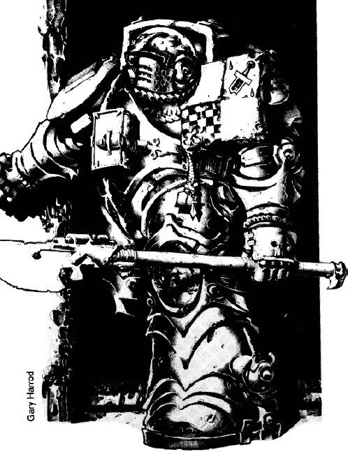
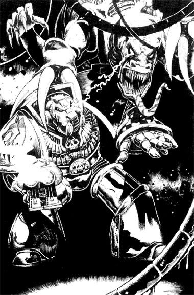


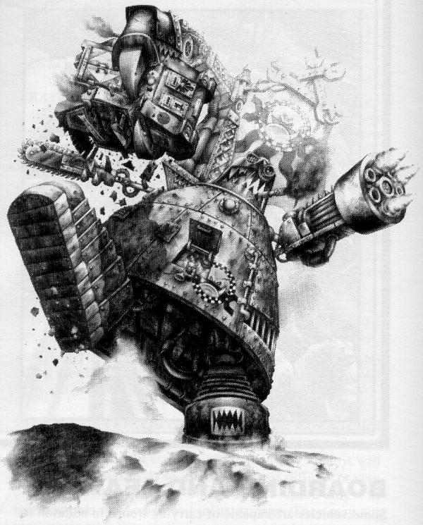
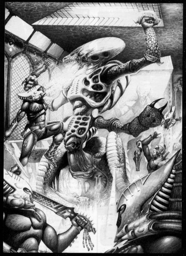
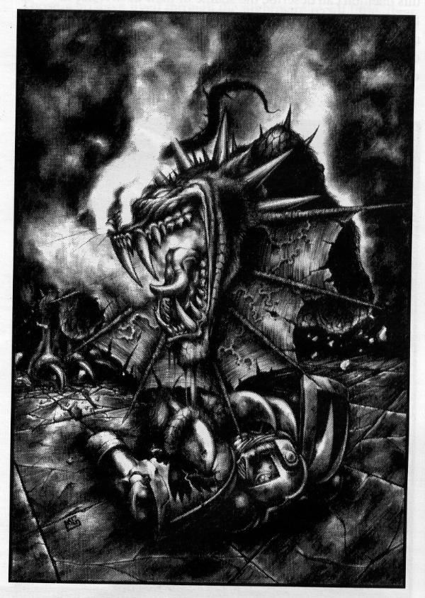
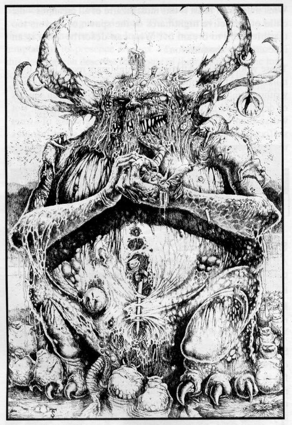
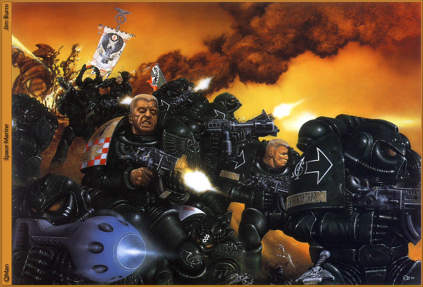
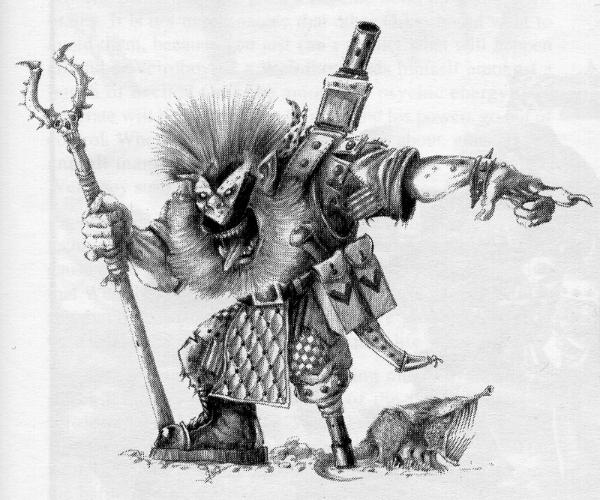
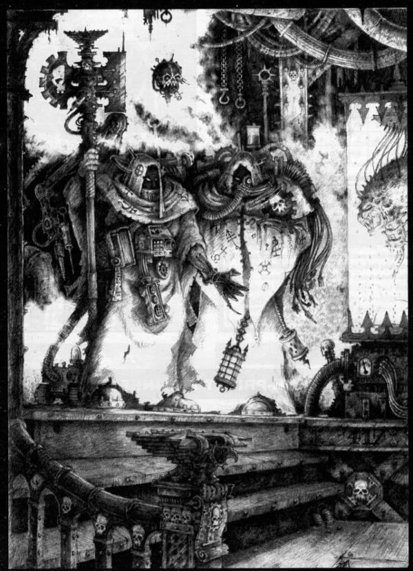
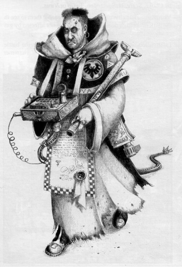
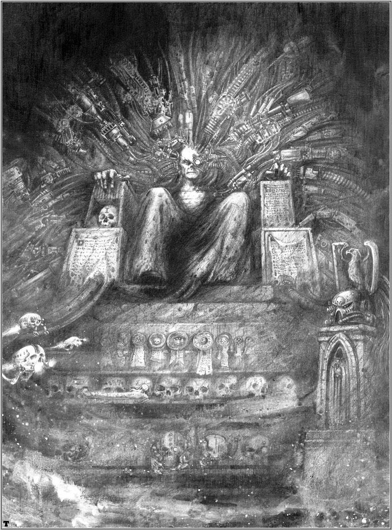
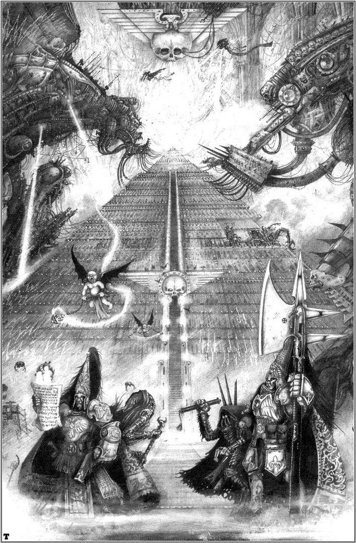


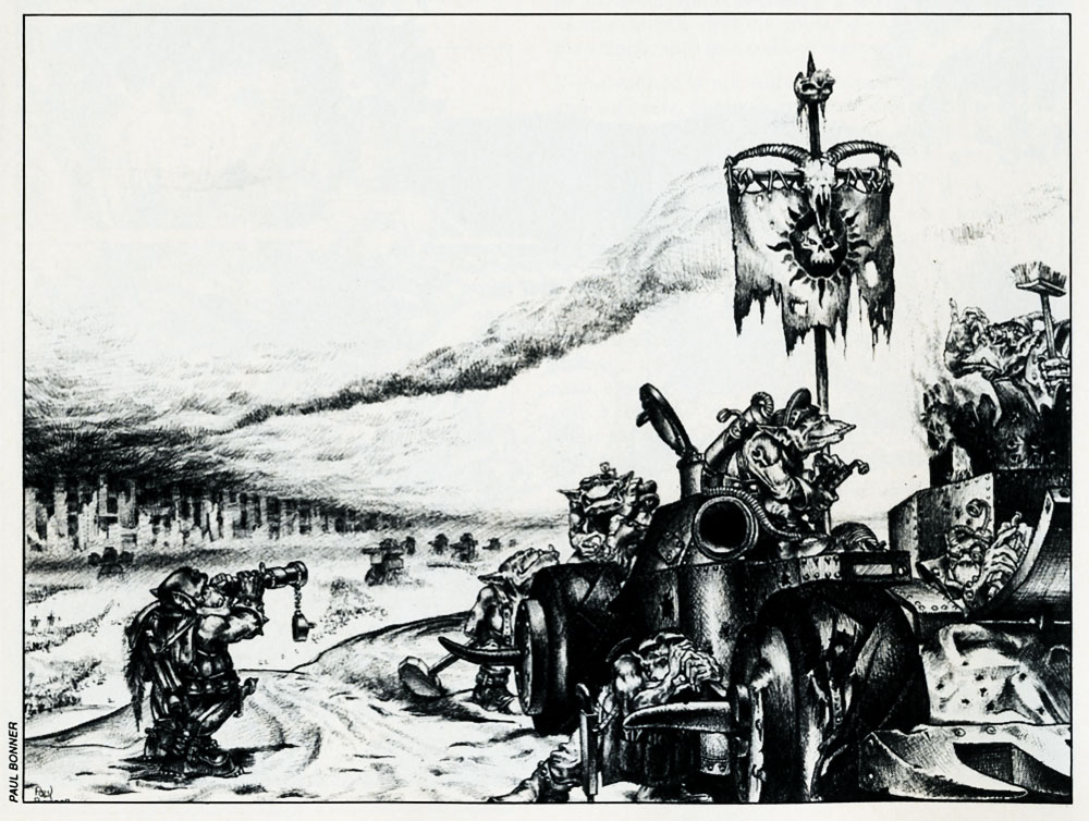
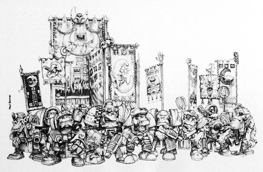
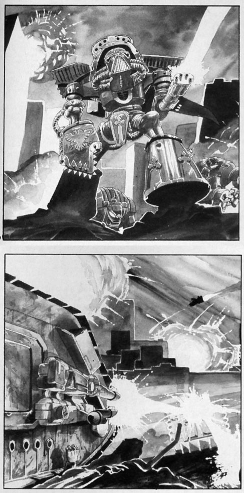
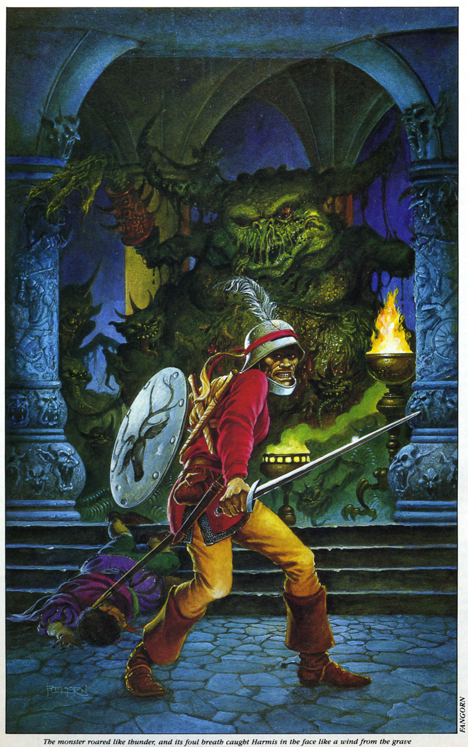

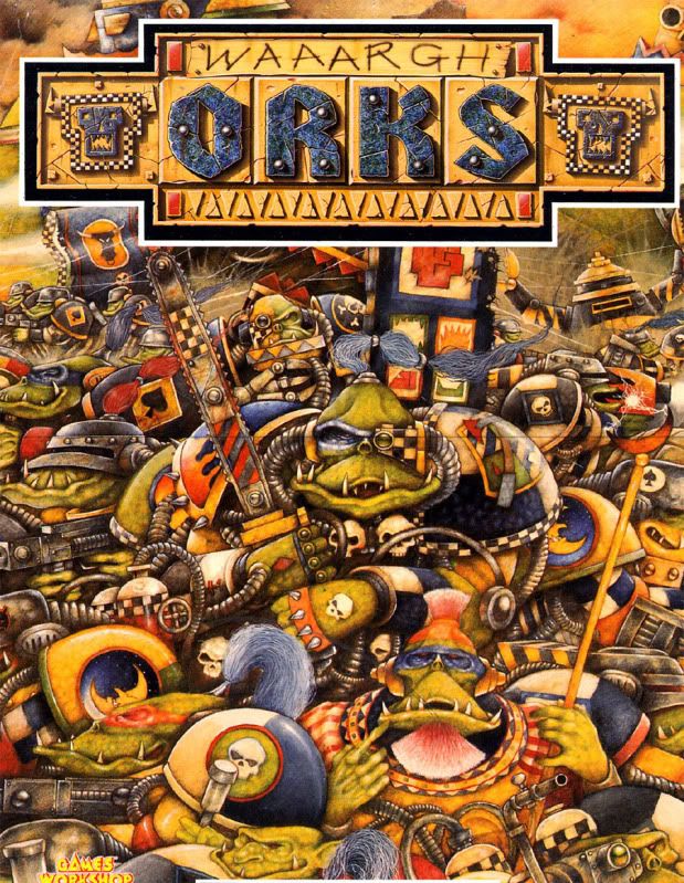
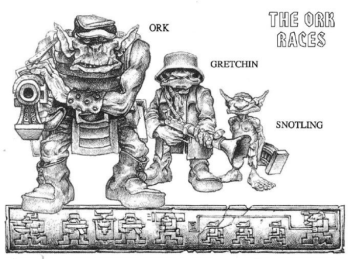
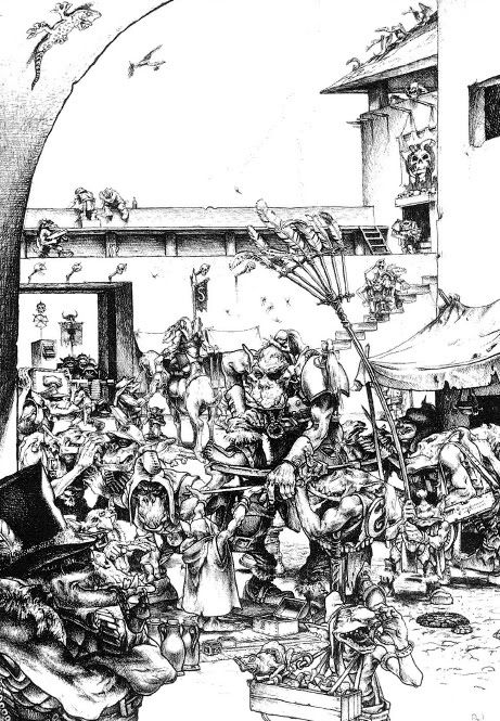
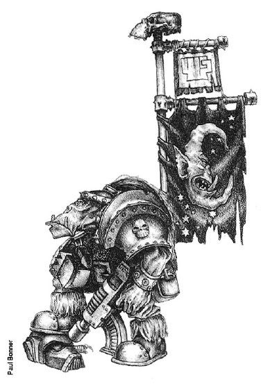
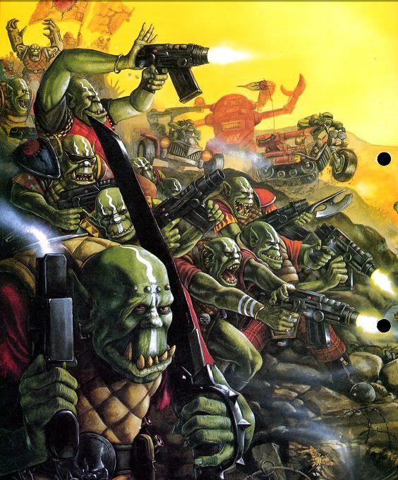
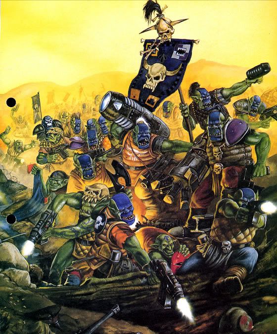
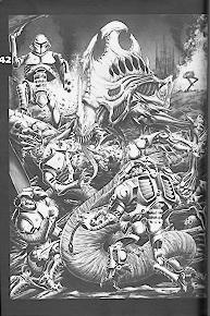
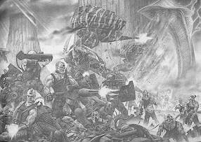 http://www.nobleknight.com/ViewProducts.asp_Q_ManufacturerID_E_-1086169478_A_ProductLineID_E_-66308237_A_CategoryID_E_5_A_GenreID_E_
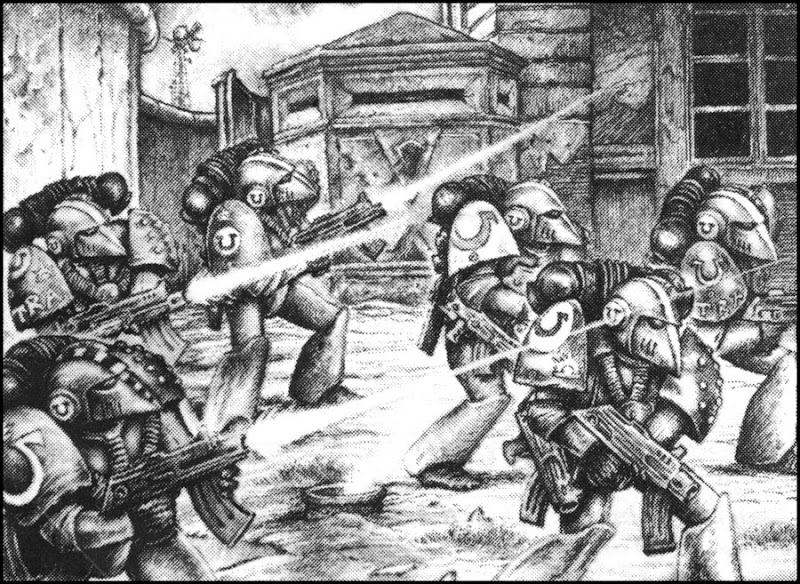
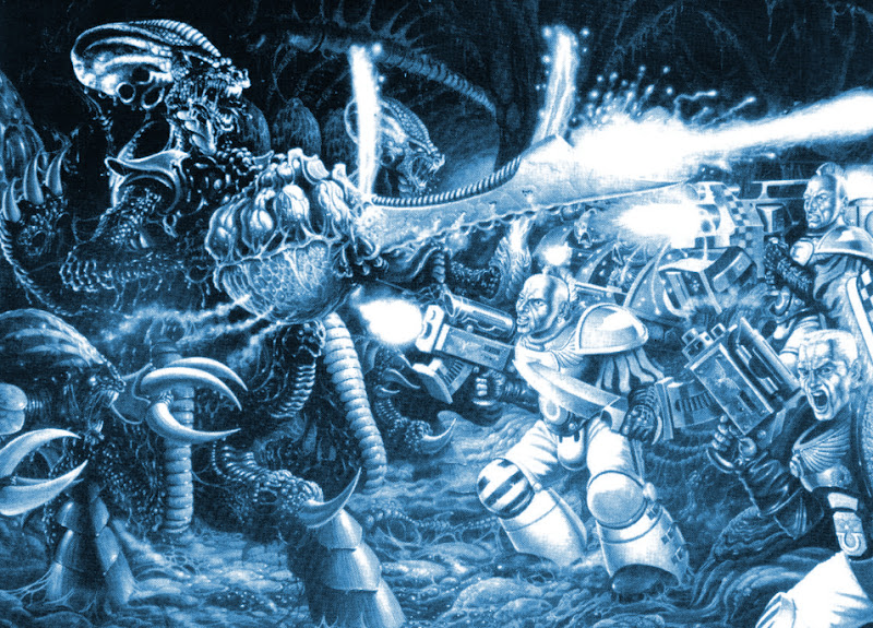
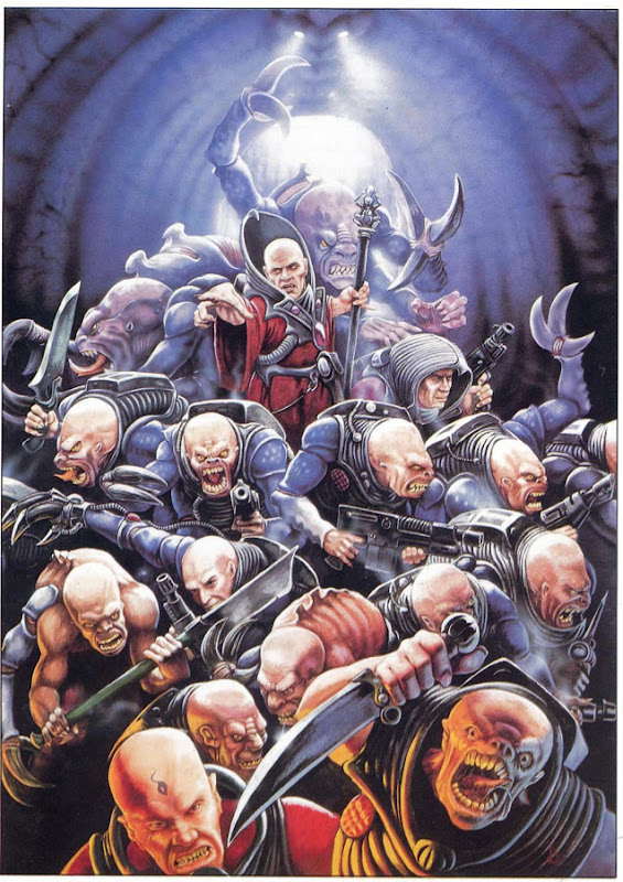
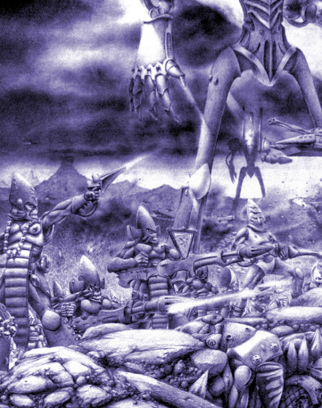
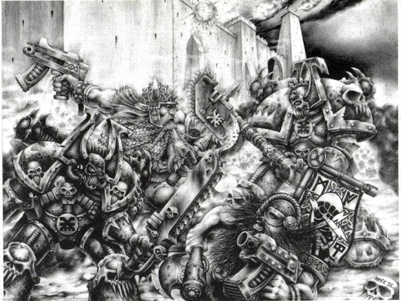
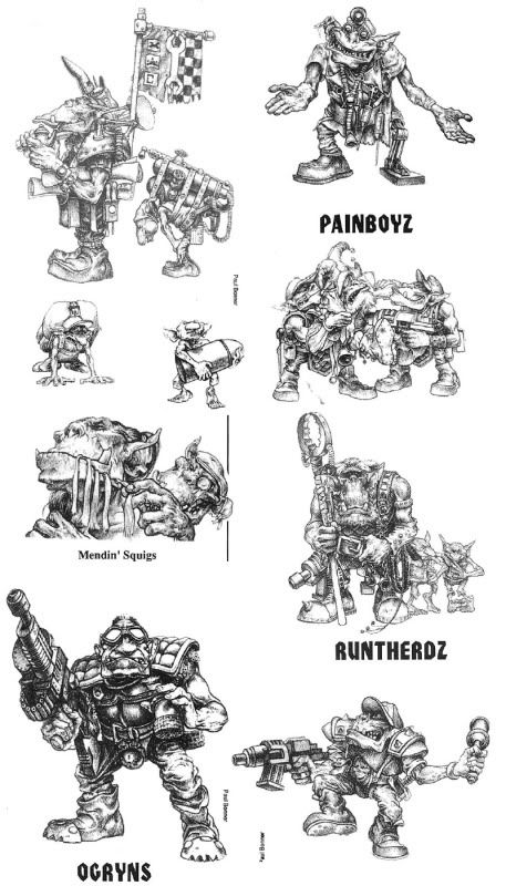


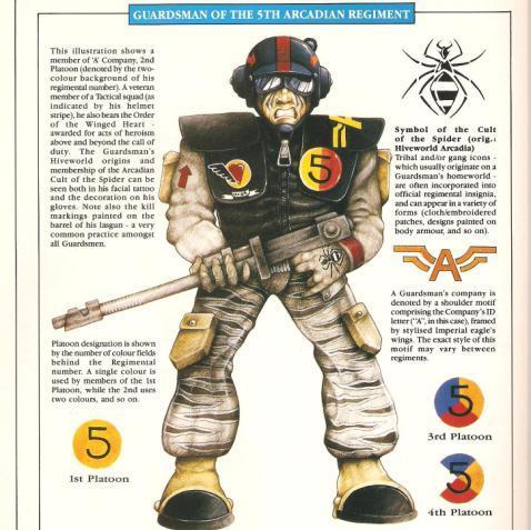
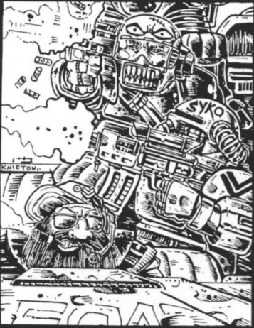

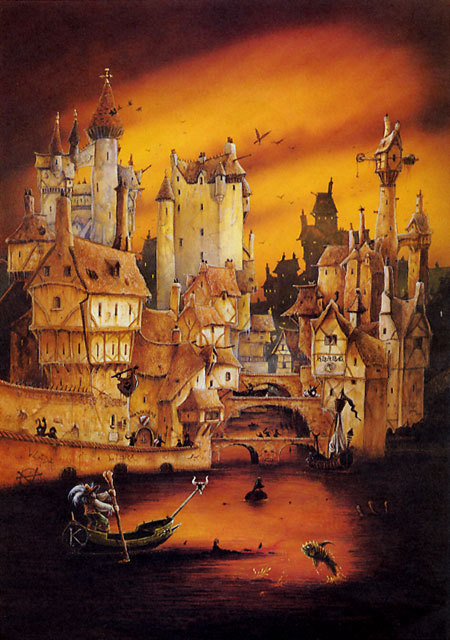

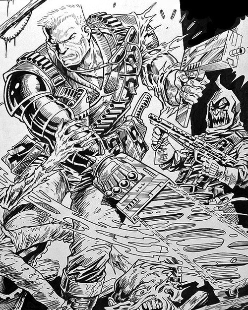
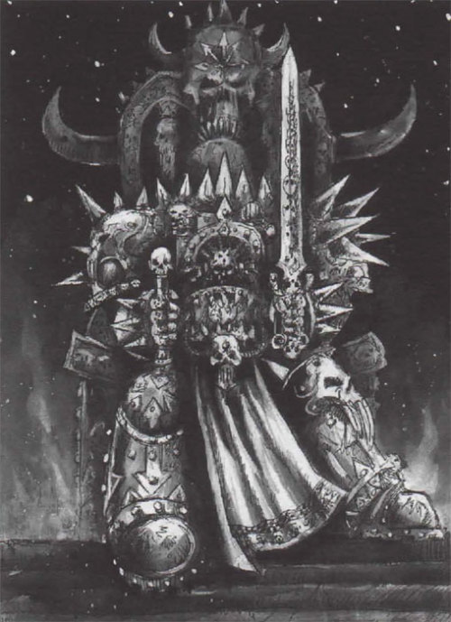


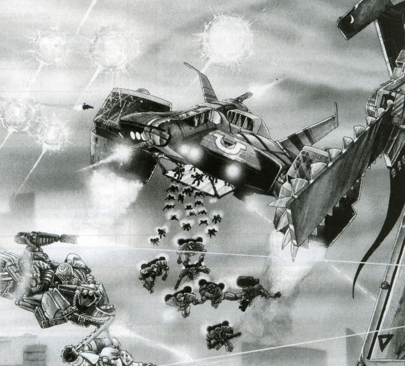
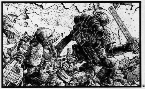
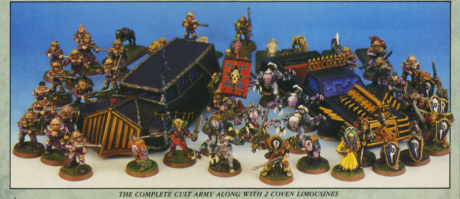
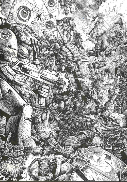
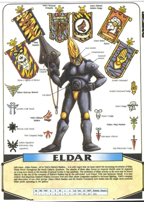
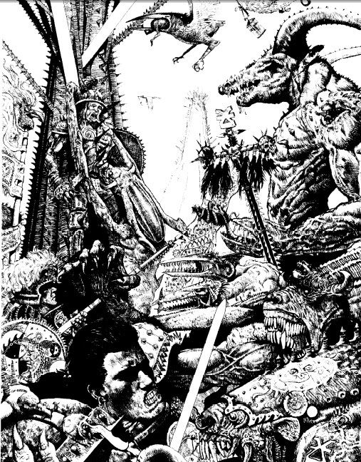
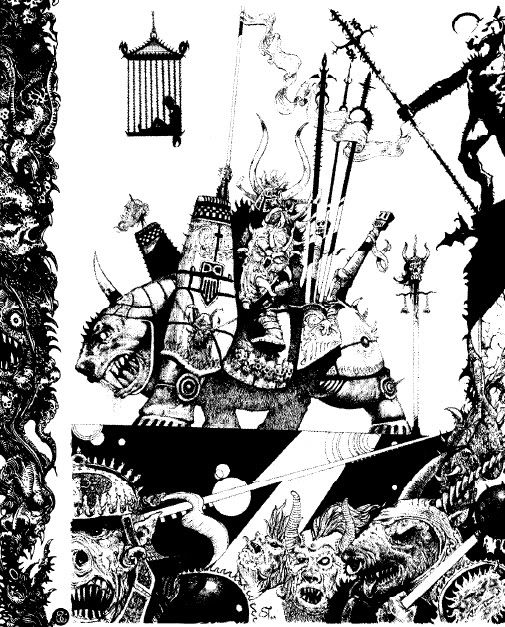
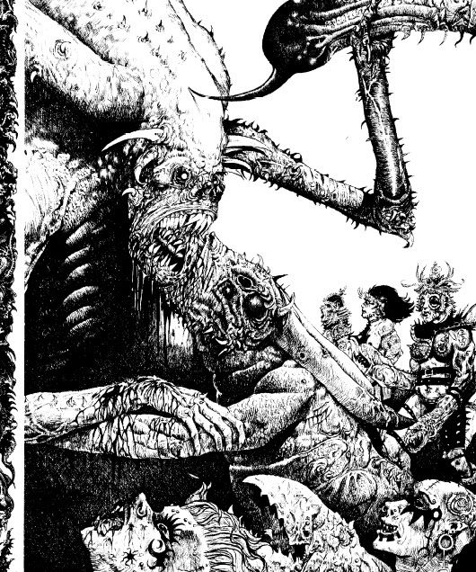
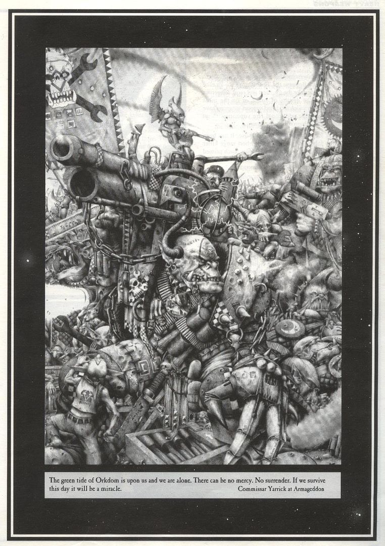
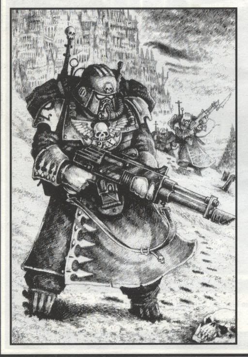
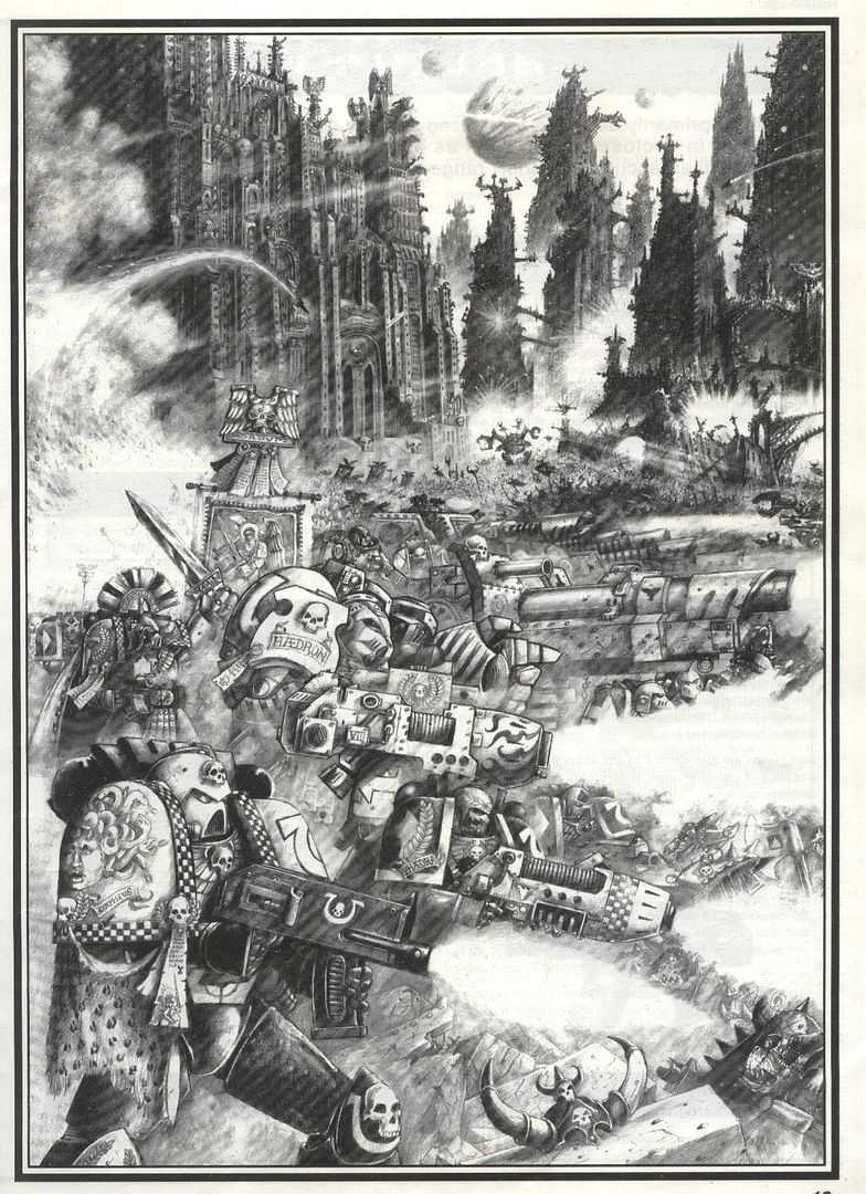
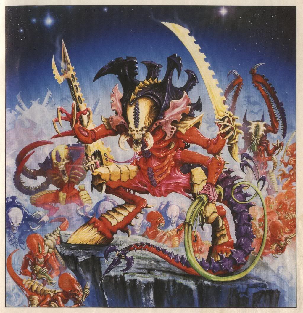
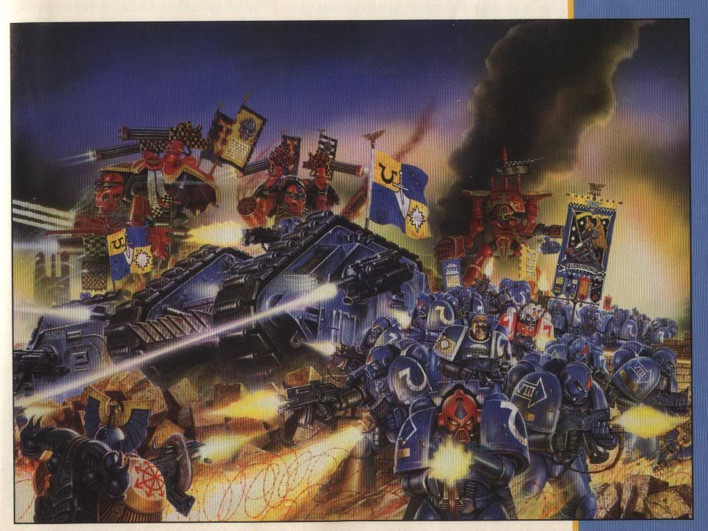
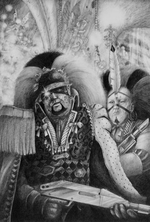
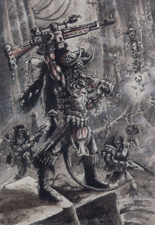
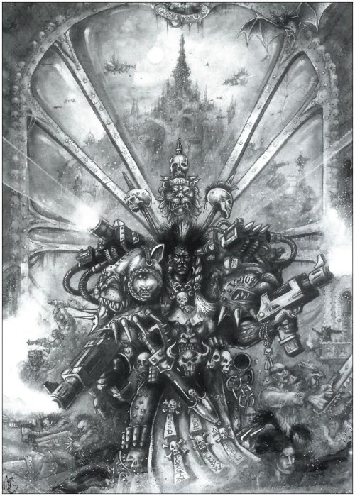
 Legendary Thread