Forum adverts like this one are shown to any user who is not logged in. Join us by filling out a tiny 3 field form and you will get your own, free, dakka user account which gives a good range of benefits to you:
No adverts like this in the forums anymore.
Times and dates in your local timezone.
Full tracking of what you have read so you can skip to your first unread post, easily see what has changed since you last logged in, and easily see what is new at a glance.
Email notifications for threads you want to watch closely.
Being a part of the oldest wargaming community on the net.
If you are already a member then feel free to login now.
2019/06/18 15:55:00
Subject: Re:'Free Your Models - Contrast' paint range -- In stores June 15th, color charts and video pg. 34
Unfortunately the paints came before the primers so I don't have many things to test them on. I'm most interested in what can be done with the black and going over metals so I plan to do quite a few experiments to see what kind of effects I can get.
This primer on is a marine that I primed with Vallejo white about 5 years ago. I first dry brushed some grey knight steel, put on black templar contrast, then gave a coat of nuln oil.
Spoiler:
I thought this other one came out kind of interesting. It was sitting around on my paintshelf for several years with Vallejo model air Steel. I covered it with black templar contrast, and dry brushed on some grey knight steel. I just went back with Wraithbone base and other contrasts to test out some details
Spoiler:
For a 10 second job, aethermatic blue work pretty well on the sword.
When the primers show up, I'm gonna try to do a zenithal highlight with them (black -> mechanicum grey-> Greyseer), drybrush a bit of metal on it, and then put black templar on it.
Another interesting thing to note is I also got some of the clear air paints. The Sigismund Yellow Clear brushed on almost the same as Iyanden Yellow except it dried with a very glossy look
2019/06/18 15:55:41
Subject: Re:'Free Your Models - Contrast' paint range -- In stores June 15th, color charts and video pg. 34
I tried out Black Templar over Leadbelcher as well as the new Iron Hands Steel and Iron Warriors base paints. IH steel and Leadbelcherive give a good highlight effect but can be blotchy on larger surfaces. The IW base being the darker of the three gives a more subtle highlight and metallic sheen but also seems to mask the blotchiness somewhat.
2019/06/18 16:23:03
Subject: 'Free Your Models - Contrast' paint range -- In stores June 15th, color charts and video pg. 34
timetowaste85 wrote: I got some Krylon satin paint that was a really close color to Wraithbone. It goes on thicker and a bit glossier, and the colors come out a tad bit darker. If you put one model with krylon next to one with Wraithbone, you’ll see the difference. But it IS minor.
Its Krylon "Ivory" Satin, i'm guessing, and yeah... its been a 90% match in all regards for me, for 25% of the price. ;-)
11527pts Total (7400pts painted)
4980pts Total (4980pts painted)
3730 Total (210pts painted)
2019/06/18 16:56:49
Subject: 'Free Your Models - Contrast' paint range -- In stores June 15th, color charts and video pg. 34
ListenToMeWarriors wrote: @Geifer: Am really appreciating your experiments, it is also great to see some ASOIAF miniatures on the site as well.
Contrast is definitely going to be the basis of my Freefolk miniatures with all the browns and Grey's, with added highlights and proper metallics where needed. It is just a case of reversing the painting technique that I have always used, starting with a dark undercoat and progressively getting lighter.
@Carnage 43, totally agree on Ultramarines blue, it just does not seem fit for the purpose of painting Ultramarines.
Glad if I could help.
I'm lucky that I remembered that I had unpainted Free Folk. They are good models to test these paints on. Originally I planned to buy a green Contrast paint and test it on Bolt Action soldiers. Wartime material shortages notwithstanding, I would have been tempted to be conservative and try for uniformity. I feel a lot better about allowing myself free rein with Free Folk, since they're all civilians and nothing is industrially produced. Much better for going wild. And at the rate I'm going through these, I may well end up with a painted army to boot.
I'll be interested to see people post traditionally and Contrast painted models next to each other to see how well they are able to match the new paintjob to the old one. I'm hardly the best painter and I have a bit of trouble imagining that that is going to go all that well in a lot of cases. Would be good to see how it actually plays out.
Nehekhara lives! Sort of!
Why is the rum always gone?
2019/06/18 17:24:59
Subject: 'Free Your Models - Contrast' paint range -- In stores June 15th, color charts and video pg. 34
Geifer wrote: I'll be interested to see people post traditionally and Contrast painted models next to each other to see how well they are able to match the new paintjob to the old one. I'm hardly the best painter and I have a bit of trouble imagining that that is going to go all that well in a lot of cases. Would be good to see how it actually plays out.
I have hard time imagining as well which is precisely why I use contrast for new project(s) rather than existing. Specifically daemons now. Later LOTR and then expand chaos side.
2024 painted/bought: 109/109
2019/06/18 18:10:12
Subject: 'Free Your Models - Contrast' paint range -- In stores June 15th, color charts and video pg. 34
Geifer wrote: I'll be interested to see people post traditionally and Contrast painted models next to each other to see how well they are able to match the new paintjob to the old one. I'm hardly the best painter and I have a bit of trouble imagining that that is going to go all that well in a lot of cases. Would be good to see how it actually plays out.
I have hard time imagining as well which is precisely why I use contrast for new project(s) rather than existing. Specifically daemons now. Later LOTR and then expand chaos side.
Yup, I think the product is fantastic but there is zero chance I can match it to prior paint jobs after a bit of experimentation. This is for projects moving forward for me too. Also Daemons first and then likely nids, beastmen, savage orcs, etc
Best Painted (2015 Adepticon 40k Champs)
They Shall Know Fear - Adepticon 40k TT Champion (2012 & 2013) & 40k TT Best Sport (2014), 40k TT Best Tactician (2015 & 2016)
2019/06/18 18:22:52
Subject: 'Free Your Models - Contrast' paint range -- In stores June 15th, color charts and video pg. 34
I used Pink Horror pink with a Crimson Carroburgh wash before. Then I tried the Volupous Pink contrast over Wraithbone. Almost identical, and 1/4 the time. Yeah...I know which one I’m using for basic horrors.
Reality is a nice place to visit, but I'd hate to live there.
Manchu wrote:I'm a Catholic. We eat our God.
Due to work, I can usually only ship any sales or trades out on Saturday morning. Please trade/purchase with this in mind.
2019/06/18 19:46:33
Subject: 'Free Your Models - Contrast' paint range -- In stores June 15th, color charts and video pg. 34
Horst wrote: Exactly. It's a godsend for new armies, but it certainly doesn't match any existing techniques.
I'm digging the result on my AdMech guys though, this took like an hour to do this
How about a breakdown on the colors used, especially the dark metallic.
THX
Automatically Appended Next Post:
Gerinako wrote: Is it me or does Corax White look better for some of them?
Blood Angel Red for example
Its just the difference between the base coats that makes them different. Corax is a bright, pure white, the Wraithbone is a light tan and Seer is a warm gray.
You are always going to get a purer version of the color over the Corax. Its interesting that the Wraithbone gives a brighter color in many of the lighter color examples.
T
This message was edited 1 time. Last update was at 2019/06/18 19:50:08
2019/06/18 20:03:03
Subject: 'Free Your Models - Contrast' paint range -- In stores June 15th, color charts and video pg. 34
I sprayed the whole thing Vallejo Grey Surface Primer, then painted the cloak with Iyanden Yellow contrast. Then I painted the pants with Snakebite Leather, and the metallic parts with Vallejo's Silver. I painted the parts I wanted dark metallic with Black Contrast, and left the parts I wanted lighter alone (like the kneepad and gun). The bright metallic parts are Vallejo Liquid Metal Copper (an alcohol based paint, but the shiniest metalic I've ever seen). The green is just Vallejo Transparent Green over Vallejo Silver, and the eyes are just Green Ink over Vallejo Grey Primer.
2019/06/18 21:19:24
Subject: 'Free Your Models - Contrast' paint range -- In stores June 15th, color charts and video pg. 34
Chris521 wrote: Unfortunately the paints came before the primers so I don't have many things to test them on. I'm most interested in what can be done with the black and going over metals so I plan to do quite a few experiments to see what kind of effects I can get.
When the primers show up, I'm gonna try to do a zenithal highlight with them (black -> mechanicum grey-> Greyseer), drybrush a bit of metal on it, and then put black templar on it.
So the primer came today and I gave it a go.
EDIT: I could pick at it all night and still find tiny flaws, but I was really happy with how the black came out. It's nice and dark, but its got a slight metallic shine to it. About 80% of the model is contrast. I even used a bit of the Apothecary white on the face.
Spoiler:
Edit: I wrote this elsewhere but I figured I'd give my explaination.
So basically a very light metallic color with a handful of shadows.
I did a few highlights on some for the sharp black edges. Blue Horror for the black sections and silver for the metallic ( most notably the belt buckle and some of the backpack).
Interestingly I didn't have to highlight his under coat at his waist. The contrast flowed off that texture nicely. The legs also have very few highlights.
The gun is Blood angels red contrast with a Lugganath orange highlight, same with the eyes.
The face is Grey Seer with Apothecary White Contrast.
The shoulder pad is Grey seer with Ultramarine Contrast, Iyandan with a light layer of gold, and Ceramite white.
The little details on the right arm also included the red and yellow contrasts, as well as Warp Lightning and skeleton horde.
The pouches are Wyldwood with a skrag brown highlight
While the metallic arm did have the Black Templar on it, there are enough layers on it (including nuln oil) that it doesn't come across. The brass and gold bits do have some snakebite leather Contrast on them. That one is fantastic on metal.
So except for the pure metallic bits. The entire model is contrast with some edge highlighting.
I think my facorite thing about the contrast is how smooth it looks. It's not as detail as my Librarian up the page, but it came out cleaner.
This message was edited 3 times. Last update was at 2019/06/19 16:48:08
2019/06/19 05:44:21
Subject: 'Free Your Models - Contrast' paint range -- In stores June 15th, color charts and video pg. 34
I sprayed the whole thing Vallejo Grey Surface Primer, then painted the cloak with Iyanden Yellow contrast. Then I painted the pants with Snakebite Leather, and the metallic parts with Vallejo's Silver. I painted the parts I wanted dark metallic with Black Contrast, and left the parts I wanted lighter alone (like the kneepad and gun). The bright metallic parts are Vallejo Liquid Metal Copper (an alcohol based paint, but the shiniest metalic I've ever seen). The green is just Vallejo Transparent Green over Vallejo Silver, and the eyes are just Green Ink over Vallejo Grey Primer.
2019/06/19 07:48:06
Subject: 'Free Your Models - Contrast' paint range -- In stores June 15th, color charts and video pg. 34
Another image from Jonas Kristrom over on FB, this time all fully dry and with added Carroburg shade wash:
So in order to get the same intensity as a Contrast paint with existing products, you're going to need two or three applications of something like the Liquitex ink, either with additives to better mimic the Contrast medium or with an additional wash of something like the Carroburg.
Since the Liquitex and similar products seem to be about the same price in pounds for a bottle, but have a bit less than double the volume per bottle, and factoring in the additives/additional shade step, I'd say that at best alternative options are the same price as Contrast, and that actually it's entirely possible the Contrast would be cheaper than making a similar product yourself with "over the counter" supplies although, admittedly, only a few pennies cheaper.
"Your society's broken, so who should we blame? Should we blame the rich, powerful people who caused it? No, lets blame the people with no power and no money and those immigrants who don't even have the vote. Yea, it must be their fething fault." - Iain M Banks
-----
"The language of modern British politics is meant to sound benign. But words do not mean what they seem to mean. 'Reform' actually means 'cut' or 'end'. 'Flexibility' really means 'exploit'. 'Prudence' really means 'don't invest'. And 'efficient'? That means whatever you want it to mean, usually 'cut'. All really mean 'keep wages low for the masses, taxes low for the rich, profits high for the corporations, and accept the decline in public services and amenities this will cause'." - Robin McAlpine from Common Weal
2019/06/19 08:38:28
Subject: 'Free Your Models - Contrast' paint range -- In stores June 15th, color charts and video pg. 34
Perhaps it's cheaper making your own, but you could probably paint another unit or two in the time taken to mix it all up.
If you try to build up the colour with multiple coats of Shade, I think you're going to get a buildup in the recesses obscuring detail. If anything the Contrast paint is thinner that a coat of Shade.
2019/06/19 08:55:02
Subject: 'Free Your Models - Contrast' paint range -- In stores June 15th, color charts and video pg. 34
AndrewGPaul wrote: Perhaps it's cheaper making your own, but you could probably paint another unit or two in the time taken to mix it all up.
If you try to build up the colour with multiple coats of Shade, I think you're going to get a buildup in the recesses obscuring detail. If anything the Contrast paint is thinner that a coat of Shade.
Maybe I phrased my post confusingly sorry, it's *not* cheaper to make your own, at least with what I can find commonly available at comparable prices. Liquitex and similar brands cost around 4 quid(discounted) for a bottle, which is about the same as a pot of Contrast(also discounted). The Contrast is 18ml to the Liquitex 30ml, but since you need to do at least a couple of coats to mimic the colour intensity of the Contrast, and because you need to either factor in additives or additional washes to punch up the small-c contrast of the ink job, at best it works out around the same price and if anything the Contrast would be a little bit cheaper.
"Your society's broken, so who should we blame? Should we blame the rich, powerful people who caused it? No, lets blame the people with no power and no money and those immigrants who don't even have the vote. Yea, it must be their fething fault." - Iain M Banks
-----
"The language of modern British politics is meant to sound benign. But words do not mean what they seem to mean. 'Reform' actually means 'cut' or 'end'. 'Flexibility' really means 'exploit'. 'Prudence' really means 'don't invest'. And 'efficient'? That means whatever you want it to mean, usually 'cut'. All really mean 'keep wages low for the masses, taxes low for the rich, profits high for the corporations, and accept the decline in public services and amenities this will cause'." - Robin McAlpine from Common Weal
2019/06/19 09:28:55
Subject: Re:'Free Your Models - Contrast' paint range -- In stores June 15th, color charts and video pg. 34
About the cost: Liquitex acrylic inks are actually quite dilute, and the red one is a transparent one (as labelled on the bottle), which explains that it might require a second coat. If you're just after the pigments (so you want to maximize the pigment/money ratio), they're not the best source. Also, for the test pieces shown, the amount of paint were probably quite different between the ink and the contrast paint, which have to be laid down pretty thick, so the cost/mL isn't all that matters.
I still think home-mixed contrast paints should be cheaper, but it's not going to be pennies to dollars, and probably not worth the trouble for most of us. It's a bit like washes, which can be made for much cheaper than buying them, but is usually only worth the trouble if you're painting hundreds on minis or a full gaming table.
What could be a bit more interesting though, is the ability to create new colors by mixing your own contrast. The range is pretty extensive, but some end up looking a lot better than others. Mixing miniature paints sometimes results in very strange results in my experience (when mixing two colors that are quite different), whereas inks are available in primary colors which can be mixed in a relatively predictable manner, so it might be the better way to obtain a specific shade.
Another big advantage is that many artist brands list the exact pigment composition, and have the same colors across multiple paint lines. This could matter for people who want to make big pieces (like vehicles) with a color that matches their infantry painted with contrast. Contrast over large flat surfaces doesn't really work, and if you can't airbrush it, it can be difficult to replicate the same color.
With the above red example, you can buy the liquitex acrylic of the exact same shade, and paint it normally on your vehicles, whereas GW's mephiston red isn't an exact match for the BA contrast (which also depends on the underlying primer obviously).
2019/06/19 09:39:46
Subject: 'Free Your Models - Contrast' paint range -- In stores June 15th, color charts and video pg. 34
AndrewGPaul wrote: Perhaps it's cheaper making your own, but you could probably paint another unit or two in the time taken to mix it all up.
If you try to build up the colour with multiple coats of Shade, I think you're going to get a buildup in the recesses obscuring detail. If anything the Contrast paint is thinner that a coat of Shade.
Maybe I phrased my post confusingly sorry, it's *not* cheaper to make your own, at least with what I can find commonly available at comparable prices. Liquitex and similar brands cost around 4 quid(discounted) for a bottle, which is about the same as a pot of Contrast(also discounted). The Contrast is 18ml to the Liquitex 30ml, but since you need to do at least a couple of coats to mimic the colour intensity of the Contrast, and because you need to either factor in additives or additional washes to punch up the small-c contrast of the ink job, at best it works out around the same price and if anything the Contrast would be a little bit cheaper.
Plenty people in this thread claimed though you can make equal paint cheaper.
2024 painted/bought: 109/109
2019/06/19 09:46:12
Subject: 'Free Your Models - Contrast' paint range -- In stores June 15th, color charts and video pg. 34
AndrewGPaul wrote: Perhaps it's cheaper making your own, but you could probably paint another unit or two in the time taken to mix it all up.
If you try to build up the colour with multiple coats of Shade, I think you're going to get a buildup in the recesses obscuring detail. If anything the Contrast paint is thinner that a coat of Shade.
Maybe I phrased my post confusingly sorry, it's *not* cheaper to make your own, at least with what I can find commonly available at comparable prices. Liquitex and similar brands cost around 4 quid(discounted) for a bottle, which is about the same as a pot of Contrast(also discounted). The Contrast is 18ml to the Liquitex 30ml, but since you need to do at least a couple of coats to mimic the colour intensity of the Contrast, and because you need to either factor in additives or additional washes to punch up the small-c contrast of the ink job, at best it works out around the same price and if anything the Contrast would be a little bit cheaper.
Plenty people in this thread claimed though you can make equal paint cheaper.
Plenty people in this thread claimed it's basically just a wash, and a lot of other things besides. What I've seen is a paint that does something unique in my own experience, if not quite a revolutionary as GW's marketing claims, and consistent failure to prove most of the claims about alternatives.
I mean, it's not like I'm a GW fanboy or anything, right now most of my paints are Vallejo and my views on a lot of GW's historical and recent actions are firmly on the record. If someone presents a cheap and easy way to mix your own alternative that achieves a similar effect I'll be all for it, it's just that as of yet despite many claims to the contrary, nobody has done that.
This message was edited 1 time. Last update was at 2019/06/19 09:48:08
"Your society's broken, so who should we blame? Should we blame the rich, powerful people who caused it? No, lets blame the people with no power and no money and those immigrants who don't even have the vote. Yea, it must be their fething fault." - Iain M Banks
-----
"The language of modern British politics is meant to sound benign. But words do not mean what they seem to mean. 'Reform' actually means 'cut' or 'end'. 'Flexibility' really means 'exploit'. 'Prudence' really means 'don't invest'. And 'efficient'? That means whatever you want it to mean, usually 'cut'. All really mean 'keep wages low for the masses, taxes low for the rich, profits high for the corporations, and accept the decline in public services and amenities this will cause'." - Robin McAlpine from Common Weal
2019/06/19 13:07:06
Subject: 'Free Your Models - Contrast' paint range -- In stores June 15th, color charts and video pg. 34
Yodhrin wrote: Another image from Jonas Kristrom over on FB, this time all fully dry and with added Carroburg shade wash:
So in order to get the same intensity as a Contrast paint with existing products, you're going to need two or three applications of something like the Liquitex ink, either with additives to better mimic the Contrast medium or with an additional wash of something like the Carroburg.
Since the Liquitex and similar products seem to be about the same price in pounds for a bottle, but have a bit less than double the volume per bottle, and factoring in the additives/additional shade step, I'd say that at best alternative options are the same price as Contrast, and that actually it's entirely possible the Contrast would be cheaper than making a similar product yourself with "over the counter" supplies although, admittedly, only a few pennies cheaper.
I mentioned a few pages back about valejos translucnet paints. I thought I would plug it again. People are saying the contrast paints are different than washes or inks. Of course they are. However, they seem very similar to valejos translucent ones, and other dark stains. I have used their wood grain and translucent green before and they seem similar to what people are posting with contrast. If I can get my hands on both I will relay the info.
2019/06/19 13:23:45
Subject: 'Free Your Models - Contrast' paint range -- In stores June 15th, color charts and video pg. 34
Yodhrin wrote: Another image from Jonas Kristrom over on FB, this time all fully dry and with added Carroburg shade wash:
So in order to get the same intensity as a Contrast paint with existing products, you're going to need two or three applications of something like the Liquitex ink, either with additives to better mimic the Contrast medium or with an additional wash of something like the Carroburg.
Since the Liquitex and similar products seem to be about the same price in pounds for a bottle, but have a bit less than double the volume per bottle, and factoring in the additives/additional shade step, I'd say that at best alternative options are the same price as Contrast, and that actually it's entirely possible the Contrast would be cheaper than making a similar product yourself with "over the counter" supplies although, admittedly, only a few pennies cheaper.
I mentioned a few pages back about valejos translucnet paints. I thought I would plug it again. People are saying the contrast paints are different than washes or inks. Of course they are. However, they seem very similar to valejos translucent ones, and other dark stains. I have used their wood grain and translucent green before and they seem similar to what people are posting with contrast. If I can get my hands on both I will relay the info.
At this point we need picture comparisons. The contrast paints are in the wind and available. Any of these other paint products out there that people keep saying are “Similar” need to be shown, not just talked about.
I’m not just pointing you out, there’s plenty of people who have said that other products do the same or they can achieve the same results with XXXX item and we need to believe them because they are champion painters and compete at the highest levels. It’s time to put up or shut up .
LOL, Theo your mind is an amazing place, never change.-camkierhi 9/19/13
I cant believe theo is right.. damn. -comradepanda 9/26/13
None of the strange ideas we had about you involved your sexual orientation..........-Monkeytroll 12/10/13
I'd put you on ignore for that comment, if I could...Alpharius 2/11/14
2019/06/19 13:35:02
Subject: 'Free Your Models - Contrast' paint range -- In stores June 15th, color charts and video pg. 34
Yodhrin wrote: Another image from Jonas Kristrom over on FB, this time all fully dry and with added Carroburg shade wash:
So in order to get the same intensity as a Contrast paint with existing products, you're going to need two or three applications of something like the Liquitex ink, either with additives to better mimic the Contrast medium or with an additional wash of something like the Carroburg.
Since the Liquitex and similar products seem to be about the same price in pounds for a bottle, but have a bit less than double the volume per bottle, and factoring in the additives/additional shade step, I'd say that at best alternative options are the same price as Contrast, and that actually it's entirely possible the Contrast would be cheaper than making a similar product yourself with "over the counter" supplies although, admittedly, only a few pennies cheaper.
I mentioned a few pages back about valejos translucnet paints. I thought I would plug it again. People are saying the contrast paints are different than washes or inks. Of course they are. However, they seem very similar to valejos translucent ones, and other dark stains. I have used their wood grain and translucent green before and they seem similar to what people are posting with contrast. If I can get my hands on both I will relay the info.
At this point we need picture comparisons. The contrast paints are in the wind and available. Any of these other paint products out there that people keep saying are “Similar” need to be shown, not just talked about.
I’m not just pointing you out, there’s plenty of people who have said that other products do the same or they can achieve the same results with XXXX item and we need to believe them because they are champion painters and compete at the highest levels. It’s time to put up or shut up .
I do not disagree about the comparison pics. I requested them pages ago. I do not have the contrast paints to compare them with.
2019/06/19 14:15:27
Subject: Re:'Free Your Models - Contrast' paint range -- In stores June 15th, color charts and video pg. 34
'It is a source of constant consternation that my opponents cannot correlate their innate inferiority with their inevitable defeat. It would seem that stupidity is as eternal as war.'
- Nemesor Zahndrekh of the Sautekh Dynasty Overlord of the Crownworld of Gidrim
2019/06/19 16:18:51
Subject: 'Free Your Models - Contrast' paint range -- In stores June 15th, color charts and video pg. 34
Yodhrin wrote: Another image from Jonas Kristrom over on FB, this time all fully dry and with added Carroburg shade wash:
So in order to get the same intensity as a Contrast paint with existing products, you're going to need two or three applications of something like the Liquitex ink, either with additives to better mimic the Contrast medium or with an additional wash of something like the Carroburg.
Since the Liquitex and similar products seem to be about the same price in pounds for a bottle, but have a bit less than double the volume per bottle, and factoring in the additives/additional shade step, I'd say that at best alternative options are the same price as Contrast, and that actually it's entirely possible the Contrast would be cheaper than making a similar product yourself with "over the counter" supplies although, admittedly, only a few pennies cheaper.
Did he mention how many coats of each were used? The liquitex ink isn't the same value of red as the contrast paint. So it has less to do with number of coats. It would be like applying multiple coats of wild rider red to garner results similar to khorne red. I'd imagine the answer would be adding a small amount of blue or purple ink to the red if you were looking for a value mach. I think the real selling point of the contrast has to do with the viscosity, since it sits in place better. You would have to mess around with gel mediums and flow aid for a while to try and mimic the contrast medium first if you wanted to solve the recipe. Most folks don't want to do that. I'm sure someone will crack it though.
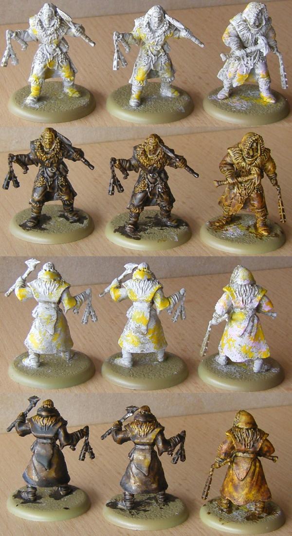
On the left, the usual thickly applied Contrast paint. In the middle, same colors in the same places, but more thinly applied and taking away pooling paint. On the right, a cleaned up one playing with off-white, pink and yellow to get a pattern on the coat.
I notice that applying Contrast thinly isn't just more work during application (not a big surprise), but makes it easy to miss spots that need cleaning up later which only takes more time and runs the risk of discoloring the bordering area. It seems to me that you are best off to slop on paint to catch all the recesses, then go back over the area with the unloaded brush to take away excess paint, working your way across the model one area at a time.
I do find (again not a big surprise) that a little cleanup goes a long way to improve the quality of the model, with not much time lost on it since you effectively brush paint away from one are of the model to another. But you want to take care that you apply enough in the first place so as not to miss anything and get a good dark to light contrast, which with diluted or plain conservative application may not be there as pronounced as you'd like.
Finally I think it's amazing what you can do with a couple of spots of different color on the base layer. I threw on the patches mostly randomly to save time, what with these being test models, but I can see this effect coming in handy for all sorts of more quality painting, providing a good base layer for surfaces that due to the automatic shades and highlights doesn't need much work to finish. Another highlight, maybe some weathering, and you can get a decent looking paintjob.
Most importantly, I have a much better feeling about Contrast for use on models with empty surfaces now. The ability to prepare the basecoat in such a way that the coat of Contrast produces an interesting look instead of a flat color and some ugly stains is of use to me. I was afraid that Contrast was only of use for specific models, but overcoming this particular problem opens up the paint for me, which I like because I am notoriously slow and anything that saves time without impacting quality is very welcome indeed. I can see painting power armor and such with contrast now where I was wary before. Might turn out to be a blessing when plastic Sisters are released.
I think I need to buy a couple more paints next time I'm at the local store.
Nehekhara lives! Sort of!
Why is the rum always gone?
2019/06/19 18:05:32
Subject: 'Free Your Models - Contrast' paint range -- In stores June 15th, color charts and video pg. 34
Respect to this man, he has destroyed 3 Rhinos so far so we don't have to.
Nah, he's used the same Rhino for all three videos
This message was edited 1 time. Last update was at 2019/06/19 19:32:35
'It is a source of constant consternation that my opponents cannot correlate their innate inferiority with their inevitable defeat. It would seem that stupidity is as eternal as war.'
- Nemesor Zahndrekh of the Sautekh Dynasty Overlord of the Crownworld of Gidrim
2019/06/19 21:21:34
Subject: Re:'Free Your Models - Contrast' paint range -- In stores June 15th, color charts and video pg. 34
lord_blackfang wrote: Respect to this man, he has destroyed 3 Rhinos so far so we don't have to.
I mean.. I guess. Does anyone actually paint vehicles like Rhino with a brush though? It is good to see someone actually do an example so there are pictures and video of what we do know, Contrast paints aren't meant for large flat surfaces where there is nothing to contrast and they show brush strokes (because there is no texture to contrast with). Although using the sponge method can give an interesting weather effect which isn't too bad.


 11527pts Total (7400pts painted)
 4980pts Total (4980pts painted)
 3730 Total (210pts painted)


 .
.