| Author |
Message |
 |
|
|
|
|
Advert
|
Forum adverts like this one are shown to any user who is not logged in. Join us by filling out a tiny 3 field form and you will get your own, free, dakka user account which gives a good range of benefits to you:
- No adverts like this in the forums anymore.
- Times and dates in your local timezone.
- Full tracking of what you have read so you can skip to your first unread post, easily see what has changed since you last logged in, and easily see what is new at a glance.
- Email notifications for threads you want to watch closely.
- Being a part of the oldest wargaming community on the net.
If you are already a member then feel free to login now. |
|
 |
2008/03/02 22:24:24
Subject: Space Marine Chapter : Crimson Hawks(WIP)
|
|

Dakka Veteran
|
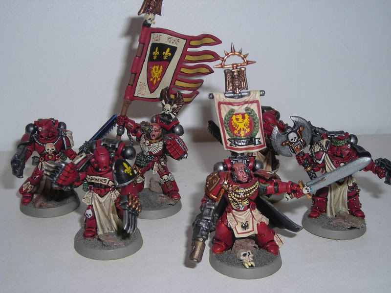
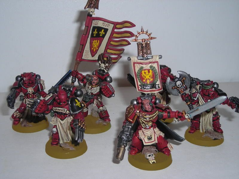
Semi-complete squadron :
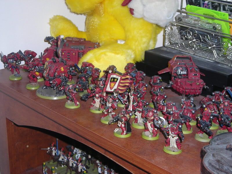
Command squad :

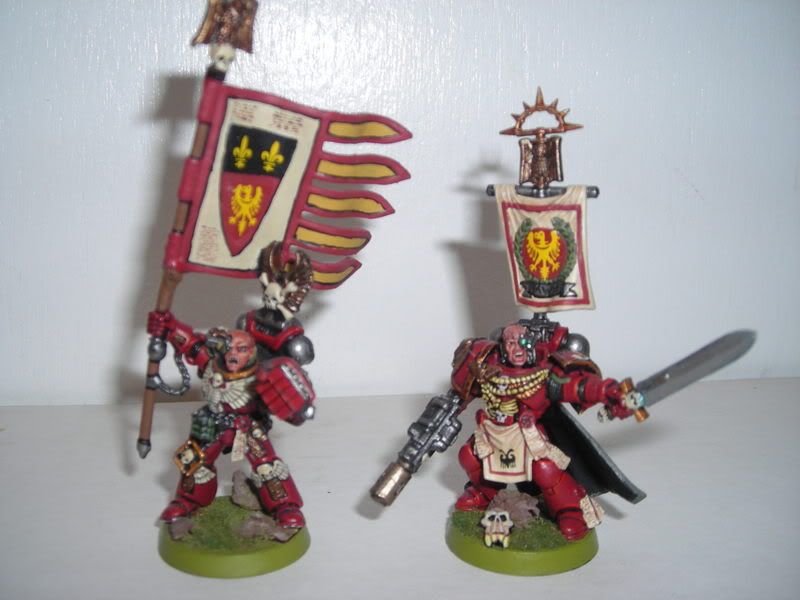
Commander and Standard Bearer :
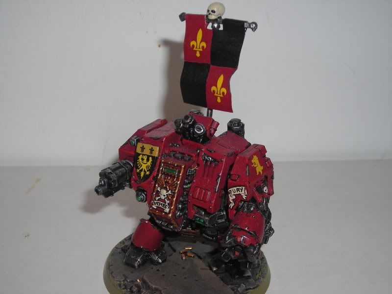
Dread Nought :
|
|
|
 |
|
2008/03/02 23:17:09
Subject: Space Marine Chapter : Crimson Hawks(WIP)
|
|

Rotting Sorcerer of Nurgle
|
i think the stuffed bear is a bit out of scale (or is his proxying for a warhound?)
the rest are really nicely painted - love the iconography
|
|
This message was edited 1 time. Last update was at 2008/03/02 23:17:26
Check out my gallery here
Also I've started taking photos to use as reference for weathering which can be found here. Please send me your photos so they can be found all in one place!! |
|
|
|
|
2008/03/03 02:17:23
Subject: Re:Space Marine Chapter : Crimson Hawks(WIP)
|
|
Dakka Veteran
|
Thanks bubber! I painted them to the best of my ability but any tips or constructive criticsm i welcome. Alot of the iconography is thanks to some medieval veni vedi vici shield transfers i had laying around. I thought they added a good 'knightly order' feel.
|
|
|
|
|
2008/03/03 13:15:16
Subject: Space Marine Chapter : Crimson Hawks(WIP)
|
|
Secretive Dark Angels Veteran
Baltimore, MD
|
More of a style point, but the dreadnought banner looks really blah compared to the other banner and the standard. Might wanna think of spiffing that up a bit.
|
Proud owner of  & & 
Play the game, not the rules.
|
|
|
|
|
2008/03/04 01:44:44
Subject: Re:Space Marine Chapter : Crimson Hawks(WIP)
|
|
Dakka Veteran
|
yeah, i know what you mean. I always meant to add something to it to make it fit in. Maybe I'll put a shield shape in the center with a hawk badge on it or add a spiffy border around it. Appreciate the comments.
|
|
|
|
|
2008/03/04 01:57:18
Subject: Space Marine Chapter : Crimson Hawks(WIP)
|
|
Decrepit Dakkanaut
|
I really like the shade of crimson you've come up with, and your painting style really works well.
|
|
|
|
|
|
2008/03/04 05:11:02
Subject: Space Marine Chapter : Crimson Hawks(WIP)
|
|
Infiltrating Oniwaban
|
I think the camera is washing out your highlights on the infantry, 'cause I can see them better on the dread. Good scheme, and good use of the transfers.
|
Infinity: Way, way better than 40K and more affordable to boot!
"If you gather 250 consecutive issues of White Dwarf, and burn them atop a pyre of Citadel spray guns, legend has it Gwar will appear and answer a single rules-related question. " -Ouze |
|
|
|
|
2008/03/04 05:30:45
Subject: Re:Space Marine Chapter : Crimson Hawks(WIP)
|
|
Growlin' Guntrukk Driver with Killacannon
|
Nice looking force, the subtle wear and tear on the vehicles looks pretty slick.
|
Waaagh-in-Progress
"...if I haven't drawn blood on a conversion, then I haven't tried hard enough." -Death By Monkeys
If Gork had wanted you to live, he would not have created me. |
|
|
|
|
2008/03/04 12:08:16
Subject: Space Marine Chapter : Crimson Hawks(WIP)
|
|
Regular Dakkanaut
|
I like the red a lot, and you have good technical detail!
...
.......
...................The color of the bases absolutely ruins it for me, however. If the rims were black or any shade of blue, and the ground a black drybrushed up to Spacewolves Grey for example, would be much more successful in my opinion. Almost anything other than off-olive-green... x.x Sorry that I'm being harsh, but the color combination you've chosen from the armor to the bases really makes me grind my teeth x.x I feel like merely changing your bases could do so much for these models...
|
And God said unto Abraham, "Take this mighty bolter, my son, and smite thy enemies from afar. Fear not, Emperor protects..er, I mean, well, youknowwhatImean." |
|
|
|
|
2008/03/04 12:22:38
Subject: Re:Space Marine Chapter : Crimson Hawks(WIP)
|
|

Hardened Veteran Guardsman
|
jedi76 wrote:yeah, i know what you mean. I always meant to add something to it to make it fit in. Maybe I'll put a shield shape in the center with a hawk badge on it or add a spiffy border around it. Appreciate the comments.
I suggest a pattern worked into the colours, like little tiny vines in grey and dark red on the black and red sections, respectively.
|
|
|
|
|
2008/03/04 15:35:23
Subject: Space Marine Chapter : Crimson Hawks(WIP)
|
|
Crazed Witch Elf
Albuquerque, NM
|
Mr. Bombadidaloo wrote:I like the red a lot, and you have good technical detail!
...
.......
...................The color of the bases absolutely ruins it for me, however. If the rims were black or any shade of blue, and the ground a black drybrushed up to Spacewolves Grey for example, would be much more successful in my opinion. Almost anything other than off-olive-green... x.x Sorry that I'm being harsh, but the color combination you've chosen from the armor to the bases really makes me grind my teeth x.x I feel like merely changing your bases could do so much for these models...
I don't know about grinding teeth, but I have to somewhat agree. A grey base would probably go really well. The red is gorgeous though.
|
Imperial Guard 
40k - 6-12-0
City Fight - 0-0-0
Planetstrike - 0-0-1
Apocolypse - 4-2-1 |
|
|
|
|
2008/03/04 17:58:23
Subject: Re:Space Marine Chapter : Crimson Hawks(WIP)
|
|
[DCM]
Illustrator
|
Did a rework of the bases in photoshop to give you a view of what Bomb and Stormtrooper are talking about.
I think the grey is rather striking with the reds.
Great job overall though on the army. My only crit is really the metal work. It feels like it could use some extra added depth. Especially on the CCW's.
|
-Aaron
Call For Fire
DA:80+S+GM(DPC)B++++I+Pw40k99+D++A++/mWD247R++T(M)DM+++++ |
|
|
|
|
2008/03/04 18:23:19
Subject: Re:Space Marine Chapter : Crimson Hawks(WIP)
|
|
Crazed Witch Elf
Albuquerque, NM
|
That grey is really nice. Definately has my vote.
|
Imperial Guard
40k - 6-12-0
City Fight - 0-0-0
Planetstrike - 0-0-1
Apocolypse - 4-2-1 |
|
|
|
|
2008/03/04 18:38:18
Subject: Space Marine Chapter : Crimson Hawks(WIP)
|
|
Homicidal Veteran Blood Angel Assault Marine
|
I like the grey as well. I'll have to remember that when I redo the bases on my blood angels.
|
I play  
I will magnetize (now doing LED as well) your models for you, send me a DM!
My gallery images show some of my work
|
|
|
|
|
2008/03/04 18:51:24
Subject: Space Marine Chapter : Crimson Hawks(WIP)
|
|
Decrepit Dakkanaut
|
The grey works because the models are red. The current bases are too bright and too yellow.
If the bases were a much darker green, like an olive drab with a black edge, there wouldn't be a problem.
Of course, if you just base them "naturally", they'd look fine, too.
But as-is, the brightness of the bases competes with the models, and that is why people think you should go with a more neutral base color.
|
|
|
|
|
|
2008/03/05 04:35:02
Subject: Re:Space Marine Chapter : Crimson Hawks(WIP)
|
|
Dakka Veteran
|
wow! the gray bases are very spiffy. I originaly thought a contrasting base color would look good but I'm convinced. Thanks a bunch gray death. I might have to add some more little rocks though.
Yeah I'm actually starting to hate that red, i actually use like 4 different shades of red to get them to that point. Glad you all think it looks good!
|
|
|
|
|
2008/03/05 17:50:26
Subject: Re:Space Marine Chapter : Crimson Hawks(WIP)
|
|
Boosting Ultramarine Biker
Arlington, VA
|
The standard bearer looks like his standard is a little bent at the hand. I have the same problem when converting mine. Aside from that, it looks good. I love the color scheme.
|
|
|
|
|
2008/03/05 19:27:26
Subject: Re:Space Marine Chapter : Crimson Hawks(WIP)
|
|
Crazed Witch Elf
Albuquerque, NM
|
Sturmtruppe wrote:The standard bearer looks like his standard is a little bent at the hand. I have the same problem when converting mine. Aside from that, it looks good. I love the color scheme.
It's just the wind blowing... yeah, that's the ticket. 
|
Imperial Guard
40k - 6-12-0
City Fight - 0-0-0
Planetstrike - 0-0-1
Apocolypse - 4-2-1 |
|
|
|
|
2008/03/13 16:47:04
Subject: Re:Space Marine Chapter : Crimson Hawks(WIP)
|
|
40kenthus
|
Nice stuff, one question were did you get the skull on the captains base?
|
Only now do I realize how much I prefer Pete Haines' "misprints" to Gav Thorpe's "brainfarts." :Abadabadoobaddon |
|
|
|
|
2008/03/13 18:26:35
Subject: Space Marine Chapter : Crimson Hawks(WIP)
|
|
Mekboy Hammerin' Somethin'
Spreading the word of the Turtle Pie
|
looks like the scout sniper one.
|
|
|
|
|
|
2008/03/14 00:01:02
Subject: Space Marine Chapter : Crimson Hawks(WIP)
|
|
Longtime Dakkanaut
|
looks good
|
|
|
|
|
2008/03/14 01:47:24
Subject: Re:Space Marine Chapter : Crimson Hawks(WIP)
|
|
Rampaging Chaos Russ Driver
|
I'm really diggin that command squad. darn all you and your good conversions/spiffy paint jobs. i promised myself i'd never play standard marines, but i may have to start an army in the near future.
anyway great paint job and the heraldry is the perfect touch. not too gaudy, but just enough flair to make them stand out some. 
|
[FONT="Times New Roman"]Those who fight monsters should take care that they never become one. For when you stand and look long into the abyss, the abyss also looks into you.[/FONT] |
|
|
|
|
2008/03/14 02:11:47
Subject: Re:Space Marine Chapter : Crimson Hawks(WIP)
|
|
Dakka Veteran
|
Yeah thats totally the scout sniper skull under my commander, looks like a dead ork maybe. Someday I'll actually paint my scout snipers too, but not this month. I actually am not sure if they are going to fit in with my other marines. The scouts look so much like contemporary troops, which isnt bad just not sure if it'll look right.
Appreciate the comments and critiques as always
|
|
|
|
|
2008/04/20 09:55:04
Subject: Re:Space Marine Chapter : Crimson Hawks(WIP)
|
|
Slippery Scout Biker
|
wow! the gray bases are very spiffy. I originaly thought a contrasting base color would look good but I'm convinced. Thanks a bunch gray death. I might have to add some more little rocks though.
Yeah I'm actually starting to hate that red, i actually use like 4 different shades of red to get them to that point. Glad you all think it looks good!
First off... nice scheme!
I was going to say, on the red front, it might be the camera but your paint looks a little sticky... sort of thick. Does that make any sense? Id suggest thinning the first coat or just using a simpler paint job to get a similar colour: like the first coat red gore, and then dry brush. ink, and detail edges, rather than so many successive coats.
Re: the dreads banner, something to go in the empty quarters would work, but I like the suggestion of vines. Perhaps incorporating them with a central crest. If you fancy doing something difficult like that, I'd pencil it on first. Unless you're a freehand genius.
Re. the scouts. I kinda hate them, especially the non-sniper ones. Im going to ebay my battleforce ones - maybe just ultramarine them to a decent standard and then sell. 
Finally, YAS to grey . I had a siam-hamm eldar force that used a darker grey to similar effect, its a very nice complement to deeper reds. Now go build a CoD board to match!
DMG
|
The enemy is within. Don't confuse me with him. |
|
|
|
|
|
|
 -- $k
-- $k  -- 9k
-- 9k  -- 6k
-- 6k  -- 4k
-- 4k  --
-- 