| Author |
Message |
 |
|
|
|
|
Advert
|
Forum adverts like this one are shown to any user who is not logged in. Join us by filling out a tiny 3 field form and you will get your own, free, dakka user account which gives a good range of benefits to you:
- No adverts like this in the forums anymore.
- Times and dates in your local timezone.
- Full tracking of what you have read so you can skip to your first unread post, easily see what has changed since you last logged in, and easily see what is new at a glance.
- Email notifications for threads you want to watch closely.
- Being a part of the oldest wargaming community on the net.
If you are already a member then feel free to login now. |
|
 |
2009/03/05 22:48:48
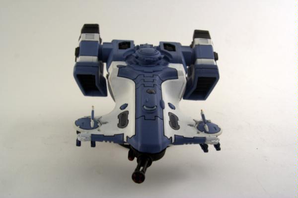
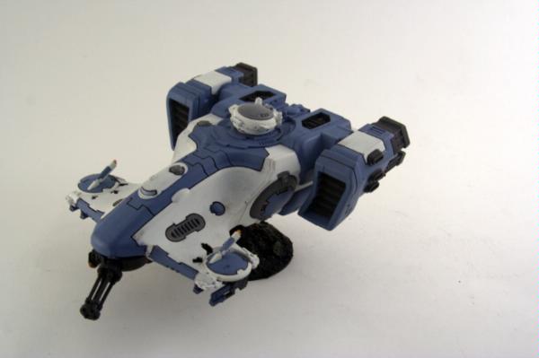
Subject: Pics of my Devilfish WIP - comments?
|
|

Pulsating Possessed Chaos Marine
|
Having played with these off and on mostly unpainted for a while now, I've decided to try to paint them since I'm now using them all the time in 5e.
This is a WIP and I'm trying to figure out a few things like:
How to effectively paint the windshields
What parts I can put a warm/contrasting color to match the orange/red fauna on my bases (or if this is really necessary)
Detailing - I'm not sure how I can highlight these or if I really need to. Lining is not one of my talents.
Cleanup - some areas obviously need touchup
Painting the white - on one of these it's still just the basecoat. The other needs another coat of white. Right now I've just done white basecoat + 2 or 3 thin coats of skull white. Not sure if I should start with a darker basecoat like menoth white highlight and then go to skull white
Decals.
Any comments/criticism welcome! I am definitely still a beginner painter. Pictures are ok but I need some stronger lights for my too big lightbox i think.
|
|
This message was edited 1 time. Last update was at 2009/03/05 22:49:45
'12 Tournament Record: 98-0-0 |
|
|
 |
|
2009/03/05 22:52:38
Subject: Pics of my Devilfish WIP - comments?
|
|

Regular Dakkanaut
|
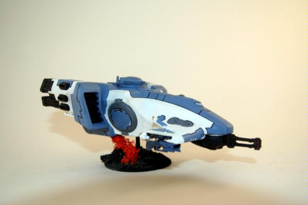
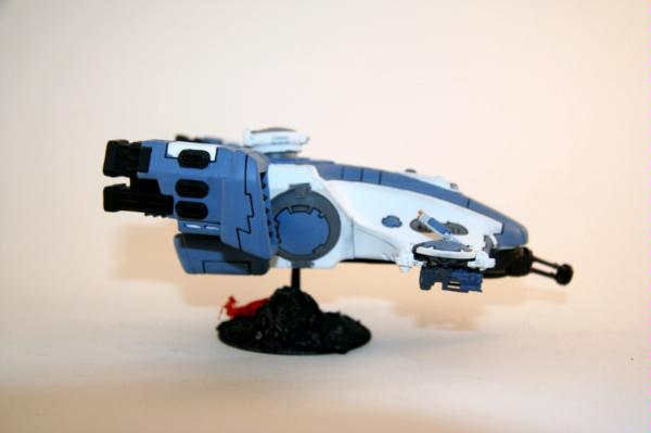
I don't like the red on the base - sorry.
BUT i love the rest of the paint job. Maybe a bit of a boltgun metal drybush on the engines?
But overall its very clean and smart, keep going it will be great to see a whole army done to that standard.
|
|
|
|
|
|
2009/03/05 22:57:10
Subject: Pics of my Devilfish WIP - comments?
|
|
[ARTICLE MOD]
Huge Hierodule
|
Agreed. The red clashes and detracts from an otherwise very crisp, clean looking paint job. Recommend you line the little cracks with either badab black or the blue wash. It will flow well and help make neat lines.
|
|
|
|
|
|
2009/03/05 23:02:23
Subject: Pics of my Devilfish WIP - comments?
|
|
Pulsating Possessed Chaos Marine
|
Hmm, thats too bad...I do like how the bases turned out, but it is quit a big contrast. Here's an example of an older pic with similar bases on troops:

Maybe the contrast is just too much, or maybe the tanks are just so much bigger that it doesn't work as well. Hmmm.
|
'12 Tournament Record: 98-0-0 |
|
|
|
|
2009/03/05 23:06:35
Subject: Pics of my Devilfish WIP - comments?
|
|
Longtime Dakkanaut
|
I'd think about tan bases and pale orange scrub.
Dark models with dark bases just blend into everything. And the red is too stark and contrasting.
The paint job is very nice.
|
In the dark future, there are skulls for everyone. But only the bad guys get spikes. And rivets for all, apparently welding was lost in the Dark Age of Technology. -from C.Borer |
|
|
|
|
2009/03/05 23:09:00
Subject: Re:Pics of my Devilfish WIP - comments?
|
|
Longtime Dakkanaut
|
I like the red, but I think the base would look better in a light earth tone.
|
|
|
|
|
2009/03/05 23:11:51
Subject: Pics of my Devilfish WIP - comments?
|
|
Pulsating Possessed Chaos Marine
|
Hmm, well, the bag of lichen I pulled this from has color from the bright read to orange to yellow brown, so that is doable. I have 24 more fire warriors to paint and base so I will try that on the next batch and see the difference. I am not excited about repainting the bases though, but I can see how they are too dark and have wondered about that myself
|
'12 Tournament Record: 98-0-0 |
|
|
|
|
2009/03/05 23:40:57
Subject: Pics of my Devilfish WIP - comments?
|
|
Possessed Khorne Marine Covered in Spikes
|
like the fish dont realy like the fire worriors and the orange shrub thing doesnt help but lovin the fish paint job
|
|
|
|
|
|
2009/03/06 00:04:24
Subject: Pics of my Devilfish WIP - comments?
|
|

Lead-Footed Trukkboy Driver
The bit stuck on the side of England. Wales isn't it.
|
I love the red and black bases the red is a nice counterpoint.. Makes the terrain alien. Orange is a complimentory colour to blue and "they" say you should avoid complimentories . Red and green, blue and orange, yellow and purple. Oh another thing don't tau use there armour colours as camoflage , so the terrain should be similar colours to their uniform?
|
|
|
|
|
|
2009/03/06 00:45:24
Subject: Pics of my Devilfish WIP - comments?
|
|
Pulsating Possessed Chaos Marine
|
I don't know about camouflage - the codex sept colors pont towards that sometimes, but others are different. After starting the army using shadow grey I've had to start re-doing a lot of stuff using a shadow grey/space wolves grey mix, which is basically the sa'cea sept colors in the codex and the urban camoflage. But with the white on the tanks it doesn't make sense for urban camo either...maybe I just need to make the firewarriors white or make the bases snow or...who knows. But right now they don't totally match, and obviously don't have camo.
Not sure about contrasting colors - the sept markings in the book are almost often contrasting (using firey orange for blue fire warriors).
thanks for all the comments and the compliments on the devilfish. A lot of time has passed from painting the FWs and the devilfish so it's nice to see I've improved. The FWs are actually in the process of being re-done and thats a pretty old picture. I'm a pretty off and on painter so I never seem to get much stuff done but I'm really trying to get this army finished since it feels nice to put a fully painted army on the board.
|
'12 Tournament Record: 98-0-0 |
|
|
|
|
2009/03/06 02:23:22
Subject: Pics of my Devilfish WIP - comments?
|
|
Committed Chaos Cult Marine
Lawrence, KS (United States)
|
I actually love the extreme contrast you've got going on in your Fire Warriors. It makes them look like something beyond just a piece of a tabletop game. I like the idea a lot.
However, the execution could be better. The Fire Warriors look like they could at least use a blue wash and a going back over with their basecoat, if nothing else. The contrast on the blue itself is not good enough. I'd say keep the base blue, though. It will make the brilliant contrast with the red even more relevant.
What I really don't like, however, is the pure white sections of the Devilfish. I'd say those could easily be another shade of blue, in keeping with the theme, and perhaps have some of the lichen growing over the hull? Just an idea, as it would convey the contrast much like you did with your FWs.
|
Pain is an illusion of the senses, Despair an illusion of the mind.
 The Tainted - Pending The Tainted - Pending
I sold most of my miniatures, and am currently working on bringing my own vision of the Four Colors of Chaos to fruition |
|
|
|
|
2009/03/06 02:30:39
Subject: Pics of my Devilfish WIP - comments?
|
|
Pulsating Possessed Chaos Marine
|
Thanks, yeah I thought about ways to weather the devilfish or have the lichen more prominent/growing over the hull. The problem I have is figuring out a way to do that without making the skimmers seem completely stationary - conveying a sense of movement through the terrain. it would be easy to do if I was making this, say, a diorama, but not necessarily as it is. Any ideas? I kind of want to do weathering effects (say exhaust stains behind the vents on the front, and behind the exposed engines on top) and along that theme I could put some of the lichen around the front of the engines or say, tangled in the burst cannon or the drones or hanging from the bottom of the devilfish.
As for the FWs...yes, they're being painted - a lighter shade over the current blue, and some highlighting. They were some of the first miniatures I ever painted - I only posted the pic to give a better example of the way the bases look with the rest of my army, I didn't have an opportunity to take a new pic. Not that they look that much better yet  . One thing for sure is changing is their guns - they are terribly painted.
|
|
This message was edited 1 time. Last update was at 2009/03/06 02:33:11
'12 Tournament Record: 98-0-0 |
|
|
|
|
2009/03/06 02:43:29
Subject: Pics of my Devilfish WIP - comments?
|
|
Committed Chaos Cult Marine
Lawrence, KS (United States)
|
I wouldn't have lichen growing up and around the Devilfish from the base, but rather growing from sections of the ship itself, like the hatches and grates (to keep it from looking anchored to the ground). Of course, you'd probably have to weather the fish for this to look any good, as lichen growing rampant over a pristine vehicle wouldn't look right at all. Be really sparing with it, though. This could be really easy to overdo.
|
Pain is an illusion of the senses, Despair an illusion of the mind.
The Tainted - Pending
I sold most of my miniatures, and am currently working on bringing my own vision of the Four Colors of Chaos to fruition |
|
|
|
|
2009/03/06 02:45:52
Subject: Re:Pics of my Devilfish WIP - comments?
|
|
Nasty Nob on Warbike with Klaw
|
The lichen reminds me of the wierd alien plants from the remake of war of the worlds.
|
WAAAAAAAAAAAAAAAAAAAAAAAGGGGGHHHHH!!!!!!!!!! |
|
|
|
|
2009/03/06 03:22:08
Subject: Pics of my Devilfish WIP - comments?
|
|
Pulsating Possessed Chaos Marine
|
Yeah...I think I'll save weathering effects and lichen on the vehicle for when I start painting piranhas this week...I don't care as much about them as I rarely use them and they aren't as big. See how it looks/works then go back and hit the devilfish and the three hammerheads.
does anyone have a suggestion on how to do the windshields? I'm not sure what I need...maybe a tutorial on how to paint something that is supposed to look reflective or glass. I could do something simple like just highlight one corner to give a look of light glinting off the window...but I really don't have any idea how to go about that effectively.
|
|
This message was edited 1 time. Last update was at 2009/03/06 03:23:41
'12 Tournament Record: 98-0-0 |
|
|
|
|
|
|


