| Author |
Message |
 |
|
|
|
|
Advert
|
Forum adverts like this one are shown to any user who is not logged in. Join us by filling out a tiny 3 field form and you will get your own, free, dakka user account which gives a good range of benefits to you:
- No adverts like this in the forums anymore.
- Times and dates in your local timezone.
- Full tracking of what you have read so you can skip to your first unread post, easily see what has changed since you last logged in, and easily see what is new at a glance.
- Email notifications for threads you want to watch closely.
- Being a part of the oldest wargaming community on the net.
If you are already a member then feel free to login now. |
|
 |
2019/02/08 16:36:00
Subject: New Adepta Sororitas Preview
|
|

Regular Dakkanaut
|
 Nightlord1987 wrote:Lol Nightlord1987 wrote:Lol. Some skulls are holy relics, others are just littered across the floor like so much useless trash. Grimdark1!
I get that it's fun to harp on the setting's aesthetics and all, but that's hardly an egregious example.
I'm pretty sure the Catholic church sets a good precedent for treating some human remains with undue reverence because they allegedly came from saintly individuals vs. leaving others in the charnel-house because, well, who cares?
|
Hope is the first step on the road to disappointment. |
|
|
 |
|
2019/02/08 16:36:11
Subject: New Adepta Sororitas Preview
|
|

Walking Dead Wraithlord
|
Still looking good. Still planning to buy at least a squad.
|
|
|
|
|
2019/02/08 16:40:55
Subject: New Adepta Sororitas Preview
|
|
Haemonculi Flesh Apprentice
|
Those hinges are on the wrong side 
|
|
|
|
|
|
2019/02/08 16:43:47
Subject: New Adepta Sororitas Preview
|
|
Fixture of Dakka
|
I like it. Always wanted a sisters army but never was going to buy in 2000 points worth. Excited to see how they're released and how I can fit them in with the rest of my inquisition.
|
|
|
|
|
2019/02/08 16:51:14
Subject: New Adepta Sororitas Preview
|
|

Calculating Commissar
|
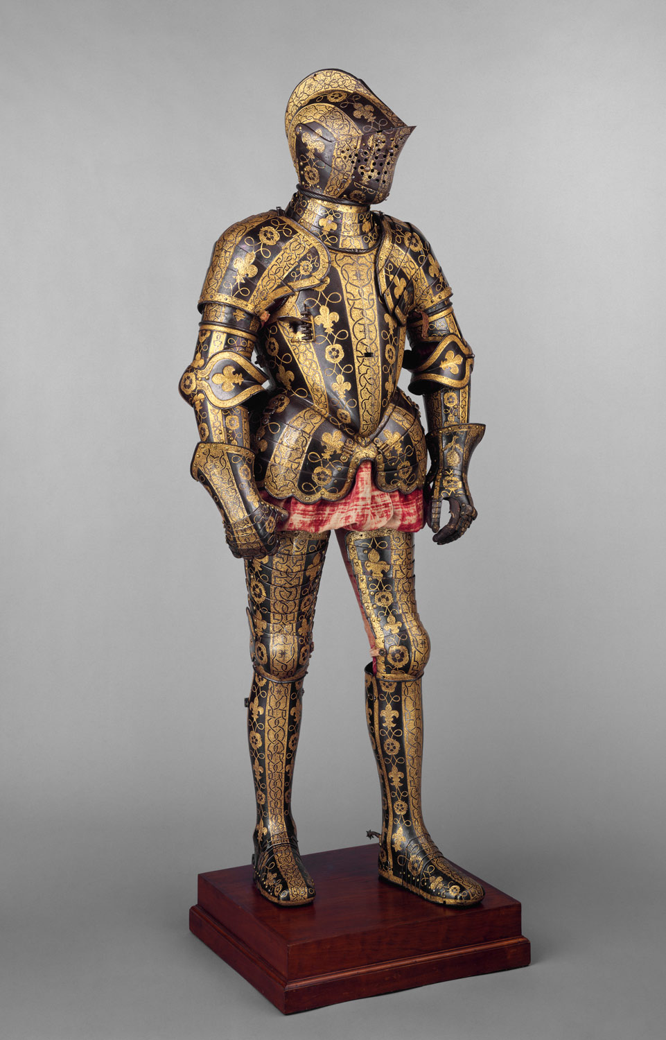
Or 16th century plate armour  The greaves and helmet are obviously based upon historic designs, and the breastplate is essentially a mid-15th century/ maybe early peascod breastplate with breasts attached over the top (use your own headcannon for whether these are decorative or not). The only way the sallet is anachronistic is that it fell out of fashion about 50 years before the peascod came in...
|
|
This message was edited 1 time. Last update was at 2019/02/08 16:52:51
 ChargerIIC wrote: ChargerIIC wrote:If algae farm paste with a little bit of your grandfather in it isn't Grimdark I don't know what is.
|
|
|
|
|
2019/02/08 20:34:10
Subject: New Adepta Sororitas Preview
|
|
Troubled By Non-Compliant Worlds
Kent; United Kingdom; Terra
|
Well I think this model looks awesome, as does Celestine, Veridia and all the battle sisters concepts models. I shall be putting aside a fair wedge of cash for this release!!
|
Check out my blog for all things 30k, 40k, Oldhammer and tutorials:
http://classicastartes.blogspot.co.uk
    |
|
|
|
|
2019/02/08 23:24:28
Subject: New Adepta Sororitas Preview
|
|

Hallowed Canoness
|
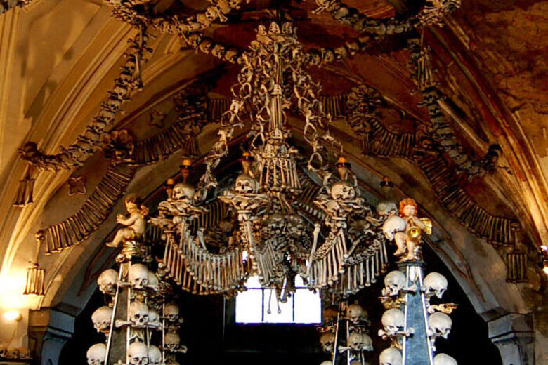
Vey nice, very catholic, hope we'll get even more skulls everywhere though. The Sisters is really the faction where skulls are the most appropriate in the skull universe of skulls that is Warhammer "40 000 Skulls".
I mean, catholics do this:
|
"Our fantasy settings are grim and dark, but that is not a reflection of who we are or how we feel the real world should be. [...] We will continue to diversify the cast of characters we portray [...] so everyone can find representation and heroes they can relate to. [...] If [you don't feel the same way], you will not be missed"
https://twitter.com/WarComTeam/status/1268665798467432449/photo/1 |
|
|
|
|
2019/02/09 01:33:44
Subject: Re:New Adepta Sororitas Preview
|
|
Calm Celestian
|
Love love love.
My only fear is I won't get my current sisters backlog done before this drops.
|
|
|
|
|
|
2019/02/09 01:38:57
Subject: New Adepta Sororitas Preview
|
|
Fireknife Shas'el
|
I always said to my friends I'd build a SoB army if they ever came out in plastic. Not looking forward to $30 CAD character models, though.
|
|
|
|
|
|
2019/02/09 01:58:27
Subject: New Adepta Sororitas Preview
|
|
Stealthy Warhound Titan Princeps
|
Gotta throw some shade - I find the shoulders excessive - though I think it is just the way they stick up in that pose perhaps. The bolter is also too big - I know that is a silly thing to complain about in 40K, but I swear the older ones were a bit slimmer and better scaled to the models. That shrine is awesome though and I am generally glad to see no major change to the aesthetic.
|
|
|
|
|
2019/02/09 02:15:54
Subject: New Adepta Sororitas Preview
|
|
Terrifying Doombull
|
Sounds like you're making assumptions.
I just don't like 4 different aesthetics jammed together like a layer cake (I'll admit the hat and legs kinda match)
@Meliessia- problem is, for me I wouldn't want to paint any of it metal, but the only metal looking parts are the legs, shoulder pad/gorget array, helmet and maybe the breast cups. It would look pretty wacky.
Also the rebreather gorget, which is bizarrely fixed in place to shoulder pads that literally can't be (or else she can't lower that right arm, or at least that shoulder pad would always be sticking up at that weird angle)
The corset, sleeves, gloves and robe all look like cloth, and with the exception of the gloves and corset, the same cloth, with the corset oddly fastened over an inner robe... somehow. [the alternative is the lower robe and sleeves don't attach to anything at all] She's got multiple layers from foot to head, and multiple layers of stuffing over her skin. At minimum a robe with a corset over it then breast cups over that, then everything pinned down by the massive gorget/shoulder pad array, and a backpack sort of stapled onto... something from behind, and the breast cups have to be attached by either glue or as if they're suction cups. But her legs just have one layer of armor, I guess? It's just a baffling composite.
Even worse now that I'm not looking at it on a phone.
|
Efficiency is the highest virtue. |
|
|
|
|
2019/02/09 02:18:29
Subject: New Adepta Sororitas Preview
|
|
Consigned to the Grim Darkness
|
Voss wrote:@Meliessia- problem is, for me I wouldn't want to paint any of it metal
Even if you don't paint metal parts metallic, it's a prime spot for different colors. Also, the arms aside from the sleeves, the shoulders, the legs, and the helmet would all appear to be metal. The chest part has a layer of cloth on the outside as part of decoration, the "corset" look that many people don't like. But it is still power armor they're wearing.
|
The people in the past who convinced themselves to do unspeakable things were no less human than you or I. They made their decisions; the only thing that prevents history from repeating itself is making different ones.
-- Adam Serwer
My blog |
|
|
|
|
2019/02/09 03:28:24
Subject: New Adepta Sororitas Preview
|
|
Longtime Dakkanaut
|
Voss wrote:.That's definitely a Sister. But...
Maybe its the different shades of grey but the greaves+lower robe+corset+shoulder pads (of doom)+anachronistic helmet don't create a unified model. Too piecemeal, too many unrelated aesthetics layered on top of each other
Do you think the same of the current models? All those are features that are present on the older stuff as well, with only slight differences.
|
|
|
|
|
2019/02/09 03:40:59
Subject: New Adepta Sororitas Preview
|
|
Longtime Dakkanaut
|
That shield of bones looks a lot like charnel throne terrain for the Flesh Eater Courts.Wait...could Catholics actually be Flesh Eaters?
|
|
This message was edited 1 time. Last update was at 2019/02/09 03:41:44
|
|
|
|
|
2019/02/09 05:33:23
Subject: New Adepta Sororitas Preview
|
|

Owns Whole Set of Skullz Techpriests
Versteckt in den Schatten deines Geistes.
|
The Sister looks like a Sister. That's the important part. No radical redesign, no attempt to appease certain noisy minority groups screaming about certain elements of the armour or footwear - just a Sister, dressed like a Sister, being a Sister. Good. That's the way should. [EDIT]: But yeah, those hinges are on the wrong side.  Kid_Kyoto wrote: Kid_Kyoto wrote:From what I understand most land masses in 40k rest on a bed of rolling skulls which is what causes the occasional skull quake. (learned geology from Realms of Battle boards)
They're not actually skulls. It's a fictional element found throughout the galaxy known as "skulldanium".
|
|
This message was edited 1 time. Last update was at 2019/02/09 05:35:55
|
|
|
|
|
2019/02/09 08:24:32
Subject: New Adepta Sororitas Preview
|
|
[MOD]
Solahma
|
Well we believe the body and blood of our Lord is truly present in communion so ...
As for the hinges, sometimes you do find them on the inside (for example, contemporary kitchen cabinet designs). I’m not sure I quite understand how the ones depicted on the render are supposed to work and my guess would be that they are present because the little sub-reliquary doors are too plain otherwise. Voss wrote:Sounds like you're making assumptions.
I just don't like 4 different aesthetics jammed together like a layer cake
This render reflects one aesthetic; namely, the aesthetic of the Adepta Sororitas, established decades ago and faithfully represented by this latest render. As you yourself noted, that’s definitely a Sister. The Adepta Soroitas aesthetic obviously incorporates a variety of IRL historical references but at this point it is so iconic as to be practically synonymous with the faction’s identity.
I’ll apologize in advance if I’m coming across as splitting hairs but the background on this, going back many years now, is certain posters claiming they like Sisters but simultaneously arguing that Sisters should look radically different than they actually do, in terms of being redesigned (as opposed to simply updating the sculpts for better detail, proportion, etc). That makes no sense to me. Calling for major redesigns is a pretty clear indication of not liking the faction to the point of wanting it transformed into something else.
So I’m not trying to pick on you specifically and I admit my initial reply was too terse. You’re right, I was making assumptions. That’s my bad, it’s a kneejerk reaction to a decade of defedning the actual faction, my favorite faction. And now that GW has shown it will allow actual Sisters of Battle to return in plastic, I should probably not be so defensive. Old habits die hard!
Then again, we haven’t seen Repentia yet.
|
|
This message was edited 3 times. Last update was at 2019/02/09 08:55:41
|
|
|
|
|
2019/02/09 08:57:07
Subject: Re:New Adepta Sororitas Preview
|
|

Inspiring SDF-1 Bridge Officer
|
Well, IMHO they are succeeding in making them look like the old sisters of battle made with modern tech, so that's definitely a plus.
I might have liked a slightly more drastic redesign of some stuff, and some proportions could be a smidge better, but the previews have been great so far, and I feel I'm going to spend a lot of money there.
Plus, they just might be a bit more drastic with new units while keeping the classic ones... well, classic. That would be cool too.
Automatically Appended Next Post:
 Manchu wrote: Manchu wrote:I’ll apologize in advance if I’m coming across as splitting hairs but the background on this, going back many years now, is certain posters claiming they like Sisters but simultaneously arguing that Sisters should look radically different than they actually do, in terms of being redesigned (as opposed to simply updating the sculpts for better detail, proportion, etc). That makes no sense to me. Calling for major redesigns is a pretty clear indication of not liking the faction to the point of wanting it transformed into something else.
Well, people can like something and still want that something to be better (for their own definition of "better", of course). I may love Imperial Guard and still think that Catachans and Cadians are kind of crap, and that a redesign using some of the old Jes Goodwin sketches would look dope and much better, after all. Or I might have loved the dark eldars from the start and still think that the complete redesing of the whole line was absolutely incredible. That wouldn't make me "not like" the faction. Some other people may like the fluff but the models not so much, or whatever. Different people will have different pet peeves, and dismissing them off hand with a simple " well, it seems you don't like that thing you like" may be a tad reductionist.
I for example love sisters, and I'm loving the previews, and I still would not have minded if they had gone farther with the redesign... or rather, I might not have minded, since it would depend a lot on implementation. I could also have hated it. I like the ones we're getting, so far. And as you say, we still haven't seen repentia...
|
|
This message was edited 4 times. Last update was at 2019/02/09 09:09:23
|
|
|
|
|
2019/02/09 09:20:10
Subject: New Adepta Sororitas Preview
|
|
[MOD]
Solahma
|
I’ll have to push back on the idea that this is all merely subjective, if that’s the right term. Again, there’s a reason why this render is unambiguously, inarguably a Sister of Battle to every rational observer. In contrast, for example, Primaris SM incorporate a lot subtle and not-so-subtle design elements that together represent a sharp discontinuity with “traditional” SM. But of course, that’s the point. Primaris Marines aren’t the same as the old Marines. Now, whether someone thinks that’s a good thing or not, no one can say Primaris must look more like the old ones. But this doesn’t apply to the long-awaited redesign of Sisters of Battle. This isn’t a seperate (sub)faction; this is supposed to be the same faction.
When GW announced this strange tip-toe approach to the re-release, I was really skeptical and critical. I still am. I can’t shake the feeling that I need to hold my breath waiting for an unpleasant suprise. And that could be what happens with Repentia.
But so far? So good!
|
|
|
|
|
|
2019/02/09 10:57:18
Subject: New Adepta Sororitas Preview
|
|
Troubled By Non-Compliant Worlds
Kent; United Kingdom; Terra
|
Here are some Sisters I have just painted... these new one look like they’ll fit right alongside them without looking too out of place (though I may paint them as another order).
That’s all I can ask really. I didn’t want a massive redesign... just a modernisation into beautiful crisp plastic!
|
|
This message was edited 1 time. Last update was at 2019/02/09 11:58:54
Check out my blog for all things 30k, 40k, Oldhammer and tutorials:
http://classicastartes.blogspot.co.uk
|
|
|
|
|
2019/02/09 11:49:52
Subject: New Adepta Sororitas Preview
|
|
Hallowed Canoness
|
GaroRobe wrote:That shield of bones looks a lot like charnel throne terrain for the Flesh Eater Courts.
It's from the Sedlec ossuary. If you look closely, you can see a small bird (made of human bone) eating the eye of a corpse (made of, well… human bone lol), which was a way to celebrate some military victories over… Ottomans if I recall correctly, and how birds ate the eyes of the defeated ottomans. Nice!
Reality is more over-the-top than 40k lol.
|
"Our fantasy settings are grim and dark, but that is not a reflection of who we are or how we feel the real world should be. [...] We will continue to diversify the cast of characters we portray [...] so everyone can find representation and heroes they can relate to. [...] If [you don't feel the same way], you will not be missed"
https://twitter.com/WarComTeam/status/1268665798467432449/photo/1 |
|
|
|
|
2019/02/09 11:57:03
Subject: New Adepta Sororitas Preview
|
|
Longtime Dakkanaut
|
Legion can you spoiler tag that photo, it’s huge
|
|
|
|
|
2019/02/09 12:35:27
Subject: New Adepta Sororitas Preview
|
|
Calculating Commissar
|
One of the things I like about that Sister model is they have taken the time to clamp each skull to the back of the reliquary Looks great with the clamps through the face.
|
ChargerIIC wrote:If algae farm paste with a little bit of your grandfather in it isn't Grimdark I don't know what is.
|
|
|
|
|
2019/02/09 15:45:04
Subject: New Adepta Sororitas Preview
|
|
[MOD]
Solahma
|
Good point, a wonderful little detail showing the lack of a boundary between reverence and brutality.
|
|
|
|
|
|
2019/02/09 16:16:28
Subject: New Adepta Sororitas Preview
|
|
Terrifying Doombull
|
I think some of what's bothering me about it is the increased detail of the render. Some of the elements that were blurred on the metal models (or hidden by their guns, poses and paint jobs) really jump out on this picture, and my brain is resistant to resolving them into coherent look rather than very distinct elements that don't really go together.
Part of that too is different subsections have a distinct different tint to them. If it was mostly black with red sleeves and robes (as in those pictures of the metals), my reaction might different.
But the focus of this, to me, is how distinct the different elements of her armor are
|
Efficiency is the highest virtue. |
|
|
|
|
2019/02/09 16:26:57
Subject: New Adepta Sororitas Preview
|
|
Inspiring SDF-1 Bridge Officer
|
Manchu wrote:I’ll have to push back on the idea that this is all merely subjective, if that’s the right term. Again, there’s a reason why this render is unambiguously, inarguably a Sister of Battle to every rational observer. In contrast, for example, Primaris SM incorporate a lot subtle and not-so-subtle design elements that together represent a sharp discontinuity with “traditional” SM. But of course, that’s the point. Primaris Marines aren’t the same as the old Marines. Now, whether someone thinks that’s a good thing or not, no one can say Primaris must look more like the old ones. But this doesn’t apply to the long-awaited redesign of Sisters of Battle. This isn’t a seperate (sub)faction; this is supposed to be the same faction.
When GW announced this strange tip-toe approach to the re-release, I was really skeptical and critical. I still am. I can’t shake the feeling that I need to hold my breath waiting for an unpleasant suprise. And that could be what happens with Repentia.
But so far? So good!
I do agree that so far so good, and that the renders shown so far are unmistakingly SoBs. And I din't mean that it is subjective, not exactly, but rather that someone can like a faction, or the idea of it, or the fluff, and still not like the actual, physical intepretation of them.
Going back to one of my examples, the rebooted Dark Eldars are still unmistakingly Dark Eldars, I would say, and still anything and everything is better than what was before. So far, with these SoBs we have exactly what we had before, except more defined and with better detail, but it is 100% what was before, with little or no redesign whatsoever. I do like them, a lot, so far. But I don't know wether or not I would have liked them if they had strayed more from that, because they haven't, at least not so far. Automatically Appended Next Post: Voss wrote:I think some of what's bothering me about it is the increased detail of the render. Some of the elements that were blurred on the metal models (or hidden by their guns, poses and paint jobs) really jump out on this picture, and my brain is resistant to resolving them into coherent look rather than very distinct elements that don't really go together.
Part of that too is different subsections have a distinct different tint to them. If it was mostly black with red sleeves and robes (as in those pictures of the metals), my reaction might different.
But the focus of this, to me, is how distinct the different elements of her armor are
The renders are one thing, but they aren't the full (or final) picture, not by a long shot. I'm pretty sure they will look better in the flesh, so to speak.
|
|
This message was edited 1 time. Last update was at 2019/02/09 16:28:14
|
|
|
|
|
2019/02/09 16:39:02
Subject: New Adepta Sororitas Preview
|
|
Calculating Commissar
|
Voss wrote:I think some of what's bothering me about it is the increased detail of the render. Some of the elements that were blurred on the metal models (or hidden by their guns, poses and paint jobs) really jump out on this picture, and my brain is resistant to resolving them into coherent look rather than very distinct elements that don't really go together.
Part of that too is different subsections have a distinct different tint to them. If it was mostly black with red sleeves and robes (as in those pictures of the metals), my reaction might different.
But the focus of this, to me, is how distinct the different elements of her armor are
I see your points, but for me those components do not look so disjointed. It really is just plate armour with extra cloth and some scifi greeblings.
Lengthen the tabard, add some sleeves, add the backpack and respirator tube, and a couple of decorative domes on the chest, and this armour would look remarkably close to the Sister armour. It even has giant pauldrons!
Sure, that is a lot of small changes, but they are applied over a coherent base of well defined plate armour features. Even the corset look is pretty much found within plate armour, especially the later versions as above. Cloth coverings over armour were also common.
I think you are right- if the model was painted, it would pull the features in together.
Automatically Appended Next Post:
Incidentally, this was practical armour, not just decorative. Used for jousting (with additional armour plates added), foot tourneys, and apparently also intended for field use. So real, effective armour, despite the decoration. I don't know if it was proofed, but coming out of Greenwich at that time means it would likely have been effective at stopping pistols and most firearms of the day.
|
|
This message was edited 4 times. Last update was at 2019/02/09 16:46:00
ChargerIIC wrote:If algae farm paste with a little bit of your grandfather in it isn't Grimdark I don't know what is.
|
|
|
|
|
2019/02/09 17:56:29
Subject: New Adepta Sororitas Preview
|
|
Grim Dark Angels Interrogator-Chaplain
Vigo. Spain.
|
If they redesign the Repentia like they did with the Dark Eldar Mandrakes I would be rapt.
Repentia just don't look good and the concept they are trying to represent works better if they are more similar to flagelants than to BDSM nuns with giant chainswords (Even if I think BDSM nuns with giant Chainswords are amazing). But I wouldn't mind BDSM nuns with giant chainswords in new plastic technology. I just think those models don't match with their fluff.
|
 Crimson Devil wrote: Crimson Devil wrote:
Dakka does have White Knights and is also rather infamous for it's Black Knights. A new edition brings out the passionate and not all of them are good at expressing themselves in written form. There have been plenty of hysterical responses from both sides so far. So we descend into pointless bickering with neither side listening to each other. So posting here becomes more masturbation than conversation.
ERJAK wrote:Forcing a 40k player to keep playing 7th is basically a hate crime.
|
|
|
|
|
2019/02/09 18:33:04
Subject: New Adepta Sororitas Preview
|
|
Monster-Slaying Daemonhunter
|
I would like to see Repentia along the lines of wrapped-in-scripture as opposed to the whips-and-leather thing they've got going.
That said, I really like this imagifier. She maintains the existing aesthetic, and while new ones will certainly be larger than m,y existing ones, they should all fit right in.
I don't look forward to re-basing everyone to 32's, though. That's going to be "FUN".
|
Guardsmen, hear me! Cadia may lie in ruin, but her proud people do not! For each brother and sister who gave their lives to Him as martyrs, we will reap a vengeance fiftyfold! Cadia may be no more, but will never be forgotten; our foes shall tremble in fear at the name, for their doom shall come from the barrels of Cadian guns, fired by Cadian hands! Forward, for vengeance and retribution, in His name and the names of our fallen comrades! |
|
|
|
|
2019/02/09 19:05:13
Subject: Re:New Adepta Sororitas Preview
|
|

Huge Bone Giant
|
Current Repentias suffer a little from being surprisingly modestly clad for naked Sisters with giant chainswords and some stapled on scripture. It gives the impression of the oft quoted BDSM nun much more than the raging zealots they're supposed to be.
GW should at least drop the armor bits on the new ones. While they serve to tie the models in with the other Sisters, they do detract from the idea behind Repentias. Galas isn't wrong to mention Flagellants in this regard. Do they need puffy arms and giant feathers for you to know they're a legitimate Empire unit? No. And their ragtag look even enhances the appearance of a Warrior-Priest in the unit with the direct poor fanatics/rich clergy contrast.
Repentias could be that.
Also, boobies.
|
Nehekhara lives! Sort of!
Why is the rum always gone? |
|
|
|
|
2019/02/09 19:50:30
Subject: New Adepta Sororitas Preview
|
|

Bonkers Buggy Driver with Rockets
|
She looks great. I see no need to change or ”develop” the look of the battle sisters. The existing aesthetic in plastic is all I need. Better to focus on the Repentia, and maybe a couple of new vehicles? Some militia chaff maybe...
|
|
|
|
|
|
|
|