Switch Theme:

Scroll work!  [RSS] Share on facebook Share on Twitter Submit to Reddit
»
Author Message
Advert


Forum adverts like this one are shown to any user who is not logged in. Join us by filling out a tiny 3 field form and you will get your own, free, dakka user account which gives a good range of benefits to you:
  • No adverts like this in the forums anymore.
  • Times and dates in your local timezone.
  • Full tracking of what you have read so you can skip to your first unread post, easily see what has changed since you last logged in, and easily see what is new at a glance.
  • Email notifications for threads you want to watch closely.
  • Being a part of the oldest wargaming community on the net.
If you are already a member then feel free to login now.


Made in ca
Been Around the Block


Can anyone give a suggestion or tips on how they do scroll work.
Since I started painting minatures only a few weeks ago, I was using a fine brush with white paint but someone said it looked more like scratches. Just wondering what you guys recomend... also if you include pics that would be helpful.

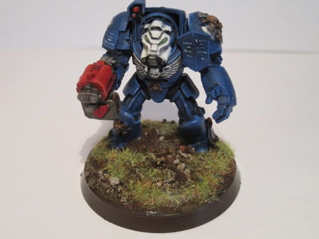
Heres an examle of my scroll/ armour writing :


Thanks in advance
   
Made in ca
Plastictrees


Calgary, Alberta, Canada

I think it "reads" better as text if you can put more up and down strokes in there. I also tend to start the text with a larger legible letter, vaguely emulating illuminated manuscripts.
   
Made in us
Gargantuan Gargant


Binghamton, NY

Perhaps a denser, more regular block of "text" would help it look like... well, text. Personally, I would assume those white squiggles were text before I assumed scratches, but maybe some people require either a frame (like a purity seal) or an identifiable column to make the connection.

The Dreadnote wrote:But the Emperor already has a shrine, in the form of your local Games Workshop. You honour him by sacrificing your money to the plastic effigies of his warriors. In time, your devotion will be rewarded with the gift of having even more effigies to worship.
 
   
Made in us
Longtime Dakkanaut


USA

Also try not to use a pure white, it will contrast too much. For such things as you are talking about I use Vallejo "Sky Grey" it is the lightest grey I have ever found, and when placed next to another color it looks white with out looking light it has been bleached.

Ashton


Forum Index » Painting & Modeling
Go to: