Switch Theme:

A question about 30K Space Wolf Iconography.  [RSS] Share on facebook Share on Twitter Submit to Reddit
»
Author Message
Advert


Forum adverts like this one are shown to any user who is not logged in. Join us by filling out a tiny 3 field form and you will get your own, free, dakka user account which gives a good range of benefits to you:
  • No adverts like this in the forums anymore.
  • Times and dates in your local timezone.
  • Full tracking of what you have read so you can skip to your first unread post, easily see what has changed since you last logged in, and easily see what is new at a glance.
  • Email notifications for threads you want to watch closely.
  • Being a part of the oldest wargaming community on the net.
If you are already a member then feel free to login now.


Made in us
Regular Dakkanaut


North Carolina

I know how 40K Space Wolves iconography works. Pack marking on the right shoulder pad with company marking on the left. 30K has me stumped though... Pack marking still on the right shoulder pad but what's on the left? Company icon or legion icon? Are the company icons just variants of the legion icon? Basically, I want to build a pre-heresy 13th company. I know what the 13th company icon looks like, I just don't know where it goes on the model in 30K. 13th Company post heresy are on the left shoulder pad, but does that hold true for 30K? Ultimately I understand that it's my army and that I can paint it however I see fit. That said, I'd like to paint it "properly" if at all possible.
   
Made in gb
Speedy Swiftclaw Biker


Glasgow, Scotland

I asked around a number of places this same question in a number of different fashions. I get where you're coming from - this is 30K, and in a lot of senses, it's almost more of a historical wargame than a spin-off of 40K. There's a lot more playing to fluff rather than inventing your own going on - it's a tighter space, creatively.

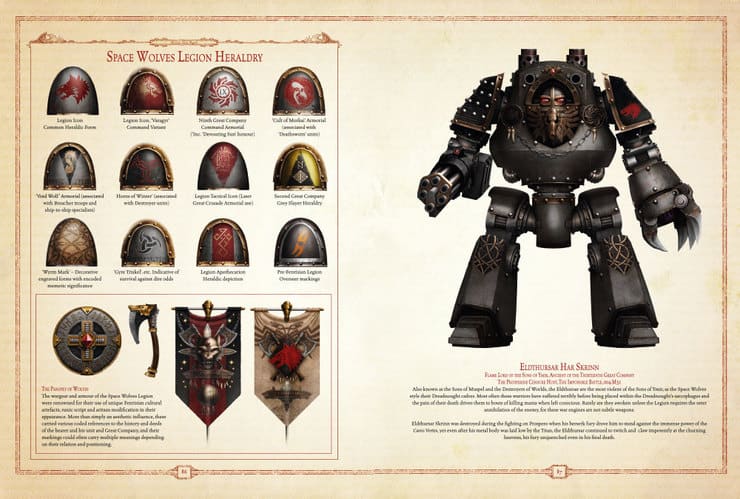
With that said, Space Wolves.. don't seem to have anything set in stone, beyond a left pauldron being plain grey with a red wolf head sigil. Even the Inferno book, which shows a Grey Slayer in MkIV armour (where the general consensus is that MkIV was more common on the Traitor Legions) and a panopoly of right pauldron designs citing specific units in specific companys or weird niche cases rather than anything complete and definitive like Ultramarine's have.

The general consensus is 'whatever', which I guess can be a little unnerving. I've read a good deal of Book VII: Inferno, as well as both A Thousand Sons and Prospero Burns and found no mention of it. I heard there's a couple of Audio Dramas (one of which even features Geigor, the one special character model we actually have other than Russ who wasn't even mentioned in the main Horus Heresy books and I'm definitely totally not butthurt that we didn't get pre-Dreadnout Bjorn no siree not me not at all), but I haven't heard them yet so I can't comment on whether they make mention of it.

What I do have, is two photos from ForgeWorld products. Here and here. One of which depicts a Grey Slayers with black and red triangles Grey Hunter style with some fancy runic lookin' Tactical Squad arrow, and the other is a second plain grey with some sort of company sigil, possibly?

For what it's worth, I will generally do triangles on my shoulders. Red and Black for Grey Slayers and other basic Troops, Red and Yellow for Fast Attack units and Jump Pack marines, White and Black for Heavy Support and other Heavies, Yellow and Black (predominantly yellow) for Elites and Veterans, and Yellow and Black (predominantly black) for HQ/command characters. This is basically just the Heraldry typically used in 40K, and I reason using it as.. well, it had to come from somewhere, maybe my dudes were among the earliest instigators of this pattern?

You've definitely got a few options available to you. If you want to be super safe then I'd just leave the right pauldron plain grey like the MkIV Grey Slayer pictured in Book VII: Inferno - otherwise, black and red is a pretty good call. Possibly, given the black shoulders 13th Company used during the Eye of Terror campaign back in 3rd/4th Edition 40k, plain black might also work? If you're like me and kinda fancy getting a bit of variation in colour, do the classic Space Wolves scheme, or just go nuts. There's a whole lot that's set in stone in 30K, but the heraldry of The Rout is most certainly not.

10,000 30K/40K Space Wolves, 6000pts 30K Iron Warriors, 3200pts Daemons of the Ruinstorm
3500pts AoS Maggotkin of Nurgle, 3000pts AoS Stormcast Eternals, 2000pts AoS Skaven
1800pts Middle-earth Rivendell, 1000pts Grey Company, 600pts Iron Hills
1800pts Middle-earth Angmar, 1100pts Moria, 1000pts Dol Guldur
Blood Bowl Skaven, Blood Bowl Orcs

Blog | Twitter | Instagram | Middle-earth SBG Hero Tracker - now on the Play Store
   
Made in us
Regular Dakkanaut


Page 86 of book 7 has some examples of different shoulder pads on the right (most I assume would be on the left). Like most legion secondary marks I think they are pretty much optional. examples parallel pretty close to the decal sheet. Some are stylized squad marks, other show deeds of significance (one was for surviving against grave odds), and another just a stylized pattern. The Pre legion symbol though was worn on the right with the imperial eagle/raptor head worn on the left. I would do what you think is cool (squad marks on the right knee for example? Why not?), while this is closer to historical war gaming it isn't fundamentally, there is no AN XXX color that is required for SW or that MkII helmets on mk IV bodies were not historical for example, which allows creative interpretation and also makes sense in fluff sense- I doubt Forge Worlds share color swatches when they resupply XD. Furthermore different companies have different traditions and idiosyncratic behaviors and unit markings, with the Terran versus Primarch homeworld marines being the classic example for basically every legion. There's the example of the Nemesis chapter of the Ultramarines doing their own thing as well as the black templars, among others. As long as you do something having thought it through in its' implications then you should be good, the Vlka Fenryka is one of the last legions I expect to enforce uniformity when even the UM and IF don't.
   
Made in us
Dakka Veteran


Chicago

I had the same question when I started my Wolves and the best answer seemed to be whatever you want. The Legion wasn't as divergent as the "modern" Chapter but not by much. They make a point in Inferno to say that the Wolves followed very few of the structures the other Legions did.

Some great companies were more geared toward one way of wat than others but markings were never gone into detail all that much. Most official models have the red Wolves head as the Legion symbol on the left shoulder pad and some type of pack marking on the right. Pack symbols could be stylized versions of traditional squad symbols or shapes and colors like 40k Wolves.

There's also some old art of the 13th Company from the Visions book showing the Company symbol on the left.

So I'd say the choice is yours.
   
Made in gb
Sure Space Wolves Land Raider Pilot


Freezing to death outside the Fang

typically company/squad/honour/rank marking goes on the right and legion icon goes on the left, unless there are bonding studs in which case, legion icon goes either on the left or on the knee pad.
Here is an example of some of the legion markings in case you haven't seen them.
Spoiler:

host of the eternity king 3500pts+ lizardmen 1000pts
and 2000pts+ 8000+ pts 1400+ pts
HH 7700+ pts 1350 pts HH raven guard 2500+ pts 50 pp Idoneth Deepkin 2000 pts 
   
 
Forum Index » The Horus Heresy
Go to: