Forum adverts like this one are shown to any user who is not logged in. Join us by filling out a tiny 3 field form and you will get your own, free, dakka user account which gives a good range of benefits to you:
No adverts like this in the forums anymore.
Times and dates in your local timezone.
Full tracking of what you have read so you can skip to your first unread post, easily see what has changed since you last logged in, and easily see what is new at a glance.
Email notifications for threads you want to watch closely.
Being a part of the oldest wargaming community on the net.
If you are already a member then feel free to login now.
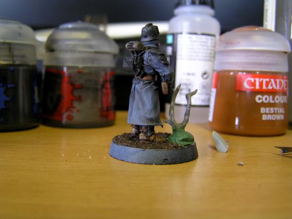
Hi guys, I need some help with painting up my DKoK, I have no idea what a good scheme is but I am looking for something grey/blue (not too blue), that stands out on the table without being too colourful, maybe washes? Also I am useless with colour theory so guides would be fantastic, also I would love to see your own army including artillery and tanks to give me a bit of inspiration. I don't have access to an airbrush either which limits me a fair bit.
Follow my Instagram for WIP/updates and general geekery.
gladiator.painting
'It is a source of constant consternation that my opponents cannot correlate their innate inferiority with their inevitable defeat. It would seem that stupidity is as eternal as war.'
- Nemesor Zahndrekh of the Sautekh Dynasty Overlord of the Crownworld of Gidrim
Here's one of the first DKOK Grenadiers I painted. Since then I added some red markings on the shoulders.
The only thing I wasn't really happy with was the black. I would describe it as a semi-fast way of painting them, far from awesome looking but also not a speed painted rush job (at least by my standards). Here's the full instructions copy/pasted from my notes....
Reaper Twilight Blue basecoat
Eshin Grey armour plates
Calthan Brown (boots, mask, etc) and Khemri Brown (air tube, greaves, gloves) - replace with Mournfang Brown and 50:50 Steel Legion Brown:Rakarth respectively
Lead Belcher metals
Wash Army Painter Strong Tone over everything, Nuln Oil wash on black areas
Highlight coat with Twilight Blue thinned with Strong Tone rather than water to dull it down
Mix in a bit of Reaper Snow Shadow to highlight coat
Highlight Calthan Brown areas with Calthan brown, leave Khemri areas.
Highlight Black areas with Eshin Grey
Highlight imperial eagles with Leadbelcher then Runefang
Paint mask with Reaper Snow Shadow
This message was edited 1 time. Last update was at 2017/10/06 18:23:30
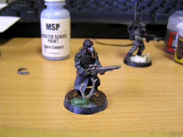
Guys those colour schemes are fantastic thank you, but I am looking for slightly less blue and more on the grey side, which would be a good substitute for the fang base colour, also thanks so much for your help guys, I love this community!
Follow my Instagram for WIP/updates and general geekery.
gladiator.painting
Here's what I have so far but I can't help but feel that it could be so much better, can anybody recommend a drybrush for it or complementary colours for the cuffs/collar?
Automatically Appended Next Post: No idea why its sideways...
This message was edited 1 time. Last update was at 2017/10/06 19:14:40
Follow my Instagram for WIP/updates and general geekery.
gladiator.painting
Check out my Gallery, it's a bunch of my DKoK stuff, tanks and infantry.
I use Basalt Grey from Vallejo as the base. (German Grey if you are using their Air line) Highlight with a lighter grey and use a black wash once I get the models painted up to shade the recesses. Imperial symbols are painted in an old gold.
I don't have an army painted up, but I painted this guy a while ago and have been meaning to go back to the army recently. Based on your typical Kreiger but wanted to add a bit of extra colour to make it look almost nepoleon, mixed with the French WWl vibe.
FURIOSO wrote: Here's what I have so far but I can't help but feel that it could be so much better, can anybody recommend a drybrush for it or complementary colours for the cuffs/collar?
Automatically Appended Next Post: No idea why its sideways...
If you're gunna go with grey great coats, I'd suggest a different colour for the helmet and shoulder pads. Maybe black, but you want it to contrast with the coat, otherwise the metal gets mixed with the cloth a bit. If you want the metal armour, I'd suggest going for a much darker grey for the coat.
I'd also be tempted to put a flash of colour in there somewhere, like orangey masks and/or cuffs, to cut up the otherwise monochrome scheme.
The sort of colours that work well tend to be opposites. For mostly monochrome schemes though, a splash of colour can often look quite good to pick out certain details, like the face or weapon
This message was edited 1 time. Last update was at 2017/10/10 13:27:37
If you're gunna go with grey great coats, I'd suggest a different colour for the helmet and shoulder pads. Maybe black, but you want it to contrast with the coat, otherwise the metal gets mixed with the cloth a bit. If you want the metal armour, I'd suggest going for a much darker grey for the coat.
I'd also be tempted to put a flash of colour in there somewhere, like orangey masks and/or cuffs, to cut up the otherwise monochrome scheme.
The sort of colours that work well tend to be opposites. For mostly monochrome schemes though, a splash of colour can often look quite good to pick out certain details, like the face or weapon
I share this opinion. When you plan a colour scheme you should also plan which types of materials and surfaces your paints will represent. By this, I mean selecting some paints to solely represent 'hard surfaces', such as helmets and pauldrons, and other paints to represent cloth.
Cloth and painted metal surfaces (such as helmets) reflect light differently in real life. It's really difficult to match a painted metal component with a cloth article in real life, and in most cases they didn't bother. If you look at the uniforms and equipment of 20th century armies, soldiers would be equipped with helmets painted in a colour approximately that of their uniforms, but never identical, and with wear and fading, helmets and uniforms would end up looking very differently.
I prefer a colour scheme where the main paints are only used to represent one specific type of material. I would also recommend colours with lower saturation for 'hard surfaces', and high saturation colours for skin and hair surfaces. This enhances the realism of the miniatures and makes them easier to comprehend at a distance.
and what about taking the guns to the age of the uniform? I think if you give the weapons some "wooden parts" it will give it a more wwII style, and it could be one of the details that makes the army stand out.
Dakka is the ork word for shooting, but the ork concept of shooting is saturation fire. Just as there is no such thing as a "miss" in a target-rich environment, there is no such thing as a "dodge" in a bullet rich one


 8000 points fully painted
 hive fleet belphegor 3500 points
 1k sons killteam