| Author |
Message |
 |
|
|
|
|
Advert
|
Forum adverts like this one are shown to any user who is not logged in. Join us by filling out a tiny 3 field form and you will get your own, free, dakka user account which gives a good range of benefits to you:
- No adverts like this in the forums anymore.
- Times and dates in your local timezone.
- Full tracking of what you have read so you can skip to your first unread post, easily see what has changed since you last logged in, and easily see what is new at a glance.
- Email notifications for threads you want to watch closely.
- Being a part of the oldest wargaming community on the net.
If you are already a member then feel free to login now. |
|
 |
2018/08/08 16:11:33
Subject: Object Source Lighting Advice (Eldar Fire Prism)
|
|

Regular Dakkanaut
|
Hi,
I have been painting for many years but feel like I've become very comfortable and not trying new things. I'd like to start trying a few more advanced techniques so I can improve.
Specifically, I am painting a Fire Prism and would like to give object source lighting a go. I am hoping to give the effect that the prism crystal is glowing.
I would love to post an image of my current progress, but apparently first time posters cannot post image URLs. Hopefully I will post it in the comments.
Any advice on how I might proceed would be very helpful and gratefully received.
Thanks in advance. Automatically Appended Next Post: 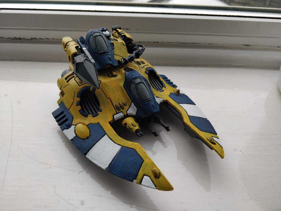
|
|
This message was edited 1 time. Last update was at 2018/08/08 16:11:58
|
|
|
 |
|
2018/08/08 18:52:28
Subject: Object Source Lighting Advice (Eldar Fire Prism)
|
|
Leader of the Sept
|
If it's the crystalnglowing, then you need to decide what colour you want it, and then use that colour to highlight all.the surfaces facing the prism.
If you want to enhance the effect you can darken down the surfaces in shadow of the crystal.as.well.
You should also probably look into getting more.concentrated poi t source reflections in the cockpit glazing that directly fac3s the prism.
|
|
This message was edited 1 time. Last update was at 2018/08/08 18:53:22
Please excuse any spelling errors. I use a tablet frequently and software keyboards are a pain!
 Terranwing - w3;d1;l1 Terranwing - w3;d1;l1
 51st Dunedinw2;d0;l0 51st Dunedinw2;d0;l0
 Cadre Coronal Afterglow w1;d0;l0 Cadre Coronal Afterglow w1;d0;l0 |
|
|
|
|
2018/08/10 12:22:18
Subject: Object Source Lighting Advice (Eldar Fire Prism)
|
|

Krazy Grot Kutta Driva
|
Totally unrelated to the question asked.
Did you paint all that yellow and white over black primer? Ever tried white, maybe grey or even yellow primer? All that yellow is sooo much easier over anything but black.
|
|
|
|
|
2018/08/10 13:01:30
Subject: Object Source Lighting Advice (Eldar Fire Prism)
|
|
Regular Dakkanaut
|
I actually did it over orange. Yellow isn't finished yet, needs a couple more coats. But I'm pleased with the white.
|
|
|
|
|
2018/08/10 13:14:26
Subject: Object Source Lighting Advice (Eldar Fire Prism)
|
|

Liche Priest Hierophant
|
White dwarf has had good articles on it. I am shure there are many good online out there as well.
|
|
|
|
|
|
2018/08/10 14:23:58
Subject: Object Source Lighting Advice (Eldar Fire Prism)
|
|
Krazy Grot Kutta Driva
|
Gotcha. Excellent work on the panel lining then!
Lots of great OSL ( glowy stuff) tutorials out there. Check a couple out and see what looks do-able. For glow color perhaps purple? Nice contrast with the yellow and shouldn't get lost in the blue, especially if you go for the Pinker tones.
Good luck!
|
|
This message was edited 1 time. Last update was at 2018/08/10 14:25:48
|
|
|
|
|
2018/08/12 15:35:44
Subject: Re:Object Source Lighting Advice (Eldar Fire Prism)
|
|
Regular Dakkanaut
|
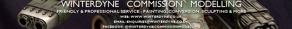
Made some progress. Thanks for the advice re: purple glowy stuff. Chose orange because that is my army-wide colour for thinks like power swords/gems/accessories. I understand that it's going to be tricky though!
Got the tank painted. Very pleased with the crystal since it's my first time doing any kind of gradients/blending.
Now for the more tricky stuff!
|
|
|
|
|
2018/08/12 16:47:43
Subject: Object Source Lighting Advice (Eldar Fire Prism)
|
|
Ship's Officer
|
The prism crystal looks good, could use a gloss varnish though; the rest of the vehicle could use some work, especially the application, the paint itself looks like texture paint which I know it isn't, try thinning down your paint and apply in thin layers.
The white dot on blue gems for highlight does not look like what you're trying to achieve. I suggest using dark blue, then mid blue, then some light blue, before dotting the white highlight, then a gloss varnish to shine it. Do a search for painting gems.
If this is one of your first attempts at painting, don't take it the wrong way from what I've said, just improve with more painting.
|
|
|
|
|
2018/08/12 17:51:11
Subject: Object Source Lighting Advice (Eldar Fire Prism)
|
|
Regular Dakkanaut
|
I've actually been painting for years, just got to a level that I was happy with and kind of stagnated. But now I've come back to the hobby and want to try to improve, not just settle for mediocrity.
So thanks for the advice, will try to take as much on board as I can! All advice is good.
|
|
|
|
|
2018/08/13 07:45:21
Subject: Object Source Lighting Advice (Eldar Fire Prism)
|
|
Longtime Dakkanaut
|
There's a few tricks to OSL.
1) Ambient light first. Paint the model first with the main source of light (usually 'the sun'). This is 'typical' model painting.
2) Pay attention to light direction and occlusion. This means you shouldn't highlight up the OSL past something that should block it. If an imaginary ray from the light source hits something, that should go brighter and tint toward the light colour.
3) Light makes stuff brighter within range, not darker. When you're tinting toward a light colour with OSL be careful not to darken the base colour you're working over. This breaks the effect and makes the tinted area look dirty, rather than lit. If in doubt, take a photo and greyscale it. If it reads 'off' in greyscale, it's because your brightness levels are off.
4) Contrast is key - in direct contradiction to the above, your lightsource surface is usually darker just at the edge where it meets a surface catching the light, and then VERY bright inside. This defines the shape of the lit surface.
5) Relief effects continue the illusion. If you're doing any weathering / chipping, remember that those too will catch OSL 'light' and you can use this to reinforce the effect.
6) Bloom is best kept subtle. 'Bloom' is a result of your eye, not the actual light - it's the over-saturation of a light colour around the light source as a result of its brightness. It's dependent on viewer angle, not the light itself. Think of it as lens flare. Because it breaks the rules of physics, it can ruin the effect if overused because you see light where there shouldn't be any at certain angles. This is why the blend to the lit edge on the black casing of the plasma pistol is very tight (only a couple of brush strokes in width). It's also this that makes heavily airbrushed OSL not work very well in my opinion.
I used these tricks on this model's plasma pistol and the area around it.
 Automatically Appended Next Post:
I should say as well, OSL onto yellow will have to be very subtle indeed as yellow's already quite a bright colour to begin with. Use a lot of glaze medium and VERY little actual colour and very low brush load (not much in your brush). Take your time and build tints (remembering it goes lighter) very gradually. It'll be easy to go too dark.
|
|
This message was edited 6 times. Last update was at 2018/08/13 07:56:32
|
|
|
|
|
2018/08/13 14:49:11
Subject: Re:Object Source Lighting Advice (Eldar Fire Prism)
|
|
Regular Dakkanaut
|
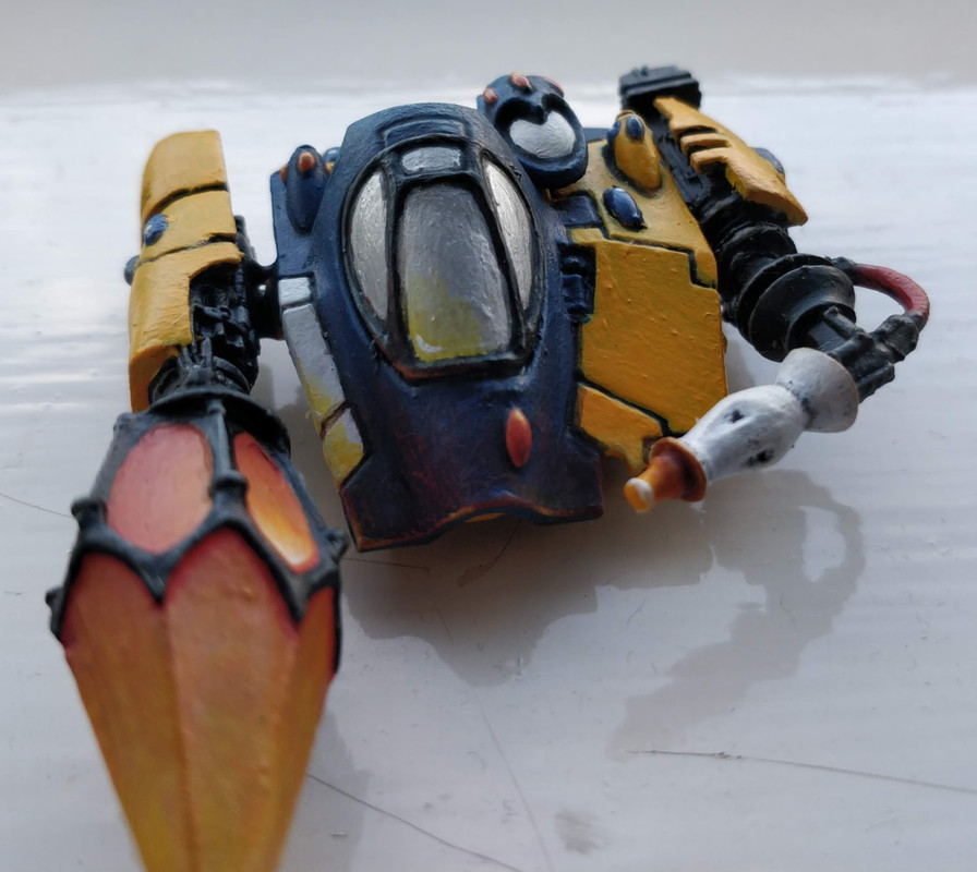
Had a little go on the turret first. Reasonably pleased with the results. Room for improvement, but I'm proud to have given it an attempt. Not sure about the effect on the white, it's very difficult to make white look lighter. Perhaps a very fine edge highlight with a pale yellow would work better? Not attempted the effect on the yellow yet, since most of the turret is actually blue. There is a tiny bit off to the right which I have done a very subtle highlight on just to see. I think it looks good, but we'll see when I move on to the main body of the vehicle.
|
|
|
|
|
2018/08/13 20:45:00
Subject: Object Source Lighting Advice (Eldar Fire Prism)
|
|

Fresh-Faced New User
|
I think you have done a great first attempt at blending on the gem and lighting reflection on the cockpit window ect.
I can't give that much advice with this other than to keep practicing with an eye of making the transitions as gradual and smooth as possible - many many thin coats of your color gradients. You should look up some wet blending tutorials if you haven't tried this technique.
One thing I really suggest you go back and look at is your base coating, though. The yellow armor plating shows streak marks and what looks to be contaminants like grains of dust in the paintwork. Its very hard to get a nice finish from this kind of texturing (unless you are after the grimy style) and your highlights ect will not pop as much.
After basing the model in white, i suggest laying down some yelllow ink over the armor. Then you just need to slowly build it up with thin coats - dont rush this and make sure to work the paint consistently to avoid the streak marks. You will achieve a far more pleasant result. But i can see where you have aimed to improve - keep it up!
|
|
|
|
|
2018/08/14 09:13:26
Subject: Object Source Lighting Advice (Eldar Fire Prism)
|
|
Longtime Dakkanaut
|
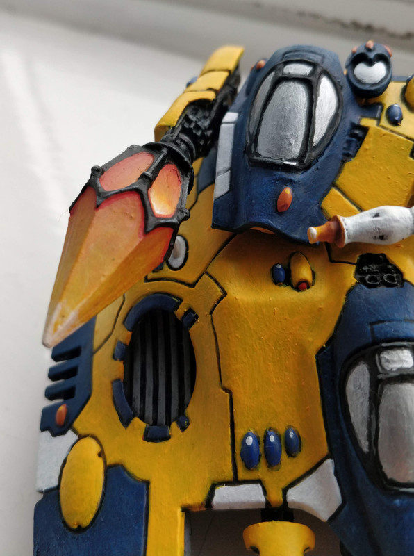
You can't make white brighter. White is white because it's already reflecting everything it can.
You can only tint its shade toward the colour of light it should be reflecting. If your ambient (main) light already has that surface up at white (which yours seems to) then you can't go any whiter and secondary light sources will have no visible effect.
Think of it like trying to shine a low power flashlight in broad daylight.
So what you've got on those white areas breaks rule 3, and thus doesn't look like light.
On the blue surface it's reading ok. You've got light hitting the edge, but not much of the flat of the surface (this is an effect of 'specularity' in highlighting, typical on surfaces you want to look shiny or glossy - they're actually usually pretty dark for the most part, with very sharp, very bright highlights).
Zoomed in, your paint is super grainy and appears to have lumps in it. You may find that it is drying on your palette (making a wet palette will really help) or you may need to use a drying retarder. I suspect however, you're using a poor quality tissue or paper towel to wipe your brushes and it's depositing fibres on the bristles which are ending up stuck in your paint. One of those areas where cutting corners won't help you in the long run. These things in particular can make it extremely difficult to get smooth blends going.
|
|
|
|
|
|
2018/08/14 20:12:39
Subject: Re:Object Source Lighting Advice (Eldar Fire Prism)
|
|
Regular Dakkanaut
|
Here is the final product. Thanks guys for the feedback and advice. Definitely going forward I am going to look at thinning my paints - something I've never done before now, but which I am excited to try and see the results.
Made some great progress on this model alone, so despite it obviously not being the best painted miniature on this forum (by far) I am please with the results and look forward to practicing and improving!!
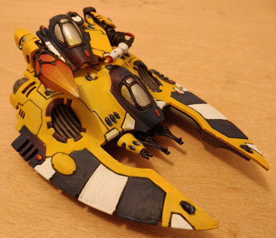
I realise now that the blue panel underneath the crystal should have a bit of red on it... Will go back and fix that now! Also, apologies for terrible lighting.
|
|
|
|
|
|
|