Forum adverts like this one are shown to any user who is not logged in. Join us by filling out a tiny 3 field form and you will get your own, free, dakka user account which gives a good range of benefits to you:
No adverts like this in the forums anymore.
Times and dates in your local timezone.
Full tracking of what you have read so you can skip to your first unread post, easily see what has changed since you last logged in, and easily see what is new at a glance.
Email notifications for threads you want to watch closely.
Being a part of the oldest wargaming community on the net.
If you are already a member then feel free to login now.
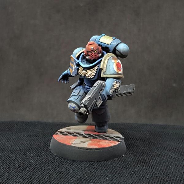
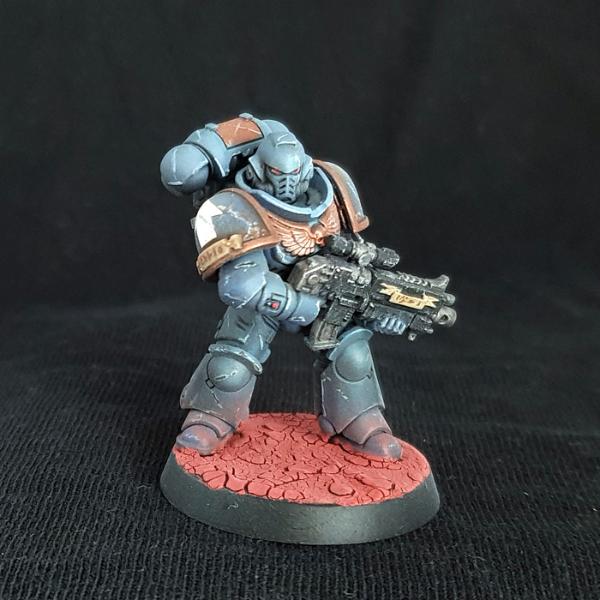
So after a couple of years of mostly painting and exclusively playing AoS, I've decided to finally get into 40K in earnest, and it's going to be by painting up the contents of the Indomitus box... eventually. What I'm doing first is going through half or maybe all of an Intercessors box to test out paint choices and techniques so that I've got a firm recipe when I start on the Indomitus models.
What I'm doing here is really basically painting these like they're mecha models; fairly heavily weathered sci-fi model kits are really my bread and butter outside of miniature painting, and I feel like most of the techniques translate perfectly well, although it's a lot harder to do brushed-on chipping on minis.
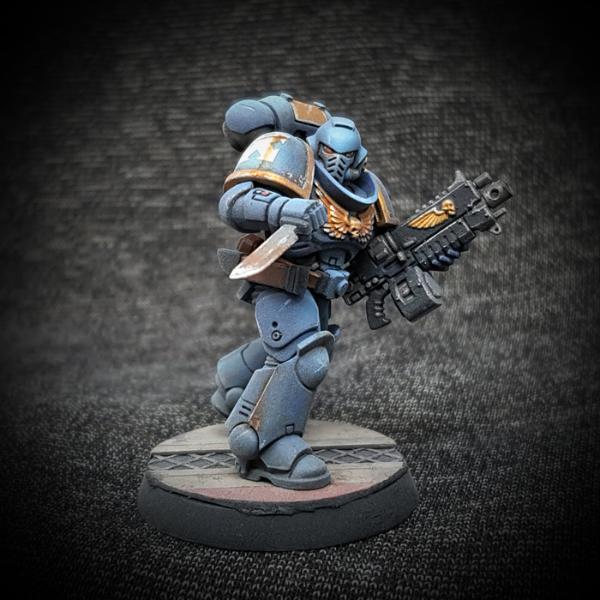
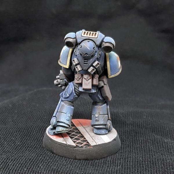
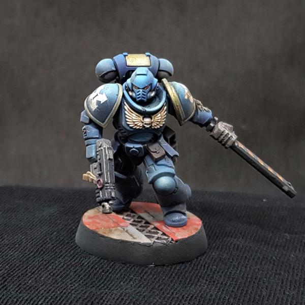
Anyway, here's the first one:
Overall, I got basically the look I'm going for, but I also think there's a couple of things that could be better. Notably there needs to be more contrast to the initial highlights on the armor (which are done with an airbrush) because the oil filter I applied later dulled them down a lot, and I also wanted to try a brighter gold color so that it would pop more from a distance. I'm kind of trying to strike a balance between a vaguely "realistic" weathered look and something that still has enough contrast to look good on the table. We'll see. Feedback welcome, I'm just having fun experimenting at the moment.
Edit - I also have a WIP of the next one in my gallery, but I deleted that picture from this post because it's probably not appropriate for this subforum
This message was edited 2 times. Last update was at 2021/08/09 00:25:07
AngryAngel80 wrote: I don't know, when I see awesome rules, I'm like " Baby, your rules looking so fine. Maybe I gotta add you to my first strike battalion eh ? "
Yeah, it's closer to Space Wolves blue, really... the midtone is actually Macragge Blue, but I did an oil filter with mostly grey, that's what gives it this desaturated look, and the matte topcoat probably adds to the effect. I like the color myself, even if it's a bit off, but I'm trying to make the next one a bit more vibrant, just to see what it looks like.
I'm not familiar with oil filters at all, could you explain it a bit or point me in the direction of some tutorials?
They're really not much different from glazes, i.e. you apply oil paints all over a surface to change its hue. You can either do this by thinning down oil paints to really create what's basically a glaze, or you can do what I do here and do a so-called "dot filter" where you dot the oil paint on first and then smudge it using a brush damp with white spirits to create an uneven discoloration for a more weathered appearance. It's a technique that I think is most common among tank modelers and tbqh I wouldn't know of any tutorials that explain its application specifically for miniature painting. This video from a PG Millennium Falcon build series explains it really well, though. Incidentally, the whole channel is awesome, and no, it's not me ;-)
I really basically do what you see in this video, I just dot the oil paint on with a toothpick instead of a brush because you really only need tiny, tiny amounts.
The great advantage of oil paints over acrylic glazes is that they stay workable for hours, sometimes even days, and they don't react with water-based acrylics at all. You can use them over your regular water-based paints with no topcoat and then manipulate them with brushes, cottonbuds, with or without white spirits, until you have the effect you want.
I think you have the weathering effects down pat. Only my own opinion, but I think the veterans armor should be a bit more faded than a newly inducted replacement. Unless their tech servitors have lots of free time, Squads and companies having unfaded, pristine, armor in remote war zones, should have their combat readiness & experience in question.
jdouglas wrote: I think you have the weathering effects down pat. Only my own opinion, but I think the veterans armor should be a bit more faded than a newly inducted replacement. Unless their tech servitors have lots of free time, Squads and companies having unfaded, pristine, armor in remote war zones, should have their combat readiness & experience in question.
Yeah, that's pretty much my reasoning. If these guys are supposed to be such badasses, they need to look like they've actually seen combat. And exposure to sunlight and the elements will fade the overall color.
I’ve seen ultras all across the spectrum, from powder blue to almost black. I prefer mine a richer sapphire, but that’s just me. Yours is a great example from the lighter end, and an army of them would look great.
I might try to find a few more things to help make the mini pop a bit more. Maybe change the company/pauldon trim, brighten the lenses, or something. Realistic weathering tends to make dull game pieces, as you noted.
My first Ultras army covered that whole spectrum!
I didn't know about shaking paints so as I went along I was painting with darker pigment that had sank more!
I might try to find a few more things to help make the mini pop a bit more. Maybe change the company/pauldon trim, brighten the lenses, or something. Realistic weathering tends to make dull game pieces, as you noted.
Yeah, that's exactly what I'm trying to do with the second one I'm working on - I punched up the highlights on the blue quite a bit and switched to a brigher gold color. I used Balthasar Gold on the first one because it just happens to be a color I really like and I think it's what the box says to use, but the oil filter dulled it down too much. Brighter lenses is a good idea too, thanks. Too late for #2 now, but I'll see about starting with a brighter base color on the next one.
This message was edited 1 time. Last update was at 2021/08/10 19:29:39
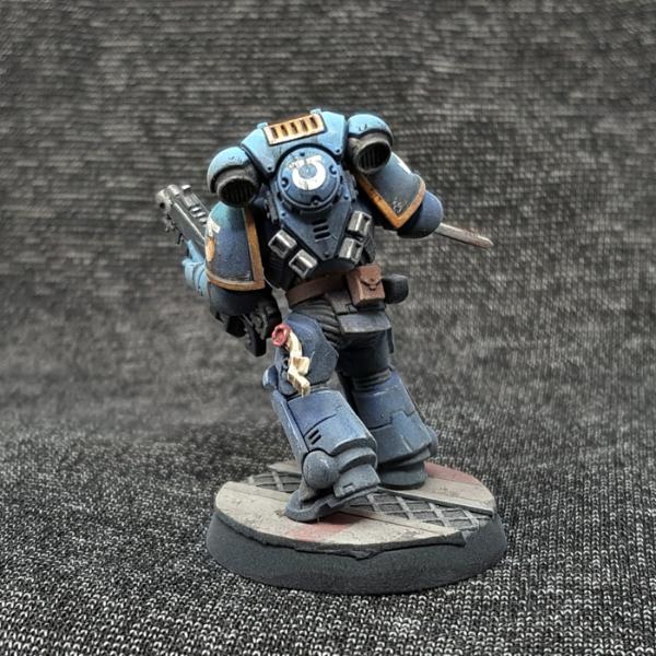
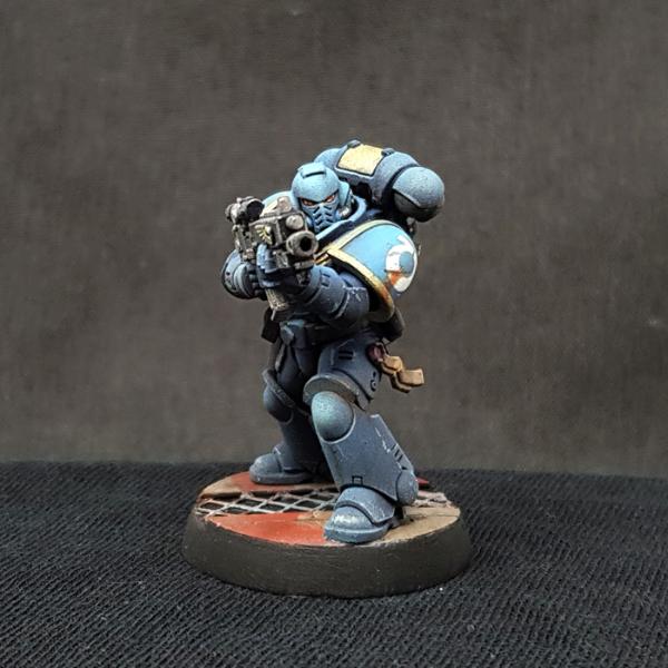
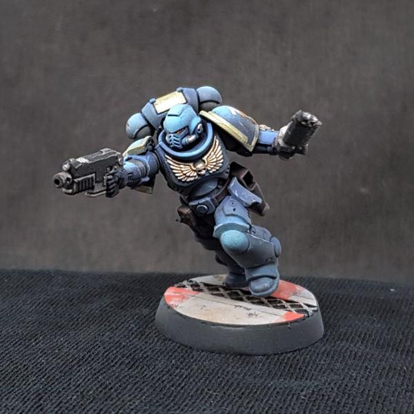
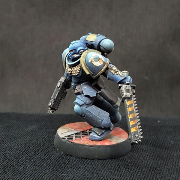
Here's the next one. The overall goal here was more contrast, basically, so that it would pop more from a distance. So what I did was to use a brighter gold, brown instead of dark grey for the belt and the pouches, more intense highlights on the armor, and I generally went a bit less heavy handed with the dot filter to desaturate the blue a bit less.
I also made some other smaller adjustments like the way the chipping is done or edge highlighting instead of drybrushing on the gun, and obviously the base is different. What's weird is that presumably because of the brighter highlight on top, it completely knocked the color balance of my phone's camera out of whack and I had to switch to a charcoal background instead of black.
Well, and obviously I also made a different base. The ugly sanding job on the edge is completely unacceptable, of course, but I can address that with the next one. I'm just not sure if I should go with these sci-fi bases because I actually think the simple Martian Ironearth one is a really good color match with the blue, and it's of course far, far less time consuming to do. But at the same time it feels a bit like a copout (at the very least I'll add some rocks and/or greebles), and I already have 2000 points of Blades of Khorne in AoS that have lava bases done with crackle paint, so... I dunno. I'd actually appreciate some opinions on that.
Also, one thing I definitely screwed up is the most extreme highlight on the backpack - it's too large and covers basically the entire top panel, resulting in the appearance that the entire panel is a different color, rather than a highlight.
You set me on a path to get my own oils, although a project to actually try them out is several months down the line!
I can't wait to see more.
I think the martian base does add a nice contrast to the blue. Why not both? A factory floor lost to the eons, only now coming to the surface again.
You set me on a path to get my own oils, although a project to actually try them out is several months down the line!
Oil paints are great. I really can't recommend the stuff enough.
I think the martian base does add a nice contrast to the blue. Why not both? A factory floor lost to the eons, only now coming to the surface again.
You mean combine both on each base?
There's an idea. I think I'll try that. I was going to add some metal debris to the Martian Ironearth bases anyway, if I was going to go that route. Thanks!
Combine on some bases other bases have dedicated to one or the other if done well will give the effect of different Marines moving through the environment, it would give further effect to your storyline of these marines being combat tested in multiple terrains!
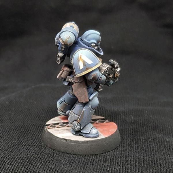
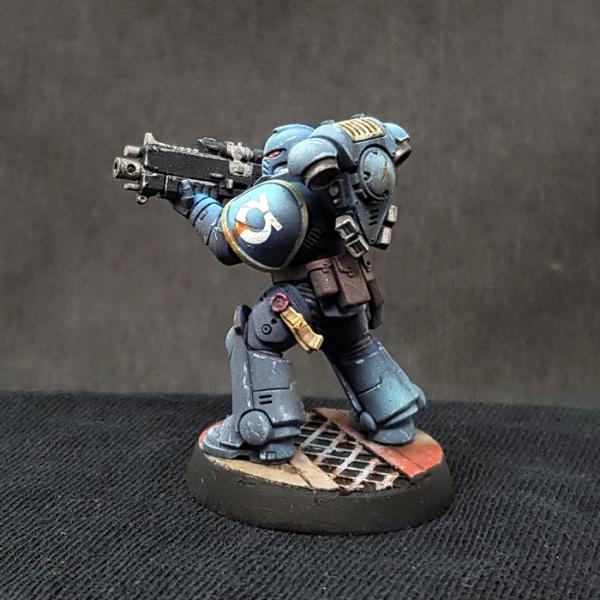
It may just be the angle of the photo from the front perspective, but it seems a lot less weathered than the rear of the model, and the rear of the model I would say you have absolutely nailed the balance in colour and weathering... I think the front could use a tad more, specifically on the helmet.
From the rear shot, for me that is my personal perfect ultramarine scheme, it is outstanding.
My hobby instagram account: @the_shroud_of_vigilance My Shroud of Vigilance Hobby update blog for me detailed updates and lore on the faction:
Blog
endlesswaltz123 wrote: It may just be the angle of the photo from the front perspective, but it seems a lot less weathered than the rear of the model, and the rear of the model I would say you have absolutely nailed the balance in colour and weathering... I think the front could use a tad more, specifically on the helmet.
From the rear shot, for me that is my personal perfect ultramarine scheme, it is outstanding.
The colors on the helmet are a bit blown out on the pics for some reason, it does have two scratches and a rust streak under the right eye (which is turned into the collar and thus not really visible), but I did go a bit easier on the helmet because I didn't want to lose the contrast. Whether that needed more was actually one of the things I was fussing about a bit with this one, so I appreciate the feedback!
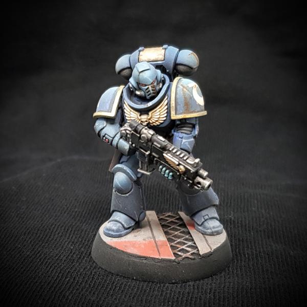
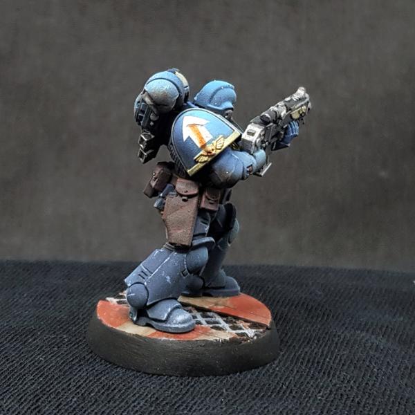
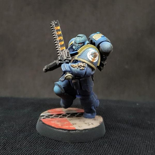
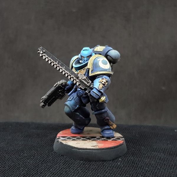
Alright, next one. I screwed up a few things here - the black outline on his right pauldron isn't supposed to be like a freaking inch wide, of course, and don't ask me about the moldline on his boot. The purity seal also broke off and got lost at one point. I may be working on too much stuff at once, and my workspace may be a bit messy at the moment. I might replace that purity seal eventually, but then again, this is just a test pig, and I want to move on to the next one so that I can wrap this up and start painting the actual army.
Anyway, I tried to do the airbrushed highlights on the armor a bit more focused this time, which I think worked out pretty well. The gold is Vallejo Metal Color Gold this time, which is brighter and thus creates more contrast, and as Nevelon suggested, a brighter color for the lenses, which turned out to be a really good idea.
There's a couple of screwups here and I'm still not 100% sure about how I'm going to base these guys - this one looks pretty good, but it was also really time consuming to make, and I'm not sure I want to put myself through that for an entire army. But other than that, I think I've pretty much got it now. I'll do one more to fine tune a few things and just to practice, and then I'm tackling the Assault Intercessors from the Recruit box first.
spacehamster wrote: Here's the next one. The overall goal here was more contrast, basically, so that it would pop more from a distance. So what I did was to use a brighter gold, brown instead of dark grey for the belt and the pouches, more intense highlights on the armor, and I generally went a bit less heavy handed with the dot filter to desaturate the blue a bit less.
I also made some other smaller adjustments like the way the chipping is done or edge highlighting instead of drybrushing on the gun, and obviously the base is different. What's weird is that presumably because of the brighter highlight on top, it completely knocked the color balance of my phone's camera out of whack and I had to switch to a charcoal background instead of black.
Well, and obviously I also made a different base. The ugly sanding job on the edge is completely unacceptable, of course, but I can address that with the next one. I'm just not sure if I should go with these sci-fi bases because I actually think the simple Martian Ironearth one is a really good color match with the blue, and it's of course far, far less time consuming to do. But at the same time it feels a bit like a copout (at the very least I'll add some rocks and/or greebles), and I already have 2000 points of Blades of Khorne in AoS that have lava bases done with crackle paint, so... I dunno. I'd actually appreciate some opinions on that.
Also, one thing I definitely screwed up is the most extreme highlight on the backpack - it's too large and covers basically the entire top panel, resulting in the appearance that the entire panel is a different color, rather than a highlight.
AngryAngel80 wrote: I don't know, when I see awesome rules, I'm like " Baby, your rules looking so fine. Maybe I gotta add you to my first strike battalion eh ? "
Finally, some ultras I actually fancy! Great weathering, kudos! I'll be following your progress with great interest, I'm planning to do a BA army in a similar, military modelling weathered style. I'm a noob when it comes to filters & oil washes, but it's something I've really fallen for. Those colour modulations are just so refined and vibrant somehow compared to acrylic inks & washes.
One thing I'd like to ask, if I may? I've found that oil washes in particular tend to mellow out significantly after they have dried. Any tips on how to get the oil washes to remain looking more like how they look when the oils are still a bit wet? When I apply an oil wash, it usually looks the best around the 30 minute mark, and then loses a lot of that vibrancy as the oils cure.. Is it just something I have to develop an eye & judgement for, or are there some chemical tricks one can make to help getting a certain look from an oil wash?
Cheers
This message was edited 3 times. Last update was at 2021/08/23 16:47:25
AngryAngel80 wrote: I don't know, when I see awesome rules, I'm like " Baby, your rules looking so fine. Maybe I gotta add you to my first strike battalion eh ? "
skeleton wrote: you could make a mould for your base topper so you dont have to make it from scrats for every base
The more time consuming part is the sanding once it's all glued on, though. The base topper is really just two pieces of styrene sheet and some Tamiya tape, it's actually really simple and if I do each one individually I can vary them a bit.
I think the brass/gold is a lot richer/deeper and also the hue of the blue seems a bit more darker/grainy.
Maybe its the model itself as well though
Hmm... the gold is definitely a richer one, the Vallejo Gold is very pale. The blue tone is probably just the picture, though, the colors get a bit blown out no matter what I do - that second one actually has more of the bright blue on it, one of the things I was trying to do with the third was to darken it down a bit overall without losing contrast. Anyway, I appreciate the feedback!
One thing I'd like to ask, if I may? I've found that oil washes in particular tend to mellow out significantly after they have dried. Any tips on how to get the oil washes to remain looking more like how they look when the oils are still a bit wet? When I apply an oil wash, it usually looks the best around the 30 minute mark, and then loses a lot of that vibrancy as the oils cure.. Is it just something I have to develop an eye & judgement for, or are there some chemical tricks one can make to help getting a certain look from an oil wash?
If there's a way to do that, I wouldn't know, sorry... maybe there's a thinner you can use that makes the oils dry a bit glossier to keep some of that richness, but I actually use them specifically because I like the sort of dusty and slightly grainy appearance you get when they're dry, so I really can't help you there...
This message was edited 3 times. Last update was at 2021/08/24 15:58:20
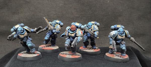
Alright, time to get serious about these guys. First I did one last and final paint test just to see if I really had things dialed in (I really hadn't, but I felt like I was close enough.)
This guy came out a bit lighter on top than the previous one, but overall I felt like it was about time to stop messing around and just take a crack at the full squad from the Recruit starter box.
First, here's the Sergeant. I don't know why his right eye looks darker than the other one in these pics, but, well, it does.
There's also no decal that fits his kneepad in the Recruit box, this one's from the regular Intercessors box that I got the test models from.
Two pictures of this dude because I couldn't decide which angle I liked better:
I also did hazard stripes on two of the four regular troops' swords to get a bit of variation and because I wanted to try it. It's pretty time consuming but ultimately worth it, so I might do it on all 10 of the Assault Intercessors in the Indomitus box. We'll see.
And here's the whole squad.
I'm pretty happy with how these guys came out, and I'm definitely sticking with this paint and basing scheme for the rest of the army, but as you can see, getting a consistently smooth edge on these bases is a bit of a problem. I really don't know why some of them have that gap, they all looked smooth before I painted them. But it's always different when you're doing a whole squad of something than when you're just doing one and you take your time to scrutinize everything, I guess.


 Eldar- 4436 pts

 Ultramarines, 3rd Co. and friends, 16k+
  4k
4k  2k Points
 Competition Index