| Author |
Message |
 |
|
|
|
|
Advert
|
Forum adverts like this one are shown to any user who is not logged in. Join us by filling out a tiny 3 field form and you will get your own, free, dakka user account which gives a good range of benefits to you:
- No adverts like this in the forums anymore.
- Times and dates in your local timezone.
- Full tracking of what you have read so you can skip to your first unread post, easily see what has changed since you last logged in, and easily see what is new at a glance.
- Email notifications for threads you want to watch closely.
- Being a part of the oldest wargaming community on the net.
If you are already a member then feel free to login now. |
|
 |
2023/05/05 13:37:51
Subject: Calling all Contrast Paints experts!
|
|

Using Inks and Washes
|
I'm painting up some tiles from Hexton Hills, think along the lines of Mighty Empires and such. My main theme will be a green, temperate climate, like hills in Ireland or Scotland.
Here's there map generator: https://map.gravenguild.com/
I'm adhering to their color scheme in the map generator, so your basic hills and plains looks like this:
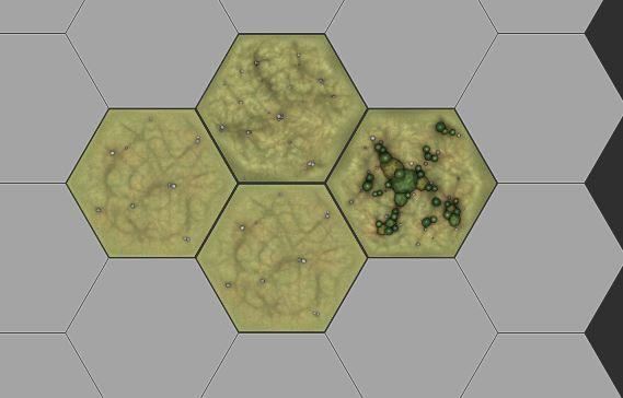
But I'm nervous to get started. I'm painting them so that the edges of each tile will blend together seamlessly, so when I pick my base green, I've got to stick with it. It's going to be on nearly every tile, to help blend the landscape together.
Because I've got... Too many tiles... I'm going to use GW Contrast Paint over white primer (Army Painter Matt White) for most of the painting.
I've got all (most?) of GW's Contrast line in green. My question to y'all is: what color Contrast Green would you use to color-match those tiles?
|
I play...
Sigh.
Who am I kidding? I only paint these days... |
|
|
 |
|
2023/05/05 13:48:04
Subject: Re:Calling all Contrast Paints experts!
|
|
Lieutenant General
|
You can see examples of all the Contrast paints over various primer colors on the Warhammer Chelmsford Facebook page.
|
'It is a source of constant consternation that my opponents
cannot correlate their innate inferiority with their inevitable defeat. It would seem that stupidity is as eternal as war.'
- Nemesor Zahndrekh of the Sautekh Dynasty
Overlord of the Crownworld of Gidrim |
|
|
|
|
2023/05/05 15:35:43
Subject: Re:Calling all Contrast Paints experts!
|
|
Using Inks and Washes
|
Thanks, that's helpful! I'm less familiar with GW sprays... Is "white scar" their white-white primer?
Mantis Warriors green might be good. Or Warp Lightening. Hard to tell, as those two colors are not shown next to each other...
|
I play...
Sigh.
Who am I kidding? I only paint these days... |
|
|
|
|
2023/05/05 16:48:18
Subject: Re:Calling all Contrast Paints experts!
|
|

Huge Bone Giant
|
I don't have more than one or two Contrast greens so can't help with the color selection, but I have a thought you may want to give some consideration before you paint. Now this may only be my taste, but I don't care for how the less tinted parts of Contrast green look over a white or off-white base. I had much more success using light beige and ocher to get highlights that blend better with the darker areas. I found white as a base too stark.
Contrast paint is a tint and only as consistent as you can make it. It works well with pre-shading, so there is something to be said for thinking about your base colors just as much as the Contrast paint you plan to use.
|
Nehekhara lives! Sort of!
Why is the rum always gone? |
|
|
|
|
2023/05/05 18:10:09
Subject: Calling all Contrast Paints experts!
|
|

Leader of the Sept
|
Warp lightning is designed to look glowy, so might not be the best if you are trying to get a grass look.
|
Please excuse any spelling errors. I use a tablet frequently and software keyboards are a pain!
 Terranwing - w3;d1;l1 Terranwing - w3;d1;l1
 51st Dunedinw2;d0;l0 51st Dunedinw2;d0;l0
 Cadre Coronal Afterglow w1;d0;l0 Cadre Coronal Afterglow w1;d0;l0 |
|
|
|
|
2023/05/06 10:26:47
Subject: Re:Calling all Contrast Paints experts!
|
|
Longtime Dakkanaut
|
Why HQ hasn't taken that idea and put in on the website proper I'll never understand. It's such a fantastic resource to refer to.
|
|
|
|
|
|
2023/05/07 08:04:10
Subject: Calling all Contrast Paints experts!
|
|

Dakka Veteran
|
Having used all the Contrast paints I would say that Gutrippa flesh is closest to your example picture, with Militarum green or Creed camo (or both) for forests. Maybe even Plaguebearer flesh for individual trees.
I would also get a light green or two for drybrushing because you can't always control the colour of raised areas as well as you would like. I am holding Krieg Khaki and Nurgling green next to the example picture and I am seeing shades of both in it. I recommend drybrushing the whole tile before picking the forests and other details.
|
That place is the harsh dark future far left with only war left. |
|
|
|
|
2023/05/08 19:47:35
Subject: Calling all Contrast Paints experts!
|
|
Been Around the Block
|
I've painted up a couple FDM-printed Hexton Hills tiles, and I found Contrast paints pool a little too much to my liking in the layer lines, which gives a very striated appearance (kinda cool in an abstract way, but not very natural in appearance). If you're using SLA the texture is probably better, but if you happen to be using FDM like me, I found better results with using a light green spray primer (just cheap stuff from the hardware store) and adding depth with a selective washing/drybrushing. Much cheaper too!
|
|
This message was edited 2 times. Last update was at 2023/05/08 19:48:17
|
|
|
|
|
|
|