| Poll |
 |
|
|
|
| Author |
Message |
|
|
|
|
|
Advert
|
Forum adverts like this one are shown to any user who is not logged in. Join us by filling out a tiny 3 field form and you will get your own, free, dakka user account which gives a good range of benefits to you:
- No adverts like this in the forums anymore.
- Times and dates in your local timezone.
- Full tracking of what you have read so you can skip to your first unread post, easily see what has changed since you last logged in, and easily see what is new at a glance.
- Email notifications for threads you want to watch closely.
- Being a part of the oldest wargaming community on the net.
If you are already a member then feel free to login now. |
|
 |
2023/05/16 13:53:19
Subject: Returning from the mists of time, I have a paint scheme I'd like opinions on
|
|

Rough Rider with Boomstick
|
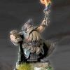
Hey all,
haven't posted on Dakka in about half a decade but this appears to be The Right Time.
I've ordered the models to create an Intercessor Kill Team, but using Iron Armour Legionnaire miniatures because they're so much cooler. The force represents a small number of veterans from a destroyed chapter.
What do you all think of this paint scheme? Too many colours? I want influence of both Salamanders and Iron Warriors in there but I may be overcomplicating things.
(I probably won't put hazard stripes on both shoulders and they'll definitely be simpler but hazard stripes are the main thing I want to incorporate)
Cheers all!
Cap'n R
|
Run a whole lot of wfrp and other rpg's, play The Woods and Kill Team, gather and look mournfully at imperial guard knowing I'll never finish enough to use them on the tabletop  |
|
|
 |
|
2023/05/16 14:56:01
Subject: Re:Returning from the mists of time, I have a paint scheme I'd like opinions on
|
|

Armored Iron Breaker
Struggling about in Asmos territory.
|
Personally would (to avoid the rastaman schematic) change the red spot color into something else, preferably something metallic.
There used to be a rule to flags for instance that you can only use two mineral colors and combine it with a metal color, which seems to work well in paint-schemes too imho.
That means combining no more than two (vibrant) colors (in your case green with yellow (black not counted, you can combine that with everything) with either gold, bronze, copper, tin, platinum or silver (etc) tinted colors.
As in; yellows, browns, beiges, pastel forms of the prior, and whatever tint of grey.
The Rastaflag is red-green(mineral) gold(metal) for instance. (so the rule is kept, that is beside the point here anyway  )
But using 2 metal colors and 1 mineral color imho looks way better than the other way around as far as I am concerned.
Note I said personally here, ultimately it is your mini so your call what you want to look at.
If you love the rasta flag go with it.
Kind regards!
-Leopold helveine.
|
|
This message was edited 4 times. Last update was at 2023/05/16 15:00:04
"Why would i be lying for Wechhudrs sake man.., i do not write fiction!"
|
|
|
|
|
2023/05/16 15:39:18
Subject: Returning from the mists of time, I have a paint scheme I'd like opinions on
|
|

Horrific Hive Tyrant
|
I like it but I would keep both legs green.
|
|
|
|
|
2023/05/16 16:45:35
Subject: Returning from the mists of time, I have a paint scheme I'd like opinions on
|
|
Trigger-Happy Baal Predator Pilot
netherlands
|
To many colors keep it black and yellow or black green.
|
full compagny of bloodangels, 5000 pnt of epic bloodangels
5000 pnt imperial guard
5000 pnt orks
2500 pnt grey knights
5000 pnt gsc
5000 pnts Chaos legionars
4000 pnt tyranids
4000 pnt Tau
|
|
|
|
|
2023/05/16 17:50:11
Subject: Re:Returning from the mists of time, I have a paint scheme I'd like opinions on
|
|
Rough Rider with Boomstick
|
 Leopold Helveine wrote: Leopold Helveine wrote:Personally would (to avoid the rastaman schematic) change the red spot color into something else, preferably something metallic.
Very useful thanks! I'll post some alternate versions tomorrow (with the feedback below as well 🙂) definitely not intending the Jamaica reference.
|
Run a whole lot of wfrp and other rpg's, play The Woods and Kill Team, gather and look mournfully at imperial guard knowing I'll never finish enough to use them on the tabletop |
|
|
|
|
2023/05/17 07:14:32
Subject: Returning from the mists of time, I have a paint scheme I'd like opinions on
|
|

Posts with Authority
|
Not feeling the exact colour shades you have chosen. Maybe go with a cold green and warm yellow, or warm yellow and cold green instead of both being warm shades?
|
|
|
|
|
2023/05/17 07:53:38
Subject: Re:Returning from the mists of time, I have a paint scheme I'd like opinions on
|
|

Huge Bone Giant
|
Looks good to me.
 Captain Roderick wrote: Captain Roderick wrote: Leopold Helveine wrote:Personally would (to avoid the rastaman schematic) change the red spot color into something else, preferably something metallic.
Very useful thanks! I'll post some alternate versions tomorrow (with the feedback below as well 🙂) definitely not intending the Jamaica reference.
Personally I see no reason to move away from red if it's used in such limited quantities. For the most part color overload becomes an issue when you have too many colors of similar prominence. It would probably get too much if for instance you added red to the bolter. As it is the yellow and green are very dominant and the red parts few and limited in size. As a spot color that's fine. You'd want something to that effect anyway, regardless of which color you choose.
|
Nehekhara lives! Sort of!
Why is the rum always gone? |
|
|
|
|
2023/05/17 14:51:03
Subject: Returning from the mists of time, I have a paint scheme I'd like opinions on
|
|
Rough Rider with Boomstick
|
 tauist wrote: tauist wrote:Not feeling the exact colour shades you have chosen. Maybe go with a cold green and warm yellow, or warm yellow and cold green instead of both being warm shades?
Here's some experimentation with colder shades, as well as with different areas painted green (both legs, whole torso)
|
Run a whole lot of wfrp and other rpg's, play The Woods and Kill Team, gather and look mournfully at imperial guard knowing I'll never finish enough to use them on the tabletop |
|
|
|
|
2023/05/17 14:53:28
Subject: Re:Returning from the mists of time, I have a paint scheme I'd like opinions on
|
|
Rough Rider with Boomstick
|
And one more, with helm and backpack all yellow
|
Run a whole lot of wfrp and other rpg's, play The Woods and Kill Team, gather and look mournfully at imperial guard knowing I'll never finish enough to use them on the tabletop |
|
|
|
|
2023/05/17 14:58:51
Subject: Re:Returning from the mists of time, I have a paint scheme I'd like opinions on
|
|
Rough Rider with Boomstick
|
And yet another version!
|
Run a whole lot of wfrp and other rpg's, play The Woods and Kill Team, gather and look mournfully at imperial guard knowing I'll never finish enough to use them on the tabletop |
|
|
|
|
2023/05/17 15:16:18
Subject: Returning from the mists of time, I have a paint scheme I'd like opinions on
|
|

Veteran Inquisitorial Tyranid Xenokiller
|
This last one is the best so far. The one leg yellow/other leg green seemed weird since it wasn't carried up the whole model. A "simple" split scheme might be nice, with the striped shoulders.
Maybe mirror the effect you have with the hands (green over grey) on the legs, so the green is the outer pad and the grey is the inner part.
One thing you should also think about is painting this scheme over a whole army. It's pretty complicated, which means longer painting times for each guy. That can really add up over the whole project.
|
New Career Time? |
|
|
|
|
2023/05/17 16:06:06
Subject: Re:Returning from the mists of time, I have a paint scheme I'd like opinions on
|
|
Rough Rider with Boomstick
|
Oh yeah don't worry about me having to do a whole army. This is for a 6-man kill team in iron armour, counts-as intercessors :-D
|
Run a whole lot of wfrp and other rpg's, play The Woods and Kill Team, gather and look mournfully at imperial guard knowing I'll never finish enough to use them on the tabletop |
|
|
|
|
2023/05/18 11:20:14
Subject: Returning from the mists of time, I have a paint scheme I'd like opinions on
|
|
Armored Iron Breaker
Struggling about in Asmos territory.
|
Captain Roderick wrote: tauist wrote:Not feeling the exact colour shades you have chosen. Maybe go with a cold green and warm yellow, or warm yellow and cold green instead of both being warm shades?
Here's some experimentation with colder shades, as well as with different areas painted green (both legs, whole torso)
Warm green both legs is the best imo but if you like to go more original the one with the sandy yellow is great too.
Making both his torso and backpack one color looks better than making the backpack the other btw.
If you don't want the jamaica flag look then mute the red or use gold or silver for his eyes/seal.
|
|
This message was edited 1 time. Last update was at 2023/05/18 11:21:25
"Why would i be lying for Wechhudrs sake man.., i do not write fiction!"
|
|
|
|
|
2023/05/18 13:00:57
Subject: Returning from the mists of time, I have a paint scheme I'd like opinions on
|
|

Regular Dakkanaut
|
Captain Roderick wrote:Hey all,
haven't posted on Dakka in about half a decade but this appears to be The Right Time.
I've ordered the models to create an Intercessor Kill Team, but using Iron Armour Legionnaire miniatures because they're so much cooler. The force represents a small number of veterans from a destroyed chapter.
What do you all think of this paint scheme? Too many colours? I want influence of both Salamanders and Iron Warriors in there but I may be overcomplicating things.
(I probably won't put hazard stripes on both shoulders and they'll definitely be simpler but hazard stripes are the main thing I want to incorporate)
Cheers all!
Cap'n R
Looks good to me.
If I were to try and be critical just to provide food for thought, then the main thing you want is contrast, and that maybe hard to achieve with this colour combination. Some ways to achieve this are through levels (i.e. "brightness"), warmth, saturation and colour. Your levels are all the same, as is the saturation and all the colours are "warm" colours" and yellow and green are next to each other on the colour wheel. You could increase the contrast by making a cool green or a dark green or by using orange or red instead of yellow. I wouldn't make a light green AND a light yellow like you did in one of your variation examples. Pick one to be light and keep the other either middling or dark.
You can change the saturation by mixing black & white with whatever colour you want to make it more "greyish". Unfortunately there's no easy way to increase the saturation, at least not with acryllics.
But I'm just being picky. It looks fine. Especially if the grey (metallic?) bits contrast in level with both the yellow and green, that should provide contrast for you.
That all said, there's always excpetions to rules. You can make complimentary or mono-colour schemes look good too. They're just harder on miniatures because they're so small that at "tabletop distance", which is where we're mostly looking from, it'll blend into one blob and won't look as good.
|
|
This message was edited 4 times. Last update was at 2023/05/18 13:05:13
|
|
|
|
|
2023/05/18 15:04:44
Subject: Returning from the mists of time, I have a paint scheme I'd like opinions on
|
|
Posts with Authority
|
The last one is looking best so far, keep going!
Are you thinking of sticking to a neutral grey (ie a grey with only pure black and white) or were you thinking of tinting it? A slightly greenish grey could work with the green and all
While I kind of liked the pale yellow example, I remembered such a colour is a nightmare to paint, so you'll probably want to stick to a more "tan", brownish/orangish shade of yellow. Green colours have much better coverage in acrylics, so you have more liberties sussing out the green shade, while still keeping reasonable paint coverge
Lastly, I'd do final colour tests with actual models if I were you.. paint on plastic always looks so different than RGB picts on a screen
|
|
This message was edited 4 times. Last update was at 2023/05/18 15:07:45
|
|
|
|
|
2023/05/19 01:05:04
Subject: Returning from the mists of time, I have a paint scheme I'd like opinions on
|
|
Krazy Grot Kutta Driva
|
I would stick with the first scheme. The only thing I would change is to split the cod piece and belt buckle inhale colors. That way it gives better balance to the model. One thing is you will get better with hazard stripes. Good luck!
Automatically Appended Next Post:
I would stick with the first scheme. The only thing I would change is to split the cod piece and belt buckle inhale colors. That way it gives better balance to the model. One thing is you will get better with hazard stripes. Good luck!
|
|
This message was edited 1 time. Last update was at 2023/05/19 01:05:19
|
|
|
|
|
2023/05/24 17:13:07
Subject: Returning from the mists of time, I have a paint scheme I'd like opinions on
|
|
Rough Rider with Boomstick
|
Thanks for the feedback all 👍 I've got one of the minis through so was thinking of doing some test paintjobs, might pick something old and naff to test it on instead.
|
Run a whole lot of wfrp and other rpg's, play The Woods and Kill Team, gather and look mournfully at imperial guard knowing I'll never finish enough to use them on the tabletop |
|
|
|
|
2023/05/25 11:38:40
Subject: Re:Returning from the mists of time, I have a paint scheme I'd like opinions on
|
|
Dakka Veteran
|
Hope you enjoy painting hazard stripes, the curved surfaces of those shoulders aren't going to be easy. I've just been trying to do hazard stripes on the shoulder pad of an Iron Warriors and I started again three times before giving up and just painting it black... Doing two matching/reflected shoulder pads would probably give me an embolism!
|
|
|
|
|
2023/05/25 12:18:08
Subject: Returning from the mists of time, I have a paint scheme I'd like opinions on
|
|
Executing Exarch
|
I think you're going to have a hell of a time painting one model with any of your schemes, let alone six.
I would really consider simplifying your scheme further to just black and green or black and yellow. The last scheme is best, but I'd get rid of the yellow greaves.
|
|
|
|
|
|
2023/05/26 19:06:11
Subject: Re:Returning from the mists of time, I have a paint scheme I'd like opinions on
|
|

Stormin' Stompa
|
I think I found some inspiration for. 

On amore serious note, I like the green and grey with the minimal pieces of yellow.
|
|
This message was edited 1 time. Last update was at 2023/05/26 19:07:26
Ask yourself: have you rated a gallery image today? |
|
|
|
|
|
|


