| Author |
Message |
 |
|
|
|
|
Advert
|
Forum adverts like this one are shown to any user who is not logged in. Join us by filling out a tiny 3 field form and you will get your own, free, dakka user account which gives a good range of benefits to you:
- No adverts like this in the forums anymore.
- Times and dates in your local timezone.
- Full tracking of what you have read so you can skip to your first unread post, easily see what has changed since you last logged in, and easily see what is new at a glance.
- Email notifications for threads you want to watch closely.
- Being a part of the oldest wargaming community on the net.
If you are already a member then feel free to login now. |
|
 |
2015/02/20 16:14:36
Subject: New Necron Codex: The Ugliest Codex Ever?
|
|

Raging Ravener
|
Hi!
I've just been flicking through the new Necron codex. Very good rules aside, does anyone else find the Codex's art to be extremely ugly by GW standards? I thought that the digital art along the descriptions of the units was bad - all pieces look the same, colourful but devoid of character, very generic and bland, not gothic or grimdark at all (in a book on robots shaped like the Grim Reaper, dammit!). But then I saw the clip-arts with colour schemes, pages after pages, only slight changes in colour. (Would it really hurt to paint some miniatures to a decent level and post photos instead?) Anyway, it's definitely not the art that drew me into Wh40k in the first place.
So, this is the bottom of the pit when it comes to codex art for me. In wargaming, only Starship Troopers rulebooks were uglier.
Anyone feels the same? Or anyone likes the art in the new book?
|
|
|
|
 |
|
2015/02/20 16:20:35
Subject: New Necron Codex: The Ugliest Codex Ever?
|
|

Steady Space Marine Vet Sergeant
England
|
That's necrons for you. They all look ugly as sin.
|
 If you can't believe in yourself, believe in me! Believe in the Dakka who believes in you! If you can't believe in yourself, believe in me! Believe in the Dakka who believes in you! |
|
|
|
|
2015/02/20 16:36:47
Subject: New Necron Codex: The Ugliest Codex Ever?
|
|
Raging Ravener
|
Even if they are the ugliest 40k army (you could argue for that, but I still think they're at least better than Cadians), you can still do with them things like this:


|
|
|
|
|
|
2015/02/20 16:43:48
Subject: New Necron Codex: The Ugliest Codex Ever?
|
|
Thermo-Optical Hac Tao
|
I haven't seen the codex but from all the leaked art there was I agree with you. I'm not against digital art but I don't like the Necron stuff. It looks very digital and just doesn't look good...
|
|
|
|
|
2015/02/20 21:41:53
Subject: Re:New Necron Codex: The Ugliest Codex Ever?
|
|
Longtime Dakkanaut
|
Yes the new art looks like crap and more like something from a different, nicer game. I also disliked the new tyranid art in the recent campaign book, it was technicaly much better than what is in the necron book but had that comic booky cartonish zerg vibe.
I say the loose touch with the grimdark, maybe it's time to send the some Baudelaire or full series of that a 'awful diseases' documentary or sth.
|
From the initial Age of Sigmar news thread, when its "feature" list was first confirmed:
Kid_Kyoto wrote:
It's like a train wreck. But one made from two circus trains colliding.
A collosal, terrible, flaming, hysterical train wreck with burning clowns running around spraying it with seltzer bottles while ring masters cry out how everything is fine and we should all come in while the dancing elephants lurch around leaving trails of blood behind them.
How could I look away?
|
|
|
|
|
2015/02/20 22:34:20
Subject: New Necron Codex: The Ugliest Codex Ever?
|
|
Hallowed Canoness
|
I hate the photographs. All of them are bland and generic on saleable Imperial scenery. Bleh.
I wish GW would either go back to using scratch-built scenery in their photography, or at least start selling some non-Imperial terrain!
|
   
"That time I only loaded the cannon with powder. Next time, I will fill it with jewels and diamonds and they will cut you to shrebbons!" - Nogbad the Bad. |
|
|
|
|
2015/02/20 23:10:04
Subject: New Necron Codex: The Ugliest Codex Ever?
|
|

Wing Commander
|
 Furyou Miko wrote: Furyou Miko wrote:I hate the photographs. All of them are bland and generic on saleable Imperial scenery. Bleh.
I wish GW would either go back to using scratch-built scenery in their photography, or at least start selling some non-Imperial terrain!
Aye, seeing yet another photospread on the studio RoB with Citadel Terrain is boring as all hell.
In the older books, the photo shoots were often done on terrain which matched, in some aspect, the army itself. Guard pictures with bunkers and fortifications, catachans on jungle, Tau on arid terrain, etc.
But GeeDubs can't sell you that for massive markup, so it's got to go.
The new codecii are clearly trying to imitate Forgeworld, though in a much cheaper, lazier way. FW often includes spreads of particular units, their organization structure and with varying uniforms/patterns and then breaks down the significance of each thing. Thing is, their art tends to be a higher quality and represents a very small part of their total page count (it's about 7 or so pages IIRC in IA12, an ~300 page book with three different armies covered, about 2-3 pages per). The 'cron codex art, particularly the symbols/organization ones look exceptionally cheap and lazy, basic Coredraw sort of stuff I did in 9th grade.
The digital art I didn't mind as much, though I will agree the "mood" of them is far less horrific/macabre as older Necron art, but then they've moved away from that theme almost entirely for the whole race, and they at least kept some of the old art (though it really does stand out as being thematically more powerful than the newer stuff).
Hell, there was a lot more actual art in the Necron book than either the Ork or Dark Eldar one, which was almost exclusively model photos.
|
Therefore, I conclude, Valve should announce Half Life 2: Episode 3.
|
|
|
|
|
2015/02/20 23:10:50
Subject: New Necron Codex: The Ugliest Codex Ever?
|
|

Shrieking Traitor Sentinel Pilot
|
Furyou Miko wrote:I hate the photographs. All of them are bland and generic on saleable Imperial scenery. Bleh.
I wish GW would either go back to using scratch-built scenery in their photography, or at least start selling some non-Imperial terrain!
Total lack of non-Imperial terrain is a big problem. Back in the day, GW would show off codex armies in cool, thematic terrain that complemented the army and really got your imagination going. Clearly they only use scenery kits now because they want to sell their scenery kits and discourage gamers from getting creative with scratch builds (which won't put money in their pockets), but pretty much all the terrain they sell is Imperial and when they're showing off a non-Imperial army with Imperial terrain, it just doesn't match and the overall presentation just looks generic and bad. They need to either start selling terrain geared toward other races, or get over themselves and convert/scratch build terrain like they used to.
|
40k is 111% science.
|
|
|
|
|
2015/02/20 23:12:13
Subject: New Necron Codex: The Ugliest Codex Ever?
|
|
Thermo-Optical Hac Tao
|
It's not the fact it's digital I mind, it's just that it's too digital, to processed and clean. It's just soulless (yeah I know; Necrons...) but not in a good thematic way, in a looks crap way.
|
|
|
|
|
2015/02/21 00:18:52
Subject: New Necron Codex: The Ugliest Codex Ever?
|
|
Pile of Necron Spare Parts
Sarasota, FL
|
I didn't particularly like the artwork ether. But am I the only one who thinks Necrons look BA?
|
|
|
|
|
2015/02/21 00:30:28
Subject: New Necron Codex: The Ugliest Codex Ever?
|
|
Archmagos Veneratus Extremis
On the Internet
|
The art reminded me of the art that's popped up in the Heraldry books for WFB and the Ogres book. I don't mind it so much as it just exists to show the concept cleanly and clearly.
|
|
|
|
|
2015/02/21 00:53:43
Subject: New Necron Codex: The Ugliest Codex Ever?
|
|
Hallowed Canoness
|
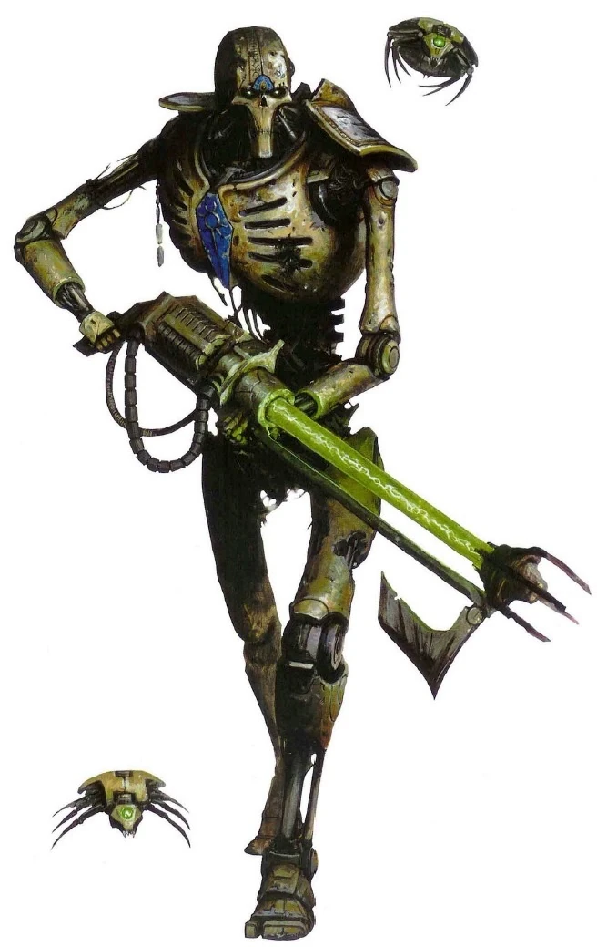
 Living Metal wrote: Living Metal wrote:I didn't particularly like the artwork ether. But am I the only one who thinks Necrons look BA?
This guy? Hulking metal monster, outmassing a Space Marine and armed with a rifle that can shatter tanks;

This guy? Stick insect with rivets and a cute little axe

|
"That time I only loaded the cannon with powder. Next time, I will fill it with jewels and diamonds and they will cut you to shrebbons!" - Nogbad the Bad. |
|
|
|
|
2015/02/21 00:57:08
Subject: New Necron Codex: The Ugliest Codex Ever?
|
|

Glorious Lord of Chaos
The burning pits of Hades, also known as Sweden in summer
|
The oldoldcrons are horrible.
Necron warriors are actually cool, though they would have been far cooler with a straight, calm, mindless walking pose (like that art) than the weird squatting.
|
|
|
|
|
|
2015/02/21 00:59:29
Subject: New Necron Codex: The Ugliest Codex Ever?
|
|
Archmagos Veneratus Extremis
On the Internet
|
And Furyou Miko shows that taste is subjective.
|
|
|
|
|
2015/02/21 01:22:35
Subject: New Necron Codex: The Ugliest Codex Ever?
|
|
Shrieking Traitor Sentinel Pilot
|
Furyou Miko isn't alone. I always liked the old metal Necron models. The new ones are ok, but the old ones had a much more unique aesthetic to them, while the new ones are very obviously Terminator/fantasy skeleton inspired.
|
40k is 111% science.
|
|
|
|
|
2015/02/21 01:24:45
Subject: New Necron Codex: The Ugliest Codex Ever?
|
|
Thermo-Optical Hac Tao
|
I prefer the new ones but I don't know how much of that is just because they're newer and were made in a different material with better technology.
|
|
|
|
|
2015/02/21 01:38:01
Subject: New Necron Codex: The Ugliest Codex Ever?
|
|
Archmagos Veneratus Extremis
On the Internet
|
 fallinq wrote: fallinq wrote:Furyou Miko isn't alone. I always liked the old metal Necron models. The new ones are ok, but the old ones had a much more unique aesthetic to them, while the new ones are very obviously Terminator/fantasy skeleton inspired.
I like both for different reasons but the point was that tastes are very subjective and one person's favorite model or edition is someone else's least favorite.
|
|
|
|
|
2015/02/21 10:06:18
Subject: New Necron Codex: The Ugliest Codex Ever?
|
|
Hallowed Canoness
|
 Except for the fact that I'm always right, because if you say I'm not right, I'll open my eyes really wide and smile. Like this!
 Metalcrons are awesome! Plastic warriors look like a stiff breeze would knock them over!
 I also hate the Monolith, so you take me as you get me.
|
|
This message was edited 1 time. Last update was at 2015/02/21 10:06:58
"That time I only loaded the cannon with powder. Next time, I will fill it with jewels and diamonds and they will cut you to shrebbons!" - Nogbad the Bad. |
|
|
|
|
2015/02/21 13:24:08
Subject: Re:New Necron Codex: The Ugliest Codex Ever?
|
|
Pile of Necron Spare Parts
|
The new art style is a poor direction for GW to go in. I was, however, more upset by the heavily abridged narrative background which gives the Necrons their unique flare and nuances them beyond pissed off space robots.The description of the Ghost Arc, for example, used to describe the evolution of the arc from a civilian vehicle which collected the dead to a military weapon. Such inclusions provided a sense of continuity from the Necronytr to the Necrons. Made for a tragic read. There are many examples like that where the fluff was just ditched to keep the codex short.
|
|
|
|
|
2015/02/21 13:45:53
Subject: New Necron Codex: The Ugliest Codex Ever?
|
|
Hallowed Canoness
|
Except it wasn't ditched for codex brevity, it was ditched for shiny but boring photographs.
|
"That time I only loaded the cannon with powder. Next time, I will fill it with jewels and diamonds and they will cut you to shrebbons!" - Nogbad the Bad. |
|
|
|
|
2015/02/21 13:48:43
Subject: Re:New Necron Codex: The Ugliest Codex Ever?
|
|
Deranged Necron Destroyer
Somewhere Ironic
|
Sweet, another hate thread. Oh boy, I can't wait to read the recycled comments about how bad GW made their products that you keep buying despite yourself.
On topic, I actually like the new art and the coloration of the 5th ed dex art. I guess that means I have bad taste. Sorry. Ugliest Codex? Definitely not.
|
DQ:90S++G++MB++I--Pw40k01+D+A++/hWD-R+++T(D)DM+
 Organiser of 40k Montreal Organiser of 40k Montreal
There is only war in Montreal
kronk wrote:The International Programmers Society has twice met to get the world to agree on one methodology for programming dates. Both times they met, the meeting devolved into a giant Unreal Tournament Lan party...
|
|
|
|
|
2015/02/21 15:09:45
Subject: New Necron Codex: The Ugliest Codex Ever?
|
|
Decrepit Dakkanaut
|
I think the book looks great. The cover is a little bland compared to some of the new illustrations actually in the book.
|
|
|
|
|
2015/02/21 18:47:47
Subject: Re:New Necron Codex: The Ugliest Codex Ever?
|
|

Paramount Plague Censer Bearer
|
 Shadelkan wrote: Shadelkan wrote:Sweet, another hate thread. Oh boy, I can't wait to read the recycled comments about how bad GW made their products that you keep buying despite yourself.
On topic, I actually like the new art and the coloration of the 5th ed dex art. I guess that means I have bad taste. Sorry. Ugliest Codex? Definitely not.
Cool Story, Bro. 
In relation to the topic, meh, just another 7th ed codex.
|
My win rate while having my arms and legs tied behind by back while blindfolded and stuffed in a safe that is submerged underwater:
100% |
|
|
|
|
2015/02/21 22:39:42
Subject: Re:New Necron Codex: The Ugliest Codex Ever?
|
|
Thermo-Optical Hac Tao
|
Shadelkan wrote:Sweet, another hate thread. Oh boy, I can't wait to read the recycled comments about how bad GW made their products that you keep buying despite yourself.
On topic, I actually like the new art and the coloration of the 5th ed dex art. I guess that means I have bad taste. Sorry. Ugliest Codex? Definitely not.
Right, because taste isn't subjective or anything. You like it, awesome. Some people don't, awesome. It's hardly a hate thread to say you don't like a style of art.
|
|
|
|
|
2015/02/21 22:51:48
Subject: New Necron Codex: The Ugliest Codex Ever?
|
|
Wicked Canoptek Wraith
|
What do you expect from an anorexic army?
|
|
|
|
|
|
2015/02/22 21:22:14
Subject: New Necron Codex: The Ugliest Codex Ever?
|
|
Raging Ravener
|
Furyou Miko wrote:I hate the photographs. All of them are bland and generic on saleable Imperial scenery. Bleh.
I wish GW would either go back to using scratch-built scenery in their photography, or at least start selling some non-Imperial terrain!
They could even use Forge World scenery or Monolith kitbashes for Necron-specific terrain, that could work.
 ClockworkZion wrote: ClockworkZion wrote:The art reminded me of the art that's popped up in the Heraldry books for WFB and the Ogres book. I don't mind it so much as it just exists to show the concept cleanly and clearly.
I don't mind a page or five of clean, informative, but uninspired art. I mind 30 pages of it, though (but I've seen just the digital edition, so maybe it's better with the printed codex).
 Ashiraya wrote: Ashiraya wrote:
Necron warriors are actually cool, though they would have been far cooler with a straight, calm, mindless walking pose (like that art) than the weird squatting.
I, for one, love the squatting, it makes warriors look deranged, hungry, and beastly. Still, for an army with a different feel an upright pose would be cool, too.
 ImAGeek wrote: ImAGeek wrote:I prefer the new ones but I don't know how much of that is just because they're newer and were made in a different material with better technology.
I think it's not the material, they could do skeletons in the '80s, after all.
Furyou Miko wrote:
Metalcrons are awesome! Plastic warriors look like a stiff breeze would knock them over!
I also hate the Monolith, so you take me as you get me.
I quite like both versions of 'Crons, but I still find the Monolith boring. New Obelisk feels kinda better, and I really like this one: https://3.bp.blogspot.com/_ARyCHIqabVY/S3g7ASxDRCI/AAAAAAAAAdc/fcQdmOKWK8U/s1600/Monolith.jpg.
 Tinchebrai wrote: Tinchebrai wrote:The new art style is a poor direction for GW to go in. I was, however, more upset by the heavily abridged narrative background which gives the Necrons their unique flare and nuances them beyond pissed off space robots.The description of the Ghost Arc, for example, used to describe the evolution of the arc from a civilian vehicle which collected the dead to a military weapon. Such inclusions provided a sense of continuity from the Necronytr to the Necrons. Made for a tragic read. There are many examples like that where the fluff was just ditched to keep the codex short.
There are other examples: in the new codex, the thing with ordinary Necrontyr and dissenters getting remade into mindless warriors feels downplayed - and when I read about it in the Ward codex, it felt dystopian and powerful, a bit like stories from Cyberiad by Stanislaw Lem. Also, the Praetorians are here no longer to make your Overlord bow before the Triarch. Generally, it feels nicer and more friendly.
Shadelkan wrote:Sweet, another hate thread. Oh boy, I can't wait to read the recycled comments about how bad GW made their products that you keep buying despite yourself.
On topic, I actually like the new art and the coloration of the 5th ed dex art. I guess that means I have bad taste. Sorry. Ugliest Codex? Definitely not.
Nah, it's pretty civil here - if I started to write about GW's corporate policies, how money impacts game design, and point cost creep, now that would be a hate thread. And, well, of course I feel my taste is the best ever  , but feel free to write why you like the new art - it can only make the thread better and the readers - wiser, maybe even it can make some of them appreciate the new codex!
|
|
This message was edited 1 time. Last update was at 2015/02/22 21:28:04
|
|
|
|
|
|
|


