| Author |
Message |
 |
|
|
|
|
Advert
|
Forum adverts like this one are shown to any user who is not logged in. Join us by filling out a tiny 3 field form and you will get your own, free, dakka user account which gives a good range of benefits to you:
- No adverts like this in the forums anymore.
- Times and dates in your local timezone.
- Full tracking of what you have read so you can skip to your first unread post, easily see what has changed since you last logged in, and easily see what is new at a glance.
- Email notifications for threads you want to watch closely.
- Being a part of the oldest wargaming community on the net.
If you are already a member then feel free to login now. |
|
 |
2015/03/02 19:01:30
Subject: Angron Primarch Of The World Eaters
|
|

Regular Dakkanaut
|
Angron Primarch Of The World Eaters
Forge World miniature, Masters6-level, NMM. Vote on CMON.
Post on MadFly-Art.
Post on Facebook.
Painted by: Yaroslav Bozhdynsky
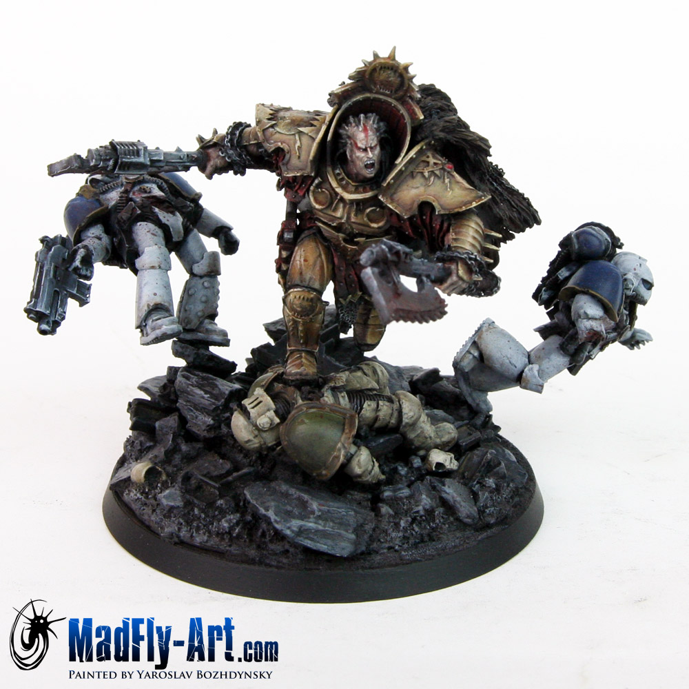
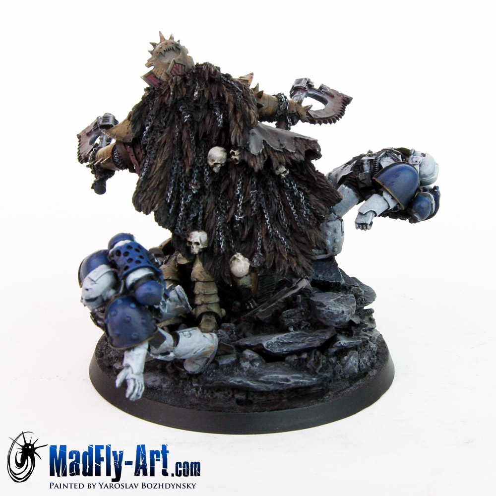
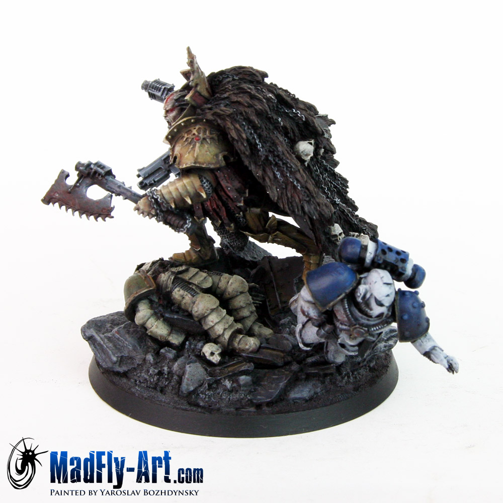
Comments and votes are welcome
|
|
|
|
 |
|
2015/03/02 19:50:34
Subject: Re:Angron Primarch Of The World Eaters
|
|

Unhealthy Competition With Other Legions
|
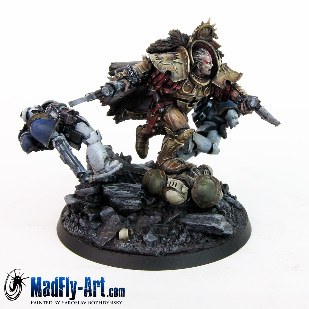
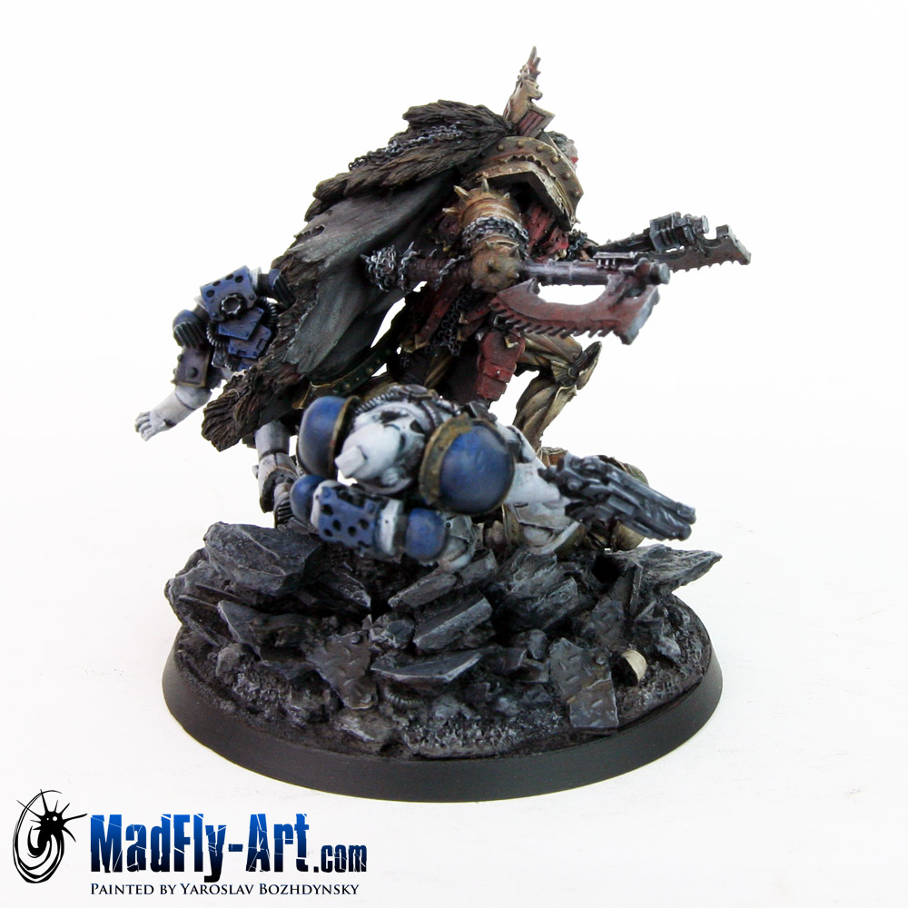
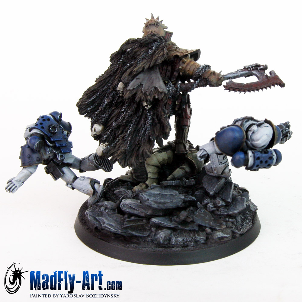
Angron himself is very nicely painted, however the NMM gold on the marines just looks unfinished. If I was going to nitpick I'd have to say the gold on angron could use some sharper transitions; these would help reinforce the metallic nature you're trying to achieve
|
5,000 Raven Guard 
3,000 Night Lords  |
|
|
|
|
2015/03/02 20:21:59
Subject: Angron Primarch Of The World Eaters
|
|

Is 'Eavy Metal Calling?
|
Epic! The tone is perfect!
|
|
|
|
|
|
2015/03/04 08:02:12
Subject: Angron Primarch Of The World Eaters
|
|

Scribe of Dhunia
|
I want to like the work you've done here, but i just can't. The armor just doesn't pop enough and the entire model is far too flat for me.
The model over all (especially the base) is far too flat for me. Nothing pops, nothing stands and out, and overall, nothing inspires me to be say "this is Angron, the primarch of the World Eaters" and honesty, it really detracts from the model for me.
The face seems very monotone and overall, the model lacks the violence factor, meaning that even though the marine just got SLASHED ACROSS THE CHEST WITH A CHAIN AXE, theres no blood. No...anything. No weathering, no dust or dirt, no nothing.
Your painting is excellent, no questions, but I can't bring myself to like it, especially if its something you are willing to call "Master Level." Even if this is what the client requested, i was hoping for so much more form this.
|
|
|
|
|
2015/03/04 09:39:47
Subject: Re:Angron Primarch Of The World Eaters
|
|

Speedy Swiftclaw Biker
|
@scarecrow456: wow thats a little harsh way to say he still has room to improve, although I must agree with you on the fact It still can be improved.
@madfly-art: There's no doubt you posses "master" quality painting skills bro, but like I said I must agree a bit with what scarecrow456 says. So here are two suggestions on how I think you could improve.
1) Put brighter colors on details you want the viewers to notice, don't just mix with white to make highlighting colors. This will make the colors look bleached and does the opposite of bright colors. Using brighter colors will not only make the details pop-out, but also gives the viewer a focus point and this is very important (for some who are spoiled with all the awesome eye candy on this website, it is very very important  ). Light directs the viewers eye. That also brings me to my second point.
2) Use darker backdrops when photographing your models. It is not just for fun. But darker backdrops compliment and enhance your painting. White backdrops can bleach out your models restricting brighter parts of the model to stand out. Maybe this will also fix our view on the lack of focus points on your model.
Hope you find my comments useful and keep up the good work!
|
|
This message was edited 1 time. Last update was at 2015/03/04 13:21:28
|
|
|
|
|
2015/03/04 09:42:03
Subject: Angron Primarch Of The World Eaters
|
|

Warning From Magnus? Not Listening!
|
I feel like the photo isn't doing the model any justice.
|
Notice: If you notice this notice you will notice that this notice is not worth noticing
|
|
|
|
|
2015/03/05 15:51:23
Subject: Re:Angron Primarch Of The World Eaters
|
|
Mimetic Bagh-Mari
|
Looks great! The 'flat' looks nice and gritty.. Looks like he's been slaughtering and fighting.. which is a good thing and very World Eaters of him!
|
|
|
|
|
2015/03/08 18:07:52
Subject: Re:Angron Primarch Of The World Eaters
|
|
Unhealthy Competition With Other Legions
|
 Warsmith262 wrote: Warsmith262 wrote:Looks great! The 'flat' looks nice and gritty.. Looks like he's been slaughtering and fighting.. which is a good thing and very World Eaters of him!
But looking flat is the exact opposite of what you try and achieve with NMM; by using flat colours you try and convey a sense of depth and perspective. His work has failed to create that illusion
|
5,000 Raven Guard
3,000 Night Lords |
|
|
|
|
2015/03/08 18:17:48
Subject: Angron Primarch Of The World Eaters
|
|

Ancient Space Wolves Venerable Dreadnought
I... actually don't know. Help?
|
Great job! Although, the base looks a bit dull, maybe work some green in there?
|
|
|
|
|
|
|
|

 ~2800 points