Forum adverts like this one are shown to any user who is not logged in. Join us by filling out a tiny 3 field form and you will get your own, free, dakka user account which gives a good range of benefits to you:
No adverts like this in the forums anymore.
Times and dates in your local timezone.
Full tracking of what you have read so you can skip to your first unread post, easily see what has changed since you last logged in, and easily see what is new at a glance.
Email notifications for threads you want to watch closely.
Being a part of the oldest wargaming community on the net.
If you are already a member then feel free to login now.
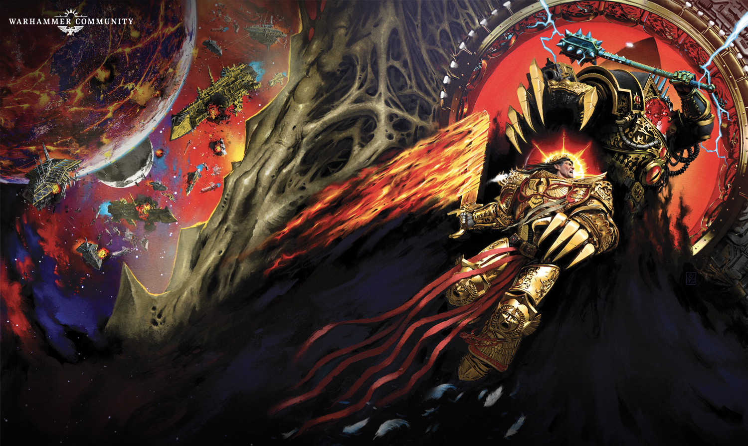
Those covers are just terrible. Never been a fan of that art style but what they've done with it just makes it worse. The bits with the ships and the thrones are nice enough, but the rest just looks so lifeless and uninteresting as if they're just hurriedly posed 3d models with a quickly edited random background and some thoughtless special effects edited ontop.
This message was edited 1 time. Last update was at 2023/08/09 16:48:07
GaroRobe wrote: Not a huge fan of the final covers. The Emperors pose seems very weird and it’s angled very strangely.
The personalized chairs are nice. Angron has the khorne one, Magnus has the tzeentch one. Is the bone for Curze? And the fourth is Fulgrims? Can a snake man use a chair?
I'm assuming the chairs are for THE GODS THEMSELVES once they manifest into the materium upon Horus' inevitable triumph.
That's definitely the worst cover of the entire HH/SoT series. Not sure what they were thinking there. How odd to drop the ball like that on the last book, representing a famous scene that's been represented twice before and better.
Were there even that many of the 40k-ish upside down prow vessels at Terra? I thought they were pretty rare until post heresy.
This message was edited 1 time. Last update was at 2023/08/09 19:27:12
1: Who is the Empperor attacking? It certainly isn't Horus. He seems to be looking off frame and leaping in the same direction.
2: The claws were initially what threw me off, large areas of plain gold. This larger pic does have some definition/markings, but that will not appear on a book cover, being shrunk down.
3: Horus and especially his face feels very cartoony. The Emperor, face and armour seem great, but in a completely different style to Horus.
4: The black cloud in the lower half. I imagine it was done to frame the emperor, but we end up with dark grey and black in 1/3 of the picture.
5: Ships and the planet. They are good/no issues with them for me. BUT some sort of glass/force field would add more to it, and then at the bottom the stars creep into the black cloud at the bottom, rendering the hard edge provided higher pointless.
Horus is the most jarring part, he just doesn't seem to fit with the rest of the picture in the way he has been drawn/painted.
A sad end to a great series.
Compare the above to the following and I would choose the image below every time. They both convey the same information and feel, but the below image is stylistically consistent and has a gravitas/sense of depth that the new one doesn't.
This message was edited 5 times. Last update was at 2023/08/09 22:36:34
2025: Games Played:8/Models Bought:162/Sold:169/Painted:127
2024: Games Played:6/Models Bought:393/Sold:519/Painted: 207
2023: Games Played:0/Models Bought:287/Sold:0/Painted: 203
2020-2022: Games Played:42/Models Bought:1271/Sold:631/Painted:442
2016-19: Games Played:369/Models Bought:772/Sold:378/ Painted:268
2012-15: Games Played:412/Models Bought: 1163/Sold:730/Painted:436
GaroRobe wrote: Not a huge fan of the final covers. The Emperors pose seems very weird and it’s angled very strangely.
The personalized chairs are nice. Angron has the khorne one, Magnus has the tzeentch one. Is the bone for Curze? And the fourth is Fulgrims? Can a snake man use a chair?
I'm assuming the chairs are for THE GODS THEMSELVES once they manifest into the materium upon Horus' inevitable triumph.
I’d expect nurgle to have a rotten wood chair or a fleshy mass though, not bone. Since it’s not like slaanesh would use that one which means the chair at the far end would be theirs
GaroRobe wrote: Not a huge fan of the final covers. The Emperors pose seems very weird and it’s angled very strangely.
The personalized chairs are nice. Angron has the khorne one, Magnus has the tzeentch one. Is the bone for Curze? And the fourth is Fulgrims? Can a snake man use a chair?
I think we all know that the bone chair would be Fulgrims....
1: Who is the Empperor attacking? It certainly isn't Horus. He seems to be looking off frame and leaping in the same direction.
2: The claws were initially what threw me off, large areas of plain gold. This larger pic does have some definition/markings, but that will not appear on a book cover, being shrunk down.
3: Horus and especially his face feels very cartoony. The Emperor, face and armour seem great, but in a completely different style to Horus.
4: The black cloud in the lower half. I imagine it was done to frame the emperor, but we end up with dark grey and black in 1/3 of the picture.
5: Ships and the planet. They are good/no issues with them for me. BUT some sort of glass/force field would add more to it, and then at the bottom the stars creep into the black cloud at the bottom, rendering the hard edge provided higher pointless.
Horus is the most jarring part, he just doesn't seem to fit with the rest of the picture in the way he has been drawn/painted.
A sad end to a great series.
Compare the above to the following and I would choose the image below every time. They both convey the same information and feel, but the below image is stylistically consistent and has a gravitas/sense of depth that the new one doesn't.
TBF the faces in the black and white picture are pretty bad.
Personally I like the revealed cover, but everyone has their own opinions!
MOD EDIT: use spoiler tags please when quoting such large posts
This message was edited 1 time. Last update was at 2023/08/10 17:54:24
The faces in the B&W artwork are incredible I think! Remember being so spooked out by that as a kid.
And just the level of drama. You can see that everything has led up to that moment. I know you can have some fun with Sanguinius (and the concept of what the Prmiarchs are has been expanded greatly since then) but your eyes are really just drawn to the main protagonists.
I actually prefer that to Adrian Smith's own later colour piece, although they are very different in concept: this is almost a snap-shot illustration of the confrontation, whereas the later one looks more like a mural.
This message was edited 1 time. Last update was at 2023/08/11 10:17:05
Pacific wrote: I actually prefer that to Adrian Smith's own later colour piece, although they are very different in concept: this is almost a snap-shot illustration of the confrontation, whereas the later one looks more like a mural.
There's a good sense of tension to the black and white piece. Both Horus and the Emperor look like they're about to strike at any moment, waiting for the other to move first like an old West quick-draw.
Mentlegen324 wrote: Those covers are just terrible. Never been a fan of that art style but what they've done with it just makes it worse. The bits with the ships and the thrones are nice enough, but the rest just looks so lifeless and uninteresting as if they're just hurriedly posed 3d models with a quickly edited random background and some thoughtless special effects edited ontop.
It's not an art style, it's just unfinished digital attempt at an oil or other physical painting. The standards for commercial digital art have been allowed to slip for some reason. You'd think GW, a company famous for it's artwork that they'd either pay the price to have real art or rendered digital art and not the crappy digital art imitation of an oil painting since their IP is the golden goose, you have a long lead time and know the basic plot of this book, no excuse, just baffling cheapness and indifference. GW hired a greedy or incompetent artist and don't care.
One reason is a race to the bottom since digital art allows outsourced contractors to easily take work anywhere and digital allows an artist to more easily work on several pieces on the go. You also have a lot more self-taught artists who might have big holes in their understanding. (Just pay a visit to DeviantArt) On the one hand this situation should theoretically improve quality since there are more artist competing with each other but maybe a lack of an objective standard for art or what is or isn't a finished piece has allowed this culture of just commissioning crappy, often clearly unfinished art. Games companies I blame the most, they commissioned an absurd amount of low quality artwork in recent years (I often wonder why because it just acts as anti-advertising for their product) and maybe this has enabled bad standards to move upward.
Though generally when cheap labour enters a market employers find what the tolerated level of shoddy work is and adapt to the new lower wages, they get addicted to it and pass the costs onto customers and society. A common occurrence, it's just odd to us to see in art.
Rant below and examples of the same artist with digital and physical as well as a good digital artist who works for GW.
Spoiler:
Part of the problem is that in digital art colors don't really blend together (Because they aren't real physical objects) and the shades and tones aren't the same as in natural pigments. So instead of the colors blending into an almost infinite range of shades it will tend to look like huge brush strokes of photoshop layers because that's essentially what it is. It looks "flat" and the colour tones look "washed out" and bland. An artist might convince themself that this detail isn't needed and yet you can tell when it's missing. You aren't painting in a stylised way, you're doing realism with less detail, ie, worse.
The famous GW artist Adrian Smith (https://40k.gallery/artist/adrian-smith) did almost all his memorable work in inks and paints but he did produce this image in digital trying to imitate an oil painting. It's an impressive feat and on first glance looks convincing but you can see a common issue where the background doesn't look like it's connected to the foreground and seems to be composed of giant washed out photoshop tint layers. And as stated before generally the colours and hue seem "off" and bland. The filigree on the armour looks weird and watery like it was bad ai art, it may have been too detailed for his tools to be able to do properly digitally.
Compare with this famous Adrian Smith piece from when he reached the peak of his prowess in physical art.
There is immense fine detail even in the areas he left less detailed and "scribbled", no giant photoshop-like layer "brush strokes" and the colours pop despite them being illuminated pixels like the digital on our screen, his colour palette was worse because he never had to think about picking his colours out of a digital palette, he just used the physical pigments he had access to. It's just more vibrant and more memorable. There is just so much more innate detail in physical art because it's a physical object and small details are easier to include. If I have one big problem with digital art it's a lack of colours and tones, the physical art will always contain more because the colours are mixing properly whereas in digital they don't.
Now compare this to a guy who is a true master of digital artwork for GW, Lewis Jones. (https://40k.gallery/artist/lewis-jones) He is the one behind the brilliant current GS Cults, CSM and Imperial Guard codexes. They are amazing and look like the love children of a Caravaggio and a John Blache artwork.
But both the CSM and GS Cult artwork were well-cropped because when you look at them in their full form you see horrible unfinished sections around where they cropped it. Look at the muzzle flashes weird tripod daemon engine and generally everything in the upper 4th of the screen being full of ugly DeviantArt style "brush strokes".
On the Genestealer Cult cover you see a lot less of this but look at the wall of pale cultists running from the background to the foreground, they are composed of big rectangular photoshop layers, there is no depth, they are watery colour layers of one exact perfectly homogeneous hex colour and look wrong. And look at the guy in the very front of the foreground, he looks weird and wrong because he doesn't really look like he belongs with the background, (Again a common problem with digital art) he looks like he was created just like the others and then given a general darker layer over himself, probably on another layer and then cut and pasted in. As an attempt to emulate shadow it fails. There is another guy much closer to the other figures who has been treated with the same filter or layer and makes it even more jarring.This one was cropped in a way which makes this less obvious though. So even a guy who is amazing a digital art still has a lot of "DeviantArt-esque" cheapness on the edges just due to the inherent limitations of the medium, you can't leave poorly detail areas and expect them to blend in with highly detailed areas, an inherent failure of the digital medium.
Compare his excellent art, however with some generic outsourced stuff in the same codex. It's detailed but not detailed enough, things all over look wrong and cheap. He has either left this art unfinished or is unable to produce the necessary quality to be an actual replacement for physical art. More broadly I think this represents more of an illustration than true art. More and more of this is in GW products and I genuinely wonder why. All it does is produce wild dissonance between different pieces of art in the book, particularly between modern and classic works and makes Warhammer seem more cheap. GW always had a huge advantage over other fantasy games with their art being leagues ahead, it played a huge role in why GW is so successful today.
This message was edited 5 times. Last update was at 2023/08/26 19:37:54
It's not an art style, it's just unfinished digital attempt at an oil or other physical painting. The standards for commercial digital art have been allowed to slip for some reason. You'd think GW, a company famous for it's artwork that they'd either pay the price to have real art or rendered digital art and not the crappy digital art imitation of an oil painting since their IP is the golden goose, you have a long lead time and know the basic plot of this book, no excuse, just baffling cheapness and indifference. GW hired a greedy or incompetent artist and don't care.
It's the same artist that's done the cover for every single other HH/Siege novel, so GW's just aiming for consistency. Maybe he's just a little drained at this point.
The artist who did the new cover is Neil Roberts, the same artist who has done pretty much every Horus Heresy black library book and a much more besides. I was under the impression that he was pretty highly regarded by Warhammer community. The old art is undeniably great but it wouldn't make a good novel cover. The decision to put the Emperor in front of Horus is so they will both fit on the front cover of the book.
It's perfectly fine to not like the cover but it's important to remember that the best cover and the best art is not remotely the same thing.
Finally being released after being announced months ago.
Limited to 1,000 copies. Are Word Bearers unpopular enough that I don't need to worry about getting a copy? Or should I preemptively hit the loot group?
Why would you want to pay silly money for a copy which the editor most likely still hasn't bothered to put through a spell checker, and which GW doesn't really want to sell you, when the paperback omnibus already exists?
Lord Damocles wrote: Why would you want to pay silly money for a copy which the editor most likely still hasn't bothered to put through a spell checker, and which GW doesn't really want to sell you, when the paperback omnibus already exists?
Probably for the same reason anyone ever buys a special edition of a book?
It's not like the paperback omnibus is that much cheaper. Black Library only sells the Ebook, and the average price on Amazon is close to $60.
"Unimaginably ancient xenos artefact somewhere on the planet, hive fleet poised above our heads, hidden 'stealer broods making an early start....and now a bloody Chaos cult crawling out of the woodwork just in case we were bored. Welcome to my world, Ciaphas."
Inquisitor Amberley Vail, Ordo Xenos
"I will admit that some Primachs like Russ or Horus could have a chance against an unarmed 12 year old novice but, a full Battle Sister??!! One to one? In close combat? Perhaps three Primarchs fighting together... but just one Primarch?" da001


 Member of
  DKoK Blog:
 Have a look, I guarantee you will not see greyer armies, EVER! Now with at least 4 shades of grey