Forum adverts like this one are shown to any user who is not logged in. Join us by filling out a tiny 3 field form and you will get your own, free, dakka user account which gives a good range of benefits to you:
No adverts like this in the forums anymore.
Times and dates in your local timezone.
Full tracking of what you have read so you can skip to your first unread post, easily see what has changed since you last logged in, and easily see what is new at a glance.
Email notifications for threads you want to watch closely.
Being a part of the oldest wargaming community on the net.
If you are already a member then feel free to login now.
Porportions are very different of a human. If you increased the Votaan to primaris height you would end up with an Ogryn.
Theres many reasons the majority of GW kits have been increasing in scale and not all are related to fluff. I can only remember once the kits reducing in size and that was with the old night goblins.
Olthannon wrote: I guess that if primaris are meant to be 8 and a half foot and the Votann model is about half that, then it's good enough.
I don't know what size they are but they look about the same as the AoS ones.
The issue with Primaris is that the models are scaled to look like a run of the mill seven foot tall Marine next to normal human models. The model tells us they're the size Marines should be like. Conceivably he fluff writers that cooked up the whole Primaris mess went with them being bigger than normal Marines because the new models are bigger than the old models. Which is pretty stupid, but we've had to deal with the Primaris size issue from the beginning.
GW is all about Marines and of course they would compare a new Squat to an Intercessor, but in my opinion we're going to be better off seeing a Squat next to a Guardsman or Genestealer (4th gen) Neophyte to get a real idea of what they look like. I find it a lot more sensible to compare an abhuman to a base human rather than a modified human. Of course GW disagrees...
Nehekhara lives! Sort of!
Why is the rum always gone?
Sunny Side Up wrote: Horus AND the Emperor once fought an Ork Boss and barely survived (and couldn't kill the Ork) back in the olden days.
That is still accurate today though, as there really is no (known) limit on how much a warboss can grow. I mean, the primary reason for the deathwatch to exist was to cull ork empires before a warboss that level could emerge again.
Ragnar Blackmane himself was willing to sacrifice two whole fleets of space wolves and his own life in order to stop Thrakka from getting any more powerful than he already is and failed to do so - and Thrakka isn't even the ballpark of the ork which gave Horus and the Emperor trouble who is described as being twice the emperor's size. Thrakka is described as being the size of a dread, about as tall as a primarch (which isn't that accurate of a measurement itself).
In later books it was also implied that the Emperor was losing the fight on purpose to test Horus' loyalty.
7 Ork facts people always get wrong: Ragnar did not win against Thrakka, but suffered two crushing defeats within a few days of each other. A lasgun is powerful enough to sever an ork's appendage or head in a single, well aimed shot. Orks meks have a better understanding of electrics and mechanics than most Tech Priests. Orks actually do not think that purple makes them harder to see. The joke was made canon by Alex Stewart's Caphias Cain books. Gharkull Blackfang did not even come close to killing the emperor. Orks can be corrupted by chaos, but few of them have any interest in what chaos offers. Orks do not have the power of believe.
Olthannon wrote: I guess that if primaris are meant to be 8 and a half foot and the Votann model is about half that, then it's good enough.
I don't know what size they are but they look about the same as the AoS ones.
The issue with Primaris is that the models are scaled to look like a run of the mill seven foot tall Marine next to normal human models. The model tells us they're the size Marines should be like. Conceivably he fluff writers that cooked up the whole Primaris mess went with them being bigger than normal Marines because the new models are bigger than the old models. Which is pretty stupid, but we've had to deal with the Primaris size issue from the beginning.
GW is all about Marines and of course they would compare a new Squat to an Intercessor, but in my opinion we're going to be better off seeing a Squat next to a Guardsman or Genestealer (4th gen) Neophyte to get a real idea of what they look like. I find it a lot more sensible to compare an abhuman to a base human rather than a modified human. Of course GW disagrees...
I'd argue that actually, primaris are good choice because they are genetically enhanced to be that size and thus a good control scale. Baseline humans can be all sorts of sizes, as are their models.
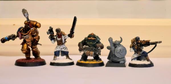
So this is my own scale example using the Necromunda Squats. As with all Necromunda minis, they are a little larger than life. Part of the style of the game. Based on the other scale photo, the Votann will be a touch smaller than them. So I think they will look about right.
Geifer wrote: Kommandos are sneaky gits that done fight like proper Orks. Their Nob should be puny.
There is no lore support for that claim and there is no size difference between regular orks and regular kommadoz to support that theory either.
In most lore pieces about imperials fighting kommadoz they are actually described to be more vicious than regular orks, though the fear component of having a huge overpowering brute sneak up on you clearly changes perspective.
7 Ork facts people always get wrong: Ragnar did not win against Thrakka, but suffered two crushing defeats within a few days of each other. A lasgun is powerful enough to sever an ork's appendage or head in a single, well aimed shot. Orks meks have a better understanding of electrics and mechanics than most Tech Priests. Orks actually do not think that purple makes them harder to see. The joke was made canon by Alex Stewart's Caphias Cain books. Gharkull Blackfang did not even come close to killing the emperor. Orks can be corrupted by chaos, but few of them have any interest in what chaos offers. Orks do not have the power of believe.
Regardless of the semantics the new squats do appear to be actually “squat”. We will know exactly by how much when they are released but all indications are that they will be shorter than a human. Which is all I ask.
I guess we'll get some form of icon bearer during the second wave. You can see some in the artwork. Not that artwork=model these days, but since standards are becoming more commonplace (primaris, death guard, sisters of battle, etc all have them), I'd be shocked if we didn't get some for the Leagues
"On that basis, wherever we included a traditional dwarfen element, we were careful to give it a gothic sci-fi reimagining and ensure it felt organic within this millennia-old spacefaring society.”"
To me it seems a little odd to say that when for example sticking a very clearly Dwarf-themed crest on something like the Hearthkyn Theyn comes across as not feeling very "organic" due to it being the only piece in the squad with that style.
This message was edited 1 time. Last update was at 2022/09/08 14:53:06
Mentlegen324 wrote: To me it seems a little odd to say that when for example sticking a very clearly Dwarf-themed crest on something like the Hearthkyn Theyn comes across as not feeling very "organic" due to it being the only piece in the squad with that style.
Jess: "The angular decorative elements and runic motifs are similarly a callback to dwarfen runes. Their use increases as you go up the ranks, helping the elites stand out on the battlefield. While the basic look could be called utilitarian, these designs helped allude to the ancient nature and craftsmanship of some of their wargear."
It certainly works for me.
I think you sort of missed what I was getting it. It doesn't feel very organically or naturally integrated into them for a squad to have absolutely none of those design motifs but then a single one of them suddenly has a big obviously Dwarfy themed Crest.
This message was edited 1 time. Last update was at 2022/09/08 15:32:28
No, I understood what you meant. I just think it works, because as Jess says, the lower your rank, the more utilitarian, and the higher your rank, the more "dwarvish" elements get incorporated. To me the crest works, and doesn't look out of place at all. Some Hearthkyn might have decal-based runes, but the crest is the first thing that highlights "dwarf" in a way that visually lets the leader stand out. Almost like the old germanic totem-based standards, just without the need for a standard-bearer. Then the higher ranks start getting dwarven glyphs molded into their armor.
If I have a complaint, it's that I'm not a huge fan of the glyph designs. Feels more Celtic than Germanic.
KillerAngel wrote: No, I understood what you meant. I just think it works, because as Jess says, the lower your rank, the more utilitarian, and the higher your rank, the more "dwarvish" elements get incorporated. To me the crest works, and doesn't look out of place at all. Some Hearthkyn might have decal-based runes, but the crest is the first thing that highlights "dwarf" in a way that visually lets the leader stand out. Almost like the old germanic totem-based standards, just without the need for a standard-bearer. Then the higher ranks start getting dwarven glyphs molded into their armor.
If I have a complaint, it's that I'm not a huge fan of the glyph designs. Feels more Celtic than Germanic.
But having more Dwarfy elements at a higher rank is a different matter, that didn't mean the only option for the rest was none at all actually on the model itself. If they had given even the basic warriors just a very small bit of that theming (not just just the decal) then it would have felt a bit more cohesive and not just suddenly appearing out of almost nowhere on the Theyn.
This message was edited 2 times. Last update was at 2022/09/08 16:24:31
KillerAngel wrote: No, I understood what you meant. I just think it works, because as Jess says, the lower your rank, the more utilitarian, and the higher your rank, the more "dwarvish" elements get incorporated. To me the crest works, and doesn't look out of place at all. Some Hearthkyn might have decal-based runes, but the crest is the first thing that highlights "dwarf" in a way that visually lets the leader stand out. Almost like the old germanic totem-based standards, just without the need for a standard-bearer. Then the higher ranks start getting dwarven glyphs molded into their armor.
If I have a complaint, it's that I'm not a huge fan of the glyph designs. Feels more Celtic than Germanic.
But having more Dwarfy elements at a higher rank is a different matter, that didn't mean the only option for the rest was none at all actually on the model itself. If they had given even the basic warriors just a very small bit of that theming (not just just the decal) then it would have felt a bit more cohesive and not just suddenly appearing out of almost nowhere on the Theyn.
LMAO you're basically concern trolling at this point. Basic troops are plain. This is standard GW practice.
Marines all have some minor iconography. Same with Admech. Same with Necrons. Same with Sisters. I do think some minor iconography would have benefited the overall aesthetic. Why mock him for the aesthetic preference?
‘What Lorgar’s fanatics have not seen is that these gods are nothing compared to the power and the majesty of the Machine-God. Already, members of our growing cult are using the grace of the Omnissiah – the true Omnissiah, not Terra’s false prophet – to harness the might of the warp. Geller fields, warp missiles, void shields, all these things you are familiar with. But their underlying principles can be turned to so much more. Through novel exploitations of these technologies we will gain mastery first over the energies of the empyrean, then over the lesser entities, until finally the very gods themselves will bend the knee and recognise the supremacy of the Machine-God"
- Heretek Ardim Protos in Titandeath by Guy Haley
JSG wrote: LMAO you're basically concern trolling at this point. Basic troops are plain. This is standard GW practice.
And historical practice as well. What most people picture a "viking" to be is really a noble, or someone with money/skill enough to get the good gear. Most soldiers were just farmers or tradesmen with a shield a spear/axe. Not sure how the Hearthkyn are any different. They have the same armor and weapons, have the same general motifs, the higher ranks just have more ornate versions.
Geifer wrote: Kommandos are sneaky gits that done fight like proper Orks. Their Nob should be puny.
There is no lore support for that claim and there is no size difference between regular orks and regular kommadoz to support that theory either.
In most lore pieces about imperials fighting kommadoz they are actually described to be more vicious than regular orks, though the fear component of having a huge overpowering brute sneak up on you clearly changes perspective.
Orks get bigger the more they fight, and them kunnin' kommandos spend more time sneakin' about than bashin' 'eads in.
KillerAngel wrote: No, I understood what you meant. I just think it works, because as Jess says, the lower your rank, the more utilitarian, and the higher your rank, the more "dwarvish" elements get incorporated. To me the crest works, and doesn't look out of place at all. Some Hearthkyn might have decal-based runes, but the crest is the first thing that highlights "dwarf" in a way that visually lets the leader stand out. Almost like the old germanic totem-based standards, just without the need for a standard-bearer. Then the higher ranks start getting dwarven glyphs molded into their armor.
If I have a complaint, it's that I'm not a huge fan of the glyph designs. Feels more Celtic than Germanic.
But having more Dwarfy elements at a higher rank is a different matter, that didn't mean the only option for the rest was none at all actually on the model itself. If they had given even the basic warriors just a very small bit of that theming (not just just the decal) then it would have felt a bit more cohesive and not just suddenly appearing out of almost nowhere on the Theyn.
LMAO you're basically concern trolling at this point. Basic troops are plain. This is standard GW practice.
You're really going to go straight to mocking?
Go take a look at most basic troops again. Space Marines have iconography on their chest or bolter, Imperial Guard with an Aquila on their chest, helmet or lasgun, Orks glyphs, The Tau Empire shoulder pad, Necrons with the Ankh, Skitarii with their Chest cog, Genestealer cults with their cult symbol jewellery, Sororitas with the Fluer De Lyse.
There's a difference between the "plain" of nearly every other army and the "nothing" of the standard Hearthkyn.
This message was edited 2 times. Last update was at 2022/09/08 16:56:21
Agreed. This is all just personal preference here, no one is wrong.
Mentlegen324 wrote: Go take a look at most basic troops again. Space Marines have iconography on their chest or bolter, Imperial Guard with an Aquila on their chest, helmet or lasgun, Orks glyphs, The Tau Empire shoulder pad, Necrons with the Ankh, Skitarii with their Chest cog, Genestealer cults with their cult symbol jewellery, Sororitas with the Fluer De Lyse.
There's a difference between the "plain" of nearly every other army and the "nothing" of the standard Hearthkyn.
I think you make a pretty valid point here, but in my mind, the "high-tech" and yet still "ancient nature" feel to the army is the unifying aesthetic. I don't think it needs to be "fantasy dwarf" based or centered around a faction logo, especially when "utilitarian" is what has been called out by the designers.
That said, I really want to draw up some high-tech space Viking shields to 3D print and use as the source of the Ymyr Conglomorate invulnerable save.
EDIT:
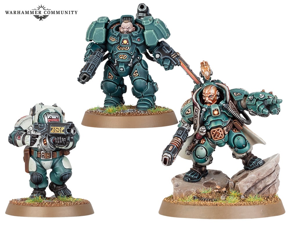
BTW, I really think this picture from the recent War-Com article really highlights what I mean by same aesthtic, but more ornate gear. Just need to figure out what I want to do about the squiggly runes...
Spoiler:
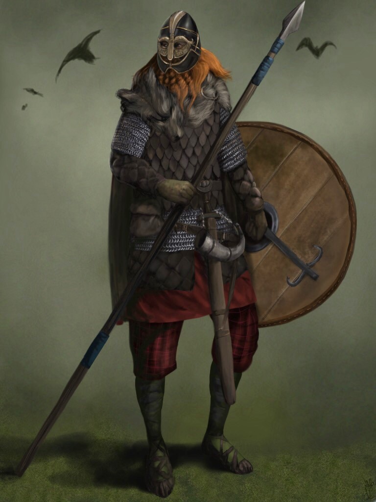
Then compare to a Viking warrior:
Spoiler:
A Viking Hersir (commander):
Spoiler:
Viking Huscarl (professional warrior):
Spoiler:
And finally a Viking Warlord:
Spoiler:
Sorry for the deep dive. Adderall just kicked in yo.
This message was edited 3 times. Last update was at 2022/09/08 17:19:44
KillerAngel wrote: No, I understood what you meant. I just think it works, because as Jess says, the lower your rank, the more utilitarian, and the higher your rank, the more "dwarvish" elements get incorporated. To me the crest works, and doesn't look out of place at all. Some Hearthkyn might have decal-based runes, but the crest is the first thing that highlights "dwarf" in a way that visually lets the leader stand out. Almost like the old germanic totem-based standards, just without the need for a standard-bearer. Then the higher ranks start getting dwarven glyphs molded into their armor.
If I have a complaint, it's that I'm not a huge fan of the glyph designs. Feels more Celtic than Germanic.
But having more Dwarfy elements at a higher rank is a different matter, that didn't mean the only option for the rest was none at all actually on the model itself. If they had given even the basic warriors just a very small bit of that theming (not just just the decal) then it would have felt a bit more cohesive and not just suddenly appearing out of almost nowhere on the Theyn.
LMAO you're basically concern trolling at this point. Basic troops are plain. This is standard GW practice.
You're really going to go straight to mocking?
Go take a look at most basic troops again. Space Marines have iconography on their chest or bolter, Imperial Guard with an Aquila on their chest, helmet or lasgun, Orks glyphs, The Tau Empire shoulder pad, Necrons with the Ankh, Skitarii with their Chest cog, Genestealer cults with their cult symbol jewellery, Sororitas with the Fluer De Lyse.
There's a difference between the "plain" of nearly every other army and the "nothing" of the standard Hearthkyn.
Well, the old Squats were the same. The troopers had no iconography at all, they were just short soldiers with beards in kinda imperial uniform. Or biker dress. The only models with such stuff as runes, nordic helmets or beards on their armour were the Warlord and his Hearth Guard. It was like the Imperial Guard back then - those Roman/Greek style helmets and armour plates were reserved for the command units.
Like you said it was elites and leaders who got stuff in the way of decoration, and that applied to other armies too. That's just how miniatures were back then and wasn't so much a choice of direction for the Squats specifically.
This message was edited 1 time. Last update was at 2022/09/08 17:23:33
All I can say is...clearly they didn't OP the hell out of this new faction in order to drum up sales. Oh wait, they did. Blatantly.
You know the more I've spent time looking at the models, the more I don't really like any of them. I wanted to buy in, but with 40K basically now a dead game in my local area, and the rules being a trash heap of a mess, I think it's time to just let it go...
So, unless I'm misreading something, based on today's interview it sounds like the design studio very deliberately chose to move the LoV beyond the dwarf archetype. I appreciate this, honestly. To me, 40k is at its worst when it's too derivative of other fantasy or sci-fi tropes, or when it just imports historical analogues without sufficient change. The weapons seem very "space dwarfish" to me, at least - chunky, solid, deliberate, imposing. I really like the new take on bolt and las weapons, honestly.
I do wonder if they might release more iconography-heavy units in the future, based on the feedback they're receiving now? Seems like that would improve the range for a lot of people.
crumby_cataphract wrote: So, unless I'm misreading something, based on today's interview it sounds like the design studio very deliberately chose to move the LoV beyond the dwarf archetype. I appreciate this, honestly. To me, 40k is at its worst when it's too derivative of other fantasy or sci-fi tropes, or when it just imports historical analogues without sufficient change.
40k is at its worst when it is... being 40k? That's an interesting take.
Gamgee on Tau Players wrote:we all kill cats and sell our own families to the devil and eat live puppies.
Kanluwen wrote: This is, emphatically, why I will continue suggesting nuking Guard and starting over again. It's a legacy army that needs to be rebooted with a new focal point.
Confirmation of why no-one should listen to Kanluwen when it comes to the IG - he doesn't want the IG, he want's Kan's New Model Army...
tneva82 wrote: You aren't even trying ty pretend for honest arqument. Open bad faith trolling.
- No reason to keep this here, unless people want to use it for something...
crumby_cataphract wrote: So, unless I'm misreading something, based on today's interview it sounds like the design studio very deliberately chose to move the LoV beyond the dwarf archetype. I appreciate this, honestly. To me, 40k is at its worst when it's too derivative of other fantasy or sci-fi tropes, or when it just imports historical analogues without sufficient change.
40k is at its worst when it is... being 40k? That's an interesting take.
I really don't get the idea of wanting a Fantasy in Space setting to not be what it's meant to be.
I really don't understand these last two comments. crumby_cataphract is rather clear that he likes it when 40K takes its source material and transforms it rather than than just importing it.
I would think they find Space Wolves to be fine in concept, but gets rather ridiculous when you start adding things like the Stormwolf/Stormfang (flying Viking Longboat) and Logan Grimnir on a sleigh (Odin as Santa Claus).