| Author |
Message |
 |
|
|
|
|
Advert
|
Forum adverts like this one are shown to any user who is not logged in. Join us by filling out a tiny 3 field form and you will get your own, free, dakka user account which gives a good range of benefits to you:
- No adverts like this in the forums anymore.
- Times and dates in your local timezone.
- Full tracking of what you have read so you can skip to your first unread post, easily see what has changed since you last logged in, and easily see what is new at a glance.
- Email notifications for threads you want to watch closely.
- Being a part of the oldest wargaming community on the net.
If you are already a member then feel free to login now. |
|
 |
2018/04/05 02:40:51
Subject: Seeking criticism
|
|

Nasty Nob
|
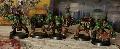
This is a semi finished product I'm looking for critique and advice on. I know I have no bases yet, and a few unpainted toe guards, but open to advice, constructive and rude, dun really care.
|
I am the kinda ork that takes his own washing machine apart, puts new bearings in it, then puts it back together, and it still works. |
|
|
 |
|
2018/04/05 03:53:31
Subject: Seeking criticism
|
|
Regular Dakkanaut
|
I see one mold line that bothers me, but that's truly about it. You've got a clean simple paint scheme that is going to look great and serve you well for a horde army! If you were to really force me to pick something I might suggest adding one bright accent color to make them pop. Honestly, depending on what you have in mind for your bases, it could be something there.
|
|
|
|
|
2018/04/05 04:33:34
Subject: Seeking criticism
|
|
Boosting Space Marine Biker
|
Yeah I agree with Beezley1981, except for some mold lines, which I know suck to get rid of, they do pop out more once you paint a model, your models look good.
I would use a brighter red as your pop color, just to add some color, since orks love red. Keep it up, you will have a nice looking army for the table.
|
|
|
|
|
|
2018/04/05 04:34:49
Subject: Re:Seeking criticism
|
|

Incorporating Wet-Blending
|
You might also consider some slightly different browns to keep the models from looking too much the same.
|
|
|
|
|
|
2018/04/05 04:54:51
Subject: Seeking criticism
|
|
Nasty Nob
|
beezley1981 wrote:I see one mold line that bothers me, but that's truly about it. You've got a clean simple paint scheme that is going to look great and serve you well for a horde army! If you were to really force me to pick something I might suggest adding one bright accent color to make them pop. Honestly, depending on what you have in mind for your bases, it could be something there.
DarkKnights44 wrote:Yeah I agree with Beezley1981, except for some mold lines, which I know suck to get rid of, they do pop out more once you paint a model, your models look good.
I would use a brighter red as your pop color, just to add some color, since orks love red. Keep it up, you will have a nice looking army for the table.
Thank you for feedback, I will def look at my other boyz and touch up the shoota's, and (on ork3) that line on top of that torso (that line is def a pita)
JoshInJapan wrote:You might also consider some slightly different browns to keep the models from looking too much the same.
Yeah I was starting to worry about this, I used a bugmans glow I think it was to try and vary the shades of brown. I'm thinking about using tans and whites in other sets of boyz to give it a 'cloth armor' feel. Doesn't look too bad after Agrax Earthshade (I noticed this on some grots). Thank you for the advice
|
I am the kinda ork that takes his own washing machine apart, puts new bearings in it, then puts it back together, and it still works. |
|
|
|
|
2018/04/05 12:46:37
Subject: Seeking criticism
|
|

Librarian with Freaky Familiar
|
Well alright, what you go there is a solid table top quality model. From what i can see brush control is pretty good, and you seem to have the basic idea of painting down. They are however, pretty bland. They have no razle dazle, nothing that really makes them stand out. On the table they are gonna mesh into a blob. Personally i would use different paint other then GW, thats because GW paint always sends to leave a gloss varnish when it drys giving everything a wet looking sheen.
Get some more edge highlighting on the metal bits, and toss in some more fun colors while you are at it. One of the best things about orks is you can go absolutely hog wild with your colors and it totally works. Some bright reds, or yellows, or even blues on some of the armor would help a lot. Over all solid table top models.
|
To many unpainted models to count. |
|
|
|
|
2018/04/05 13:04:44
Subject: Seeking criticism
|
|
Powerful Phoenix Lord
|
At a glance, perfectly good tabletop quality - in fact, above average of what you'd see on a gaming night, easily.
I agree with multiple browns. As an avid Old West gamer, I can highly recommend multiple browns...I have maybe 25 different ones and you can do a lot of good work with different shades. It really does break up the models.
|
|
|
|
|
2018/04/05 13:37:42
Subject: Re:Seeking criticism
|
|

Camouflaged Zero
|
These guys are decent tabletop quality. What these guys need is more contrast. Colors are rather flat and muted. Highlighting the colors will go a long way.
Plus like peeps already suggested you should use some saturated tones to spice them up.
|
|
|
|
|
2018/04/07 00:28:09
Subject: Seeking criticism
|
|

Alessio Cavatore
Nottingham
|
They are a decent tabletop quality and can be good to go.
If you are looking to take a little further, a thinned down dark wash in the cloth recesses, not all over will help, then thin lining the cloth with a slightly lighter brown, and a thin lighter touch in places on the cloth, followed by a thinned sepia was over cloth will tie together.
edging the weapons with a dark silver line, just some from one angle helps to make them pop.
A thinned down black with a little black and greenwash, and using a fine brush go along the edge of the areas where skin meets cloth or armour or between fingers and around eyes will add a thin dark edging.
A lighter red in the eye will also help. Like pupil in humans.
Where metal meets brown armour, same with thinned down was paint thin line to help edge.
You have kept colour scheme simple and core colours down which is the main thing, too many people use too many colours and it looks fussy.
If your having issues with getting colors balanced and moving into the hobby these paint ranges are a good choice as they come in sets of three, Base mid and highlight and work well with GW stuff. https://www.wargamesfoundry.com/pages/the-foundry-paint-system
|
|
This message was edited 1 time. Last update was at 2018/04/07 00:30:18
|
|
|
|
|
2018/04/07 08:03:24
Subject: Seeking criticism
|
|
[DCM]
Fireknife Shas'el
|
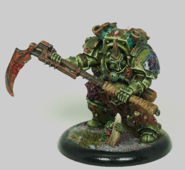
I’ll echo what the others said, these are a good tabletop quality, the skin and teeth are particularly good and I quite like the eyes. Also the goggles on the on boy have come out really well.
Top three things I would suggest:
1) Paint the loincloths, preferably using your clan colour. Leaving them black just makes them look unfinished.
2) Similarly, for the ones with the black trousers, it looks unfinished; better to use a dark grey and black wash to give them depth. As you do more that could also be an area to mix it up (black boots, brown trousers and brown boots, black trousers, etc. To break the monotony).
3) I’d recommend a second black wash on the guns; it gives them more of a black anodised look, like real world firearms and also makes them look different to the blades.
|
|
|
|
|
|
2018/04/08 21:37:11
Subject: Seeking criticism
|
|

Longtime Dakkanaut
|
More attention to cleaning mold lines 
|
|
|
|
|
|
2018/04/08 22:33:08
Subject: Seeking criticism
|
|
Twisted Trueborn with Blaster
|
I'm gonna have to pile in with several other people and say the only thing that jarringly sticks out are some mold lines. But that's how you know you're doing a good job, because you don't start to notice mold lines until the painting gets good enough that the detract from an otherwise solid model. But, sometimes you just miss the bastards, and sometimes you think you got it down, until you paint it and realize you can still see it.
Automatically Appended Next Post:
Also, to add to the comment about using different browns, it takes shockingly little to do that if you want to. One or two additional base browns mixed with the exact same highlights will provide a fair bit of variation. I find Beasty Brown (or equivalent to be a good highlight color, because it's very neutral and will easily take shading from any other base brown color.
|
|
This message was edited 1 time. Last update was at 2018/04/08 22:35:51
"But If the Earth isn't flat, then how did Jabba chakka wookiee no Solo ho ho ho hoooooooo?" |
|
|
|
|
2018/04/10 11:43:28
Subject: Seeking criticism
|
|
Nasty Nob
|
how can I make the brass/bronze pop some? I like the drybrushed brass/bronze on the metal but it doesn't really show until I hold the model arm's length away. My next hobby time block is gonna involve putting some decals on these guys, fixing a few of the mistakes I dislike, transferring them to a nice base, and painting some toe guards, and dry brushing some runefang steel on the edges of the gunz.
|
I am the kinda ork that takes his own washing machine apart, puts new bearings in it, then puts it back together, and it still works. |
|
|
|
|
2018/04/10 12:36:26
Subject: Seeking criticism
|
|
Rotting Sorcerer of Nurgle
|
 Rismonite wrote: Rismonite wrote:how can I make the brass/bronze pop some? I like the drybrushed brass/bronze on the metal but it doesn't really show until I hold the model arm's length away. My next hobby time block is gonna involve putting some decals on these guys, fixing a few of the mistakes I dislike, transferring them to a nice base, and painting some toe guards, and dry brushing some runefang steel on the edges of the gunz.
there are a couple of ways:
Add a smidge of silver & pure gold to the mix on your next drybrush stage.
Add some verdigris - I think GW do a paint for this but I just use inks & weathering powder (made from crushed chalk pastels):
Change some of the tones of the other colours - they all seem to be about the same. The easiest thing to change would be the trousers ( IMHO).
But great job so far!.
|
Check out my gallery here
Also I've started taking photos to use as reference for weathering which can be found here. Please send me your photos so they can be found all in one place!! |
|
|
|
|
2018/04/12 00:28:58
Subject: Seeking criticism
|
|

Mutilatin' Mad Dok
Norway, Tønsberg
|
Nice, clean, simple paintjob, emphasis on clean, well done. It would be more interesting with some rust effects, they're easily applied with some simple rust pigments, a drybrush of ryza rust and or typhus corrosion.
|
|
|
|
|
|
|