| Author |
Message |
 |
|
|
|
|
Advert
|
Forum adverts like this one are shown to any user who is not logged in. Join us by filling out a tiny 3 field form and you will get your own, free, dakka user account which gives a good range of benefits to you:
- No adverts like this in the forums anymore.
- Times and dates in your local timezone.
- Full tracking of what you have read so you can skip to your first unread post, easily see what has changed since you last logged in, and easily see what is new at a glance.
- Email notifications for threads you want to watch closely.
- Being a part of the oldest wargaming community on the net.
If you are already a member then feel free to login now. |
|
 |
2018/10/11 17:25:05
Subject: Dark Angels 3rd Company and Friends [28/01/19] Crimson Fists Primaris Test Mini
|
|

Adolescent Youth with Potential
|
[ A brief intro: This is a continuation of my old username Dark6Spectre's P&M Blogs, where I never got far. What a mess  . This is a reboot of a reboot where he now has the time, he has the models, but can Phil actually get on with it?
Most of this will be Dark Angels and Elysian Drop Troops, but I also have the odd IG bits.]
So, Part 1! A fresh beginning!
It turns out despite taking a break, my knowledge and skill at painting has improved slightly, and as a result anything posted on the original blog is either getting minor changes... or finding itself in a bath of dettol.
My old routine involved spending days on one model, devoting hours on freehand. Mmmm looking noice. Right wack half a tub of Devlan Mud over him. Woo Weathering! [Devlan Mud is the old Agrax Earthshade. I still have old paints. Sorry]
This time we're going for less shade and more highlights.
While my Elysians were painted with an aim for FW 'realism' and I am happy with that, I've decided that Space Marines just don't look that interesting with dulled down colours (Not enough Devlan Mud? WEATHERING POWDER EVERYWHERE!). Feeling like every marine is a hero in his own right, I want to make my Dank Angles look swell but without the squeaky-clean look that GW displays. So while I have still done a patch of weathering and battle damage, getting my marines some eye catching colour is my main priority.
Setting
The previous blog received a backstory for the campaign I was portraying, but for now let's just say urban fighting in the winter. Fun. I'm unsure of time period, can I be lazy and say 42nd Millennium? But an alternate timeline where 3rd Company are different and Primaris aren't a thing and Cadia still stands an- hehe you get the idea. I also give each model a backstory, and a little excerpt. I don't work for BL so don't expect much, it will probably be tongue-in-cheek or just poor writing. Sozzles.
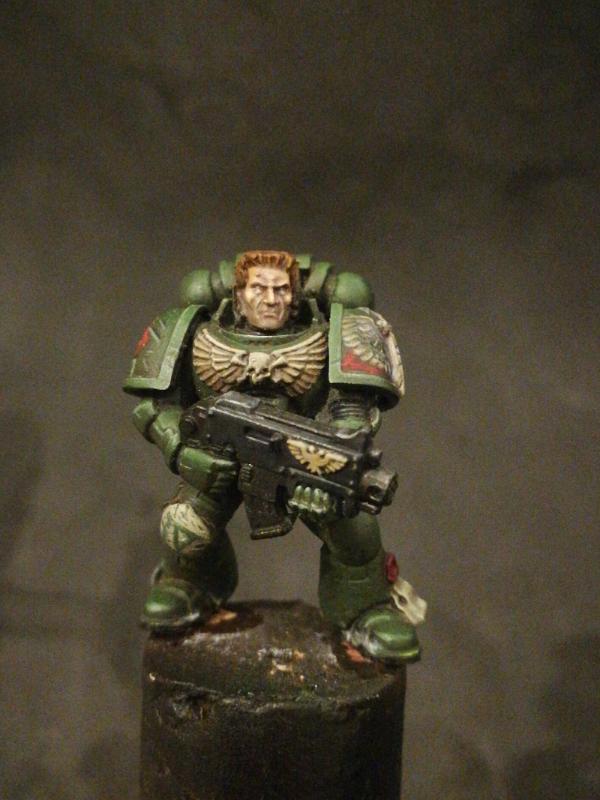
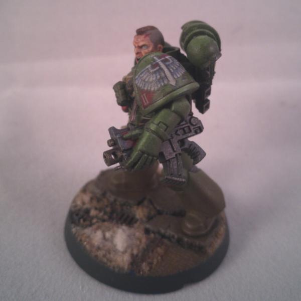
Here's my first test model. Minus some snow he's pretty much good to go. Comments and Criticisms are most welcome. I've been trying some new things here so any tips would be very helpful!
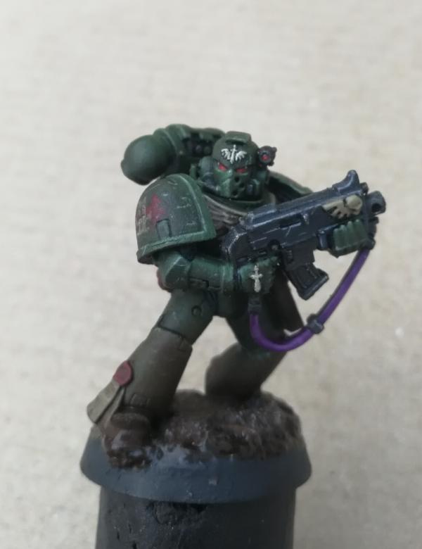
- Originally the emphasis was on the Marine's eyes, but as I built up on the highlighting, attention was drawn to his beaky thing. Then I painted his sling purple because he's a pimp. And now everyone wants his sling. STOP LOOKING AT IT!
- On a side note has anyone noticed only elite or upgrade kits have slings on a bolter. It is clearly a right of passage to receive a sling for one's weapon system. Despite looking cool this guy is pretty low on the pecking order so either he was awarded it for being a goody goody or he had to buy it from some 3rd party manufactorum.
- There's something slightly off about the shoulder pad scuff marks. I can't quite put my finger to it 
4th Squad at time of pict recording were clearing through a bombed out district where intense bombing had shattered streets and damaged the sewage system. This Marine could well be walking through 
- The basing is my first attempt at mud. It was meant to just be dirty water but turned out this way so I stuck with it. The road was done using ballast thickened with PVA glue. Once dry, Astrogranite was applied in layers to attempt a 'tarmac' effect above. The mud was PVA glue mixed with powder. After the model was matt varnished, gloss varnish was painted to the mud.
- I still struggle with painting brown pouches. I am contemplating changing to black from now on.
- The old style of freehand-ing the DA logo involved Space Wolves Grey being painted to an already glazed shoulder pad with 3rd Company logo showing through. This meant mistakes had to be rectified with green and red and that was very difficult to blend in. As a result I use a new method where the area for the emblem is painted in black, with shades of grey gradually building up to allow an illusion of depth with the feather tips receiving white. Maybe I went overboard with the Sepia again but hey ho. If anyone is interested in a full tutorial I will post one up. 
|
|
This message was edited 8 times. Last update was at 2019/01/28 20:26:40
|
|
|
 |
|
2018/10/11 17:59:07
Subject: Dark Angels 3rd Company and Friends [11/10/2018 : Reboot of a Reboot]
|
|

[SWAP SHOP MOD]
Robot Cat
OH-I Wanna get out of here
|
The freehand is fantastic, and I really like the overall dark and gritty vibe. Only thing I don't like is the purple sling. It's a really bright color versus the rest of the tones, and just doesn't fit in very well imo. A brown to match the pouches, or even the bone color of the chest emblem, would be much better I think.
|
|
|
|
|
2018/10/14 19:52:09
Subject: Dark Angels 3rd Company and Friends [11/10/2018 : Reboot of a Reboot]
|
|
Adolescent Youth with Potential
|
 whalemusic360 wrote: whalemusic360 wrote:The freehand is fantastic, and I really like the overall dark and gritty vibe. Only thing I don't like is the purple sling. It's a really bright color versus the rest of the tones, and just doesn't fit in very well imo. A brown to match the pouches, or even the bone color of the chest emblem, would be much better I think.
Cheers! Unfortunately each attempt at freehand is different, and whilst I can forgive myself for the DA logo I'm a fool for not using the tactical squad arrow transfers on the other pauldron. Getting those twin arrows to match on 5 different models is stressful, and the moment I offset the squad number.... 
Yeah the sling was obnoxiously vibrant. I think when I first painted him the intention was to get a dark purple/brown, but as I started adding more colour any contrast was getting more obvious in a bad way.
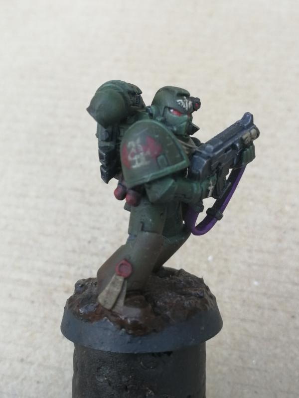
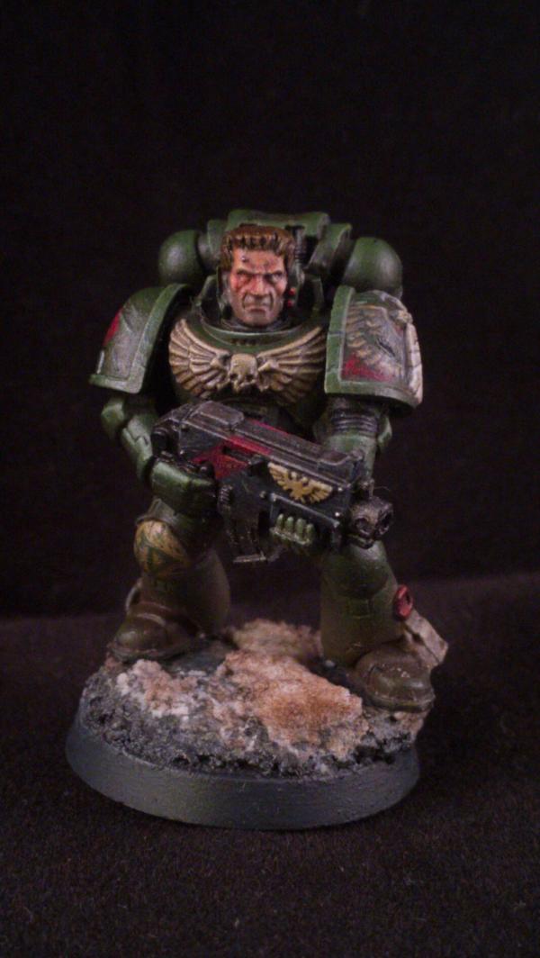
Here is the dude again with a brown sling. The PVA Mud effect wasn't as good as I expected, and for a small base very difficult to model. As I was planning on applying a bit of snow I decided instead to overlay all of the mud with some slushy dirty snow.
More to come tomorrow!
|
|
|
|
|
2018/10/14 20:56:33
Subject: Dark Angels 3rd Company and Friends [14/10/2018 : Purple Slings are not authorised]
|
|

Phanobi
Canada,Prince Edward Island
|
Seriously fantastic freehand skills there and I love the muted colour scheme. If this is how good a standard marine will look I am very excited to see a captain!
|
|
|
|
|
|
2018/10/15 01:31:17
Subject: Dark Angels 3rd Company and Friends [14/10/2018 : Purple Slings are not authorised]
|
|
[SWAP SHOP MOD]
Robot Cat
OH-I Wanna get out of here
|
The brown sling looks so much more natural. Very much looking forward to seeing more.
|
|
|
|
|
2018/10/16 23:20:57
Subject: Dark Angels 3rd Company and Friends [16/10/2018 : He's not even finished Phil what's the point?]
|
|
Adolescent Youth with Potential
|
Commander Cain wrote:Seriously fantastic freehand skills there and I love the muted colour scheme. If this is how good a standard marine will look I am very excited to see a captain!
Thank you! Freehand is my favourite part of painting, while I find other areas that seem simple in comparison so difficult to do!
The only captain model I own is the Dark Vengeance one still on the sprue. He looks alright so I'll give him some loving eventually. I'll soon be repainting a Jump Pack Chaplain and I'm very keen on trying some Warm/Cold Black effects on him.
whalemusic360 wrote:The brown sling looks so much more natural. Very much looking forward to seeing more.
Here is more! (I'll sneak some purple in on a future model  )
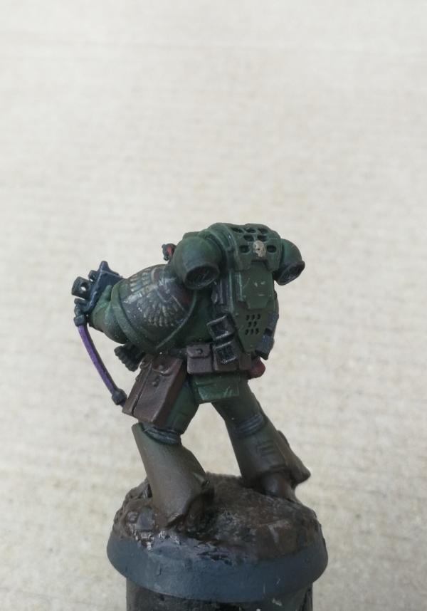
Here we have my second almost-finished model. Some touch ups still needed but otherwise he's 90% there!
Painting the freehand this time was a lot quicker, but also felt sloppier. Thankfully a Sepia Wash and chipped paint effect sort of covers it.
When first assembled years ago I decided to physically cut damage effects into both pauldrons. His right one looks ok, all it required was a highlight and a recess wash.
His left one was some chunky blast damage and... I have no idea. After I had painted the freehand, trying to identify where the damage started and what highlight colour to use confused me so I took an extended tea break.
I also can't paint hair. Any tips? I think the top is OK, the front just needs more contrast in shading with thin highlights.
Chest Eagles also annoy me. Something that seems easy to do with a drybrush stresses me and I'm never happy with the result. Any tips here would also be helpful.
Now some Trivial Questions:
I'm not into gaming but I'm hoping to start soon in a non-compet way, but I heard Plasma Gun, Cannon, and Combi- Plas is an effective Tactical Squad loadout, is this true?
What other loadout combinations are useful?
What are people's opinions on different squads having a theme? I had originally split troops evenly across the army for some uniformity. But I was also thinking of giving each squad a particular look.
So far 4th Squad, that these two are part of, are cautiously advancing (If SM even do that). Meanwhile another squad looks like they're in the fight for their lives, lots of one handed bolter shooting with angry faces, that sort of thing. Thoughts?
|
|
|
|
|
2018/10/17 08:24:52
Subject: Re:Dark Angels 3rd Company and Friends [16/10/2018 : He's not even finished Phil what's the point?]
|
|

Fixture of Dakka
|
Wow. That freehand is intense. 
Any tips for achieving the results you get?
I hear you on the symbols all being different. On one hand it's annoying cause it'd be nice to have a uniform look, but on the other hand it helps break up the model a bit if everyone is slightly different.
I personally just headcanon it as each brother paints his own symbol on his armour and thus every symbol is a brothers own interpretation (and not just me being gak). Plus I don't like transfers so It's that or nothing....
Also, I liked the obnoxiously vibrant purple sling. The purple complements the green very well.
|
|
|
|
|
|
2018/10/17 11:59:57
Subject: Dark Angels 3rd Company and Friends [16/10/2018 : He's not even finished Phil what's the point?]
|
|
[SWAP SHOP MOD]
Robot Cat
OH-I Wanna get out of here
|
I like it when squads look like they are doing their thing together as well. Doesnt make sense to have a guy at ease in the same group as a guy running and gunning.
|
|
|
|
|
2018/10/17 12:42:15
Subject: Dark Angels 3rd Company and Friends [16/10/2018 : He's not even finished Phil what's the point?]
|
|

Dipping With Wood Stain
|
For me, the first marine looks way over weathered, which killed all the contrast. I think the second one looks great, it's weathered but the colors and highlights are still there! I also like the dirty snow base, though I hope you'll clean up the rim. And as others have said, killer freehand!
Regarding the purple, I think it could work if you added the color somewhere else as well, such as the lenses, wax seals, plasma coils or even personal heraldry. With purple only on the sling it kinda "steals the thunder", and not in a good way. It could work well on the captain, on the cloak or the ropes running across his chest.
|
|
|
|
|
|
2018/10/17 13:34:53
Subject: Dark Angels 3rd Company and Friends [16/10/2018 : He's not even finished Phil what's the point?]
|
|
Regular Dakkanaut
|
Wow, both models look awesome.
The idea of all squad members doing the same thing is painfully obvious and im gutted ive never thought of it- such a good idea.
With regards to loadout- i think the general thought is to have a consistent purpose- so if you go plasma then go plasma, combi plasma, if you go melta then go melta, combi melta etc. Leave the heavy weapons out of tac squads unless you plan to keep them static and use the other bodies as a "meat shield" for said heavy weapon. Personally id have my tac squads with special weapons plus combi on the sargeant, then save my heavy weapons for a devastator squad.
Im sure you know plasma is very fluffy for DA and they have some really cool stratagems specifically for plasma, so a full squad of plasma cannons to me sounds very cool.
What have you got planned for your force?
Ohhh and one more thing- thoughts on red bolter casing? feel like it would look incredibly striking against the green and offer more potential for your awesome freehand
|
|
This message was edited 1 time. Last update was at 2018/10/17 13:38:35
|
|
|
|
|
2018/10/17 19:04:49
Subject: Dark Angels 3rd Company and Friends [16/10/2018 : He's not even finished Phil what's the point?]
|
|
Longtime Dakkanaut
|
Very gritty and realistic. I like a lot.
|
|
|
|
|
|
2018/10/19 21:13:24
Subject: Re:Dark Angels 3rd Company and Friends [16/10/2018 : He's not even finished Phil what's the point?]
|
|
Adolescent Youth with Potential
|
Snrub wrote:Wow. That freehand is intense.
Any tips for achieving the results you get?
I hear you on the symbols all being different. On one hand it's annoying cause it'd be nice to have a uniform look, but on the other hand it helps break up the model a bit if everyone is slightly different.
I personally just headcanon it as each brother paints his own symbol on his armour and thus every symbol is a brothers own interpretation (and not just me being gak). Plus I don't like transfers so It's that or nothing....
Also, I liked the obnoxiously vibrant purple sling. The purple complements the green very well.
For the freehand? I'll get round to posting a tutorial with images, but for now it's a case of sticking my face right up to my lamp, and the lamp right above the model. I start with painting the area in Black Grey, then with a 0/5 brush painting thick feathers with Shadow Grey. Similiar to highlighting actual wings I use Fortress Grey to slowly build up the leading edges, finishing with a white highlight. if needs be I use watered down Shadow Grey to bring shading back, and with Black Grey re-do the outline if any mistakes were made.
Funnily enough I was thinking something similar, it's your own motif, paint it yourself! *hands paintbrush to warrior who is far better at killing orks than using a brush*.
I am contemplating giving transfers a go in future, mainly just as a guide so the Squad Markings aren't painfully different.
whalemusic360 wrote:I like it when squads look like they are doing their thing together as well. Doesnt make sense to have a guy at ease in the same group as a guy running and gunning.
It might make painting a squad of standing soldiers boring but I agree, especially when you could make a diorama setting. It looks weird where five guys are just chilling out, Big John is over there running around waving his sword, and Danny's shooting his bolter looking like he's had better Sundays.
mcmattila wrote:For me, the first marine looks way over weathered, which killed all the contrast. I think the second one looks great, it's weathered but the colors and highlights are still there! I also like the dirty snow base, though I hope you'll clean up the rim. And as others have said, killer freehand!
Regarding the purple, I think it could work if you added the color somewhere else as well, such as the lenses, wax seals, plasma coils or even personal heraldry. With purple only on the sling it kinda "steals the thunder", and not in a good way. It could work well on the captain, on the cloak or the ropes running across his chest.
It might be something to do with the photography, but also the first guy had been varnished and I heard that stuff does take the contrast out slightly. Unless you mean the muddy greaves, in which case yeah, I was trying to make a muddy base but I gave up. I might give the legs a quick drybrush of base colour so it's no obnoxiously brown.
What? I need something to memorialise the absolute carnage it was making muddy water! Yeah I've now scraped the base with a scalpel, there was so much glue!
Yup, my intention is if I do it again it'll have to match with something else purple, so a captain or robed veteran would make a great model to have a pimp sling.
Process wrote:Wow, both models look awesome.
The idea of all squad members doing the same thing is painfully obvious and im gutted ive never thought of it- such a good idea.
With regards to loadout- i think the general thought is to have a consistent purpose- so if you go plasma then go plasma, combi plasma, if you go melta then go melta, combi melta etc. Leave the heavy weapons out of tac squads unless you plan to keep them static and use the other bodies as a "meat shield" for said heavy weapon. Personally id have my tac squads with special weapons plus combi on the sargeant, then save my heavy weapons for a devastator squad.
Im sure you know plasma is very fluffy for DA and they have some really cool stratagems specifically for plasma, so a full squad of plasma cannons to me sounds very cool.
What have you got planned for your force?
Ohhh and one more thing- thoughts on red bolter casing? feel like it would look incredibly striking against the green and offer more potential for your awesome freehand
It's not too late! A quick switcheroo and give the base's reverse a label, and you know Brother Green from 4th Squad is actually in 2nd Squad and Brother Heresygrowsfromidleness from 2nd Squad is actually in 4th squad. Not difficult. No not at all 
Ok that's cool, I'll have one squad with combi melta as. I might leave a combi flamer out for now but I don't know.
Plasma for everyone! Expect you, Hellblasters, you don't belong in my universe!
I'm generally just going along with what I have, which is too much! I have to do some touch ups on a Rhino and Predator, but I'll aim for at least the command structure plus two tactical squads as priority. However I might just move in and out other side projects to keep the motivation going. (Elysians!)
Ummm, I forgot! While I'm not a fan of a full red casing, I liked the look of the diagonal red stripe seen on Dark Angels in IA. It's a good thing you mentioned it though as I had honestly forgotten. I will go back and rectify the error!
Fifty wrote:Very gritty and realistic. I like a lot.
Cheers dude! I've tried before doing the glazing where the shade difference is over the top but I wasn't good at it. This way works fine for me until I see the inside of a leg is still black and whoops now his leg is brighter than the rest of his body.
WOW YOU TAKE SO LONG ON A SINGLE MODEL CONGRATS
So the lightbox I bought off ebay arrived yesterday, and I'm still figuring out camera settings on my Huawei P10, so apologies for picture quality being different, they'll be uniform soon!
Here we have the next guy pretty much done. I was going to post photos yesterday before I went to the pub but it turns out with decent lighting the guy's right eye was slightly different. Ever the perfectionist (and idiot) I came back from said pub... and why the hell did I try to paint eyes after a few pints...  . After doing everything up to and including getting my Airbrush needle to pick away at his eye ready to repaint it, I got to this stage and decided I'll leave him before things go downhill. oops.
|
|
|
|
|
2018/10/19 22:34:22
Subject: Dark Angels 3rd Company and Friends [19/10/2018 : Airbrush needles are quite good at scraping paint]
|
|
[SWAP SHOP MOD]
Robot Cat
OH-I Wanna get out of here
|
The stripe looks great. Not sure I’d change anything at this point. Maybe some squiggles on the purity seal, and some extra gubbins and whatnots for extra Dark Angelness.
|
|
|
|
|
2018/10/19 22:59:39
Subject: Dark Angels 3rd Company and Friends [19/10/2018 : Airbrush needles are quite good at scraping paint]
|
|
Adolescent Youth with Potential
|
whalemusic360 wrote:The stripe looks great. Not sure I’d change anything at this point. Maybe some squiggles on the purity seal, and some extra gubbins and whatnots for extra Dark Angelness.
That moment when the squiggly lines are so faint no one notices.  To be honest I did mask them too much and you would probably need a microscope. On the the first guy I had definitely done better with the keeping it visible under thin highlights. These are things for me to work on though! Hooray give it a year I might have a squad painted!
Oh dear I'm a sucker for that. I've got heaps of gubbins and I just don't use them. After grenades and pouches I'm like "meh", only the odd minor thing gets used like the little backback decorations. I'll definitely give the sergeant some incense burners and whatnot to mask the strange exotic smells radiating from his armour (even crusties can be Space Marines).
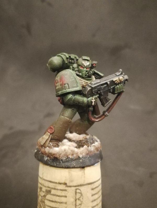
Good news! I fiddled with the box and camera settings. Some better quality photos. Despite varnishing him some paint has still flaked off while I have been attempting to salvage his eye. After I rectify some mistakes and more varnish I'm thinking a slight gloss wash on the snow to make it look wet would work, because right now it looks like a cola candyfloss machine has exploded.
Enjoy!
 Automatically Appended Next Post: Automatically Appended Next Post: For reference this was the desired effect for the seal. Oops.
|
|
This message was edited 1 time. Last update was at 2018/10/19 23:08:09
|
|
|
|
|
2018/10/19 23:58:29
Subject: Dark Angels 3rd Company and Friends [19/10/2018 : Airbrush needles are quite good at scraping paint]
|
|
[SWAP SHOP MOD]
Robot Cat
OH-I Wanna get out of here
|
I think you got almost too detailed with the script, to where it looked more like texture then words.
I suspect it’s the light box blowing the shadows up, but looks like you missed some mold lines. Better start over again lol.
|
|
|
|
|
2018/10/20 11:57:00
Subject: Dark Angels 3rd Company and Friends [19/10/2018 : Airbrush needles are quite good at scraping paint]
|
|
Adolescent Youth with Potential
|
whalemusic360 wrote:I think you got almost too detailed with the script, to where it looked more like texture then words.
I suspect it’s the light box blowing the shadows up, but looks like you missed some mold lines. Better start over again lol.
Yeah I think you're right. Uber detail like that isn't that necessary as no one really sticks their head in to read Shakespeare' back catalogue. Normal distance it just looks textured.
What?! No. Your eyes are deceiving you
When I first painted them up I clearly missed patches as last week I was still scraping lines I'd only just noticed. That one on the leg is so obvious I can't believe I missed it . Oh well in the dettol you go
|
|
|
|
|
2018/10/20 14:26:51
Subject: Dark Angels 3rd Company and Friends [19/10/2018 : Airbrush needles are quite good at scraping paint]
|
|
[SWAP SHOP MOD]
Robot Cat
OH-I Wanna get out of here
|
Harsh but fair lol. I wouldn’t sweat it honsestly.
|
|
|
|
|
2018/11/24 21:51:02
Subject: Re:Dark Angels 3rd Company and Friends [19/10/2018 : Airbrush needles are quite good at scraping paint]
|
|
Adolescent Youth with Potential
|
All was quiet on the Western Front. Phil was dealing with more pressing matters that kept him away from painting. However, the local GW is having a Space Marine Hero painting competition on December 1st and Phil thought ahhh why not. He's not entered a competition like this before and so bought one of those Hero models.
So far he's been fun to paint.
I'm going all out on this guy, as you can see by the 99.99% finished head. I'm happy with it as I've poured hours of time on it, however I'll probably find a fault and mess it up trying to rectify a problem that isn't there .
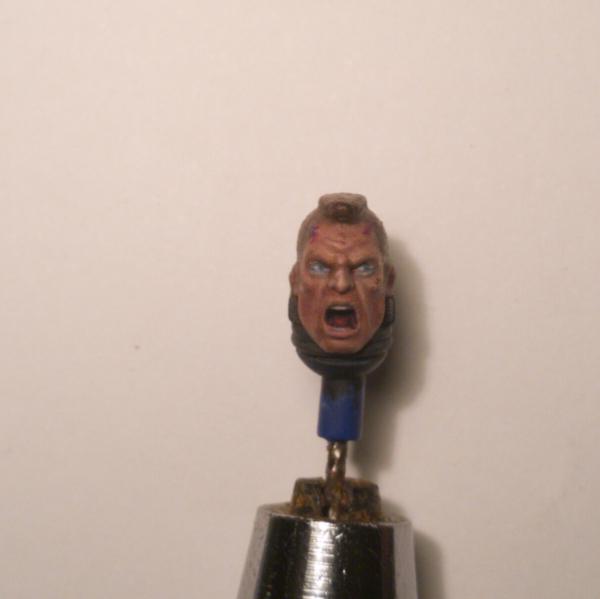
I'm attempting to paint a shade brighter than normal for the competition to make details stand out more. It's painstakingly slow as I'm trying new techniques, and hours of glazing etc is still needed. So far the freehand emblem is actually one of easier things to do!
Here's the body so far:
C+C and tips are most welcome! For a competition should I stick to matt varnish or go for something glossier like satin?
|
|
|
|
|
2018/11/25 13:53:39
Subject: Dark Angels 3rd Company and Friends [24/11/18 Painting Comp WIP]
|
|
[SWAP SHOP MOD]
Robot Cat
OH-I Wanna get out of here
|
I think I prefer your normal green. This seems too light, more like a Raptors marine. Might be the pic washed out though.
|
|
|
|
|
2018/11/30 18:40:03
Subject: Dark Angels 3rd Company and Friends [24/11/18 Painting Comp WIP]
|
|
Adolescent Youth with Potential
|
whalemusic360 wrote:I think I prefer your normal green. This seems too light, more like a Raptors marine. Might be the pic washed out though.
That's fair, the usual green I paint with is brighter than the suggested DA paint as it is, only a double wash mutes the colour. Here I've been repainting and glazing more. There might be some washout as well.
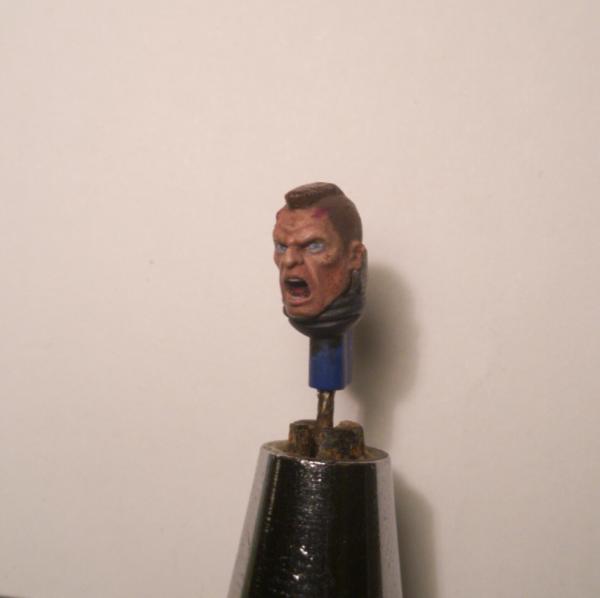
Anyhow Brother Yeet is almost finished, just the odd touch up and some mud and snow with some (SOME) powder to blend with the base.
Painting the face in two tones has been a killer, one eye catching the sun more does make things look odd.
|
|
This message was edited 1 time. Last update was at 2018/11/30 19:08:51
|
|
|
|
|
2018/11/30 19:11:09
Subject: Dark Angels 3rd Company and Friends [30/11/18 Painting Comp WIP]
|
|
[SWAP SHOP MOD]
Robot Cat
OH-I Wanna get out of here
|
Looks great! I have a soft spot for DA, and this guy makes me happy. The freehand chapter icon is super good too.
|
|
|
|
|
2018/12/03 07:33:25
Subject: Re:Dark Angels 3rd Company and Friends [30/11/18 Painting Comp WIP]
|
|
Fixture of Dakka
|
He's phenomenal looking!
The lighter green is fine, I think. It's more vibrant then a Raptor put not as "neon" as a Salamander. It's a green that still says Dark Angel. The honking great chapter symbol helps too!
I feel like the front could use something though. The frag grenade blends in too much with the armour and the bandolier.
The face is stand out though. From the skin tone, to the teeth and tongue and the light hitting his left side. It's all come together really well.
|
|
|
|
|
|
2018/12/04 14:22:31
Subject: Dark Angels 3rd Company and Friends [30/11/18 Painting Comp WIP]
|
|
Adolescent Youth with Potential
|
whalemusic360 wrote:Looks great! I have a soft spot for DA, and this guy makes me happy. The freehand chapter icon is super good too.
I'm happy that you're happy! I'm quite confident now in painting the emblem, time being the only thing I have to deal with. The Squad Designation marking on the other shoulder is a different matter , I'm contemplating using the transfers to get some more uniformity in the red arrows between the models.
Snrub wrote:He's phenomenal looking!
The lighter green is fine, I think. It's more vibrant then a Raptor put not as "neon" as a Salamander. It's a green that still says Dark Angel. The honking great chapter symbol helps too!
I feel like the front could use something though. The frag grenade blends in too much with the armour and the bandolier.
The face is stand out though. From the skin tone, to the teeth and tongue and the light hitting his left side. It's all come together really well.
That was what I thought as well, Lufwaffe Cam. Green gives a nice shade that's not too Olive, but not too vibrant. I'm not a big fan of DA Green (or it's current equivalent) as it feels a bit too flat.
I completely agree with you on that. The Krak Grenade just does not do the job. Trying to make the Frags more vibrant was not working either, I was mixing white with olive for highlighting and it didn't quite cut it. Maybe if I just stuck to black (so blue-grey) in the future?
Anywhoo I placed 2nd in the competition which I'm more than chuffed with. My freehand getting me compliments, however I reckon little things like shaded areas could have done more work, and some other less noticeable parts not being a consistent standard with the rest of the model. Maybe they thought my grenades were poo
Once again I messed up a bit with the powder. Thinking I had brushed off enough, and hoping the varnish would blow away more hadn't worked out too well. But such is life. Oh well, I'm more than happy with Brother YEET, He took far too long to paint but I've learnt some fresh techniques that should make some areas easier to paint in future. I might also try using bleached bone as the highlight mix to avoid loss in vibrancy that you get with white.
I wanted the focus to be on the face, kneepad, and shoulder, and I'm more than happy. In some lighting the face looks odd, especially the difference in the eyes but I did want one side to look more light reflective.
From now on as I am trying to get into gaming I'll be mass painting models to at least a basic level, and then I'll add extra details bit by bit when I have the time. Bring on the army of 3 base colours and nothing else!
|
|
This message was edited 3 times. Last update was at 2018/12/04 14:36:15
|
|
|
|
|
2018/12/04 15:03:31
Subject: Dark Angels 3rd Company and Friends [04/12/18 Brother YEET wins 2nd place ]
|
|
[SWAP SHOP MOD]
Robot Cat
OH-I Wanna get out of here
|
Did you get any feedback on what they did/didn't like? I think there are some spots you could pick out a few extra details, like controls on the Bolter and the part on the backpack right behind his head.
|
|
|
|
|
2018/12/04 22:40:14
Subject: Dark Angels 3rd Company and Friends [04/12/18 Brother YEET wins 2nd place ]
|
|
Adolescent Youth with Potential
|
whalemusic360 wrote:Did you get any feedback on what they did/didn't like? I think there are some spots you could pick out a few extra details, like controls on the Bolter and the part on the backpack right behind his head.
Nope unfortunately I did not, I'm not sure but it might have been a public ballot, however between submission and results I wasn't around to hear any feedback (next competition I will stand there and interrogate people )
Those controls were dodgy, as it's a pretty unique model I wasn't sure what is meant to go there regarding colour so left it plain, however I do want to paint something. Do you have any suggestions? Red/white buttons etc
Ah yeah i usually just paint that part like black tubing. Perhaps a dash of colour will make it interesting?
Even when I varnish a model it's never really complete in my eyes, I'm always picking up something later that I want to rectify!
|
|
|
|
|
2018/12/05 15:48:16
Subject: Dark Angels 3rd Company and Friends [04/12/18 Brother YEET wins 2nd place ]
|
|
[SWAP SHOP MOD]
Robot Cat
OH-I Wanna get out of here
|
Red/white would be a mirror for modern firearms, so could work. Or maybe black, bronze or lighter silver colored controls? You don't want the colors to draw your eyes to that part over others, as it's a pretty unimportant part. But making them different then the rest of the gun will help for painting contests where they are looking at the little details.
On the backpack, those two little circles could be indicator lights for backpack function instead of nobs or whatever. A place to put some red or green or whatever.
A busted helmet on the base would have been a cool touch too, but not sure if that was out of the rules for the contest.
Edit: Note that your painting is way better than mine, so feel free to completely ignore me. It's hard to be critical of a model that is really good already so being really nit picky.
|
|
This message was edited 1 time. Last update was at 2018/12/05 15:51:14
|
|
|
|
|
2019/01/28 20:25:47
Subject: Dark Angels 3rd Company and Friends [04/12/18 Brother YEET wins 2nd place ]
|
|
Adolescent Youth with Potential
|
whalemusic360 wrote:Red/white would be a mirror for modern firearms, so could work. Or maybe black, bronze or lighter silver colored controls? You don't want the colors to draw your eyes to that part over others, as it's a pretty unimportant part. But making them different then the rest of the gun will help for painting contests where they are looking at the little details.
On the backpack, those two little circles could be indicator lights for backpack function instead of nobs or whatever. A place to put some red or green or whatever.
A busted helmet on the base would have been a cool touch too, but not sure if that was out of the rules for the contest.
Edit: Note that your painting is way better than mine, so feel free to completely ignore me. It's hard to be critical of a model that is really good already so being really nit picky.
Some very good points there, thank you very much! Yeah something to add detail and colour but nothing to draw you away.
Lol that's fair, there's always things I struggle with and all advice is very helpful. Some basic techniques I still suck at, like recess shading using a fine brush
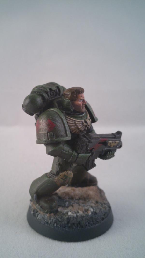
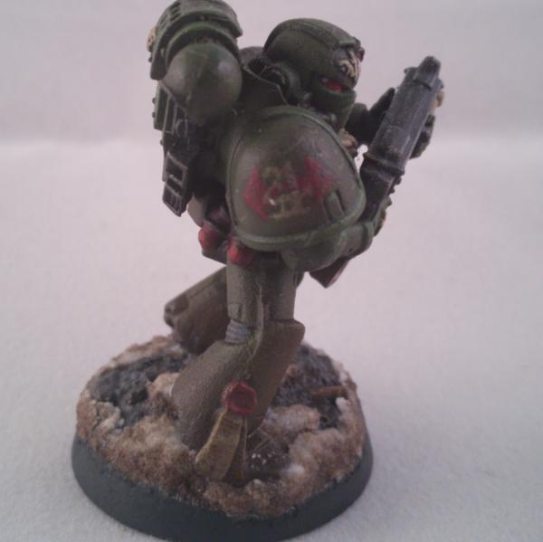
So, after a festive period away from painting [read: boozing  ] I took back my Primaris beef because the models look fantastic even without the beer goggles. I bought the IF supremacy force however I quickly decided CF would be better to paint as I've always had a soft spot for them.
Here has been my progress on a test mini, he's blue- tac'd with the intention to later have both helmet and bare head interchangeable.
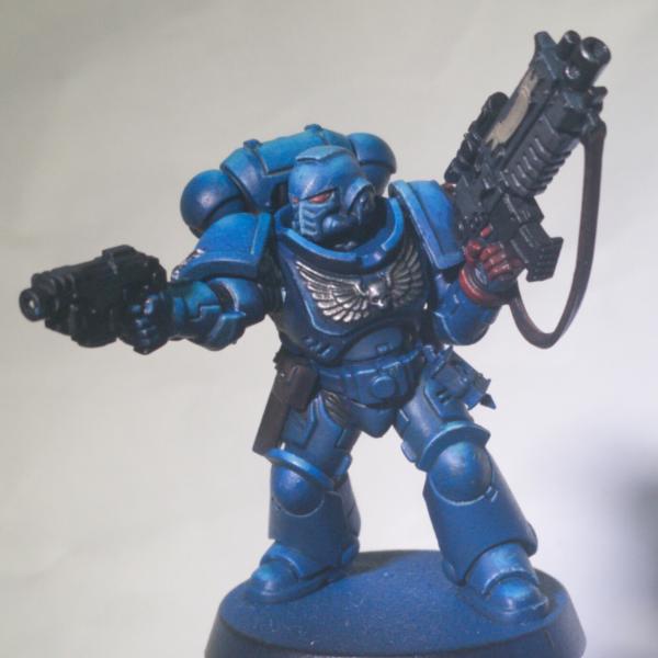
I've tried out different techniques around his body, and I intend to have the finished effect to match his legs. This is simply just knocking back the colour with a final thin dark blue glaze, then two subtle glazes of sepia wash for all-over weathering that isn't too muting.
The overall armour glazing is messy, my Vallejo Kantor and Alaitoc Blue equivalents are working great with Vallejo glaze medium, however the Ice blue (old Caledor Sky) doesn't, so I'll need to wait for the vallejo version to be in stock as it's stress inducing .
No weathering powder is intended on this guy. Instead some stronger glazing and very thin oil paints to keep the details prominent.
Originally I attempted Ben Komet's style of painting, however as mentioned the brush glazing is currently difficult. A few days ago I found Scarlet Sable's work and loved his ultramarine, so I'm trying his techniques out here. Some of my edge highlighting looks wobbly so I might knock it back a few shades, especially in the darker blue areas like his chest. I will intend to try his airbrush layering method on the next primaris. However a few test runs on old models have not given me confidence! 
As CF lack markings I may eventually add freehand but for now I'll just add some transfers when I'm happy with the colours.
I've read about triangulating and spot colours. So I'm contemplating either a red casing or some red stripes on his pistol, to match with his eyes and left hand. A red right hand for veteran would be an obvious answer but this guy is just a wee nipper. Any other suggestions?
|
|
|
|
|
2019/01/28 20:58:28
Subject: Re:Dark Angels 3rd Company and Friends [28/01/19] Crimson Fists Primaris Test Mini
|
|

[SWAP SHOP MOD]
Robot Cat
OH-I Wanna get out of here
|
I think right now he is very similar to an Ultramarie, which I assume you want to avoid. I'd try to knock the silvers up a few shades, and the blues down even further. Everything right now is the same basic intensity, so the reds and silvers aren't really popping. Maybe bringing the leather pouches and sling up some shades as well, to a more sand brown. Red kill marking stripes on black casings on the guns would give you some pop too. I'd change the scroll work on the bolter to silver, like it's a metal embossed decoration and not some paper superglued on by the tech marine.
Below is an example of some CFs that did that stuff, and I think they really look great. Obviously all this is imo.
Warning: huge pic stolen from the internet.
|
|
|
|
|
2019/01/28 22:56:36
Subject: Re:Dark Angels 3rd Company and Friends [28/01/19] Crimson Fists Primaris Test Mini
|
|
Adolescent Youth with Potential
|
whalemusic360 wrote:I think right now he is very similar to an Ultramarie, which I assume you want to avoid. I'd try to knock the silvers up a few shades, and the blues down even further. Everything right now is the same basic intensity, so the reds and silvers aren't really popping. Maybe bringing the leather pouches and sling up some shades as well, to a more sand brown. Red kill marking stripes on black casings on the guns would give you some pop too. I'd change the scroll work on the bolter to silver, like it's a metal embossed decoration and not some paper superglued on by the tech marine.
You got me. I want to paint Ultramarines but don't want to admit it!
Haha nah I find it difficult following the guides yet paint CF, with a much darker colour palette, whilst still getting these raised highlights I want. Mind you I think the image brightness doesn't help...
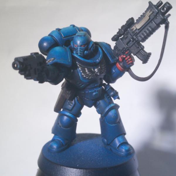
I've chucked the kantor and sepia glazes over, dropping the colour back. Whilst getting more blood red on his hand. I'll need to edge highlight again on some patches, and I'm contemplating getting a dark sea blue glaze on shaded parts to drop the colour further to get a more vivid light contrast.
That's a good idea, however what if the scroll matches the sand of the sling and pouches? I feel like it might mix well. I'm not good at metallics but also want to avoid NMM effects. On a spare scroll I'll try the silver effect as I am curious. I might also try the sand scroll but add the odd chip on the edges with metallics to show it's just painted metal.
Oops yeah I've forgotten to highlight the wings after my wash. Once I've reached the same point with bits hopefully it will all be homogenised and make further adjustments. Ah the joy of using every sub assembly as a test piece...
[edit] oh dear now the sepia makes anything with ice blue zenithal highlight (e.g. The helmet) a very different blue to the base kantor blue. On one hand I love the effect I've got... On the other it's closer to an ultramarine blue, and now it doesn't look highlighting but a different chapter's equipment
Haha can never win.
|
|
This message was edited 2 times. Last update was at 2019/01/28 23:32:03
|
|
|
|
|
|
|
