| Author |
Message |
 |
|
|
|
|
Advert
|
Forum adverts like this one are shown to any user who is not logged in. Join us by filling out a tiny 3 field form and you will get your own, free, dakka user account which gives a good range of benefits to you:
- No adverts like this in the forums anymore.
- Times and dates in your local timezone.
- Full tracking of what you have read so you can skip to your first unread post, easily see what has changed since you last logged in, and easily see what is new at a glance.
- Email notifications for threads you want to watch closely.
- Being a part of the oldest wargaming community on the net.
If you are already a member then feel free to login now. |
|
 |
2018/11/11 18:01:59
Subject: Colour exhaustion
|
|

Fresh-Faced New User
|
Hi all,
Basically some time ago I had some issues with some highlights one my custom 'nids and posted online my minis asking for suggestions. The choral response was to strip everything and start over as apparently I severely lacked the skills to deliver what was in my head. At first I was like "wow, everyone is a hater online", then I showed the post to some friends and they reluctantly agreed with the internet. Ok, ouch, fair enough: I'm a noob and maybe I overshot it.
The issue is that from then I spent three weeks looking at color schemes and now I don't even know what I like anymore. sometimes I even get the random thought "I'm tired of this crap, I'll sell everything!", or the "Let' make an even crazier scheme!!"
Did this ever happened to you? How did you come to a conclusion? I have like four colour schemes that I could kinda go for but I honestly can't pick..
Do I go for fluff? For combat style of the army? For the easiest (which is still not that easy) to paint?
Thanks for the answers
|
|
|
 |
|
2018/11/11 18:14:50
Subject: Colour exhaustion
|
|
Decrepit Dakkanaut
UK
|
A few thoughts:
1) Burnout happens to us all at any point in time. Sometimes the best thing to do is just step away from the aspect that is burning you out and focus on something else for a bit. That might meaning gaming, building, converting or even another hobby or interest. Basically trying to force it can sometimes make it worse, whilst taking a step back lets you, in essence, recharge your batteries and interest.
This can very much be the case when you are under skilled and/or lacking in confidence as trying to force through things will result in lower quality work that will make you even more frustrated.
2) Painting isn't a magical art you have to be born with to have; but it does require learning and practice and you can't avoid either. So a few things that can help out
a) find some local gamers to teach you to paint in person. Doesn't matter if its your scheme or not, just improving your understanding and skill will help tremendously.
b) Watch the warhammer youtube channel and all Duncan's painting videos. They are often short and easy to view and digest the information.
c) Get a pack of gaunts and sacrifice them to the paint gods. Ergo paint them up - spray them white - paint them again. Repeat over and over. Every so often you might have to paint strip them (as the layers will get thicker as you put more paint atop paint). Basically you're practicing - not just the layers and colours but even the mechanics of how to hold the brush and model; how to turn them to get different angles etc...
d) Workstation makes a HUGE difference. good seating, a high support for your hands; bright light, good brushes; wet pallet etc... All these things make it easier to paint which results in improved results for you.
|
|
|
|
|
|
2018/11/11 18:20:00
Subject: Colour exhaustion
|
|
Leader of the Sept
|
Do you have any pics from before? Dakka is pretty good at giving advice on colour theory and technique without being judgemental. Everyone needs to start somewhere  Automatically Appended Next Post:
 Also, if.youre not quite sure on which scheme to choose then do a squad in each of the choices. Seeing several minis next to each other might help you choose, or just decide to have several different schemes in one force. Some people like to have a common scheme through an army, but the 40k universe is large enough for lots of different organizations and hive fleets working together.
|
|
This message was edited 1 time. Last update was at 2018/11/11 18:22:39
Please excuse any spelling errors. I use a tablet frequently and software keyboards are a pain!
 Terranwing - w3;d1;l1 Terranwing - w3;d1;l1
 51st Dunedinw2;d0;l0 51st Dunedinw2;d0;l0
 Cadre Coronal Afterglow w1;d0;l0 Cadre Coronal Afterglow w1;d0;l0 |
|
|
|
|
2018/11/11 18:23:01
Subject: Colour exhaustion
|
|

Ship's Officer
|
When comes to painting, you have to think in layers, thin layers to achieve your desired effect, typically at least 3 shades of your desired color(dark, medium, highlight). Most beginners paint one thick opaque color thinking that's how it should be.
There is actually Color Theory that tells you what combination of colors goes well together, and in what capacity/saturation.
You can keep practicing at painting, everyone starts at the beginner stage, no exceptions. It will take time to get better. You can commission professionals to do your work, but be wise about who you pick and look around before you commit.
|
|
|
|
|
2018/11/11 18:23:27
Subject: Colour exhaustion
|
|

Battlefield Tourist
|
This happens to me all the time. The only way out of it is to go for a scheme.
People online have high standards. When I started out and for years afterwards I would have been absolutely destroyed if I had posted my stuff online. Luckily for me, posting stuff online was not very easy or common back then. Even now, I am just a mediocre painter by online standards.
So I say, just go for it. Just pick a scheme, and try. You will probably not hit your ideal standard for a while, but you will have painted minis and that is better than not painted minis.
Aside from that, try looking up some basic colour theory to help you chose colours.
|
|
|
|
|
|
2018/11/11 18:46:57
Subject: Colour exhaustion
|
|
Mastering Non-Metallic Metal
|
I'd be interested in seeing what scheme you could have come up with that was so irredeemable that everyone agreed that it should never be seen again.
Telling someone that they should just scrap what they are doing and do something else is not constructive or helpful.
I'm sure that with one or two changes any scheme idea can be made to work.
Quick example: Your red and green scheme looking too Christmas-y? Darken one of the colours and it'll immediately look better. 
As for your actual question; finding a scheme for 'nids.
Look about for a scheme someone else has done that you like the look of. Ask them how it was done.
Or
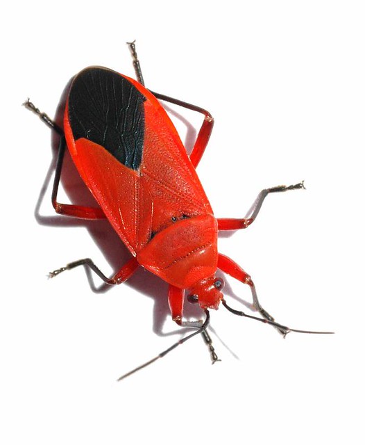
Look to nature. Google for photos of colourful animals (in particular, insects) and that should give you some inspiration.
Either paint a copy of those, or modify to your tastes.
|
     Mastodon: @DrH@warhammer.social Mastodon: @DrH@warhammer.social
The army-                  ~2295 points (built). ~2295 points (built).
 
* -=]_,=-eague Spruemeister General. * A (sprue) Hut tutorial *
Dsteingass - Dr. H..You are a role model for Internet Morality!  // inmygravenimage - Dr H is a model to us all // inmygravenimage - Dr H is a model to us all
Theophony - Sprue for the spruemeister, plastic for his plastic throne! // Shasolenzabi - Toilets, more complex than folks take time to think about! |
|
|
|
|
2018/11/11 21:24:11
Subject: Re:Colour exhaustion
|
|
Fresh-Faced New User
|
Firstly, thank you all for the feedback.
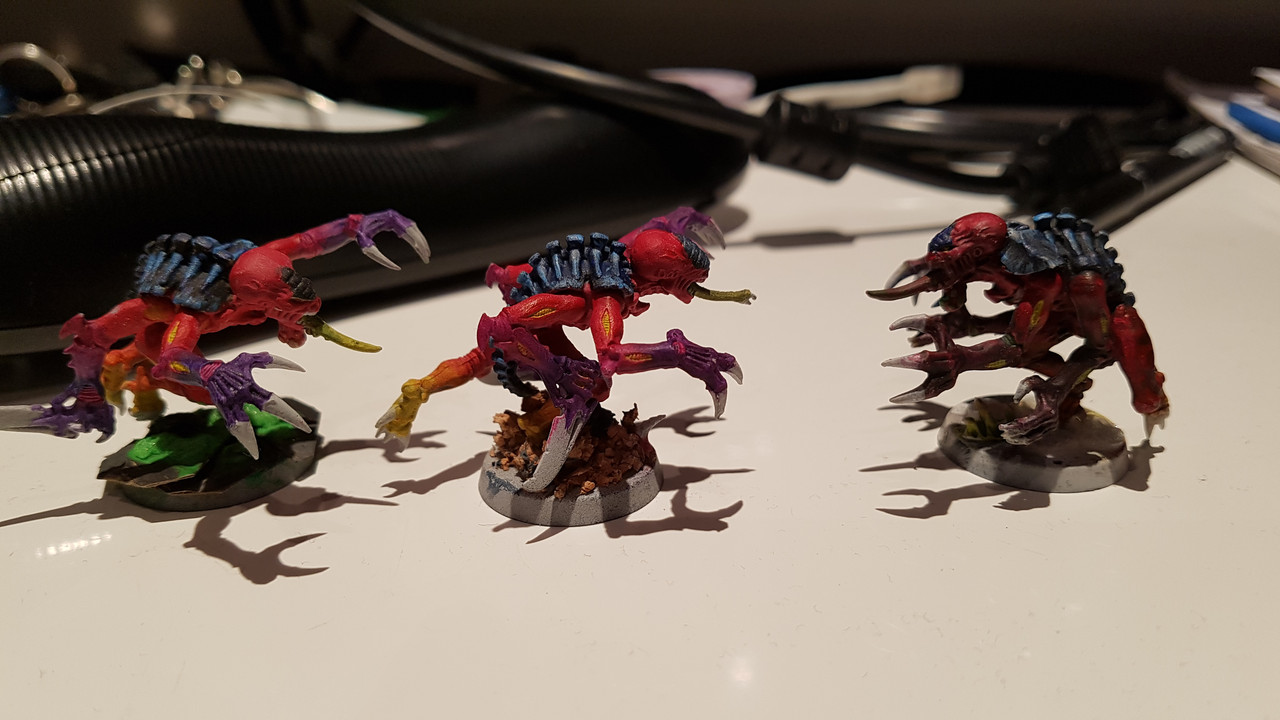
Here's my little buggers (my twist on the Behemoth HF) : I mean, the people online were pretty supportive, they told me to strip them, get better paints, thin said paints and yeah, look for tutorials and then start again with something a little more at my speed. Mainly it was said that I had too many colours, and that a two colour scheme is much more effective on the field.
From then I watched a buttload of tutorials, read a lot of articles and tested some schemes on the remaining sprues (I actually ran out of space and started to overwrite),
-When I met the Nids for first time I fell in love with Behemoth artwork, also it fits that I'm into big monsters (only exeption being stealers, hormas and rippers). but let's face it, red and black are kinda of a pain to work on (at least at my level for now..) also it can look a bit bleak with the dark carapace once on the field (that's why I was trying to spruce it up with the orange and purple)
-But Kraken can be done easily and effectively, not crazy about the fluff tho, also again: red is a 
-I like the Tiamet and fluff but their scheme is a bit dull I find..
-Quote above for Hydra
-Christmas Nids are cool but fall under the "red" issue
-I saw online blue skin with orange/yellow carapace and that is kinda cool
-A 'crazy' idea I had today was a splinter fleet that flew in the warp by mistake and came out after thousands of years, just to give me an excuse to go Pollock style with fluo colors.
I mean, I dunno if I was put down by Behemoth by having to strip the 30 minis I've done already, but yeah as soon as I settle on a scheme I'll get decent paints and gear.
|
|
|
|
|
2018/11/11 21:41:11
Subject: Colour exhaustion
|
|
Thane of Dol Guldur
|
Pick one scheme and use it to perfect your painting techniques. Alternatively, pick a couple and do them for different units. That's the benefit of tyranids. I'd second the fact that you can have too many colours. This is particularly true for tyranids... You've got all 3 primary colours there and that's always going to clash. My advice would be to get rid of the yellow feet.. It looks weird. Keep all their extremeties the same shades for uniformity. Definitely keep it simpler before trying more advanced techniques like colour blending.
|
  Heresy World Eaters/Emperors Children Heresy World Eaters/Emperors Children 
Instagram: nagrakali_love_songs |
|
|
|
|
2018/11/11 22:46:35
Subject: Colour exhaustion
|
|
Leader of the Sept
|
Personally I think the only problem is with the yellow and yellow is a really hard colour to do well anyway.
|
Please excuse any spelling errors. I use a tablet frequently and software keyboards are a pain!
Terranwing - w3;d1;l1
51st Dunedinw2;d0;l0
Cadre Coronal Afterglow w1;d0;l0 |
|
|
|
|
2018/11/11 23:16:45
Subject: Re:Colour exhaustion
|
|
Mastering Non-Metallic Metal
|
Right, so I won't get into painting techniques as that's a whole other thread, and I'll likely prattle on enough here without that side of things... I'll just focus on scheme. You were aiming for a variation on the Behemoth hive fleet, You wanted them to stand out a bit more on the table, First. Yes, you tried to do too much on one model: Red and blue, fine Red to yellow blend, fine Red to purple, fine Purple and yellow, fine Blue and yellow, fine All of the above, too much. So let's bring it back to the start, Behemoth. Dark blue/black and red. The way to get things to "pop" is to play with contrast. This can be with colour (using colour theory), or with shading/tone (bright vs dark). Things to change with the blue/black: More blue; bring it up lighter at the highlights from black to blue to light blue to almost white. This gives contrast between the light highlights and the dark recesses. or Swap that around and have a light blue base and black "highlights". Same contrast as above but unique from the typical Behemoth with one change. (you could even go one step further and make the red a dark crimson to completely flip the scheme). and/or Could go for a more blue-purple tone to it to differentiate from blue/black. Things to change with the red: Pick either the purple or the yellow/orange blend, not both. Or neither. Consider desaturating the red; adding grey to the red. This will make it seem more realistic and give contrast to the vibrant blue above. or highlight the red with pink or flesh-tone (works with the desaturation), gives a cooler red tone. Probably good contrast with a warmer purple "blue". or highlight with orange. To contrast with a darker (cooler) blue. gives a warmer red tone. If fading out the colour of the limbs, desaturate the colour, e.g. with yellow going lighter: or with purple going darker: note that this bug doesn't have a blue back, you may want to keep that dark to do this. This means it's the red that fading out and not a new colour emerging. You retain the red and blue/black scheme. If you want the fleshy bits (between the armour plates) to be yellow, mix that with flesh-tones to tone it down a bit. Maybe make it darker (mix or wash with dark brown) to contrast with the bright red (as you have it, they blend in a bit too much and clash rather than contrast). And one last thing about picking colour schemes in general. I use this website to check on the colour theory things: http://paletton.com/#uid=1000u0kllllaFw0g0qFqFg0w0aF You can select your main colour then click the "complimentary" toggle. This adds the opposing colour on the wheel that will contrast with the chosen colour (e.g. red and green). You can see than a more orange-red contrasts with a more blue-green. A more purple-red contrasts with a more yellow-green. and so on. I also use the "triad" feature there that adds 2 opposing colours to the one chosen. You will see that you can get a Red - blue - yellow triad, but this shows that the purple is incompatible even though it's complimentary to yellow. The website just helps to visualise the colours together and find a set that works together quickly. Right, I've gone on enough. Hope that helps and gives you an idea that not all it lost, you just need to be a bit more subtle with your choice of colours. Good luck.
|
|
This message was edited 2 times. Last update was at 2018/11/11 23:20:59
Mastodon: @DrH@warhammer.social
The army- ~2295 points (built).
* -=]_,=-eague Spruemeister General. * A (sprue) Hut tutorial *
Dsteingass - Dr. H..You are a role model for Internet Morality! // inmygravenimage - Dr H is a model to us all
Theophony - Sprue for the spruemeister, plastic for his plastic throne! // Shasolenzabi - Toilets, more complex than folks take time to think about! |
|
|
|
|
2018/11/12 02:13:42
Subject: Colour exhaustion
|
|

Liche Priest Hierophant
|
"The choral response was to strip everything and start over as apparently I severely lacked the skills to deliver what was in my head."
When you say you lack the skills to deliver what is in your head I suspect this problem can be different then what you belive. One thing is the execution of the colour scheme. How good you are at actually painting as in the craft. But the other thing, that I suspect you are not aware of, is your colour theory. That would be painting as how colours interact with each other. And almost no matter how good your craft is, the resoult will not work out if the theory is bad.
The colour on the first genstealers have all the colour + grey on the scything tallon. If anything it reminds me a bit of shaven ice with tastes added in different colorours. Or perhaps a bit like a poisenus frog. But the colours are all over the place, very little contrast.
The yellow and purple hormagaunt has very low level of colour contrast. Yellow has about a weight of 9, and purple has about a weight of 1. (I can not remember the theoretic framework that used these numbers, but they hold true.) You would need about 9 amounts of purple to 1 of yellow for it to have harmony, and you have way to much yellow. You can dilude the yellow with black/white or grey. ( PS: If you wanne darken yellow use brown, if you use black you get a green colour.) This can be thinking of qualaty contrast where you take down the qualaty on the yellow to mute it more.
For something more comprehensible that is not just me rambeling check out this handy guide. It is part 3, the last part, but it has links to chapter 1 and 2 as well.
http://theback40k.blogspot.com/2010/05/little-color-theory-part-iii.html
|
|
|
|
|
|
2018/11/12 02:37:26
Subject: Colour exhaustion
|
|

Fireknife Shas'el
|
Hivemindless wrote:Hi all,
Do I go for fluff? For combat style of the army? For the easiest (which is still not that easy) to paint?
Honestly, Nids are a horde army, so choose something that's quick to paint, or you'll be forever making a 1000pt army, let alone a big tournament army. That super-awesome scheme idea in your head will feel like a mistake when you're on mini #153, especially when you're painting the less important members of your horde (gaunts)
Even simple paint jobs look very impressive when you've to big blocks of 30 of them.
|
|
|
|
|
|
2018/11/12 13:09:10
Subject: Colour exhaustion
|
|
Legendary Dogfighter
|
Paint to make yourself happy.
Not society.
If you liked what you did then awesome.
If they didn't...well tough gak to them. You're not here to make them happy.
(Especially with most 40k armies being grey plastic...or whatever colour GW adds to it)
Just keep practicing.
But ease to paint is always good.
For instance I recently finished 30 American GI's for WWII.
It took 12 hours and I only used it think 8 paints.
Just get base colours on.
Wash.
Drybrush sandy colour for weathering and highlights.
Done.
|
|
This message was edited 2 times. Last update was at 2018/11/12 13:12:30
|
|
|
|
|
2018/11/12 17:52:08
Subject: Colour exhaustion
|
|
Battlefield Tourist
|
From what I can see there you do not lack in skill. Just some poor colour choice is all, and I do not think stripping the models is called for.
I think the red-to-purple works okay, but the yellow does not. So I would just paint over the yellow if I was you. It isn't in a high value place (no one is looking closely at the feet on minis) so I would just quickly fix it with some red and move on. The basics of the scheme (red with black-blue) is fine.
|
|
|
|
|
|
2018/11/13 00:21:20
Subject: Colour exhaustion
|
|
Been Around the Block
|
I agree with ValentineGames. Do what works for you. Of course with that in mind there are all sorts of tricks to improve your painting and style, colour theory being the main one here, and as has been said, thinning paints, using washes, drybrushing, spotting and cleaning those mould lines etc.
But back to the point, I think those you have shown are salvageable. I would just use a dark brown wash to give some shading, while reducing the contrast between the red and purple, and the yellow would come out darker and richer too. Also, you mention black being difficult. I would recommend using a dark grey, and black washes. If you start with black you have nowhere to go for shadow.
I know nothing about the fine points of colour theory, but i feel I have a decent eye for these things. I'll have to post some of my work so that I can earn the right to say things like that though!
|
|
|
|
|
2018/11/13 14:24:16
Subject: Colour exhaustion
|
|
Daemonic Dreadnought
|
 Niiai wrote: Niiai wrote:"The choral response was to strip everything and start over as apparently I severely lacked the skills to deliver what was in my head."
When you say you lack the skills to deliver what is in your head I suspect this problem can be different then what you belive. One thing is the execution of the colour scheme. How good you are at actually painting as in the craft. But the other thing, that I suspect you are not aware of, is your colour theory. That would be painting as how colours interact with each other. And almost no matter how good your craft is, the resoult will not work out if the theory is bad.
The colour on the first genstealers have all the colour + grey on the scything tallon. If anything it reminds me a bit of shaven ice with tastes added in different colorours. Or perhaps a bit like a poisenus frog. But the colours are all over the place, very little contrast.
The yellow and purple hormagaunt has very low level of colour contrast. Yellow has about a weight of 9, and purple has about a weight of 1. (I can not remember the theoretic framework that used these numbers, but they hold true.) You would need about 9 amounts of purple to 1 of yellow for it to have harmony, and you have way to much yellow. You can dilude the yellow with black/white or grey. ( PS: If you wanne darken yellow use brown, if you use black you get a green colour.) This can be thinking of qualaty contrast where you take down the qualaty on the yellow to mute it more.
For something more comprehensible that is not just me rambeling check out this handy guide. It is part 3, the last part, but it has links to chapter 1 and 2 as well.
http://theback40k.blogspot.com/2010/05/little-color-theory-part-iii.html
I know what it's like to be stuck on a color scheme. Can shut me down for weeks trying to find the right one.
What occurs to me about the Genestealers is the scheme should pop more as-is, especially with the red body and the purple claws. This isn't a bad color scheme overall, minor issues with technical execution would correct many of the issues with the models. Maybe it's the camera skewing the colors, but the purple just looks a lot darker than the reds, and the reds look a lot more intense than the purple. My eye is drawn to the body and away from the claws when I look at them, the most interesting part of the scheme is the depth in the carapace.
OP: a few suggestions around how to make the red and purple work better.
1) Create depth in the recesses to make everything else stand out. I see the same shade of red everywhere. Consider using a Burnt Umber (reddish brown) color to make the red stand out. You can thin it a little and apply it to the body.
2) Create contrast on heads & appendages with pin washes. I see a lot of veins up-close that are getting overwhelmed by the body color. Consider using a thin black pin wash to make a shadow around them.
3) Create highlights on the purple parts with thinned paint. The purple color is much darker than the red, you have to work with the light to make it stand out convincingly. Mix the purple with a light blue or white and hit the top ridges with a detail brush to make it stand out. Use a thin wash of the original purple on top of the highlights to color correct.
The good thing about washes and highlights is they can be applied quickly and easily without getting too detailed.
|
|
|
|
|
|
2018/11/13 15:15:12
Subject: Colour exhaustion
|
|

Fresh-Faced New User
|
Thanks guys, you gave me a lot to think about.
The articles and the colour wheel are very nice.
I feel I'm probably sticking with behemoth (still studying the wheel to get if i want the classic behemoth or the Christmas variety).
Playing poorhammer i got all the minis used from ebay, so i already planned to strip most anyways (eventually)
|
|
|
|
|
2018/11/13 16:00:49
Subject: Colour exhaustion
|
|
Liche Priest Hierophant
|
Techsoldaten has a lot of good sugestions. Muting down colours by having the main colours tinted by brown, black or grey is a good idea, and then use the more 'pure' colour as the highlight. The pure colour is always more pupre and brighter, so it will popp a lot more, and you will divert focus to those arias.
Personally I think you use to many colours. Blue, red, yellow, purple and grey is just to much. It will also be a pain in the ass to paint for your first big painting project. I would rather stick to something easier.
I paint leviathan (white purple and red/orange) for my nids. But my GSC use the same colour scheme but orange/yellow on the claws. Yellow and purple makes a fine contrast. You could try to modefy an excisting colour scheme with just one colour. That way you do not have to be bound to a spesific colour.
With nids you can do a lott though. If you want a really easy scheme just do the entier model in one colour, and then just runn 2 pararell lines in the colour of the shell. They will end up looking very poisenus.
For instance an earthen grey, with a black wash or an agrash earthshade wash, with a slightly lighter grey as a drybrush. Just add your choise of colour as stripes on the shell. (Yellow and green screams poisenus bugs.) Or an almost dark body. The nice thing is you could finish that colour scheme very fats and it would look very impresive on the battlefield.
If you wanne be tricky said wash could be the contrast colour to the poison colour on the shell. (AKA a grey model washed with purple, and yellow stripes running along the shell on each side.)
|
|
|
|
|
|
2018/11/13 16:33:04
Subject: Colour exhaustion
|
|
[DCM]
Moustache-twirling Princeps
Gone-to-ground in the craters of Coventry
|
The way I paint my stuff (and it isn't great, but well... )is to set a scheme for each type of part of the model.
My Imperial Guard follow a scheme like this:
Flesh is a dark brown colour, with a flesh wash and drybrushed lighter flesh.
Cloth uniform is grey.
Armour panels, helmets and backpacks, etc are brown. Weapons are mostly done like the armour.
Boots, belts and straps are black.
Metal parts are gunmetal.
Almost everything gets a black wash and drybrush to get the colour back around the edges.
This carries over to the vehicles.
It is brown, grey and metal, with a bit of black.
For 'nids, I'd do similar.
Chitin is a dark colour.
Fleshy bits are a lighter or paler colour.
Claws, teeth and horns are white or something in the colour wheel that fits.
Change-to-fit, for poison parts or something.
|
|
|
|
|
|
2018/11/13 16:54:23
Subject: Colour exhaustion
|
|
Legendary Master of the Chapter
|
Hivemindless wrote: Did this ever happened to you? How did you come to a conclusion? I have like four colour schemes that I could kinda go for but I honestly can't pick.. Thanks for the answers
Literally all the time Iv honestly stripped and restarted my imperial fist army about 5-6 times just trying to get the right shade of yellow. iv already did a 180 on my IG kill teams because i didnt like the shade of grey i was working on for 2 days on a single model. its best to realize you arent going to like a scheme early on so you can quickly change it. the best suggestion would be to do a lot of test models and write down ALL the paints and techniques you have done. pictures too. that way once you do find something you like you can reproduce it faster. honestly the Jeanstealers arent looking tooooo bad. it might be color overload with both red fading to yellow and blurple. You could always filter it all back down with a red glaze or candy layer to tie all the colors together.
|
|
This message was edited 1 time. Last update was at 2018/11/13 17:01:47
 Unit1126PLL wrote: Unit1126PLL wrote: Scott-S6 wrote: Scott-S6 wrote:And yet another thread is hijacked for Unit to ask for the same advice, receive the same answers and make the same excuses.
Oh my god I'm becoming martel.
Send help!
|
|
|
|
|
2018/11/13 17:07:37
Subject: Colour exhaustion
|
|
Liche Priest Hierophant
|
 Desubot wrote: Desubot wrote:Hivemindless wrote:
Did this ever happened to you? How did you come to a conclusion? I have like four colour schemes that I could kinda go for but I honestly can't pick..
Thanks for the answers
Literally all the time
Iv honestly stripped and restarted my imperial fist army about 5-6 times just trying to get the right shade of yellow.
iv already did a 180 on my IG kill teams because i didnt like the shade of grey i was working on for 2 days on a single model.
its best to realize you arent going to like a scheme early on so you can quickly change it.
the best suggestion would be to do a lot of test models and write down ALL the paints and techniques you have done. pictures too. that way once you do find something you like you can reproduce it faster.
honestly the Jeanstealers arent looking tooooo bad. it might be color overload with both red fading to yellow and blurple. You could always filter it all back down with a red glaze or candy layer to tie all the colors together.
Have you heard art is never done, only abandoned? You should have done more samples before settling on a colour scheme. Ever houer you spend planing is 10 houers you save afterwards. Here it would be striping the models and starting over again.
|
|
|
|
|
|
2018/11/14 04:50:21
Subject: Colour exhaustion
|
|
Daemonic Dreadnought
|
Niiai wrote: Desubot wrote:
Literally all the time
Iv honestly stripped and restarted my imperial fist army about 5-6 times just trying to get the right shade of yellow.
iv already did a 180 on my IG kill teams because i didnt like the shade of grey i was working on for 2 days on a single model.
its best to realize you arent going to like a scheme early on so you can quickly change it.
the best suggestion would be to do a lot of test models and write down ALL the paints and techniques you have done. pictures too. that way once you do find something you like you can reproduce it faster.
honestly the Jeanstealers arent looking tooooo bad. it might be color overload with both red fading to yellow and blurple. You could always filter it all back down with a red glaze or candy layer to tie all the colors together.
Have you heard art is never done, only abandoned? You should have done more samples before settling on a colour scheme. Ever houer you spend planing is 10 houers you save afterwards. Here it would be striping the models and starting over again.
Yes, but... people's technique improves over time. I've stripped models just to repaint them now that I've learned a better way to do a certain color.
My Noise Marines all have yellow guns. There was a book called 'Evay Metal Masterclass, showed how they do the yellows on Ork armor, it just got to me. Had to strip 20 NMs to redo it.
Took all kinds of time, but ended up with something very satisfying. I can see the logic in redoing things. Besides, yellow has always been the hardest color to work with.
|
|
|
|
|
|
|
|


 6000 pts -
  4000 pts - Harlies: 1000 pts -
  1000 pts