| Author |
Message |
 |
|
|
|
|
Advert
|
Forum adverts like this one are shown to any user who is not logged in. Join us by filling out a tiny 3 field form and you will get your own, free, dakka user account which gives a good range of benefits to you:
- No adverts like this in the forums anymore.
- Times and dates in your local timezone.
- Full tracking of what you have read so you can skip to your first unread post, easily see what has changed since you last logged in, and easily see what is new at a glance.
- Email notifications for threads you want to watch closely.
- Being a part of the oldest wargaming community on the net.
If you are already a member then feel free to login now. |
|
 |
2020/04/22 21:59:43
Subject: Help me finish this Cybork
|
|

Roarin' Runtherd
|
Hey Dakkers
May I have help from the resident expert painters?
I'm having a lot of trouble with this model. I love the build, but something about the paint job is not sitting right with me. I've tried quite a few things already, but it just doesn't feel like it does the model justice. I think something is fundamentally wrong with my choices but I can't figure out what it is.
Is it too many colours? The wrong colours? Too much detail?
I'm open to any and all advice. What would you do? What would you change?
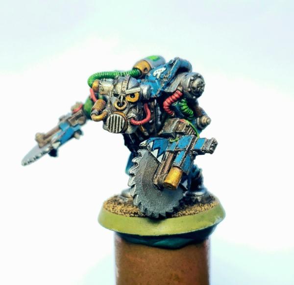
There's a few more photos in the gallery: https://www.dakkadakka.com/gallery/images-11150-62931_Cybork%20Nob%20Wip.html
|
Music:https://bowchicawowow.bandcamp.com/releases
Movies:https://www.imdb.com/name/nm3533355/ |
|
|
 |
|
2020/04/23 01:28:19
Subject: Help me finish this Cybork
|
|

Member of a Lodge? I Can't Say
|
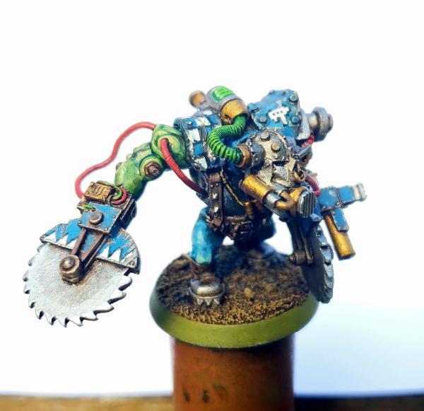
IMO it's the green wires - they should either be less bright or a different color.
The mini has red, blue and green, together the way they are it just makes the mini feel off to me.
Maybe hit the red wires with a little ink to darken them as well.
|
I prefer to buy from miniature manufacturers that *don't* support the overthrow of democracy. |
|
|
|
|
2020/04/23 04:58:14
Subject: Help me finish this Cybork
|
|
Roarin' Runtherd
|
 ScarletRose wrote:IMO ScarletRose wrote:IMO it's the green wires - they should either be less bright or a different color.
The mini has red, blue and green, together the way they are it just makes the mini feel off to me.
Maybe hit the red wires with a little ink to darken them as well.
Thanks for the ideas.
I'll definitely darken the wires and see where it goes.
As for the colour of the wires...i had a lot of trouble with this going in. My Deathskull colour load-out is already full enough (standard ork fare + blue as a primary, white as a secondary and more brass bits than normal)
In that context, what colour would you have chosen for the wires?
|
Music:https://bowchicawowow.bandcamp.com/releases
Movies:https://www.imdb.com/name/nm3533355/ |
|
|
|
|
2020/04/23 05:44:03
Subject: Re:Help me finish this Cybork
|
|

Fixture of Dakka
|
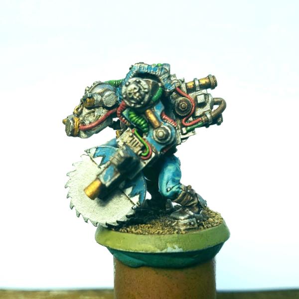
I think it's a case of partially the wrong colours, partially too many colours.
The model is overwhelmingly blue. You have blue on the weapons, the armour and the pants (and around the neck too maybe?).
I would suggest losing the blue from one of these areas. My choice would be the pants.
You could change it too a black/dark grey or a dark brown. Keeps it neutral and won't draw your eye away from other areas. I would do the same for around the neck area too, if that is indeed blue like the plants.
The armour/weapons look good the way they are (well done on those checkers!)
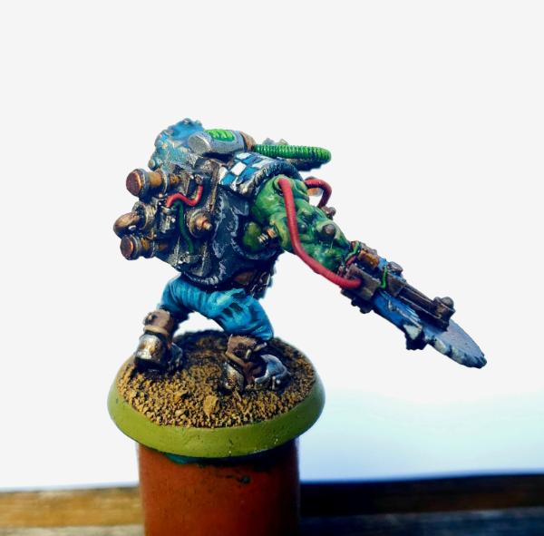
The cables are another area too. You have a lot of cables, and while you've done well to keep them only two colours, I think the light green wasn't the right choice.
The red works, because nothing else is red and it helps break up the large colour blocks of other areas, as does the gold on the face and back.
Were I painting it, i'd make the green cables either plain black or hazard striped. (I'd be use black and orange for hazard stripes as opposed to black and yellow, as the yellow will mix in with the blue and the green areas)
The green energy pack thing on his back is probably ok to stay the colour it is. I wouldn't change that until after i'd done everything else and if it still looked out of place, then paint it another colour.
Also, while they have little bearing on the colours themselves, the buzzsaws do look a little... plain. Just two big blocks of metal. If you wanted to give the saws a little bit of visual interest and help break up the large areas of silver, you could paint a thin ring of black between where the darker and lighter shades meet. Alternatively (or as well as) you could throw in some rust.
|
|
|
|
|
|
2020/04/23 06:31:11
Subject: Help me finish this Cybork
|
|
Roarin' Runtherd
|
Awesome. Thanks for really getting into it.
I'll get on these ideas and report back soon!
|
Music:https://bowchicawowow.bandcamp.com/releases
Movies:https://www.imdb.com/name/nm3533355/ |
|
|
|
|
2020/04/23 15:20:05
Subject: Help me finish this Cybork
|
|
Regular Dakkanaut
|
Yeah, I'd suggest making the green cables gray instead (like Eshin grey with light grey or even leadbelcher highlights), and/or making the pants brown or gray or tan.
When it comes to clan colors, I treat ork mobs like a bunch of sports fans. They're not going to be in uniform, and most of them will only be wearing a few bits of the team's colors to show their affiliation. The visual effect in a group will be obvious, but only a few of them will go head to toe in team colors. So never be afraid to deviate from the basic scheme, especially with customized models that you want to stand out.
|
|
This message was edited 1 time. Last update was at 2020/04/23 15:22:21
|
|
|
|
|
|
|