Forum adverts like this one are shown to any user who is not logged in. Join us by filling out a tiny 3 field form and you will get your own, free, dakka user account which gives a good range of benefits to you:
No adverts like this in the forums anymore.
Times and dates in your local timezone.
Full tracking of what you have read so you can skip to your first unread post, easily see what has changed since you last logged in, and easily see what is new at a glance.
Email notifications for threads you want to watch closely.
Being a part of the oldest wargaming community on the net.
If you are already a member then feel free to login now.
2020/08/02 16:11:20
Subject: Vote for the Winner of the 65th Dakka Painting Challenge:Objective Secured.
As always, you can vote for as many or as few entries as you like, for any reason. Quality of paintwork, the effort on show, the interpretation of the theme or anything else that catches your eye. Feedback in this thread or on the entrants’ blog/gallery pages is also very welcome, and many of the images here link through to the Dakka gallery if you want to rate them over there as well.
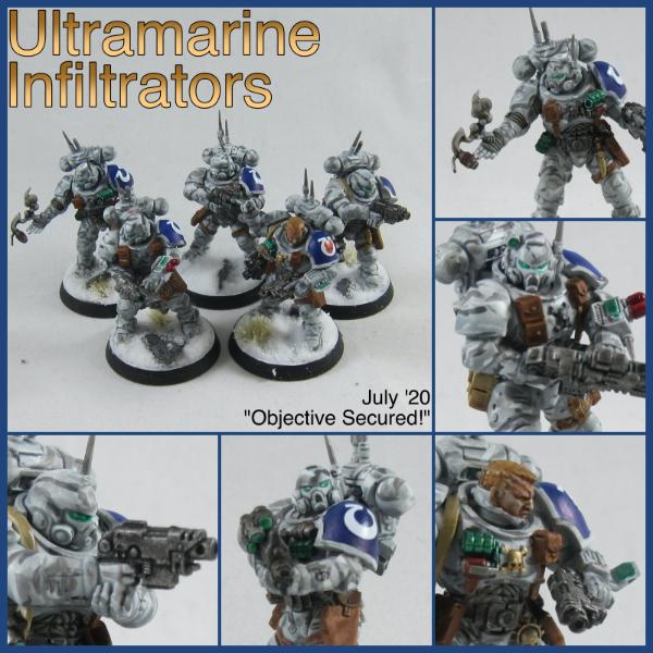
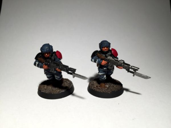
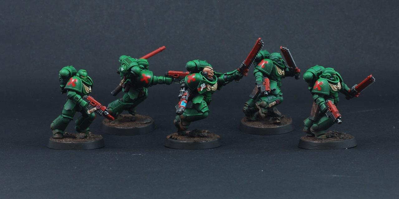
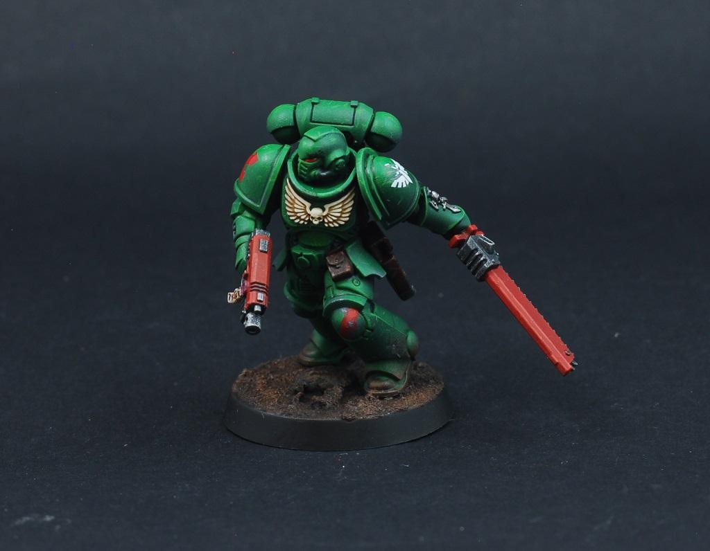
Nevelon -- Infiltrators
Spoiler:
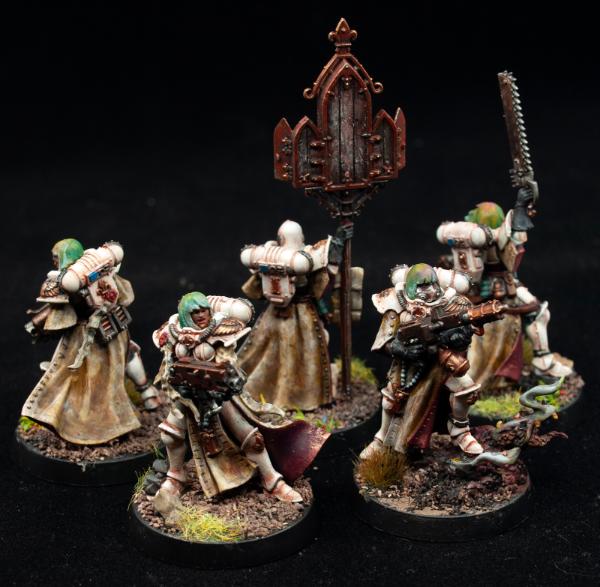
MobileSuitRandom --Battle Sisters
Spoiler:
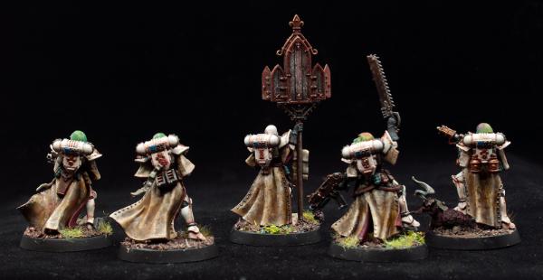
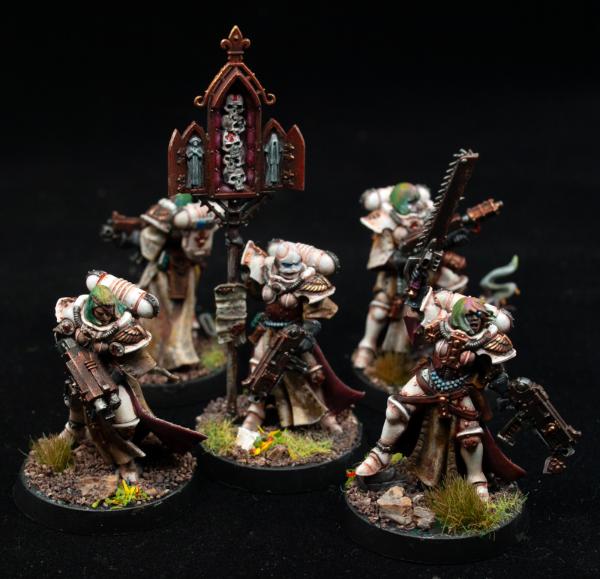
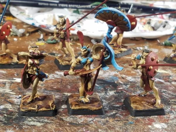
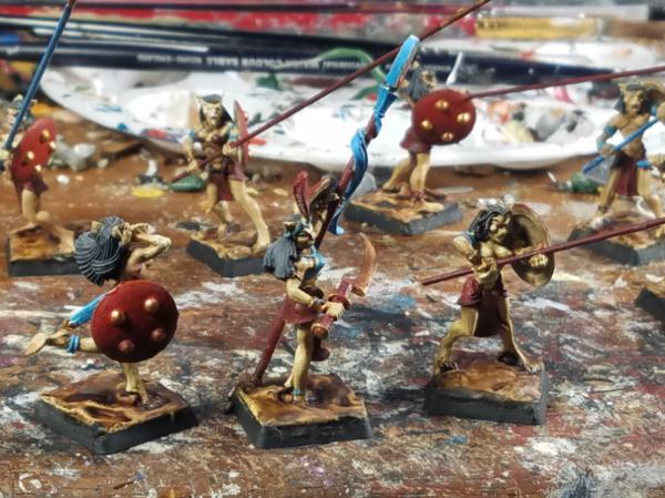
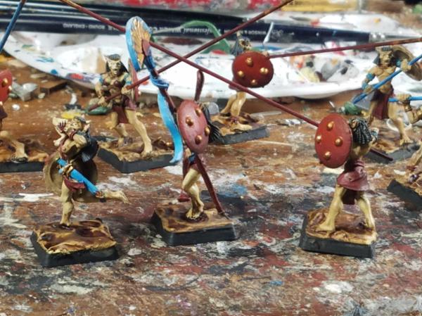
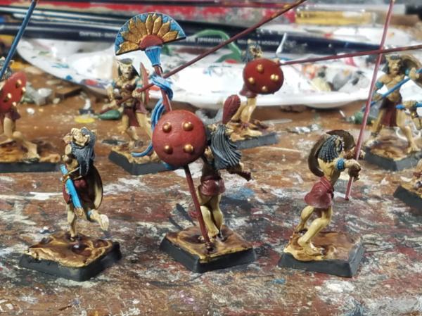
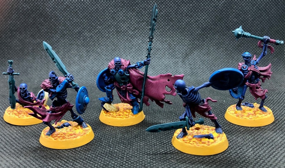
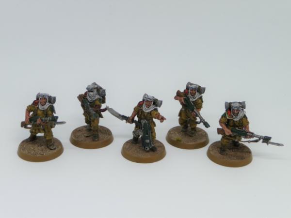
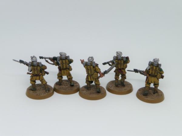
Vejut – Basti Spearmen
Spoiler:
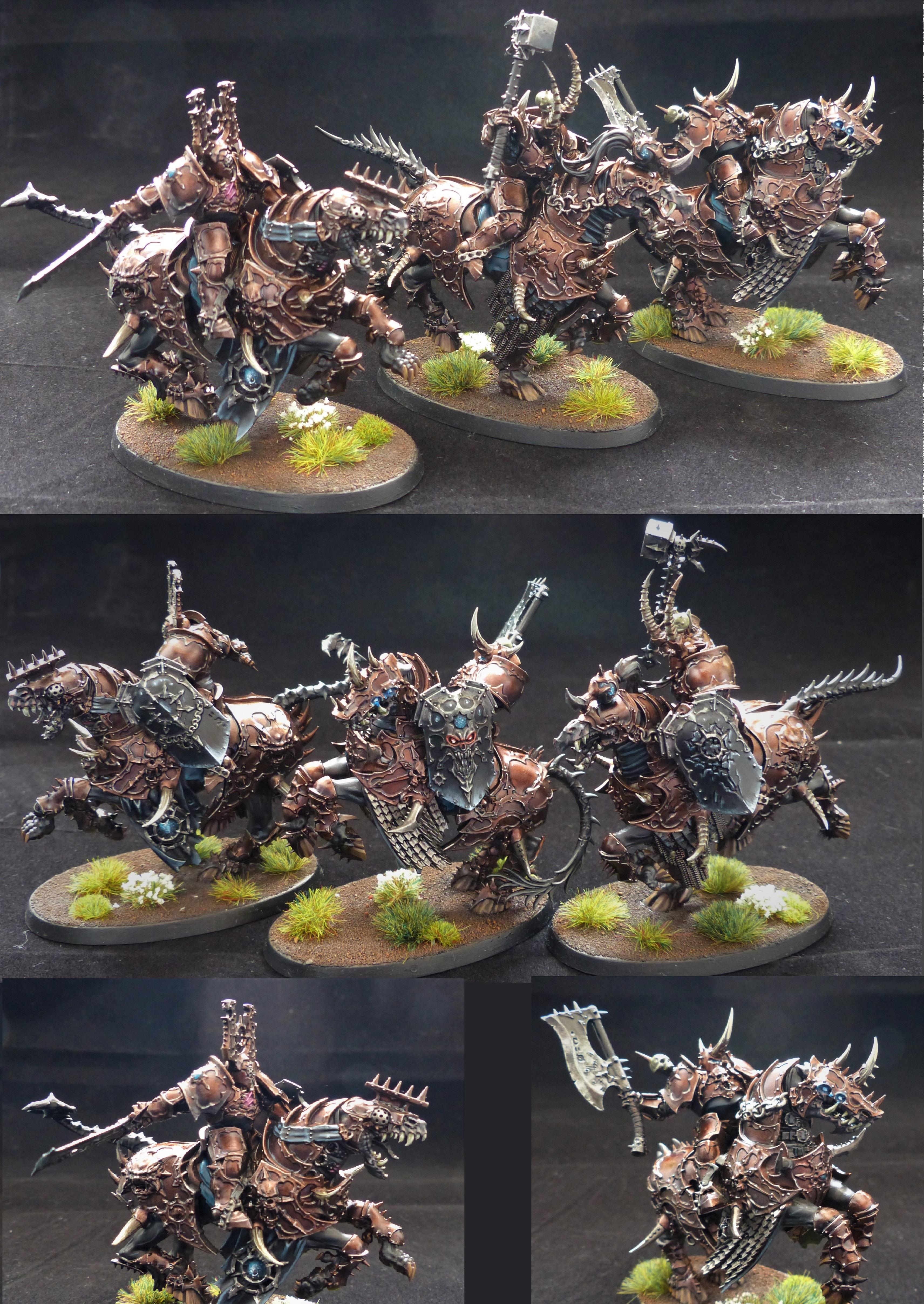
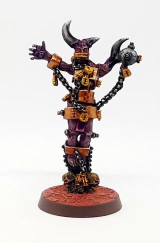
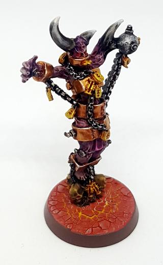
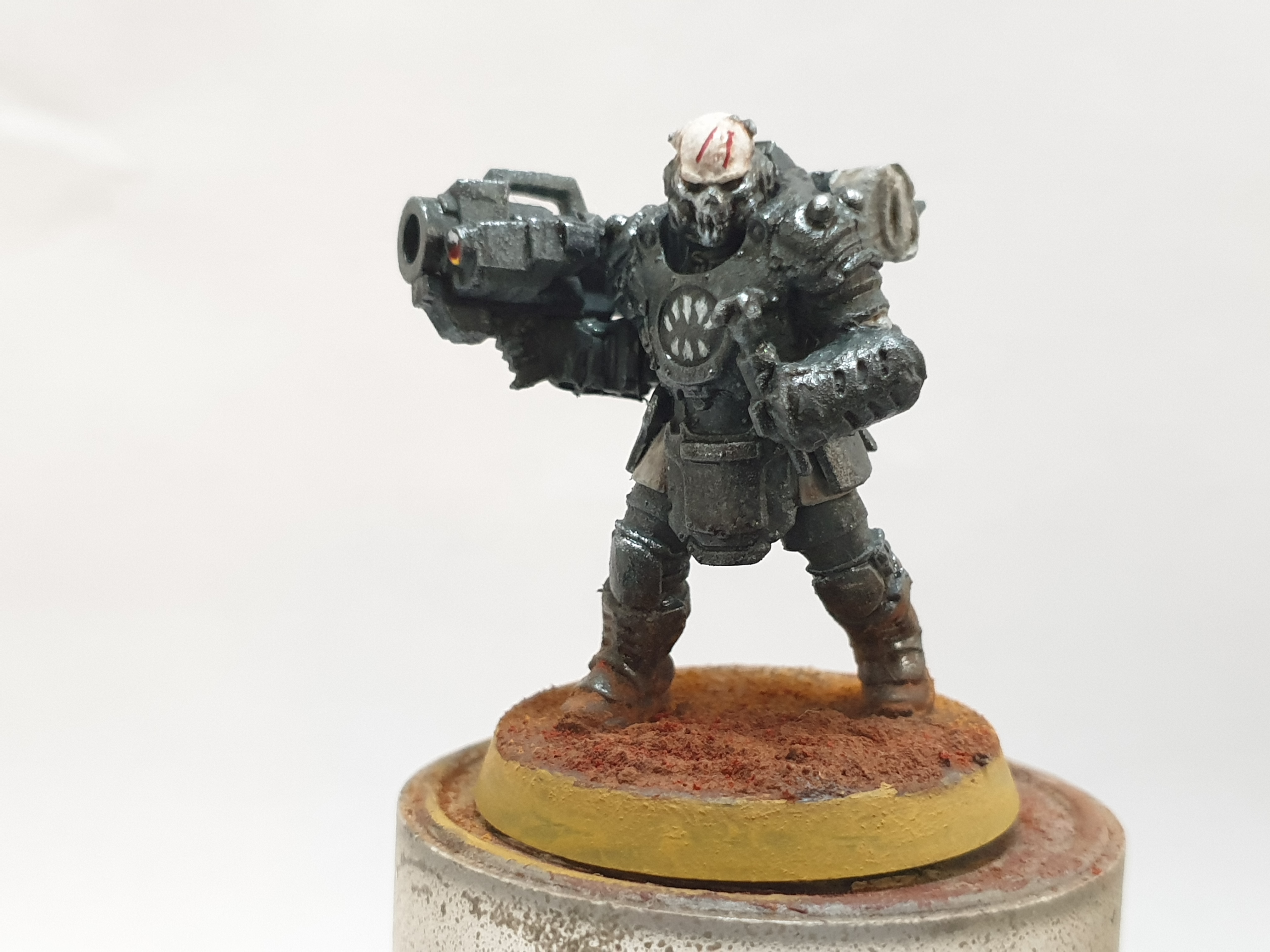
JamesY – Varanguard
Spoiler:
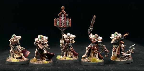
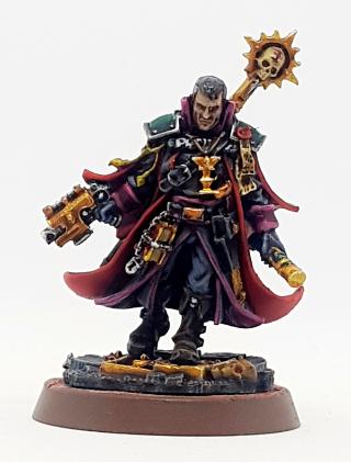
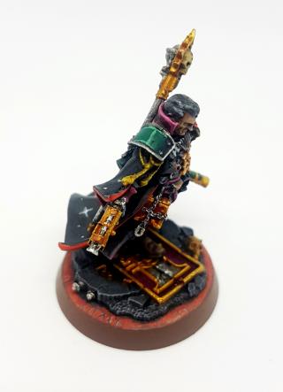
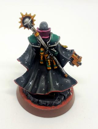
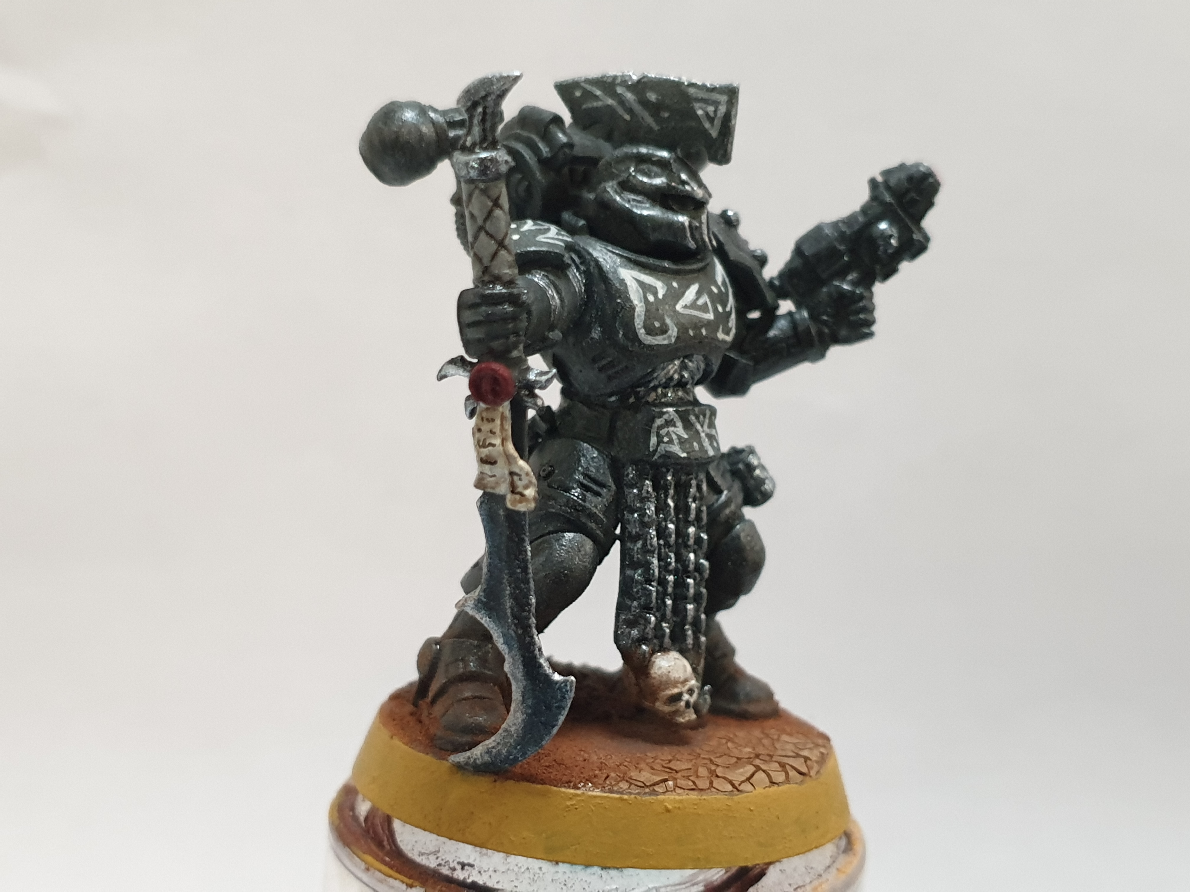
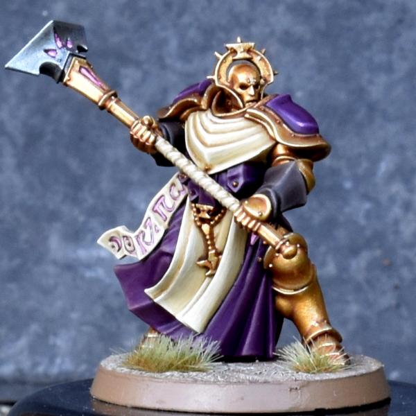
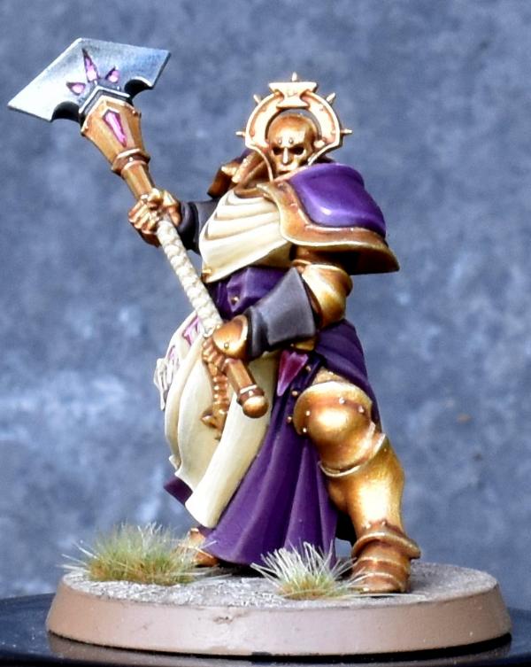
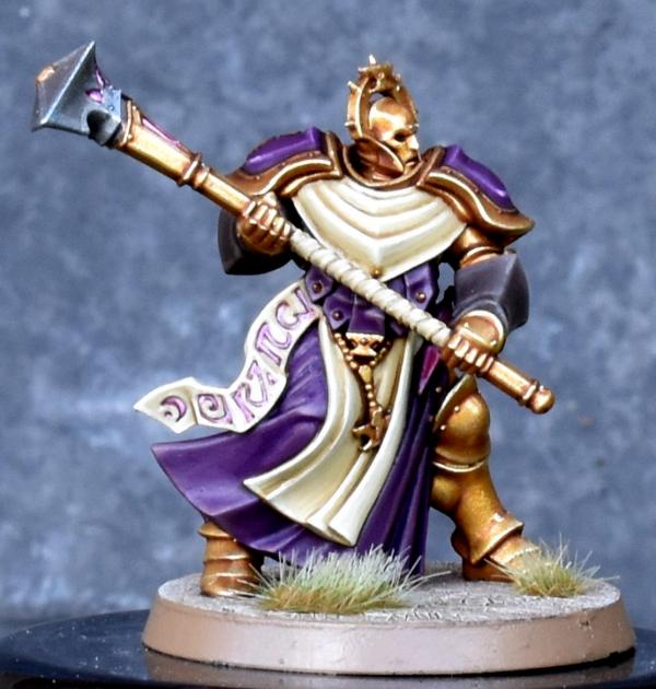
Whittlesey40k – Eisenhorn and Cherubael
Spoiler:
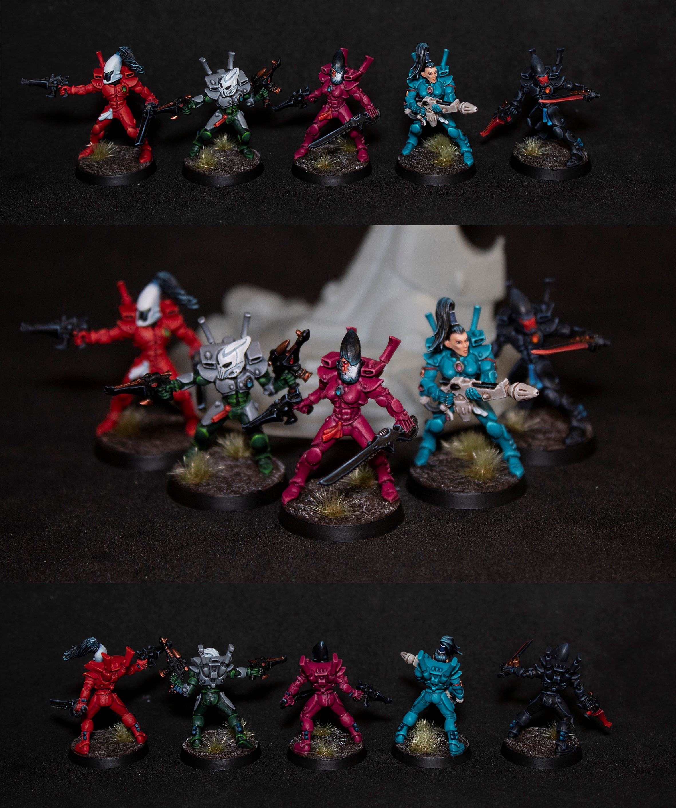
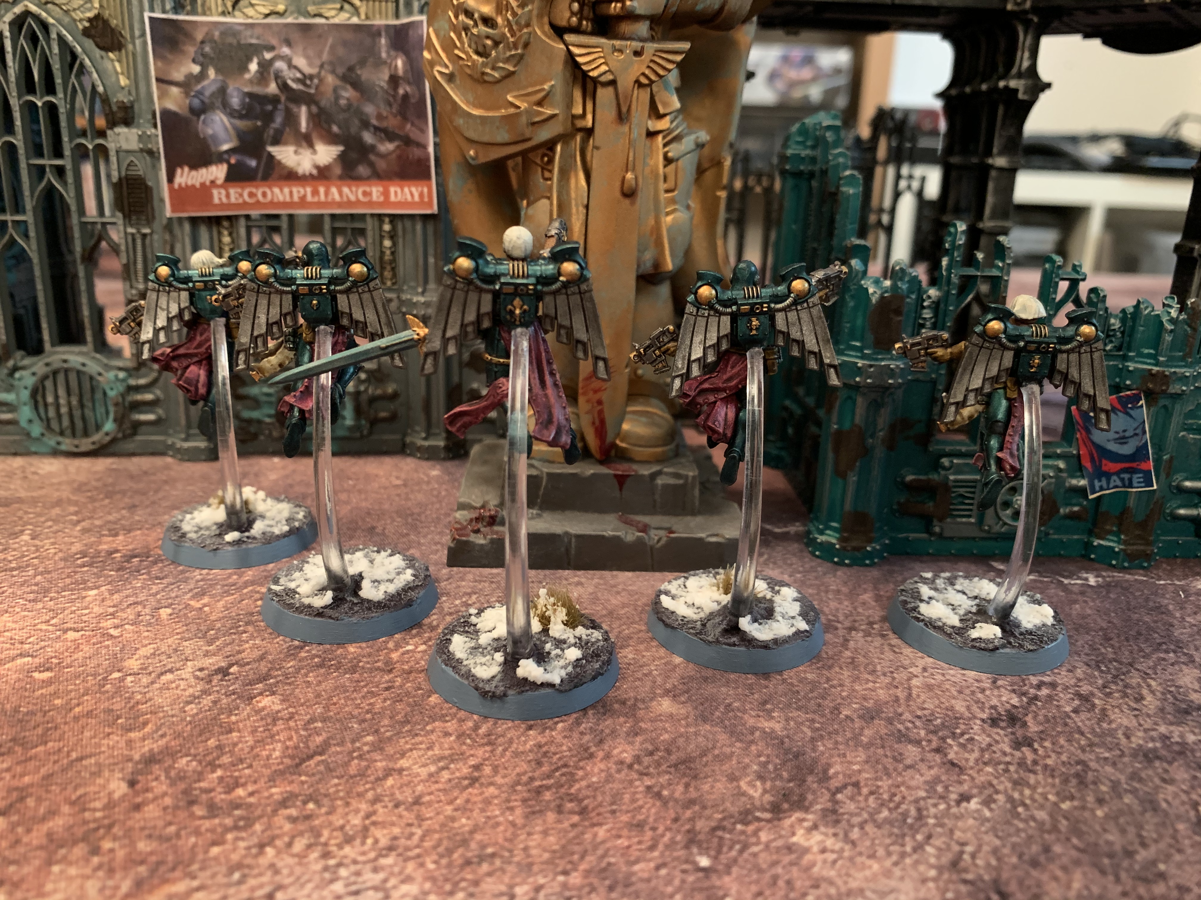
Captain Brown – Phoenix Lord, Objective
Spoiler:
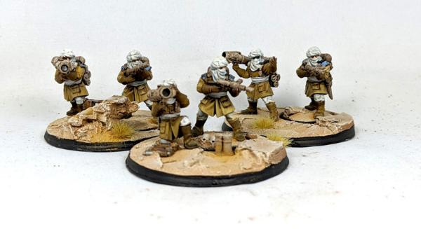
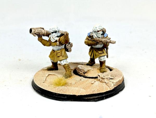
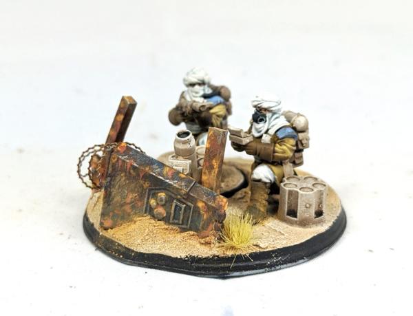
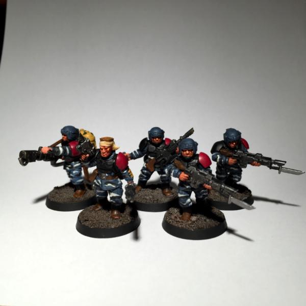
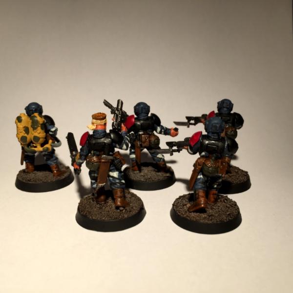
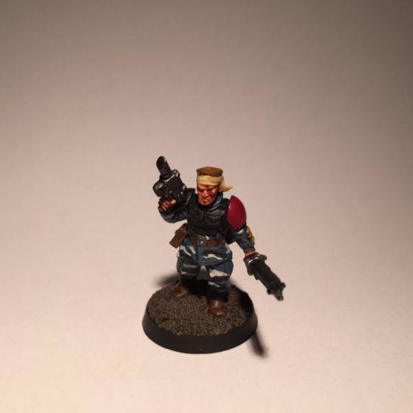
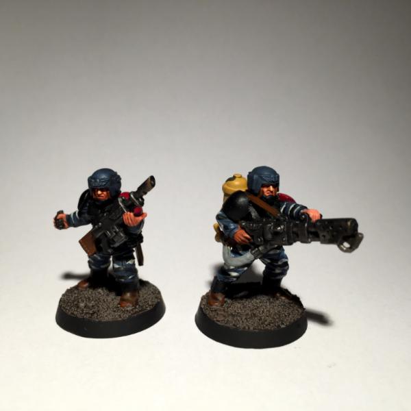
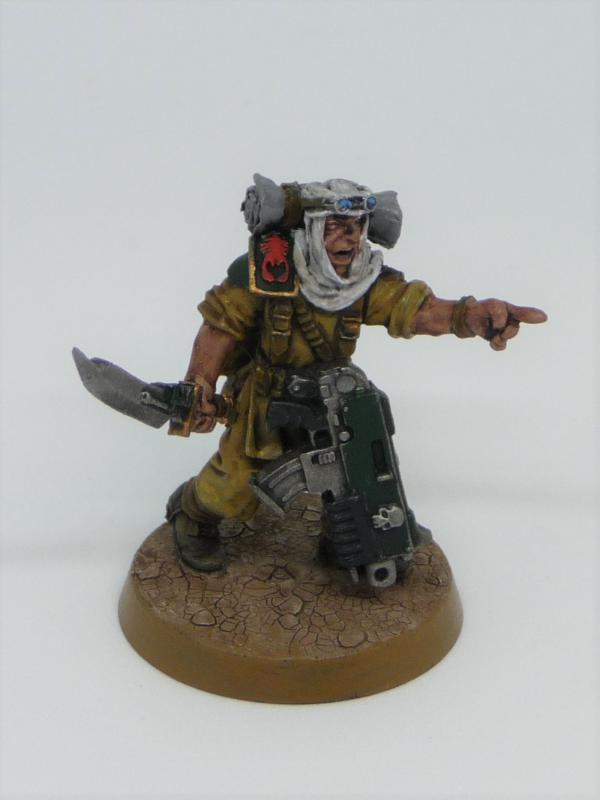
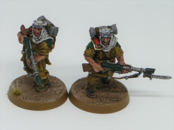
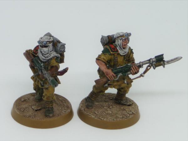
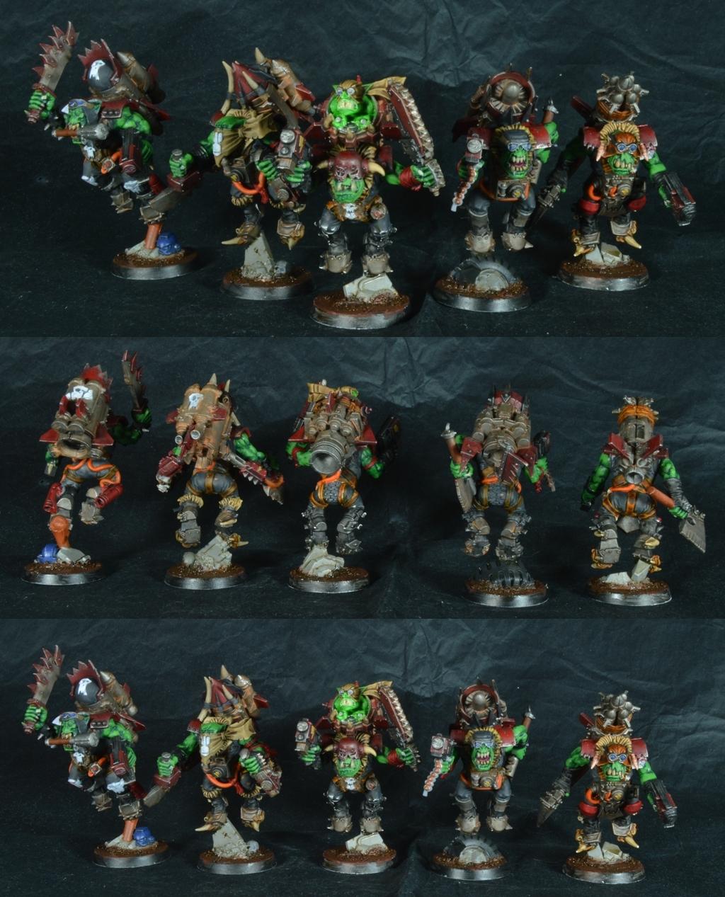
Endtransmission – Tallarn Raiders
Spoiler:
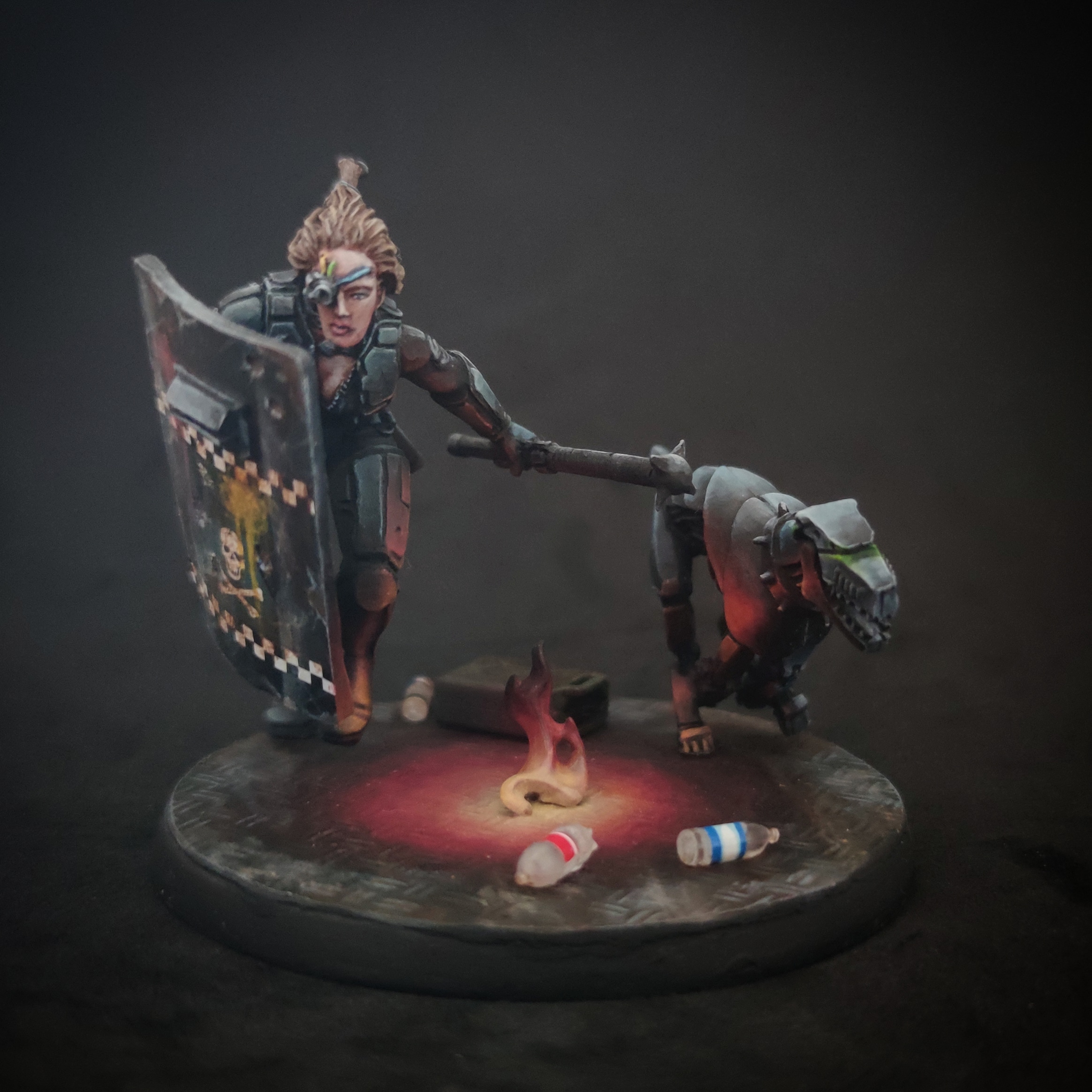
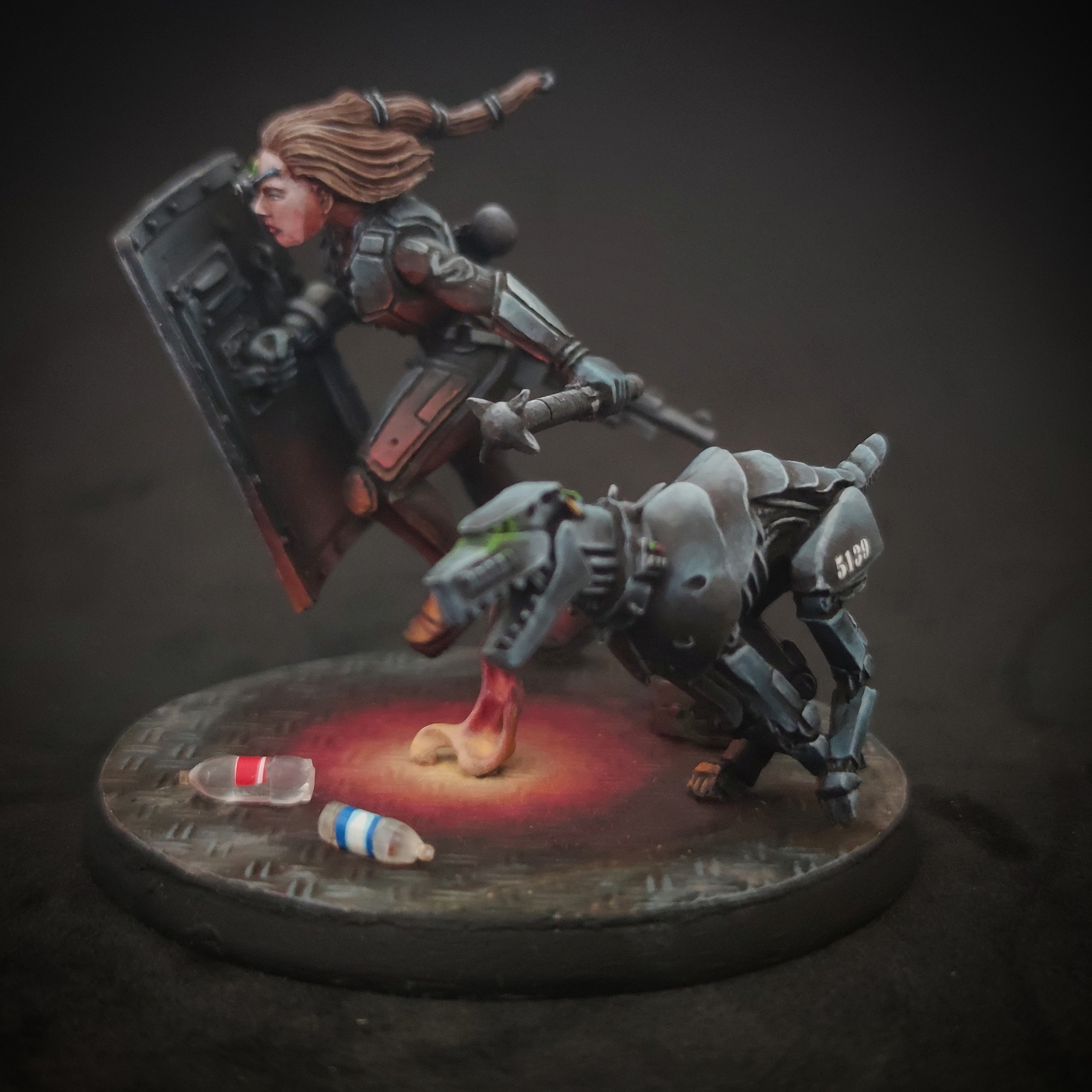
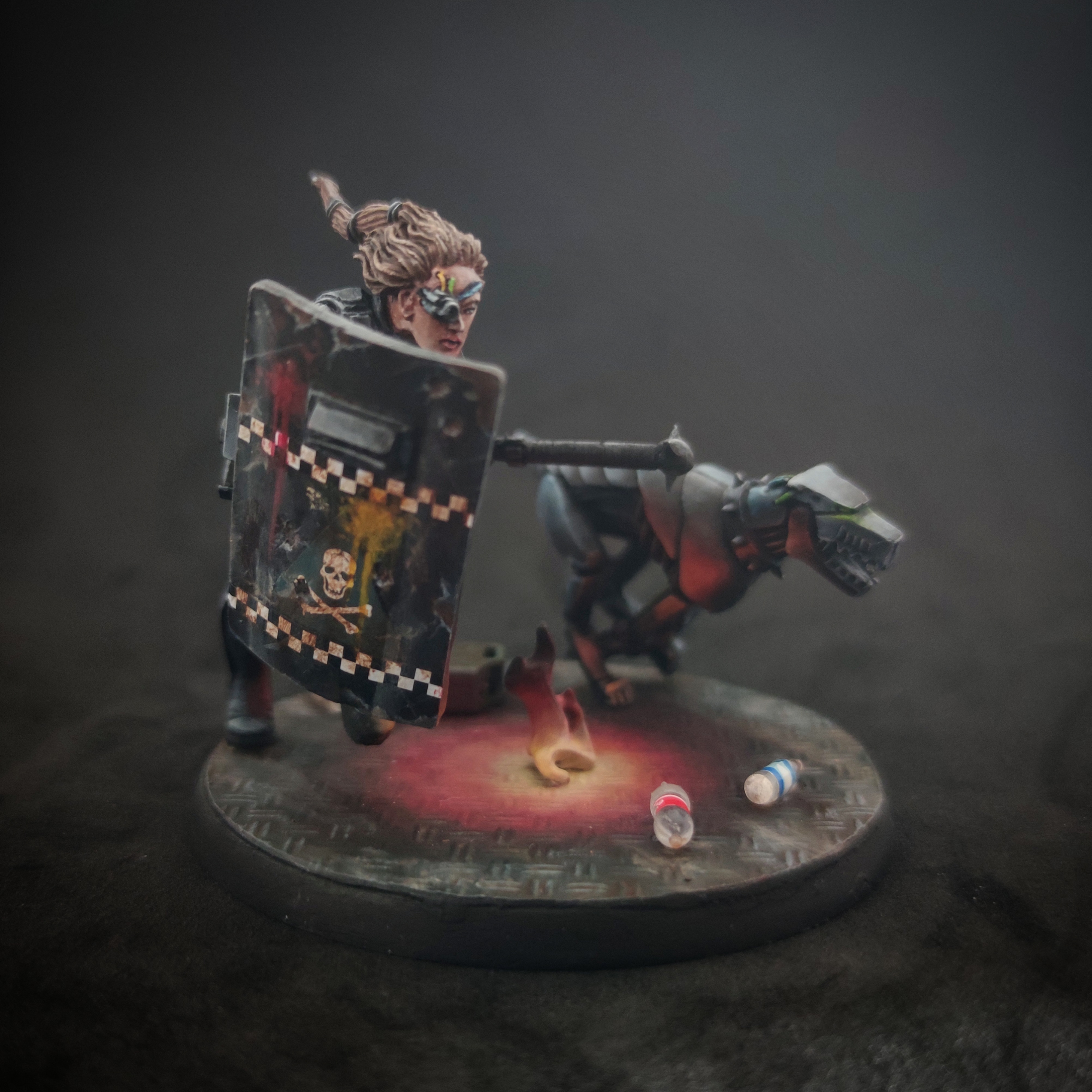
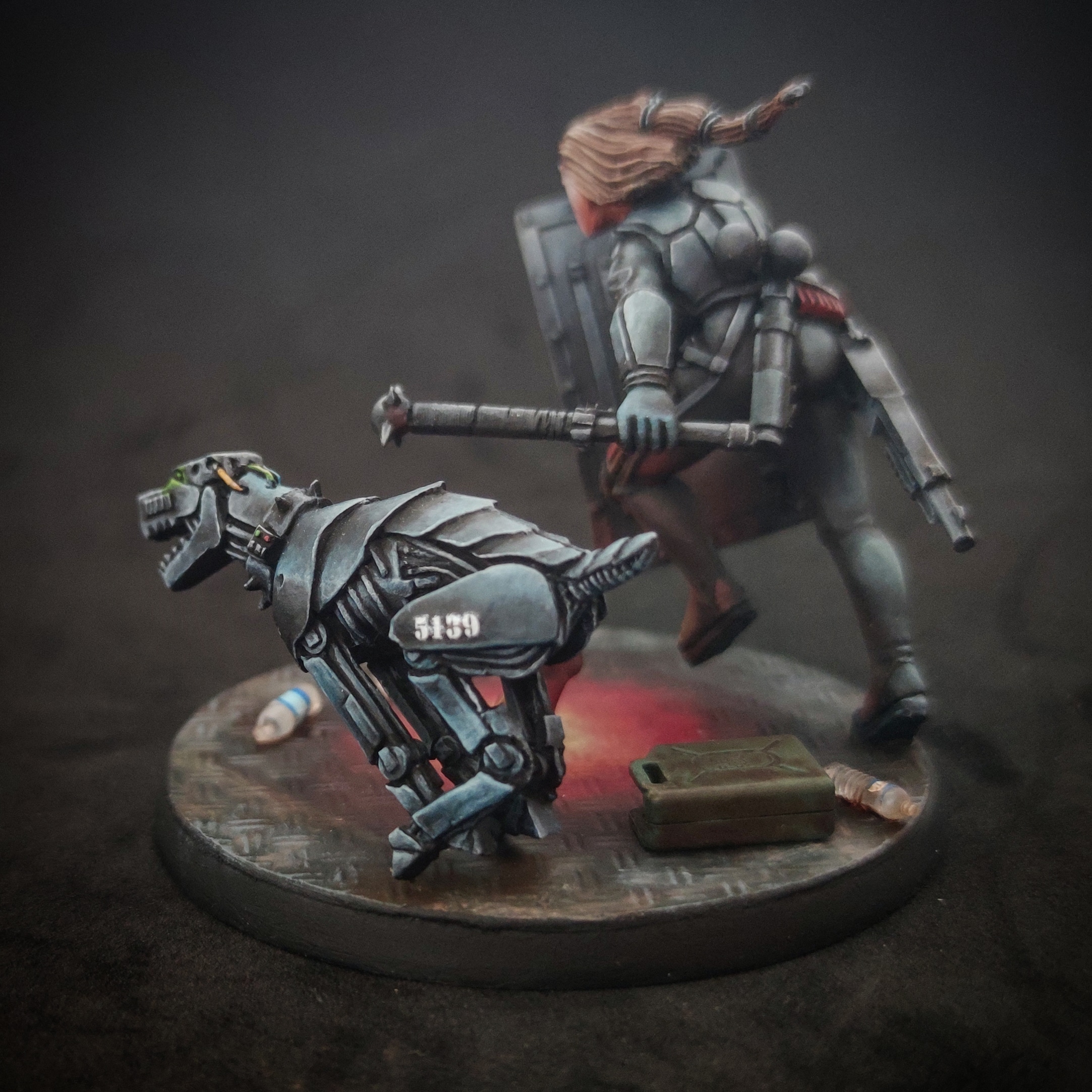
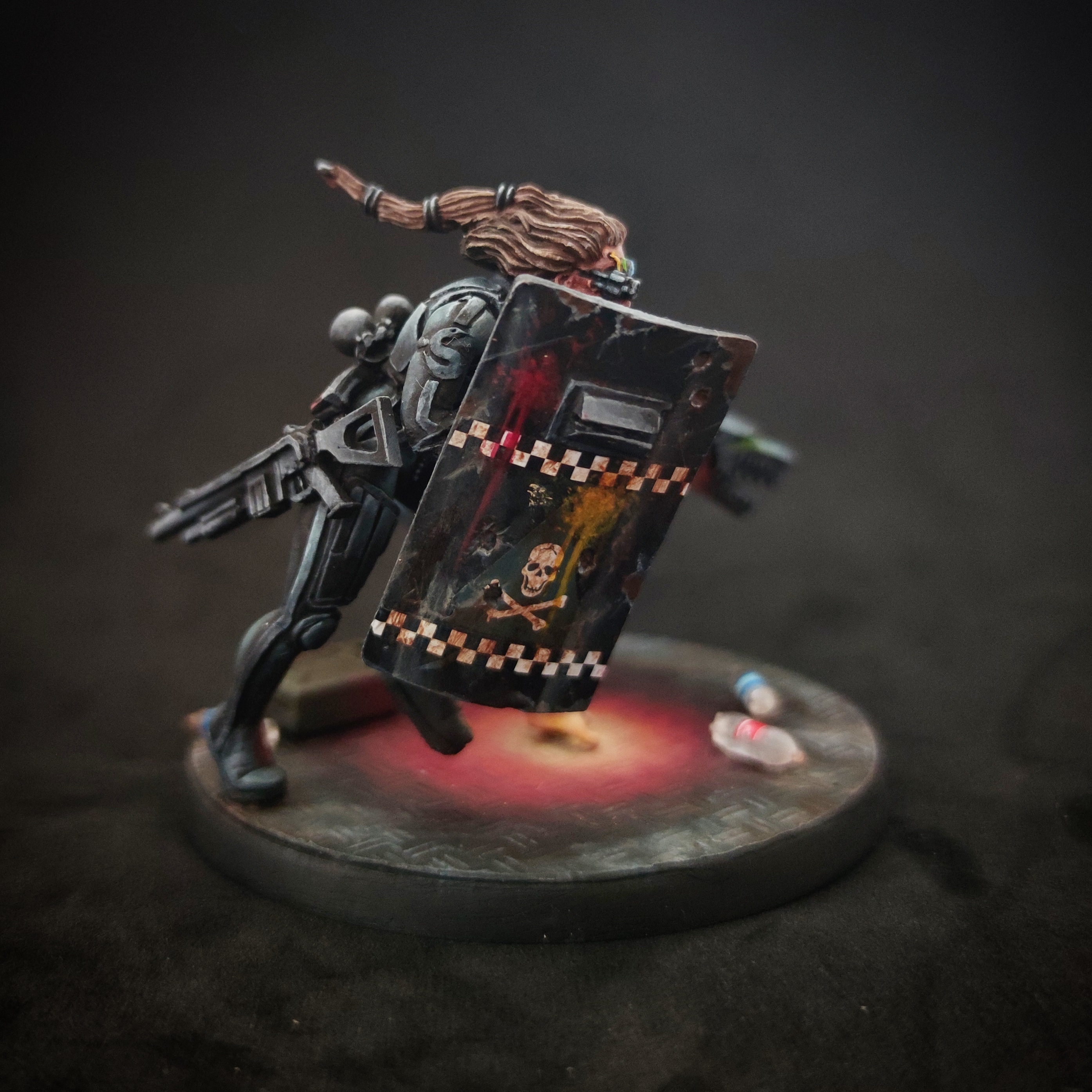
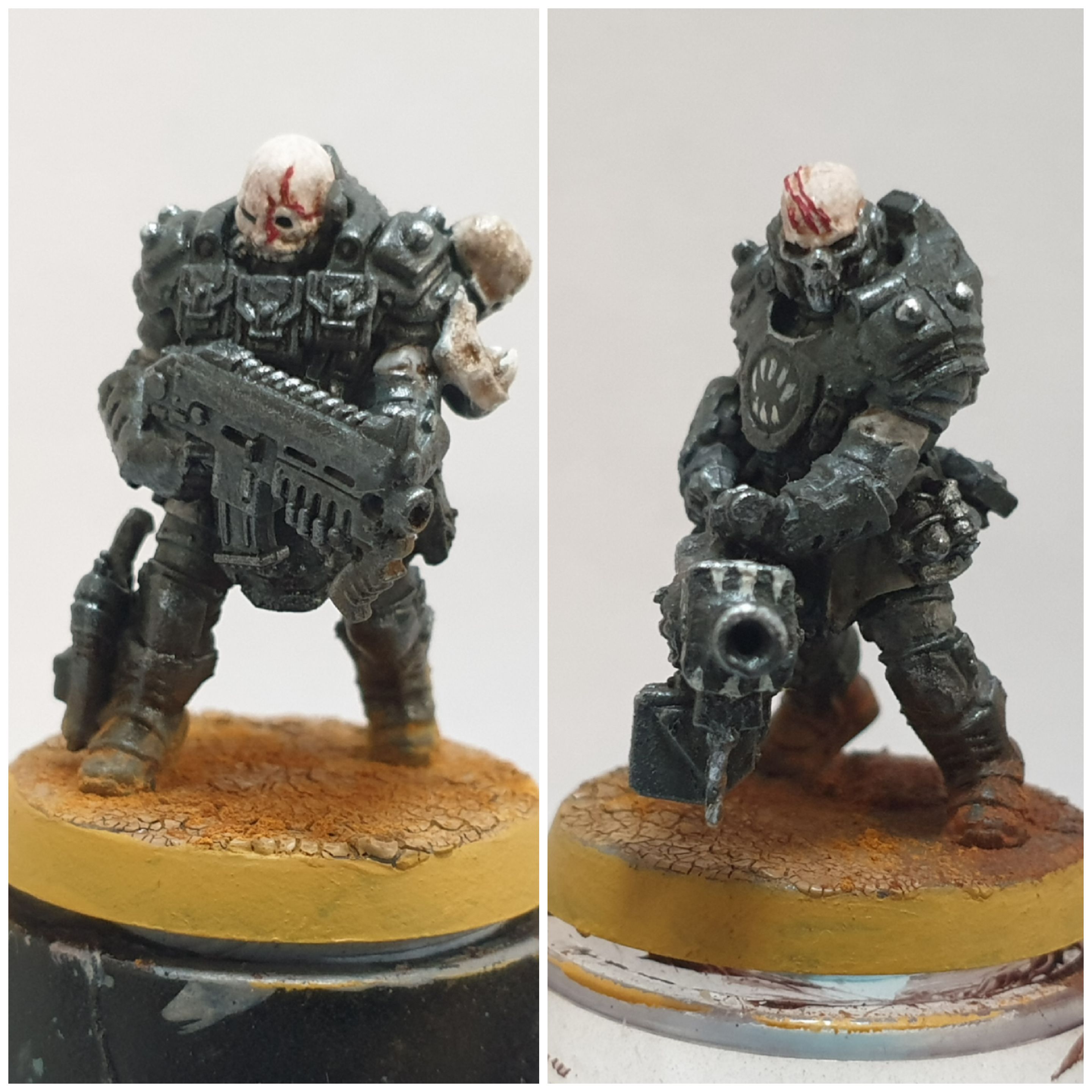
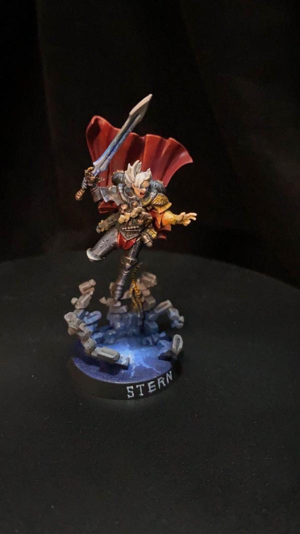
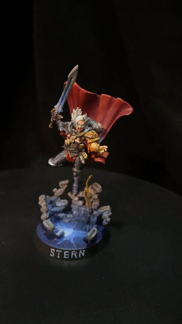
Queen_annes_revenge -- Barbaretta and cyber mastiff
Are we still trying to limit this to 5 votes? It's been a while.
Some great entries, but my votes are for:
- Queen_annes_revenge - I don't like OSL because usually it breaks the laws of physics. So often the light from a lamp/light seems to bend backwards and reflect onto a surface behind it! But this is exactly how OSL should be! In fact, this is so good (I guess so 'right') that I didn't even notice it at first. Also lots of great details like the shield and bottles.
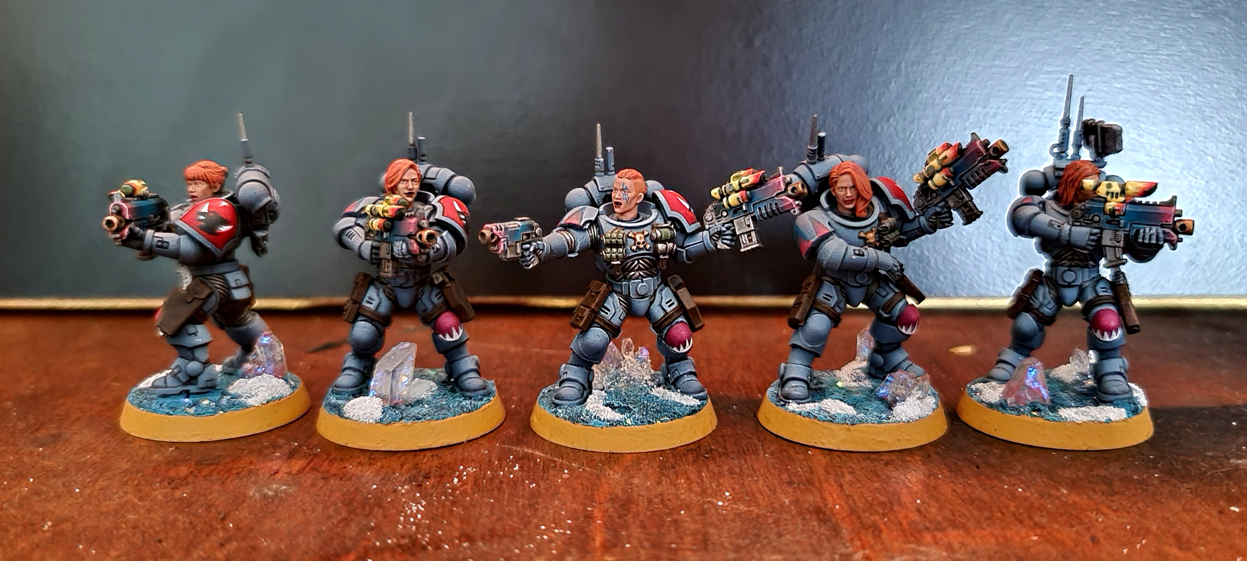
- Jamie Shred - I really like the style of these guys. The wounds and blood is spot on. It's easy to go over the top with that kind of thing, but I think you've nailed it.
- Ezki - Looks more WWII than W40k, I think because it's really caught the setting and environment really well. The snow, rusty barbed wire, mud - all sets the scene nicely.
- Chris56 - no idea what these models are, but the freehand on the robe and sashes is amazing, plus the little details like the gems and toenails. You didn't do yourself justice with the pics - more close ups please!
- Modock - what a great piece. So many nice details. It's hard to get the balance between lots of bland walls, and way too many things going on, but you've got it spot on. Really like the graffiti, but generally the whole tone of the piece.
Well done to everyone who completed (or even nearly completed) something. It can be hard to find the time sometimes. The 2 models I entered are literally the only things I got finished in July. So this is all great motivation.
Dark Angels/Deathwing - just getting started!
Space Marines - Stark Crusaders 4500pts/PL244 (2700pts painted)
Eldar - Biel Tan 2000pts
Space Wolves 1500pts
I think five was the standard suggestion back when we' get maybe 20 entries a month, so it was still a quarter of the field. These days, I think we average around 30-35, so really five isn't that many by comparison.
But yeah. it was only ever a suggestion, it's 100% at the discretion of anyone voting how many or few they go for. If a limit helps marrow it down then by all means stick to it, but likewise, of you want to throw a vote at half or even all of the entries, feel completely free to do so.
2020/08/02 20:26:08
Subject: Re:Vote for the Winner of the 65th Dakka Painting Challenge:Objective Secured.
Whittlesey40k wrote: Are we still trying to limit this to 5 votes? It's been a while.
Some great entries, but my votes are for:
- Queen_annes_revenge - I don't like OSL because usually it breaks the laws of physics. So often the light from a lamp/light seems to bend backwards and reflect onto a surface behind it! But this is exactly how OSL should be! In fact, this is so good (I guess so 'right') that I didn't even notice it at first. Also lots of great details like the shield and bottles.
Thanks! I agree, some osl is just not correct, and often ends up overused on things like vehicles. I think some folks just blast the light area with an airbrush, which often looks false. I've been experimenting more with it lately, but I try to keep it subtle and/or interesting as a focal point, or like in this piece, to add a warm element to an overall fairly cold composition, rather than just any old thing. I study where and how light falls, and things like the inverse square law of light to ensure I'm get the effect right.
Heresy World Eaters/Emperors Children
Instagram: nagrakali_love_songs
2020/08/02 20:26:38
Subject: Re:Vote for the Winner of the 65th Dakka Painting Challenge:Objective Secured.
Zed wrote: *All statements reflect my opinion at this moment. if some sort of pretty new model gets released (or if I change my mind at random) I reserve the right to jump on any bandwagon at will.
2020/08/03 07:50:51
Subject: Vote for the Winner of the 65th Dakka Painting Challenge:Objective Secured.
So many really beautiful models. I really like the Barbaretta and cyber mastiff. The light from the flare was done really nicely and the models were painted very cleanly.
2020/08/03 12:15:36
Subject: Re:Vote for the Winner of the 65th Dakka Painting Challenge:Objective Secured.
Great round! Some random comments while going through the list -
JamesY - These *are* zebras under the armour, right? Really like your take Chaos in general - rather down-to-earth 'barbarian' hordes but still fittingly weird & ornate for Chaos!
QAR - Always fun to see Inq 54 minis pop up, great job with the weathering & effects here obvi
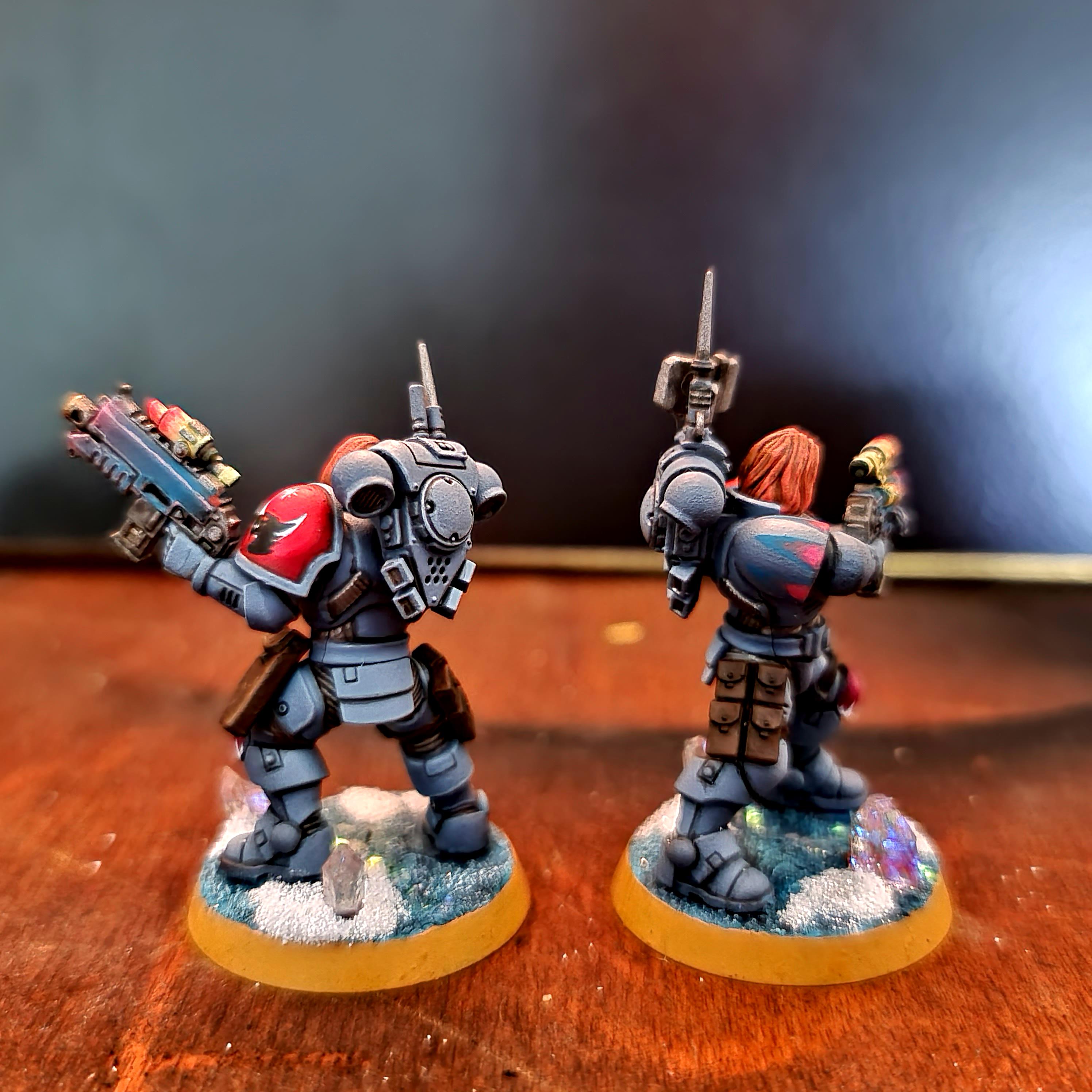
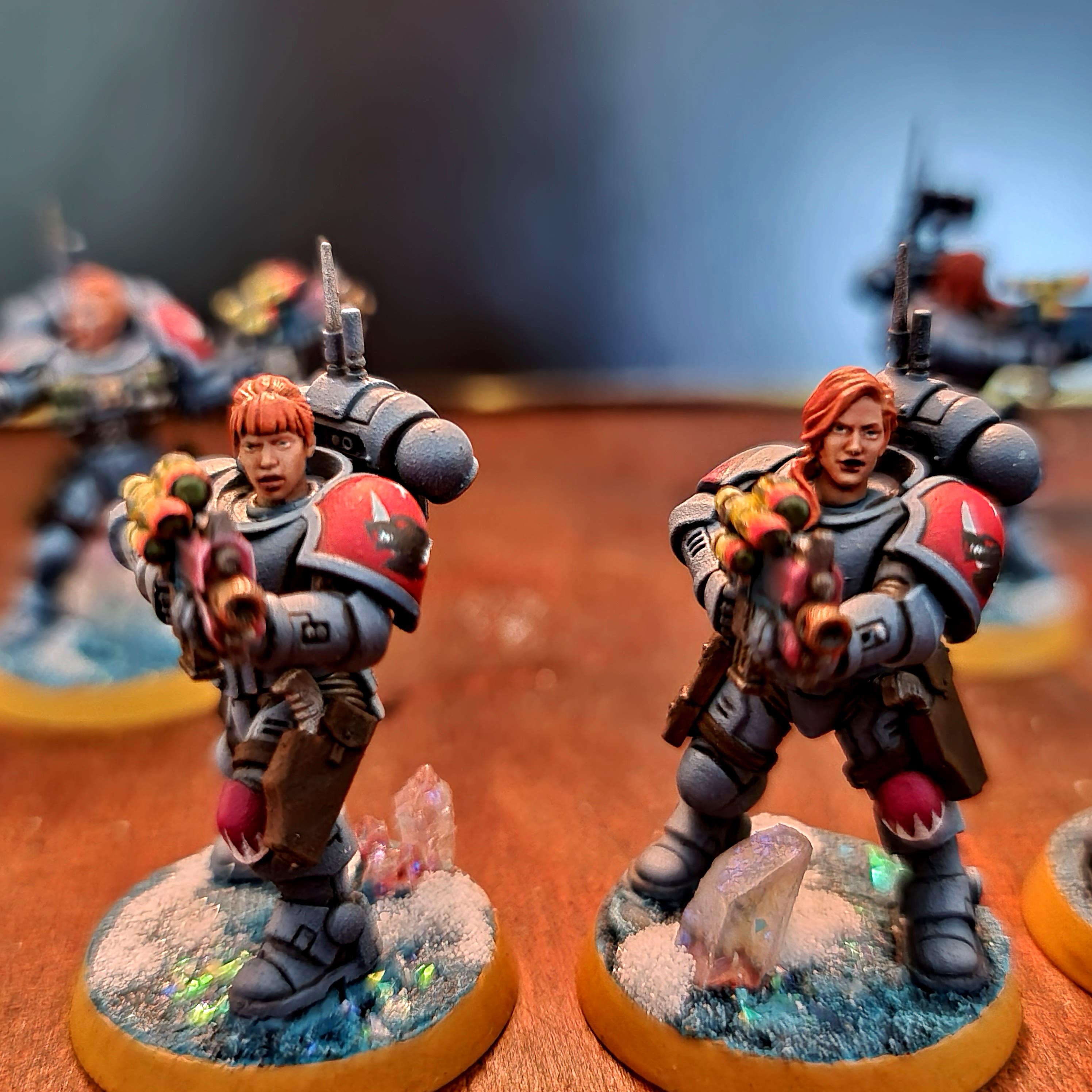
Freya - These turned out so good! Also interesting how well the tacticool primaris armour works with the female heads.
Mothsniper - Super interesting, somehow 'cel-shaded' look
Jadenim - These are Victoria Miniatures, right? I always like how they carry on with this tough-but-cartoony 2000AD style, and your paintjob makes this work well, too.
Ezki - Awesome weathering, I'd really want to keep clear of these barricades (and the cannon, too)
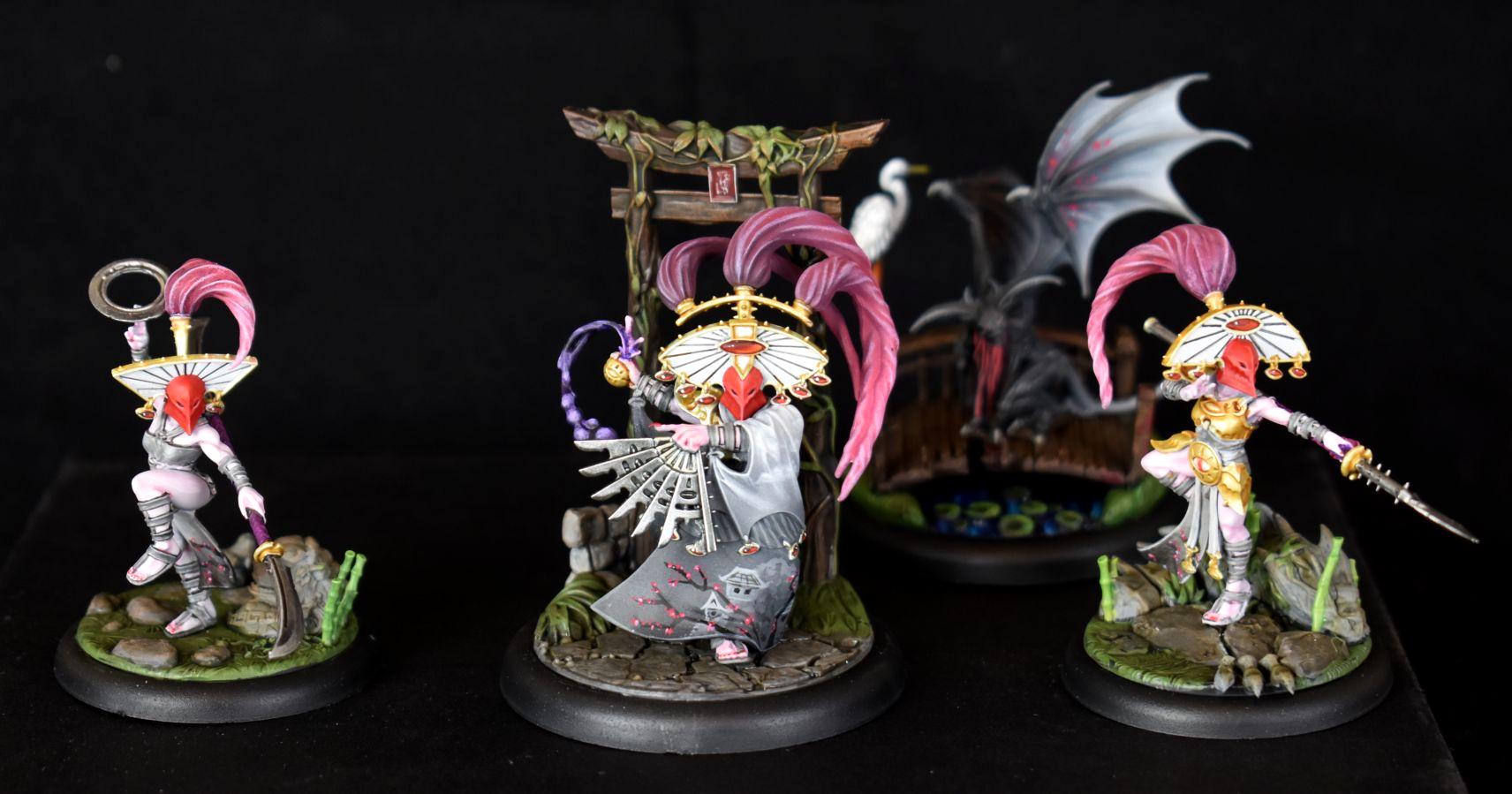
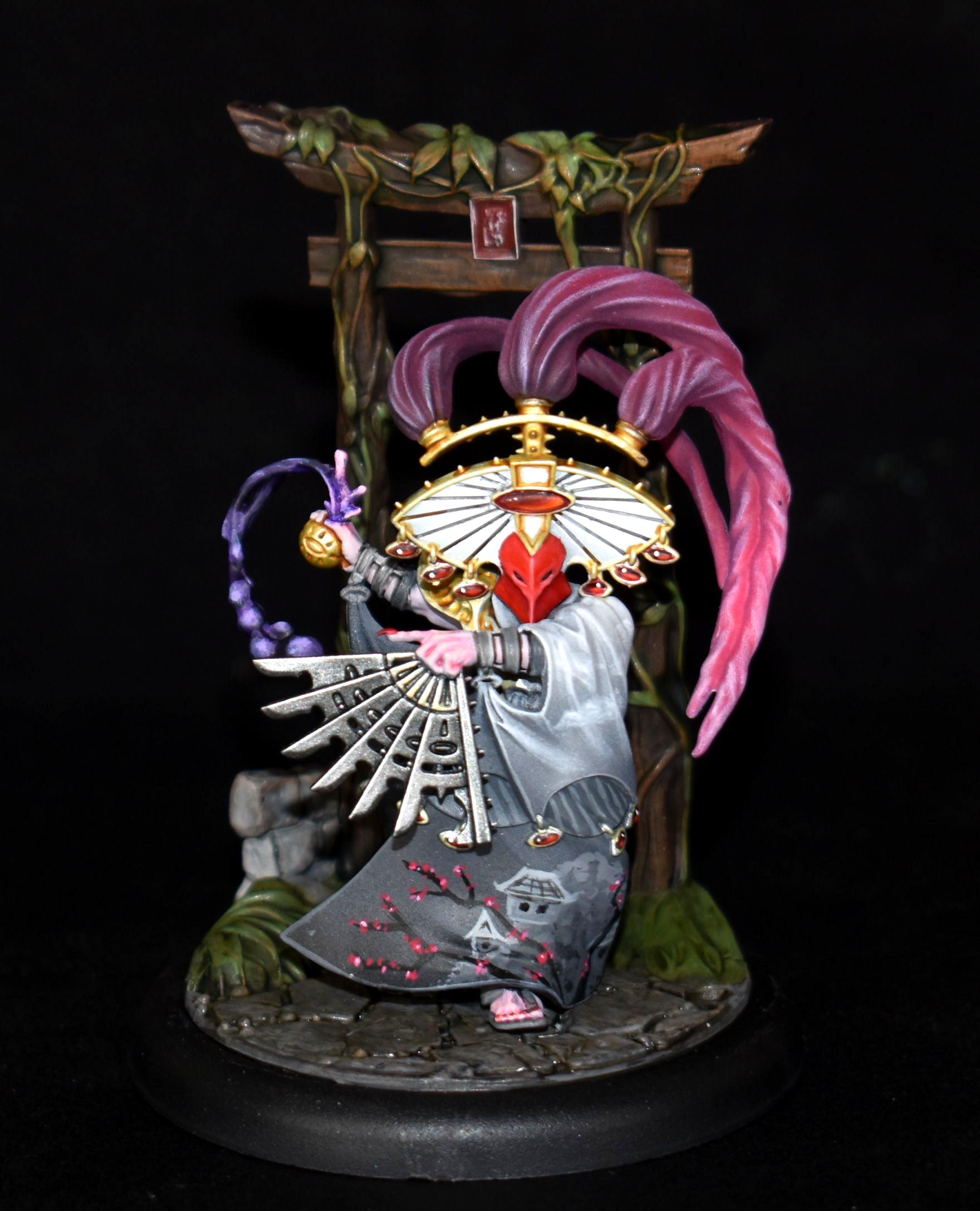
Chris56 - Yeah, that's my favourite this month! Warcry is my fave current GW range anyways and you really brought out every inch (or rather mm) of Wuxia in these minis.
Feltmonkey - ha, the no-nonsense but still atmospheric paintjob kinda even sells the assault intercessors better to me than the 'official' ones ^^
~~~ I Love The Power Glove. It's So Bad. ~~~
2020/08/03 14:43:54
Subject: Vote for the Winner of the 65th Dakka Painting Challenge:Objective Secured.
Thanks MobileSuitRandom; yes, these are the new VM Desert Scorpions. I’d been using her stuff for a while, mixed in with various other third-party bits, to convert my Tallarn and I was psyched when she finally released her own take on the regiment.
Zed wrote: *All statements reflect my opinion at this moment. if some sort of pretty new model gets released (or if I change my mind at random) I reserve the right to jump on any bandwagon at will.
2020/08/03 19:34:58
Subject: Vote for the Winner of the 65th Dakka Painting Challenge:Objective Secured.
@mobilesuitrandom thanks for the kind words. I had actually intended to paint them as zebras, but didn't as they are nearly all barding and not much skin, so thought it might look too busy against the ornaments on the armour. I'm pleased with the way the overall scheme is coming together; they are a part of what will be a huge grand alliance of chaos, so I wanted a scheme that would work if used as a part of any monogod army, which is more limiting than you'd first think.
Thanks for all the votes so far, I intend to try and leave a comment for everyone this month, which I'll do another time.
I've voted for more, but here are just a few comments:
Whittlesey40k: Nice work on the cape, I like that kind of wizard-ish look.
Endtransmission: You don't see desert fighters so often, but you did a great job here. The bases really support the theme and I love the weathered barricade in the third pic.
Queen_annes_revenge: The metal blending is very inspiring, same thing goes for the OSL. I like the (paintball?) spots on the shield.
CancelledApocalypse: Beautiful paint job on all of them. The skin on the lady looks incredibly clean. She and the black Guardian are my favorites of the bunch. Do you have more pics of the black Guardian against a white background?
JoshInJapan: I'm digging the lighting effects here.
Freya: Clean paint work, the crystals make the bases look just that extra interesting.
Mothniper: Visually very interesting models, it's hard to stop staring at this explosion of colors. So much color variety on small figures doesn't always work, but you did an excellent job and I like the geisha-like faces on some of them. Do you have plans for a whole army in this theme? It would be a great entry for AOP!
Ezki: Just as Whittlesey40k said, I'm also seeing a convincing WWII scene here. Very well done.
Chris56: Wonderfully painted and that cloak is so eye catching. The oriental theme works very well with these models, good choice!
Paradigm: Interesting outcome, all the pics are like I'm looking at a complete painting with those frames. Nice!
Maxwin: Awesome blending on the green power weapons.
Modock: Getting a Bladerunner vibe there. Sweet!
Feltmonkey: Is it the actual lighting + black background or did you paint the lower parts darker than the rest?
Midget Gems: These models always put a smile on my face. What a crazy bunch! I like that red/brown color on some of the metal parts. (Personally I'd add some fire/smoke/power effects on the exhausts.)
Ms07b3: Nothing wrong with the models, but the bases steal the show IMO. The exploding/floating stuff combined with the lightning make it look like a scene from a superhero comic.
My Magic Pillar:
Thanks for all the votes! I would've added some OSL on top of the pillar and "energy" colors in the cracks, but I didn't have more time. Still pretty satisfied with the result, it was a fun project.
2020/08/04 12:34:05
Subject: Re:Vote for the Winner of the 65th Dakka Painting Challenge:Objective Secured.
Tim 121RVC wrote: I've voted for more, but here are just a few comments:
Queen_annes_revenge: The metal blending is very inspiring, same thing goes for the OSL. I like the (paintball?) spots on the shield.
Thanks! The marks on the shield are not supposed to be paintballs, but more paint bombs. I took inspiration from the old riot police photos from Northern Ireland and the like, where the cops always had paint all over their shields.
This message was edited 1 time. Last update was at 2020/08/04 12:34:19
Heresy World Eaters/Emperors Children
Instagram: nagrakali_love_songs
2020/08/04 22:45:44
Subject: Re:Vote for the Winner of the 65th Dakka Painting Challenge:Objective Secured.
Thanks for the votes, and thanks for the comments, MobileSuitRandom and Tim 121RVC. Tim, yep the upper areas are painted quite a bit lighter than the lower areas, to direct the eye to the head, chest, and shoulder areas. I edge highlighted the lower armour a few shades darker than the upper areas as well. That's a good way to add some atmosphere, realism, and scale to something like Space Marines. The photos flattened out quite a lot of what I did on the minis, so they look pretty flat. I think I went a bit understated and ended up with nothing eyecatching on the models. The weathering is really subtle and the edge highlights similarly so, so you don't even see them in the photos. Oh well.
Nevelon - These are great. I like the camo pattern a lot. Still not a fan of that metallic green though, sorry. Thanks for stepping in to help Para out.
MobileSuitRandom - Grim, grubby, and atmospheric. I like the muted tones. I'm not sure why they've all dyed their hair rainbow colours though. Fighting their way to a disco, perhaps?
Vejut - At first glace I thought, "bloody hell he's painted loads of those." Then I realised it was four photos together. It's a nice looking regiment of cat women, albiet smaller than I originally thought.
JamesY - Superb job on these, and nice to see them in such big clear photos! The blue tones on the cloaks and the horses' skin really complement the bronze well.
Whittlesey40k - Good bold painting here. You've really captured Eisenhorn, I think.
Captain Brown - Really bright, solid, eyecatching stuff.
Endtransmission - Nice clean work, with a very real-world-army feel.
Queen_annes_revenge - Great work on an interesting couple of models. The OSL on the mechanical dog is very nice.
CancelledApocalypse - Super clean, super neat, and very strong colours. I just noticed the guy with the broken faceplate! Cool.
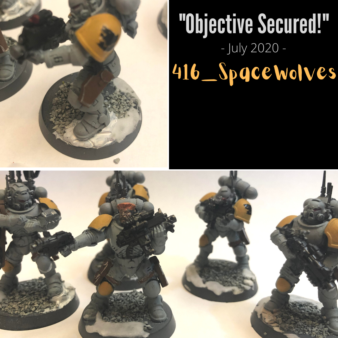
416_SpaceWolves - The guy with Space Wolves in his name paints... Space Wolves! Damn, I had my money on Blood Angels. What you've got there is pretty neat, but it looks sort of basecoated so far. The armour could do with a wash or something to separate out the panels. Or, if you don't want to darken the armour panels you could do what I did, and use the Black Templar Contrast paint to black line the armour panels. You have to thin it a bit with the contrast medium, and only use a small amount on your brush, but you can touch it into the recesses and the capillary action kind of pulls it into the edges around the armour.
Pariah Press - Cool models, and well painted. I see the twin guns in the middle of the body as eyes, and the vent underneath as a nose, and I can't unsee that. It's like they're all looking at different stuff. The one on the right has spotted a bird.
JoshInJapan - Lovely to see some nicely-done scenery, especially made out of household stuff. The main console is a cheese container isn't it? I love camembert, so that would have been worth a vote in itself just for the cheese. I'm not sure what these comments even are any more. I like your scenery.
Jamie Shred - Braaaaaaaaains. These are so bold and colourful they look like they've lurched off the pages of a comic book.
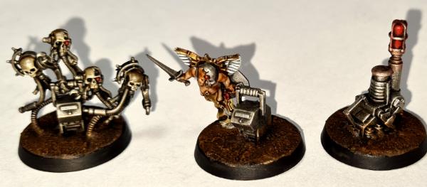
DV8 - Cool, weird mechanical worms. I love the bases on these so much. Quite simple, but gorgeous colours.
Freya - Great painting, and a nice concept to make them women. I'm personally fully signed up to the female Space Marines movement. We've got female Stormcasts now and they look really cool, so why not?
Deadshot - Nice simple but decent objectives. The question remains though - how secure are they?
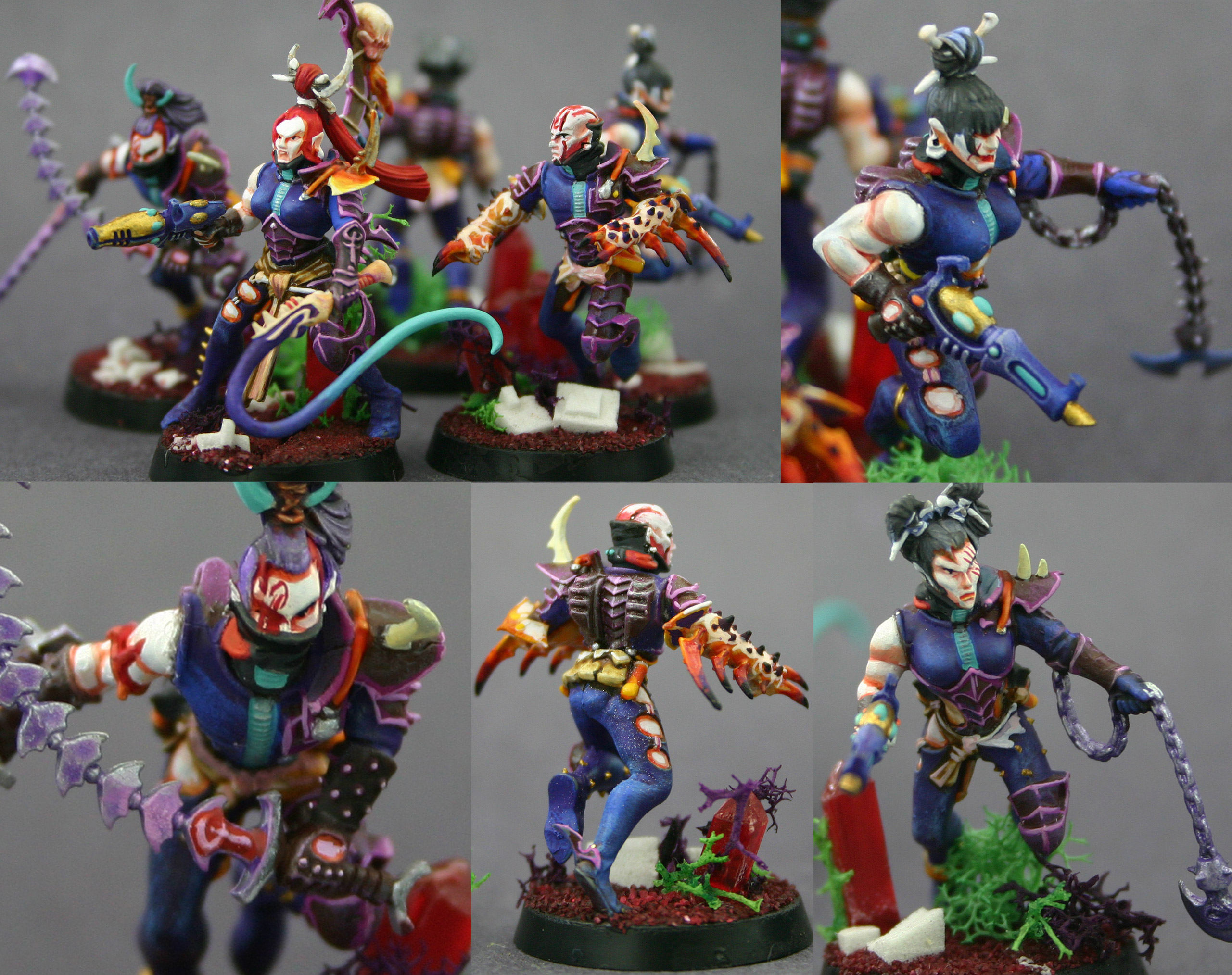
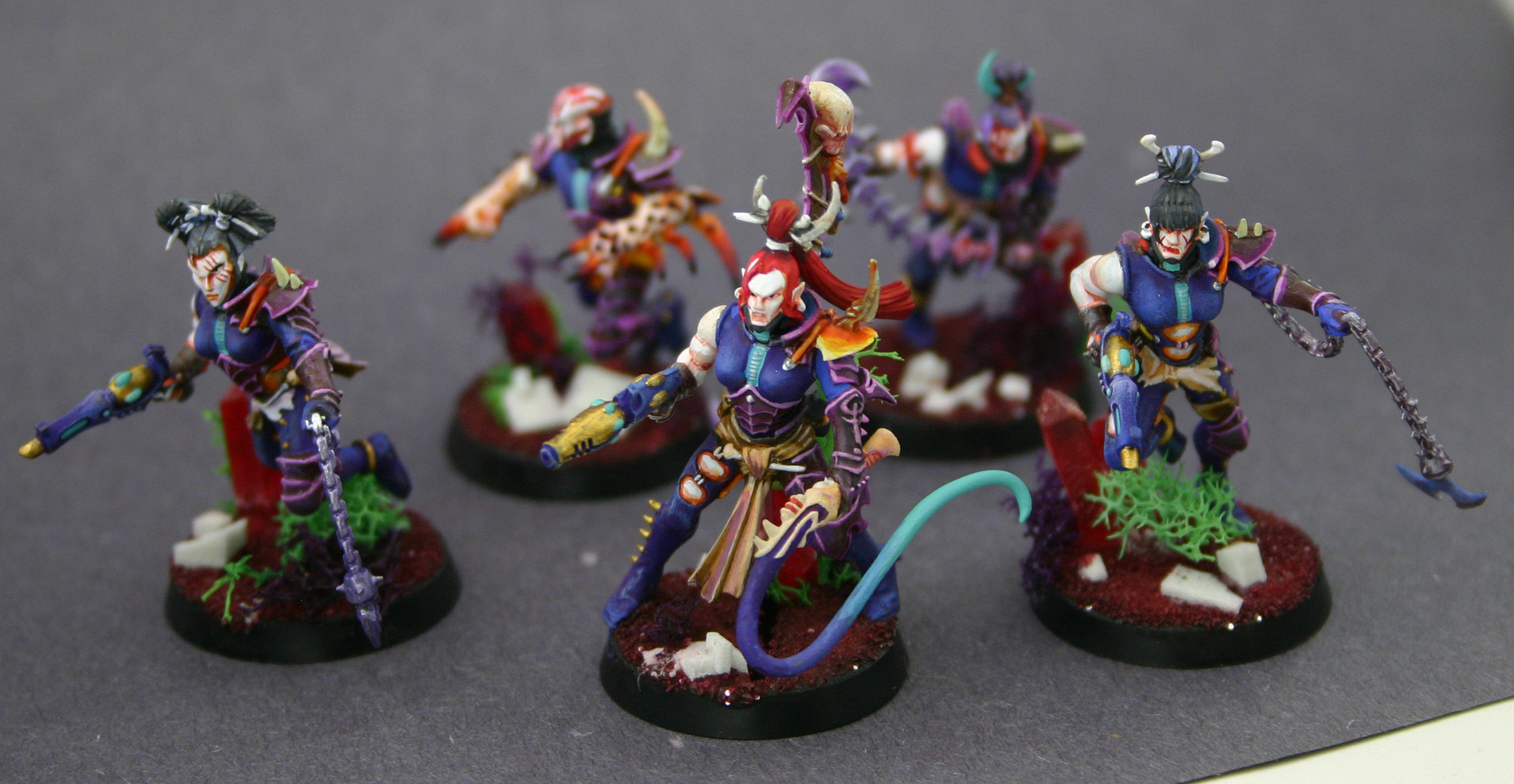
Mothniper - Really colourful! Almost too many colours! These are going to look eye-catching on the table. I really like the face paint/tattoos.
JustALittleOrkish - Great painting, really unusual colour choices. You're not going to come across anyone else with the same colour scheme!
Viterbi - I always like your terrain backdrops. The sisters themselves are cool, with loads of details picked out. The more I see of the Sisters of Battle, the more I get the urge to get hold of some of them to paint myself.
Thechosen1 - A nice camo scheme. I also like to see someone else who doesn't feel tied down to a particular brand of paints. And for that matter, someone who, like myself, has some P3 paints but has never got round to opening them.
Turaxa - Really neat camo. This squad look like the cast of an action movie. Everyone except the guy with the bandana is about to be murdered by the Predator.
Jadenim - A lot of real-world inspired guardsmen this month. I like how knackered they look, and I don't fancy that one guy's chances of firing that bolter without falling on his arse.
Timppaka - Quite imposing and atmospheric. I like the runes painted onto the armour.
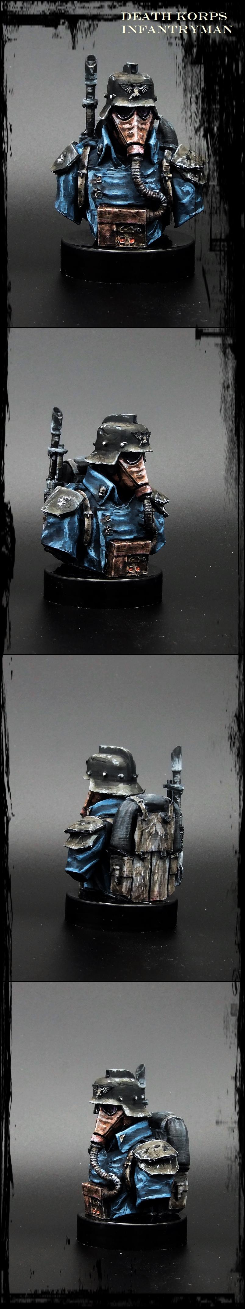
Ezki - Quality stuff this. DKoK are so very grimdark, and you've got that here, with the rusty barbed wire and the mud. Nice work.
Chris56 - Amazing freehand and a fantastic interpretation of these models. Beautiful work.
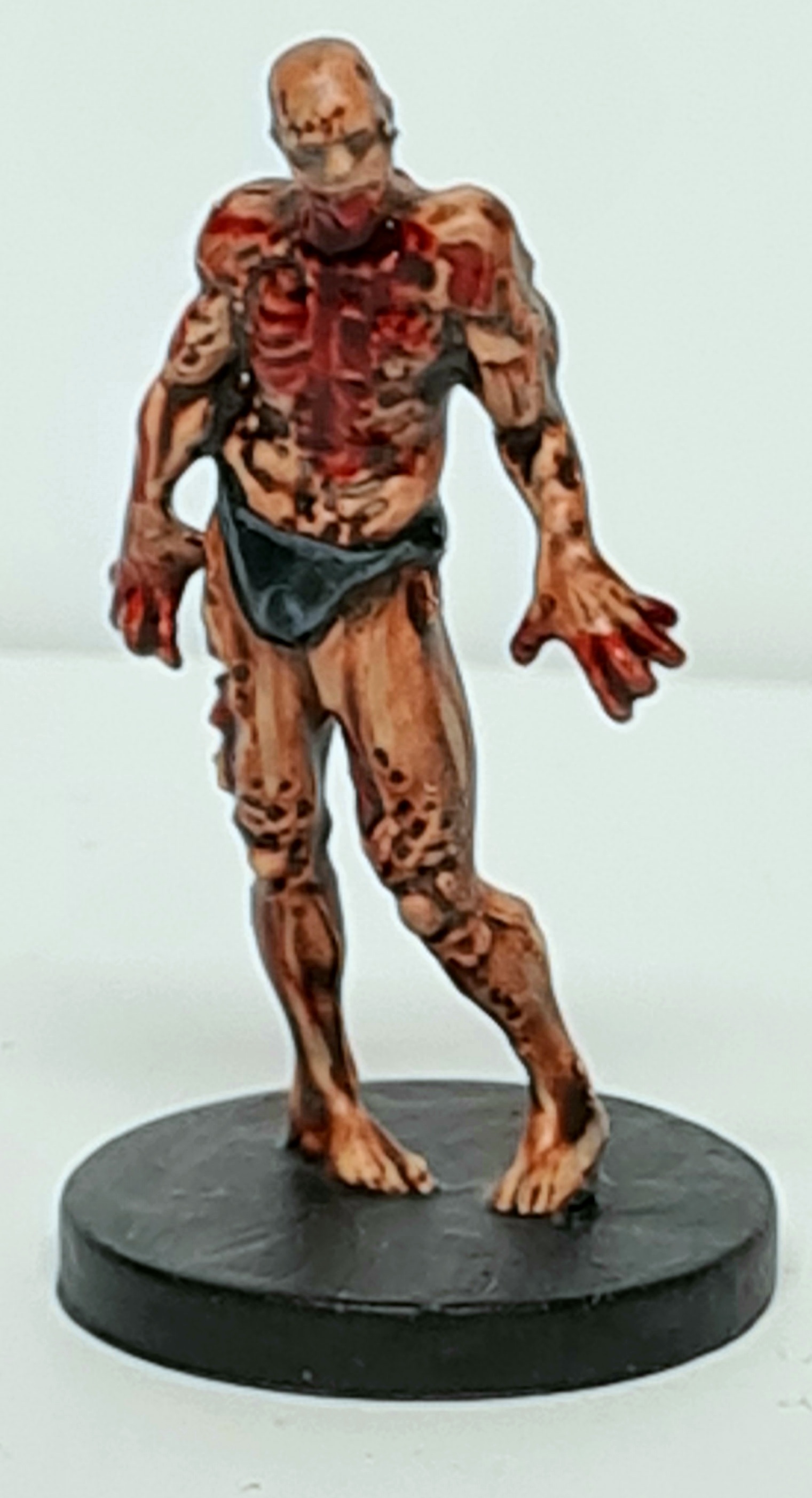
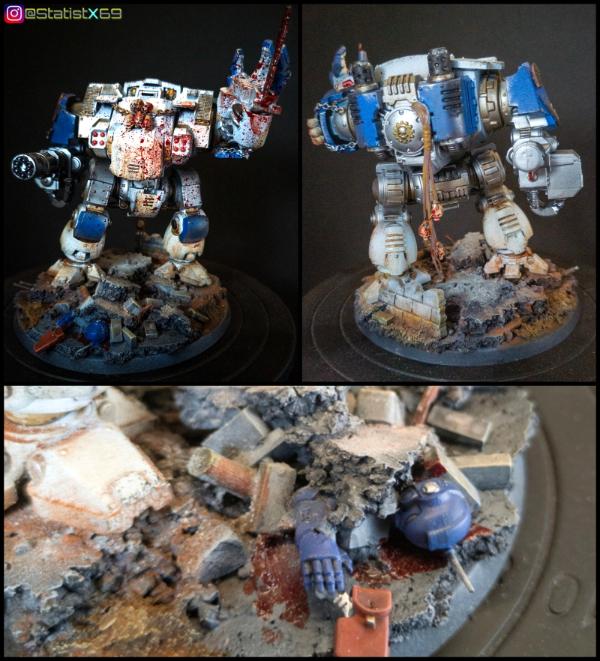
Statistx - You've got good movement in the pose, and obviously the gore is eyecatching. Has he trodden on one of his own guys?
Paradigm - That's a really cool bust. Where did you get the file for 3D printing it? Not that I have a 3D printer, but if I ever get one, I reckon that bust would be a cool mini to paint. Your interpretation is great, loose and atmospheric as usual.
Tim 121RVC - Simple, stark, phallic. Good stuff. There's something about the colours that instantly makes me think of 1990s White Dwarfs.
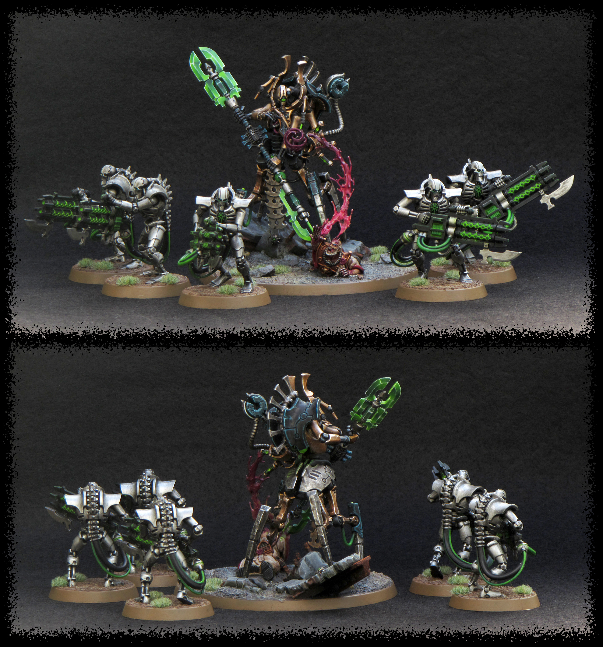
Maxwin - Super work. The basic troops are an example of how a traditional Necron paint scheme can still look good, and the HQ guy is pretty spectacular. The blades look excellent.
Modock - This is pretty ridiculous. It looks amazing. Are the posters printed out? What about the graffiti?
Midget Gems - Glad you managed to get them finished and photographed (I understand the latter part was the most difficult bit!) I like the little touches like the flying helmet and the Ork with the stick grenade in his mouth.
Maharg - Very nice and clean. The purple is great, and looks very regal.
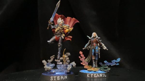
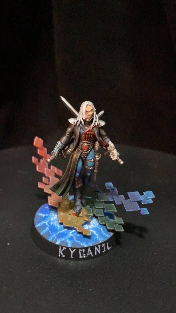
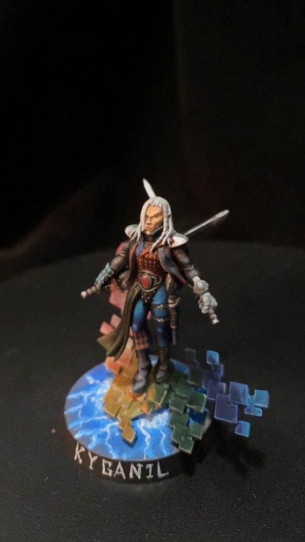
Ms07b3 - I'm not a fan of these models personally (that stupid upside-down cloak) but you've done a nice job on them both. Great job on the diamond patterns on Kyganil.
Great job everyone! It's excellent that we are getting so many entries, and of so good quality, with so many different approaches being taken every month. I haven't even had a proper look at what people are doing for "Mastermind" yet. The challenge goes from strength to strength!
2020/08/04 23:26:01
Subject: Re:Vote for the Winner of the 65th Dakka Painting Challenge:Objective Secured.
Thanks felt! I always look forward to your comments each month, they're always insightful and you often point out things I hadn't noticed on various models. Yep, the helmet is drilled out and the shattered faceplate and face underneath is modelled with greenstuff. I wanted to do that because the craftworld for that model is Altansar, which got stuck in the eye of terror for millennia. They never take their helmets off and no-one knows why. It's not super visible, but the black eye and white pupil are my take on what's underneath. Also, the crying blood - though that could just be because of the impact that shattered the helmet.
Loved your dark angels this month! You say my entry is super neat, but it pales in comparison to yours - beautiful work! And the mud and grime around the feet and lower legs just looks perfect.
CancelledApocalypse: Beautiful paint job on all of them. The skin on the lady looks incredibly clean. She and the black Guardian are my favorites of the bunch. Do you have more pics of the black Guardian against a white background?
I don't, but I could probably take some more. It was really late at night when I was taking the photos and when I got to editing them together, I realised I didn't have a particularly decent image of the black (Arach-Qin) guardian. By that point, though, I didn't have the energy to go set up again and take more.
This message was edited 1 time. Last update was at 2020/08/04 23:32:04
2020/08/04 23:33:08
Subject: Vote for the Winner of the 65th Dakka Painting Challenge:Objective Secured.
I've been tempted by a resin one like an Elegoo Mars, but I think I'd need to turn my garage into a 3D printing space, because they're rather messy apparently.
This message was edited 1 time. Last update was at 2020/08/05 00:55:23
2020/08/05 00:04:03
Subject: Re:Vote for the Winner of the 65th Dakka Painting Challenge:Objective Secured.
Thanks for the kind comments, Whittlesey40k, Jadenim, MobileSuitRandom, Tim121RVC and Felt!
Some great work from so many this month - I voted for a quite few, including:
JamesY (they are zebras in my head, too);
QAR ('cos obviously great detail and blending);
CancelledApocalypse (for those awesome helmets!!);
Freya (for the great gradients and fantastic feminism);
Modock (for the Giraldez-shaming shading and use of vibrant Infinity-colour);
Felt for the subtle detail and shading; and
JustALittleOrkish (this was one of the most interesting entries I've seen for a really long time...your use of solid, contrasting block colours has really made me stop and think...I love these and I want to find a way to steal your idea here...thanks!).
All the best to everyone and thanks as always to the fantastic team who do all the work!
Skirr and Skiver, Fancyman of Cornwall and Best Friend of your Mother's.
2020/08/05 00:32:50
Subject: Re:Vote for the Winner of the 65th Dakka Painting Challenge:Objective Secured.
Thanks Chris56! Your Cypher Lords look fantastic, they were an instant vote as soon as I saw them. I'm an absolute sucker for anything Japanese themed, and those cherry blossom freehands on the grey cloth were absolutely inspired in my eyes.
2020/08/05 19:11:02
Subject: Re:Vote for the Winner of the 65th Dakka Painting Challenge:Objective Secured.
Thanks to everyone who voted for my submission, and to Mothsniper (in the submission thread) and Feltmonkey for the comments. Also, yes, I reckon that Sgt Bandana is often the only squad member to survive.
From among the many excellent entries some standouts for me were:
Whittlesey40k: I like the purple and gold contrast on the daemonhost, and Eisenhorn's starry cape.
Endtransmisssion: I like the bases on these.
Queen_annes_revenge: It's nice to see a 54mm figure in the mix. Great work on Barbaretta's face, the OSL and the shield.
CancelledApocalypse: The paintwork on these is beautifully clean, and the face on the Altansar one is cool. I second Tim 121RVC's request for white-background pics of these, it's hard to see the one on the right.
Freya: The faces on these are great, and I really like the sparkly crystals on the bases.
Mothsniper: Those are some very colourful wyches, and the painting is very smooth.
Ezki; The base and weathering on this are fantastic, and the sculpted muzzle flash is a neat touch.
Chris56: Very smooth, great colour scheme and I really like the freehand sakura on the robe. Which line is the torii on the base from?
Thanks to Tim121RVC, feltmonkey and Turaxa for the comments.
And thanks to everyone who voted. More votes than I used to get
Dark Angels/Deathwing - just getting started!
Space Marines - Stark Crusaders 4500pts/PL244 (2700pts painted)
Eldar - Biel Tan 2000pts
Space Wolves 1500pts
Thanks, Turaxa.
The bases are Wyrd bases for Malifaux - I wish I could get some 30mm ones but my local supplier is out of stock and isn't getting any more in....I made some moulds of the statuary and bamboo to make my own bases but Imight have to shop further afield...
Skirr and Skiver, Fancyman of Cornwall and Best Friend of your Mother's.
2020/08/06 00:45:19
Subject: Re:Vote for the Winner of the 65th Dakka Painting Challenge:Objective Secured.
MobileSuitRandom wrote:Great round! Some random comments while going through the list -
Spoiler:
JamesY - These *are* zebras under the armour, right? Really like your take Chaos in general - rather down-to-earth 'barbarian' hordes but still fittingly weird & ornate for Chaos!
QAR - Always fun to see Inq 54 minis pop up, great job with the weathering & effects here obvi
Freya - These turned out so good! Also interesting how well the tacticool primaris armour works with the female heads.
Mothsniper - Super interesting, somehow 'cel-shaded' look
Jadenim - These are Victoria Miniatures, right? I always like how they carry on with this tough-but-cartoony 2000AD style, and your paintjob makes this work well, too.
Ezki - Awesome weathering, I'd really want to keep clear of these barricades (and the cannon, too)
Chris56 - Yeah, that's my favourite this month! Warcry is my fave current GW range anyways and you really brought out every inch (or rather mm) of Wuxia in these minis.
Feltmonkey - ha, the no-nonsense but still atmospheric paintjob kinda even sells the assault intercessors better to me than the 'official' ones ^^
Thanks! I think the armor is just more streamlined and round which lends itself to female forms. I like it way better than standard old marine armor as far as painting goes.
Tim 121RVC wrote:I've voted for more, but here are just a few comments:
Spoiler:
Whittlesey40k: Nice work on the cape, I like that kind of wizard-ish look.
Endtransmission: You don't see desert fighters so often, but you did a great job here. The bases really support the theme and I love the weathered barricade in the third pic.
Queen_annes_revenge: The metal blending is very inspiring, same thing goes for the OSL. I like the (paintball?) spots on the shield.
CancelledApocalypse: Beautiful paint job on all of them. The skin on the lady looks incredibly clean. She and the black Guardian are my favorites of the bunch. Do you have more pics of the black Guardian against a white background?
JoshInJapan: I'm digging the lighting effects here.
Freya: Clean paint work, the crystals make the bases look just that extra interesting.
Mothniper: Visually very interesting models, it's hard to stop staring at this explosion of colors. So much color variety on small figures doesn't always work, but you did an excellent job and I like the geisha-like faces on some of them. Do you have plans for a whole army in this theme? It would be a great entry for AOP!
Ezki: Just as Whittlesey40k said, I'm also seeing a convincing WWII scene here. Very well done.
Chris56: Wonderfully painted and that cloak is so eye catching. The oriental theme works very well with these models, good choice!
Paradigm: Interesting outcome, all the pics are like I'm looking at a complete painting with those frames. Nice!
Maxwin: Awesome blending on the green power weapons.
Modock: Getting a Bladerunner vibe there. Sweet!
Feltmonkey: Is it the actual lighting + black background or did you paint the lower parts darker than the rest?
Midget Gems: These models always put a smile on my face. What a crazy bunch! I like that red/brown color on some of the metal parts. (Personally I'd add some fire/smoke/power effects on the exhausts.)
Ms07b3: Nothing wrong with the models, but the bases steal the show IMO. The exploding/floating stuff combined with the lightning make it look like a scene from a superhero comic.
My Magic Pillar:
Thanks for all the votes! I would've added some OSL on top of the pillar and "energy" colors in the cracks, but I didn't have more time. Still pretty satisfied with the result, it was a fun project.
Thanks man! I got the crystals from GSW and then added a holographic glitter flake with a 'ardcoat sealant to them and then proceeded to add some other types of glitter to the bases to kinda mimic crystal formations on the ground. Was all kinda just an experiment to be honest.
feltmonkey wrote:Thanks for the votes, and thanks for the comments, MobileSuitRandom and Tim 121RVC. Tim, yep the upper areas are painted quite a bit lighter than the lower areas, to direct the eye to the head, chest, and shoulder areas. I edge highlighted the lower armour a few shades darker than the upper areas as well. That's a good way to add some atmosphere, realism, and scale to something like Space Marines. The photos flattened out quite a lot of what I did on the minis, so they look pretty flat. I think I went a bit understated and ended up with nothing eyecatching on the models. The weathering is really subtle and the edge highlights similarly so, so you don't even see them in the photos. Oh well.
Spoiler:
Nevelon - These are great. I like the camo pattern a lot. Still not a fan of that metallic green though, sorry. Thanks for stepping in to help Para out.
MobileSuitRandom - Grim, grubby, and atmospheric. I like the muted tones. I'm not sure why they've all dyed their hair rainbow colours though. Fighting their way to a disco, perhaps?
Vejut - At first glace I thought, "bloody hell he's painted loads of those." Then I realised it was four photos together. It's a nice looking regiment of cat women, albiet smaller than I originally thought.
JamesY - Superb job on these, and nice to see them in such big clear photos! The blue tones on the cloaks and the horses' skin really complement the bronze well.
Whittlesey40k - Good bold painting here. You've really captured Eisenhorn, I think.
Captain Brown - Really bright, solid, eyecatching stuff.
Endtransmission - Nice clean work, with a very real-world-army feel.
Queen_annes_revenge - Great work on an interesting couple of models. The OSL on the mechanical dog is very nice.
CancelledApocalypse - Super clean, super neat, and very strong colours. I just noticed the guy with the broken faceplate! Cool.
416_SpaceWolves - The guy with Space Wolves in his name paints... Space Wolves! Damn, I had my money on Blood Angels. What you've got there is pretty neat, but it looks sort of basecoated so far. The armour could do with a wash or something to separate out the panels. Or, if you don't want to darken the armour panels you could do what I did, and use the Black Templar Contrast paint to black line the armour panels. You have to thin it a bit with the contrast medium, and only use a small amount on your brush, but you can touch it into the recesses and the capillary action kind of pulls it into the edges around the armour.
Pariah Press - Cool models, and well painted. I see the twin guns in the middle of the body as eyes, and the vent underneath as a nose, and I can't unsee that. It's like they're all looking at different stuff. The one on the right has spotted a bird.
JoshInJapan - Lovely to see some nicely-done scenery, especially made out of household stuff. The main console is a cheese container isn't it? I love camembert, so that would have been worth a vote in itself just for the cheese. I'm not sure what these comments even are any more. I like your scenery.
Jamie Shred - Braaaaaaaaains. These are so bold and colourful they look like they've lurched off the pages of a comic book.
DV8 - Cool, weird mechanical worms. I love the bases on these so much. Quite simple, but gorgeous colours.
Freya - Great painting, and a nice concept to make them women. I'm personally fully signed up to the female Space Marines movement. We've got female Stormcasts now and they look really cool, so why not?
Deadshot - Nice simple but decent objectives. The question remains though - how secure are they?
Mothniper - Really colourful! Almost too many colours! These are going to look eye-catching on the table. I really like the face paint/tattoos.
JustALittleOrkish - Great painting, really unusual colour choices. You're not going to come across anyone else with the same colour scheme!
Viterbi - I always like your terrain backdrops. The sisters themselves are cool, with loads of details picked out. The more I see of the Sisters of Battle, the more I get the urge to get hold of some of them to paint myself.
Thechosen1 - A nice camo scheme. I also like to see someone else who doesn't feel tied down to a particular brand of paints. And for that matter, someone who, like myself, has some P3 paints but has never got round to opening them.
Turaxa - Really neat camo. This squad look like the cast of an action movie. Everyone except the guy with the bandana is about to be murdered by the Predator.
Jadenim - A lot of real-world inspired guardsmen this month. I like how knackered they look, and I don't fancy that one guy's chances of firing that bolter without falling on his arse.
Timppaka - Quite imposing and atmospheric. I like the runes painted onto the armour.
Ezki - Quality stuff this. DKoK are so very grimdark, and you've got that here, with the rusty barbed wire and the mud. Nice work.
Chris56 - Amazing freehand and a fantastic interpretation of these models. Beautiful work.
Statistx - You've got good movement in the pose, and obviously the gore is eyecatching. Has he trodden on one of his own guys?
Paradigm - That's a really cool bust. Where did you get the file for 3D printing it? Not that I have a 3D printer, but if I ever get one, I reckon that bust would be a cool mini to paint. Your interpretation is great, loose and atmospheric as usual.
Tim 121RVC - Simple, stark, phallic. Good stuff. There's something about the colours that instantly makes me think of 1990s White Dwarfs.
Maxwin - Super work. The basic troops are an example of how a traditional Necron paint scheme can still look good, and the HQ guy is pretty spectacular. The blades look excellent.
Modock - This is pretty ridiculous. It looks amazing. Are the posters printed out? What about the graffiti?
Midget Gems - Glad you managed to get them finished and photographed (I understand the latter part was the most difficult bit!) I like the little touches like the flying helmet and the Ork with the stick grenade in his mouth.
Maharg - Very nice and clean. The purple is great, and looks very regal.
Ms07b3 - I'm not a fan of these models personally (that stupid upside-down cloak) but you've done a nice job on them both. Great job on the diamond patterns on Kyganil.
Great job everyone! It's excellent that we are getting so many entries, and of so good quality, with so many different approaches being taken every month. I haven't even had a proper look at what people are doing for "Mastermind" yet. The challenge goes from strength to strength!
You did a good job on yours too. Don't be so hard on yourself. Honestly I don't even know why people like my entry lol! I don't feel like I did as well as I did last time but last time I didn't get hardly any votes. *shrugs* Sometimes that's just how it goes though.
Chris56 wrote:Thanks for the kind comments, Whittlesey40k, Jadenim, MobileSuitRandom, Tim121RVC and Felt!
Some great work from so many this month - I voted for a quite few, including:
JamesY (they are zebras in my head, too);
QAR ('cos obviously great detail and blending);
CancelledApocalypse (for those awesome helmets!!);
Freya (for the great gradients and fantastic feminism);
Modock (for the Giraldez-shaming shading and use of vibrant Infinity-colour);
Felt for the subtle detail and shading; and
JustALittleOrkish (this was one of the most interesting entries I've seen for a really long time...your use of solid, contrasting block colours has really made me stop and think...I love these and I want to find a way to steal your idea here...thanks!).
All the best to everyone and thanks as always to the fantastic team who do all the work!
Hey this lesbian gotta lesbian harder ya know?
Turaxa wrote:Thanks to everyone who voted for my submission, and to Mothsniper (in the submission thread) and Feltmonkey for the comments. Also, yes, I reckon that Sgt Bandana is often the only squad member to survive.
From among the many excellent entries some standouts for me were:
Whittlesey40k: I like the purple and gold contrast on the daemonhost, and Eisenhorn's starry cape.
Endtransmisssion: I like the bases on these.
Queen_annes_revenge: It's nice to see a 54mm figure in the mix. Great work on Barbaretta's face, the OSL and the shield.
CancelledApocalypse: The paintwork on these is beautifully clean, and the face on the Altansar one is cool. I second Tim 121RVC's request for white-background pics of these, it's hard to see the one on the right.
Freya: The faces on these are great, and I really like the sparkly crystals on the bases.
Mothsniper: Those are some very colourful wyches, and the painting is very smooth.
Ezki; The base and weathering on this are fantastic, and the sculpted muzzle flash is a neat touch.
Chris56: Very smooth, great colour scheme and I really like the freehand sakura on the robe. Which line is the torii on the base from?
Thanks! The crystals are the reason I have glitter literally everywhere now. Like... everywhere. It's bad. Help.
Find me on Reddit
https://www.reddit.com/user/Tacocatra
Find me on Instagram
https://www.instagram.com/ariartcorner
Check out my Etsy!
https://www.etsy.com/shop/ariartcorner
2020/08/06 05:30:09
Subject: Re:Vote for the Winner of the 65th Dakka Painting Challenge:Objective Secured.
Wow, nice work as always. I wasn't able to join as intended this round-- I was hustling to deliver my entry to LoER Terrain Contest (hosted this month by Captain Brown and attended by 416_SpaceWolves and Mothsniper, so they've shown that one CAN do both). Check it our here https://www.dakkadakka.com/dakkaforum/posts/list/790738.page if you like.
Despite not entering, it was still a pleasure to review and judge! One thing I always love is the range of models. I only play 40k in terms of miniature games, and this gives a great chance to see what's going on in different gamescapes. There's some incredible sculpting and design out there, amplified by some incredible talent around here. I also really enjoyed the objectives and terrain pieces. Nice work on a fun theme, everyone.
With any luck I'll be back among your number next month with Mastermind.
Thanks for the feedback feltmonkey and just give in, the sister's are waiting for you
A lot of great entries again, congrats on everyone who finished and here are my favorites:
queen_annes_revenge: The OSL really does the trick and sets the mood for the scene. The paintwork on the models is great as usual, but I am not a fan of Barbaretta's face and hair sculpt, it looks a little weird considering the scale, the sculptor could have done better.
CancelledApocalypse: That motley assortment of colors is just amazing, very clean paintjobs and "Pinky's" helmet looks amazing!
Freya: Those glitter bases are marvelous and otherwise very nice clean armour and love the face tattoo on the Sgt.
Ezki: That scene just looks so real, you can hear the gun and smell the fresh snow, great work!
Chris56: From the base decoration, the uncommon skin tone to the freehand I love what you have done to one of my favorite WarCry warbands.
Modock: You're making MDF terrain look amazing, that should be enough. But the work on the graffiti and rest is great and that bar should be secured stat.
2020/08/06 14:16:20
Subject: Re:Vote for the Winner of the 65th Dakka Painting Challenge:Objective Secured.
Right, in feltmonkey style, I am going to try and write a comment for every entry. I'll be honest, I voted for everyone (besides myself, obviously) this month, as the standard was so high, and it was my little boy's second birthday, so I might have gotten carried away with the festivities and good spirits. Anyway, here goes;
Nevelon - Really great jog on the camo, and nice to see a different take on ultramarines. Thanks for picking up the reins also to keep it all going.
MobileSuitRandom - Nice scheme, especially the robes-they look like they are being worn on a battlefield.
Vejut - Nice choice of blue to contrast the sandy bases, which look great.
Whittlesey40k - Really crisp; I can see every detail nice and clear.
Captain Brown - Solid and consistent all the way around, and you have balanced the black against the bone well.
Endtransmission - These are fantastic. They look like they are in a warzone, and you have balanced the tones of the base and the tunics really well so that they stand out, whilst still looking like they can blend in.
Queen_annes_revenge - Really nice composition. The osl on the leg looks spot on (not that the rest doesn't), and the extra touches like the bottles and paint splatters really help sell the scene.
CancelledApocalypse - A great selection of colours, all really neatly highlighted and shaded. The black and red is my favourite, great looking mini.
416_SpaceWolves - They are neat and the paint looks well applied. You have gotten to a good point to be able to start building up new skills like shading and highlighting.
Pariah Press - A great scheme on beautiful models. Always appreciate seeing something new for the first time. I don't know how they come when new, but I really like the posing on them too.
JoshInJapan - Really nice and clean looking, and they definitely look like they belong in some utopian setting. Extra recognition for the homemade element.
Jamie Shred - Really good use of blacklining, every detail just pops right out. Really bright and crisp.
DV8 - The whole model just looks really crisp and well executed. The autumnal leaves were a really well picked addition.
Freya - Excellent work on those faces, you have pulled off a female paint job tremendously well. And those eyebrows, the girls I teach would be proud of those!
Deadshot - All the details are crisp and clear to see, and overall a really neat paintjob.
Mothniper - The multitude of colours work well together, and the tattoos are really neat-those faces are really small, so you've done really well to get all that detail into them.
JustALittleOrkish - Skeletons by night? They look great and definitely unique.
Viterbi - Great choice of colours, almost like the brides of the Sons of Horus. Not sure how well that would go down with the ecclesiarchy though. The scenery in the background looks really good also.
Thechosen1 - Nice and consistent camo pattern-the colours tie in well together.
Turaxa - Nice city camo scheme, and if that is a plastic orlock head from the one true version of necromunda, then an extra vote for you!
Jadenim - Clean, crisp and you've done a good job of keeping them looking like they belong in the 40k universe, which can often be lost when using third party kits.
Timppaka - I really like these conversions; the reiver head on the palatine body is a great match, and you have definitely created a very sinister tone to them in the paint work.
Ezki - This is definitely one of my favourite entries this month-clean and dirty at the same time. The browns look great against the blues and the snow. It's an excellent piece.
Chris56 - The bases are a work of art in themselves, and help to sell the oriental theme as much as the fantastic kimonos do. Really impressive work. Look forward to seeing the whole warband.
Statistx - You've balanced the weathering and the gore just right, which is not easy on a model that size where its easy to overdo it or be too conservative. The shading on the white also looks really well executed.
Paradigm - Really moody and atmospheric, and you've created some great textures. Even more impressive with the eyesight difficulties you've been having. Hope you are recovering alright.
Tim 121RVC - Lovely work on the red pyramid, the blending looks clean and uniform all the way around.
Maxwin - It all looks really neat and precise. The warriors look like they mean business, and the green blade really stands out, and looks great against the pink matter that is coming out of the fella on the floor. Great job all round.
Modock - I don't even know where to start. It all looks great, the posters, the graffiti, the aging on the walls. Great piece of terrain.
Feltmonkey-they look wonderfully clean and crisp, and really well placed highlights. With the speed to did them in, I wouldn't be surprised if you have the whole indomitus box painted by now. Also-thanks for the comments on mine, and for commenting on everyone every month. Doing similiar myself now has definitely given me an appreciation for how big a commitment it is for you to do it every month.
Midget Gems - Lovely bright green skin, which contrasts well with muted colours elsewhere (that orange really pops.) Plus it's Orks, and that is always a plus. You've done a great job on the leather straps as well.
Maharg - Clean, crisp, neat and tidy. An army looking like that would be very impressive on the table, and its always nice to see alternatives to the box art.
Ms07b3 - Really nice choice and placement of colour. Those diamonds on the chest and boot cuff are ridiculously well done. How did you manage to get so many in without losing their shape?
I think that's it, apologies if I have missed anyone.
Another great month, it's super cool to see so many entries.
Foremost, thanks to Whittlesey40k, Jadenim, Tim 121RVC, feltmonkey, Chris56, Viterbi and JamesY for the comments and votes.
feltmonkey wrote:Modock - This is pretty ridiculous. It looks amazing. Are the posters printed out? What about the graffiti?
Thanks Feltmonkey, yes posters are printed on a thick 200g glossy photo paper while the graffiti are printed on a thin 100g matt photo paper.
Entries that tickled my eyes:
Nevelon - different take on a color scheme which I really like. The camo is subtle but effective.
JamesY - the paintjob is smooth and clean with interesting details like the glowing eyes and contrasting highlights especially on the shields.Gorgeous unit for sure!
Endtransmission - nice looking entry and those bases are neat as well.
Queen_annes_revenge - one of the top entries for me. The NMM, the freehand, the OSL all done extremely well. Great job, QAR.
DV8 - amazing take on the slave drones. Smooth like the butter and sweet like the honey and I like what you did with the bases.
Freya - great looking unit with plenty of freehand, burnt muzzles the fearless attitude...
Ezki - superb entry with great weathering effects, rust, snow and dirt. Nicely done.
Chris56 - another top entry for me. All around beautiful paint job and the freehand on a such small scale is just nuts. Amazing piece, Chris.
Tim 121RVC - interesting piece you got there.You added quite a lot to the original model. How did you do the vines, green stuff?
Maxwin - great work with the metals and I like the glowing green effects especially on the big staff/axe. Also the blends are really clean, impressive!
Feltmonkey - sick unit! The green scheme is attractive and extremely clean but with subtle weathering...works like a charm.
Maharg - clean metals with smooth color blends on top and you got a great looking mini!
This is all and till next time.
This message was edited 1 time. Last update was at 2020/08/06 21:05:17


 Ultramarines, 3rd Co. and friends, 16k+
  4k
4k  2k Points
 Competition Index
 Dark Angels/Deathwing - just getting started!
 Space Marines -
 Eldar - Biel Tan 2000pts

 Heresy World Eaters/Emperors Children


 Thanks for stepping in to help Para out.
 What you've got there is pretty neat, but it looks sort of basecoated so far. The armour could do with a wash or something to separate out the panels. Or, if you don't want to darken the armour panels you could do what I did, and use the Black Templar Contrast paint to black line the armour panels. You have to thin it a bit with the contrast medium, and only use a small amount on your brush, but you can touch it into the recesses and the capillary action kind of pulls it into the edges around the armour.