| Author |
Message |
 |
|
|
|
|
Advert
|
Forum adverts like this one are shown to any user who is not logged in. Join us by filling out a tiny 3 field form and you will get your own, free, dakka user account which gives a good range of benefits to you:
- No adverts like this in the forums anymore.
- Times and dates in your local timezone.
- Full tracking of what you have read so you can skip to your first unread post, easily see what has changed since you last logged in, and easily see what is new at a glance.
- Email notifications for threads you want to watch closely.
- Being a part of the oldest wargaming community on the net.
If you are already a member then feel free to login now. |
|
 |
2021/01/05 05:53:30
Subject: Primaris Salamanders - some new stuff I've done recently WIP
|
|

Stalwart Space Marine
|
Did a bit more work recently, from some the boxes I own and have not painted yet...
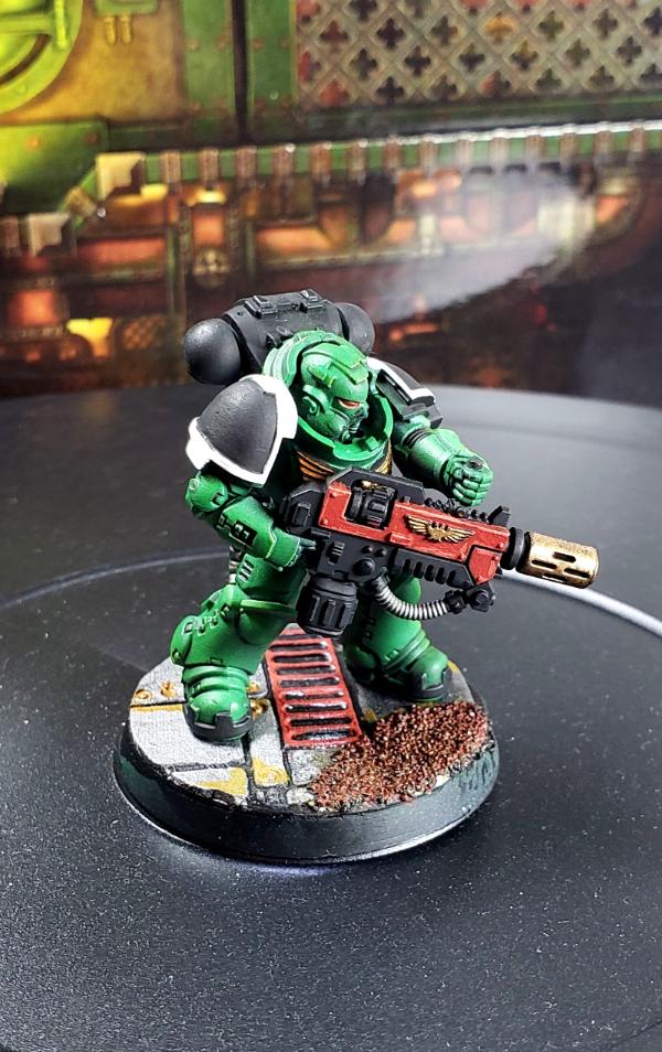
Close up of the tabletop ready Eradicator. I think I'm going to stick to this paint scheme the red guns take a bit extra work but they look sharp in my opinion. Might need to soften the lights, pretty bright compared to the other pictures taken on the desk.
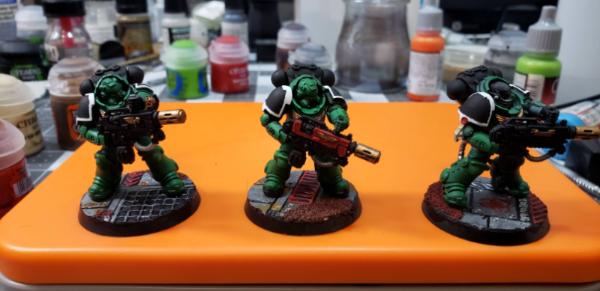
All 3 Eradicators ( WIP)
Hellblasters from the
Up next - some special characters. For now just primer and some zenithal prime.
|
|
|
 |
|
2021/01/06 23:16:40
Subject: Re:Primaris Salamanders - some new stuff I've done recently WIP
|
|

Esteemed Veteran Space Marine
|
No comments? Unacceptable!  Looking really good jb - I always found red to be the best accent colour for Salamanders, and you've done an excellent job on the weapons here. I think you could perhaps be a touch tidier on the highlights; getting them a bit finer. But that's a minor nitpick really. Overall, it's a really sharp look - well done!
If you are using an airbrush for the zenithal, I can recommend giving them a glaze with Vallejo's green ink (either as a main colour or even after your base green). It can really help tie it all together and give it a 'pop'.
Keep up the good work!
|
|
|
|
|
|
2021/01/08 05:37:23
Subject: Re:Primaris Salamanders - some new stuff I've done recently WIP
|
|
Stalwart Space Marine
|
Thanks, the highlights I still struggle getting right. Need to figure out what if its brush control or something else I'm missing. Also looking at some of these I definitely need to clean up mold lines better but when the model is unprimed they look ok and once paint hits it, I see lines...
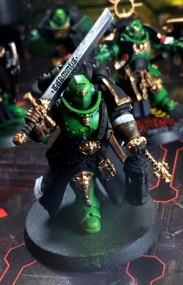
Work is done on the primaris captain.
Not sure if i love the drake scale cloak so might paint the scales a darker red color or something.
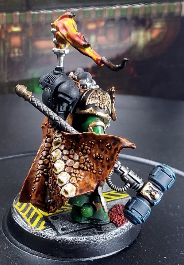
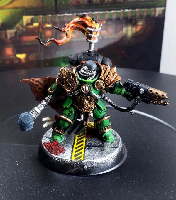
Some early work in progress on additional HQ. Started blocking out the main colors and getting some of the gold accents in.
|
|
|
|
|
2021/01/09 00:26:53
Subject: Re:Primaris Salamanders - some new stuff I've done recently WIP
|
|
Stalwart Space Marine
|
need some suggestions here if anyone has ideas.
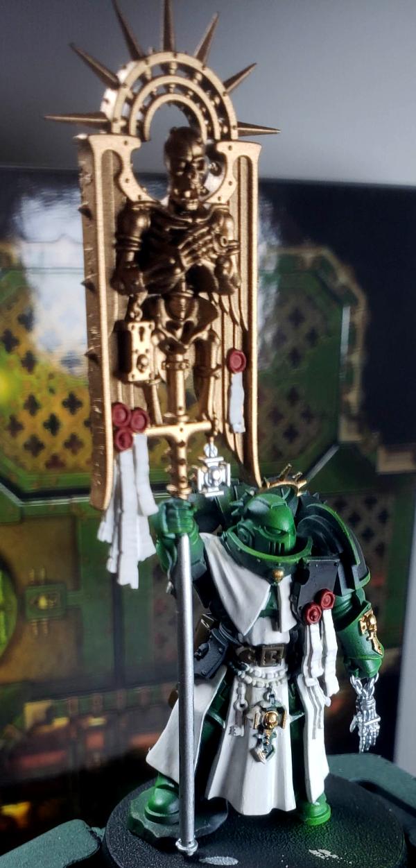
Went with a mix of white and wraithbone. At first I liked how it was coming out but now it looks too white/flat. Any suggestions on how to get it closer to the weathered look you see on the official minis? White is a color I been struggling with.
Second option is to paint it black, almost tempted to go to that or dark brown so it has a leather look.
|
|
|
|
|
2021/01/11 06:07:16
Subject: Re:Primaris Salamanders - some new stuff I've done recently WIP
|
|
Stalwart Space Marine
|
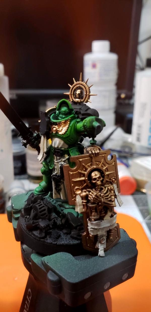
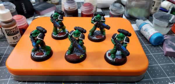
Might keep black tabards on all the units except for the standard bearer and captain.
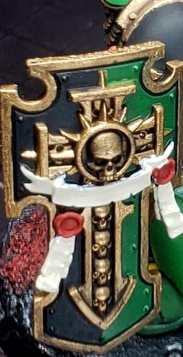
Front of the Stormshield and Plasma gun guy, might try and do some edge highlights on him but I have so much unpainted stuff he might just move to the "painted" section
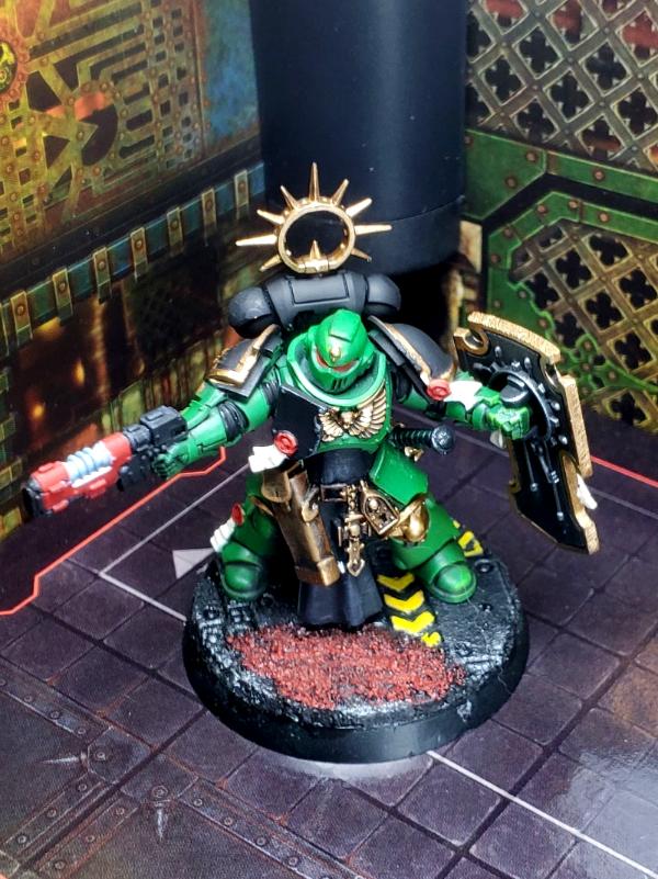
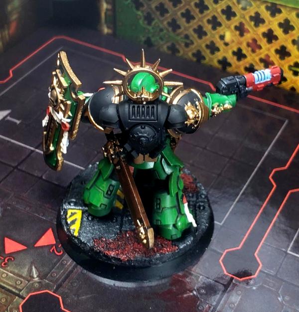
Back of the Stormshield and Plasma gun guy
Close up of the shield, think I like how the dual color came out
Next in line is the executioner - might change the sleeve color to something darker.
|
|
|
|
|
2021/01/11 12:54:15
Subject: Re:Primaris Salamanders - some new stuff I've done recently WIP
|
|
Esteemed Veteran Space Marine
|
jb1981 wrote:Thanks, the highlights I still struggle getting right. Need to figure out what if its brush control or something else I'm missing. Also looking at some of these I definitely need to clean up mold lines better but when the model is unprimed they look ok and once paint hits it, I see lines...
jb1981 wrote: Went with a mix of white and wraithbone. At first I liked how it was coming out but now it looks too white/flat. Any suggestions on how to get it closer to the weathered look you see on the official minis? White is a color I been struggling with.
Second option is to paint it black, almost tempted to go to that or dark brown so it has a leather look.
For the tabard, a simple wash of agrax earthshade, and then some highlights can bring that out with a dirty linen look, which is what I assume you're looking for. For leather, base coat Rhinox hide, then move progressively towards Mournfang Brown in mixes.
Just my opinion, but I'd say that what can bring your painting to the next level is highlighting. You've got great colour theory so I don't think you need worry so much about which colours you've chosen. For the most part they all tie in really nicely and appropriately - there is no imbalance to my eyes. Similarly, your brush control is almost spot on. I can't see many places where you've come over the lines. The main 'problem' (It's not really a problem  ) is that your green is looking a touch flat, as is the black. I'd suggest your green could be 3 stages of highlight; [50:50 Warpstone Glow:Moot Green, 100% Moot Green, 70:30 Moot Green: Yriel Yellow]. The last one is the most important to mix cautiously and apply finely. It'll give the green an emerald pop, but you can overdo the yellow and it'll come out odd.
As for technique, make sure you've thinned your paints to the consistency of single cream. It wants to flow, but not run away all watery. Apply by dragging the tip towards you and always try to angle the model so you have the most comfortable draw towards you (I recommend a citadel painting handle if possible). For extra fine highlights, load the brush moderately and drag the side along raised edges rather than the tip. This works best on a sharp edge, but the effect is rather easy on the panels of SM armour.
I hope this helps. You've got some excellent looking Fireborn and I'd love to see your progression to the next level. Feel free to PM me if you need to 
|
|
|
|
|
|
2021/01/11 22:51:01
Subject: Re:Primaris Salamanders - some new stuff I've done recently WIP
|
|
Stalwart Space Marine
|
Thanks for the advice. Always looking to get better, highlights are just not something that I have figured out correctly yet.
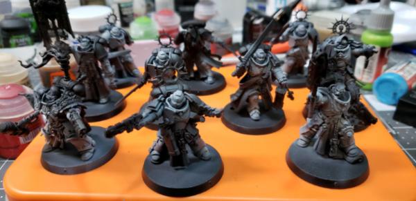
Here is an older squad I did, the hard edges were easy to do with a side brush but anywhere I had to use the brush tip to highlights it looks messy.

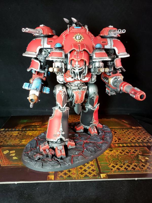
Imperial Knight with non-edge highlights, again they seem to be messy and too thick.
The suggestions on getting the green is something I'll definitely give a shot. Right now my process is;
1. Airbrush on black primer
2. Airbrush on white in zenithal and targetted application. Where I expect green armor I will hit it with a layer of white.
3. Airbrush on green color in the areas that will be green and around there
3.1 drybrush a lighter green. Sometimes skip this step here and do it later.
4. Block in black into all the areas that will be dark that were painted green.
5. Apply a wash into recesses
6. Apply other colors
7. Clean up green where possible
8. Base
|
|
|
|
|
2021/01/12 01:04:52
Subject: Re:Primaris Salamanders - some new stuff I've done recently WIP
|
|
Esteemed Veteran Space Marine
|
I can see what you mean now  .
I would say, regarding the SMs, that most of your problems there are compounded by 2 issues. First, your highlights are too stark. The thickness would be fine if you had mixed that layer 50:50 between base and highlight. As it is, the colour is too stark to blend at that thickness.
The second issue is that you've chosen to use the tip in the first place. Almost every edge on a SM should be perfect for a side brush technique and there's no reasom not to make life easier for yourself here. Using the tip to highlight, in my experience, should only be used if the highlight is only marginally lighter (so it blends in as a layer).
If you need to 'peep' over the edge to make a wider highlight (for example; laying a middle highlight), you can side brush but 'roll' the brush over so it catches more than just the very knife edge, thus being controlled and limiting the thickness to just what you want. Hard to explain, but you're still using the edge as a guide, but tilting the brush at a shallower angle for a thicker highlight than you would get just side brushing with the tip. Get a piece of sprue primed and practice just running your brush down it, tilted slightly to catch part of the face so it creates a thicker line.
Thinning paints is a must for getting fine tip highlights. I can strongly recommend a flow improver and possibly a retarder if you aren't already. Just adds a degree of control and smooth action to the paint. As does a good fine brush. I tend to use a 0 or a 00 for most highlights, but a 1 would be good for that knight.
Your green process seems good, similar to my own (Although all the Salamanders in my gallery are from before I got my airbrush). I'm not a fan of drybrush myself, but I never mastered it's subtlties - to each their own .
Hope this helps again and don't be despondent - practice makes perfection. It'll come in time.
|
|
This message was edited 1 time. Last update was at 2021/01/12 01:08:15
|
|
|
|
|
2021/01/12 01:46:04
Subject: Re:Primaris Salamanders - some new stuff I've done recently WIP
|
|
Stalwart Space Marine
|
you might be right on the colors, ill have to try going in transitions in the highlights. I did order the green ink from Vallejo so I'll see how that works.
Thanks for all the tips btw.
|
|
|
|
|
2021/01/12 16:11:44
Subject: Re:Primaris Salamanders - some new stuff I've done recently WIP
|
|
Esteemed Veteran Space Marine
|
No problem, just passing along experience from my own issues painting Salamanders
P.S. Use the ink in the airbrush - it's way better that way. And be warned that it may give a gloss finish if applied heavily, so shake it well and consider a matt varnish afterwards. Good luck!
|
|
|
|
|
|
|
|