| Author |
Message |
 |
|
|
|
|
Advert
|
Forum adverts like this one are shown to any user who is not logged in. Join us by filling out a tiny 3 field form and you will get your own, free, dakka user account which gives a good range of benefits to you:
- No adverts like this in the forums anymore.
- Times and dates in your local timezone.
- Full tracking of what you have read so you can skip to your first unread post, easily see what has changed since you last logged in, and easily see what is new at a glance.
- Email notifications for threads you want to watch closely.
- Being a part of the oldest wargaming community on the net.
If you are already a member then feel free to login now. |
|
 |
2021/07/13 21:06:38
Subject: could use some help here
|
|

Been Around the Block
louisiana
|
hi guys im getting back into warhammer after like ........13+ years all the paint names have changed and is really throwing me off lol im going to be rebuilding my orks i used to use
chaos black
gore red
snakebite leather
goblin green
bleached bone
i cannot find any of these colors now i think i found the equivalent for the bleached bone and im pretty sure that chaos black is now abbabrax black? i thought goblin green was warboss green but i got home and compared the 2 and warboss is much darker thye had 6 diff shades of red and i couldnt tell the difference any help would be appreciated
|
|
|
 |
|
2021/07/13 21:26:42
Subject: could use some help here
|
|

Ork-Hunting Inquisitorial Xenokiller
|
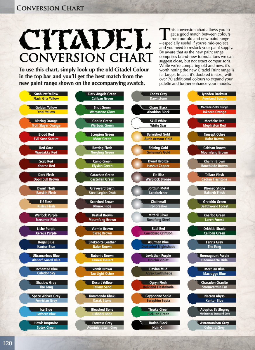
Try the first 2 columns of this chart
https://www.dakkadakka.com/wiki/en/Paint_Range_Compatibility_Chart
There was, when the range expanded and the names changed, a PDF from GW that had the list too, I'm not sure if its still available
|
|
|
|
|
2021/07/13 23:28:49
Subject: Re:could use some help here
|
|
Lieutenant General
|
|
'It is a source of constant consternation that my opponents
cannot correlate their innate inferiority with their inevitable defeat. It would seem that stupidity is as eternal as war.'
- Nemesor Zahndrekh of the Sautekh Dynasty
Overlord of the Crownworld of Gidrim |
|
|
|
|
2021/07/14 06:26:21
Subject: could use some help here
|
|

Regular Dakkanaut
|
Please be aware both of the resources posted above are NOT 1:1 replacements for your original colours. What pot were your paints in? Those colour names appeared in both MkII (hexagonal with soft lids) and MkIII-IV (crystal clear pots with black bolter shell or flip-top lids).
If you are looking for the latter, I can definitely help.
Chaos Black - almost any brand of black will be a match. All of them are PBk7 - Carbon Black based.
Red Gore - P3 Amethyst Rose is a 99% match. The undertone is *slightly* less purple, it's more matte in finish, and has much, much better coverage than GW's Red Gore. Overall a better paint.
Snakebite Leather - unfortunately I have yet to find an exact replacement for this one. Nothing I've looked at comes close. P3 Bogrin Brown is too yellow-orange, Coat D'arms Barbarian Leather is too pastel and not strong enough in hue, Coat D'arms Hairy Brown is too weak and not ochre enough. Vallejo Heavy Goldbrown, Reaper MSP Palomino Gold. P3 Rucksack Tan and P3 Meaty Ochre are all too light.
The closest mix I've found so far is 75% P3 Meaty Ochre + 25% P3 Bloodstone + a tiny bit of black. And it's at best, maybe a 90-95% match, not what I'd consider an acceptable replacement. Lacks SBL's strong ochre-orange undertone and vivid masstone.
Goblin Green - Coat D'arms Goblin Green is a 99% match. Possibly a tiny touch yellower, and unfortunately has much poorer coverage, but the colour is the same. I'd recommend getting another similar green with better coverage to serve as underpaint, and just use Coat's GG as the top layer.
Bleached Bone - I have not found a 100% match in a bottle, but there are many close contenders. P3 Menoth White Base is a little yellower and less white, Army Painter Skeleton Bone is a little browner and less white. Those two mixed together + white will yield a near match, with the bonus of both having far superior coverage to GW's Bleached Bone.
More not-a-matches for Bleached Bone:
P3 Jack Bone - too brown, not enough white.
Coat D'arms Linen - too yellow, too white.
Coat D'arms Bone - much too yellow, not white enough
Vallejo Buff - too yellow-green, not white enough.
Now's a good time to migrate your paint supply away from GW if at all possible. They regularly throw out their entire paint range and replace all the colours, to no end of frustration for those trying to match old armies. No other company does this - seriously go with any other range, or better yet a mix of ranges. Personally I'm fond of P3 as my base set, because the colour range and more importantly paint consistency is very similar to the old Mk III - IV range that I grew up using. If you're also used to those GW paints that were made in France, then P3 will be immediately familiar to you. Not all their colours are equally good as the old GW's, but a good number of them are superior (like Amethyst Rose), so it's not a bad trade-off. The P3 range is somewhat duller, in line with the more modern paint schemes than the kick-in-the-Teef bright hues of the early 2000's, but that can easily be made up by grabbing a few primaries from Coat D'arms or Vallejo.
~
|
|
This message was edited 5 times. Last update was at 2021/07/14 10:04:56
|
|
|
|
|
2021/07/14 11:41:32
Subject: could use some help here
|
|
Ork-Hunting Inquisitorial Xenokiller
|
Fire_Forever wrote:Please be aware both of the resources posted above are NOT 1:1 replacements for your original colours. What pot were your paints in? Those colour names appeared in both MkII (hexagonal with soft lids) and MkIII-IV (crystal clear pots with black bolter shell or flip-top lids).
Oh very much the case, even some of GWs "equivalents" are nothing like the colours they replaced.
The "equivalent" colour is GWs way of saying "forget what you used, use this", so much more suited to following painting guides than making old and new models colour match.
|
|
|
|
|
2021/07/14 11:56:55
Subject: could use some help here
|
|
[DCM]
Fireknife Shas'el
|
Most of the Vallejo game colours are pretty good matches for the old GW line.
|
|
|
|
|
|
2021/07/14 12:54:51
Subject: could use some help here
|
|
Longtime Dakkanaut
|
I thought there was a company, who’s name I forget, who specifically attempt to remake the plc citadel colours. Anyone?
|
|
|
|
|
2021/07/14 13:53:16
Subject: could use some help here
|
|

Fixture of Dakka
|
mrFickle wrote:I thought there was a company, who’s name I forget, who specifically attempt to remake the plc citadel colours. Anyone?
No, don't mention them. Because then he'll appear, spouting off about how his paints are "the most bestest formulated paints ever" and "1 thick coat is enough to win a golden daemon" and other assorted drivel.
Vallejo is probably your best place to start looking for equivalent colours due to sheer size of the range. Even if they don't match 100% sometimes it doesn't take too much muckin' about with mixing other colours to get it to where you want.
Another paint brand that I haven't seen mentioned is Scale75. They have quite a good range. I haven't done any colour matching for the old Citadel range, but it might be worth a look.
|
|
|
|
|
|
2021/07/14 14:16:39
Subject: could use some help here
|
|
Regular Dakkanaut
|
Vallejo is often the most accessible (any hobby shop will likely have them) and well costed. Their bottles are good at keeping paint over the long term, with the standard dropper issues - tips can clog, mixing after separation is a pain. Many Vallejo paint formulas separate badly in the bottle and on a wet palette, so invest in mixing balls or a vortex mixer if it's to be your core brand.
Scale75 I wouldn't recommend for someone who's accustomed to vintage GW. It handles quite differently and has an extremely matte finish, which does not match well to early 2000's GW paint. It's also very thick and needs a lot of dilution or mixing with other products in order to reach working consistency. None of that makes it bad paint, don't get me wrong - but it's not a match for what OP's looking for.
As for what I think is being referenced above, if it's INSTAR Vintage, Stay the heck away. Worst paint I've ever had the misfortune of ordering in my life and equally crappy customer service. Their paint is NOT in any way a match to vintage GW. You'll get closer using those "compatibility" charts and that's saying something. It's like cruddy hardware store wall paint, dull, lifeless, and with the slimiest feeling acrylic paint medium I've ever worked with. Utterly disgusting. Automatically Appended Next Post:  Jadenim wrote: Jadenim wrote:Most of the Vallejo game colours are pretty good matches for the old GW line.
Some are better than others, but I'd say on average they're only a bit more similar than eras between GW ranges. That is to say, you'll find approximates but not really "I can paint two models and have them look like the same unit" matches without adjustment.
For example Vallejo Game Color's Scurvy Green is greener than the Scaly Green it imitates, but is still very close. That's one of the better ones. At the opposite end VGC's Dark Fleshtone is a bad imitation of GW's Dark Flesh, with none of Dark Flesh's iron oxide redness. It's a dull, grey red instead. Most of the range is similar, sort-of-but-not-quite the same. VGC's Dark Green is both greyer, less pigmented, and has poorer coverage than the Dark Angels Green it's supposed to parallel. It lacks DA Green's emerald undertone, probably because it's made from a different pigment or pigment mix. The GC range also doesn't feel the same on the brush as the French-made GW paints. The short term adhesion (time between drying and curing) is especially poor.
|
|
This message was edited 1 time. Last update was at 2021/07/14 14:35:23
|
|
|
|
|
2021/07/15 00:42:04
Subject: could use some help here
|
|
Been Around the Block
louisiana
|
Fire_Forever wrote:Please be aware both of the resources posted above are NOT 1:1 replacements for your original colours. What pot were your paints in? Those colour names appeared in both MkII (hexagonal with soft lids) and MkIII-IV (crystal clear pots with black bolter shell or flip-top lids).
If you are looking for the latter, I can definitely help.
Chaos Black - almost any brand of black will be a match. All of them are PBk7 - Carbon Black based.
Red Gore - P3 Amethyst Rose is a 99% match. The undertone is *slightly* less purple, it's more matte in finish, and has much, much better coverage than GW's Red Gore. Overall a better paint.
Snakebite Leather - unfortunately I have yet to find an exact replacement for this one. Nothing I've looked at comes close. P3 Bogrin Brown is too yellow-orange, Coat D'arms Barbarian Leather is too pastel and not strong enough in hue, Coat D'arms Hairy Brown is too weak and not ochre enough. Vallejo Heavy Goldbrown, Reaper MSP Palomino Gold. P3 Rucksack Tan and P3 Meaty Ochre are all too light.
The closest mix I've found so far is 75% P3 Meaty Ochre + 25% P3 Bloodstone + a tiny bit of black. And it's at best, maybe a 90-95% match, not what I'd consider an acceptable replacement. Lacks SBL's strong ochre-orange undertone and vivid masstone.
Goblin Green - Coat D'arms Goblin Green is a 99% match. Possibly a tiny touch yellower, and unfortunately has much poorer coverage, but the colour is the same. I'd recommend getting another similar green with better coverage to serve as underpaint, and just use Coat's GG as the top layer.
Bleached Bone - I have not found a 100% match in a bottle, but there are many close contenders. P3 Menoth White Base is a little yellower and less white, Army Painter Skeleton Bone is a little browner and less white. Those two mixed together + white will yield a near match, with the bonus of both having far superior coverage to GW's Bleached Bone.
More not-a-matches for Bleached Bone:
P3 Jack Bone - too brown, not enough white.
Coat D'arms Linen - too yellow, too white.
Coat D'arms Bone - much too yellow, not white enough
Vallejo Buff - too yellow-green, not white enough.
Now's a good time to migrate your paint supply away from GW if at all possible. They regularly throw out their entire paint range and replace all the colours, to no end of frustration for those trying to match old armies. No other company does this - seriously go with any other range, or better yet a mix of ranges. Personally I'm fond of P3 as my base set, because the colour range and more importantly paint consistency is very similar to the old Mk III - IV range that I grew up using. If you're also used to those GW paints that were made in France, then P3 will be immediately familiar to you. Not all their colours are equally good as the old GW's, but a good number of them are superior (like Amethyst Rose), so it's not a bad trade-off. The P3 range is somewhat duller, in line with the more modern paint schemes than the kick-in-the-Teef bright hues of the early 2000's, but that can easily be made up by grabbing a few primaries from Coat D'arms or Vallejo.
~
my older paint pots from your description were from mk3-4 they were clear with black lids octagonal in shape i had bought the warboss green thinking it was the same as goblin green but comparing the 2 warboss is quite a bit darker im thinking maybe the new scorpion green mixed in with warboss would make it a few shades lighter perhaps? and i appreciate all the help Automatically Appended Next Post: this is why i love this community i appreciate everyone's input and help i can always count on dakkadakka
|
|
This message was edited 1 time. Last update was at 2021/07/15 00:43:09
|
|
|
|
|
2021/07/15 07:10:32
Subject: could use some help here
|
|
Regular Dakkanaut
|
It's worth a try, but Warboss + Scorpion isn't likely to get you to Goblin Green alone, best I can guess without the actual paint in front of me.
G.G. is duller (heading towards grey/complement), less yellow (middling green, not significantly blue or yellow leaning), and lighter (has white in it). Scorp.G is a neon green heading strongly towards the yellow end of the spectrum, almost a chartreuse. Adding a touch of white in there might help, it'd depend if both the hue and saturation need fixing, or hue and brightness. Black will dull it down but also shift it towards green, a red or brown-red will dull the green but darken too. If it needs to be both less saturated and lighter, grey might work.
Best advice I can give is you're just going to have to put some colours out on a palette and start tinkering with them. Try to keep notes on what you do, so if/when you do find that perfect mix you can replicate it again.
There's some swatch comparisons against GW Goblin Green and other paints of its era, in this thread: https://www.dakkadakka.com/dakkaforum/posts/list/283673.page which might be helpful in eliminating some purchase options, if nothing else.
|
|
|
|
|
2021/07/16 18:30:59
Subject: could use some help here
|
|
Fighter Ace
|
I have a host of Instar paints and I haven’t had any issues with them. Some of them are more watery than others but that’s been my experience with other brands too. The bottles were annoying initially due to nozzle blockages but I’m still alive so.
I have no problem with other opinions being aired in other posts but I thought I should mention it.
For the record, when it comes to matching old paints I too would be inclined towards Vallejo, but I wanted to voice my own experience of the Instar brand to balance things out here 
|
|
|
|
|
|
|
|