ListenToMeWarriors wrote: My last couple of Aggrax bottles have been glossy, largely rectified by strongly shaking the bottle then mixing in a little medium. But if it is a sign of the new formulation I am not a fan.
I had the same issue with the last few of mine too. One of the bottles refused to not be glossy even after shaking. Even my current pot which isn't leaving my models glossy, is still darkening more than I'd like without the introduction of medium to thin it back. Which is fine for my Black Legion/Chaos Knights, but my Primaris are managing to have quite the range of shades of olive drab. I might not have noticed with any other color, but it's pretty obvious with green.
Ghaz wrote: Looks like a few more paints have been added to the Last Chance to Buy category. Currently there are 31 Air paints, 7 Dry paints, 4 Shades and 1 Spray in the category.
some of the air paints are a bit suprising, Sons of Horus Green... NOW?!
Seriously. Has anyone ever gotten that spray to go on well?
It's the worst. THE WORST.
I bought a can early this year and it worked fine for me. I used it as a primer for army painter speed paints and they came out fine (which would show up issues more than most other situations).
It's the only can I've bought and it seems okay to me. Perhaps they've varied over the years? Or maybe it varies country to country?
Reminds me of nothing so much as Arnold in Conan the Barbarian talking to the creepy cultist, killing him and stealing his clothes:
"Its all you'll ever need"
I notice that there is no mention of the Air paints at all.
The Air paints always felt like the red haired step child because GW doesn't sell their own air brushes and don't want to risk people finding out there's other paint brands if they go looking into them.
Plus the citadel pots aren't great for airbrushes - droppers and backflushing (to mix thinner) are much more convenient than using a sacrificial hairy stick.
But that's almost half the air range they've put onto LCTB now. Quite a few colours remain as layer paints so just need more thinning, but there's a number now of the ex-forgeworld colours that got brought back and are being murdered again. And EOL the heresy air colours just feels mean right now.
The Air paints were originally a Forge World line that they had for several years before they were moved into the main paint line when the Contrast paints were released. Their pots originally looked like this...
I actually really like iron hands steel as a color. Has a nice warm tone vs the cooler tone of leadbelcher.
Nothing is quite as good as the vallejo metal colors (for acrylics) though.
I might pick up a couple pots of the new contrast. Aeldari Emerald looks like it might be close enough to Kabalite green. . . a color I use for my AoS stormcast / CoS / KO armies. And the Black Legion might be just what I need. . . I found that Black Templar was just a liiiiitle too transparent out of the pot for what I want.
Maybe some of the brighter primary colors as well. I use Contrast a lot for my wife's Seraphon, and it works amazing. I can pump out seriously good looking models really fast if they are covered in texture.
Seriously. Has anyone ever gotten that spray to go on well?
It's the worst. THE WORST.
I bought a can early this year and it worked fine for me. I used it as a primer for army painter speed paints and they came out fine (which would show up issues more than most other situations).
It's the only can I've bought and it seems okay to me. Perhaps they've varied over the years? Or maybe it varies country to country?
It's probably a mix of all of the above--plus white sprays tend to be extremely twitchy when it comes to weather conditions in my experience...and where I live? Humidity can be non-existent then stifling in mere hours!
Ghaz wrote: The Air paints were originally a Forge World line that they had for several years before they were moved into the main paint line when the Contrast paints were released. Their pots originally looked like this...
They had Air before they moved the FW colours over. I picked up a few back when I was getting into airbrushing around 2016.
Reminds me of nothing so much as Arnold in Conan the Barbarian talking to the creepy cultist, killing him and stealing his clothes:
"Its all you'll ever need"
I notice that there is no mention of the Air paints at all.
I've been told regarding the airbrush paints "it'll make more sense soon" that said I'm honestly tempted to hold off on my imperial fists until july in case GW discontinues the whole range, although I would think they'd keep averland sunset at the least
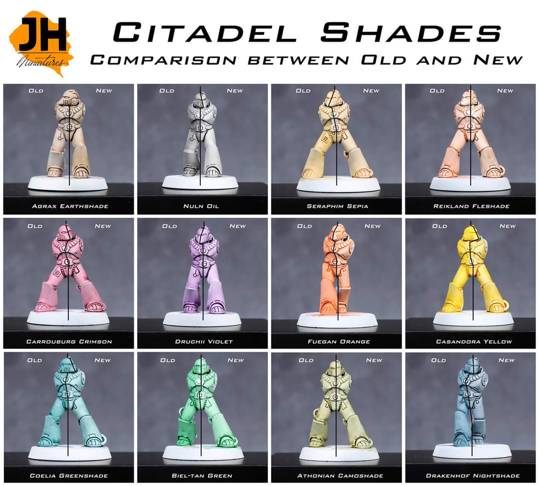
So, I have been allowed to try out the new formula Citadel Shade paints for a few weeks now and I've put my thoughts in a video. I'll have a look at all 7 new Shade paints and also compare the old versions of favourites like Nuln Oil and Agrax Earthshade with their new version. Are they really an improvement or just the same product in a smaller 18ml pot?
Yesterday's paint article on Warhammer Community had this line:
"We are approaching the release of 25 brand new Contrast Paints, a range of new and reformulated Shade paints, and the best and brightest white Spray ever."
And I think the reveal video said July? I could actually see the paints in tomorrow's pre-order announcement. Just a guess, of course.
So, I have been allowed to try out the new formula Citadel Shade paints for a few weeks now and I've put my thoughts in a video. I'll have a look at all 7 new Shade paints and also compare the old versions of favourites like Nuln Oil and Agrax Earthshade with their new version. Are they really an improvement or just the same product in a smaller 18ml pot?
Mr_Rose wrote: Do we know when the new paints will actually be available? I had thought they might be on preorder today…
They said July in the very first article...
If the paints were going to be on pre-order today we would have known last Sunday in their 'Sunday Preview' article on Warhammer Community where they let us know what's coming up for pre-order the next weekend (this week is Codex Chaos Space Marines and more Horus Heresy kits).
stahly wrote: So, I have been allowed to try out the new formula Citadel Shade paints for a few weeks now and I've put my thoughts in a video. I'll have a look at all 7 new Shade paints and also compare the old versions of favourites like Nuln Oil and Agrax Earthshade with their new version. Are they really an improvement or just the same product in a smaller 18ml pot?
Quick question, stahly - when you were at the test event, did they mention if a matte (or non-gloss, at least) version of Cryptek Armourshade would be coming at some point? As it is gloss-only at the moment, getting rid will lose the colour from the range.
Honestly, if that's the result then why does contrast even exist? Yeah, GW has fixed the pooling issues but it seems like they've only done it at the expense of removing the "one coat shading" part. The one on the right is a lot smoother but it also has no depth, you'd need to do a conventional shade + highlight process on it to get to an acceptable standard.
Honestly, if that's the result then why does contrast even exist? Yeah, GW has fixed the pooling issues but it seems like they've only done it at the expense of removing the "one coat shading" part. The one on the right is a lot smoother but it also has no depth, you'd need to do a conventional shade + highlight process on it to get to an acceptable standard.
Eh, honestly, the thumbnail is weird, as it shows off one of the two or three new paints that have little inbuilt shading.
Honestly, if that's the result then why does contrast even exist? Yeah, GW has fixed the pooling issues but it seems like they've only done it at the expense of removing the "one coat shading" part. The one on the right is a lot smoother but it also has no depth, you'd need to do a conventional shade + highlight process on it to get to an acceptable standard.
I do hear what you’re saying. But, I’d like to counter that an easy bright yellow base layer is in itself a desirable result? By no means what we know Contrast for, but a result likely to be popular unto itself?
apparently some of the new contrasts aren't really contrasts but are basicly just inks, and yeah.. as Mad Doc said, just being able to get a bright clean yellow in one pass, is desirable in and of itself.
Those yellows look amazing, and the reds look very interesting too. Contrasts used as gw sells them to be look awful but they are great paints to use to make the most of their transparency over value sketches and as filters. They are basically inks but the coverage of those yellow is very interesting to me.
Honestly, if that's the result then why does contrast even exist? Yeah, GW has fixed the pooling issues but it seems like they've only done it at the expense of removing the "one coat shading" part. The one on the right is a lot smoother but it also has no depth, you'd need to do a conventional shade + highlight process on it to get to an acceptable standard.
You could also watch one of the videos posted before getting all clever from a thumbnail.
There's 6 that work like that and 21 that work like classic Contrast.
Mad Doc Grotsnik wrote: I do hear what you’re saying. But, I’d like to counter that an easy bright yellow base layer is in itself a desirable result? By no means what we know Contrast for, but a result likely to be popular unto itself?
But then why call it contrast? It's completely counterintuitive if you're using the same brand name to describe two separate product lines: a "one layer for basic tabletop" system and a high-opacity base layer for conventional painting (which is somehow not the same as the existing product line of high-opacity base layers).
If it was made using the Contrast medium, then it would be perfectly acceptable to call it a Contrast paint even if it doesn't necessarily work like a Contrast paint normally does.
kodos wrote: Contrast was first advertised as a quick way to paint
and now it is just a different way for classic GW painting with base and highlight
so yeah, there is not much contrast any more to the contrast paints, but more expensive regular ones
They were pitched as that but are so much more versatile than that, they are basically inks. And can be used in so many ways, believe it or not there are more ways to paint than the gw way, and contrast paints are just one tool in your toolbox to get the results you want. Even GW painting tutorials use them in many different ways. They are not “just a different way for classic GW painting” at all.
lord_blackfang wrote: So the verdict is in. Looks like I'll be spending 150€+ on new Contrasts huh. Wish I hadn't wasted money on Scale75 Instants and AP Speedpaints.
I'm not sold on the new Contrasts. There's a couple of interesting colours in there, the purple and the blue-green interest me as currently I've not used a good purple in the "one coat" market.
The low-contrast Contrasts in the new range don't really interest me. Like, cool, it's a quick way to lay down a well saturated yellow... but how often do I actually want to do that? Almost never. I'm almost always aiming for a slightly desaturated yellow in which case the existing Contrasts are good or good old Averland Sunset.
I'm 50/50 on AP speed paints now. Ironically, the reactivation thing makes them bad for actual speed painting, but they are a lot easier to get a smooth coat than contrasts, so I've come around to them when I want to do a quick basecoat on a model where pooling will be hard to control.
Never tried the Scale75 Instants, you don't like them?
The main thing I'd be interested in is if these Contrasts are significantly better than the old Contrasts for controllability. If somehow they make something as controllable as AP Speed Paints that didn't take an eternity to dry and didn't have the bleeding issues, it'd be all over that.
Automatically Appended Next Post:
BrianDavion wrote: apparently some of the new contrasts aren't really contrasts but are basicly just inks, and yeah.. as Mad Doc said, just being able to get a bright clean yellow in one pass, is desirable in and of itself.
They don't really look like inks to me either, they kind of are something new.
Automatically Appended Next Post:
kodos wrote: Contrast was first advertised as a quick way to paint
and now it is just a different way for classic GW painting with base and highlight
so yeah, there is not much contrast any more to the contrast paints, but more expensive regular ones
They're a way to lay down a solid vibrant and saturated colour quickly. Currently, even with a white undercoat, it takes a few coats to get a nice saturated yellow or a nice saturated red, or you start with a desaturated version of the colour (like the Base range) and add a glaze to bring back the saturation, which still means multiple coats of paint. These new Contrasts fill that niche.
Personally I think it's a pretty small niche though, as I rarely ever want a high saturation pure red or pure yellow or whatever. But maybe they're really useful and I'm just not creative enough to figure out that use, lol.
Not convinced having wildly different acting paints under the same name is a particularly helpful bit of marketing strategy. Sure, an avid painter might look them up beforehand and know some of them are more like washes that will barely tint the raised sections but nicely colour the crevices, then some of them have no contrast to them at all but have super bright coverage, but to the average joe walking into a shop and seeing them, having them under the same name seems pretty unhelpful.
Why not just call the inky ones something different? Then have the others split into two groups, saturated or subtle? This way seems like a great way of getting people to buy paint, discover it doesn't work they want, then get annoyed and not buy any more of your paint
Ghaz wrote: If it was made using the Contrast medium, then it would be perfectly acceptable to call it a Contrast paint even if it doesn't necessarily work like a Contrast paint normally does.
No, it's not acceptable at all. As a user of the product I don't care what ingredients went into it, I care about how it behaves when I paint with it. If it says contrast on the pot I expect it to behave as a contrast paint: one-coat coverage with clearly defined highlight and shadow areas. If it instead acts like a base paint and gives me a high-opacity base coat it isn't doing what it says on the pot and I'm going to be incredibly annoyed that I wasted my money on the paint and now have to strip the model to re-paint it with actual contrast paint. And because I now know I can't trust the product descriptions I'm going to be reluctant to buy any more GW paints in the future.
Yes it is, because GW decided it is and it’s their product. Having a dozen or more types of paints would just lead to unnecessary confusion. If it’s a Contrast paint (and it is) then call it that.
Ghaz wrote: Yes it is, because GW decided it is and it’s their product. Having a dozen or more types of paints would just lead to unnecessary confusion. If it’s a Contrast paint (and it is) then call it that.
"Whatever GW says is automatically right" is hardly a compelling defense against the argument that GW is making a mistake. And it is not a contrast paint in the only way that matters to the user. It does not shade the model like contrast paints are expected to, it behaves more like GW's existing line of base paints.
They were pitched as that but are so much more versatile than that, they are basically inks. And can be used in so many ways, believe it or not there are more ways to paint than the gw way, and contrast paints are just one tool in your toolbox to get the results you want. Even GW painting tutorials use them in many different ways. They are not “just a different way for classic GW painting” at all.
they are basically Inks, something that caused a big rage with the first release if you said it because Contrast are totally something different than Inks
I am glad that there are more different Inks out there, specially for niche colours that are complicated to mix
but were the original line was offering something slightly different with some colours (not all of them work the same way or give as good results) we are now back to have more expensive Ink
kodos wrote: Contrast was first advertised as a quick way to paint
and now it is just a different way for classic GW painting with base and highlight
so yeah, there is not much contrast any more to the contrast paints, but more expensive regular ones
They're a way to lay down a solid vibrant and saturated colour quickly. Currently, even with a white undercoat, it takes a few coats to get a nice saturated yellow or a nice saturated red, or you start with a desaturated version of the colour (like the Base range) and add a glaze to bring back the saturation, which still means multiple coats of paint. These new Contrasts fill that niche.
Personally I think it's a pretty small niche though, as I rarely ever want a high saturation pure red or pure yellow or whatever. But maybe they're really useful and I'm just not creative enough to figure out that use, lol.
for me, for a pure high saturated red and yellow I have the Liquitex Inks and the new Contrast look like to be more similar to those (were the original ones offered something that was a little different)
like the Promo/Review Video with the Yellow/Blue Marine, this is something you would do with the Liquitex ones, while with "Contrast" I would expect to not need to make edge highlights
(we are back to have more expensive Inks and Washes that are marketed as brand new way to paint and big improvement)
The Nighthaunt Gloom changing is a perfect example of why I can't justify using Citadel paints for big projects anymore. The whole range changed once, there's every chance it can/will happen again.
Ghaz wrote: Yes it is, because GW decided it is and it’s their product. Having a dozen or more types of paints would just lead to unnecessary confusion. If it’s a Contrast paint (and it is) then call it that.
"Whatever GW says is automatically right" is hardly a compelling defense against the argument that GW is making a mistake. And it is not a contrast paint in the only way that matters to the user. It does not shade the model like contrast paints are expected to, it behaves more like GW's existing line of base paints.
It's their product, not yours, so yes if they want to call it Contrast then that is their right. If you don't like it then make your own and name it whatever you want.
Arbitrator wrote: The Nighthaunt Gloom changing is a perfect example of why I can't justify using Citadel paints for big projects anymore. The whole range changed once, there's every chance it can/will happen again.
Nighthaunt Gloom and Hexwraith Flame were basically the prototypes for the Contrast paints. It doesn't make sense to leave these two that will require a different medium. Changing (and improving) two paints out of a line of hundreds of paints makes it a pretty small chance that it will happen again.
Relying on the forgeworld air paints is clearly a bad idea though. They went end-of-life there, were eventually brought back into the main citadel air line when Contrast came out, and many have just gone last-chance-to-buy again.
Nighthaunt Gloom and Hexwraith Flame were basically the prototypes for the Contrast paints. It doesn't make sense to leave these two that will require a different medium. Changing (and improving) two paints out of a line of hundreds of paints makes it a pretty small chance that it will happen again.
Nighthaunt Gloom looks very different to the current version, despite it being the designated "use this as the primary colour" for one of their main armies.
Also as I said, they changed the entire line only ten years or so again so it isn't like there's not a precedent for this kind of thing.
kodos wrote: they are basically Inks, something that caused a big rage with the first release if you said it because Contrast are totally something different than Inkst)
Inks and contrast are different things, an ink has a specific chemical composition and technical definition which contrast paints do not meet (key is in the name, its illegal in many areas to market a paint as an ink or an ink as a paint), though the end result is that they both behave similarly as far as our plastic dudes are concerned.
Ghaz wrote: Juan Hidalgo compares the new Shades to the old...
...did he hate the old washes that much? Because otherwise if comes off as... shilly? (he loves them all, without a single one being stated as worse, even though a fair amount of the tones change, and hey, yeah, smaller pot but you get better paint, so no problemo)
Crimson wrote: That's basically what all the reviews have said. They're better but cost more.
Dunno, tbh. I do like the fact that the current nuln oil and agrax earthshade helps me make easy filters in addition to just regular washes.
Nuld Oil, for example, feels like is completely different from what it was, and it currently works great to dull down metals.
Guess I'll have to stock up those at the very least.
EDIT: There's also another issue, now that I think about it, and it's that washes, when compared with contrast paints, tend IME to be easier to work with, move around and taking off excess with a brush than contrasts, that as soon as they start to dry tend to leave ugly skid marks. If all the new washes area ctually contrast paints... well, that's an issue.
Ghaz wrote: Juan Hidalgo compares the new Shades to the old...
...did he hate the old washes that much? Because otherwise if comes off as... shilly? (he loves them all, without a single one being stated as worse, even though a fair amount of the tones change, and hey, yeah, smaller pot but you get better paint, so no problemo)
Yeah, he hates them, I spoke to him during the seminar, no shilling. I wasn't fond of the old Shades either. Remember, we're paint nerds. Even if the result is just 10% better we happily throw our money at it
But as you can see in my review (https://youtu.be/tDyU_qUO-sY) or in his stream, the new washes tint and stain a lot less while still creating deep shadows in the recesses. Some painters might prefer more tinting, but what I want from a wash is a smooth finish, and the new Shade paints deliver in this regard, which makes them a lot better in my book. I could do without the price increase obviously.
Ghaz wrote: Juan Hidalgo compares the new Shades to the old...
...did he hate the old washes that much? Because otherwise if comes off as... shilly? (he loves them all, without a single one being stated as worse, even though a fair amount of the tones change, and hey, yeah, smaller pot but you get better paint, so no problemo)
Yeah, he hates them, I spoke to him during the seminar, no shilling. I wasn't fond of them either. Remember, we're paint nerds. Even if the result is just 10% better we happily throw our money at it
But as you can see in my review (https://youtu.be/tDyU_qUO-sY) or in his stream, the new washes tint and stain a lot less while still creating deep shadows in the recesses. Some painters might prefer more tinting, but what I want from a wash is a smooth finish, and the new Shade paints deliver in this regard, which makes them a lot better in my book. I could do without the price increase obviously.
Thanks for that. How about the way it works? Do they behave as contrasts when starting to dry?
Ghaz wrote: Juan Hidalgo compares the new Shades to the old...
Spoiler:
...did he hate the old washes that much? Because otherwise if comes off as... shilly? (he loves them all, without a single one being stated as worse, even though a fair amount of the tones change, and hey, yeah, smaller pot but you get better paint, so no problemo)
Answered in his earlier video starting at about the 1:07 mark.
Ghaz wrote: Juan Hidalgo compares the new Shades to the old...
...did he hate the old washes that much? Because otherwise if comes off as... shilly? (he loves them all, without a single one being stated as worse, even though a fair amount of the tones change, and hey, yeah, smaller pot but you get better paint, so no problemo)
Yeah, he hates them, I spoke to him during the seminar, no shilling. I wasn't fond of them either. Remember, we're paint nerds. Even if the result is just 10% better we happily throw our money at it
But as you can see in my review (https://youtu.be/tDyU_qUO-sY) or in his stream, the new washes tint and stain a lot less while still creating deep shadows in the recesses. Some painters might prefer more tinting, but what I want from a wash is a smooth finish, and the new Shade paints deliver in this regard, which makes them a lot better in my book. I could do without the price increase obviously.
Thanks for that. How about the way it works? Do they behave as contrasts when starting to dry?
A bit, when you apply them, it takes a moment and then the capillary effect starts like crazy and pushes the darker pigments/dyes into the recesses, I found you need to be watchful and soak up any excess wash as it gathers quickly in the recesses. However, unlike Contrast, you have a longer timeframe manipulating them, being able to push them around and such. I found Contrast starts to dry very quickly and then it's easy to get tears and blotches when you want to move them around with your brush. Hope that makes sense
Ghaz wrote: Juan Hidalgo compares the new Shades to the old...
Spoiler:
...did he hate the old washes that much? Because otherwise if comes off as... shilly? (he loves them all, without a single one being stated as worse, even though a fair amount of the tones change, and hey, yeah, smaller pot but you get better paint, so no problemo)
Answered in his earlier video starting at about the 1:07 mark.
Hm... that's worrying, actually. IME contrasts are quite finickier.
I'm also a bit worried about hexwraith, as I love how it works and how easily it allows me to do stuff like space marine lenses and the like (below is a spilered image od a leviathan I did a while ago, the green is all hexwraith directly over metal and white).
Ghaz wrote: Juan Hidalgo compares the new Shades to the old...
Spoiler:
...did he hate the old washes that much? Because otherwise if comes off as... shilly? (he loves them all, without a single one being stated as worse, even though a fair amount of the tones change, and hey, yeah, smaller pot but you get better paint, so no problemo)
Answered in his earlier video starting at about the 1:07 mark.
Hm... that's worrying, actually. IME contrasts are quite finickier.
I'm also a bit worried about hexwraith, as I love how it works and how easily it allows me to do stuff like space marine lenses.
I don't know if they used the same formula as Contrast. The way I understood it from the guy who develops all the paints at GW was that they used the knowledge they gained from developing Contrast to improve the Shade paints formula.
stahly wrote: I don't know if they used the same formula as Contrast. The way I understood it from the guy who develops all the paints at GW was that they used the knowledge they gained from developing Contrast to improve the Shade paints formula.
You have been using the new ones, though, right? How they behave when compared with the old washes and with contrast paints?
While I do agree the naming convention is a little strange for some of the new contrasts paints, a few of those colors that provide little contrast and instead just provide clean, solid coverage in one pass is a huge plus. I have been painting for a couple decades now, and while I am not a fantastic painter by any means, a quick way to get a decent looking yellow base is awesome to me. Especially as someone who doesn’t have a lot of time to paint.
To new painters, whom from I constantly hear painting yellow is awful (and I mostly agree) those yellows will be even more helpful.
Strange naming, useful product, so I give it a pass.
The Nighthaunt Gloom changing is a perfect example of why I can't justify using Citadel paints for big projects anymore. The whole range changed once, there's every chance it can/will happen again.
It's a risk with any paint line. Painter I followed (LionOfFlanders) was trying to update one of his armies from a few years previously and found the Vallejo flesh color had changed significantly even though the name hadn't.
chaos0xomega wrote: an ink has a specific chemical composition and technical definition which contrast paints do not meet (key is in the name, its illegal in many areas to market a paint as an ink or an ink as a paint), though the end result is that they both behave similarly as far as our plastic dudes are concerned.
never came across that thing, is this an US specific law/guideline?
Because everything I have seen was that the difference between an Ink and a Paint is largely up to the company’s definition of their brands (which comes down to inks can be used with pen out of the box, were paints need a brush, if you can use the colour to write with a pen on paper, it is an ink and not a paint)
the main difference is that most Inks are a solution (were the pigment is dissolved) were the Paint is a "slurry", but there are exceptions to both
stahly wrote: I don't know if they used the same formula as Contrast. The way I understood it from the guy who develops all the paints at GW was that they used the knowledge they gained from developing Contrast to improve the Shade paints formula.
You have been using the new ones, though, right? How they behave when compared with the old washes and with contrast paints?
I did read it, but I'm afraid it doesn't answer my question, or at least I don't see the answer. You say that there is "significantly less pooling in the flat areas, and dark and strong shadows", which is the end result, but nothing about how it behaves when actually putting it on the mini and when trying to move it around. I've consistently seen that washes were easy to move around and to remove when pooling, whereas with contrast paints moving the paint around is harder without leaving brush marks, and as soon as it is even a tiny bit bit dry any attempt to remove pooled paint leaves an ugly rim of dried paint.
So I am still with no answer to the question of wether the new washes behave more like the old ones or like contrast paints, and IMHO it's a significant difference and it will affect how you need to go about actually painting with them.
Ghaz wrote: It's their product, not yours, so yes if they want to call it Contrast then that is their right. If you don't like it then make your own and name it whatever you want.
Lolwut. "GW can do whatever they want" is not a valid response to criticism of GW's decision. But I'll take that as your concession that you have no valid defense against the fact that GW is making a mistake here by using misleading branding for their new products.
(Not that I personally have a stake in this, given the well established history that I can't trust GW paints to be accurate and consistent over time I will not buy anything from GW.)
Ghaz wrote: Seems to me that you think you know better than anyone else. Obviously, that's not the case.
Cool, so now you've moved on to the petty insults stage of not having any defense for GW's actions but not being willing to admit that GW could make a mistake.
First time the contrast paints were release, they sold out pretty quickly and were hard to hold of for quite a while. This way they can gauge a little demand hopefully?
arkhanist wrote: Relying on the forgeworld air paints is clearly a bad idea though. They went end-of-life there, were eventually brought back into the main citadel air line when Contrast came out, and many have just gone last-chance-to-buy again.
yeah my plan was to use citidel averland sunset air. I am... reconsidering
First time the contrast paints were release, they sold out pretty quickly and were hard to hold of for quite a while. This way they can gauge a little demand hopefully?
Two weeks doesn't give them time to make any more product. At best it gives them chance to decide how much to shaft the independent shops on their orders and how much to keep for themselves.
Sabotage! wrote: While I do agree the naming convention is a little strange for some of the new contrasts paints, a few of those colors that provide little contrast and instead just provide clean, solid coverage in one pass is a huge plus. I have been painting for a couple decades now, and while I am not a fantastic painter by any means, a quick way to get a decent looking yellow base is awesome to me. Especially as someone who doesn’t have a lot of time to paint.
To new painters, whom from I constantly hear painting yellow is awful (and I mostly agree) those yellows will be even more helpful.
Strange naming, useful product, so I give it a pass.
as I said, just think of the contrast label as a guide to what medium to use to dilute it. *shrugs*
My guess for two week pre-order is that GW expects to fulfill a large number of orders of varying size and contents. Releasing 40+ paints is a bit more complicated process than releasing a Codex and handful of miniatures. Very few of the orders are identical and it will take a while to pack them all.
2 Weeks is very normal when GW has a big release that they expect will generate abnormally high order volume. It gives them additional production and packing time and also helps to likely allow them to ship out product in two staged batches so that delivery can be more unified and smooth flowing.
It can also give them a "week off" from a big release which might well be important in terms of staff work hours and workload.
For those who are worrying about losing the old 'filtering' style shade, the army painter acrylic quickshade washes work similarly to current GW washes. Less colours in the range, but a lot cheaper. Similar sorts of effects, but not drop in replacements for current GW shades; but then, neither are the new ones!
The old 'in-a-tin' oil based quickshades have been renamed 'dips' so a bit easier to find the right ones now.
Ghaz wrote: Juan Hidalgo compares the new Shades to the old...
Attached is the end result of his test. I must say I like the new formula better than the old one. If you prefer the old, it might be a good idea to grab some before they disappear from the stores.
Ghaz wrote: Juan Hidalgo compares the new Shades to the old...
Attached is the end result of his test. I must say I like the new formula better than the old one. If you prefer the old, it might be a good idea to grab some before they disappear from the stores.
God damn, does the new Nuln Oil do anything at all?
Looks like it will black line pretty decently. I suspect 1:1 Basilicanum Grey and Contrast medium would be closer to the current Nuln Oil, though.
Ghaz wrote: Juan Hidalgo compares the new Shades to the old...
Attached is the end result of his test. I must say I like the new formula better than the old one. If you prefer the old, it might be a good idea to grab some before they disappear from the stores.
And if you want to see his results with the new Contrast paints you can find them HERE
Are there any videos showing how these washes or new contrasts work over not white paint? As I doubt I'm in the minority when I say I pretty much never paint over a pure white undercoat, so its not hugely helpful to see what they all look like over that. I'm not washing a white space marine, ever, I suspect. How is it over a coloured basecoat for example, as that's pretty much how I think most people use washes?
Also, how are the super saturated paints over a non-white undercoat? Black, grey, xenothol etc?
Sabotage! wrote: While I do agree the naming convention is a little strange for some of the new contrasts paints, a few of those colors that provide little contrast and instead just provide clean, solid coverage in one pass is a huge plus. I have been painting for a couple decades now, and while I am not a fantastic painter by any means, a quick way to get a decent looking yellow base is awesome to me. Especially as someone who doesn’t have a lot of time to paint.
To new painters, whom from I constantly hear painting yellow is awful (and I mostly agree) those yellows will be even more helpful.
Strange naming, useful product, so I give it a pass.
as I said, just think of the contrast label as a guide to what medium to use to dilute it. *shrugs*
I think that's fair, especially considering how different many of the paints in the existing range are (Black Templar compared to Aethericmatic Blue for example).
BigOscar wrote: Are there any videos showing how these washes or new contrasts work over not white paint? As I doubt I'm in the minority when I say I pretty much never paint over a pure white undercoat, so its not hugely helpful to see what they all look like over that. I'm not washing a white space marine, ever, I suspect. How is it over a coloured basecoat for example, as that's pretty much how I think most people use washes?
Also, how are the super saturated paints over a non-white undercoat? Black, grey, xenothol etc?
Yeah, also how it works over hand painted models is probably more important to me than how it behaves over a sprayed surface.
Sabotage! wrote: While I do agree the naming convention is a little strange for some of the new contrasts paints, a few of those colors that provide little contrast and instead just provide clean, solid coverage in one pass is a huge plus. I have been painting for a couple decades now, and while I am not a fantastic painter by any means, a quick way to get a decent looking yellow base is awesome to me. Especially as someone who doesn’t have a lot of time to paint.
To new painters, whom from I constantly hear painting yellow is awful (and I mostly agree) those yellows will be even more helpful.
Strange naming, useful product, so I give it a pass.
as I said, just think of the contrast label as a guide to what medium to use to dilute it. *shrugs*
I think that's fair, especially considering how different many of the paints in the existing range are (Black Templar compared to Aethericmatic Blue for example).
It was always a gripe people had that the different contrasts behaved differently and that there should be a more consistent effect across the range. Sooo, GW went the other way and introduced a line of contrasts that behave absolutely nothing like a contrast?
I still find it a bit odd, as "Contrast" was surely named "Contrast" for it's ability to quickly create a shadow/highlight contrast, and so to name paints that don't do that as "Contrast" seems a bit backward. It also takes people one step further away from just being able to look at the pot on the shelf in a store (or a swatch on a webstore) and decide which colour to buy. Stores are really going to need to paint up samples for the store shelves, or customers will need to stand in front of the rack on their phones googling product reviews to know how certain paints will come out.
But, I don't really care that much, just seems like a silly choice, I think they probably should have just given them a different name even if they do use the same medium.
I will say one really nice thing my LGS does is has a display of textured bases all painted with contrast and normal bases with the GW textured basing paints on them. It's really nice to see how the product looks on a real life sample before buying it.
stahly wrote: So, I have been allowed to try out the new formula Citadel Shade paints for a few weeks now and I've put my thoughts in a video. I'll have a look at all 7 new Shade paints and also compare the old versions of favourites like Nuln Oil and Agrax Earthshade with their new version. Are they really an improvement or just the same product in a smaller 18ml pot?
Question? Why are you wearing a mask? Humans follow mouth and facial expressions along with sound in interpreting language, gaining information about value and affect, for instance. The mask forbids this natural activity, and feels artificial, as if listening to an ATM machine. That makes the video listenable, but frankly unbearable to watch. Masks are not conducive to effective communication. Not for me, thanks…
Thank you for this valuable comment. As you can easily tell from my avatar, I wear a half-mask made by Aeldari craftsmanship to protect my face from the prying eyes of the internet and hazards of content creation.
I bet there are a lot of other content creators to watch if you can't stand my face
Now that the release date is set in stone, the real question is what will I do for the next three weeks? Try to finish as many models from the WIP pile as possible or build a ton of new models to try new paints on? Unfortunately I think I know the answer
stahly wrote: So, I have been allowed to try out the new formula Citadel Shade paints for a few weeks now and I've put my thoughts in a video. I'll have a look at all 7 new Shade paints and also compare the old versions of favourites like Nuln Oil and Agrax Earthshade with their new version. Are they really an improvement or just the same product in a smaller 18ml pot?
Question? Why are you wearing a mask? Humans follow mouth and facial expressions along with sound in interpreting language, gaining information about value and affect, for instance. The mask forbids this natural activity, and feels artificial, as if listening to an ATM machine. That makes the video listenable, but frankly unbearable to watch. Masks are not conducive to effective communication. Not for me, thanks…
While all of that is true, I was still able to follow what Stahly was trying to get across. A mask not being "conducive" to "effective communication" in this case has not prevented Stahly from effectively communicating to at least the level necessary for me to be able to fully comprehend him.
Not sure why that wasn't the case for you, though. Are you okay?
jeff white wrote: Question? Why are you wearing a mask? Humans follow mouth and facial expressions along with sound in interpreting language, gaining information about value and affect, for instance. The mask forbids this natural activity, and feels artificial, as if listening to an ATM machine. That makes the video listenable, but frankly unbearable to watch. Masks are not conducive to effective communication. Not for me, thanks…
Absolutely this. Lipreading, at even a basic level, can make a big difference when people are trying to understand, or remember, what is being said. For people who are viewing in a 2nd or 3rd language, that helps a lot.
I never really thought about it before covid masks started, but you are 100% correct.
As a 2nd language I really struggled to talk with people wearing covid masks because I could not lipread anymore. Strange that how much we lipread without realising.
As for the Mask on the video makes it a bit harder but its a personal choice and we should respect that.
The content is top notch as always and I thank you so much these reviewers, saves me tons of money.
Regardless of ink names and such I really dont like paints changing so often... defies the point of having a consistent army done with them... So yeah one less point to buy from GW.
jeff white wrote: Question? Why are you wearing a mask? Humans follow mouth and facial expressions along with sound in interpreting language, gaining information about value and affect, for instance. The mask forbids this natural activity, and feels artificial, as if listening to an ATM machine. That makes the video listenable, but frankly unbearable to watch. Masks are not conducive to effective communication. Not for me, thanks…
Absolutely this. Lipreading, at even a basic level, can make a big difference when people are trying to understand, or remember, what is being said. For people who are viewing in a 2nd or 3rd language, that helps a lot.
I agree... but then a whole heap of youtubers don't show their faces at all to hide their identity so it hardly bothers me if one decides to wear a mask (though if he's doing it to hide his identity it's probably not a great choice, I'm sure people can still recognise him in spite of the mask).
Seems a weird point to complain about considering 90% of youtube painting tutorials and the like don't show the persons face anyway as they are just a voiceover while you watch the actual painting. I'd probably recommend subtitles
Funny that on a reviewer end of video bloopers he spilled the pot while opening it and almost spilled it twice by cleaning it. Yep truly horrible pots.
Also the comment that These are Better, well better at doing what you like them to do ( means jack to me) Or better at doing the same thing?
I mean looking at null oil, well I may want to have the darker tint overall on all mini rater than just darker recesses. Its fundamentally different.
Thats not better thats different.
For me shades are good to shade the full colour not just the recesses.
For me shades are good to shade the full colour not just the recesses.
This is my current worry too, going off of the tester posted a page back. These new shades seem great at doing recesses, but might be way worse at doing things like tinting the color of the texture paints on a base.
NAVARRO wrote: Should they not behave similarly? They dont look like they are part of the same subrange at all.
Yep. And that's why it's such a marketing failure by GW, you shouldn't have to depend on third-party reviews to figure out what the actual behavior of your paints will be. Every other range has accurate labeling, why can't GW do the same?
I mean they seem to behave SO drastically different. Some as opaque as it can get while others so thin with minimal coverage.
This is why these reviews are so important, I would never spend the cash on expensive paints just to figure out the coverage.
Should they not behave similarly? They dont look like they are part of the same subrange at all.
It's not like the first wave of Contrast paints have the same coverage. Compare Magos Purple and Aethermatic Blue and Shyish Purple and Cygor Brown and you'll see a wide range of coverage as well.
Ghaz wrote: It's not like the first wave of Contrast paints have the same coverage. Compare Magos Purple and Aethermatic Blue and Shyish Purple and Cygor Brown and you'll see a wide range of coverage as well.
I like the "rusty" effect on the Killa Kan. I've never tried contrast paints or their equivalents so far but since I have a bunch of scratch built ork vehicles that I'd like to speed paint I might try that Garaghak's Sewer.
In all fairness Contrast was never well marketed in the first place, the range has been all over the place with coverage, and never really worked with one thick coat or as a universal “speed paint”. That being said I can see why GW would want to simplify the ranges and it was easier to group them based on having a similar medium as well as being best used over a lighter undercoats.
Anyway, I’m a bit hesitant with the reformulated shades paints, they probably are more useful for people who just want to hit the recesses with minimal staining on the surface but I mostly use them as a filter and for recess shading at the same time. Some of the new contrast paints do look fun and useful, especially the brighter greens and purples.
kodos wrote: specially with the guide being available as plain text as well
I watched a few seconds, so I missed that component of the video.
I don't do videos at all, since I can skim-read an article far faster than listed to a video.
Hidden faces also passed me by, for that reason.
I mean they seem to behave SO drastically different. Some as opaque as it can get while others so thin with minimal coverage.
This is why these reviews are so important, I would never spend the cash on expensive paints just to figure out the coverage.
Should they not behave similarly? They dont look like they are part of the same subrange at all.
It's not like the first wave of Contrast paints have the same coverage. Compare Magos Purple and Aethermatic Blue and Shyish Purple and Cygor Brown and you'll see a wide range of coverage as well.
Looks like the case but the fact the range is expanding more and more I think that perpetuating this "issue" will only IMO increase the confusion.
Whey you buy a layer a base or a ink you expected them to have differences in therms of cover too due to pigments but never so wildly different as contrasts.
On the last video even the YouTuber said that feels some should be technicals instead of contrasts etc.
When I pick a colour from the shelve I go by range and colour. I cant do that effectively with contrasts, I pick a colour but I dont know if its translucid or opaque. Makes it hard for me to choose a contrast. See my point? The name of the subrange does not actually help.
For the expensive price of the pots im not willing to experiment and try myself either.
You have to understand that Contrast is not opaque. By its nature it's a transparent/translucid paint. It's that some colours have a darker/stronger dying effect and some have a more transparent/lighter effect. I understand that this might be confusing and requires some experimentation, but what's the alternative? You want to have lighter and darker colours in the range, otherwise you would end up with a range of only mid-tones.
And from my experience with the new Contrast paints (GW sent them to me already, my review will be out on Saturday), it's not that the mentioned "flat" colours produce no highlights or shadows at all, they're just veeery subtle. I agree a different label or naming convention might have been helpful, maybe something like heavy glazes or Citadel One Coat.
But I think these new type of Contrast paints are actually my favourite of the new bunch, because they are so vibrant and dry so smooth, and I tend to add a highlight or two anyways. With the three new yellows you can have a pretty smooth coat of yellow with a single application, how great is that?
Sure I agree they should have different tones from light to dark on the contrast range, but some show through almost all of the white primer while others almost totally cover it, and Im not sure what the alternative would be in therms of labelling like you say.
Maybe include on the pots some pigment strength/ intensity bars, much like, say spicy food labels with the peppers logos. That would help.
Im coming from a customer point of view reading the sales pitch " contrast paints that colour, shade and highlight your minis easy" and we know now that depending on bottles some are visibly contrast while others the "flats" not so much. I cannot intuitively shop contrasts like I do most other ranges unfortunately. Well thats why your and other reviews are so helpful to me. I just need to memorise the funny names so I dont forget what I want XD
Without reviews I would be blind as bat... 100% trial and error.
As for the yellows I like the one with red shadows pools the most, that looks useful.
Am I right that they only added 2 new purples and they both have the same flaws as the previous 2? (One being far too dark and the other being far too thin) So still no normal purple contrast that actually has some coverage without being essentially squid ink?
BigOscar wrote: Am I right that they only added 2 new purples and they both have the same flaws as the previous 2? (One being far too dark and the other being far too thin) So still no normal purple contrast that actually has some coverage without being essentially squid ink?
No. Luxion Purple looks like it's in the middle of the pack in terms of coverage.
Myst have missed that one in the couple of videos I watched, cheers.
Edit- in fact I didn't, but the video I watched had that down as incredibly dark. Not sure why it isn't in that picture. (They did try watering it down and it wasn't so bad, but still not just a regular contrast colour)
That is one of Juan Hidalgo's pics. You can see in any of his 'Eavy Contrast videos that he wicks away any excess pooling of of the paint instead of just letting it dry.
I watched the video on the page before this where they just slather it on and it looked a lot like the darkness and thickness of shyish purple. (I think the woman's exact words were "this paint is so unbelievably dark")
I want to airbrush it tbh over a xenothol to be the easy armour for 30k emperor's children and it looks a lot like it won't work for that as its just too dark and thick.(sure I could thin it, mix it with a lighter purple etc etc but you Starr to defeat the point at that stage)
NAVARRO wrote: Funny that on a reviewer end of video bloopers he spilled the pot while opening it and almost spilled it twice by cleaning it. Yep truly horrible pots.
Also the comment that These are Better, well better at doing what you like them to do ( means jack to me) Or better at doing the same thing?
I mean looking at null oil, well I may want to have the darker tint overall on all mini rater than just darker recesses. Its fundamentally different.
Thats not better thats different.
For me shades are good to shade the full colour not just the recesses.
For GW, shades are for, well, shading the recesses. Watch any of the GW painting videos and they hardly ever pinwash - it's wash all over then touch up flat surfaces with the base colour. So something that flows better into the recesses is a better option for their preferred technique. And if that new Nuln Oil flows like the gloss version without being glossy it'll be brilliant for that.
For tinting entire surfaces, that's what Contrast is for. Hopefully one of the new blacks will work for darkening weapons and other such techniques. We were already seeing GW move towards this, for example a lot of more recent videos had them shading skin with diluted Guilliman Flesh, rather than Reikland Fleshshade. They may also have used it for tinting gold.
Honestly, GW must know how popular their washes are - plenty of painters use GW washes even if using other paints. I can't imagine they'd put out a few formulation of them if it was worse, or cut off part of the market. I think they are just separating out shades and contrast more.
stahly wrote: You have to understand that Contrast is not opaque. By its nature it's a transparent/translucid paint. It's that some colours have a darker/stronger dying effect and some have a more transparent/lighter effect. I understand that this might be confusing and requires some experimentation, but what's the alternative? You want to have lighter and darker colours in the range, otherwise you would end up with a range of only mid-tones.
And from my experience with the new Contrast paints (GW sent them to me already, my review will be out on Saturday), it's not that the mentioned "flat" colours produce no highlights or shadows at all, they're just veeery subtle. I agree a different label or naming convention might have been helpful, maybe something like heavy glazes or Citadel One Coat.
I think the solution is just not to have them all under the single banner of "Contrast". Either name them something different, or use what art companies have used for years and indicate on the bottle what the level of opacity is. Maybe divide them into different "levels" or "classes", 1 = light coverage, 2 = moderate coverage, 3 = heavy coverage, A = vibrant colour that doesn't really create contrast at all, B = speciality... maybe sounds confusing but I think it's less confusing than having a range of very different paints under the same banner.
To me it's a bit silly to call them all "Contrast" as that name implies the paint creates a useful level of contrast from shade to highlight, but if that's what they want to do they could still separate them out by using numbers of letters to indicate how they function.
But I think these new type of Contrast paints are actually my favourite of the new bunch, because they are so vibrant and dry so smooth, and I tend to add a highlight or two anyways. With the three new yellows you can have a pretty smooth coat of yellow with a single application, how great is that?
I'm not super excited by those paints because it's so rare that I actually want a vibrant highly saturated colour. If that's what someone wants then I'm glad it caters to them, but I can't really get myself excited when I'm struggling to think of the last time I actually wanted a super vibrant red or yellow, I almost always want a desaturated version of those colours.
I watched the video on the page before this where they just slather it on and it looked a lot like the darkness and thickness of shyish purple. (I think the woman's exact words were "this paint is so unbelievably dark")
Due to transparent nature of Contrast paints, two painters can have different end result with the same paint. Unlike opaque paints, the method of application counts with Contrast. That's why it's a good idea to treat painted samples as more of suggestions than definite guides.
One of my favourite Contrast paint examples is this piece of tissue paper where I used exactly one brushfull of Iyanden yellow to paint different coloured lines. As the amount of paint on the brush reduces, the colour becomes lighter. This is equivalent of applying a good amount of paint on a surface (top) and spreading it out thinner (bottom). This is also how I like to test new colours before applying them on a miniature.
BigOscar wrote: Am I right that they only added 2 new purples and they both have the same flaws as the previous 2? (One being far too dark and the other being far too thin) So still no normal purple contrast that actually has some coverage without being essentially squid ink?
No. Luxion Purple looks like it's in the middle of the pack in terms of coverage.
Myst have missed that one in the couple of videos I watched, cheers.
Edit- in fact I didn't, but the video I watched had that down as incredibly dark. Not sure why it isn't in that picture. (They did try watering it down and it wasn't so bad, but still not just a regular contrast colour)
That is one of Juan Hidalgo's pics. You can see in any of his 'Eavy Contrast videos that he wicks away any excess pooling of of the paint instead of just letting it dry.
Thats a good point. Juan habits of soaking the excess out of the pools will obviously create different coverage results as will the dilution of the contrast paints like on some other reviewer video.
You can probably lighten up the darker tones but I bet you are going to struggle to have a good result when darkening the lighter ones.
Here are my thoughts on the new White Scar primer:
Sad to see Corax White spray to go away, but I've primed a few models with White Scar and it's really easy to use. White primers can be fickle, this one goes on smooth like a charm and it's hard to mess up even if you might spray on a little bit too much.
My favorite is the reviewer (in the loosest interpretation of the term) who always uses gloom, doom and shock thumbnails for videos that are just the tiniest bit shy of being full blown and gushing adverts.
privateer4hire wrote: My favorite is the reviewer (in the loosest interpretation of the term) who always uses gloom, doom and shock thumbnails for videos that are just the tiniest bit shy of being full blown and gushing adverts.
Do you have any idea how little that narrows it down?
privateer4hire wrote: My favorite is the reviewer (in the loosest interpretation of the term) who always uses gloom, doom and shock thumbnails for videos that are just the tiniest bit shy of being full blown and gushing adverts.
Do you have any idea how little that narrows it down?
@Kanluwen, maybe you could try moisture absorber packs? They're relatively cheap and they might work to keep whatever space you use dry.
As for the new paints, I think the new reds, oranges and yellows are great and will probably finally get me to try contrast paints. I imagine I could get good results by mixing my own paint with artist inks, but that is more hassle than I'm willing to do right now in my hobbying.
Those new flat contrasts have nice color, but I hate that they’re labeling them as contrast with nothing on the pot to distinguish them from all the other contrasts that auto shade. Did they remove the technical line or why weren’t they added to that?
AduroT wrote: Those new flat contrasts have nice color, but I hate that they’re labeling them as contrast with nothing on the pot to distinguish them from all the other contrasts that auto shade. Did they remove the technical line or why weren’t they added to that?
Good question. Maybe they're testing the waters, just like former Technical paints Hexwraith Flame and Nighthaunt Gloom were the testbeds for the Contrast formula?
Those more flat colours quickly became some of my favourite paints from the new bunch of colours. They're really fantastic on less textured details such as power armour and robes because of their smoothness. I want a full range of them now
As the guy all my coworkers at the flgs point to when someone has questions about paint, I just hate that it’s an extra asterisk I will have to remember to point out when I explain what all the different paints are and do.
AduroT wrote: As the guy all my coworkers at the flgs point to when someone has questions about paint, I just hate that it’s an extra asterisk I will have to remember to point out when I explain what all the different paints are and do.
Maybe paint some bases with all the contrasts and stick them to a card like a colour chart. GW stores have that and seems to be quite useful to figure out what kind of contrast you will get from the pot. Not ideal but just an idea for your store. Would save you memorising every colour name and what it actually does.
AduroT wrote: Those new flat contrasts have nice color, but I hate that they’re labeling them as contrast with nothing on the pot to distinguish them from all the other contrasts that auto shade. Did they remove the technical line or why weren’t they added to that?
The Technical paints, as noted on the GW web store, includes the mediums, the varnishes, the texture paints, the gemstone paints, Nihilakh Oxide, Blood for the Blood God and Nurgle's Rot. There are Contrast paints from the first release that didn't have a lot of contrast (e.g., Cygor Brown). If they're too strong out of the pot for you, then thin them with Contrast medium, but I'm glad that we're given the opportunity to use them straight from the pot at full strength if we want to.
When will GW ever make yellow, orange, and purple gemstone paint?
Probably never as you can use thinned Contrast over a metallic undercoat and achieve the same results. I'm actually surprised that the gemstone paints haven't been discontinued yet.
And another review of the new Contrast paints. Definitely worth watching.
AduroT wrote: Those new flat contrasts have nice color, but I hate that they’re labeling them as contrast with nothing on the pot to distinguish them from all the other contrasts that auto shade. Did they remove the technical line or why weren’t they added to that?
The Technical paints, as noted on the GW web store, includes the mediums, the varnishes, the texture paints, the gemstone paints, Nihilakh Oxide, Blood for the Blood God and Nurgle's Rot. There are Contrast paints from the first release that didn't have a lot of contrast (e.g., Cygor Brown). If they're too strong out of the pot for you, then thin them with Contrast medium, but I'm glad that we're given the opportunity to use them straight from the pot at full strength if we want to.
When will GW ever make yellow, orange, and purple gemstone paint?
Probably never as you can use thinned Contrast over a metallic undercoat and achieve the same results. I'm actually surprised that the gemstone paints haven't been discontinued yet.
Gem paints are more like candies rather than thinned contrast paints. They are gloss and are best painted with some thickness to give a depth that will cause light reflected at different angles to have different amounts of saturation.
Basically they're more like GW's attempt at Tamiya clears, but I only ever tried the blue and found it to be inferior to Tamiya clear blue for the intended purpose of painting small gem-like details so I never spent much time with it. Maybe they're better than Tamiya clears for painting large areas? Dunno.
If you are looking for something like a GW gem paint and don't want to deal with Tamiya's alcohol based acrylics, I think Army Painter's Speedpaints are a better alternative to Contrasts because they have a more satin finish and a more consistent sheen (assuming you can live with the reactivation and slow drying time issues).
Just for clarification, of the new "Contrast" paints, which ones are just straight up colours that don't actually do any of the stuff contrast is meant to do?
H.B.M.C. wrote: Just for clarification, of the new "Contrast" paints, which ones are just straight up colours that don't actually do any of the stuff contrast is meant to do?
-Magmadroth Flame
-Baal Red
-Asurmen Blue
-Doomfire Magenta
-Karandras Green
-Bad Moon Yellow
H.B.M.C. wrote: Just for clarification, of the new "Contrast" paints, which ones are just straight up colours that don't actually do any of the stuff contrast is meant to do?
-Magmadroth Flame
-Baal Red
-Asurmen Blue
-Doomfire Magenta
-Karandras Green
-Bad Moon Yellow
I’ll dispute Imperial Fist. While the shading is less pronounced the the orange pooling of Iyanden Yellow, it does offer a subtle shading effect as opposed to the flat yellow Bad Moon.
Also, I would dispute HBMC's comment about "any of the stuff contrast is supposed to do". While some of the new Contrast paints don't appear to provide almost any shading or highlighting, they do provide a solid foundation of colour in fraction of time compared to Base or Layer paints. That is super useful.
However, I do agree with previous posters that it would have been great to somehow denote which Contrast paints behave differently. Call them Citadel Intense or something similar.
AduroT wrote: Those new flat contrasts have nice color, but I hate that they’re labeling them as contrast with nothing on the pot to distinguish them from all the other contrasts that auto shade. Did they remove the technical line or why weren’t they added to that?
The Technical paints, as noted on the GW web store, includes the mediums, the varnishes, the texture paints, the gemstone paints, Nihilakh Oxide, Blood for the Blood God and Nurgle's Rot. There are Contrast paints from the first release that didn't have a lot of contrast (e.g., Cygor Brown). If they're too strong out of the pot for you, then thin them with Contrast medium, but I'm glad that we're given the opportunity to use them straight from the pot at full strength if we want to.
When will GW ever make yellow, orange, and purple gemstone paint?
Probably never as you can use thinned Contrast over a metallic undercoat and achieve the same results. I'm actually surprised that the gemstone paints haven't been discontinued yet.
And another review of the new Contrast paints. Definitely worth watching.
The exciting part of that for me was the news that 7 of the colours, the ones I was more interested in as well, are single pigment. Hyped to play with these.
H.B.M.C. wrote: Just for clarification, of the new "Contrast" paints, which ones are just straight up colours that don't actually do any of the stuff contrast is meant to do?
-Magmadroth Flame
-Baal Red
-Asurmen Blue
-Doomfire Magenta
-Karandras Green
-Bad Moon Yellow
H.B.M.C. wrote: Just for clarification, of the new "Contrast" paints, which ones are just straight up colours that don't actually do any of the stuff contrast is meant to do?
-Magmadroth Flame
-Baal Red
-Asurmen Blue
-Doomfire Magenta
-Karandras Green
-Bad Moon Yellow
Karandras Green looks fine...
Yeah, the blue and green are actually fine. Including them was an incorrect assumption on my part because these were six paints they specifically named in a video, then proceeded to show off the yellow, red, orange, and magenta from it, so I thought the blue and the green would be the same. But no their marketing makes it even more confusing.
I’d call this a deep thought. But that would be overly egging the pudding. So let’s call it an Idiot Savant thought at best, comfortably leaning toward Idiot.
When Contrast first launched, it was absolutely its own thing. Since then, a lot of multicoloured water has passed underneath the interwebular bridge.
I suspect, but cannot prove or offer anything akin to evidence, that these new ones lean into how known and respected painters have adapted Contrast Paints to do novel and interesting things with?
So one thing I'm curious about, how do the new washes behave when swept into the crevices rather than as an all over wash?
One way I like to use washes is just get the right amount on the brush, and carefully mop the wash toward the crevice. If you get just the right amount of paint on the brush it'll blend itself out into the panel, and if you accidentally have too much paint on the brush you can swap to a damp clean brush and blend out the transition.
Are the new shades better, worse, or the same for using in that way?
To be clear, I'm not criticising the paints that are just doing a solid colour with no inbuilt shading or highlighting (although they shouldn't be called "contrast" paints).
I think it's a good thing that there are solid bright colours that will go over a white undercoat without the need for layer after layer.
Check out my Contrast paint swatch with all 61 old & new colours, hand-painted on White Scar primer:
I've also written a review that should hopefully answer the question of what's it with these new "flat" colours like Baal Red and Magmadroth Flame. And if we really need three more yellows:
Warhammer Community says that they will "... also have more news on the Citadel Colour paints..." next Sunday during the Summer Skirmish Preview, although I can't imagine what that could be.
Ghaz wrote: Warhammer Community says that they will "... also have more news on the Citadel Colour paints..." next Sunday during the Summer Skirmish Preview, although I can't imagine what that could be.
I don't think that more news on paints refer to Summer Skirmish Preview but it's interesting nevertheless.
Ghaz wrote: Warhammer Community says that they will "... also have more news on the Citadel Colour paints..." next Sunday during the Summer Skirmish Preview, although I can't imagine what that could be.
Weren't quite a few of the airbrush range being sent to LCTB? I remember rumors earlier this year that the Air line was being moved to droppers.
Maybe that's the news.
Yes, they cut a number of Air and Dry paints with the most likely reason being to clear enough room in the current paint rack for the new Shades and Contrast paints.
On the 17th of July, Warhammer TV will be hosting the #WarhammerPaintathon! It’s your chance to get involved in a big communal painting drive, in which everyone gets together online to tackle anything from a single model to a whole army. Visit the Warhammer Twitch channel to get involved.
In the run-up to the big day, Warhammer TV will be hosting six Hang Out and Hobby specials across two weeks, focusing on the new paints, between 5pm and 7pm.
Here’s the lineup so you know just what to expect over the next two weeks. Make sure you’ve got plenty of paint water at the ready!
On Wednesday the 6th of July, our presenters will be checking out all 25 of the new Contrast paints so you can get an idea of where they fit within the current collection.
Four episodes airing on Thursday the 7th, Friday the 8th, Wednesday the 13th, and Thursday the 14th of July will go in-depth on different elements of the new Contrast range, discovering how they apply over the vibrant new White Scar Spray paint.
Our hosts will also be exploring how the most vivid paints look over various metallics, and thinning them down to use them as glazes on other colours.
On Friday the 15th, they will get to grips with the newly formulated Shade paints, looking at how to paint diseased flesh and undead skin, alongside a host of other tips and tricks.
And on Sunday the 17th, it’s the big event – the stupendous eight-hour paintathon! You’ll need something to paint – maybe there’s a Combat Patrol or Vanguard box you have your eye on, or a hero you always wanted to paint but couldn’t find the right time to start. Here’s what the WarhammerTV Painting Team will be working on.
I might have to check it out today to see if they have anything we haven't seen yet in regard to the new Contrast paints (runs from Noon to 2PM ET).
stahly wrote: Check out my Contrast paint swatch with all 61 old & new colours, hand-painted on White Scar primer:
I've also written a review that should hopefully answer the question of what's it with these new "flat" colours like Baal Red and Magmadroth Flame. And if we really need three more yellows:
Also has a downloadable version of my complete Contrast paint swatch.
Wow that imperial fist/badmoon yellow followed by Cassandora yellow looks amazing actually. Very impressive.
I'm definitely going to be picking up the new shade line -- probably all of them in fact. Gonna grab a few new Contrasts as well. The new single pigment ones will make painting super bright Seraphon even breezier than before.
It was noted on today's show that there's been a large request to see the new Contrast paints over metallics so they plan on doing that on the shows this week and next.
Ghaz wrote: It was noted on today's show that there's been a large request to see the new Contrast paints over metallics so they plan on doing that on the shows this week and next.
Hope they follow up. In the past, they've acknowledged popular requests and promised to follow up on the Warhammer community site, but never do. Like promising to compare the size of the kill team DKK to the FW ones
Ghaz wrote: It was noted on today's show that there's been a large request to see the new Contrast paints over metallics so they plan on doing that on the shows this week and next.
Seen them in the flesh at Chelmsford GW. They have all the metallics bases and all the contrasts on top of them as a huge reference sheet. Look sweet. Pictures of that are on FB Chelmsford.
I dunno if it's already been posted in this thread or if it only came up on my YT recommendations, but Sword 'n' Steele did them over metallic silver in her video...
I know it's very much first-world problems, but I do wish ones of the retailers would have done a bundle of all the new paints. Not even at a discount, just a way to buy them without having to add them all separately to the basket..
deano2099 wrote: I know it's very much first-world problems, but I do wish ones of the retailers would have done a bundle of all the new paints. Not even at a discount, just a way to buy them without having to add them all separately to the basket..
deano2099 wrote: I know it's very much first-world problems, but I do wish ones of the retailers would have done a bundle of all the new paints. Not even at a discount, just a way to buy them without having to add them all separately to the basket..
GW are doing a bundle if you don't mind buying direct from GW, and they give you a FREE mug even.
I did see one online store in Oz doing a bundle also, didn't check whether it was at a discount or not.
deano2099 wrote: I know it's very much first-world problems, but I do wish ones of the retailers would have done a bundle of all the new paints. Not even at a discount, just a way to buy them without having to add them all separately to the basket..
But according to some people in dakkadakka zero discount bundles are useless, evil and do nothing but harm by existing
For a bundle of three items, that's basically true. For a bundle of 30 items, less so!
Automatically Appended Next Post:
NAVARRO wrote: Just wondering is the new white spray going to have a pot equivalent?
There's already a White Scar pot but it's a layer paint, rather than a base paint, so needs a few coats to get good coverage.
In retrospect, I should probably have just Googled "Citadel contrast bundle" instead of visiting a bunch of retailers I'd used before and looking to see if they had one...
deano2099 wrote: There's already a White Scar pot but it's a layer paint, rather than a base paint, so needs a few coats to get good coverage.
Ideally a few coats of some other manufacturer's paint
Ooh, which one is that that matches the new spray?
Are you asking if anyone except GW makes a pure white?
The biggest thing is surface finish. That's why lots of GW tutorials have you spraying something black and then turning around and also painting it black with a brush, the brush on stuff has a different surface finish. (as an aside, I've found Vallejo Model Colour Black has a very similar finish to their black spray, close enough that I don't bother recoating the whole model just to do a touch-up).
I love Morrow White as a brush on white, but it's on the glossy side. I have no idea what the White Scar spray is going to be like, but I'm going to guess it's less glossy than Morrow White.
In some cases the Citadel sprays don't 100% match the pot either. Death Guard Green being a notable example.
AllSeeingSkink wrote: The biggest thing is surface finish. That's why lots of GW tutorials have you spraying something black and then turning around and also painting it black with a brush, the brush on stuff has a different surface finish. (as an aside, I've found Vallejo Model Colour Black has a very similar finish to their black spray, close enough that I don't bother recoating the whole model just to do a touch-up).
I love Menoth White as a brush on white, but it's on the glossy side. I have no idea what the White Scar spray is going to be like, but I'm going to guess it's less glossy than Menoth White.
Citadel sprays tend to be on the slightly glossy/satin side as well.
Arbitrator wrote: In some cases the Citadel sprays don't 100% match the pot either.
Yeah, I wouldn't trust that White Scar Pot has the same end result as White Scar Spray (I have not checked, but it's common for GW paints to not quite match their sprays).
Automatically Appended Next Post:
Arbitrator wrote: In some cases the Citadel sprays don't 100% match the pot either. Death Guard Green being a notable example.
AllSeeingSkink wrote: The biggest thing is surface finish. That's why lots of GW tutorials have you spraying something black and then turning around and also painting it black with a brush, the brush on stuff has a different surface finish. (as an aside, I've found Vallejo Model Colour Black has a very similar finish to their black spray, close enough that I don't bother recoating the whole model just to do a touch-up).
I love Menoth White as a brush on white, but it's on the glossy side. I have no idea what the White Scar spray is going to be like, but I'm going to guess it's less glossy than Menoth White.
Citadel sprays tend to be on the slightly glossy/satin side as well.
Yeah, it might be a good match in the end, I dunno. I just found the P3 paint wasn't a great basecoat for AP Speedpaints when as it seemed like too slick of a surface.
Also, sorry, I meant Morrow White, not Menoth White, Menoth is the off white bone colour, Morrow is the one that actually looks white, I'll edit my previous post.
If white scar is titanium white (and I’m guessing it is), any white works. IDK, because I’ve never used White Scar due to the horror stories.
If a local store stocks multiple lines just grab some white from Vallejo or army painter or whatever. Really anything will do.
If some posters seem snarky it’s because every manufacturer that makes a pure white uses the exact same pigment: titanium dioxide. They’re literally all the same except for small differences in medium. And I mean literally.
If we’re talking as a base for contrast, then the medium actually will matter though. Contrast works best on a borderline satin finish (vs flat).
Quasistellar wrote: If white scar is titanium white (and I’m guessing it is), any white works. IDK, because I’ve never used White Scar due to the horror stories.
If a local store stocks multiple lines just grab some white from Vallejo or army painter or whatever. Really anything will do.
If some posters seem snarky it’s because every manufacturer that makes a pure white uses the exact same pigment: titanium dioxide. They’re literally all the same except for small differences in medium. And I mean literally.
If we’re talking as a base for contrast, then the medium actually will matter though. Contrast works best on a borderline satin finish (vs flat).
Clearly titanium dioxide is the most common white pigment by far (as Bob Ross would say, Titanium Hwhite). Especially in artists paints where they straight out tell you that is the only pigment in it.
But when talking about miniature paints, they can be subtly off-white and the different binders, solvents, and matting agents can produce different looking effects. There can also be a large variation in how the paint lays down, the reason I mentioned Morrow White as my favourite pot white (no idea if it's the same as White Scar though) is because it's one of the smoother whites I've use, it needs fewer coats than many other whites I've used, and unlike the GW whites it doesn't dry out in the bottle, irreparably separate, or turn claggy. When someone asks "is this white spray going to have a pot equivalent" they most likely mean "can I get the same result without using a spray can?" or "can I touch up the spray without completely repainting the model?", not "does it use titanium hwhite?"
Technically, you could buy a white oil paint, the end result would be a titanium dioxide pigment being applied to the model, but clearly the outcome isn't going to be what the person was wanting when they were asking that question
AllSeeingSkink wrote: When someone asks "is this white spray going to have a pot equivalent" they most likely mean "can I get the same result without using a spray can?" or "can I touch up the spray without completely repainting the model?", not "does it use titanium hwhite?"
Yes that was what I was trying to find out. Seems like the reviews of the new spray are that it has a smooth finish and is quite good for contrasts.
Question remain if the pot equivalent is close enough for retouching so that contrasts behave the same way or in the case you don't like using sprays in the winter if the pot will do the same job.
We already know that White Scars pot is a piece of gak paint that acts like ground chalk in water, so no, it can't be used to correct a contrast undercoat.
Cheers.
I mean I have had no luck with GW whites they seem to be a one time use since they dry out in the pot after that.
I use Vallejos for whites but seems like GW should have a pot version of this new white formula just for contrasts use.
BrianDavion wrote: So I pikcked up and tested Imperial fist... thinking it's gonna be a nice yellow for base coats on well.. Imperial fists
Agreed but it's going to have to have white or other very light base to go over.
I got a nice dirty yellow painting over zandri dust which worked perfectly for my space rat-men guys.
That scorpion green is sooper bright! If I still played 40k, it would make Sons of Medusa or eldar look really cool with minimal work.
I have the new Shades for a while and I don't know what he did to make the Shades look so ugly. Apply them generously, let them settle for a while, and then soak up the excess with a damp brush and you'll get very smooth results.
Though if you're relying on the staining/darkening effect a lot, you might need two coats now.
My inventory, wishlist and project are still there, after I signed in.
I hadn't looked before signing in, so I assume it imported them from cookies or summat when it loaded.
I got my hands on new Contrast paints yesterday and decided to test some of them on Aeldari Guardians.
From left to right:
Black Legion, Baal Red, Imperial Fist, Magmadroth Flame, Aeldari Emerald and Asurmen Blue.
Black and Red are one and a half coat, rest are single coat straight from the pot. Black, Red, Yellow and Orange are single pigment paints. They don't provide almost any shading (unless thinned with Contrast medium) because the density of pigment is so high that there isn't notable difference between raised areas and crevices. However, this also makes them less likely to leave unwanted marks on flat surfaces. I could seriously consider painting Imperial Fist or Blood Angel vehicles with them.
Green and Blue act more like traditional Contrast paints and need to be applied more carefully. They provide shading but you can't see much of it because I tried to apply them as evenly as possible.
jullevi wrote: However, this also makes them less likely to leave unwanted marks on flat surfaces. I could seriously consider painting Imperial Fist or Blood Angel vehicles with them.
I'd love to see the results if you tried that. Been thinking of doing an IF army by using the yellow and giving it a wash of flesh shade or brown, but I worry it'll look crap on vehicles.
I was going to do this with a recipe that included Fuegan Orange as a shade, but unfortunately my order arrived without that exact pot, so the project is on hold until either it or the refund arrives and I get a replacement.
With the new Warcry boxed set announced for pre-order, I guess it's time to start painting the previous one
I came up with this wood recipe by accident. It's new Ratling Grime Contrast paint straight from the pot over Mechanicus Standard Grey - Grey Seer zenithal prime.
jullevi wrote: I got my hands on new Contrast paints yesterday and decided to test some of them on Aeldari Guardians.
From left to right:
Black Legion, Baal Red, Imperial Fist, Magmadroth Flame, Aeldari Emerald and Asurmen Blue.
Black and Red are one and a half coat, rest are single coat straight from the pot. Black, Red, Yellow and Orange are single pigment paints. They don't provide almost any shading (unless thinned with Contrast medium) because the density of pigment is so high that there isn't notable difference between raised areas and crevices. However, this also makes them less likely to leave unwanted marks on flat surfaces. I could seriously consider painting Imperial Fist or Blood Angel vehicles with them.
Green and Blue act more like traditional Contrast paints and need to be applied more carefully. They provide shading but you can't see much of it because I tried to apply them as evenly as possible.
jullevi wrote: I got my hands on new Contrast paints yesterday and decided to test some of them on Aeldari Guardians.
is that white scar or wraithbone it's over?
It's Wraithbone with White Scar sprayed from above. I like how bright the White Scar spray is but I'm struggling with its coverage. I may be using it wrong but I find it covers much worse than Wraithbone and Grey Seer. I will be using it on top of WB and GS from now on.