31639
Post by: FabricatorGeneralMike
Grats on the first place, you did a fantastic job on the whole warband, espeically the Her-itek. I love the use of the infinity model there. It is such a different silhouette to the rest of the warband and draws the eye right away.
The painting on her is top notch. The choice of colours just makes the model pop. 
Oh no the dreaded page roll over....
52201
Post by: evildrcheese
Ccongrats for the best in show, they really are a wicked loo re war band.
EDC
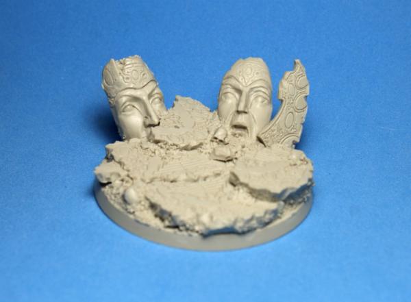
14392
Post by: nerdfest09
Well done mate! Great result on your always amazing painting, is always a pleasure to see your work and use it for inspiration
3488
Post by: jah-joshua
cheers, guys 
it's always a pleasure when ideas work out...
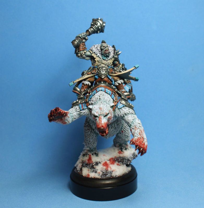
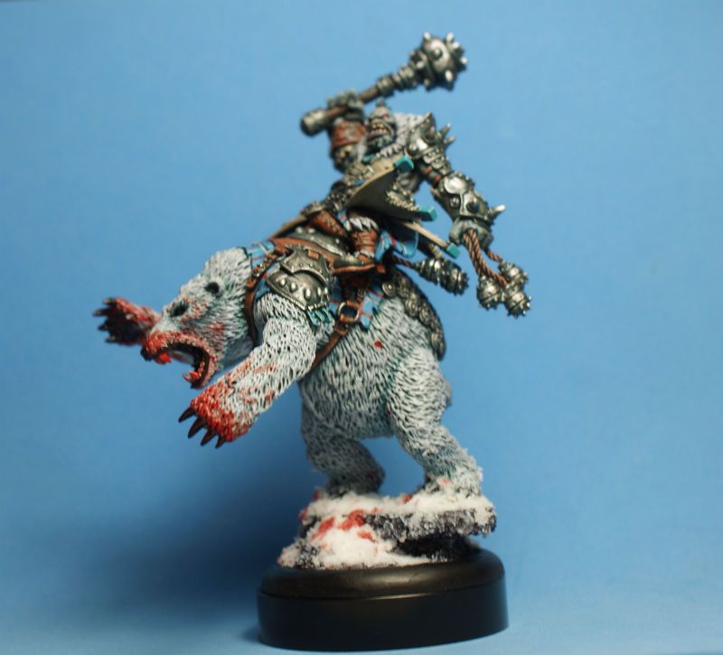
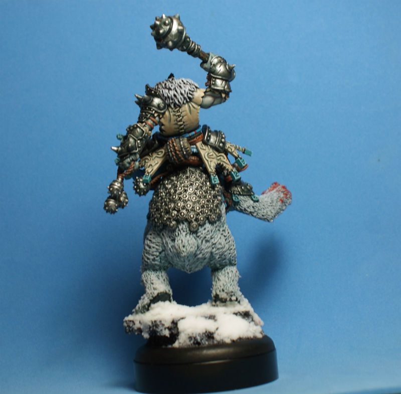
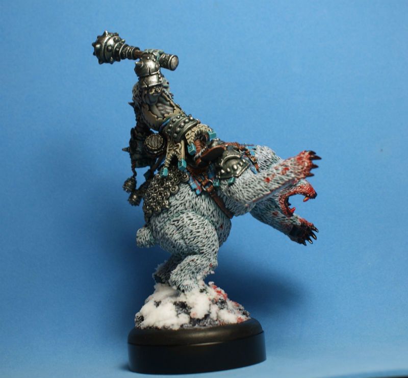
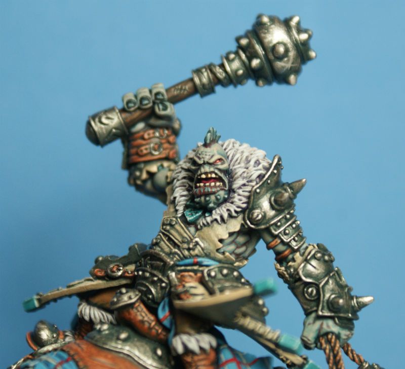
some of you may have seen this guy already, but for those that haven't, this is Borka Kegslayer, Vengeance of the Rimeshaws, from Privateer Press's Hordes game...
he was my contribution to the Clash for a Cure charity auction this year, an event that raises money for the American Cancer Society...
i had wanted to paint this guy since he was teased in 2014, but never had a chance...
when i was asked which model i would like to paint this year, there was never any question, it had to be the big guy on the bear!!!
i wanted to try and get the feel of the cold northern climes that Borka's Trolls live in, so i went with a blue undertone to everything...
i left out all of the golds of the studio scheme, except for a single gold tooth to put my stamp on the paint job, and shaded everything with blue and purple...
thanks for looking...
i hope you like him...
cheers
jah
14392
Post by: nerdfest09
I hadn't seen him before and he's really cool! (no pun intended) I like the way you kept him with cool undertones throughout the whole model it gives that snow bound look even if he wasn't riding a giant Polar Bear ;-)
81303
Post by: Stormwall
Looking great as always Jah.
Great skin tone and blood effect.
21358
Post by: Dysartes
Until the last picture, I was going to ask if it was Borka or the bear that got the gold tooth...
61618
Post by: Desubot
Nice job. also congrats on first place.
3488
Post by: jah-joshua
cheers, guys...
Borka was a lot of fun to paint
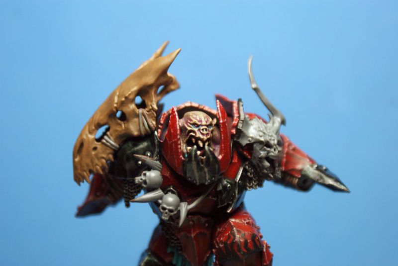
@Desubot: Borka, Astorath, and the Megaboss all won, too...
it was a good day at the con
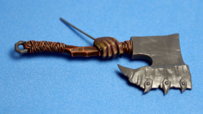
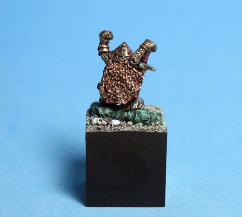
what could this be???
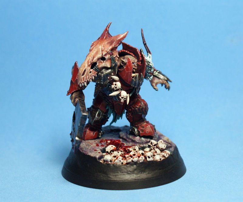
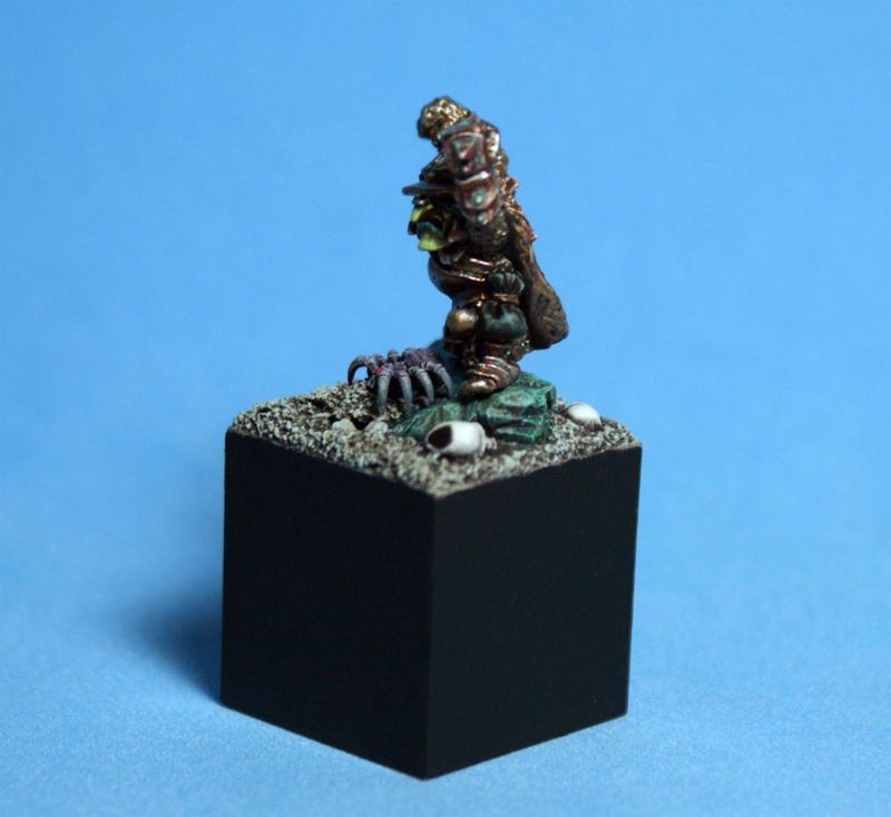
a bigass axe, and some very green skin...
i tried my hand at painting over un-primed plastic, ala David Soper...
since i paint with very thick paint, and very opaque layers, the bare plastic takes paint just fine...
i think it would be a bit delicate for gaming purposes, but those minis should be varnished to hell and back anyway...
it is a fun experiment, but i doubt that i will be abandoning my black primer any time soon...
this mini is an experiment in using very fine dots to highlight, rather than my usual edge highlights...
it is also a chance to work on very dark green skin, using more olive drab and purple, rather than the usual bright green that GW Orcs are normally painted with...
P3 Traitor Green, Ordic Olive, and Thrall Flesh, shaded with Citadel Druchi Violet, make a great skin tone on this guy...
thanks for looking...
i hope you like it...
cheers
jah
3488
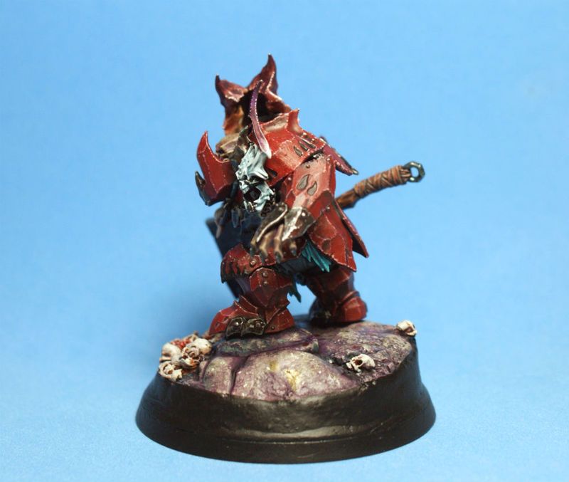
Post by: jah-joshua
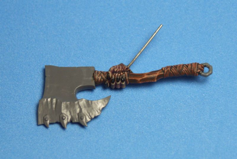
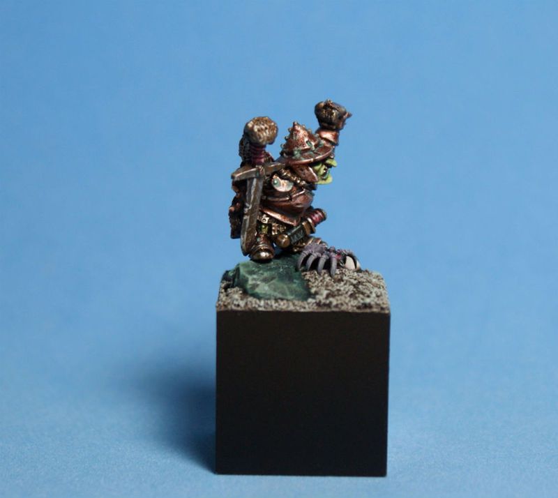
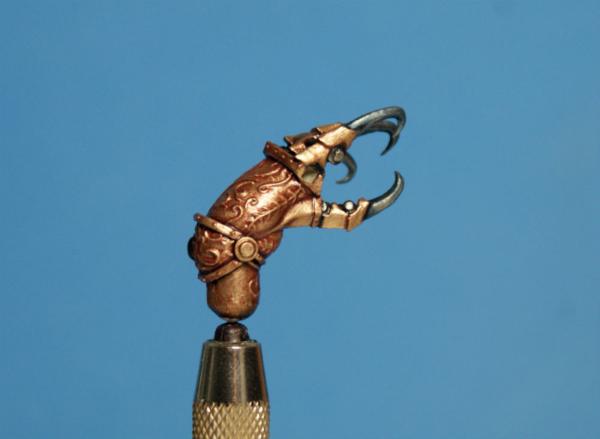
hey Dakka...
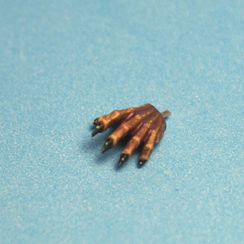
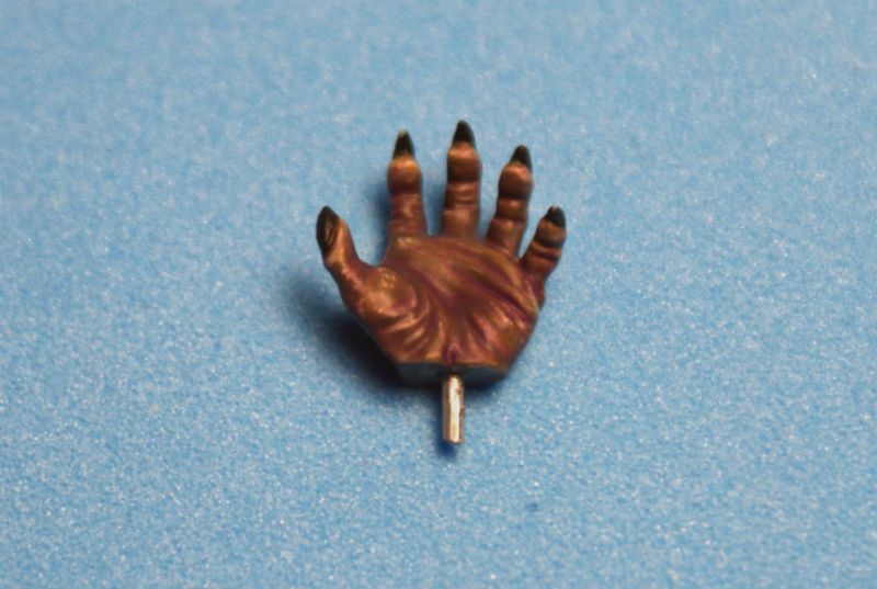
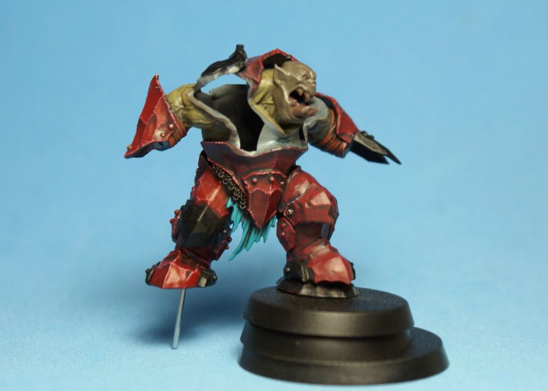
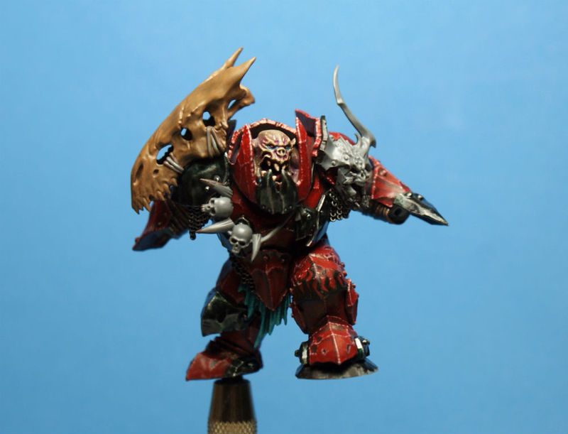
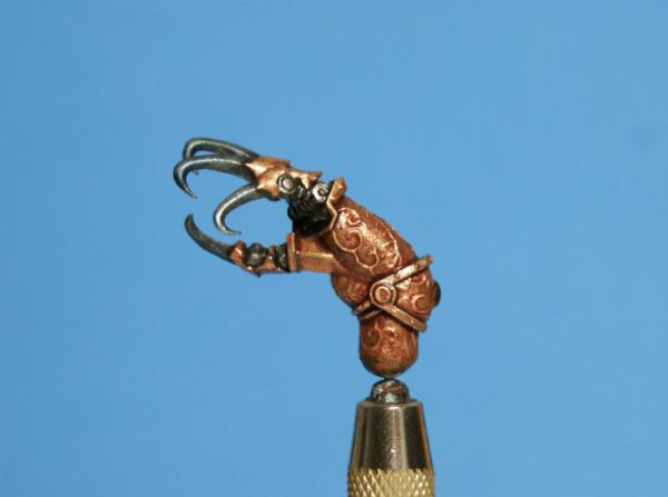
carrying on, here is the model that those wicked claws from yesterday belong to...
the first two stages of painting the skin are a solid coat of P3 Thornwood Green, followed by a layer of P3 Traitor Green...
you can see the Thornwood Green on the face, and the rest has had the Traitor Green layer... to get to the final stage, like the hands i showed yesterday, everything gets a heavy wash of Citadel Druchii Violet, a broad highlight of P3 Thrall Flesh, another Violet wash, and then a fine highlight of Thrall Flesh again, using fine dots...
the red can be seen in all of its stages here...
P3 Sanguine Base is the base coat color...
this is shaded with P3 Coal Black, and then layered up with a 1-1 mix of Sanguine Base and P3 Khador Red Base...
i wanted to keep a fairly "oxblood" tone to the armor, so i didn't go any brighter than that with my red mix...
the highlight dots are pure P3 Underbelly Blue...
to tie all of the layers together, make a richer looking red, and tone down the highlight a bit, i gave the armor plates a few layers of a glaze with pure P3 Red Ink...
normally, a glaze will be one drop of ink to ten drops of water, but i wanted the tint to be quite strong, so i didn't thin my ink at all this time...
keeping it to three layers, rather than the ten or fifteen i would do with a very thin glaze, gave me the effect I was after...
thank for looking...
i hope you like him...
cheers
jah
21358
Post by: Dysartes
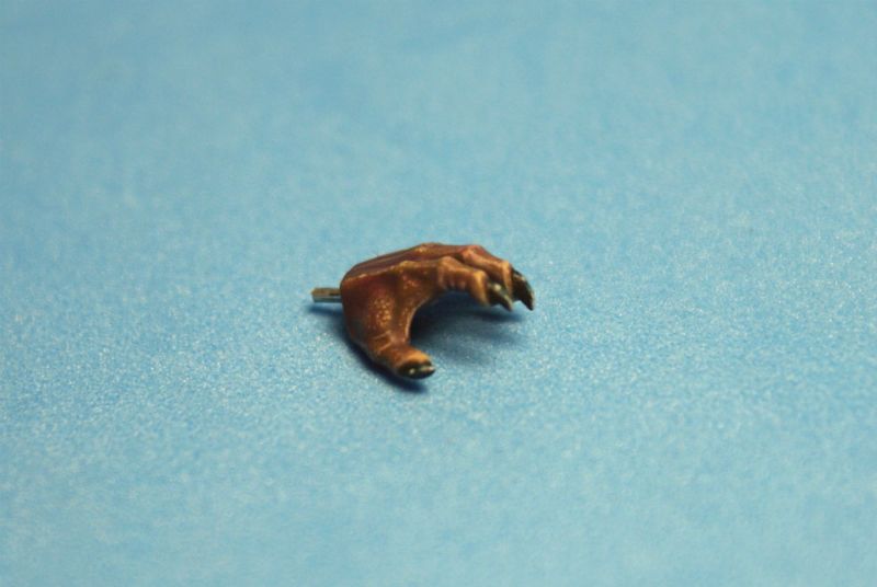
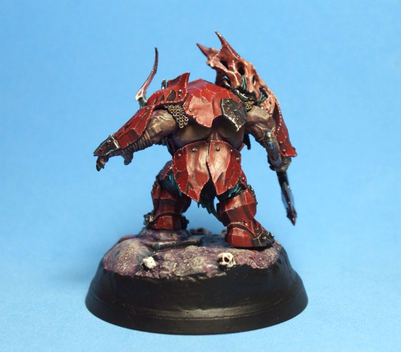
Your Orc appears to have exploded a bit there, jah - I take it there are some bit around the chest being left off to make the painting easier?
Nice tone to the red, and to the skin you showed yesterday.
3488
Post by: jah-joshua
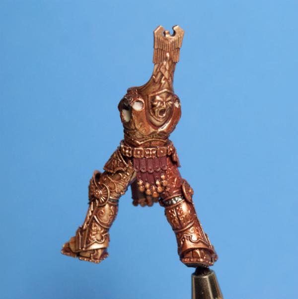
@Dysartes: cheers, mate, and you are exactly right 
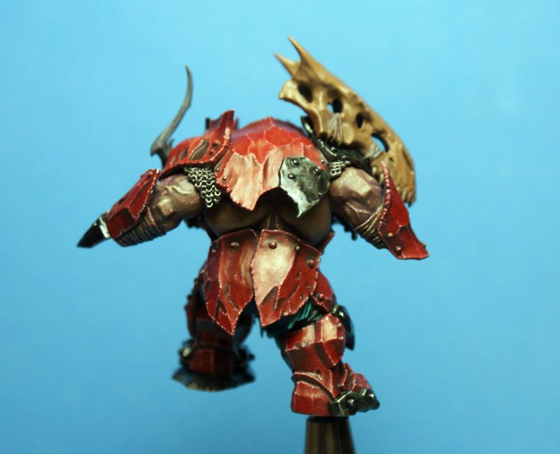
the first few shots of the Megaboss where missing some very crucial elements, namely his entire back and front plates, and two kickass skulls...
with the skintones painted, i could glue the rest of the pieces on without having to worry about leaving myself any really hard to reach spots...
before i glued the plates on, i base coated the inside of the big skull, the underside of the back plate, and the inside of the face plate...
the rest was carefully painted after the glue had completely dried...
as you can see, the Bloodletter skull, and the skull necklace have not been base coated in these shots...
it has been an interesting experiment to paint each separate component to completion in this way...
normally a mini is sprayed with black primer, and then i lay down all the base coats, to see if i like the scheme. this time, i just winged it even more than i usually do, and i had to be way more tidy laying down my colors than i ever have been...
i am usually a very sloppy painter for the first few layers, so it was good to be forced to exercise a bit more control for a change...
thanks for looking...
i hope you like him...
cheers
jah
91816
Post by: Januine
Tidy stuff Jah. Any peeks st what you're working on these days?
14392
Post by: nerdfest09
Looking good Jah! I really can relate to your painting as I see a lot of similarities (except for the much higher level you do!) which is good for me, i'm a messy painter until nearly the end of a model and I love watching it come together so knowing i'm not the only one gives me hope I can step up to do work like you can produce. That Orruk is a great model and huge with heaps of space to fill with detailed painting, you're smashing it out of the park so far! I like where the armour is going and the purple shades to the skin i'll steal :-)
3488
Post by: jah-joshua
@Januine: i don't have any pics of what is currently on the table...
there is three Kingdom Death ladies, a Tech-Priest Dominus, and a cool old Rackham Confrontation Dwarf w/ jet pack and a cool cigar all in various states of WIP, though
@nerdfest09: cheers, mate...
i'm sure i steal as much from your work, as you do from mine
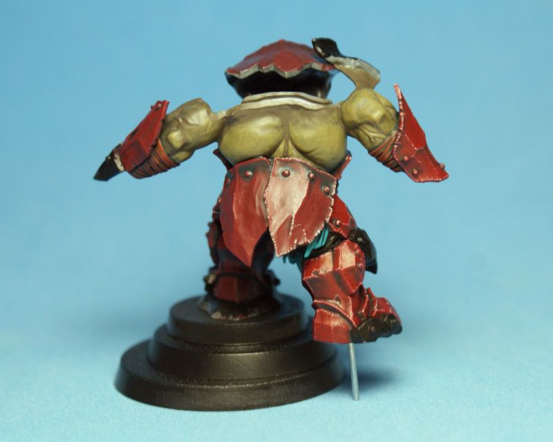
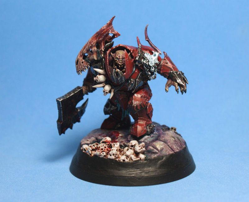
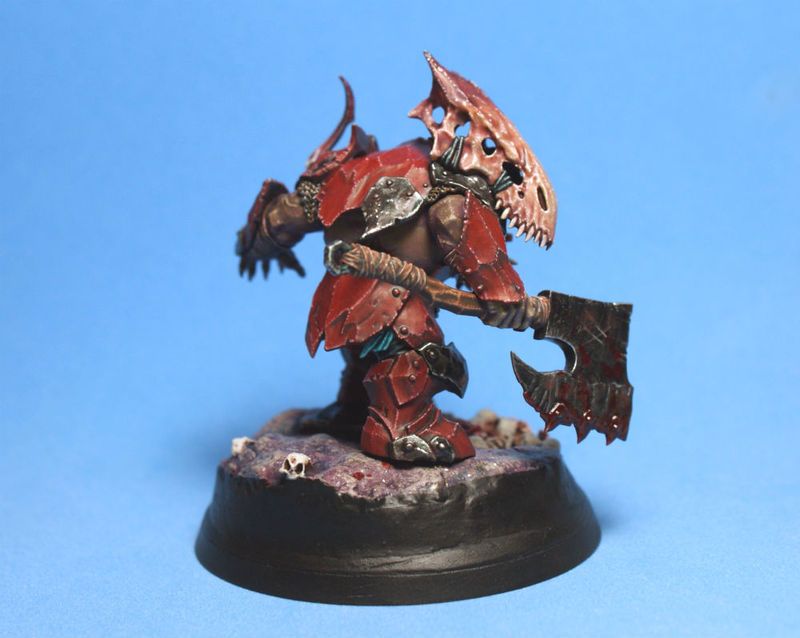
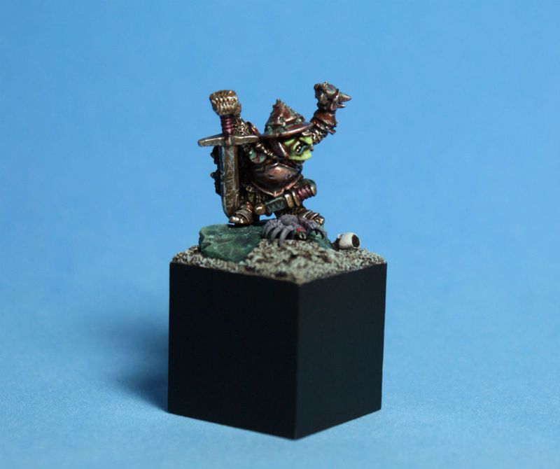
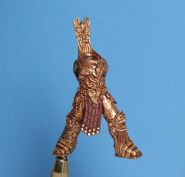
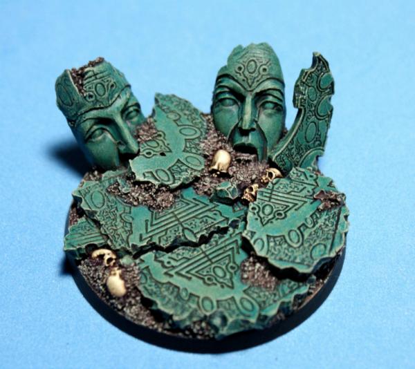
here is the recent Age of Sigmar Orruk Megaboss, in all his glory...
this is one of my favorite miniatures in the entire new AoS range, and was one of those rare models that i had to crack open, and get started with, as soon as i brought it home, and damn the consequences...
Brian Nelson did a hell of a job on this sculpt!!!
i'm not sure if the pointillism experiment was a success, or not...
that is up to the viewer, but it was a lot of fun to go crazy with the tiny dots, and i will definitely be trying a lot more textural ideas on future paint jobs...
the rock that he is standing on was an experiment in a loose painting style, with a lot of washes...
i started over a base coat of P3 Greatcoat Grey, a layer of Trollblood Highlight, and then spotty washes of P3 Green Ink, and an all over wash of Citadel Druchii Violet, and then finished off with some spots of P3 Rhulic Gold just for the hell of it...
unfortunately, the photos didn't really capture the gold flecks, but it is cool to see them catch someone's eye when they are looking at the mini, because it is so unexpected...
thanks for looking...
i hope you like him...
cheers
jah
62749
Post by: Dr H
Nice work, Jah. Like the colouration of the larger skull in particular.
The pointillism is good for indicating a rough surface, and would work well with other rough surface painting techniques (that's for smooth model surfaces, not on actual rough surfaces); Tyranid chitin comes to mind, as well as cloth items.
67097
Post by: angelofvengeance
That Megaboss is a thing of beauty, jah-joshua
Epic paint job.
52201
Post by: evildrcheese
That Ork is super cool, really digging the skin tone you've used and the way you've managed to achieve a lot of depth on colours despite using a relatively constrained spectrum of colours (browns, reds, etc)
EDC
84360
Post by: Mymearan
holy cow that is an amazing ork warboss!
3488
Post by: jah-joshua
cheers, dudes...
i have been having a lot of fun experimenting with painting on different textures lately...
right now i am playing with a snakeskin pattern on the coat of my Skarre bust from PP...
the larger surfaces really. like on this big guy, really need something a little extra...
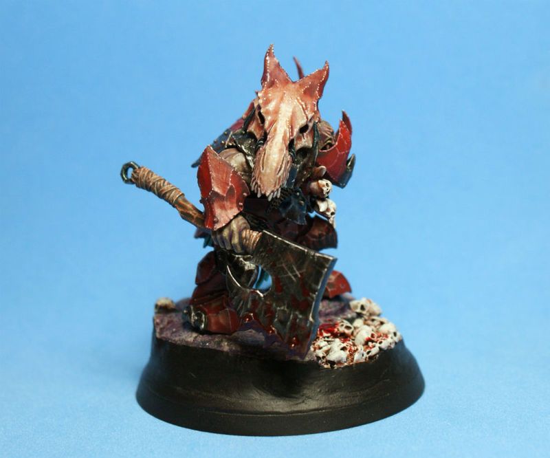
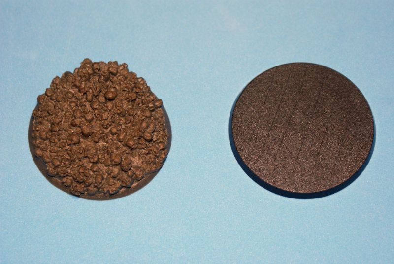
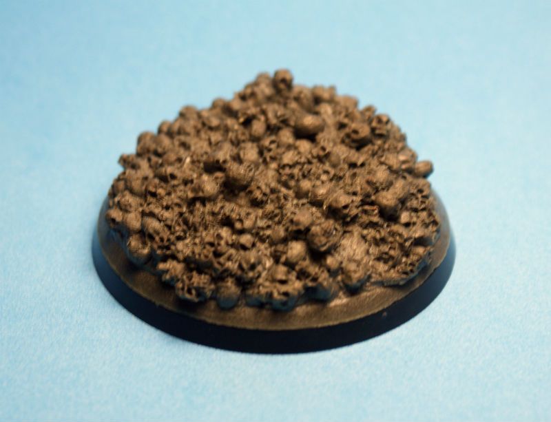
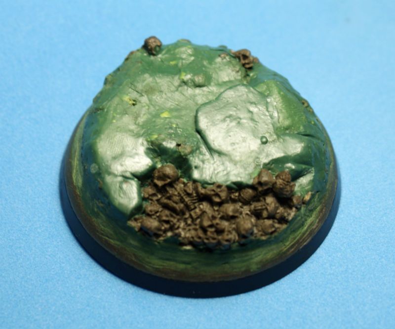
here is a quick step-by-step of the Magaboss' base...
i had this Epicast base laying around for ten years, waiting for the right model to put on it...
i thought about using it for a Khorne Jugger or something like that, but in the end, there where just too many skulls, even for me...
i finally hit on the idea to just sculpt some rock over most of the base, as a good practice exercise...
i started with the base that comes with the model, since it is slightly bigger, and glued the skull base on top of it...
the crosshatch lines ensure a better grip for the glue...
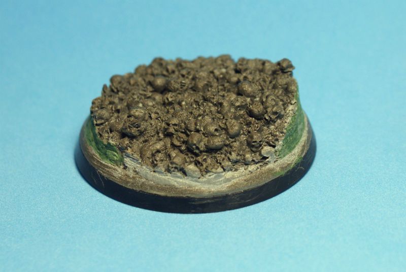
i'm not a fan of stuff hanging over the edge of the base, so all those skulls had to go...
after a bit of work with the hacksaw, I had a beveled edge that needed some putty to fill in the rough spots...
i used Green Stuff to build up the edges, and pressed a bunch of it over the bones that I wanted to cover...
then it was just a simple matter of shaping it into some rough rock shapes, with some grooves for texture, and some elevation for fun shapes...
the paint would do the rest...
thanks for looking...
i hope it was helpful...
cheers
jah
3488
Post by: jah-joshua
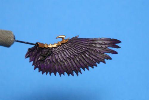
hey Dakka...
well, it turns out that my step-by-step pics are a little blurry, so they are going to be a bit on the small side to save your eyes the pain of looking at the full-size horror...
luckily, it is a very short process...
i started, as usual, over a black base coat of P3 Primer...
the first layer is pure P3 Beaten Purple...
then i painted in the feather texture using a 3-1 mix of Beaten Purple and P3 Morrow White...
the lower half of each feather was painted with a 3-1 mix of P3 Arcane Blue and Morrow White...
the last step is to deepen the shadows, and outline each feather, with a very thin wash of P3 Thamar Black...
that's it...
quick and simple, but eye catching on the table top...
thanks for looking...
i hope it was helpful...
cheers
jah
35246
Post by: genom.cor
Oooh Gorgeous!
14392
Post by: nerdfest09
Thanks man! Looks so striking and easy to replicate I'll have to have a go
3488
Post by: jah-joshua
cheers, dudes...
this should be a fun thing to try out again, when Demon Primarch Magnus comes out again at Christmas
here is a little something that I have been playing with in my spare moments..
it beats watching paint dry
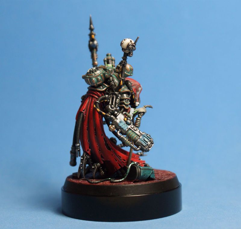
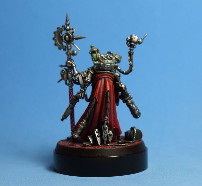
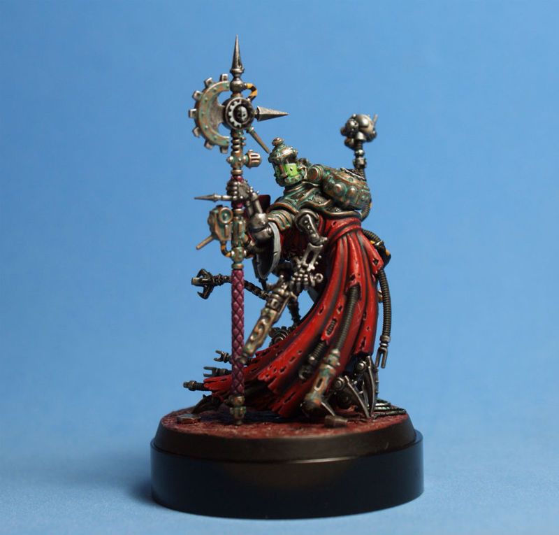
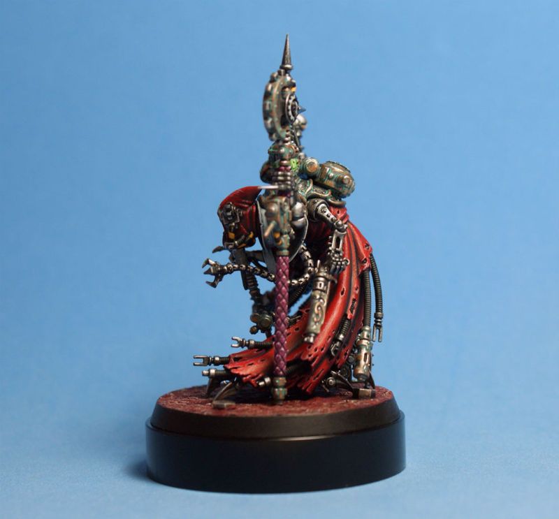
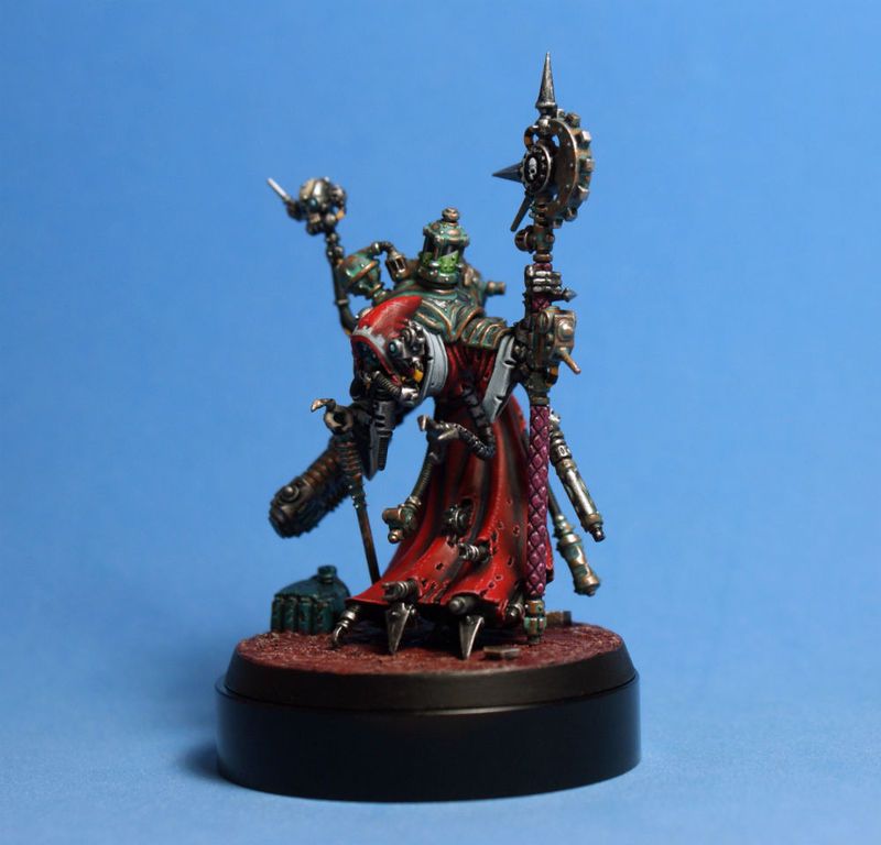
this is the Adeptus Mechanicus Tech-Priest Dominus, sculpted by Jes Goodwin...
man, he has still got the magic touch!!!
i can see myself painting a few more versions of this guy, in different color schemes...
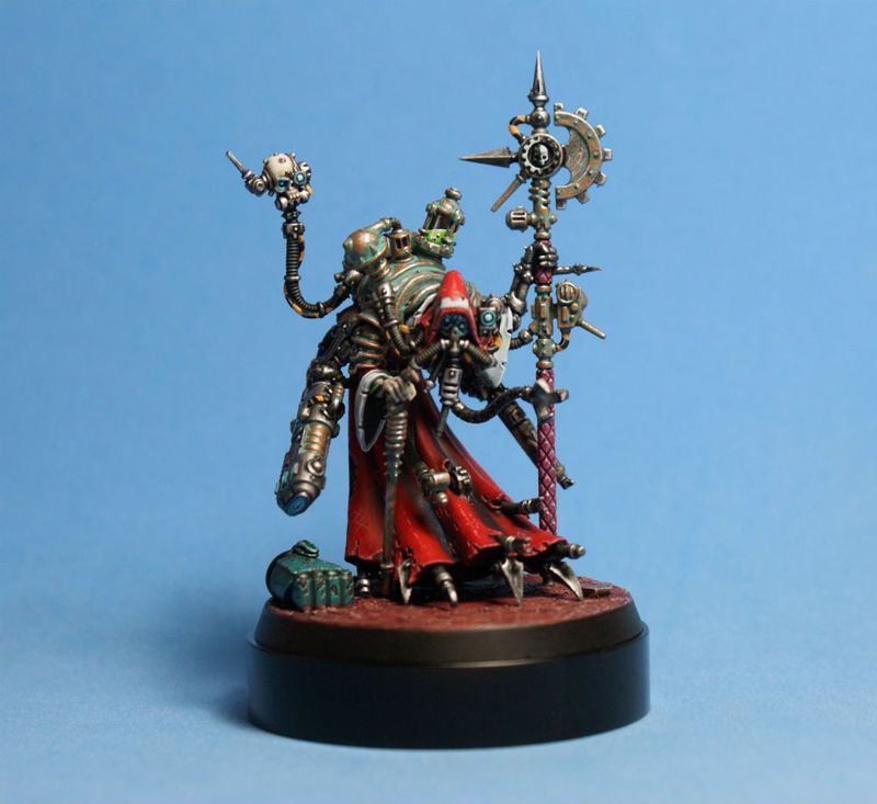
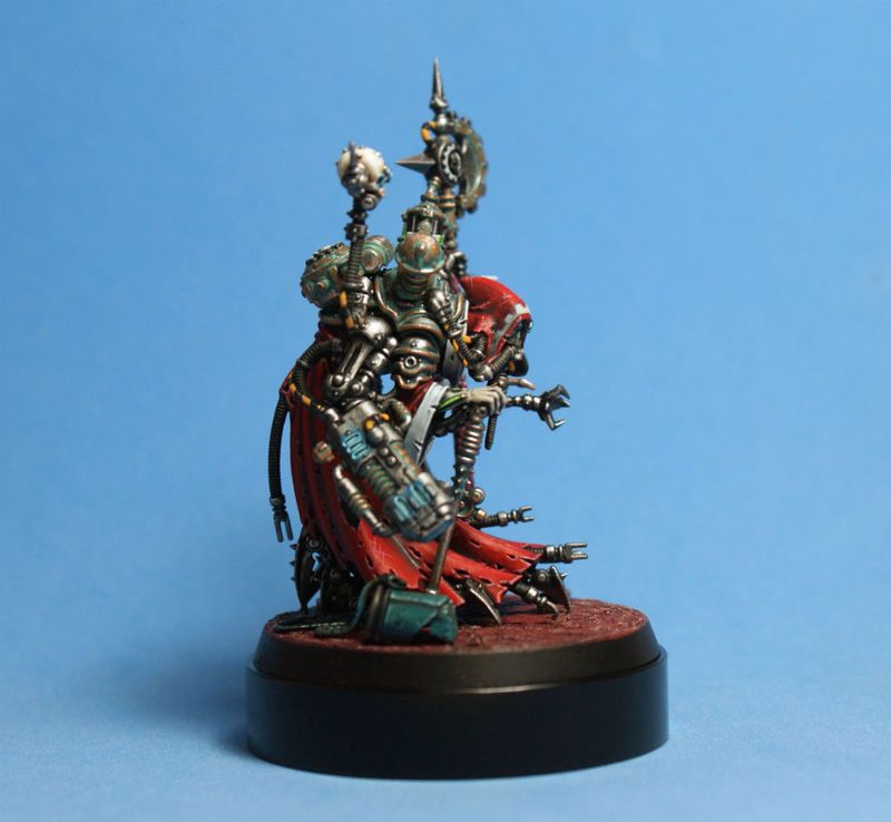
thanks for looking...
i hope you like him...
cheers
jah
39105
Post by: kakita
Damn thats some real pretty stuff...
I really like the red on the orruk.
3488
Post by: jah-joshua
thanks, kakita...
i am having a lot of fun working on trying a different tone of read each time i use it on a mini...
so many variations to try...
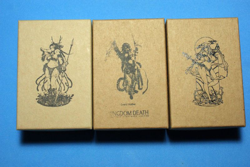
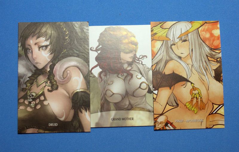
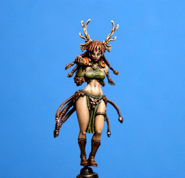
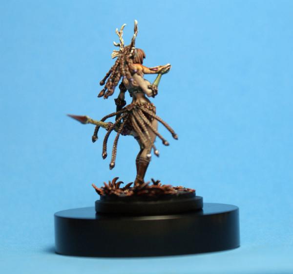
next up in the commission queue, three lovely Kingdom Death ladies...
the Christmas gift-giving season is approaching fast...
i am stoked that my homeboy has commissioned these three minis as gifts for his girlfriend...
i don't think i would ever get a chance to paint them otherwise...
most people hire me to paint Space Marines, so a few pin-ups will be a great opportunity to switch up my style.
these are my first experience with KD minis...
the resin casts are alright...
not quite on par with limited edition Studio McVey resin casts, but are "good enough"...
the detail is certainly there, but there is quite a bit if clean-up needed, and a few warped parts to straighten out...
i've been enjoying painting the very detailed bases, so far...
now it's time to dive in, and clean all these mold lines off of the ladies themselves...
cheers
jah
52201
Post by: evildrcheese
Nice work on the Tech priest, really fantastic model and you've done a brilliant paintjob.
Looking forward to seeing what you do with the Kingdom Death stuff, looks like it'll be a bit of a gear change.
EDC
61618
Post by: Desubot
Oh sweet. i heard about the concept for this commission if im sure which home boy you are talking about.
cant wait to see it pulled off.
103794
Post by: JustaerinAtTheWall
That's a properly weathered tech priest! He's looking mighty inquisitive.Pretty interested with this next project.
3488
Post by: jah-joshua
cheers, dudes
glad you like the Tech-Priest...
@Desubot: yeah, these are for Angry Mike
this is the "proof of concept" for my next commission...
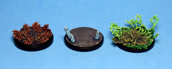
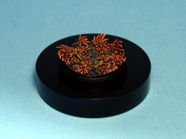
i started with the bases, because they are small, but still give an idea of the three seasons that i want to depict with the color schemes on the Kingdom Death Pin-Ups...
the Autumn base has small red-brown leaves, with mold spots on them...
this was a way to highlight the leaves without just going for a standard lighter tone of the base color, and also lend a "vibe" of the fallen leaves rotting, i hope...
the purple shade on the grey stones is a color that will be used throughout the project to unify the three models...
i was asked to give the Druidess that goes on this base olive green clothing, so i washed the sticks with P3 Ordic Olive to represent moss...
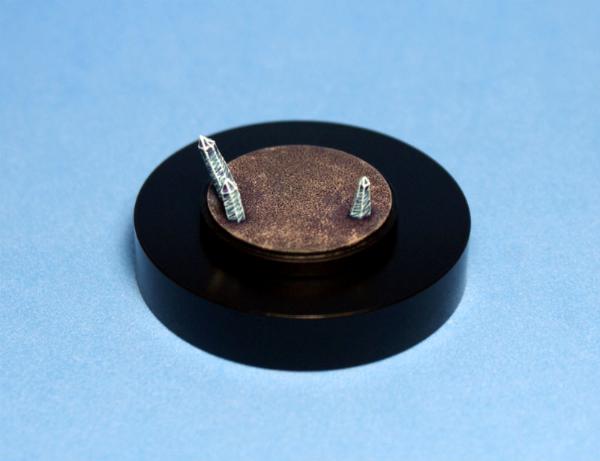
the Winter base, for the Grand Mother, was a bit of an experiment...
i cut the crystals out of some leftover plastic sprue pieces...
the paint job is a different take on the normal smooth transitions that everyone paints on their crystals...
i'm not sure if it works, but it was worth a try...
luckily, if the client doesn't like it, i can just paint over them...
the floor is rough, since it will be covered in snow...
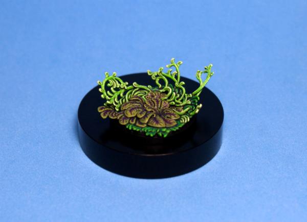
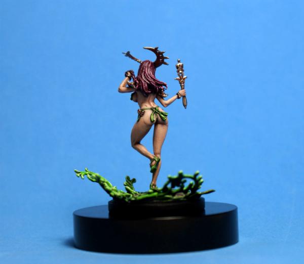
the Spring base, for Apotheosis, was just a bit of fun...
the purple on the broad leaf plants ties in with the other two bases...
the grass is green
the vines were a nice chance to try out more of the "broken line" style of highlighting...
thanks for looking...
i hope you like them...
cheers
jah
21358
Post by: Dysartes
The Autumn and Spring bases are looking great, jah - bit tricky to say much about the Winter one yet, as it isn't going to look finished without the snow added to it.
52201
Post by: evildrcheese
Nice looking bases, dude.
EDC
91816
Post by: Januine
Sweet. Looking forward to seeing the finished figs
65162
Post by: TheDraconicLord
How did you paint the Crystals? I like their aggressive look much more than the "soft hued" crystals you always see.
(Oh, and the other bases look very good, the green base's foliage is impressive!)
62749
Post by: Dr H
Nice job on the bases.
For the ice crystals; It's a pretty nice effect, but maybe a bit too regular. From a distance, at first glance, they look like they have evenly spaced lines across them. Only on closer inspection do you see they are interlocking "spikes" (also probably more apparent in the hand).
Maybe try missing a "spike" or two, here and there, to make it more random, and loose the illusion of regular lines.
3488
Post by: jah-joshua
cheers, guys...
glad to hear that the bases look good, because i've never done any like this before...
@TheDraconicLord: the crystals are just a blue base, shaded with purple, and then very light blue highlights much like a standard faded crystal is painted, and then white alternating spikes...
aggressive was pretty much the idea, because the Grand Mother that i am using for Winter is quite a creepy model...
@Dr H: i'm working on Winter now, so well see how she looks on the base, with snow down, and then i may just need to switch things up a bit...
i hope you all had lovely holidays, and the year is starting out well
catching up, after a brief pause from the forums...
photobucket has been giving me fits, and i don't like the way that the Dakka gallery resizes pics to be smaller...
until i work it all out, i'll just have to live with smaller pics, which you can click on and zoom in...
those of you who follow me on Facebook (the link is on page 1, in the first post) will have seen this already...
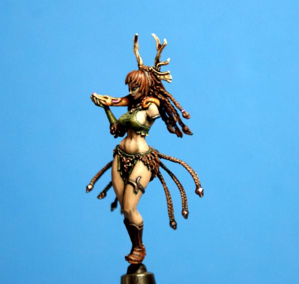
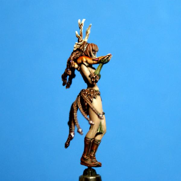
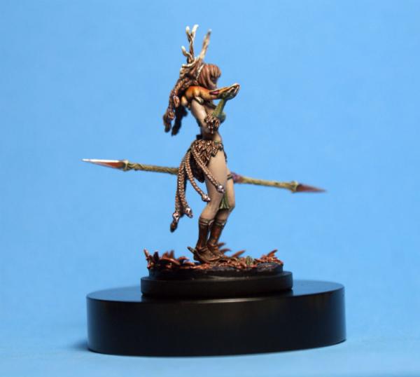
for those who don't, here is the WIP stage of the Kingdom Death Druid...
i was asked to paint the weasel creature to look like a tabby cat...
the girl who these minis are for has a tabby, so i used pictures of her's as reference...
the other request was to give her olive green clothes...
aside from that, the scheme was mine to choose...
i hope i picked some nice Autumnal colors
thanks for looking...
i hope you like her...
cheers
jah
72556
Post by: Red Harvest
I like the painting. The color choices are good. nice work on the face. The mini reminds me vaguely of the druid illustration in the new 5e D&D Player's Handbook. Although that one has a Tiger for a pet, IIRC. The mini has some very weird-- disturbing weird, not interesting weird-- proportions. (hip to knee length versus knee to bottom of foot length, for example. And the sizes of each, relative to each other. And hip to waist ratio. ( Cintura de avispa, ay.)
Don't take a pause from the forums, just take a pause from the Dakka Discussions. They really are the same movie, over and over again.
3488
Post by: jah-joshua
gracias, Red...
always interesting to hear your take on a mini, even if i disagree
i like the strange proportions of the mini, in the context of their setting...
Kingdom Death should be weird...
the wasp waist emphasizes the wide hips nicely...
this girl was done just in time for Christmas
the lady that received it as a gift was very happy, and really enjoyed seeing her tabby cat's coloration recreated on this Druid...
i tried to ramp up the texture on this mini, especially with the beaten-up leather of the boots, and the weave of the cloth...
hopefully it adds something a bit more interesting to look at...
this was my first time painting blue eyes...
it really adds a lot more life to a mini than the standard black pupil...
shading the skin, and the rest of the colors, with P3 Coal Black has added a lot of harmony to the color scheme, while giving her a less "pink" skin tone than i usually end up with...
there was a lot of fun experimenting on this mini, not least of which was trying to capture the "feeling" of a season...
now i just need to get better pics, that show the actual colors better :(
thanks for looking...
i hope you like her...
cheers
jah
61618
Post by: Desubot
Looks awesome
love the weasel
cant wait to never take mine out of the box or paint it :/
18698
Post by: kronk
Excellent skin tones! That mini is very roomy in the hips, as Hanabel says.
81303
Post by: Stormwall
Holy gak Jah, spectacular miniature.
72556
Post by: Red Harvest
Jah, the world would be a very boring place if everybody agreed on everything.  Important things here are that you enjoyed painting it and the recipient enjoyed the paint job. That's success.
It turned out very well, although I cannot make out the spear tip. (blurry) The use of the black for the skin gives the skin tones a quality that I associate with Necromancer minis, or vampires. Nice bit of contrast using it on a 'Priestess of Life'. Very effective I think.
I find painting braids to be a real PITA. How hard were they on this mini?
14392
Post by: nerdfest09
She's got your hair dude! :-) and looks wicked good!
52201
Post by: evildrcheese
Looks good, excellent work on the skin tones.
EDC
65162
Post by: TheDraconicLord
That is one sexy miniature with flawless skin. I really have to take a break from painting game models and practice some skin painting, I'm envious of that skin
62749
Post by: Dr H
Nice job, Jah. I like how you did the green in particular.
3488
Post by: jah-joshua
thanks, guys...
i am glad that everyone likes my first KD mini...
they are quite a chore to clean and prep, as well as being very delicate and stressful to work with :(
@Desubot: you cracked me up with that one...
i don't blame you, as i have grown to really dislike these so-called high-end boutique resins...
horrible casts...
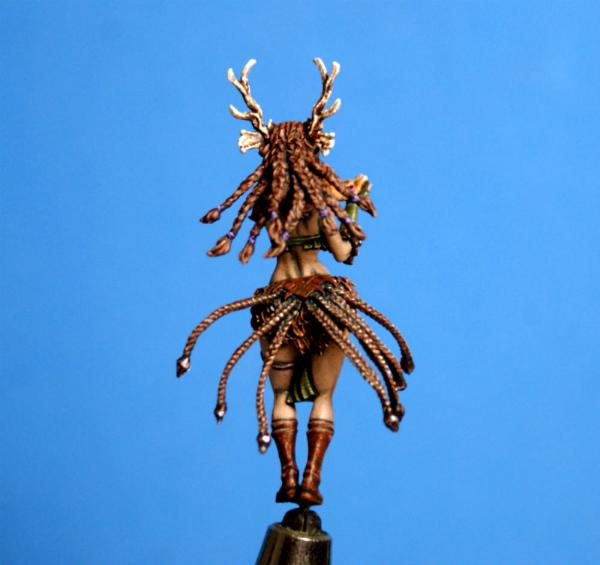
@Red Harvest: i found cleaning the braids a lot worse than painting them...
the mold lines were massive...
the way that i have been painting lately, with bright dots on the high-points, actually lends itself nicely to things like the braids...
a base coat, a wash, a mid-tone (dragging the side of the tip over the raised part of the braid), and a dot does the job
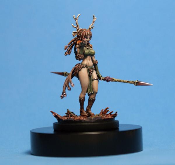
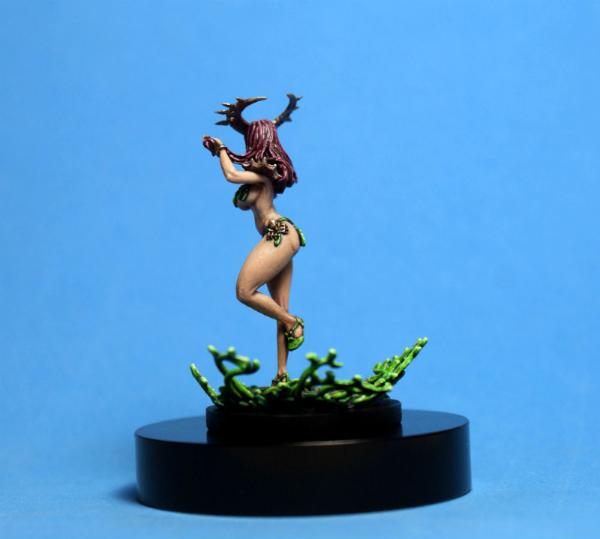
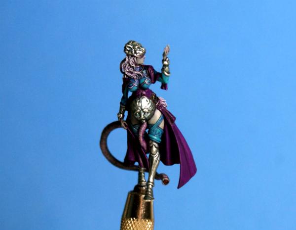
here is Spring...
sadly, i didn't get any WIP pics of her, because i had no idea what i was doing with the skin until the very end...
i was totally winging it, with no real plan...
in the end, i am happy with everything but the hair...
like Malifaux's Colette, i learned a lot about what not to do with hair, but still haven't quite cracked a style that i like yet :(
this is based on the Apotheosis Pin-Up from Kingdom Death...
the model comes with some draped cloth that hangs from her arms and waist, but we decided to leave those off, since she is clearly overdressed already
I hope i captured the feeling of Spring with the very bright green bits, and pink skin...
thanks for looking...
i hope you like her...
cheers
jah
52201
Post by: evildrcheese
Nice work Jah.
EDC
65162
Post by: TheDraconicLord
Her make-up looks amazing. The green make-up looks so good with that hair color, you are giving me some ideas (and of course the skin is ace)
62749
Post by: Dr H
Whatever it was you did with the skin it came out very well.
72556
Post by: Red Harvest
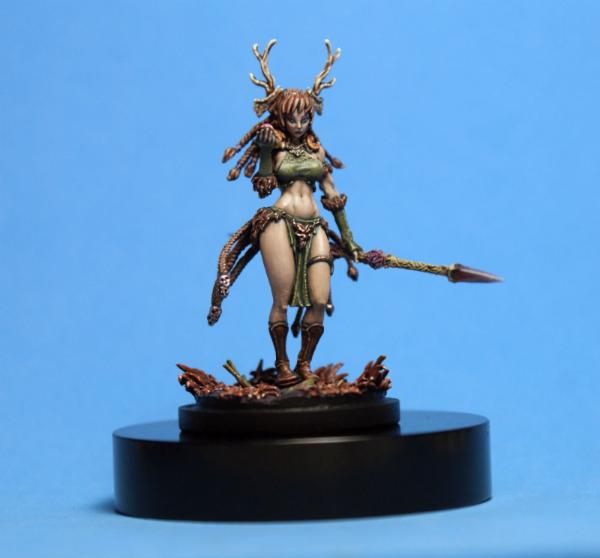
Hmm, a lettuce bikini and no fur. Spring is apparently a PETA supporter. 
How well does the green lipstick show in RL? I had to really zoom in on the image to notice it.
Nicely done overall. And hair... geez, it really depends on how well the sculptor did too. I painted the hair on the Bootleg Penthesilea-- which has excellent hair-- and it turned out, IMHO, fabulous. But then the hair on some of the other Infinity models, bleah, not so well sculpted at all. Spring's hair looks a bit 'ropey' -- which is sculptor's issue, not a painter's issue. You did about as well as can be expected.
3488
Post by: jah-joshua
thanks everyone...
glad the skin on the girls is a hit, because it is my least favorite thing to paint, and just feels like a lot of hard work...
sorry the pics are such a let down...
the make-up shows up a lot better on the mini in real life...
both on the Druidess (Autumn) with her purple eyeshadow, and on Apotheosis (Spring)...
the hair is actually really well sculpted on her, but the photos only picked up the glossiness of the final wash, making it look horrible...
in hand it looks better, and the "wet look" really goes with the shiny dots on the green vines...
here is a little sneak peek at my next project, which i am working on alongside Winter, at the moment...
The God-Emperor of Mankind!!!
i have wanted to paint this model since it was released...
when the opportunity came up, i jumped all over it
he is a big guy, in 54mm scale, but i have a feeling that he will fit just fine on the tabletop, as the supreme human...
i started off with the head, since it is the simplest part of the sculpt...
the rest of him is covered in filigree, and the eagle's feathers are detailed as hell...
i figured the most powerful human psyker should be showing his power a little, and the blue eyes will help draw the viewer to his face, rather than his shiny gold body...
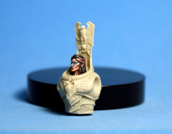
thanks for looking...
cheers
jah
91101
Post by: gummyofallbears
Theres a model?????
The mini looks amazing, the face especially is quite gorgeous but who expects less of Jah?
103794
Post by: JustaerinAtTheWall
Excellent work on the ladies there Jah, but the Big E has my full attention at this point. The celestial knight model, I presume?
65162
Post by: TheDraconicLord
 JustaerinAtTheWall wrote: JustaerinAtTheWall wrote:Excellent work on the ladies there Jah, but the Big E has my full attention at this point. The celestial knight model, I presume?
It sure looks like it. It has the 2 headed eagle and everything.
Honestly, there's only one thing to say about you painting this model:
61618
Post by: Desubot
Jesus i though that was just a photo shop.
dat contrast
3488
Post by: jah-joshua
thanks, everyone...
yes, this is the Kabuki Studio Celestial Knight...
glad that the face is a hit
this is the first stage of the golden armor...
i began over a black undercoat of P3 Primer...
the first layer of paint is P3 Molten Bronze, followed by a heavy wash of 1-1 P3 Sanguine Base and P3 Coal Black, and then a coat of P3 Flesh Wash...
the base that we have chosen is a 60mm Scibor...
thanks for looking...
cheers
jah
3488
Post by: jah-joshua
hey Dakka...
taking a brief interlude from the step-by-step of the Emperor, i needed a piece to enter in the Fantasy Single category at the local convention last Sunday...
i chose the mini that i would paint at 9pm the night before the painting contest, an old school oop Marauder Miniatures Goblin Chieftain...
after 25 years of him sitting in my miniature collection, it was about time i got around to painting this cool little guy...
this is the first of what i am calling the "12 hour challenge", where i will see if i can paint a mini in one furious painting session, which is something i have always had trouble with...
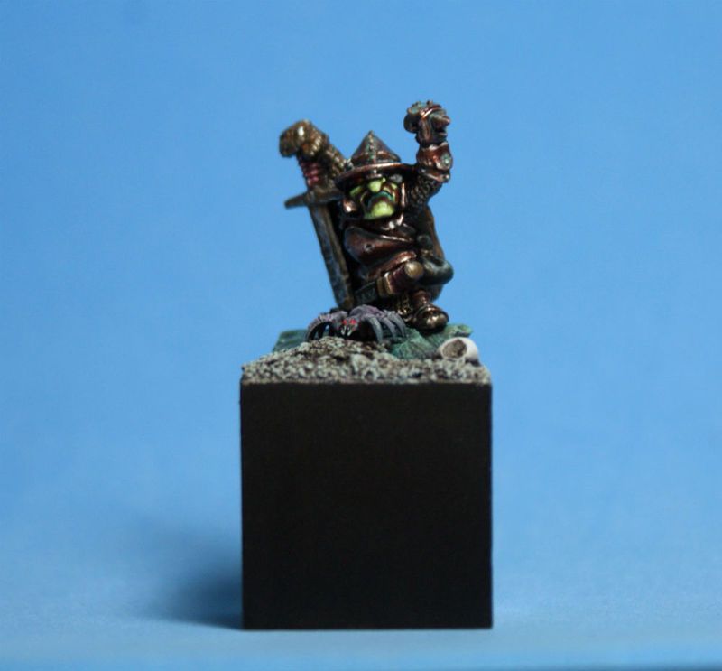
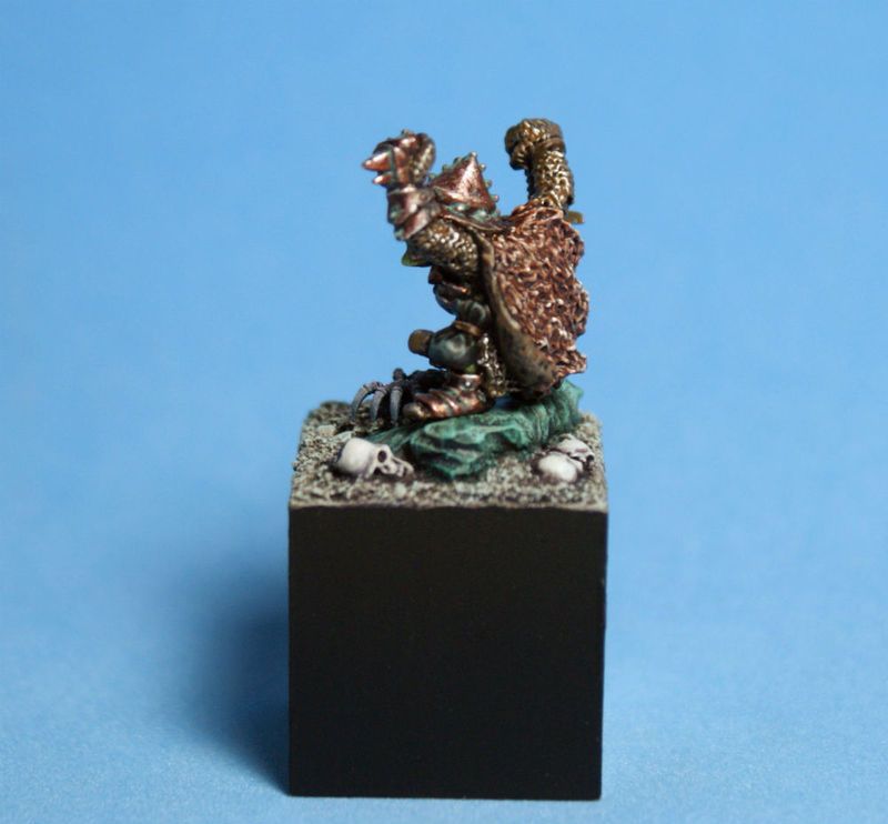
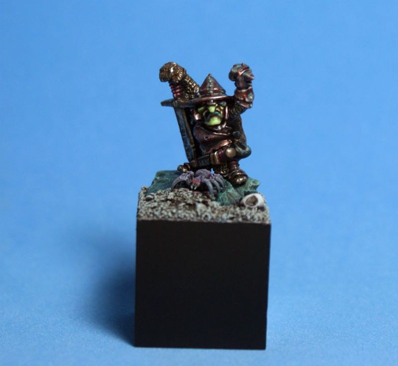
i had a lot of fun painting this guy up, even if the ticking clock did start to stress me a little as the deadline to enter the contest raced closer...
at the end of the day, he took 2nd place, so that is not a bad result for a last minute entry...
the green skin, verdigris on the bronze armor, and turquoise rock have a nice harmony together...
i look forward to painting my old Dwarf Hero from Marauder soon
this guy is for sale, along with a handful of my other painted minis, in the Swap Shop, if anyone is interested...
https://www.dakkadakka.com/dakkaforum/posts/list/556171.page
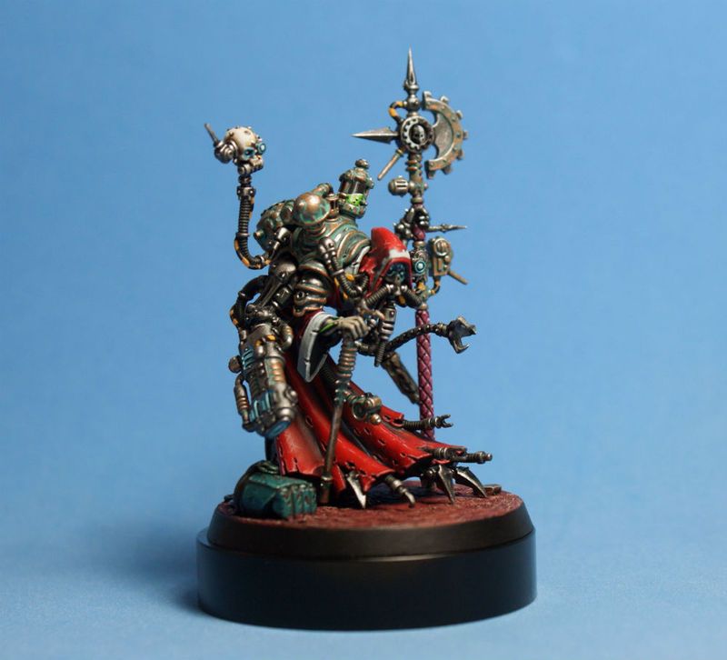
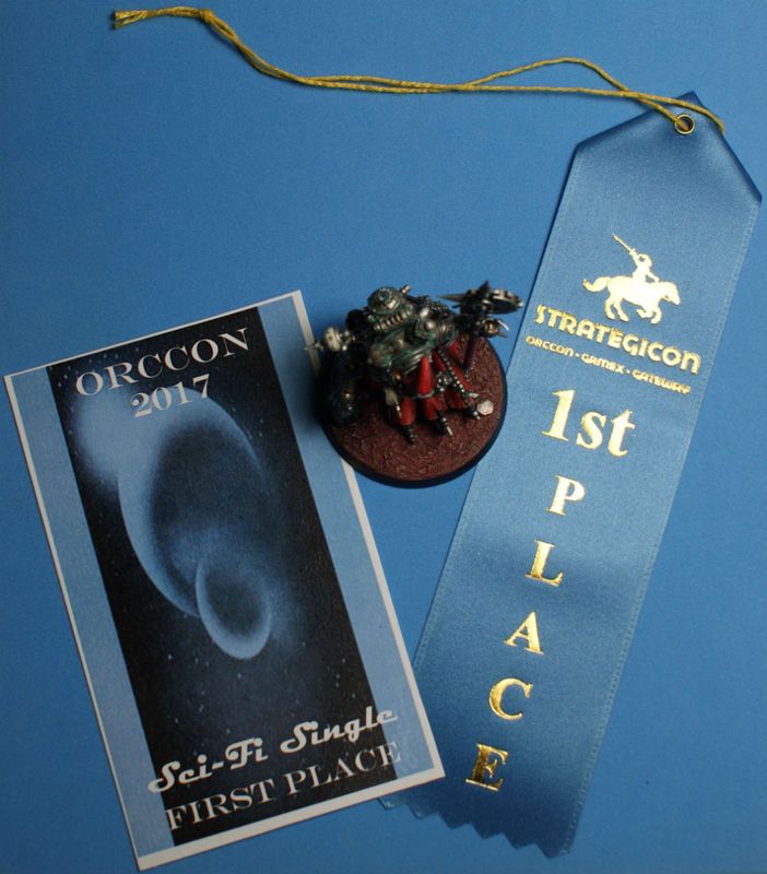
the Tech-Priest Dominus took first place on Sunday!!!
thanks for looking...
cheers
jah
77159
Post by: Paradigm
Very cool. There's always so much character in old gobbos and orcs, and you've definitely brought that out .
51376
Post by: Zambro
Wow, well done on first and second place (thought for a minute that it was the very same competition... lol).
14392
Post by: nerdfest09
12 Hours for one model?
3488
Post by: jah-joshua
cheers, Para...
i really like the old Marauder Miniatures sculpts
for minis that are older than a lot of the Dakka users, they have stood the test of time pretty well...
a real pleasure to paint...
@Zambro: same contest, two different categories...
@nerdfest09: 12 hours for the mini and the base...
that's a fraction of the amount of time that i normally spend on a mini...
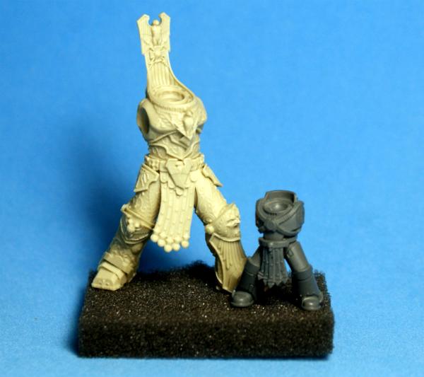
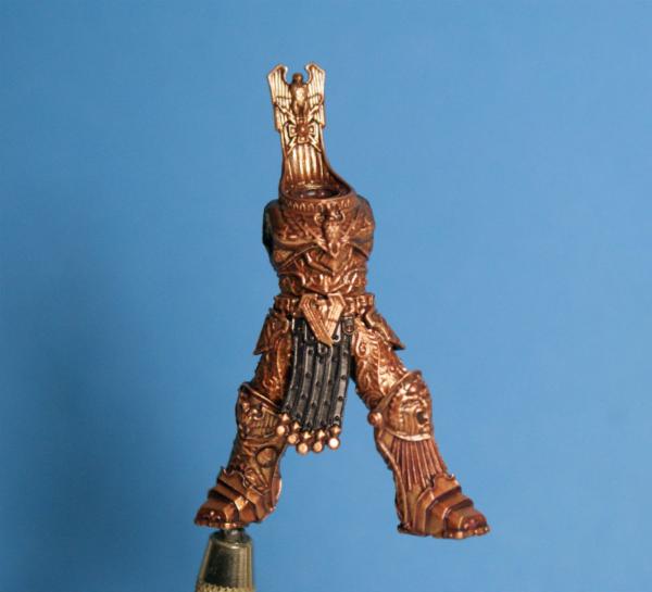
the next two stages of The Emperor...
first up is Stage 2, which is a layer of P3 Rhulic Gold and Molten Bronze at a 2-1 ratio, followed by a coat of undiluted P3 Flesh Wash...
stage 3 is pictured along with a test-fitting of the model on his base...
this is a layer of Rhulic Gold and Vallejo Air Gold at a 3-1 ratio...
if you check out his left leg, you can see the difference between Stage 2 & 3...
the armor has gotten a lot lighter, and much more golden in comparison to the previous layer...
the 60mm base is a pretty good fit for the 54mm model...
thanks for looking
cheers
jah
3488
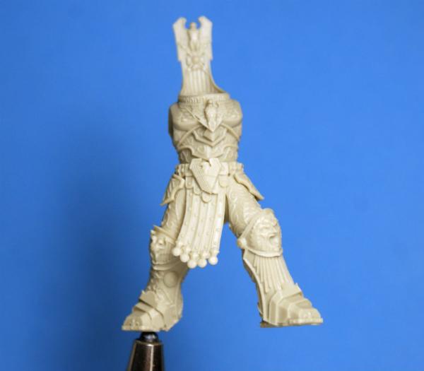
Post by: jah-joshua
hey Dakka...
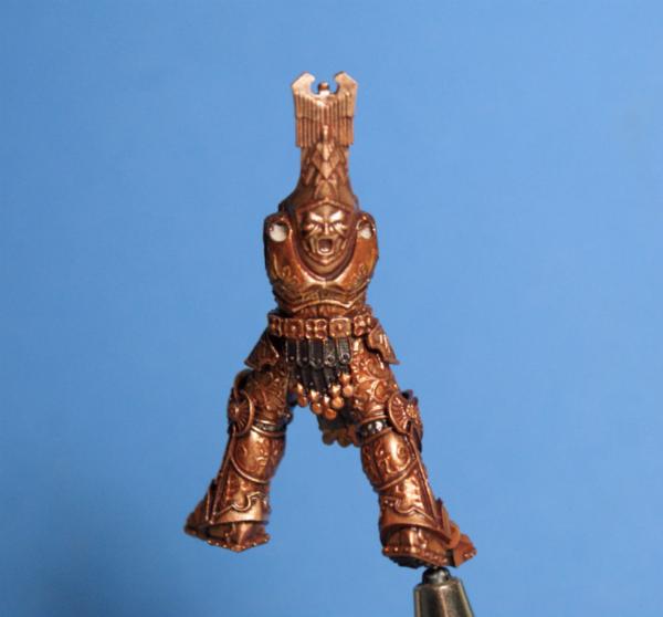
the progress continues...
the armor is still at Stage 3 (P3 Rhulic Gold and Vallejo Air Gold at a 3-1 ratio) in these photos, but has had the P3 Flesh Wash coat again over the top of the gold...
i have now built up enough of a reddish-gold base to have a lot of contrast when I start the proper highlights...
from here on, things will start to get interesting
the base has had the rough color scheme established...
the stone is base coated with P3 Meredius Blue, while the skulls and soil got a base coat of P3 Greatcoat Grey. ..
the whole base was washed with a layer of Citadel Druchii Violet for shading...
now I have to re-establish the base colors, and decide how I would like to highlight the stone...
i am thinking of a rough sponge technique, and then some gold marbling to tie in with the armor...
thanks for looking...
cheers
jah
77159
Post by: Paradigm
Coming along nicely! This is a beast of a mini and I can't wait to see it done!
3488
Post by: jah-joshua
cheers, Para...
he's coming along
Stage 4 of the gold is done...
it is a mix of P3 Rhulic Gold and Vallejo Air Gold at 2-1, then another coat of P3 Flesh Wash...
i started on the pteruges (the hanging leather straps)...
it is just a simple base coat of P3 Sanguine Base, so far...
the eagle got a base coat of P3 Umbral Umber, and then the lighter feathers got a coat of P3 Hammerfall Khaki and a shade wash of thinned Umbral Umber...
the feet and beak get a coat of P3 Rucksack Tan, and the metal is base coated with P3 Pig Iron...
next up, the finished eagle...
thanks for looking...
cheers
jah
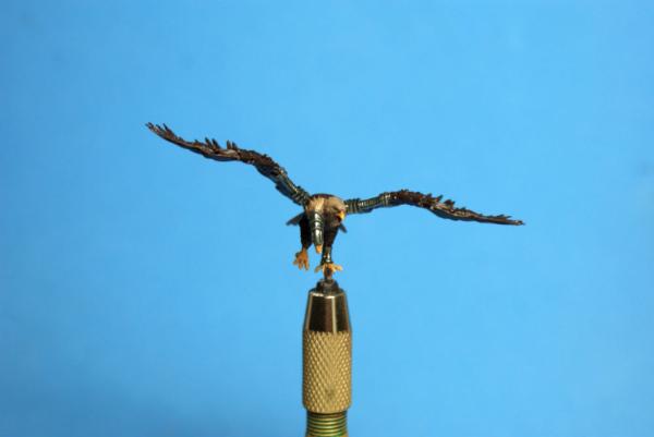
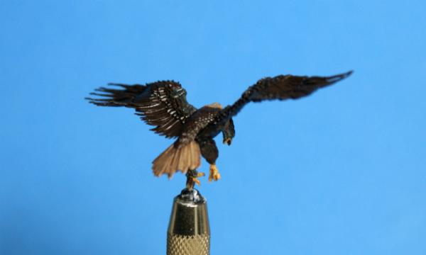
3488
Post by: jah-joshua
hey Dakka...
the bird is done!!!
i had to take a bit of artistic license with this bald eagle...
i tried using real world reference for the first attempt at this paint job, but it didn't work well on a miniature scale...
in photos of actual bald eagles, their flight feathers have a lot of white showing under the dark brown...
when i painted it like that, it just looked like a sloppy, or unfinished, paint job, like i hadn't covered all of the primer :(
the brown base coat color worked well, but a mid-brown highlight looked very boring...
in the end, i had to go for a very red-brown to make the feathers look more interesting...
i finished the white feathers and claws with P3 Menoth White Highlight...
the darker feathers were highlighted with P3 Bloodstone...
the beak and feet were finished with P3 Sulfuric Yellow (a color I hadn't used before)...
the metals got a highlight of Vallejo Air Aluminium, and the cables were painted with P3 Khador Red Base...
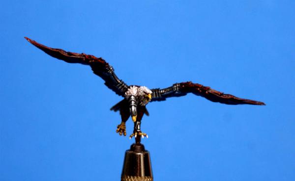
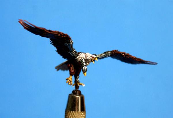
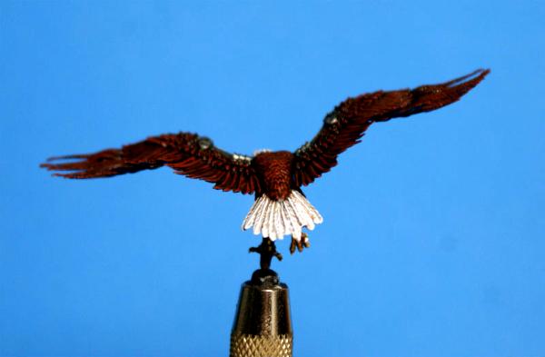
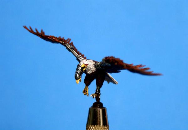
now i am painting the wicked lightning claw arm that he will be perched on
thanks for looking...
i hope you like him...
cheers
jah
62749
Post by: Dr H
Nice work. Bird looks cool.
72556
Post by: Red Harvest
Good work on the bald eagle. I painted an old wood elf warhawk as one, some time ago. It makes for a very distinct, and eye-pleasing, paint scheme. And Bald Eagles are cool. Even ones that eat cats. Or especially the ones that eat cats
52201
Post by: evildrcheese
Ooo Emperor of mankind eh? Looking good.
EDC
14392
Post by: nerdfest09
Jah that's bloody wonderful! what a cool bird, the tiny white highlights on the heads and tail that give it texture are my favorite part, you've nailed the image of a Bald eagle even if it's not true to life :-)
3488
Post by: jah-joshua
@DR. H & EDC: cheers, guys
@Red Harvest: yeah, i like bald eagles...
they used to live right at the bottom of the cliffs in Homer, Alaska, and they are so big, they don't fear anything...
i could walk right up to them, and have a little visit every morning as they ate shellfish off of the rocks at low tide
@nerdfest: the sculpting on the bird is really fine and detailed...
i just did the paint-by-numbers
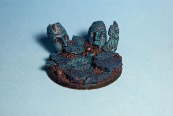
almost finished with this big bastard!!!
i still have to ruminate about using some gold speckling on the base's stones, just to jazz it up a bit, but the basic scheme is finished...
the stones are painted with a base coat of P3 Meredius Blue, then washed with Citadel Shade Druchii Violet...
after a clean-up with the Meredius Blue again, i lightly drybrushed the highlights with P3 Underbelly Blue...
a wash of P3 Turquoise Ink ties it all together...
the soil is a base coat of P3 Greatcoat Grey, a wash of Druchii Violet, and a drybrush of Underbelly Blue...
the skulls are a base coat of P3 Gun Corps Brown, a wash of Druchii Violet, a layer of P3 Menoth White Base, a wash of Citadel Shade Reikland Fleshshade, and then a stippling of P3 Menoth White Highlight...
overall, i think that the use of the violet wash throughout the three different elements of the base ties it all together nicely, but the three colors still stand out from each other...
i like the contrast between the dark soil and vibrant stones, while the red-browns and white ensure that the skulls don't get lost in the light highlights of the soil and stones...
quite a fun little experiment in painting an alien landscape...
thanks for looking...
i hope you like it...
cheers
jah
3488
Post by: jah-joshua
hey Dakka...
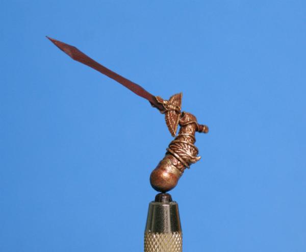
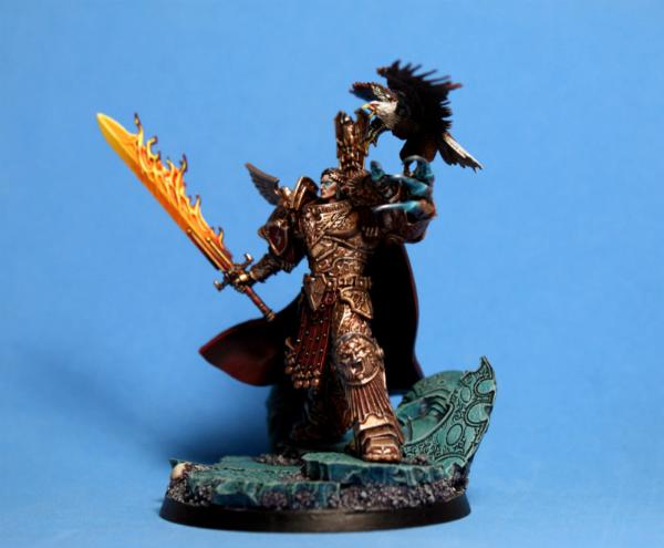
arms, claws, and flaming sword???
yep, The Emperor is about to be armed!!!
bad jokes aside, the gold on the arms is up to Stage 4, and almost ready to be glued on so that i can paint the shoulder pads...
when i first saw this mini, i immediately thought, "That sword needs some flames."...
luckily, over the few weeks that i had to put this model on the back burner, Games Workshop released a version of The Emperor's sword...
the hand is even in the exact same scale...
that was nice of them!!!
thanks for looking...
cheers
jah
3488
Post by: jah-joshua
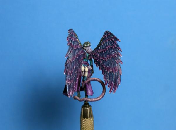
hey Dakka...
i haven't shown any pics of Winter...
this is the scheme that i decided to go with...
P3 Meredius Blue and P3 Beaten Purple are the colors for her outfit...
P3 Greatcoat Grey is the base for the skin and hair...
P3 Frostbite is used to highlight the hair, and the skin i built up by adding P3 Ryn Flesh to the Greatcoat Grey...
the metals are P3 Cold Steel washed with an equal mix of P3 Coal Black and P3 Armor Wash, and highlighted with Vallejo Air Aluminium...
now i just need to figure out how i want to highlight her clothes :(
thanks for looking...
i hope you like her...
cheers
jah
52201
Post by: evildrcheese
Winter looks ace.
Class work on the Emperor's arms too, though it'ĺl be a shame to lose the pretty hilt from the one you'very painted when you swap for the fiery sword.
EDC
94888
Post by: JamesY
Nice work so far Jah, that eagle in particular looks great.
62749
Post by: Dr H
Nice work, JAH. Like the green on the base and the golds.
Winter is looking good. For highlighting the purple (I'm assuming your talking about the purple), as she is meant to be winter, I'd say a cool highlight to emphasise the cold; a pale lilac to light blue (as opposed to a pink or magenta).
3488
Post by: jah-joshua
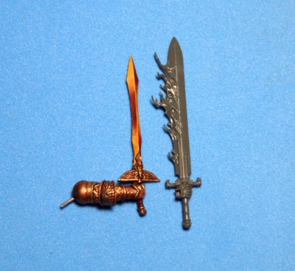
@EDC: i've saved the bits that i had to chop up, like the eagle hilt, and the eagle head on the end of the handle, as well as the blade...
rest assured, they will show up on a future mini or two
@JamesY: cheers, mate...
the eagle was a lot of fun to paint, and is a great sculpt...
@Dr H: P3 Underbelly Blue and P3 Frosbite are nice white-blues...
the question is more one of how to highlight the skirt to look like snowfall, without looking heavy-handed :(
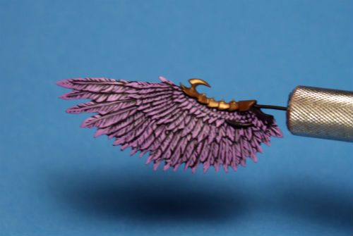
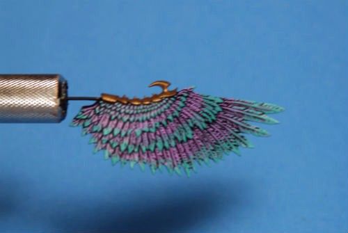
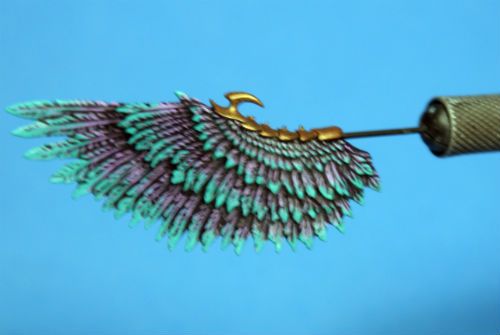
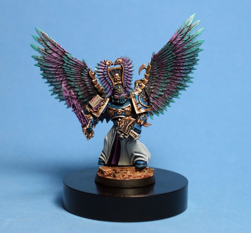
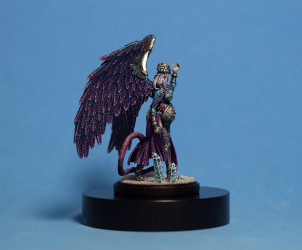
here is a quick little step-by-step for the wings that go on the Kingdom Death Grand Mother mini...
i wanted her to look like snowfall in the moonlight...
i still have to work out how to do this kind of highlighting style on her clothes, but the wings seemed like a good place to start...
Step 1 was to lay down a base coat that matched the colors i used on her clothes, so P3 Meredius Blue first, and then P3 Beaten Purple for the tips...
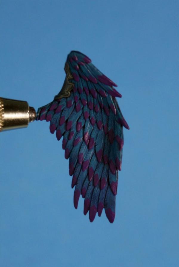
Step 2 was a shade wash of Citadel Druchii Violet, and then a mix of P3 Murderous Magenta and P3 Menoth White Highlight (mixed 3-1) for highlights on the purple wingtips...
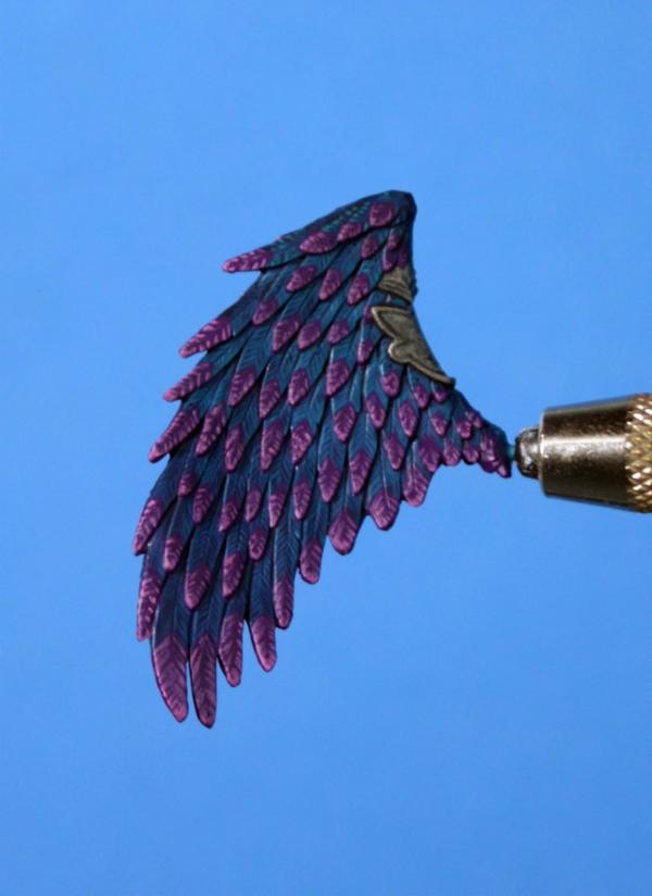
Step 3 was pure dots of P3 Underbelly Blue all along the edges of each feather...
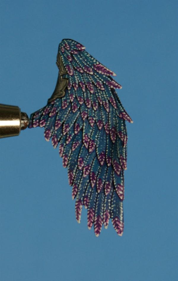
Step 4 was another wash of Citadel Druchii Violet to tone everything down, blend it together, and give a darker look...

simple, but effective, i hope...
thanks for looking...
i hope you like the style
cheers
jah
14392
Post by: nerdfest09
Lovely! simple yes, effective yes! sort of how Pyriel taught me to paint material like velvet, the dots give it the reflection or highlight while the blends in the background give your eye the colours.
95627
Post by: EmberlordofFire8
Subbed, Iike how this is going!
62749
Post by: Dr H
 jah-joshua wrote: jah-joshua wrote:@Dr H: P3 Underbelly Blue and P3 Frosbite are nice white-blues...
the question is more one of how to highlight the skirt to look like snowfall, without looking heavy-handed :(
Ah, well that's another question...
In what way are you thinking "snowfall"?
Is it that the lady has been snowed on; in which case you're looking at very small dots concentrated on upper edges but lightly spaced over almost all of it. You wanted to practice your pointillism didn't you...
Or are you thinking as a design in the "cloth"; like you get the cherry blossom on oriental dresses. Means you can do larger dots and the occasional snowflake in a stylised way.
As you said "highlight" I assume the first, but the second popped into my head and had to share. Don't envy you on either case. Look for those reference pictures and maybe a practice piece first.
Good job on the feathers.
3488
Post by: jah-joshua
@nerdfest09: cheers, mate
glad you like it...
i do try to push simple as far as i can
@EmberlordofFire8: welcome aboard
i hope you find some helpful ideas in this blog...
@Dr H:yeah, i'm going for a cloth design style, like embroidery, for the snow on the skirts...
the trick is to use a very light color, without making it look too ham-fisted...
hopefully the Druchii Violet wash over some Underbelly Blue dots will be my friend
then a finish to the pattern with some dots of Frostbite, and a few snowflakes, too...
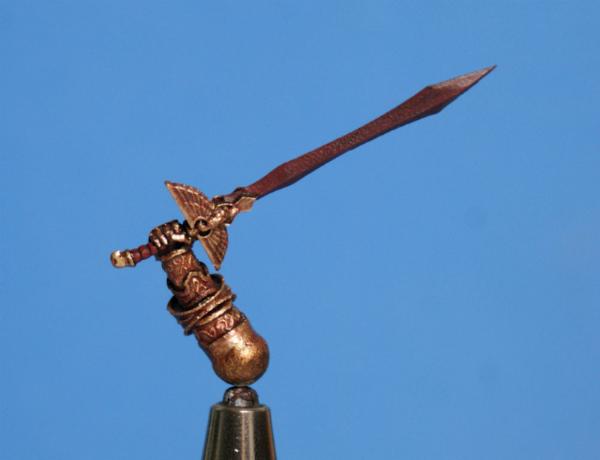
The Emperor's sword is about halfway done...
the flames on the sword are very nicely sculpted...
GW has gotten much better at sculpting flames, smoke, and ethereal effects over the last five years...
i really like these "living" effects on their recent minis...
saves me from having to sculpt them
as you can see by the hand that is holding the sword, i have painted this blade without primer...
i find that the acrylic paint sticks to plastic just fine without primer...
since i paint from darkest to lightest, there are plenty of layers of paint for the lighter colors to show up nicely...
once the piece is finished and varnished, the paint is well protected...
basically, Sanguine Base replaces my black primer here, so that i can still do the bit of sculpting on the bare plastic hand that is needed to integrate the sword with the Emperor's wrist...
i started the fire with a base coat of P3 Sanguine Base...
the yellow/orange layer is a 1-3 mix of P3 Khador Red Highlight and P3 Heartfire...
once i had a solid coat of the mid-tone, i defined the flames with P3 Skorne Red in the deepest recesses, and darkened the base of the blade, and the tips of the flames, with some more Sanguine Base...
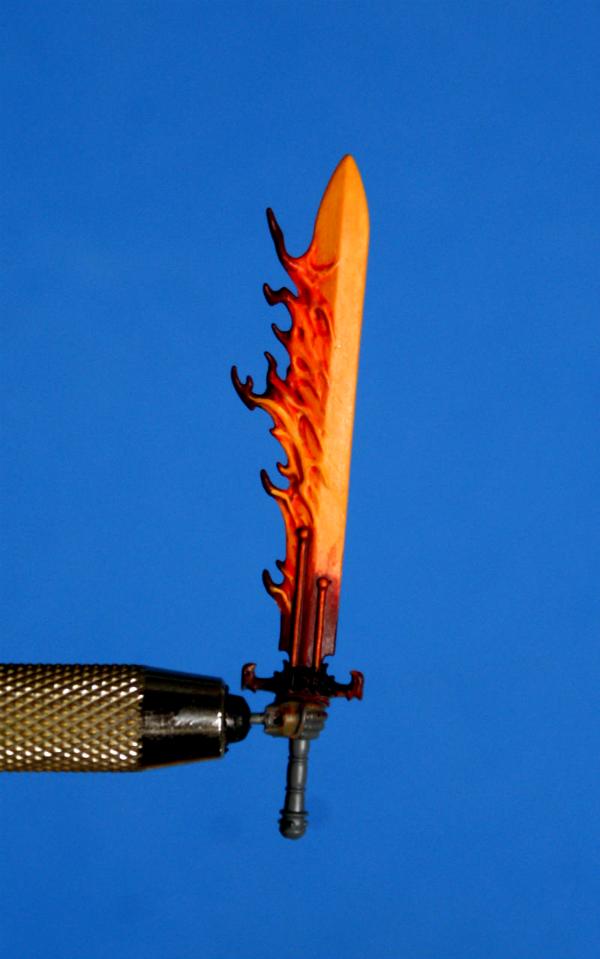
now it's time to bring in the bright colors, and add a load of contrast...
thanks for looking...
cheers
jah
14392
Post by: nerdfest09
Awesome! lovely even at that stage it looks fantastic, and the walk through will be beneficial for anyone else (me) wanting to paint flames in the future! :-)
52201
Post by: evildrcheese
Nice work on the sword so far. The Emperor himself would be pleased with the result!
EDC
3488
Post by: jah-joshua
cheers, dudes
for those of you who don't follow me on my Facebook page, last month was a great month for industry friends doing some really cool little things to show that we are really all connected...
to start, Des Hanley, former GW illustrator, and a concept designer for Crocodile Games and Avatars of War, did a run of Aliens themed Photoshop jobs on different owner, sculptor, writer, and artist friends in the miniatures industry...
i was very happy to be included, and as one of the two that get the smart gun
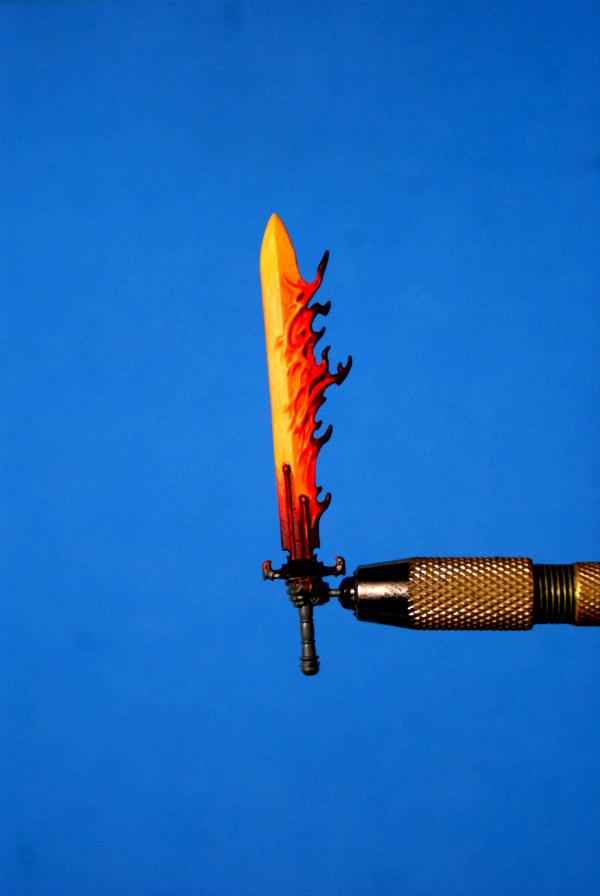
the flaming sword is coming to life...
the photos are washing out the orange, and not picking up the white :(
P3 Cygnus Yellow and P3 Morrow White mixed 1-3 makes up the brightest part of the flame...
i think i need to push the white even further, maybe a 1-6 mix, or some pure white, and then a P3 Yellow Ink wash...
this is an experiment, so i am just making it up as i got along
thanks for looking...
i hope you like it...
cheers
jah
95627
Post by: EmberlordofFire8
oooooh, fire!
Me likey!
3488
Post by: jah-joshua
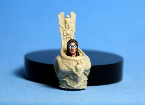
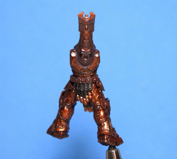
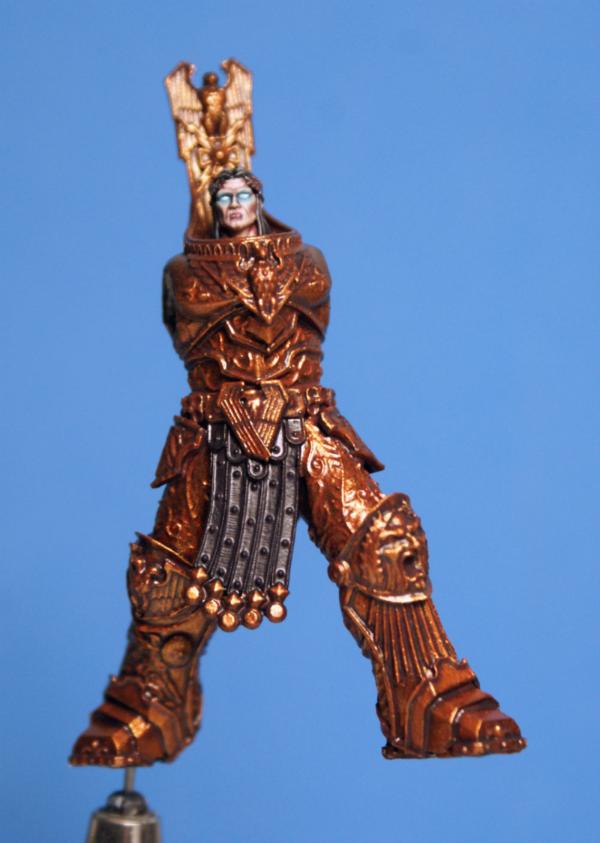
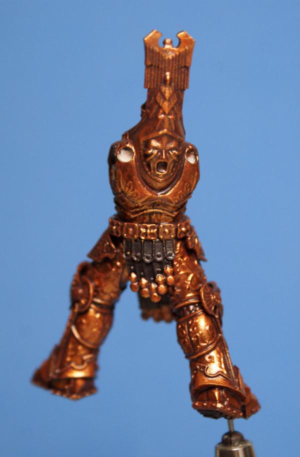
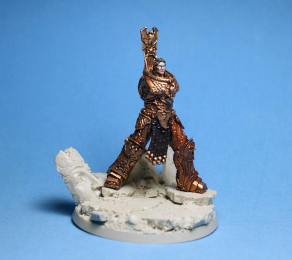
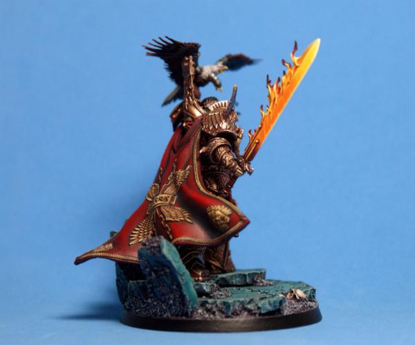
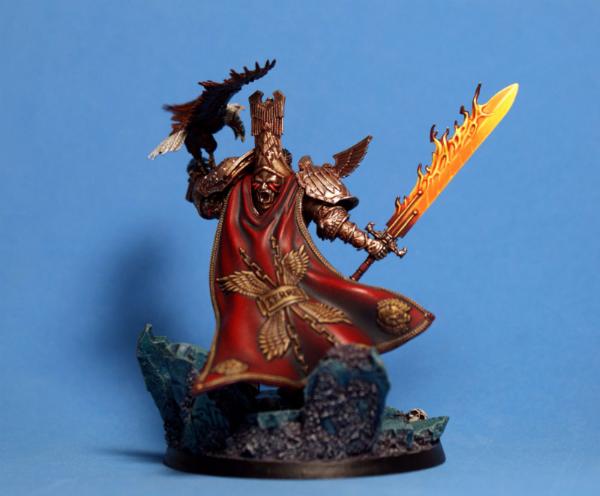
The God-Emperor of Mankind
this was an epic journey!!!
i am fairly happy with the way that he turned out in the end...
i tried to push the contrast a lot on this big guy, but it is still not quite a extreme as i would like...
i guess i need to paint a Custodes now, and push the contrast even further
the addition of the sword from the new GW Primarch model is the perfect finishing touch to this model...
the Scibor base works quite nicely, as well...
painted with P3 paints, with the exception of Vallejo Air Gold and Aluminium for the finishing touches on the metals...
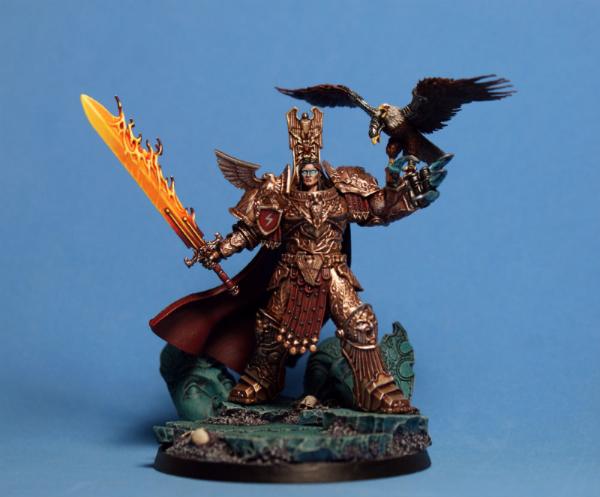
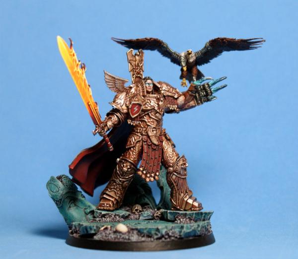

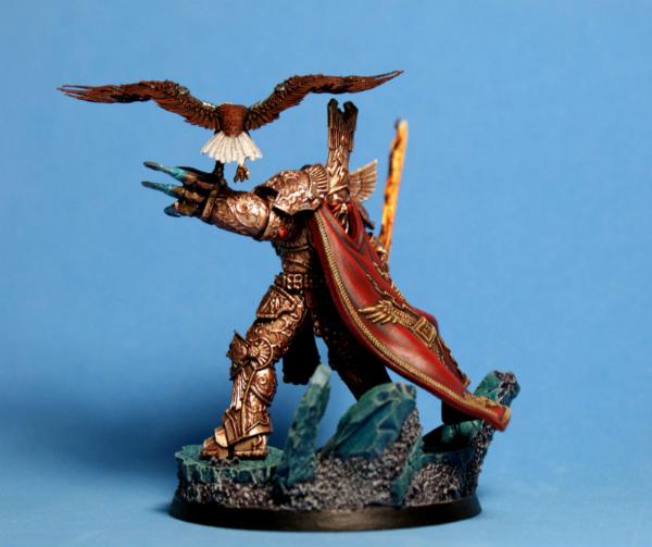
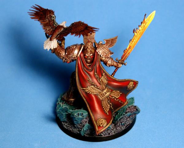
it has been quite a while since i got to paint a 54mm model...
the larger surfaces are a bit of a curse, after painting so many 30mm minis...
there is not as much leeway to trick the eye...
it was a good exercise, though...
i feel ready to conquer all of the Forge World Primarchs now
thanks for looking...
i hope you like him...
cheers
jah
77159
Post by: Paradigm
Lovely work, even by your own very high standards!
94888
Post by: JamesY
Very nice Jah
62749
Post by: Dr H
Good work, Jah. The red cloak and fiery sword are lovely.
The brightness and yellow-ness of the sword does seem to make his gold armour less special though. May be fine in person though, as it varies from photo to photo.
61618
Post by: Desubot
Sweet work
that eagle looks like double freedom.
3488
Post by: jah-joshua
@Paradigm & JamesY: cheers, lads
@Dr. H:there are plenty of dudes walking around in the Heresy in gold armour, but only one with a giant feth-off flaming sword!!!
honestly, i just went with Neil Roberts' HH art, where the sword does rather dominate the illustrations...
@Desubot: double-freedom, for sure...
rather fitting that my client is at the Pentagon
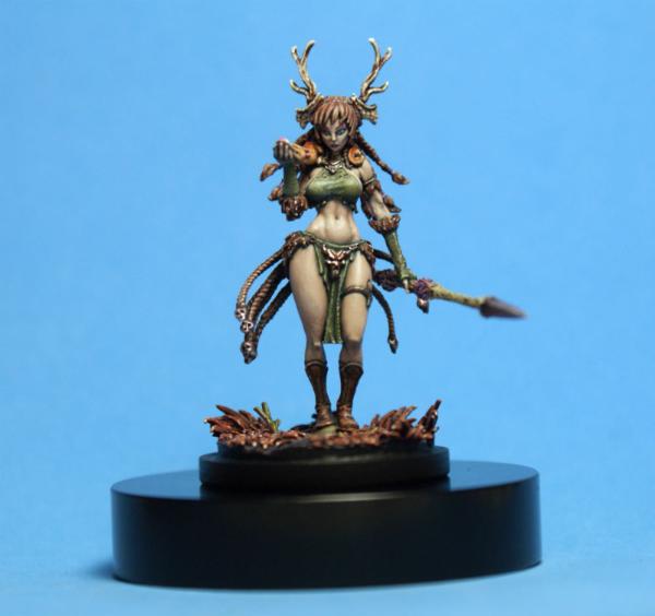
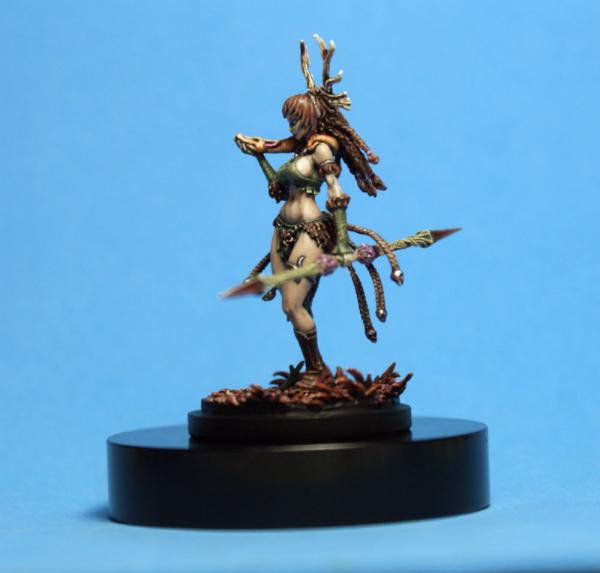
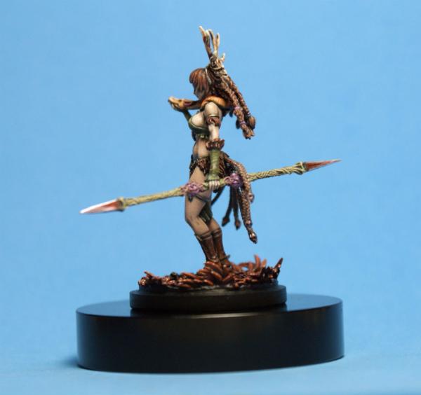
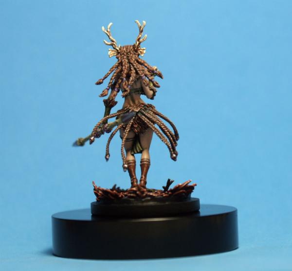
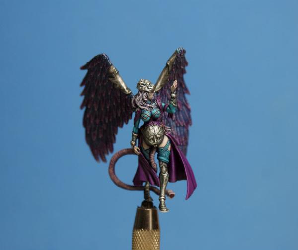
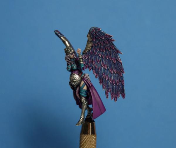
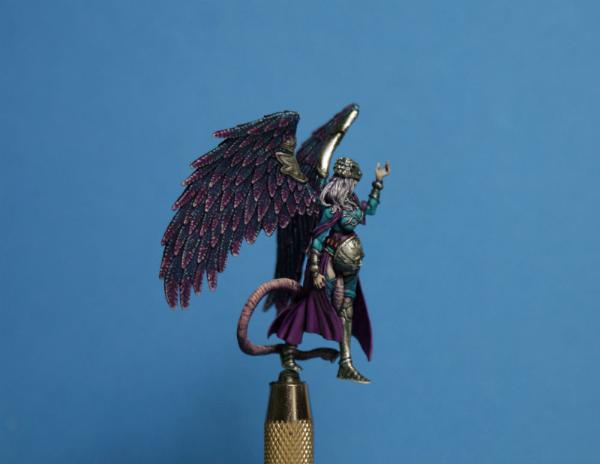
Winter is here!!!
this is the third Kingdom Death mini in the "Four Seasons" commission...
just Summer left to do, and then the commission is complete...
i enjoyed creating this color scheme, my take on a winter themed mini, and playing around with a snowfall theme on the wings and skirt...
i hope that I captured a cold vibe with this color scheme...
P3 Meredius Blue is quickly becoming one of my favorite colors to paint with
P3 Beaten Purple and Meredius Blue go good together, and P3 Underbelly Blue made a nice highlight color for both...
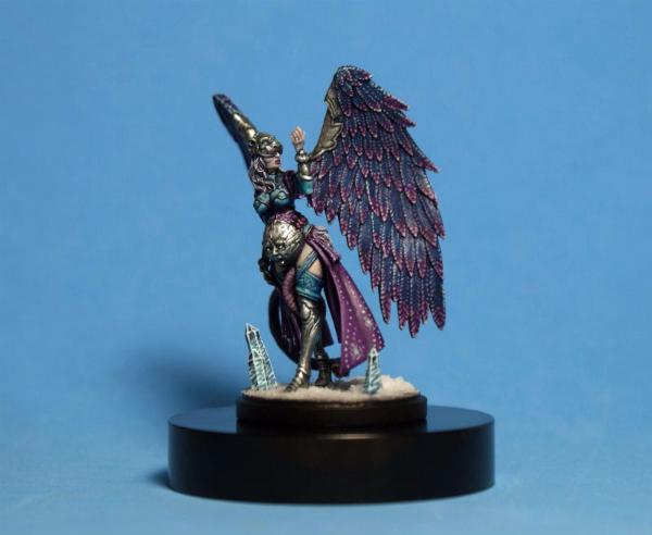
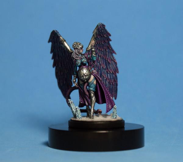

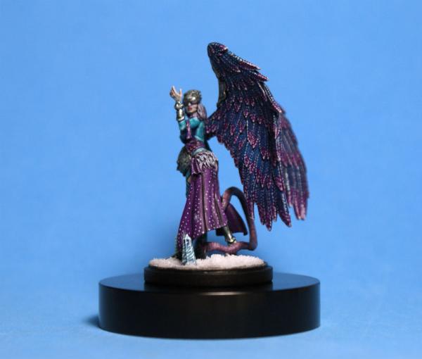
now it's on to Summer!!!
thanks for looking...
i hope you like her...
cheers
jah
62749
Post by: Dr H
jah-joshua wrote:...@Dr. H:there are plenty of dudes walking around in the Heresy in gold armour, but only one with a giant feth-off flaming sword!!!
honestly, i just went with Neil Roberts' HH art, where the sword does rather dominate the illustrations...
Fair enough, you have a point there.
Ah, good. Can't argue if you're following artwork.
As I said, it looks nice. I was just drawn to the sword, so mission accomplished.
As it is for Winter. Looks great.
Snow pattern on the cloth works well with the snaking lines.
|
|


