| Author |
Message |
 |
|
|
|
|
Advert
|
Forum adverts like this one are shown to any user who is not logged in. Join us by filling out a tiny 3 field form and you will get your own, free, dakka user account which gives a good range of benefits to you:
- No adverts like this in the forums anymore.
- Times and dates in your local timezone.
- Full tracking of what you have read so you can skip to your first unread post, easily see what has changed since you last logged in, and easily see what is new at a glance.
- Email notifications for threads you want to watch closely.
- Being a part of the oldest wargaming community on the net.
If you are already a member then feel free to login now. |
|
 |
2008/03/27 06:13:52
Subject: Realistic vs accepted standard: painting guns
|
|

Boom! Leman Russ Commander
|
I'm at a dilemma, and I thought I would ask for opinions.
Most guns painted for Marines and Guard are a combination of black and boltgn metal.
In real life, most guns are a flat black.
Stylistically....what looks better? black guns with grey highlights, or the guns painted with the unrealistic boltgun barrels and clips? For a Marine I have no problem with it, but with guard, seeing them in camouflage with all the shiny metal....it drives me nuts.
BUT....I also have to take into account what a tournament judge will look at. I've heard horror stories of guys who realistically paint Leman Russ tanks getting fewer points then someone who paints their tank green, frosts the tank with a drybrushing of a lighter green, because thats the accepted GW way.
So...any thoughts?
|
.Only a fool believes there is such a thing as price gouging. Things have value determined by the creator or merchant. If you don't agree with that value, you are free not to purchase. |
|
|
 |
|
2008/03/27 08:36:52
Subject: Realistic vs accepted standard: painting guns
|
|

Fresh-Faced New User
|
well , I tend to go for the realistic look , but i don't think that most guns are flat black .The newer generation tend to be flat black , true , but keep in mind that a well used gun will show metal at the hedges (i know ,i carry one for a living) ,that moving parts will soon be bright and shiny ,that if you carry it in the field, it will be scratched and bumped after intensive operations . In fact ,only the plastic and rubber parts stay flat black . For the clips ,some are black ,some are grey ,some in a see-through plastic , even red or yellow . The flash hiders tend to take a colour of their own after some intensive shooting .
It all depends ,IMHO,if you want to paint the used weapons of an army in campaign for a long time, or the brand new weaponry of palace guards, they're very different in looks ,even the same weapons .
Hope that helped ,
Shannon
|
|
|
|
|
2008/03/27 14:22:40
Subject: Realistic vs accepted standard: painting guns
|
|
[DCM]
Illustrator
|
Shannon is pretty much dead on for the realistic side.
You can probably try a mish mash of both realistic and unrealistic until you've got a solid idea of what looks best to you.
As for tourny judges, if you've put the effort into something and it shows technical skill and well thought out creativity, your score "should" show it. Unless the judges are worthless fanboy tools that is...
|
-Aaron
Call For Fire
DA:80+S+GM(DPC)B++++I+Pw40k99+D++A++/mWD247R++T(M)DM+++++ |
|
|
|
|
2008/03/27 14:29:07
Subject: Realistic vs accepted standard: painting guns
|
|
Secretive Dark Angels Veteran
Baltimore, MD
|
About the judging. Don't forget that judging based upon painting style is just a matter of opinion. You just didn't strike the judges fancy that day.
|
Proud owner of  & & 
Play the game, not the rules.
|
|
|
|
|
2008/03/27 14:42:34
Subject: Realistic vs accepted standard: painting guns
|
|
[DCM]
Tilter at Windmills
|
The practical reality is that at a GT, painting scores will tend to be higher for a paint scheme that “pops”. Bright colors and high contrast attract the eye, whether you’re talking about Players’ Choice votes or making sure the judges don’t overlook your masterpiece in a field of 100+ entrants. If the hall/venue has less than perfect lighting, a darker paint scheme can also result in some of your detail work being lost or hard to notice.
This is, quite honestly, part of the GT metagame for some players. When designing and painting an army for GTs, some folks give very careful consideration to getting that “pop” and making their army catch the eye. Chris Courtney’s gorgeous perfectly white Necrons, or JT Scott’s really nice banana yellow Tau are classic examples, though I’m sure they also personally liked those color schemes and appreciated the technical challenges of making those difficult colors come out nice.
All that said, at a big event the judges, while rushed for time, DO tend to look closely at paint jobs, and as grey_death said, will generally reward technical skill and creativity, even for a darker/more realistic scheme. What I would recommend, if you’re worried about your stuff being dark, is to add a display board or centerpiece (like a big banner or something) which will pop out and grab the eye and make people pause to look and notice your other details.
|
Adepticon 2015: Team Tourney Best Imperial Team- Team Ironguts, Adepticon 2014: Team Tourney 6th/120, Best Imperial Team- Cold Steel Mercs 2, 40k Championship Qualifier ~25/226
More 2010-2014 GT/Major RTT Record (W/L/D) -- CSM: 78-20-9 // SW: 8-1-2 (Golden Ticket with SW), BA: 29-9-4 6th Ed GT & RTT Record (W/L/D) -- CSM: 36-12-2 // BA: 11-4-1 // SW: 1-1-1
DT:70S++++G(FAQ)M++B++I+Pw40k99#+D+++A+++/sWD105R+++T(T)DM+++++
A better way to score Sportsmanship in tournaments
The 40K Rulebook & Codex FAQs. You should have these bookmarked if you play this game.
The Dakka Dakka Forum Rules You agreed to abide by these when you signed up.
Maelstrom's Edge! |
|
|
|
|
2008/03/27 15:04:55
Subject: Realistic vs accepted standard: painting guns
|
|
Fresh-Faced New User
|
Damn,
wish you had not said that cause i can make realistic tanks and guns ,but a big banner? no way Jose !! lol
|
|
|
|
|
2008/03/27 15:36:36
Subject: Realistic vs accepted standard: painting guns
|
|
Battleship Captain
|
Heh. One of my friends painstakingly painted his Space Wolves with realistic shading and realistic guns. Unfortunately, the color he used was close to the color of GW's plastic sprues. The judges accused him of not painting his minis other than the details.... 
|
Man, I wish there was a real Black Library where I could get a Black Library Card and take out Black Library Books without having to buy them. Of course, late fees would be your soul. But it would be worth it. - InquisitorMack |
|
|
|
|
2008/03/27 15:41:36
Subject: Realistic vs accepted standard: painting guns
|
|
[DCM]
Tilter at Windmills
|
shannon wrote:Damn,
wish you had not said that cause i can make realistic tanks and guns ,but a big banner? no way Jose !! lol
It's just another exercise for your creativity. And it only matters if you’re really concerned that the judges and other players take a close look at your army.
Just think to yourself- “What can I add to my army or its display that will grab someone’s attention from two or three meters away and encourage them to come over and take a close look?”
|
Adepticon 2015: Team Tourney Best Imperial Team- Team Ironguts, Adepticon 2014: Team Tourney 6th/120, Best Imperial Team- Cold Steel Mercs 2, 40k Championship Qualifier ~25/226
More 2010-2014 GT/Major RTT Record (W/L/D) -- CSM: 78-20-9 // SW: 8-1-2 (Golden Ticket with SW), BA: 29-9-4 6th Ed GT & RTT Record (W/L/D) -- CSM: 36-12-2 // BA: 11-4-1 // SW: 1-1-1
DT:70S++++G(FAQ)M++B++I+Pw40k99#+D+++A+++/sWD105R+++T(T)DM+++++
A better way to score Sportsmanship in tournaments
The 40K Rulebook & Codex FAQs. You should have these bookmarked if you play this game.
The Dakka Dakka Forum Rules You agreed to abide by these when you signed up.
Maelstrom's Edge! |
|
|
|
|
2008/03/27 15:42:27
Subject: Realistic vs accepted standard: painting guns
|
|
Longtime Dakkanaut
Brotherhood of Blood
|
Gaudiness seems to win more at tournaments these days. Paint on some lightning bolts or put a dash of red some were on the model. Who cares about technique and skill. Bright hilights around the edges works also. It would be nice to actually have a proficient painter judge the painting for a change.
|
|
|
|
|
2008/03/27 15:43:47
Subject: Realistic vs accepted standard: painting guns
|
|
[DCM]
Tilter at Windmills
|
Care to give any examples? While there are always horror stories out there, pretty much every army I’ve ever seen score really well or win anything for painting has been a really attractive army.
|
Adepticon 2015: Team Tourney Best Imperial Team- Team Ironguts, Adepticon 2014: Team Tourney 6th/120, Best Imperial Team- Cold Steel Mercs 2, 40k Championship Qualifier ~25/226
More 2010-2014 GT/Major RTT Record (W/L/D) -- CSM: 78-20-9 // SW: 8-1-2 (Golden Ticket with SW), BA: 29-9-4 6th Ed GT & RTT Record (W/L/D) -- CSM: 36-12-2 // BA: 11-4-1 // SW: 1-1-1
DT:70S++++G(FAQ)M++B++I+Pw40k99#+D+++A+++/sWD105R+++T(T)DM+++++
A better way to score Sportsmanship in tournaments
The 40K Rulebook & Codex FAQs. You should have these bookmarked if you play this game.
The Dakka Dakka Forum Rules You agreed to abide by these when you signed up.
Maelstrom's Edge! |
|
|
|
|
2008/03/27 15:49:14
Subject: Re:Realistic vs accepted standard: painting guns
|
|
Regular Dakkanaut
|
The GT rules for painting are online, and are pretty cut and dried. I would guess the judges will check for each of those points.
|
|
This message was edited 1 time. Last update was at 2008/03/27 15:51:35
No Comment |
|
|
|
|
2008/03/27 15:52:52
Subject: Realistic vs accepted standard: painting guns
|
|
[DCM]
Tilter at Windmills
|
While I've never had the pleasure of seeing Dave’s Genswickers in person, as I recall they have a darker, more realistic paint scheme. On the other hand they also have extensive conversion work and eyecatching artillery, don’t they?
|
Adepticon 2015: Team Tourney Best Imperial Team- Team Ironguts, Adepticon 2014: Team Tourney 6th/120, Best Imperial Team- Cold Steel Mercs 2, 40k Championship Qualifier ~25/226
More 2010-2014 GT/Major RTT Record (W/L/D) -- CSM: 78-20-9 // SW: 8-1-2 (Golden Ticket with SW), BA: 29-9-4 6th Ed GT & RTT Record (W/L/D) -- CSM: 36-12-2 // BA: 11-4-1 // SW: 1-1-1
DT:70S++++G(FAQ)M++B++I+Pw40k99#+D+++A+++/sWD105R+++T(T)DM+++++
A better way to score Sportsmanship in tournaments
The 40K Rulebook & Codex FAQs. You should have these bookmarked if you play this game.
The Dakka Dakka Forum Rules You agreed to abide by these when you signed up.
Maelstrom's Edge! |
|
|
|
|
2008/03/27 17:07:31
Subject: Realistic vs accepted standard: painting guns
|
|
Tzeentch Aspiring Sorcerer Riding a Disc
|
Composition and eye-catchiness do need to come into play when judging painting. If the technique is brilliant, but the composition is horrible, the painter should be marked off. Eye-catchiness is pretty much something we need to live with. If the minis don't 'pop' then I might not notice them out of the crowd.
--What you need to keep in mind is that a paintjob is largely a showing off of the mini's details. If you do an extremely realistic camo scheme, you might end up with a mini that doesn't Pop at all. Perhaps all of the nice little details on the mini will just blend into each other.
I don't think you necessarily need to add boltgun metal to your lasguns, but I think a secondary color is necessary. Perhaps you could use a green (or whatever the basis for your camo scheme is) as a secondary color to the black. That way you can show off the details without making it decidedly unrealistic.
|
|
|
|
|
|
2008/03/28 02:41:55
Subject: Re:Realistic vs accepted standard: painting guns
|
|
Stern Iron Priest with Thrall Bodyguard
|
while i paint most gw in the 'eavy metal style thet the customers want, when i'm paintin' other sci-fi or modern stuff, i go for a look like the m-16, and ar-15...full-on matte black...
as for modern guns all bein' matte black, i have a few that are, and a few that aren't...i have an sks that is wood, and silver-ish...i have an ak that is matte black..my 9mm is a s&w, which is half black, and half silver...
here's an example of how i do modern guns...please to enjoy...
cheers
jah
|
Paint like ya got a pair!
Available for commissions.
|
|
|
|
|
2008/03/28 03:08:47
Subject: Realistic vs accepted standard: painting guns
|
|
Battleship Captain
|
Nice highlights on the black of the weapons - doesn't look overdone.
|
Man, I wish there was a real Black Library where I could get a Black Library Card and take out Black Library Books without having to buy them. Of course, late fees would be your soul. But it would be worth it. - InquisitorMack |
|
|
|
|
2008/03/28 04:34:41
Subject: Realistic vs accepted standard: painting guns
|
|

Longtime Dakkanaut
|
the other issue is 'scale colour and light' - just because something looks good painted a flat colour in the real world, doesn't mean a 28mm version will look good painted the same flat colour.
this is particularly true of shadows. imagine a flat-painted object with a 50mm-deep hole in it, under normal lighting conditions - the edges and hole will be obvious. Now imagine the 40K version - that same hole is now only about 1 mm deep, and won't have that same nice deep shadow.
That's why we spend hours artificially adding 'highlights' and 'shadows' - we're trying to compensate for scale
|
|
|
|
|
2008/03/28 15:38:23
Subject: Realistic vs accepted standard: painting guns
|
|
[DCM]
Illustrator
|
Here's a quick example I've done, and am still using for the rest of this squad, of a black finish for a hellgun.
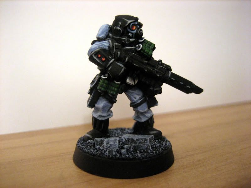
Notice I haven't gone the super realistic direction with them. But I have used the basic concept that weapons aren't all pretty colors of the rainbow. The details are picked out sparingly by using some extreme highlights on key parts of the weapon.
|
-Aaron
Call For Fire
DA:80+S+GM(DPC)B++++I+Pw40k99+D++A++/mWD247R++T(M)DM+++++ |
|
|
|
|
2008/03/28 22:11:23
Subject: Re:Realistic vs accepted standard: painting guns
|
|
Boosting Ultramarine Biker
Arlington, VA
|
I personally like something a bit more realistic-looking myself. I'll bet you can paint it some sort of camo-look to match the model's base (i.e. what terrain this dude is fighting in). My drill instructor in boot camp (a Marine sniper) used to show us pictures of sniper rifles painted and done up to match wherever they were conducting operations. That'd probably go farther in a painting competition too.
|
|
|
|
|
2008/03/29 19:53:00
Subject: Realistic vs accepted standard: painting guns
|
|
Longtime Dakkanaut
Long Beach, CA
|
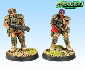
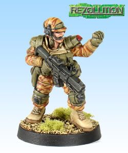
I think that stormtrooper looks kick ass.
|
"Do NOT ask me if you can fire the squad you forgot to shoot once we are in the assault phase, EVER!!!"
|
|
|
|
|
|
|