| Author |
Message |
 |
|
|
|
|
Advert
|
Forum adverts like this one are shown to any user who is not logged in. Join us by filling out a tiny 3 field form and you will get your own, free, dakka user account which gives a good range of benefits to you:
- No adverts like this in the forums anymore.
- Times and dates in your local timezone.
- Full tracking of what you have read so you can skip to your first unread post, easily see what has changed since you last logged in, and easily see what is new at a glance.
- Email notifications for threads you want to watch closely.
- Being a part of the oldest wargaming community on the net.
If you are already a member then feel free to login now. |
|
 |
2013/12/31 01:58:58
Subject: Is the Artwork Degrading?
|
|

Land Raider Pilot on Cruise Control
|
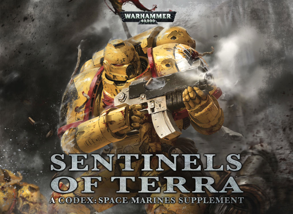
When I first started 40K Part of what drove me in was the amazing artwork. It was so distinctive and gave off such a feeling of pure awesomeness. However I've been noticing that the artwork has become more...well boring. It's not that it's bad and it is much cleaner but it just feels bland. Biggest example is C:SM. You got some nice new artwork but most of the new artwork felt generic and boring (Especially the cover). I don't really like Blanche's work but at least he gives his work an "aura". Does anyone else feel this way?
|
|
|
 |
|
2013/12/31 02:04:17
Subject: Is the Artwork Degrading?
|
|
Gore-Soaked Lunatic Witchhunter
Seattle
|
Appreciating art is a subjective experience.
|
It is best to be a pessimist. You are usually right and, when you're wrong, you're pleasantly surprised. |
|
|
|
|
2013/12/31 02:05:24
Subject: Is the Artwork Degrading?
|
|
Twisting Tzeentch Horror
|
I couldn't disagree more. I absolutely LOVE the new artwork on the Codexes and inside as well. Almost every Black Library cover is amazing.
It's certainly a different style than the old stuff - but if I am being honest, a lot of the older stuff didn't appeal to me.
|
|
|
|
|
|
2013/12/31 02:05:24
Subject: Is the Artwork Degrading?
|
|
Land Raider Pilot on Cruise Control
|
That is certainly true. I just feel like the artwork is starting to lose it's distinctiveness.
|
|
|
|
|
2013/12/31 02:07:44
Subject: Is the Artwork Degrading?
|
|
Gore-Soaked Lunatic Witchhunter
Seattle
|
That is possibly because we have so many other 40K-like things to compare it to. We have Halo, Starcraft, Crysis and a million other sci-fi wargames with some similar aesthetics to 40K so that it *seems* less distinctive.
In my opinion, I like the old stuff, I like the new stuff, and I especially like the satirical stuff. Warhamster 40K is brilliant.
|
It is best to be a pessimist. You are usually right and, when you're wrong, you're pleasantly surprised. |
|
|
|
|
2013/12/31 02:08:22
Subject: Is the Artwork Degrading?
|
|

Preacher of the Emperor
|
For me, I've generally liked the newer art than the older stuff I've seen. Especially Blanche specifically.
Not to say that the old art is at all bad, I just prefer the newer style.
|
 Order of the Righteous Armour - 542 points so far. Order of the Righteous Armour - 542 points so far. |
|
|
|
|
2013/12/31 02:10:24
Subject: Is the Artwork Degrading?
|
|
Ork-Hunting Inquisitorial Xenokiller
Strike Cruiser Vladislav Volkov
|
I think this can be best described as "nostalgia."
|
|
|
|
|
|
2013/12/31 02:10:54
Subject: Is the Artwork Degrading?
|
|
Land Raider Pilot on Cruise Control
|
 Troike wrote: Troike wrote:For me, I've generally liked the newer art than the older stuff I've seen. Especially Blanche specifically.
Not to say that the old art is at all bad, I just prefer the newer style.
Yeah Blanche is very... um moving on. Their is some newer artwork I do love to death but I still feel around 65% of it is "Un- 40k"
|
|
|
|
|
2013/12/31 02:14:45
Subject: Is the Artwork Degrading?
|
|

Heroic Senior Officer
|
I have no idea who does the art and so on, but i thought the current guard codex nailed it art wise. Not too crisp and clean but not too rough. No colour. Mostly proportionate and so on.
|
|
This message was edited 1 time. Last update was at 2013/12/31 02:15:02
|
|
|
|
|
2013/12/31 02:16:13
Subject: Is the Artwork Degrading?
|
|

Boosting Space Marine Biker
|
Clint Langley. Enough said.
|
 Solid Fists 2000 wip Solid Fists 2000 wip |
|
|
|
|
2013/12/31 02:17:06
Subject: Is the Artwork Degrading?
|
|
Land Raider Pilot on Cruise Control
|
 Swastakowey wrote: Swastakowey wrote:I have no idea who does the art and so on, but i thought the current guard codex nailed it art wise. Not too crisp and clean but not too rough. No colour. Mostly proportionate and so on.
Yeah I mean art originating around that period of time. What has always infuriated me about 40k art though is that unless you are Blanche then it is impossible to tell who actually drew it (since GW never lists it.)
|
|
|
|
|
2013/12/31 02:19:34
Subject: Re:Is the Artwork Degrading?
|
|
Hellish Haemonculus
|
Normally I really like the artwork in 40k, but the newest marines codex really let me down. It was almost entirely recycled from the last 'dex, just colorized. I was really disappointed.
|
|
|
|
|
|
2013/12/31 02:21:13
Subject: Is the Artwork Degrading?
|
|
Ancient Venerable Dark Angels Dreadnought
|
 cvtuttle wrote: cvtuttle wrote:I couldn't disagree more. I absolutely LOVE the new artwork on the Codexes and inside as well. Almost every Black Library cover is amazing.
It's certainly a different style than the old stuff - but if I am being honest, a lot of the older stuff didn't appeal to me.
This. The new artwork is good. What's terrible is the CSM codex deciding to leave special faction rules out in the dust and giving us nothing for fluff.
|
“There is only one good, knowledge, and one evil, ignorance.”
|
|
|
|
|
2013/12/31 02:21:31
Subject: Re:Is the Artwork Degrading?
|
|

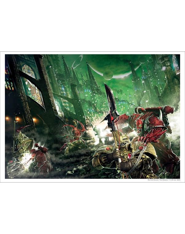
Cosmic Joe
|
I think the art has gotten much better.
I love me some Rogue Trader, but...
we went from this
To this.
|
|
This message was edited 1 time. Last update was at 2013/12/31 02:22:02
Also, check out my history blog: Minimum Wage Historian, a fun place to check out history that often falls between the couch cushions. |
|
|
|
|
2013/12/31 02:24:28
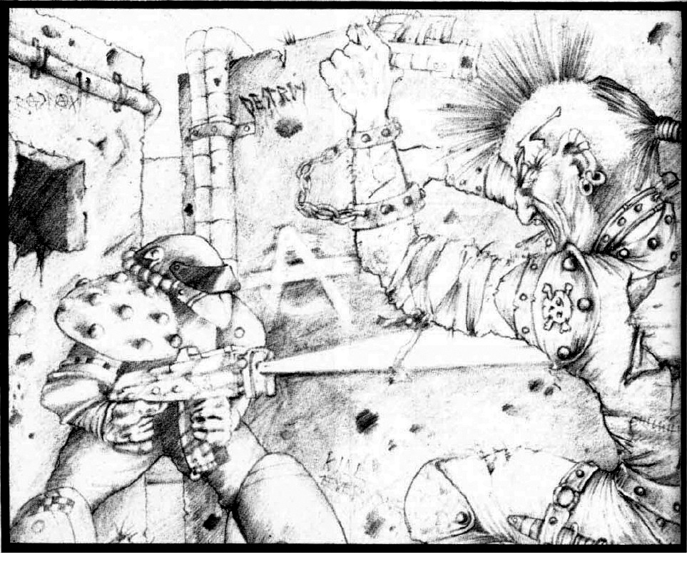
Subject: Is the Artwork Degrading?
|
|
Gore-Soaked Lunatic Witchhunter
Seattle
|
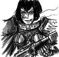
Behold, your new master, and the epiphany of art:
|
|
This message was edited 1 time. Last update was at 2013/12/31 02:24:38
It is best to be a pessimist. You are usually right and, when you're wrong, you're pleasantly surprised. |
|
|
|
|
2013/12/31 02:27:50
Subject: Is the Artwork Degrading?
|
|
Wing Commander
|
Another fan of the old stuff. I hate all the photo-realism, I love the grittier, 2000AD feel of the old stuff.
That comparison Historian posted is a perfect example. The top is art, the bottom is an exercise in computer rendering. Not evocative at all.
|
Abadabadoobaddon wrote:Phoenix wrote:Well I don't think the battle company would do much to bolster the ranks of my eldar army  so no.
Nonsense. The Battle Company box is perfect for filling out your ranks of aspect warriors with a large contingent from the Screaming Baldies shrine.
|
|
|
|
|
2013/12/31 02:30:35
Subject: Is the Artwork Degrading?
|
|
Longtime Dakkanaut
|
I haven't really noticed, then again I've already realized I'm pretty indifferent to art and will appreciate darn near anything as long as I can figure out what it is supposed to be representing.
That said, the pictures on the golden throne in the opening pages of the 3rd edition rulebook gave my gradeschool self nightmares...
|
Like watching other people play video games (badly) while blathering about nothing in particular? Check out my Youtube channel: joemamaUSA!
BrianDavion wrote:Between the two of us... I think GW is assuming we the players are not complete idiots.
Rapidly on path to becoming the world's youngest bitter old man. |
|
|
|
|
2013/12/31 02:32:35
Subject: Is the Artwork Degrading?
|
|
Land Raider Pilot on Cruise Control
|
 Silverthorne wrote: Silverthorne wrote:Another fan of the old stuff. I hate all the photo-realism, I love the grittier, 2000AD feel of the old stuff.
That comparison Historian posted is a perfect example. The top is art, the bottom is an exercise in computer rendering. Not evocative at all.
It's not that the second example is bad either. It's just not what I think is 40k. I feel this degradation began at C: SM and has been going all over the place in "40kness".
|
|
|
|
|
2013/12/31 02:55:33
Subject: Is the Artwork Degrading?
|
|
Long-Range Land Speeder Pilot
|
The art style is improving but the technique in the artwork is slipping.
For example, someone once pointed out to me the Tigurius painting. Visually, it's a huge improvement from the old style especially from RT and 2E (I am also not a fan of Blanche, so that's a large part of it), but you can see a lot of obvious brushwork from their tablet with no defined boundaries. It looks like something you'd find on deviantART or a booru compared to the meticulous lineart and inking you'd find from the 80's and 90's.
|
Hail the Emperor. |
|
|
|
|
2013/12/31 03:02:53
Subject: Is the Artwork Degrading?
|
|
Land Raider Pilot on Cruise Control
|
 Tyberos the Red Wake wrote: Tyberos the Red Wake wrote:The art style is improving but the technique in the artwork is slipping.
For example, someone once pointed out to me the Tigurius painting. Visually, it's a huge improvement from the old style especially from RT and 2E (I am also not a fan of Blanche, so that's a large part of it), but you can see a lot of obvious brushwork from their tablet with no defined boundaries. It looks like something you'd find on deviantART or a booru compared to the meticulous lineart and inking you'd find from the 80's and 90's.
Also some of Blanches stuff is good. His HH and Daemons stuff is eye melting but he can draw good things. Maybe.
|
|
|
|
|
2013/12/31 03:37:57
Subject: Is the Artwork Degrading?
|
|
Ancient Venerable Dark Angels Dreadnought
|
Tyberos the Red Wake wrote:The art style is improving but the technique in the artwork is slipping.
For example, someone once pointed out to me the Tigurius painting. Visually, it's a huge improvement from the old style especially from RT and 2E (I am also not a fan of Blanche, so that's a large part of it), but you can see a lot of obvious brushwork from their tablet with no defined boundaries. It looks like something you'd find on deviantART or a booru compared to the meticulous lineart and inking you'd find from the 80's and 90's.
Hey, I know a lot of good artists on deviantart that would also likely paint the stuff better. It's just probably rushed.
Does anyone else wish though that Mike Mignola or someone with a similar art style would draw W40K comics? I really think the gritty, simplistic and stylized appearance of Mignola's art would suit W40K really well, especially as a comic. They're practically made for each other.
|
“There is only one good, knowledge, and one evil, ignorance.”
|
|
|
|
|
2013/12/31 03:42:27
Subject: Is the Artwork Degrading?
|
|
Land Raider Pilot on Cruise Control
|
 Wyzilla wrote: Wyzilla wrote: Tyberos the Red Wake wrote:The art style is improving but the technique in the artwork is slipping.
For example, someone once pointed out to me the Tigurius painting. Visually, it's a huge improvement from the old style especially from RT and 2E (I am also not a fan of Blanche, so that's a large part of it), but you can see a lot of obvious brushwork from their tablet with no defined boundaries. It looks like something you'd find on deviantART or a booru compared to the meticulous lineart and inking you'd find from the 80's and 90's.
Hey, I know a lot of good artists on deviantart that would also likely paint the stuff better. It's just probably rushed.
Does anyone else wish though that Mike Mignola or someone with a similar art style would draw W40K comics? I really think the gritty, simplistic and stylized appearance of Mignola's art would suit W40K really well, especially as a comic. They're practically made for each other.
I have to agree with you. I still love how Rogue trader and pre 6th ed stuff looked though.
|
|
|
|
|
2013/12/31 03:42:30
Subject: Re:Is the Artwork Degrading?
|
|
Perturbed Blood Angel Tactical Marine
|
I think the new stuff is pretty great personally.
|
  "BLOOD FOR THE BL..UM EMPEROR!" "BLOOD FOR THE BL..UM EMPEROR!" |
|
|
|
|
2013/12/31 03:46:06
Subject: Is the Artwork Degrading?
|
|
Boom! Leman Russ Commander
|
I dislike a lot of the 'cartooney" pictures but prefer the detailed ones and have a nostalgic fondness for Blanches impressionistic artwork too.
|
|
|
|
|
|
2013/12/31 03:49:10
Subject: Re:Is the Artwork Degrading?
|
|
Land Raider Pilot on Cruise Control
|
that was done by Black Library in 2011 during 5th ed but even then this is okay art. It's nice but I don't get any distinct feelings from it.
|
|
This message was edited 2 times. Last update was at 2013/12/31 03:50:30
|
|
|
|
|
2013/12/31 03:54:15
Subject: Is the Artwork Degrading?
|
|
Cosmic Joe
|
As an art major who specialized in Renaissance oil painting and as an illustrator who uses digital, I believe that art isn't dependent on medium. A computer generated piece of art can be just as good art wise as an oil painting. Now if you happen to prefer one over the other, that's subjective but you can't say one is inherently worse. They're different and for art to be art depends on something more than what it was made out of.
|
Also, check out my history blog: Minimum Wage Historian, a fun place to check out history that often falls between the couch cushions. |
|
|
|
|
2013/12/31 03:59:30
Subject: Is the Artwork Degrading?
|
|
Land Raider Pilot on Cruise Control
|
 MWHistorian wrote: MWHistorian wrote:As an art major who specialized in Renaissance oil painting and as an illustrator who uses digital, I believe that art isn't dependent on medium. A computer generated piece of art can be just as good art wise as an oil painting. Now if you happen to prefer one over the other, that's subjective but you can't say one is inherently worse. They're different and for art to be art depends on something more than what it was made out of.
Excellent point. I don't feel the art is worse as much as it is less distinctive. It is just my opinion and art is subjective like you said.
(in hindsight I did not give this thread a good name.)
|
|
|
|
|
2013/12/31 05:34:49
Subject: Is the Artwork Degrading?
|
|
Focused Fire Warrior
New Zealand
|
I think the new stuff is a lot more cohesive, as in there isnt so much of that random interpretive stuff like in the third ed book. I really like the style of the new codices, when i saw "degrading" i thought this was gonna be about misogynistic undertones or something. Jeez now that was a long thread.
|
 6000pts 6000pts
 3000pts 3000pts
 1500pts 1500pts
 1000pts 1000pts
|
|
|
|
|
2013/12/31 06:00:33
Subject: Is the Artwork Degrading?
|
|
Bloodthirsty Chaos Knight
|
 Bronzefists42 wrote: Bronzefists42 wrote:
Also some of Blanches stuff is good. His HH and Daemons stuff is eye melting but he can draw good things. Maybe.
I like Blanche's Daemon stuff. Especially in the unit entries in the current Daemon codex. He actually makes them look more unreal this way. Every other codex has artwork in their unit entries that are closer to photo realism, but Blanche's art makes the Daemons look like they were impossible to catch on a camera and had to instead be hand-drawn down in a forbidden tome.
|
Space Wolves: 3770
Orks: 3000
Chaos Daemons: 1750
Warriors of Chaos: 2000
My avatar |
|
|
|
|
2013/12/31 11:18:57
Subject: Re:Is the Artwork Degrading?
|
|
Shas'ui with Bonding Knife
|
I disagree with the OP.
I think the artwork has gotten better. Go look at some Rogue Traders or 2nd ed stuff. The quality of the artwork is leaps and bounds better now.
Though personal preference is always going to be in the eye of the beholder.
|
 daedalus wrote: daedalus wrote:
I mean, it's Dakka. I thought snide arguments from emotion were what we did here.
|
|
|
|
|
|
|


 More like "REASONABLE GOOD GUY INC". (side note: exalted)