| Author |
Message |
 |
|
|
|
|
Advert
|
Forum adverts like this one are shown to any user who is not logged in. Join us by filling out a tiny 3 field form and you will get your own, free, dakka user account which gives a good range of benefits to you:
- No adverts like this in the forums anymore.
- Times and dates in your local timezone.
- Full tracking of what you have read so you can skip to your first unread post, easily see what has changed since you last logged in, and easily see what is new at a glance.
- Email notifications for threads you want to watch closely.
- Being a part of the oldest wargaming community on the net.
If you are already a member then feel free to login now. |
|
 |
2015/01/17 12:25:34
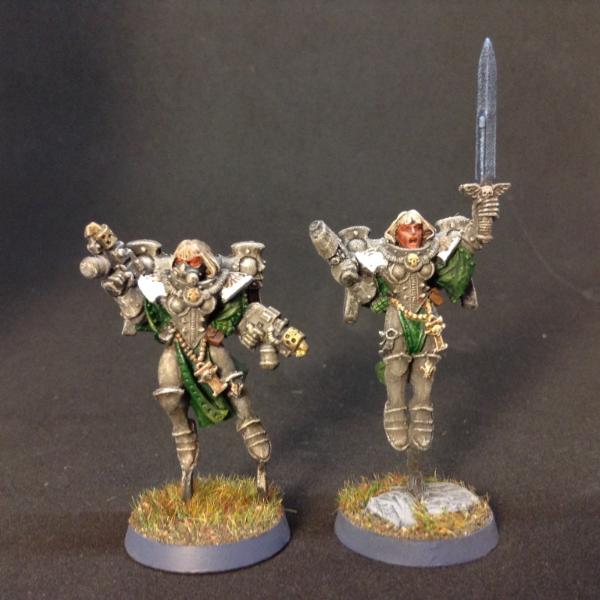
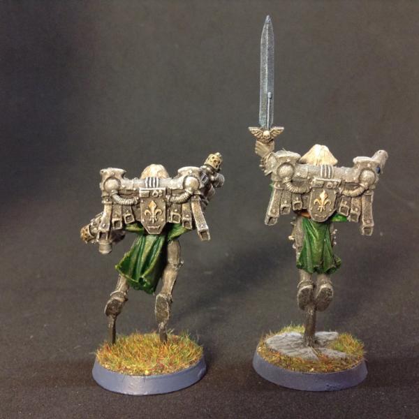
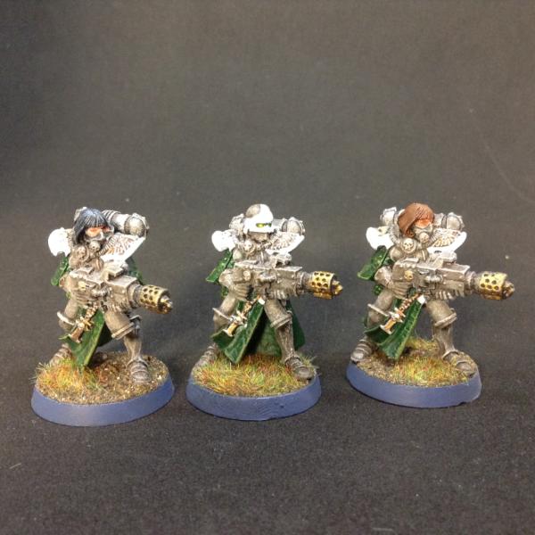
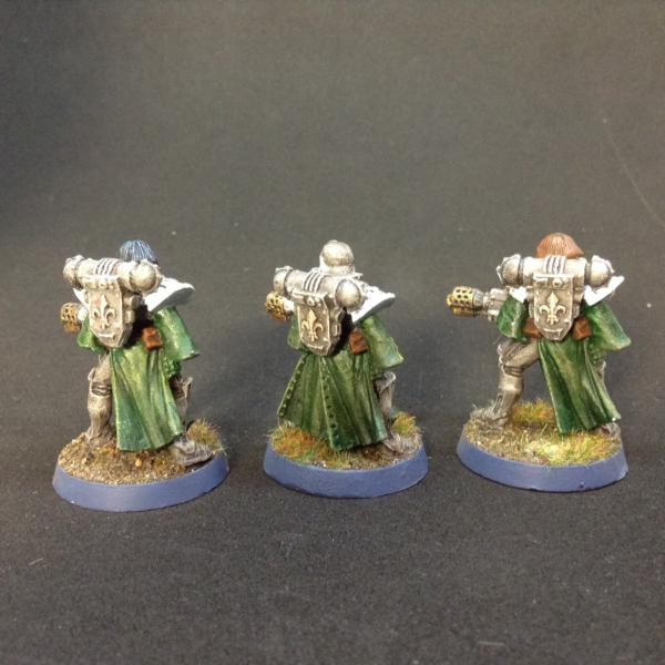
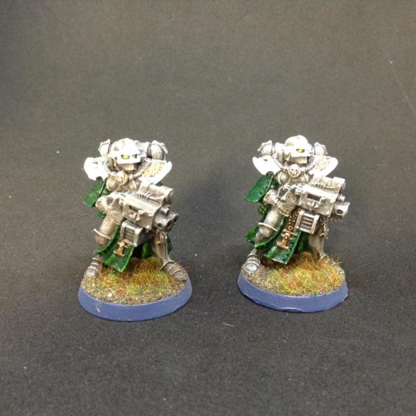
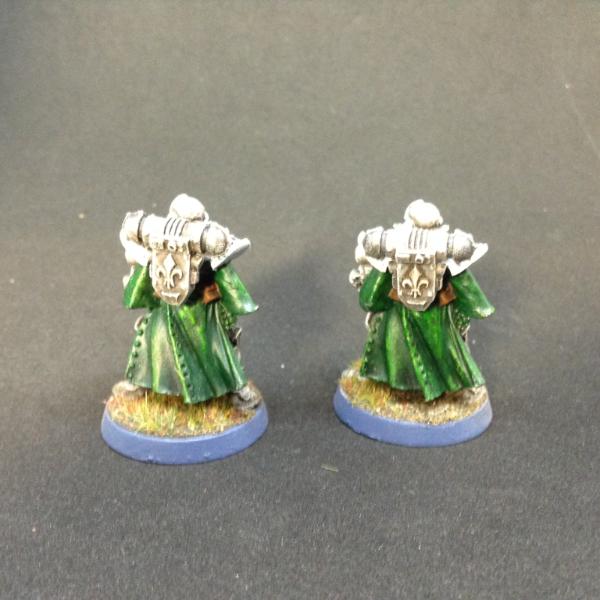
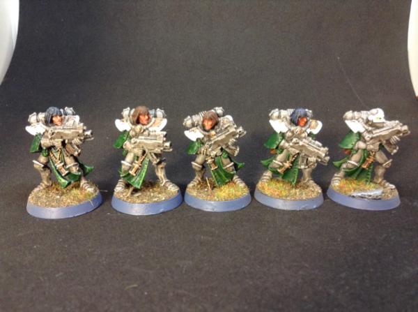
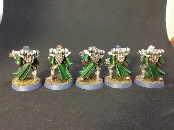
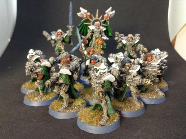
Subject: The Order of the Argent Rose - More Sisters finished
|
|

Calm Celestian
|
|
|
This message was edited 1 time. Last update was at 2015/01/17 12:34:16
|
|
|
 |
|
2015/01/18 19:53:59
Subject: The Order of the Argent Rose - More Sisters finished
|
|

Crushing Black Templar Crusader Pilot
|
I like the style you were going for but it's a bit dull, I almost feel like it needs a contrasting highlight to finish them off.
Very cool scheme/style otherwise!
|
|
|
|
|
2015/01/22 09:08:19
Subject: The Order of the Argent Rose - More Sisters finished
|
|
Calm Celestian
|
 phoenix darkus wrote: phoenix darkus wrote:I like the style you were going for but it's a bit dull, I almost feel like it needs a contrasting highlight to finish them off.
Very cool scheme/style otherwise!
I use the same armor color for my marines and the razorback had a n issue with the weapons blending into the armor and a second layer of wash helped with the contrast. I decided to do the same with my sisters and it seems to have helped.
|
|
|
|
|
|
2015/01/22 14:20:46
Subject: Re:The Order of the Argent Rose - More Sisters finished
|
|
Unhealthy Competition With Other Legions
|
I like the muted look of the armor with the green contrast. Basing looks good too, just not crazy about the edge being blue (I'm a strictly black edge guy, personal preference).
My only criticism is the skin color of the sisters. Looks like the tanning bed at the monastery is getting some serious use.
|
|
|
|
|
|
2015/01/22 22:21:49
Subject: The Order of the Argent Rose - More Sisters finished
|
|
Brain-Dead Zombie of Nurgle
California
|
overall, the color scheme & theme is awesome, but i agree with phoenix darkus- there needs to be another contrasting color in there. you don't have to overuse it, but i think that touches of pink would help. just little bits, like on some lenses or light casings. it would pop a lot and add so much to the model. if you don't want to go for that extreme of a color, i would suggest gold on the trim (or the SoB's badge on the backpack. otherwise, awesome!
|
|
|
|
|
2015/01/23 04:40:03
Subject: The Order of the Argent Rose - More Sisters finished
|
|
Decrepit Dakkanaut
|
Yeah, I was going to say, the original pictures look like they need a wash.
Also, you may want to consider going back into the green and highlighting a bit with a green color, to get more saturation in. It's easy for white/grey to make the rest of a miniature look washed out, even if it isn't.
|
|
|
|
|
|
2015/01/24 08:56:09
Subject: The Order of the Argent Rose - More Sisters finished
|
|
Calm Celestian
|
 weirdbeard82 wrote: weirdbeard82 wrote:overall, the color scheme & theme is awesome, but i agree with phoenix darkus- there needs to be another contrasting color in there. you don't have to overuse it, but i think that touches of pink would help. just little bits, like on some lenses or light casings. it would pop a lot and add so much to the model. if you don't want to go for that extreme of a color, i would suggest gold on the trim (or the SoB's badge on the backpack. otherwise, awesome!
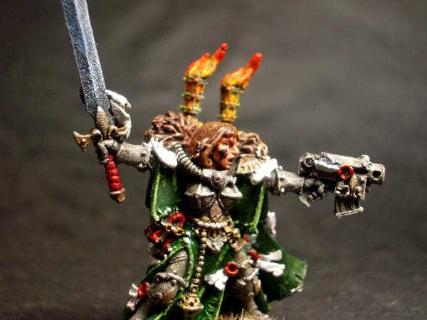
As much as I would like to keep the green lenses and lights, I have to agree that using a red as the lens color would be a better choice. I have 2 reds that I can use, the only decision would be to use an orange or yellow as the lens highlight.
here's an image of my cannoness who has several red purity seals.
|
|
|
|
|
|
2015/01/24 09:47:41
Subject: The Order of the Argent Rose - More Sisters finished
|
|

Mighty Vampire Count
|
The Green and White is really effective - great work 
|
I AM A MARINE PLAYER
"Unimaginably ancient xenos artefact somewhere on the planet, hive fleet poised above our heads, hidden 'stealer broods making an early start....and now a bloody Chaos cult crawling out of the woodwork just in case we were bored. Welcome to my world, Ciaphas."
Inquisitor Amberley Vail, Ordo Xenos 
"I will admit that some Primachs like Russ or Horus could have a chance against an unarmed 12 year old novice but, a full Battle Sister??!! One to one? In close combat? Perhaps three Primarchs fighting together... but just one Primarch?" da001
www.dakkadakka.com/dakkaforum/posts/list/528517.page
A Bloody Road - my Warhammer Fantasy Fiction |
|
|
|
|
2015/01/24 22:08:13
Subject: The Order of the Argent Rose - More Sisters finished
|
|
Calm Celestian
|
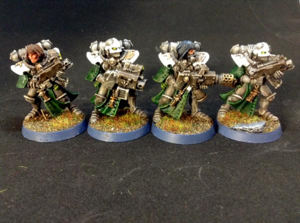
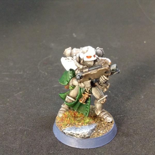
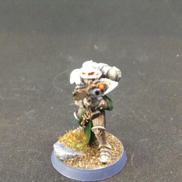
Did up one model with red for the lenses and scopes. If it works to add that touch contrast color I'll finish up the rest of them and get on to the others that I have to work on.
Also added another layer of brown wash to the bolter with a light layer of blue wash to attempt to get a "bluing" effect on gun finishes.
|
|
|
|
|
|
|
|