| Author |
Message |
 |
|
|
|
|
Advert
|
Forum adverts like this one are shown to any user who is not logged in. Join us by filling out a tiny 3 field form and you will get your own, free, dakka user account which gives a good range of benefits to you:
- No adverts like this in the forums anymore.
- Times and dates in your local timezone.
- Full tracking of what you have read so you can skip to your first unread post, easily see what has changed since you last logged in, and easily see what is new at a glance.
- Email notifications for threads you want to watch closely.
- Being a part of the oldest wargaming community on the net.
If you are already a member then feel free to login now. |
|
 |
2018/01/19 11:36:17
Subject: Various 40k models: critique wanted
|
|

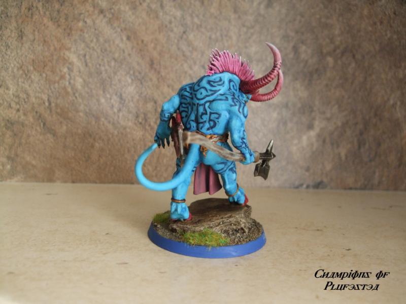
Savage Khorne Berserker Biker
|
Hi folks,
Here are some of what I consider to be my best painted, recent models, where I've tried hard, and in photos where I think you can see detail fairly clearly.
Please take a look at as many models as you like and offer some critique. I've hit a bit of a plateau recently with my technique and would like to move to the next level, particularly when it comes to fine details.
What could I have done to make these models better?
I want to get better and my aim is to produce realistic looking but clean effects on my models (so I'm not interested in going for the super-highlighted "comic book" style or the 'everything is rusty and dirty' style).
I use only brushes and am not interested in airbrushing.
My pronouns: they/them/their
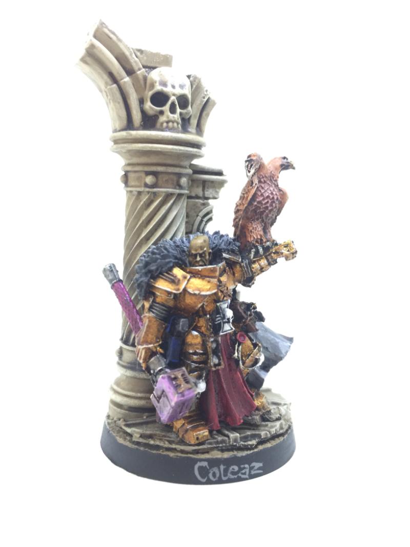
Inquisitor Lord Coteaz
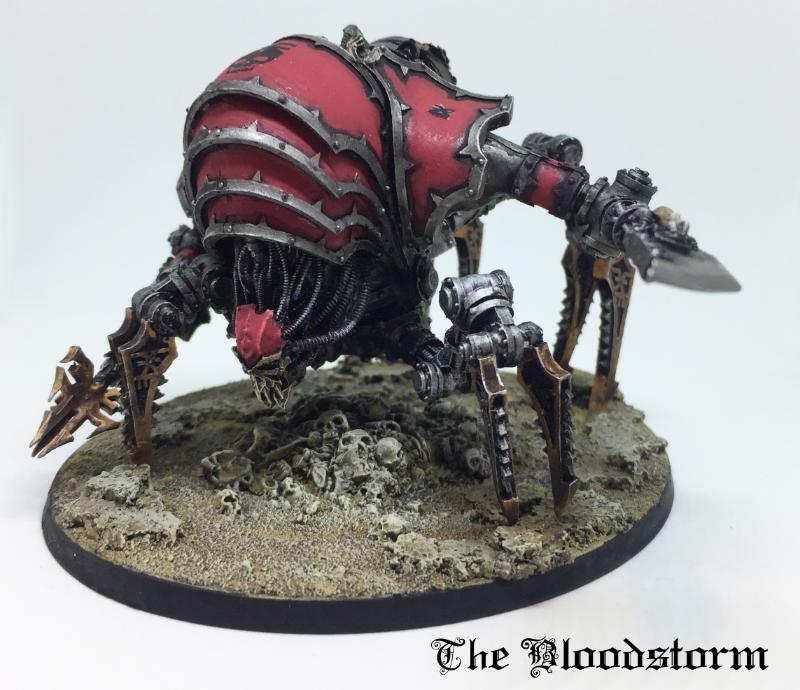
Blood Slaughterer
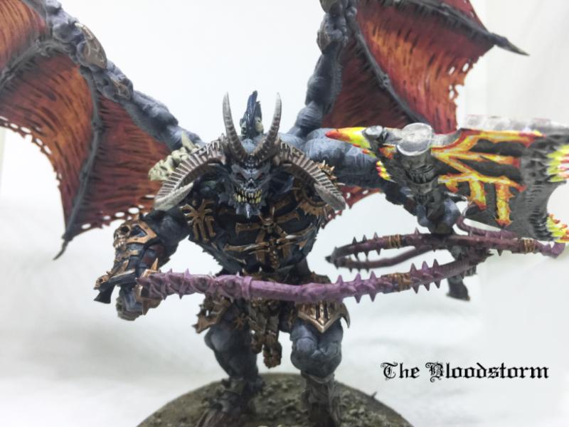
Bloodthirster
Lord of Contagion
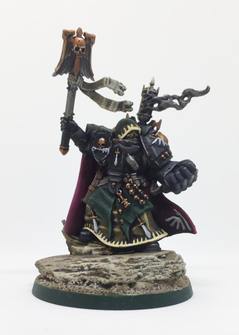
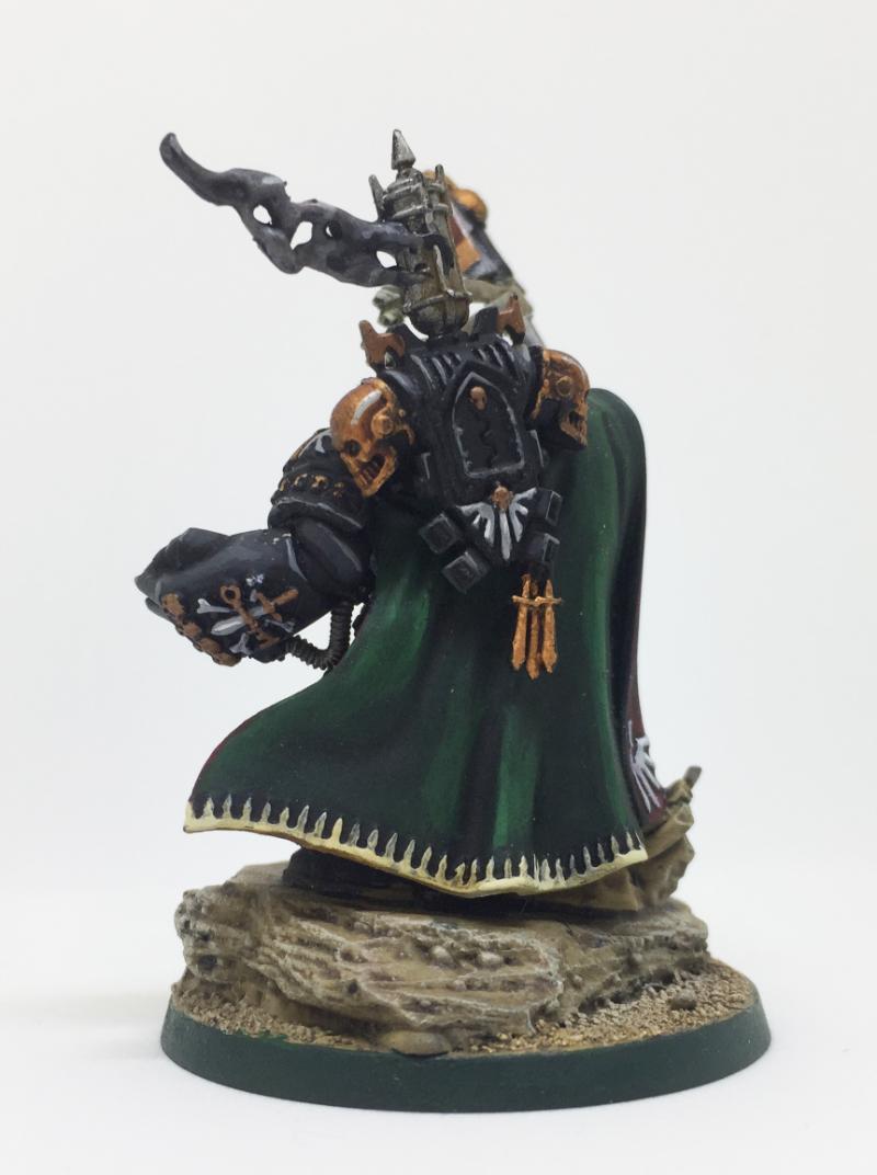
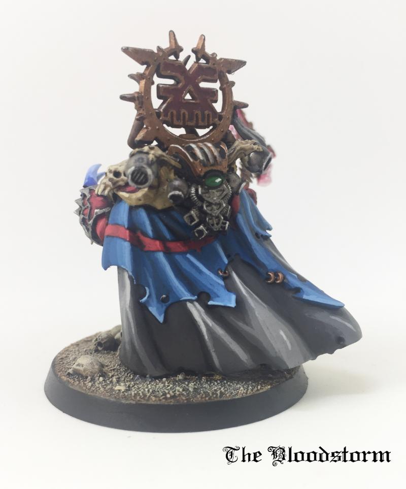
Dark Angels Interrogator-Chaplain
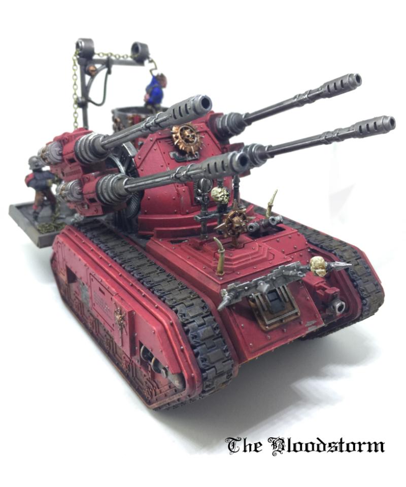
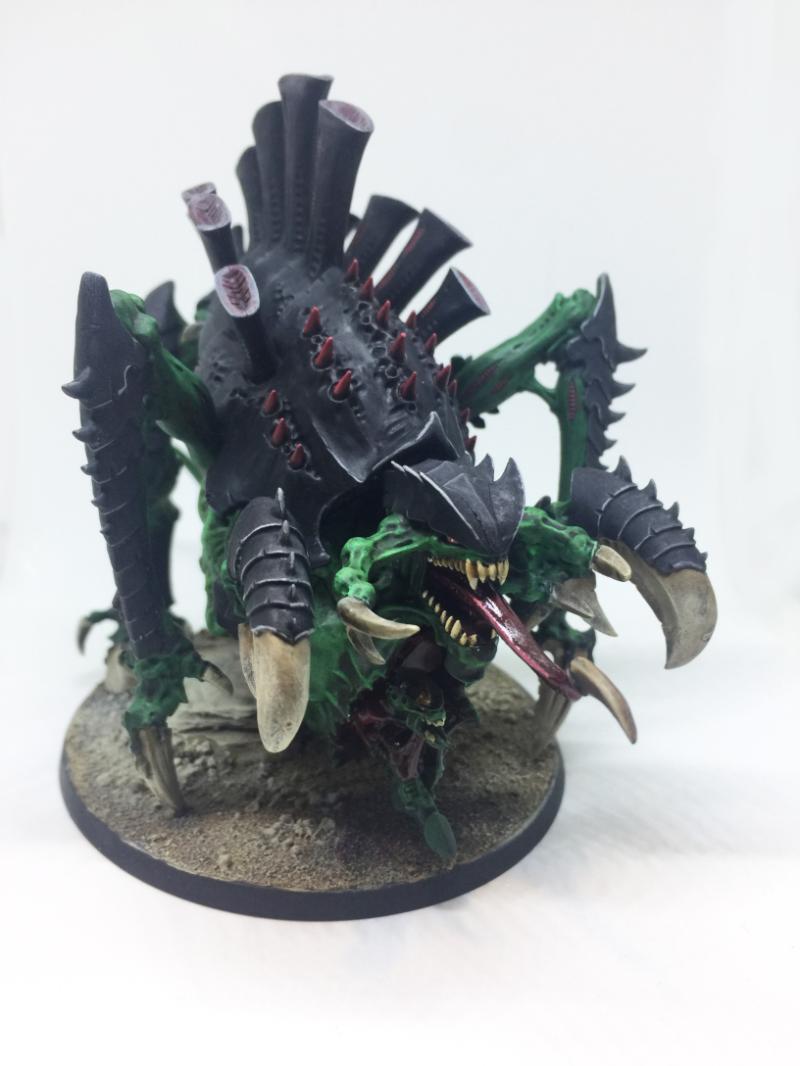
Renegade Hydra
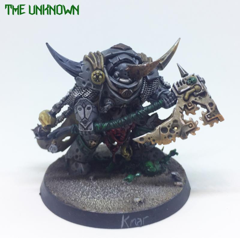
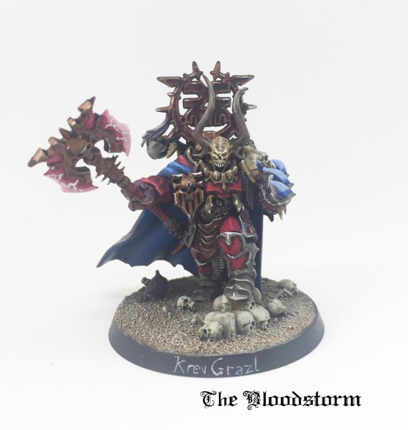
Lord of Khorne
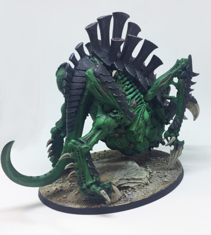
Tervigon
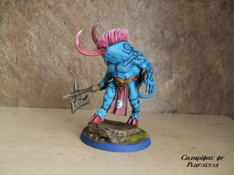
Daemon Prince (Ogroid Thaumatage)
|
|
|
|
 |
|
2018/01/19 12:02:46
Subject: Various 40k models: critique wanted
|
|
Longtime Dakkanaut
|
Some of the models look a little flat in places, or they are too flat in their contrast, like the Ogroid's back, where the swirls seem very sudden.
|
 iGuy91 wrote: iGuy91 wrote:You love the T-Rex. Its both a hero and a Villain in the first two movies. It is the "king" of dinosaurs. Its the best. You love your T-rex.
Then comes along the frakking Spinosaurus who kills the T-rex, and the movie says "LOVE THIS NOW! HE IS BETTER" But...in your heart, you love the T-rex, who shouldn't have lost to no stupid Spinosaurus. So you hate the movie. And refuse to love the Spinosaurus because it is a hamfisted attempt at taking what you loved, making it TREX +++ and trying to sell you it.
 Elbows wrote: Elbows wrote:You know what's better than a psychic phase? A psychic phase which asks customers to buy more miniatures... 
the_scotsman wrote:Dae think the company behind such names as deathwatch death guard deathskullz death marks death korps deathleaper death jester might be bad at naming?
|
|
|
|
|
2018/01/19 12:10:06
Subject: Various 40k models: critique wanted
|
|
Savage Khorne Berserker Biker
|
 CREEEEEEEEED wrote: CREEEEEEEEED wrote:Some of the models look a little flat in places, or they are too flat in their contrast, like the Ogroid's back, where the swirls seem very sudden.
I'm not sure I get what you mean. Do you mean the skin would look better with a greater contrast between light and shade?
That said, the swirls should look sudden because I took them to be tattoos and so they should look painted on.
|
|
This message was edited 2 times. Last update was at 2018/01/19 12:10:54
|
|
|
|
|
2018/01/19 12:36:09
Subject: Various 40k models: critique wanted
|
|
Potent Possessed Daemonvessel
Why Aye Ya Canny Dakkanaughts!
|
Some nice clean paintjobs there. Only criticism I'd have, as a fellow Khorne player, is about the criminal lack of Blood for the Blood God on these models, the Blood Slaughterer especially needs a good long bath in blood!
|
Ghorros wrote:The moral of the story: Don't park your Imperial Knight in a field of Gretchin carrying power tools.
 Marmatag wrote: Marmatag wrote:All the while, my opponent is furious, throwing his codex on the floor, trying to slash his wrists with safety scissors.
|
|
|
|
|
2018/01/19 12:40:19
Subject: Various 40k models: critique wanted
|
|
Savage Khorne Berserker Biker
|
 mrhappyface wrote: mrhappyface wrote:Some nice clean paintjobs there. Only criticism I'd have, as a fellow Khorne player, is about the criminal lack of Blood for the Blood God on these models, the Blood Slaughterer especially needs a good long bath in blood!
Hahaha
|
|
|
|
|
|
2018/01/19 13:14:55
Subject: Various 40k models: critique wanted
|
|
Longtime Dakkanaut
|
They look great! The Tervigon and Death Guard commander are my personal fave. The Dark Angels chaplain is maybe the weakest in my eyes.
Also some truly excellent photos, i really wish i could take'em half that well.
|
Mary Sue wrote: Perkustin is even more awesome than me!
|
|
|
|
|
2018/01/19 13:38:06
Subject: Various 40k models: critique wanted
|
|
Mekboy on Kustom Deth Kopta
|
The models are great, no question.
This isn't true for all of the models, but for some I think the paint is a little thick (I can' see the 'strokes' ever so slightly) and as has been said - to meet what you're trying to achieve I think you should have less of a contrast between your shades.
Take the Interrogator Chaplain for example, I think the cloak and other cloth bits are a bit too harsh in their transition. Perhaps add another shade layer of deeper green before the black.
Have you tried wet blending on any of the models? It is perfect to achieve; "my aim is to produce realistic looking but clean effects on my models".
The models are beautiful by the way, please don't take this critique as a negative.
|
|
|
|
|
2018/01/19 13:46:54
Subject: Various 40k models: critique wanted
|
|
Savage Khorne Berserker Biker
|
Perkustin wrote:They look great! The Tervigon and Death Guard commander are my personal fave. The Dark Angels chaplain is maybe the weakest in my eyes.
Also some truly excellent photos, i really wish i could take'em half that well.
Interesting that you thing the chaplain is weakest (I had another model in mind as the weakest). What is it about the model that makes you say that? Please speek freely!
An LED lightbox for £10 and an iPhone are all I have. They made my pictures look a lot better without too much technique.
An Actual Englishman wrote:The models are great, no question.
This isn't true for all of the models, but for some I think the paint is a little thick (I can' see the 'strokes' ever so slightly) and as has been said - to meet what you're trying to achieve I think you should have less of a contrast between your shades.
Take the Interrogator Chaplain for example, I think the cloak and other cloth bits are a bit too harsh in their transition. Perhaps add another shade layer of deeper green before the black.
Have you tried wet blending on any of the models? It is perfect to achieve; "my aim is to produce realistic looking but clean effects on my models".
The models are beautiful by the way, please don't take this critique as a negative.
Thanks. I get the point about shading now. I usually do wet blend (if I understand wet blending right). I pretty much use the technique I use for acrylic paintings, which is to put both the light and dark colours on at the same time, then blending them together while they are still wet. I think I need some acrylic retardant to help with this, as the paint dries a bit too quickly for this to always be possible. That's wet blending, right?
Well, sometimes I do that, but if I cannot be bothered, I just wash and highlight. I suppose I'm a bit lazy sometimes. I'm doing blending more now though. I'm working on Horus atm and I think his cloak is blended a lot better than these models. See image below:
![[Thumb - 171018 Horus WIP rear.jpeg]](/s/i/at/2018/1/19/98c6676118931f64d6fba6b05c898559_96054.jpeg__thumb)
|
|
|
This message was edited 3 times. Last update was at 2018/01/19 13:49:57
|
|
|
|
|
2018/01/19 13:56:45
Subject: Various 40k models: critique wanted
|
|
Mekboy on Kustom Deth Kopta
|
Thanks. I get the point about shading now. I usually do wet blend (if I understand wet blending right). I pretty much use the technique I use for acrylic paintings, which is to put both the light and dark colours on at the same time, then blending them together while they are still wet. I think I need some acrylic retardant to help with this, as the paint dries a bit too quickly for this to always be possible. That's wet blending, right?
Well, sometimes I do that, but if I cannot be bothered, I just wash and highlight. I suppose I'm a bit lazy sometimes. I'm doing blending more now though. I'm working on Horus atm and I think his cloak is blended a lot better than these models. See image below:
Correct re wet blending and correct again that acrylic retarder will help a ton! It's tough to do at the best of times so you'll probably find it easy mode once you get the retarder in the mix too.
Yea that Horus cloak is fine. The real dark shaded part should be worked up a little in my opinion but that's really just preference.
I'm the same man, I'm super lazy most of the time and prefer just a cheeky wash and highlight. It's simple though, the more varied and progressive tones you put on the model the better it'll look I think.
The thing here is what do you think about your own models - critique them yourself and work on something based on your own critique. There's no harsher judge than ourselves, in my opinion and at the end of the day yours is the only opinion that matters.
For example, I have recently tidied up every single base in my Ork army. Previously I was happy with the 'rugged' aesthetic of having rough edges on the bases but I thought I'd see how it looked on a squad with the rim tidied up and that was that.
|
|
|
|
|
2018/01/19 16:04:50
Subject: Various 40k models: critique wanted
|
|
Savage Khorne Berserker Biker
|
Yeah, I hear you! I am normally quite good at critiquing my work, but I have plateaued a bit recently, so it's good to hear other people's thoughts. Even if I was already thinking what you said, the fact it's now in the open means that people will be expecting me to post some better models in future (or at least I imagine that's what they're thinking), and that thought is enough to motivate me to up my game a bit.
So thank you so much for your help (and to everyone else too).
Any further comments will be welcomed!
|
|
|
|
|
|
2018/01/19 17:13:35
Subject: Various 40k models: critique wanted
|
|

Confident Halberdier
|
I actually disagree. I think that the dark areas on your cloak are needed and fine the way they are. You could, however, use a bit more gradation between the high/low points and I would even venture to make the brightest points (reds on your Horus model for example) even brighter, in order to really pop! The Horus model overall is quite dark and cold, so having a bright red cape will really draw your eye to it. Otherwise, it could be easily overlooked on a table top, and that's not what you want with such an important piece.
Just my 2 cents.
|
|
|
|
|
2018/01/19 17:20:59
Subject: Various 40k models: critique wanted
|
|
Longtime Dakkanaut
|
I think the Crozius looks a little odd, the silver highlight doesn't quite work, also the face looks a bit untidy as do the metallics on the whole (i feel you on that one, i HATE doing metallics). On a more subjective note i don't like the really bright bone fringes.
|
Mary Sue wrote: Perkustin is even more awesome than me!
|
|
|
|
|
2018/01/19 17:59:35
Subject: Various 40k models: critique wanted
|
|

Fireknife Shas'el
|
I'd say you don't highlight the hard edges of your models enough, but that is very much a style issue, not a painting skill issue.
I will agree with CREED that the models need more contrast to better define the shape. The Tervigon's green just looks washed, and the Ogriod Thaumaturge really lacks for definition. Overall, you tend towards flatter and/or more pastel colors, which doesn't help in this regard, though your color choices are entirely your own.
For cloth, I'm not a big fan of wet blending, as it's hard to pull off just right. I prefer to shade, put the original color over the raised areas, then use either edge highlights or thin down lighter paint with medium and progressively layer up the color.
|
|
|
|
|
|
|
|