| Author |
Message |
 |
|
|
|
|
Advert
|
Forum adverts like this one are shown to any user who is not logged in. Join us by filling out a tiny 3 field form and you will get your own, free, dakka user account which gives a good range of benefits to you:
- No adverts like this in the forums anymore.
- Times and dates in your local timezone.
- Full tracking of what you have read so you can skip to your first unread post, easily see what has changed since you last logged in, and easily see what is new at a glance.
- Email notifications for threads you want to watch closely.
- Being a part of the oldest wargaming community on the net.
If you are already a member then feel free to login now. |
|
 |
2018/07/08 21:34:32
Subject: First shot at some custodes
|
|

Pulsating Possessed Chaos Marine
|
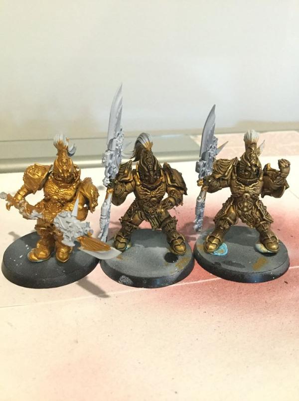
So recently i had to bite the bullet.. i found a deal that was just far too good for me to pass up on a full 2000 point force of the golden boys. Im still working out my golds, but i think im headed in the right direction with them.The three
below are in order of, basecoat --> Wash --> First Highlight.
|
 Oh stop complaining, its for the greater good... Now get in the box! Oh stop complaining, its for the greater good... Now get in the box!
Owner of R.S. Commission Studios. PM For a quote. Link in profile. |
|
|
 |
|
2018/07/08 22:46:39
Subject: First shot at some custodes
|
|

Implacable Skitarii
|
Looking good there! It's gold without being too gold, the first highlight model looks great.
Looks like you got 2000 points there already! 
|
|
|
|
|
|
2018/07/09 00:08:33
Subject: First shot at some custodes
|
|
Stubborn Temple Guard
|
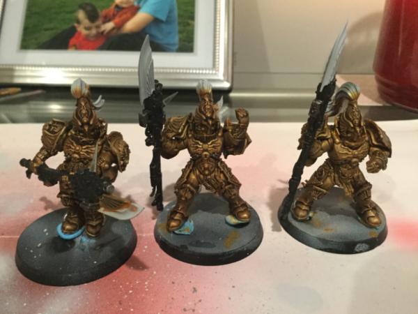
If you are going for the GW look, the wash seems a bit heavy. But it still looks solid! If you don't want the garish GW gold, this is a very good look.
|
27th Member of D.O.O.M.F.A.R.T.
Resident Battletech Guru. |
|
|
|
|
2018/07/09 00:16:30
Subject: First shot at some custodes
|
|
Pulsating Possessed Chaos Marine
|
I'm not intending for it to look like GW's studio scheme, i wanted something a little different. Too many othe people locally did a direct copy of the official one.
|
Oh stop complaining, its for the greater good... Now get in the box!
Owner of R.S. Commission Studios. PM For a quote. Link in profile. |
|
|
|
|
2018/07/09 00:49:46
Subject: First shot at some custodes
|
|

Liche Priest Hierophant
|
I think your tecnique is good, but I do not like the colour scheme. The one on the right teminds me of cheap plastic or 90's drawing imitating gold. (Painted models do notvusually have this qualaty. Mtg 1997 golden borders for an rxample of drawn imitated gold.)
Anyway I hope and suspect that they will snap out of it once you get another colour to contrast it. Red plumes perhaps.
I suspect shading them with a dark purple would make them pop more then the black. Purple is opposet to yellow on the human spectrum.
|
|
|
|
|
|
2018/07/09 01:21:50
Subject: First shot at some custodes
|
|
Pulsating Possessed Chaos Marine
|
Im sure that effect your mentioning will correct itself once i get another section of color placed down. But, i also have afew more steps to work into the gold from where they are now before im going to all them finished on that front. Another two highlights, and depending on they look from there, possibly another filter wash.
Also, they are shaded with purple, not black.
|
Oh stop complaining, its for the greater good... Now get in the box!
Owner of R.S. Commission Studios. PM For a quote. Link in profile. |
|
|
|
|
2018/07/10 01:03:13
Subject: First shot at some custodes
|
|
Pulsating Possessed Chaos Marine
|
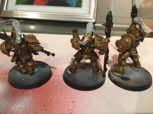
I think, im going to be calling the gold finished with this.
|
Oh stop complaining, its for the greater good... Now get in the box!
Owner of R.S. Commission Studios. PM For a quote. Link in profile. |
|
|
|
|
2018/07/10 21:03:18
Subject: First shot at some custodes
|
|

Regular Dakkanaut
|
It might simply be lighting but I would recommend more highlights
|
|
|
|
|
2018/07/11 00:10:24
Subject: First shot at some custodes
|
|
Liche Priest Hierophant
|
Apply the first layer of your other colours to se how the contrasts pan out.
|
|
|
|
|
|
|
|