A bit behind the times for a review of Contrast, but here's my 2c for anyone yet to give them a try. I've managed to accumulate quite a few
GSC models, usually via other box sets (Deathwatch Overkill, the first Kill Team release). I've been running a Deathwatch
RPG campaign
and thought these guys would be good antagonists for the party, plus a good chance to try out the Contrast range.
So first up, these figures aren’t going to win any painting contests, but the Contrast paints certainly speed things up for a basic tabletop finish. I’ve painted 40 figures in the last month,
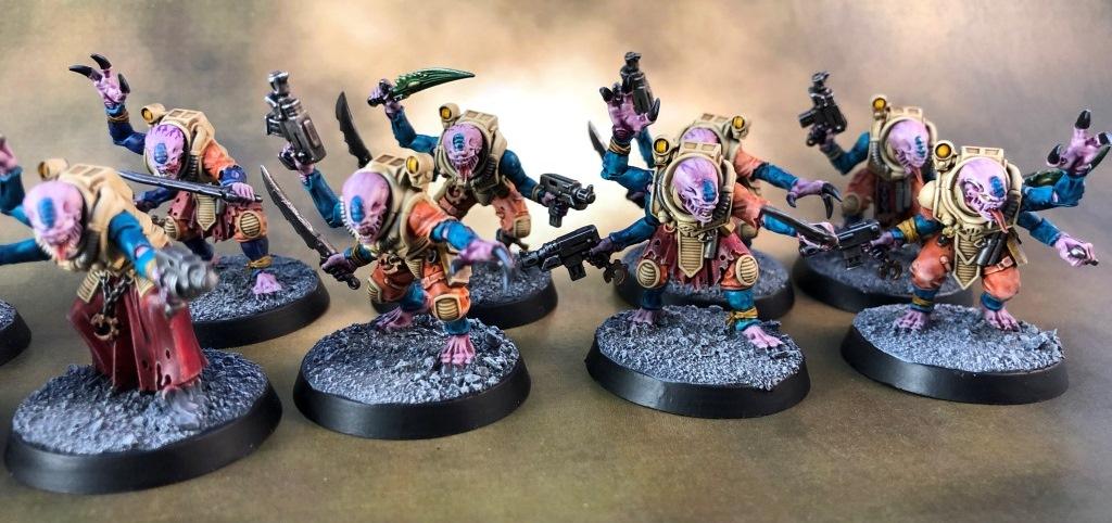
which is astonishing for me considering my usual glacial pace. I think it may be a record. Here’s the whole group:
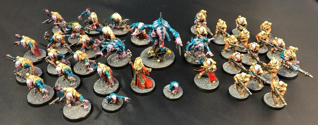
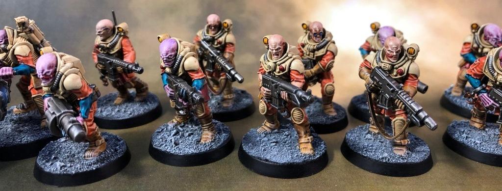
The basic scheme was pretty simple – Contrast for 90%+ of the figure. Paints used:
Basecoat: Wraithbone (all)
Skeleton Horde for the armour
Gryph-hound Orange for uniforms
Snakebite Leather for leather/straps
Guilliman Flesh for ‘human’ skin
Magos Purple for alien skin
Akhelian Green (which is actually a blue) for alien chitin
Flesh Tearers Red for cloth/robes
Robes, armour, leather were lightly drybushed with Tyrant Skull ‘dry’ paint
Metallics and blacks were done with traditional
GW paints and washes
I did some basic highlighting on the human and alien faces, but everything else is just a single pass of Contrast
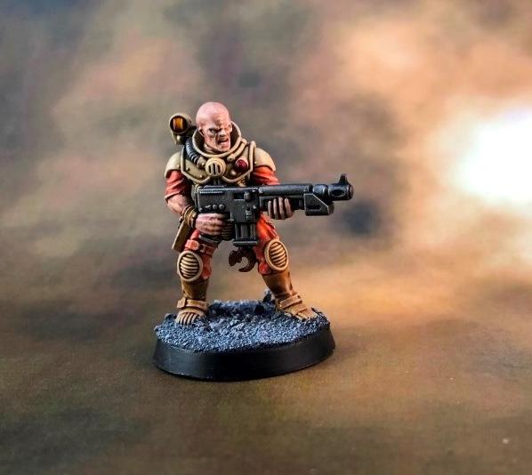
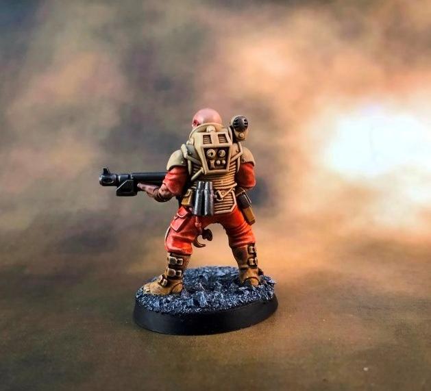
Basic trooper, done with the above colours:
3rd and 4th generation Hybrids
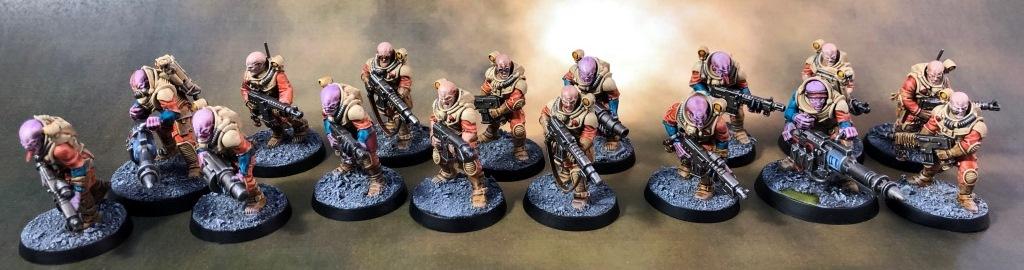
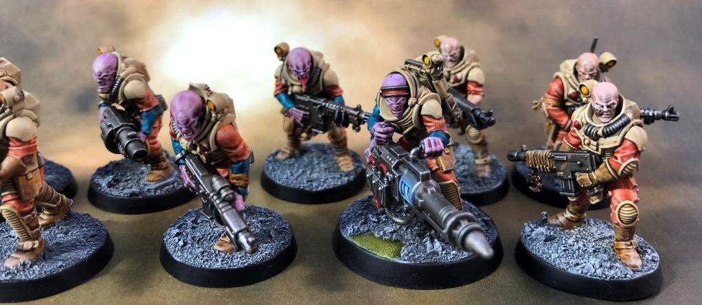
1st generation Hybrids
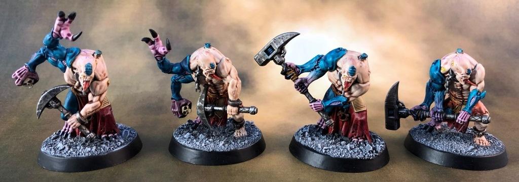
Abberants – probably the poorest job of the lot as they had more ‘human’ skin and Guilliman Flesh was my least favourite Contrast.
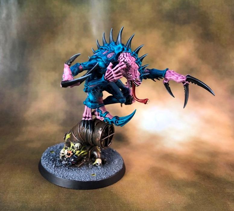
By comparison, the Akhelian Green was one of the best and I even managed some purple to blue transitions on a couple of the arms that worked well.
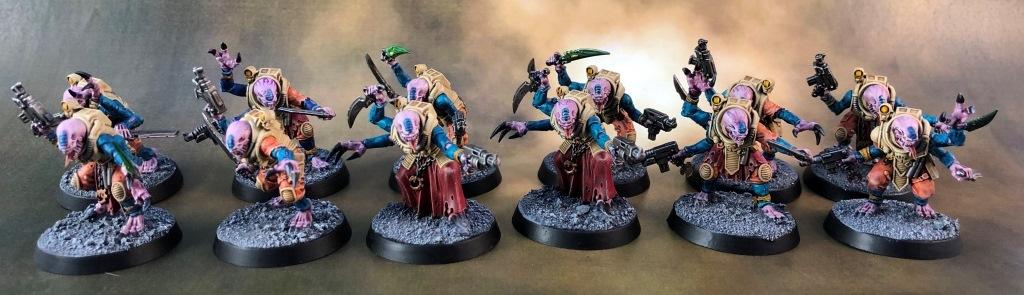
The
HQ. The red robes were done the traditional way as I found contrast really struggles to get a consistent finish over large, flat areas (like any wash).
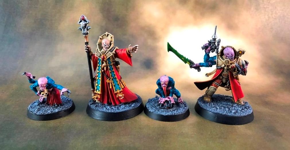
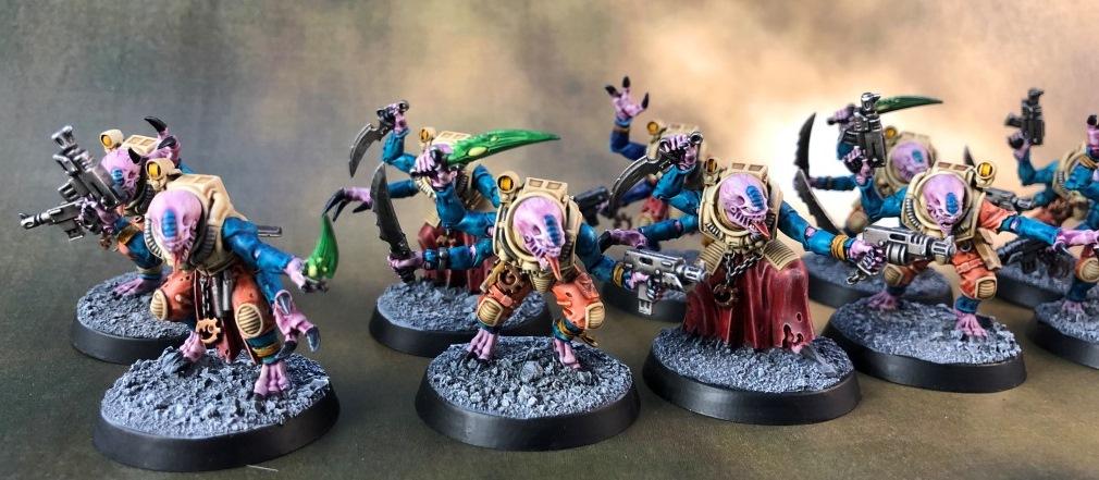
The ‘stealers – basically one pass of the purple and blue/green and then black paint on the talons. Pretty ok results for the amount of work involved
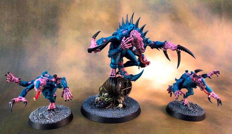
Big Daddy
Summary
Overall, these are great for quick and dirty jobs that will meet tabletop standard. There are definitely some stand outs and some so-so in the range (I only have about 30% of the available colours). I’d say Guilliman Flesh
was my least favourite, but improved when mixed with the Contrast medium. Magos Purple was OK, the rest were pretty amazing actually. They act like a wash, but with very strong pigment – one pass is all you need.
Also, apart from the one I spilled (curse tall pots), they go a long way and there is little discernible reduction from my starting pot levels after doing 40 minis.
I weep to think how quickly these paints could have done my Krieg, Renegades, Poxwalkers and cultists. You could even get away using them on Deathguard marines and Tyranids would be a breeze.
They certainly work best on high-detail models, like those. Sadly, the limitations of washes means they won’t do well on smooth flat areas, like marine armour. With thinning they might improve, but an uneven finish is likely.
So overall pretty pleased with Contrast. Most cover very well, look good and a pot will go a long way. Good for hordes and a useful addition to the painting arsenal. I’ll no doubt pick up a few more colours to try
and also experiment with different basecoats (which apparently makes quite a difference to the shade each colour comes out as) – I must also try them on Orks…


