Tinting pre-shaded models is my favorite application of Contrast and I think it works really well once you've figured out which base colors you want to use. That's the tricky part, really. Different colors shine through and are tinted differently, so that may need a bit of experimentation.
This Battle Sister's armor uses Skeleton Horde:
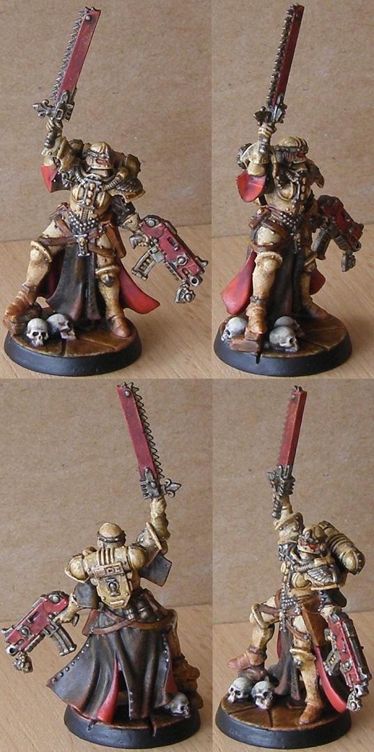
As a base I drybrushed four colors over a Dryad Bark base: Jokaero Orange, Lugganath Orange, Ushabti Bone, Pallid Wych Flesh. The layers are drybrushed in such a way as to get zenithal highlights. This is then followed by a thinnish coat of Skeleton Horde for the final look.
I like the way drybrushing gives the surface a bit of a worn look, but I've also used Contrast over standard layering on this Imperial Fist:
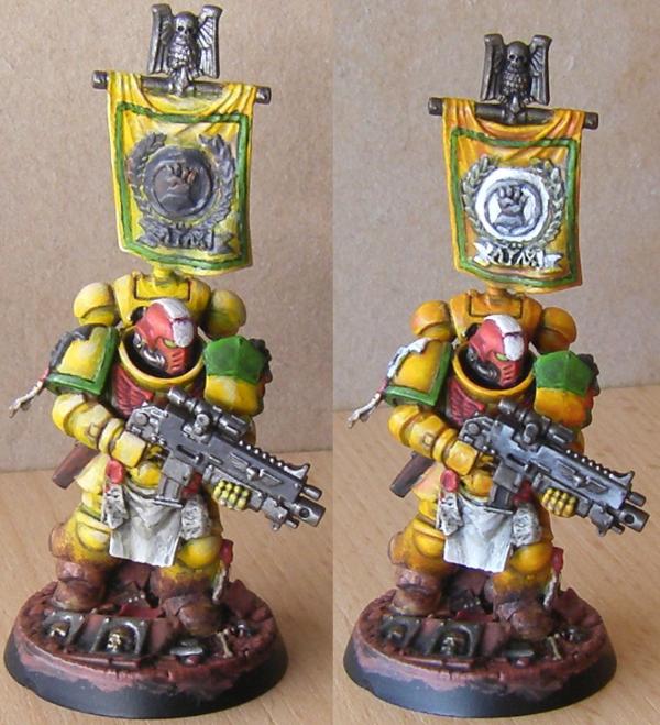
Which also happens to be the only before/after picture of the process I have. I don't remember all the colors involved, but I took it up from a medium brown and orange base over yellow to beige, then followed it up with a coat Iyanden Yellow. Again applied thinly to avoid paint from pooling. Being a quick job and the first time I tried it, that didn't work too well yet, but it will with practice.
For contrast, here's an Imperial Fist that uses the same technique as the Sister:
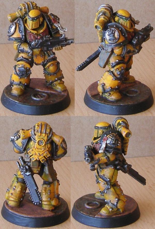
Drybrushed like the Sister with several layers of paint with the goal of highlighting certain areas over others (not zenithal,but similar in principle), the top layer was kept darker (by staying in the yellow range instead of taking it up to beige or off-white) for a more muted finish.
Going off of that experience, I'd say if you want nicely layered Ultramarines you should consider a darker blue, lighter blue, pastel blue and then either beige or off-white as the basis for your Contrast paint. As a traditional painted I don't have a clue how an airbrush figures into all that, but if you layer like that you should get a decent result.
Depending on taste, you should consider what your darkest and lightest base color is. Intense and dark colors will keep much of their quality under a layer of lighter Contrast colors while lighter and neutral tones take on a lot of the Contrast color.


 Legio Suturvora 2000 points (painted)
 Daemonhunters 1000 points (painted)
 Flesh Tearers 2000+ points (painted) - Balt GT '02 52nd; Balt GT '05 16th
 Kabal of the Tortured Soul 2000+ points (painted) - Balt GT '08 85th; Mechanicon '09 12th
 Greenwing 1000 points (painted) - Adepticon Team Tourny 2013