Forum adverts like this one are shown to any user who is not logged in. Join us by filling out a tiny 3 field form and you will get your own, free, dakka user account which gives a good range of benefits to you:
No adverts like this in the forums anymore.
Times and dates in your local timezone.
Full tracking of what you have read so you can skip to your first unread post, easily see what has changed since you last logged in, and easily see what is new at a glance.
Email notifications for threads you want to watch closely.
Being a part of the oldest wargaming community on the net.
If you are already a member then feel free to login now.
So, i'm running a Carcharadon's 40k list and i painted up my first dude aaaaaaaaaaaaaand i mean it looks....good? But i think i need a darker more....stick outy gray? Like a dark smooth gray, I kind of just made my dude look like a slightly darker version of the sprue and it just looks BAD - like its a good paintjob, but it just looks like i painted the sprue-sprue colored. Anyone got tips or ideas on what to do here? I thought about maybe painting them like orange/black and sticking away from the gray, but i'm working off a picture i found online (hopefully i can post it or something) to give you an idea of what i'm kinda aiming for.
Yeah, you're going to run into that problem any time you do something overall grey; it looks like you just failed to paint the mini. I avoid overall greys like the plague.
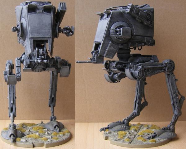
My solution to the grey plastic look is depth. Not exactly the same size as a Marine, but my AT-ST should illustrate the idea:
Whether you want to go with a stylized pattern, weathering or zenithal highlighting, I'd make sure to have a range of greys on the same areas. Not just darker recesses, but actual variation on your grey surfaces. Bare plastic is pretty uniform. In my opinion a grey paintjob needs to break up that uniformity.
Nehekhara lives! Sort of!
Why is the rum always gone?
You can achieve interesting Greys, but you're going to need to be willing to put a bit of work in and mix paints. I use the simple method of blacks and white for my Grey's, but mix in colours to suit. I like to use deck tan to create general Grey's with a little depth, but blues, yellows, reds and greens all alter the tones in different ways. A bit of experimentation would be required to figure out what worked best.
Best way to make grey look interesting is to use warm or cool greys instead of neutral for the shadows and highlights. If your armor edging is gold, I'd go with cool greys (blue-ish or cold purple-ish tinted) for the best contrast. Adding texture or battle damage can also help.
The key is adding just a *little* colour to the greys, so they still read as grey to the eye, but are more than just flat neutral monochrome.
Fire_Forever wrote: Best way to make grey look interesting is to use warm or cool greys instead of neutral for the shadows and highlights. If your armor edging is gold, I'd go with cool greys (blue-ish or cold purple-ish tinted) for the best contrast. Adding texture or battle damage can also help.
The key is adding just a *little* colour to the greys, so they still read as grey to the eye, but are more than just flat neutral monochrome.
This ^
If you don't understand what he means by warm and cold greys, check out Marco Frisonis color theory videos on YouTube. He says it way better than I ever could.
Find me on Reddit
https://www.reddit.com/user/Tacocatra
Find me on Instagram
https://www.instagram.com/ariartcorner
Check out my Etsy!
https://www.etsy.com/shop/ariartcorner
start with a lighter grey and then a thinned black wash (nun-oil/strong tone) followed by a thinned blue or purple wash..Drybrush and highlight..depth galore
Another thought is do it up as a non-metallic metal style
This message was edited 1 time. Last update was at 2021/12/20 17:56:05


 Heresy World Eaters/Emperors Children

 ' ~9000pts
 ' ~1500
 " ~3000
 " ~2500