Forum adverts like this one are shown to any user who is not logged in. Join us by filling out a tiny 3 field form and you will get your own, free, dakka user account which gives a good range of benefits to you:
No adverts like this in the forums anymore.
Times and dates in your local timezone.
Full tracking of what you have read so you can skip to your first unread post, easily see what has changed since you last logged in, and easily see what is new at a glance.
Email notifications for threads you want to watch closely.
Being a part of the oldest wargaming community on the net.
If you are already a member then feel free to login now.
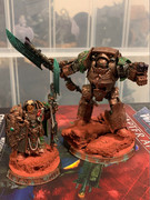
I scoured the Internet for some Custodes color schemes, and thought red was overused, blue makes the look like exiles from AoS, and black and gold are the school colors of UCF, which is down the street from me... so I picked green.
I’d say the first green, as it has a similar saturation to the example box art custodes’ red, making it sorta fit in the same way. I’m biased towards replicating box art colors though, so take it with a grain of salt.
One day I will have something funny enough to be in a signature.
I like the first or last one. They're the brightest and most intense. I figure a giant in gold armour should go with the most exuberant colours and it stands out against the gold better.
Ask yourself: have you rated a gallery image today?