| Author |
Message |
 |
|
|
|
|
Advert
|
Forum adverts like this one are shown to any user who is not logged in. Join us by filling out a tiny 3 field form and you will get your own, free, dakka user account which gives a good range of benefits to you:
- No adverts like this in the forums anymore.
- Times and dates in your local timezone.
- Full tracking of what you have read so you can skip to your first unread post, easily see what has changed since you last logged in, and easily see what is new at a glance.
- Email notifications for threads you want to watch closely.
- Being a part of the oldest wargaming community on the net.
If you are already a member then feel free to login now. |
|
 |
2025/05/20 16:32:48
Subject: Can you help? Frustration is growing...
|
|

Been Around the Block
|
For this months theme "May Day" of the dakka dakka painting competition I thought I would do the Orks Wartrike and to get more
may - feeling, I thought I would do some floral patterns to challange myself to really try to do some thin lines to get practice.
So I did some online research, found some patterns I liked and started practicing - first with a pencil,
then with a brush and played arround with color combinations and came up with this and was quite happy with what I got:
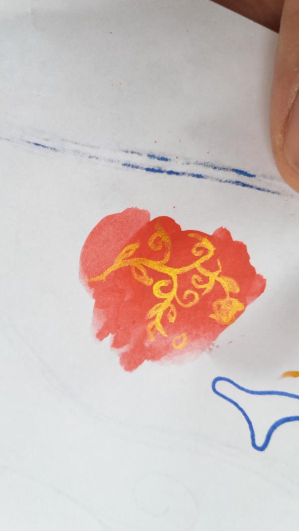
This is on paper with a fine brush, but allready the paints I normaly use on the models.
So, as I said, quite pleased, I started to paint the model, but I had problems getting the paint off the brush - I had to do every line 5 times and then it would become thicker
and thicker, but otherwhise you wouldn`t see it - the paint just wouldn`t get of the brush, on to the Model.
I used my normal spraycan Primer (black), painted red over it and then the gold metallic from army painter - it now looks like this:
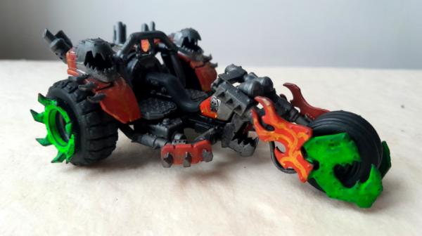
I am really dissapointed - it looks like a toddler painted the pattern with his feet....-has anyone ideas what went wrong or how I could improve?
It`s actually not the first time this has happened, sometimes I can apply the colors on the model and I allmost feel like a pro and then again this happens and
I feel like the first human....(austrian saying for beeing incompetent at something) and I don`t know what is going on.
I use a wetpallet and natural hair brushes...
|
As Sun Tzu said:"We need more Dakka!"   |
|
|
 |
|
2025/05/20 17:53:30
Subject: Re:Can you help? Frustration is growing...
|
|

Huge Bone Giant
|
Some things come to mind that might help. The first one is that a motif (flowers) on another motif (flames) isn't easy to pull off in miniature. At life size you have plenty of space to work with. On a miniature you don't just need to apply the motif itself but also give it depth with lighting. The limited space you have gets crowded quickly when you apply additional layers that give it definition and do the same to the surrounding area as well. It's a good idea to pick a motif that doesn't easily occupy the whole space because it gives you more room to apply the necessary highlights to all parts.
Another one is that the direct comparison between the test and the actual miniature is unfair. The test has depth through dark and light areas both on the base color and the motif. The miniature isn't as far along and only has flat colors. Without additional highlights it isn't ever going to look good. That's just the way 2D painting works. Refinement happens through subsequent layers that add targeted definition which in turn gives the whole thing better definition.
Getting the thickness or width of ornaments right can have a significant impact on how it's perceived. If it's too fine, the shape may lose definition just as much as if it's too thick, showing too little or too much respectively of the paint that is supposed to define that part. While this goes hand in hand with the depth you add through multiple layers, sometimes it can be good to lay down the base shape with a darker color and then fill in that shape with a finer, lighter color that is the actual base layer. This adds definition by basically outlining your motif with a darker color, but since it's best done with shades of the same color, it's not as stark as having, say, a comic-like black outline. The same goes for the darkest color of the base area you want to decorate. By going with a darker shade than your intended base color, you can then fill in the rest of the area with a lighter shade and leave the outlines of your motif untouched to get better overall definition.
|
Nehekhara lives! Sort of!
Why is the rum always gone? |
|
|
|
|
2025/05/20 19:08:24
Subject: Re:Can you help? Frustration is growing...
|
|
Been Around the Block
|
Thanks Geifer for your answer!
You really took some time to give good advice. I just feel it`s a bit too far ahead of what I am doing... I started trying to apply various colorgradients
on my last miniature for the contest - but it was only 3 layers from base, to midtones to highlights and only on the skin of the ork.
So most of the time I am just painting flat. That is why I wanted to freehand this pattern with fine lines, so I can practice doing thinner,regular lines for highlighting for example.
But if I can`t even manage to do thin lines without any limitations (in this case I can go with the line any way I want) how am I
supposed to set those lines next to each other to make them blend someday? =)
But my main problem was, like I said, that the Paint would rather stick to the brush, then to run on to the model. I would either stay on the brush, or if I used more water
to thin it, it started running everywhere, without me beiing able to control it...
|
|
This message was edited 1 time. Last update was at 2025/05/20 19:09:49
As Sun Tzu said:"We need more Dakka!" |
|
|
|
|
2025/05/20 23:04:06
Subject: Re:Can you help? Frustration is growing...
|
|
Huge Bone Giant
|
I'm hoping someone else can chime in on the brush question. I can't claim to be very sophisticated in that regard. I think the best advice I read on the matter, which aligns with my experience, is to use a brush that isn't too fine but has a fine tip. The idea is that the hairs can hold a bit of water to keep the paint on the point from drying too quickly. It takes practice to get there and you may need several attempts for any given brushstroke to take. Patience can really pay off here.
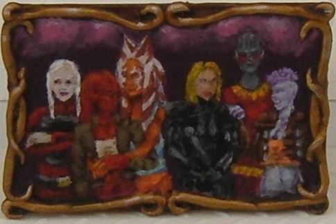
On the number of paint layers for freehands, on miniatures you can get very far with three colors. I painted the painting below a few years ago on a 2cm by 3cm plasticard bit. Disregarding the burgundy basecoat I don't think I used more than three colors anywhere. Dark, medium and light is plenty to create recognizable shapes at the size we're talking about.
How much you have to worry about transitions depends on the shape and size of your motif. Judging by the pictures you posted the flower seems to be slimmer than the highlights you put on the mek's arm. I'd say three colors is good enough for a start. If you want to try a transition, paint the medium and light layer a little shorter than you would, give those bits a little time to dry and then put the same paint on each end, but this time watered down more.
I can only speak from personal experience learning by trial and error. I think your approach to learning how to blend is fundamentally sound. It worked for me as far as that goes. I wasn't happy with the GW way of edge highlighting models. It's not bad per se and can be used to good effect. It just wasn't for me after giving it a try on a few different armies. Freehands were where I learned to blend (in my own, charmingly sloppy way  ). I didn't start with tiny little motifs, though. Instead I painted a few terrain pieces like billboards, which means pretty large surfaces and plenty of space for corrections if it didn't look right immediately. I only miniaturized that after I got in practice with putting on and taking away watered down paint on larger surfaces to get a feel for what to expect.
If you want to start small, I'd suggest being methodical about every single stage and get it to look right in isolation before you move on to the next one. Don't try to do everything at once. Try to get the basic shape right, like the thickness of the stem and leaves, without worrying about anything else yet. Then apply those other two colors so you know where to put your highlights. If you have that and the transitions look too rough for your taste, widen the lighter areas with watered down paint and see if that leads to transitions that look better.
2D painting, which isn't just freehanding in the common sense but also filling 3D surfaces with a 2D effect, requires a bit of understanding of how the various compositional stages build on each other. I painted a billboard for the painting challenge two years ago and took work in progress pictures (spoilered for size below) which hopefully illustrate what I mean. It can be a bit tricky to look at any given stage in isolation and feel confident that it's right because it never shows the full, finished picture. But if you can teach yourself to understand whether or not a stage works in isolation, as a stepping stone to the next stage, working your way up to the blended finish almost becomes painting by numbers. Yes, you still have to learn the actual technique for blending, but blending isn't something you apply without a foundation. It benefits from solid groundwork.
|
Nehekhara lives! Sort of!
Why is the rum always gone? |
|
|
|
|
2025/05/21 11:52:28
Subject: Can you help? Frustration is growing...
|
|

Posts with Authority
|
Might have been a better idea to prime the model Yellow, then paint the red tones on top of the yellow instead of first priming black, then blowing a bunch of red layers just to get to a decent red, and only then piling on the yellow, especially since yellow is the least covering acrylic paint tone in the whole colour range..
In your paper example, you painted your red, then yellow over a white "primer" (aka the paper), which already helped things along a lot.. Had you used a black coloured paper, I'm quite sure your paper test qould also have ended much worse off..
IME, I've learned the hard way that if one wants strong yellows and reds with acrylics, the key is in the priming stage and using a primer colour which is already as close as possible to the final intended red/yellow
I dont know what to make of your comment about paint not coming off from your brush.. Was it the yellow especially? Yellow acrylics are THE WORST.
|
|
This message was edited 3 times. Last update was at 2025/05/21 11:57:48
"The larger point though, is that as players, we have more control over what the game looks and feels like than most of us are willing to use in order to solve our own problems" |
|
|
|
|
2025/05/21 14:19:33
Subject: Can you help? Frustration is growing...
|
|

Fixture of Dakka
|
Yep. For bright reds, oranges, and yellows you kinda have to start off with a light color. Acrylics are just not THAT pigment-saturated to overcome a dark base without dozens of layers.
|
CHAOS! PANIC! DISORDER!
My job here is done. |
|
|
|
|
2025/05/21 15:37:36
Subject: Can you help? Frustration is growing...
|
|
Scarred Ultramarine Tyrannic War Veteran
Maple Valley, Washington, Holy Terra
|
It sounds to me like you aren’t thinning your paints enough and/or aren’t dampening your brush before painting. However, it’s also important to brush a bit on a piece of paper to remove excess paint so it doesn’t all flow onto your model in a rush. Control is the key here. I find that a little drying retardant medium helps when I’m working on fine details, as it prevents the paint from drying on my brush before I can apply it to the model, which makes it difficult to control the thickness of my stroke.
|
|
This message was edited 2 times. Last update was at 2025/05/21 15:38:29
"Calgar hates Tyranids."
 Your #1 Fan Your #1 Fan |
|
|
|
|
2025/05/21 16:52:42
Subject: Can you help? Frustration is growing...
|
|
Rogue Daemonhunter fueled by Chaos
|
I may be oversimplifying things, but it really just looks like you aren't getting good coverage with the yellow. As others have said, yellow is generally pretty light on pigment, and thinning it down with a wet palette makes it more so.
If you don't mind a soft transition from red to yellow, you can just paint a thing white line, and then paint yellow over that. If you want a harder edge, paint an ochre line, and then paint a thinner yellow line inside the ochre.
What paints are you using?
|
|
|
|
|
2025/05/22 04:36:49
Subject: Re:Can you help? Frustration is growing...
|
|

Been Around the Block
|
Thank you all for your advice!
I started out with acrylic paints for modelling, then used armypainter stuff
and now I just started using vallejo colors.
With this project I was using my last reserves of "pure red" from armypainter, "bright gold metallic" from army painter and fluorescent green "verde fluo" game color from vallejo.
I primed black, because I was thinking of ereas that I would later not be able to reach and I thought, that would be mostly forgiving. Last project I painted in parts but this time I wanted to paint the model in one piece...
Automatically Appended Next Post:
Thank you all for your advice!
I started out with acrylic paints for modelling, then used armypainter stuff
and now I just started using vallejo colors.
With this project I was using my last reserves of "pure red" from armypainter, "bright gold metallic" from army painter and fluorescent green "verde fluo" game color from vallejo.
I primed black, because I was thinking of ereas that I would later not be able to reach and I thought, that would be mostly forgiving. Last project I painted in parts but this time I wanted to paint the model in one piece...
|
|
This message was edited 1 time. Last update was at 2025/05/22 12:18:47
As Sun Tzu said:"We need more Dakka!" |
|
|
|
|
2025/05/22 12:30:07
Subject: Re:Can you help? Frustration is growing...
|
|
Huge Bone Giant
|
I moved away from using a black basecoat. I prime black but follow up with a layer of dark brown. It's still a dark color that makes dark recesses easy but it's friendlier on colors like red, orange or yellow.
I like this approach because it decreases some of the issues with a black basecoat. I use it because I'm not a fan of light primers, especially white.
I only have very limited experience with Vallejo paints, but the few I used seemed to be fairly thin straight from the bottle. Others may have a better idea, but I imagine if you thin them additionally you would run into problems with paint coverage.
|
Nehekhara lives! Sort of!
Why is the rum always gone? |
|
|
|
|
2025/06/18 14:21:35
Subject: Re:Can you help? Frustration is growing...
|
|

Whiteshield Conscript Trooper
|
Perhaps try flow improver, Windsor and Newton make a nice one. It's designed to help paint flow more easily from the brush. just a drop can help immensely.
|
|
|
|
|
|
|
