Forum adverts like this one are shown to any user who is not logged in. Join us by filling out a tiny 3 field form and you will get your own, free, dakka user account which gives a good range of benefits to you:
No adverts like this in the forums anymore.
Times and dates in your local timezone.
Full tracking of what you have read so you can skip to your first unread post, easily see what has changed since you last logged in, and easily see what is new at a glance.
Email notifications for threads you want to watch closely.
Being a part of the oldest wargaming community on the net.
If you are already a member then feel free to login now.
Selym wrote: I like the look of a LRBT, though, not as much as I used to.
Over the past couple of years I've increasingly collected historic tank models and the LRBT has gone from a cool cartoonish tank to a derpy cartoonish tank in my eyes. I still don't hate it, but it's lost a lot of its appeal to me.
In epic scale, that thing is epic. Pun fething intended bitches! I really like all of the warhound designs and would honestly love to own an armorcast titan. An armorcast emporer would be so cool! And Heirophant. And Heirodule. And, well, everything.
ImAGeek wrote: Actually yeah I really hate the normal Dreadnoughts. I absolutely adore Contemptors but the usual ones I've never liked.
I think the contemptors look like they have been hitting the donuts a little too hard and have a pot belly. Sure, they may look like they can walk, but do they have a spin cycle?
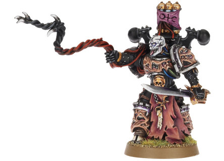
jer155 wrote: Empereror's children lord, any day of the week. that face just screams ''i've seen some sh*t''...
What, this one?
I thought that was an intentional feature.
even if it's intentional, it's still disgustingly ugly.
Definitely this one. Looks like the sculptor had a stroke whilst doing it.
I actually rather like this miniature. It's got that 80's heavy metal "bad trip" vibe that Chaos should be rife with. I quite like it.
IRON WITHIN, IRON WITHOUT.
New Heavy Gear Log! Also...Grey Knights! The correct pronunciation is Imperial Guard and Stormtroopers, "Astra Militarum" and "Tempestus Scions" are something you'll find at Hogwarts.
pax_imperialis wrote: The baneblade does look amazing and also functional, and I live in hope that one day gw reworks the Russ to make it look like a mini baneblade. The derpage of the Russ actually put me off starting a guard army for ages but now you can get the same firepower from a knight crusader for the same points as three russes and less $$. Never mind how the giant gravity stricken robot walks dammit!
I don't quite get the hatred for the Russ. I was always under the impression that they're supposed to be ugly, boxy things. The Imperium has long since forgotten how to make good tanks, so they just crank out these WWII era looking boxes with thick slabs of armor on the front.
If that's the case, I think they nailed that look.
Its a treadhead thing
Free from GW's tyranny and the hobby is looking better for it
DR:90-S++G+++M++B++I+Pww205++D++A+++/sWD146R++T(T)D+
jer155 wrote: Empereror's children lord, any day of the week. that face just screams ''i've seen some sh*t''...
What, this one?
I thought that was an intentional feature.
even if it's intentional, it's still disgustingly ugly.
Definitely this one. Looks like the sculptor had a stroke whilst doing it.
I actually rather like this miniature. It's got that 80's heavy metal "bad trip" vibe that Chaos should be rife with. I quite like it.
It's the eyes that do that particular paintjob no favours. Look at numerous other examples on Google and it's fine.
I own this guy and he really isnt that bad. The paint job really doesn't do him any favors in this image, for starters he has two speakers off each of his hips but the painter was too lazy to even pick them out and paint them the same color as the rest of the speakers. I really like the backpack, lots of cool detail that really feels like that is what a doom siren should be.
See pics of my Orks, Tau, Emperor's Children, Necrons, Space Wolves, and Dark Eldar here:
ugggggh... I just stumbled upon Epidemious in the GW website and he is horrid. The Thone is nice looking but the character seems to be half-assed. I know he's a nurgle follower, so you know, the pretty factor is out, but doesn't mean it needs to look completely terrible. Great Unclean One for exemple is badass and very nurgle ugly looking.
This message was edited 1 time. Last update was at 2015/10/11 03:05:16
Has anyone mentioned centurions yet?
Awful looking models, even the concept is just rubbish. I never understood why, when there are terminators and dread knights already, do you need another exo-exo heavy weapons suit.
Terminators at least look threatening, centurions look like chubby toddlers.
"All their ferocity was turned outwards, against enemies of the State, foreigners, traitors, saboteurs, thought-criminals" - Orwell, 1984
Will Haye's redesign for FW is orders of magnitude better than this version of the warhound.
In 6mm that model looks excellent. The reason the Armorcast ones look so... off is because they simply scaled up the Epic 40k versions leaving large dearths of detail at 28mm.
In armorcast's defense I understand their contracts only allowed them to upscale, they legally could not redesign or add details.
That being said, yeah, the original Warhounds were no prize in any scale.
r_squared wrote: Has anyone mentioned centurions yet?
Awful looking models, even the concept is just rubbish. I never understood why, when there are terminators and dread knights already, do you need another exo-exo heavy weapons suit.
Terminators at least look threatening, centurions look like chubby toddlers.
Funny thing is a fan made some alternate ones on Shapeways and they look a 100 times better.
So yeah, a fan in his spare time made a better super marine than GW.
Goddammit selym, stop stating the obvious! I mean were the originals CADs or 3d prints or did they just sculpt new ones that look exactly the same because if that's the case- JESUS CHRIST they did well!
LeCacty wrote: Goddammit selym, stop stating the obvious! I mean were the originals CADs or 3d prints or did they just sculpt new ones that look exactly the same because if that's the case- JESUS CHRIST they did well!
The founder of Armorcast, Tim DuPertuis, posts here so he might know better but this was the late 80s/early 90s so no CAD or 3D printing. Probably just resculpted them only bigger.
Kid_Kyoto wrote: That being said, yeah, the original Warhounds were no prize in any scale.
Well, they were probably fine for when they came out, which I think was the late 80's?
Well all I can say is when I discovered epic in the early 90s I was blown away by the Reaver, Warlord, Eldar and Squad designs.
And I looked at the Warhounds and said "what the ?"
So IMHO no, they were not fine even then. The impractical weapon mounts might have been OK without the dog heads, or the spikey spines. But all 3 elements together just make for a mess of a model.
This message was edited 1 time. Last update was at 2015/10/11 16:47:37
Argh trying to post on my phone results in this. This was meant to be in response to the Russ, above sorry
Ww1, they're based on the British mk4. Hence the sponsons which were used before turrets came along. Those tanks had no suspension and thus could only travel at walking speed. The lozenge shape is for crossing trenches. I get the imperium is meant to be backwards but it's a pet peeve of mine that it's inconsistent, like they have some super advanced stuff but then can't apply the same tech to a slightly different device. Either go full steampunk or full modern dammit! Or even jeez just make it look like a sherman if you want retro but functional. Sorry, rant over haha
This message was edited 1 time. Last update was at 2015/10/11 19:43:04
I like the IG tanks. I'm not a treadhead (I like that term! Thanks for introducing me to it ) but I think it looks very unique. That's the cool thing about IG: The Variety. You can have super modern crap like the Elysians and weird steampunk russians in the same universe!


 Ultramarines, 3rd Co. and friends, 16k+
  4k
4k  4k Points
 Competition Index


 ?"
?"


 6000pts
 3000pts
 1500pts
 1000pts
 ) but I think it looks very unique. That's the cool thing about