| Author |
Message |
 |
|
|
|
|
Advert
|
Forum adverts like this one are shown to any user who is not logged in. Join us by filling out a tiny 3 field form and you will get your own, free, dakka user account which gives a good range of benefits to you:
- No adverts like this in the forums anymore.
- Times and dates in your local timezone.
- Full tracking of what you have read so you can skip to your first unread post, easily see what has changed since you last logged in, and easily see what is new at a glance.
- Email notifications for threads you want to watch closely.
- Being a part of the oldest wargaming community on the net.
If you are already a member then feel free to login now. |
|
 |
2011/06/13 13:36:10
Subject: Custom Craftworld Color Scheme (Various Models)
|
|

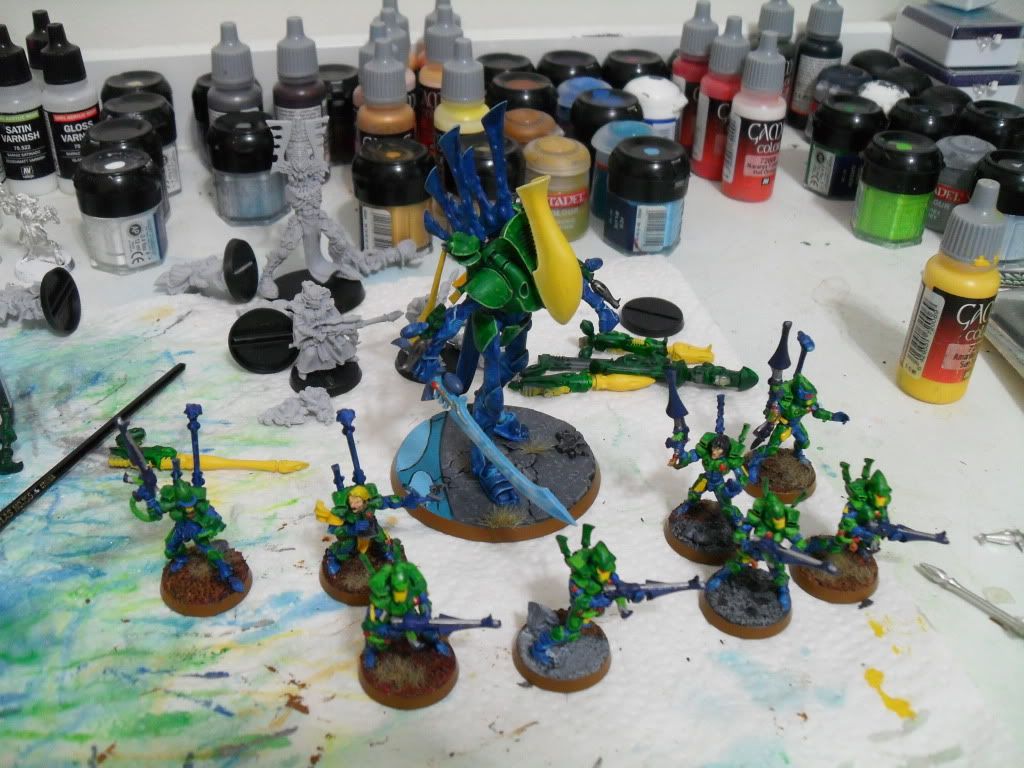
Shrieking Guardian Jetbiker
|
|
|
|
 |
|
2011/06/13 16:36:35
Subject: Custom Craftworld Color Scheme (Various Models)
|
|
Bonkers Buggy Driver with Rockets
|
i think they look good.
|
        
looted moonz 6000 pts and still growing and building |
|
|
|
|
2011/06/13 16:52:25
Subject: Custom Craftworld Color Scheme (Various Models)
|
|

Annoyed Blood Angel Devastator
Ipswich and riyadh saudi arabia
|
I like them alot.
|
|
|
|
|
|
2011/06/13 16:58:53
Subject: Custom Craftworld Color Scheme (Various Models)
|
|
Blood Angel Terminator with Lightning Claws
|
My only critique would be the hair being too yellow imo,which gives them a rather cartoony feel.The paintwork is great throughout.
|
|
This message was edited 1 time. Last update was at 2011/06/13 17:01:18
|
|
|
|
|
2011/06/13 17:25:06
Subject: Custom Craftworld Color Scheme (Various Models)
|
|
Regular Dakkanaut
|
hit them all with devlin mud, the whole model everyone and you will see a big difference in depth and the colors will still be there just shaded.
P.S- i think it is a very good start, dont orry about what others say, if you like it then its boss.
|
|
|
|
|
2011/06/13 18:22:49
Subject: Custom Craftworld Color Scheme (Various Models)
|
|
Frightening Flamer of Tzeentch
|
They look great and all, but their color reminds me of lego's
|
|
|
|
|
2011/06/13 18:35:19
Subject: Custom Craftworld Color Scheme (Various Models)
|
|

Emboldened Warlock
|
Very nice
|
Stats since joining Dakka
 Corsair Eldar: 20 Win, 1 lose, 1 draw Corsair Eldar: 20 Win, 1 lose, 1 draw
 Fallen Angels: 3 Win, 0 lose, 0 draw Fallen Angels: 3 Win, 0 lose, 0 draw
Skavens: 2 Win, 0 lose, 0 draw |
|
|
|
|
2011/06/13 19:49:00
Subject: Re:Custom Craftworld Color Scheme (Various Models)
|
|
Shrieking Guardian Jetbiker
|
The Ghoma wrote:
but their color reminds me of legos
That's what I mean. Perhaps it would be better if I cut out the red, except for the Farseers and warlocks.
|
|
|
|
|
2011/06/14 12:28:17
Subject: Custom Craftworld Color Scheme (Various Models)
|
|

Furious Fire Dragon
|
I really like this army. It's a very clean paintjob. Maybe just do some highlighting on the yellow and other places that look plain, and add some black washes to give it depth, other then that great job.
|
|
|
|
|
|
2011/06/14 12:45:00
Subject: Custom Craftworld Color Scheme (Various Models)
|
|

Norn Queen
|
Uhm, can you immediately post more pics of your terrain, it looks excellent from what I can tell.
Sorry, no comments on the Eldar!
|
Dman137 wrote:
goobs is all you guys will ever be
By 1-irt: Still as long as Hissy keeps showing up this is one of the most entertaining threads ever.
"Feelin' goods, good enough". |
|
|
|
|
2011/06/14 12:47:28
Subject: Custom Craftworld Color Scheme (Various Models)
|
|

Hardened Veteran Guardsman
|
I love the mottling effect on the vehicles, but to be honest your colour selection is a bit off.
None of the colours seems to compliment each other, and there doesn't seem to be any unifying theme. IMO, colour selection is the most important part of painting. If you can get three colours that work well together and slap them even roughly onto a model, you're half way to getting a great looking army.
I'm not saying that they're badly painted. Far from it in fact, the colours are crisp and well defined, but they lack depth. Some washes over the models would work wonders at adding depth, as well as bringing some cohesiveness to the army.
I look forward to seeing more of your work
Dave
|
What do you want for tea? I want crisps! |
|
|
|
|
2011/06/14 20:44:14
Subject: Custom Craftworld Color Scheme (Various Models)
|
|
Gargantuan Gargant
|
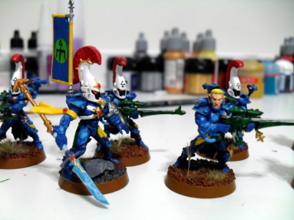
I have to admit, I'm in the "preschool playset" camp. Too many large blocks of bright, flat colors without much sensible relation between them. I think color selection is extra important with a force like this, as the old "throw half a pot of Devlan Mud on 'em" method doesn't work so well with bright, bold Eldar colors or their generally smooth and rounded sculpts.
That said, I'm amazed at how crisp and vivid you've laid down some of that color - the white and yellow, in particular (we all know how... enjoyable those are to paint). You're the only one that really has to like your paintjob, in the end, but since you asked for opinions - neither the color selection nor the mottled pattern on the vehicles suits my palette, much.
|
The Dreadnote wrote:But the Emperor already has a shrine, in the form of your local Games Workshop. You honour him by sacrificing your money to the plastic effigies of his warriors. In time, your devotion will be rewarded with the gift of having even more effigies to worship.
|
|
|
|
|
2011/06/15 11:16:10
Subject: Custom Craftworld Color Scheme (Various Models)
|
|
Shrieking Guardian Jetbiker
|
I'm going to replace the red with either my standard blue, or some other shade of blue in the case of the Wave Serpent stripes, or warlock hair.
I have now washed the green as well, bit it makes it all look remarkably dull the way I mixed it. I generally do 2 parts green wash, 1 part black wash, because simple green wash is barely darker than snot green. I may try spreading the mix ratio more and trying again. Or letting the green go... brightness may not be an issue once the red is removed.
The white and yellow... well, on most of these models, I knew how much of a pain those colors were, so I basecoated them with an airbrush, which took about 8 coats each, and was super careful not to taint the colors with fingers having half-dry paint on them.
|
|
|
|
|
2011/06/15 17:40:14
Subject: Custom Craftworld Color Scheme (Various Models)
|
|
Chalice-Wielding Sanguinary High Priest
Arlington TX, but want to be back in Seattle WA
|
Very bright and reminiscent of Scorpions, nice work
|
 4250 points of Blood Angels goodness, sweet and silky W12-L6-D4 4250 points of Blood Angels goodness, sweet and silky W12-L6-D4
 1000 points of Teil-Shan (my own scheme) Eldar Craftworld in progress 1000 points of Teil-Shan (my own scheme) Eldar Craftworld in progress
 800 points of unassembled Urban themed Imperial Guard 800 points of unassembled Urban themed Imperial Guard
 650 points of my do-it-yourself Tempest Guard 650 points of my do-it-yourself Tempest Guard
 675 points of Commoraghs finest! 675 points of Commoraghs finest!
The Dude - "Jackie Treehorn treats objects like women, man."
Lord Helmet - "I bet she gives great helmet."
|
|
|
|
|
2011/06/15 17:59:13
Subject: Custom Craftworld Color Scheme (Various Models)
|
|

Irked Necron Immortal
Necron Tomb somewhere in Scandinavia.
|
They have many different colours, I relly dont like em, looks too much toys but if you do, thats ok. Maby taking one of those colours out would help a bit. Btw like those warlocks really much!
|
''Their number is legion, their name is death.'' |
|
|
|
|
2011/06/15 18:55:25
Subject: Re:Custom Craftworld Color Scheme (Various Models)
|
|
Deadly Dark Eldar Warrior
|
I like them a lot as well. To add it to the others who commented. Very clean look. It is hard to use yellow and red and make it work. Most times armies with this colors, esp eldar and some tau end up looking like the 40k poster child to The McDonald franchise. I would add some washes to darken and add depl. but great work.
|
4500
 3000 3000 |
|
|
|
|
2011/06/16 23:56:55
Subject: Custom Craftworld Color Scheme (Various Models)
|
|
Shrieking Guardian Jetbiker
|
I have I changed the red to the blue. In the Wave Sepent's case, I believe I will change the red stripe to midnight blue or something blue-ish. Let me know if you think it's better.
EDIT: Washing greens is problematic. I have the vallejo wash but it is brighter than snot green... it just looks awful. That's why the blue looks dark and cool and the green looks bright as anything.

|
|
This message was edited 1 time. Last update was at 2011/06/16 23:57:53
|
|
|
|
|
2011/06/17 01:25:39
Subject: Re:Custom Craftworld Color Scheme (Various Models)
|
|
[ADMIN]
Decrepit Dakkanaut
|
I have to say that I'm not a big fan, but I'll tell you why:
You've used very bright colors and you haven't used any kind of shading or highlighting, so all the colors end up looking very flat and since you're using a whole bunch of different bold colors it ends up looking like a hodge-podge of flat, but bright colors...like a rainbow gone mad or something.
Using washes on big flat surfaces can be tricky since it tends to leave a splotchy residue as the wash doesn't have any definition to flow into. However that doesn't mean you should be giving up on washing necessarily.
But the first thing you should be doing is accepting that if this is the type of color scheme you want, you can't simply paint it all one shade. You have to start painting an area with a darker version of the color (or a darker complimentary color) first and then paint over that with your 'main' color.
So with yellow, you don't start painting that area with the bright yellow, instead you go with a dark mustard brown (for example), making sure to get all the sides and cracks of the area. Then you come back later with your bright yellow and you paint the big flat surface yellow, but you leave in the crevices and cracks the darker color showing. If you screw this up a bit and get some of the lighter color into the crevice, then you can go back with a targeted wash (just washing the crack where you screwed up) to help cover up your mistake.
Once you've painted the area the bright shade of the color, your last step would be to 'edge' that area with the same bright color, but now mixed 50/50 with white (you can tweak this mixture a bit to get the edge highlights looking how you want them).
This three step process is a really easy way to stay away from complex and time consuming highlighting that still looks great on the tabletop from a distance.
The last thing about washing is that you should definitely still be using it on any sections of the model that aren't big flat spaces. So in your first picture (the Support weapon) if you were to hit the blue little vents on the gun and the blue cable on the gun with a nice dark blue ink, they would look really, really good. The same with the flesh on the operator's face.
And even if you didn't want to go with the three step simple highlight I suggested above, there's no reason you couldn't go with a targeted wash on the existing models you've already painted. For example, on that Support Weapon, you could take a brown wash, target the yellow barrel area, but only hit the actual creases (the area where the gun barrel attaches to the support weapon body that is ringed in yellow and green & the very tip of the gun where you've painted the end black). Doing that would help add some really needed definition and depth to the model. And if you screw up and get a bit of wash out on the main surface of the barrel, simply take a clean brush and soak it up.
|
|
|
|
|
|
2011/06/17 02:18:17
Subject: Custom Craftworld Color Scheme (Various Models)
|
|
Dakka Veteran
|
After reading that last novel of a post, all I have to say is keep developing your shading and highlighting and that will help a good deal in breaking up the blockiness of the colors.
Seriously, though yakface has some great points in there.
Also, that psychology assignment looks like it blew.
Cheers.
|
|
|
|
|
2011/06/23 13:31:42
Subject: Custom Craftworld Color Scheme (Various Models)
|
|
Drone without a Controller
|

While I agree with the use washes camp, I'll just say: washes are our friends but the shouldn't be the final step. Stay bright
As for the approach/look/intent: Excellent.
For starters, many--read most--simply don't even paint their models, so you've already gone far beyond ordinary. I like the bright colors and love the blue and green together. You've got some skills to work with, and with some of the advice given above you can bring out even more of what is in you.
Good job! I wouldn't be ashamed to play them 
|
|
This message was edited 1 time. Last update was at 2011/06/23 13:35:32
|
|
|
|
|
2011/06/23 14:38:33
Subject: Custom Craftworld Color Scheme (Various Models)
|
|
Hacking Shang Jí
|
Okay, let's get into some color theory here:
Every color can be mapped out somewhere on three scales:
Light---------------Dark
Saturated--------------Dull (grey)
Hue---red----purple---blue---green---yellow---orange---red
The only thing you're really changing in your colors is the hue. Within each color field you're doing some excellent variation in lightness, but comparing field to field they are all very light and very saturated. That's what's giving you the preschool lego look.
I recommend trying to vary the other aspects of color than the hue. Experiment with mixing a tiny amount of black or a little white into your color (on your pallette of course) before you paint. Also, one thing I do a lot when I want to make a color less intense is I mix in a small amount of the complimentary color. For example, a small amount of red mixed into green can mean the difference between the color coming out looking like a Christmas decoration and the color coming out looking like realistic camouflage.
Now Eldar rarely get painted in entirely dull colors (now that would be an interesting thing to see, wouldn't it?) because dull colors can end up looking a bit dirty. But if you look at the studio paint jobs every army balances a bold color with a color that has very low/no saturation (except Iyanden, which I always thought looked the worst of all color schemes). The problem with your color scheme is that while they likely mercilessly grab your eyes from say, across the room, when you get close the competing bright, saturated colors confuse your eyes. We are simultaneously drawn to look at all parts of the model, and so as a result we don't actually look at any of it. Introducing some variety (other than just in hue) would help deal with that.
But you're obviously a very skilled and careful painter. Keep it up!
|
|
This message was edited 1 time. Last update was at 2011/06/23 14:39:21
"White Lions: They're Better Than Cancer!" is not exactly a compelling marketing slogan. - AlexHolker |
|
|
|
|
2011/06/23 14:46:11
Subject: Custom Craftworld Color Scheme (Various Models)
|
|
Rifleman Grey Knight Venerable Dreadnought
Realm of Hobby
|
What is the scheme?
There is no unifying or consistent colour pattern.
|
 MikZor wrote:
We can't help that american D&D is pretty much daily life for us (Aussies)
Walking to shops, "i'll take a short cut through this bush", random encounter! Lizard with no legs.....
I kid Since i avoid bushlands that is
But we're not that bad... are we? 
|
|
|
|
|
2011/06/23 19:44:34
Subject: Custom Craftworld Color Scheme (Various Models)
|
|
Shrieking Guardian Jetbiker
|
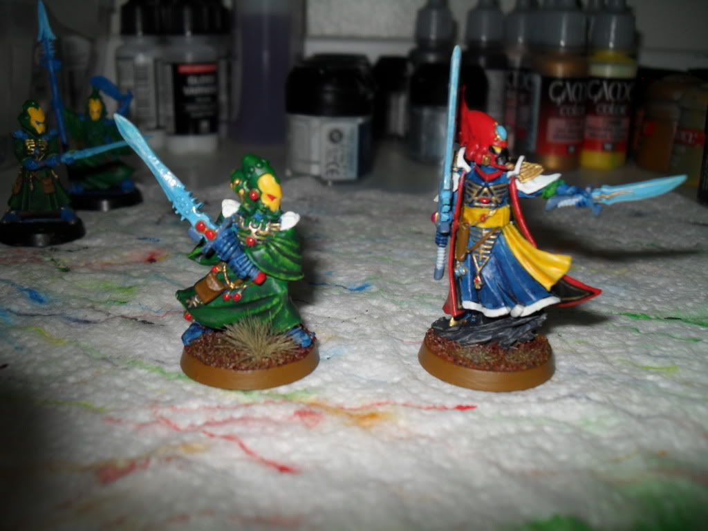
You're right. So much of the warlocks, Dire Avengers and Farseer kind of made it look mismatched.
Here's another one. I removed all of the red and tried to do more highlighting and shading.
|
|
|
|
|
2011/06/23 19:54:07
Subject: Custom Craftworld Color Scheme (Various Models)
|
|
Decrepit Dakkanaut
|
I really like your basing. Cool avatar to!
|
|
|
|
|
2011/06/23 20:46:38
Subject: Re:Custom Craftworld Color Scheme (Various Models)
|
|
Horrific Howling Banshee
|
I like it. I was going to say take out one or two of the bright colors cause it's a little overwhelming but you seem to have gotten that on your own. These last ones with the highlighting done and the red cut out look great
|

http://perilsofthewarp40k.blogspot.com/ |
|
|
|
|
2011/06/24 01:07:20
Subject: Custom Craftworld Color Scheme (Various Models)
|
|
Mighty Kithkar
|
Not my cuppa tea, but if you like it (and others seem to as well) run with it, enjoy, it's your hobbie and no-one should tell you you're wrong. If it where me I'd drop one of the bold primary colours as most craftworlds seem to only use two but that's just me.
|
Malifaux henchman, best game in the world.
|
|
|
|
|
2011/06/24 03:07:07
Subject: Custom Craftworld Color Scheme (Various Models)
|
|
Purposeful Hammerhead Pilot
Houston, Tx
|
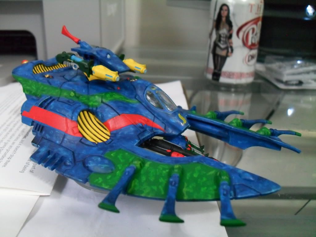
The Guardians look great. However, in my opinion, the Fire Prism has too many colors. I know Eldar are pretty colorful which is why I have trouble critiquing them. I'd say chose three strong colors that compliment and contrast each other and go with that.
|
 Maybe you hang out with immature women. Maybe you're attracted to immature women because you think they'll let you shpadoink them. Maybe you hang out with immature women. Maybe you're attracted to immature women because you think they'll let you shpadoink them. |
|
|
|
|
2011/06/24 03:20:57
Subject: Re:Custom Craftworld Color Scheme (Various Models)
|
|
Hellish Haemonculus
|
First off, great color scheme. Don't let 'em hate on you.
Second off, how'd the psych class go?
|
|
|
|
|
|
2011/06/24 07:46:47
Subject: Custom Craftworld Color Scheme (Various Models)
|
|
Hardened Veteran Guardsman
|
They've come along in leaps and bounds since we first saw them. Good work. It's always good to see a painter who can take on criticism and use it to improve their technique. It's the mark of a great painter.
Even if your painting style is the antithesis of mine (I predominantly work in muted and drab colours) I can't deny that this is a striking looking army now (for the right reasons) and I would be happy to play against it.
Keep on working on that highlighting and shading. I sense good things from you in the future
|
What do you want for tea? I want crisps! |
|
|
|
|
2011/06/24 10:03:31
Subject: Custom Craftworld Color Scheme (Various Models)
|
|
[ADMIN]
Decrepit Dakkanaut
|
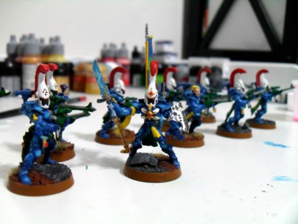
Indeed, I have to echo the last few statements. While the paint scheme itself may not be my own personal cup of tea, there is absolutely no denying a marked improvement on that Wraithlord model from the previous picture, so kudos!
I can't tell form the picture what improvements, if any, have been done to the Guardians as well, but it definitely looks like you're seeing how adding a bit of depth to the flat surfaces really helps. So if you just keep sticking to that idea and continue with more highlighting (and targeted washes/inks) you should really be able to make the paint scheme work for you.
|
|
|
|
|
|
|
|


 2000+
2000+
 coming soon