So I've got about 20
oop Harlequins, some I bought back in the day and some came from ebay, so this is going to be a bit of a fun painting challenge to combat my hobby butterfly syndrome, seeing as every one can be different.
So far the problem has been more to do with composition than painting. I've seen some really cool Harlies with a lot of black and white areas. So, does he look a little too busy, or should I repaint the blue areas to make them black to have a bit more contrast? I've tried to make it look like the green bits are lighting up his suit with some kind of explosion, but I'm not sure it's working.
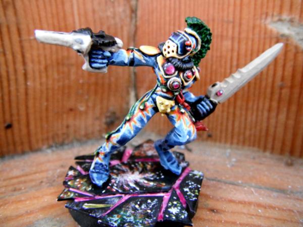
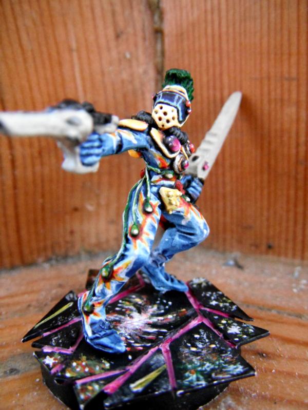
Really, this wasn't the best one for a test piece because He has less in the way of flat ares so I can't do the classic diamond pattern on him. Oh, and the weapons aren't quite finished, they need a couple more layers of bleached bone to get them smooth.
So, what do you guys think? Repaint the blue to black? Too busy? Any advice would be great.

