| Author |
Message |
 |
|
|
|
|
Advert
|
Forum adverts like this one are shown to any user who is not logged in. Join us by filling out a tiny 3 field form and you will get your own, free, dakka user account which gives a good range of benefits to you:
- No adverts like this in the forums anymore.
- Times and dates in your local timezone.
- Full tracking of what you have read so you can skip to your first unread post, easily see what has changed since you last logged in, and easily see what is new at a glance.
- Email notifications for threads you want to watch closely.
- Being a part of the oldest wargaming community on the net.
If you are already a member then feel free to login now. |
|
 |
2012/07/05 17:19:16
Subject: Ariadna Color Scheme
|
|

Martial Arts SAS
|
I've been thinking about painting my Ariadna models in dark purple and black.
What would be a good 3rd color ? I've been thinking about red but I'm not quite sure yet.
Anyone has an example of minis painted in this color scheme ?
|
|
|
|
 |
|
2012/07/05 17:21:46
Subject: Re:Ariadna Color Scheme
|
|

Man O' War
|
Interesting style, from what ariadna schemes ive seen its very different
light red seems a good idea of possibly a light blue?
its hard to say as this scheme is very different to any others ive seen.
Good idea though
|
 Khador 75p Khador 75p
 Menoth 35p Menoth 35p
 Circle 25p Circle 25p
 Legion 25p Legion 25p |
|
|
|
|
2012/07/05 17:27:30
Subject: Re:Ariadna Color Scheme
|
|
Martial Arts SAS
|
Wouldn't a light color clash too much ?
But I don't really have any experience regarding this...so...you might be right =P
|
|
|
|
|
|
2012/07/05 17:28:51
Subject: Re:Ariadna Color Scheme
|
|
Man O' War
|
I dont know really...
it could work or maybe a darker blue with light blue highlights?
|
Khador 75p
Menoth 35p
Circle 25p
Legion 25p |
|
|
|
|
2012/07/05 17:32:40
Subject: Re:Ariadna Color Scheme
|
|
Martial Arts SAS
|
I think I'll give this a try =P
Dark purple / Black / Dark Blue with the right highlights
Might end up nicely
Well at least tabletop presentable (is that a word ? =P )
|
|
|
|
|
|
2012/07/05 20:28:27
Subject: Re:Ariadna Color Scheme
|
|

Fresh-Faced New User
|
Scotland Forever tartan?

|
|
|
|
|
2012/07/05 20:35:22
Subject: Re:Ariadna Color Scheme
|
|
Martial Arts SAS
|
Interesting
But looking for a much darker force =)
But this is giving me ideas =)
|
|
|
|
|
|
2012/07/05 21:40:46
Subject: Ariadna Color Scheme
|
|
Hacking Shang Jí
|
Are you thinking a night time camo? I think Black, purple, blue and grey. if you want maybe lighting details in green like guns scopes.
|
|
|
|
|
|
2012/07/05 22:08:04
Subject: Ariadna Color Scheme
|
|

Ghulam Doctor
Manila, Philippines
|
Sounds like an intriguing scheme. For some reason, I imagine it on the Merovingian units especially. Could make for an interesting base for an urban or night-time camo scheme, as CDK says.
|
|
|
|
|
2012/07/05 22:21:46
Subject: Re:Ariadna Color Scheme
|
|
Martial Arts SAS
|
Very good idea CDK =)
I want my Ariadna force to be a rogue spec ops cell so it would indeed fit.
I've been thinking about using this color for the whole range but I agree, FRRM has an underground group style.
So much pressure now =P I'll need to level up my painting skills =P
|
|
|
|
|
|
2012/07/06 12:24:12
Subject: Re:Ariadna Color Scheme
|
|
Hacking Shang Jí
|
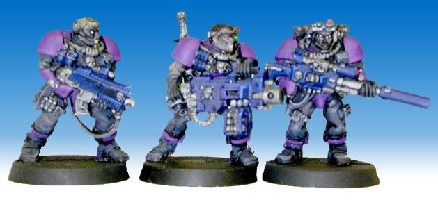
Here's some really old figs of mine done with purple black, blue and grey.
|
|
|
|
|
|
2012/07/06 12:30:27
Subject: Re:Ariadna Color Scheme
|
|
Martial Arts SAS
|
I like it =)
I want a darker scheme but it's nice to see how these colors work together =)
|
|
|
|
|
|
2012/07/06 16:38:08
Subject: Ariadna Color Scheme
|
|
Ollanius Pius - Savior of the Emperor
Gathering the Informations.
|
Purple on any kind of "special operations" looking model is a no-no, unless it's done so dark as to be a black-purple--which given that you're going to have black as part of the color scheme is going to just blend together.
I'm assuming you are going to have SAS and Merovingians for your force, yes?
As I somehow can't see kilts working so great for a "rogue"(what is it with people and having "rogue" organizations these days!) special ops team...
That said:
Black and a dark blue-grey would work out quite well.
|
|
|
|
|
2012/07/06 16:47:56
Subject: Re:Ariadna Color Scheme
|
|
Martial Arts SAS
|
The purple will indeed be very dark.
As for what will be in the force, pretty much every Ariadna models (aside from a couple Caledonian models) =P
For the Caledonian, they will mostly be the brawn of the organization. So wearing the colors, but not caring about stealth.
I just didn't want to go with the original background. So a force using every means necessary to ensure the survival of the inhabitants of their world. Seeing how terrorism isn't well perceived, I don't see how such an organization can't be called rogue.
|
|
|
|
|
|
2012/07/06 16:56:49
Subject: Ariadna Color Scheme
|
|
Ollanius Pius - Savior of the Emperor
Gathering the Informations.
|
"Every means necessary" does not equate to "terrorism".
But I'm going to ignore that bit for now, and simply say that you really should drop the purple idea.
Purple just doesn't work on "professional" looking models as a primary color. As a spot color, like for lenses on guns/goggles it'd work fine.
|
|
|
|
|
2012/07/06 17:01:57
Subject: Re:Ariadna Color Scheme
|
|
Martial Arts SAS
|
But terrorism is one of their way of doing it =P
Point taken for the purple =P
Blue-purple-black-gray might indeed be 1 color too many =P
|
|
|
|
|
|
2012/07/06 20:36:20
Subject: Re:Ariadna Color Scheme
|
|
Man O' War
|
i agree with the black-grey-dark blue scheme, but add in some highlights to really make the colours and models stand out.
|
Khador 75p
Menoth 35p
Circle 25p
Legion 25p |
|
|
|
|
2012/07/06 20:50:41
Subject: Re:Ariadna Color Scheme
|
|
Martial Arts SAS
|
Will try =)
|
|
|
|
|
|
2012/07/06 20:53:52
Subject: Ariadna Color Scheme
|
|
Fresh-Faced New User
|
the problem i can see with what i think your going for as a colour scheme is to my mind it needs a brighter more contrasting colour for the spot colour.
Although, considering some of my own rather lacklustre attempts at painting infinity miniatures it might be a better idea to not follow my advice. 
|
|
|
|
|
2012/07/06 21:10:02
Subject: Re:Ariadna Color Scheme
|
|
Martial Arts SAS
|
Trust me, you know more than me =P
What is a spot color 
There will be some bright highlights ? =P
And lens will be very bright green =)
|
|
|
|
|
|
2012/07/06 21:36:23
Subject: Ariadna Color Scheme
|
|
Fresh-Faced New User
|
A spot colour is a contrasting colour used in small amounts to draw the eye to certain points on the miniature.
so your green lens are your spot colour in this case and maybe your skin tone depending on how much it contrasts with the rest of the model.
Atleast thats what i think it means, I did a quick wikipedia search to double check and the only thing i could find was stuff to do with printing.
|
|
|
|
|
2012/07/06 21:44:08
Subject: Re:Ariadna Color Scheme
|
|
Martial Arts SAS
|
Thank you good sir 
|
|
|
|
|
|
2012/07/07 18:05:08
Subject: Re:Ariadna Color Scheme
|
|
Martial Arts SAS
|
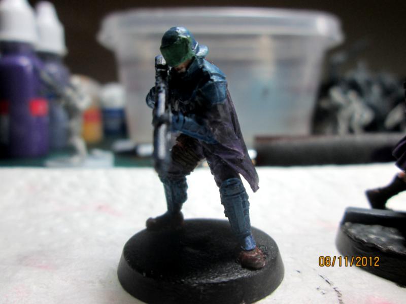
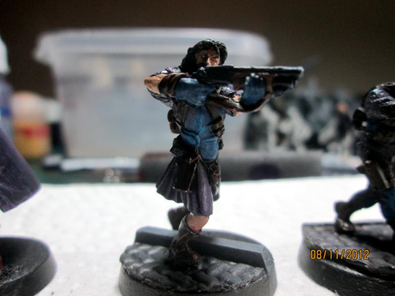
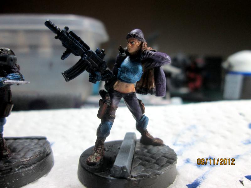
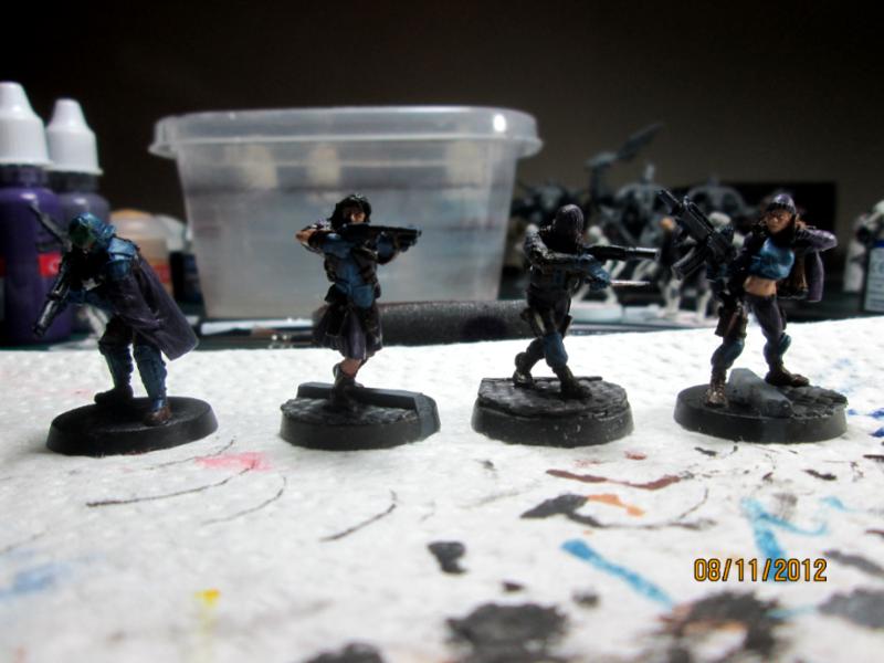
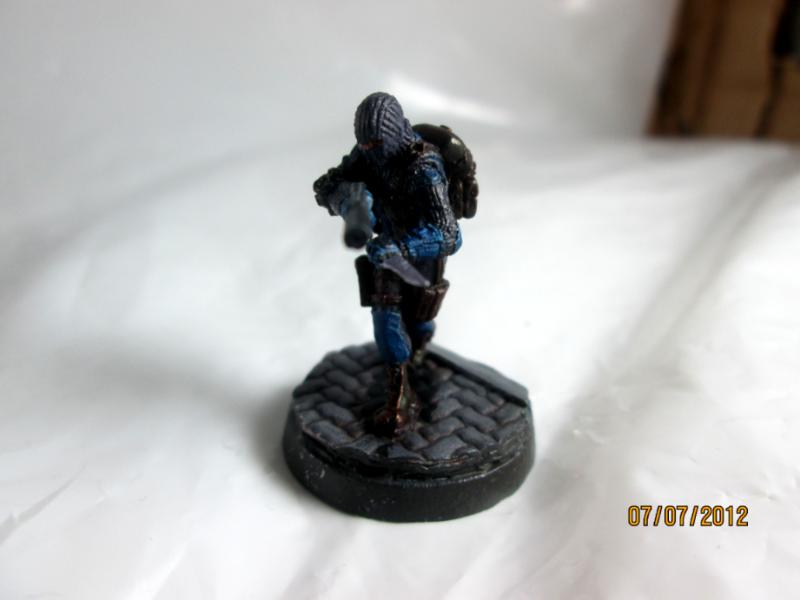
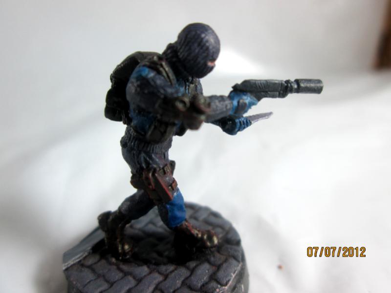
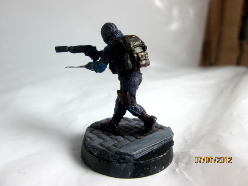
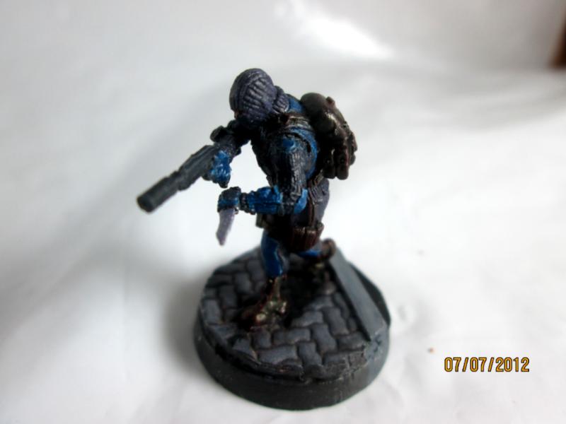
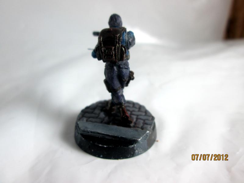
So...I've been thinking about the proposed scheme and I realised I did not want to use it because it's already my Imperial Guard' color scheme =P
So I went back to dark purple =P
I went with dark purple, dark red and blue.
I slapped paint on my SAS, I didn't liked the paint job anyway, and I'm actually quite surprised how it turned out =)
It might not be incredibly professionnal looking, but hey, it looks good imo =P
It's lacking highlights but you get the idea I guess =)
What do you guys think ?
|
|
|
|
|
|
2012/07/07 18:51:23
Subject: Ariadna Color Scheme
|
|
Hacking Shang Jí
|
The blue makes him look like a special police force. good thing!
|
|
|
|
|
|
2012/07/08 00:31:33
Subject: Ariadna Color Scheme
|
|
Member of a Lodge? I Can't Say
|
Doesn't look to bad at all.
|
|
|
|
|
|
2012/08/12 02:29:24
Subject: Re:Ariadna Color Scheme
|
|
Martial Arts SAS
|
|
|
|
|
|
|
2012/08/12 04:46:51
Subject: Ariadna Color Scheme
|
|
Hallowed Canoness
|
I like it! The purple does quite nicely with the blues and blacks. I agree it does have a "SWAT"/Police feel. Very good. ^^
|
I beg of you sarge let me lead the charge when the battle lines are drawn
Lemme at least leave a good hoof beat they'll remember loud and long
SoB, IG, SM, SW, Nec, Cus, Tau, FoW Germans, Team Yankee Marines, Battletech Clan Wolf, Mercs
DR:90-SG+M+B+I+Pw40k12+ID+++A+++/are/WD-R+++T(S)DM+ |
|
|
|
|
2012/08/15 13:27:09
Subject: Re:Ariadna Color Scheme
|
|
Martial Arts SAS
|
Are my paints still too thick ?
|
|
|
|
|
|
2012/08/15 14:11:10
Subject: Ariadna Color Scheme
|
|
Hacking Shang Jí
|
That or your primer went on thick. Still, they look pretty good.
|
|
|
|
|
|
2012/08/15 15:58:58
Subject: Ariadna Color Scheme
|
|
[DCM]
.
|
Maybe?
Bottom line is that you're almost always better off going for multiple thin coats vs. one thick coat.
If in doubt, thin it out!
|
|
|
|
|
|
|

 New Shangri-La Peace Force
 Combined Army Shasvastii painting Blog