| Author |
Message |
 |
|
|
|
|
Advert
|
Forum adverts like this one are shown to any user who is not logged in. Join us by filling out a tiny 3 field form and you will get your own, free, dakka user account which gives a good range of benefits to you:
- No adverts like this in the forums anymore.
- Times and dates in your local timezone.
- Full tracking of what you have read so you can skip to your first unread post, easily see what has changed since you last logged in, and easily see what is new at a glance.
- Email notifications for threads you want to watch closely.
- Being a part of the oldest wargaming community on the net.
If you are already a member then feel free to login now. |
|
 |
2013/04/27 17:02:25
Subject: Blending
|
|

Fresh-Faced New User
|
|
|
This message was edited 1 time. Last update was at 2013/04/27 20:17:13
|
|
|
 |
|
2013/04/27 17:44:30
Subject: Blending
|
|
Boosting Space Marine Biker
|
That looks pretty good to me.
|
|
|
|
|
|
2013/04/27 17:48:59
Subject: Re:Blending
|
|
Raging Ravener
|
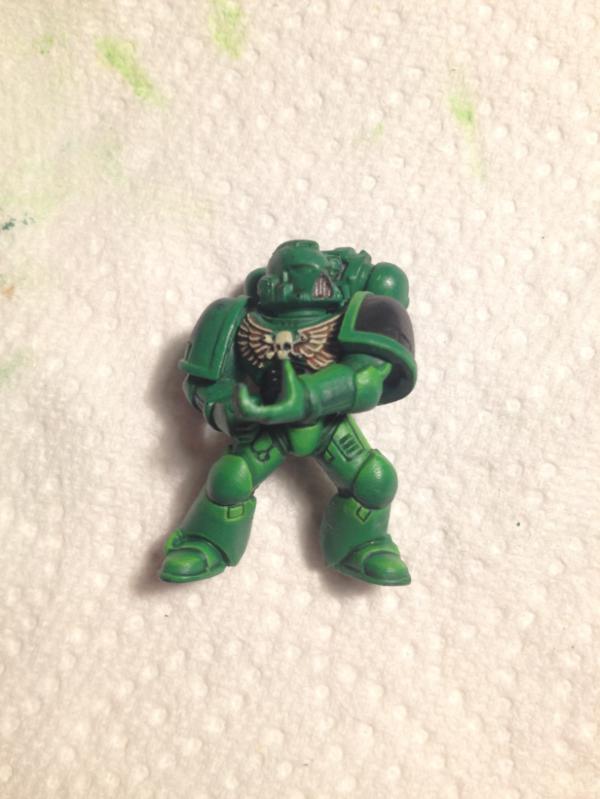
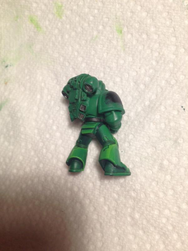
The front side is more subtle than the backside. Other than that discrepancy, I like the effect.
|
 5,500 18/4/2 w/l/d 5,500 18/4/2 w/l/d
 2,000 2/1/0 w/l/d 2,000 2/1/0 w/l/d
Message me if you'd be interested in buying / trading for a beginner's SW army! |
|
|
|
|
2013/04/27 17:53:21
Subject: Blending
|
|

Bane Knight
Inverness, Scotland.
|
Yup - looks fine, but one good tip is to apply an ultra-thin filter (if that's the correct term?) of the middle colour, which helps to blend things and brings the effect back towards the intended colour. Not to be confused with a wash, though.
|
|
|
|
|
2013/04/27 18:14:08
Subject: Re:Blending
|
|
Been Around the Block
|
I personally prefer the hard edge style, but you applied the blended effect really well here. Excellent gradients and brush control. I agree that the front is more subtle and attractive than the back (esp. the back right leg is too light). The front looks great though. The only quibble I have is with the small rectangular plates below the knees - those are too bright and stand out. Blended highlights like these are trying to emphasize depth of the overall shape. So, unlike edge highlights, you're not going to blend up to every possible break around small details. Those little cutouts are highlighted just as brightly as the tops of the kneepads, even though they're surrounded by lower-lit plates. I would keep a thin edge highlight on the inside of the rectangles, but otherwise shade them the same as their surroundings. You might also consider adding a stronger shading gradient on the sides of the... um... crotch-piece. It's almost uniformly bright right now even though it has quite a bit of physical depth.
Those are really minor details, though, and only stand out to me because I'm also working on understanding lighting and blending right now. Overall, I think it's a really well-done blending job.
|
|
|
|
|
2013/04/27 20:19:01
Subject: Blending
|
|
Fresh-Faced New User
|
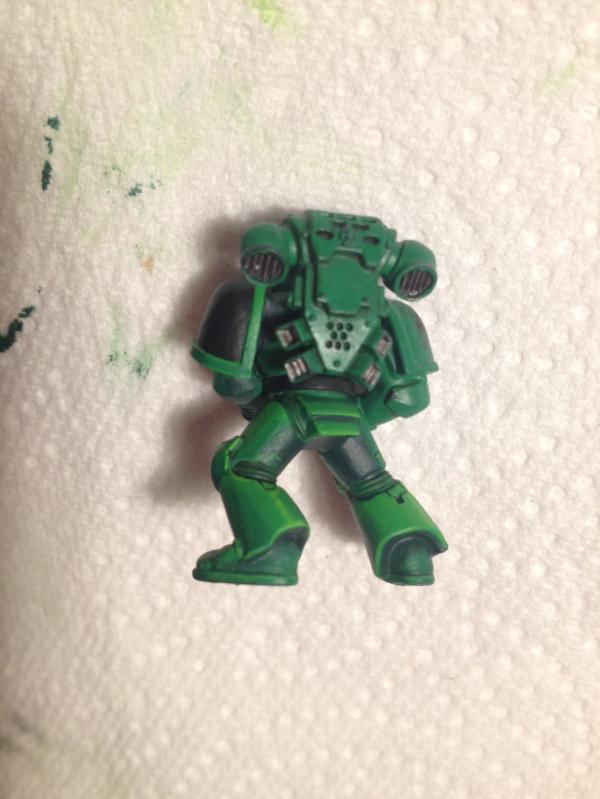
Thanks a lot for your comments, a lot of interesting stuff. I agree the back of the legs has a less good blending, and I definitely prefer the left back than the right back. I will try to correct it.
I just realized that two of the picture in the first post were the same :p I corrected the last link
|
|
|
|
|
|
|
|