|
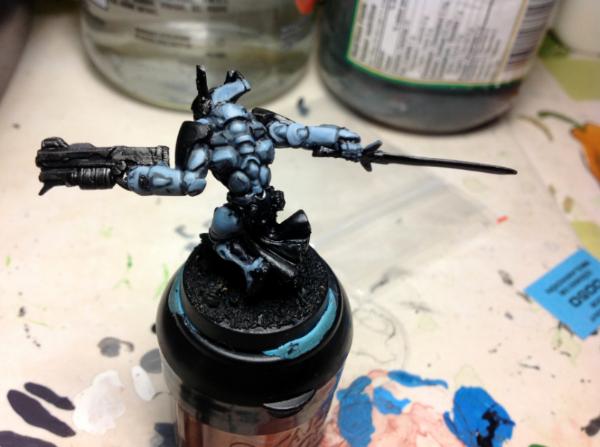
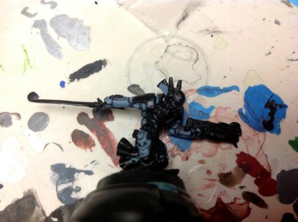
The tricky part in trying to match that sort of a look isn't the color recipe, but the application - it's not easy pushing the contrast on small sections of a tiny model that far, especially while maintaining smooth transitions. Glazing, more than layering, is what will get you there. Might be easiest to start with a relatively pale grey (cool, as opposed to warm, but it needn't be distinctly blue-grey), then glaze down with muted blues before returning for extreme highlights.
Honestly, though, that's a pretty big jump to make, stylistically, if you're accustomed to layering with mostly opaque paints. You aren't in a bad place, right now, so I might just push the highlights a bit further and call it a day. Really depends on how far you want to push yourself on this model and how closely you want to emulate the example. If you're just after a solid paintjob that approximates the studio scheme, keep doin' what you're doin'.
|


 (had to double check!!)
 Before all else, be armed