| Author |
Message |
 |
|
|
|
|
Advert
|
Forum adverts like this one are shown to any user who is not logged in. Join us by filling out a tiny 3 field form and you will get your own, free, dakka user account which gives a good range of benefits to you:
- No adverts like this in the forums anymore.
- Times and dates in your local timezone.
- Full tracking of what you have read so you can skip to your first unread post, easily see what has changed since you last logged in, and easily see what is new at a glance.
- Email notifications for threads you want to watch closely.
- Being a part of the oldest wargaming community on the net.
If you are already a member then feel free to login now. |
|
 |
2013/11/07 08:34:39
Subject: Dkok commissar, doesn't look "right"
|
|

Plummeting Black Templar Thunderhawk Pilot
|
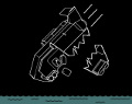
Here is my finished commissar, but something isn't right, something doesn't work and I can't figure out what. Anyone got any ideas or suggestions?
|
|
|
 |
|
2013/11/07 08:37:16
Subject: Dkok commissar, doesn't look "right"
|
|

Heroic Senior Officer
|
He would be bang on but from the photo the gold is very very shiny and white. In my opinion doesnt go well with the camo looking colours. Maybe...
|
|
|
|
|
2013/11/07 08:40:22
Subject: Dkok commissar, doesn't look "right"
|
|
Plummeting Black Templar Thunderhawk Pilot
|
The only gold on the model is on the swords hand guard and the medals on his chest. The rest was done with silver, maybe that's why?
|
|
|
|
|
2013/11/07 08:41:43
Subject: Dkok commissar, doesn't look "right"
|
|
Heroic Senior Officer
|
I see it now, before i thought it was very very bright light gold haha, but yea i dont think it goes too well. Thats the bit that sticks out at me.
|
|
|
|
|
2013/11/07 08:45:26
Subject: Dkok commissar, doesn't look "right"
|
|
Plummeting Black Templar Thunderhawk Pilot
|
I'm also not happy about the inside of the jacket or the trousers, but I'm not sure whether I should make them lighter or darker :/
|
|
|
|
|
2013/11/07 08:47:39
Subject: Dkok commissar, doesn't look "right"
|
|
Heroic Senior Officer
|
Personally i once had these guys and gold, crimson, black and silver sword was super simple and looked great. But as a rule i prefer brighter colours but the back of the model looks great, the front is where it goes downhill. The model is painted really well and i probably wouldnt have seen anything wrong with it until you asked me to look for a flaw so you know it might be absolutely fine by other peoples standards.
|
|
|
|
|
2013/11/07 11:11:20
Subject: Dkok commissar, doesn't look "right"
|
|

Been Around the Block
|
Hello hello, the biggetst problem is that the model is too flat. Please consider a quick wash with nuln oil on the whole model (but do not dip it please) and then redefine details with brighter colors.
About the coat, after the wash, give some touches of the same green you've used mixed with light brown 1:1.
Try to be precise and you'll improve the model a lot 
|
|
|
|
|
|
2013/11/07 11:34:12
Subject: Dkok commissar, doesn't look "right"
|
|
Pulsating Possessed Chaos Marine
UK
|
I think it would look better if you paint the trousers the same colour as the lapels of the jacket and the cap. The brown contrasts too much imo.
|
|
|
|
|
2013/11/07 16:10:52
Subject: Dkok commissar, doesn't look "right"
|
|
Plummeting Black Templar Thunderhawk Pilot
|
Well the model has chipped and peeled since then, so is now being stripped anyway -_-
Very tempted to give up and sell it.
|
|
|
|
|
2013/11/07 16:18:25
Subject: Dkok commissar, doesn't look "right"
|
|
Pulsating Possessed Chaos Marine
UK
|
No, damnit! Don't sell it. It's a great mini and you did very well on it.
Just have another crack at it.
Maybe you could have a look at some pics of Dkok commissars on google and see if you can find something thats like what you're aiming for?
|
|
|
|
|
2013/11/07 16:30:49
Subject: Dkok commissar, doesn't look "right"
|
|

Fresh-Faced New User
|
It might be because you gave him a green coat and commissars usually wear black, that subtle difference could just be throwing it off. I've always thought the position of the legs on that mini were a little awkward, they seem a little short or something.
|
|
|
|
|
2013/11/07 16:54:49
Subject: Dkok commissar, doesn't look "right"
|
|
Is 'Eavy Metal Calling?
|
Certainly don't give up, it's such a cool model. When I did mine, I kept it to a very limited range of colours. It was basically black for the cloak and hat, dark red for inside of coat and for eyes, dark brown for trousers and mask. Pale/faded gold for armour, Blue OSL for the power sword. I think this is one of those minis that really benefits from limited colours, as that fits the grim and foreboding aesthetic.
|
|
|
|
|
|
2013/11/07 19:11:56
Subject: Dkok commissar, doesn't look "right"
|
|

Powerful Spawning Champion
|
Ditch the silver. It looks bad and detracts from the rest of the work.
|
|
|
|
|
2013/11/07 19:23:08
Subject: Dkok commissar, doesn't look "right"
|
|
Judgemental Grey Knight Justicar
|
moar gold and moar red
|
I have half a mind to kill you, and the other half agrees |
|
|
|
|
2013/11/08 09:31:33
Subject: Dkok commissar, doesn't look "right"
|
|
Plummeting Black Templar Thunderhawk Pilot
|
I want a gritty look, but it has to be bright and cold to go alongside a snowy trench line style of basing.
|
|
|
|
|
2013/11/09 05:03:34
Subject: Dkok commissar, doesn't look "right"
|
|
Utilizing Careful Highlighting
|
Make it an arctic version of a Commissar, do it in white instead of black. Paint it like a deathwing terminator, bone without the dunk in brown wash except in the face and chest area. Then do the metallic and decorative parts in a very dark gold.
|
|
|
|
|
2013/11/09 05:13:43
Subject: Dkok commissar, doesn't look "right"
|
|
Jovial Plaguebearer of Nurgle
|
I would say try a dark brown wash on the pants and darken up the silver on the chest. Those are the only two things that stick out to me. I really like the back of the jacket, looks fantastic from that angle.
|
|
|
|
|
2013/11/10 11:42:47
Subject: Re:Dkok commissar, doesn't look "right"
|
|
Shas'ui with Bonding Knife
|
Three things are going on here that are distracting the eye:
1) Your metallics are clashing - you have a bronzey-gold, and a cool silver, and in they are very close to one another.
2) You have 3 colors vying for attention in the uniform, a cool grey-blue, neutral brown, and a warm green. I would personally make the pants and lapels / cuffs match in color.
3) I can see that you've tried some shading, but i'd try to do a little more - the pants in particular could use a a dose of depth.
All constructive criticism, on the whole i can see what you were going for, and your almost there.  Color theory takes a while to get a hold of, and it's always a bummer when you pick colors you love, and they end up fist-fighting each other on a model.
|
 daedalus wrote: daedalus wrote:
I mean, it's Dakka. I thought snide arguments from emotion were what we did here.
|
|
|
|
|
2013/11/10 12:21:02
Subject: Dkok commissar, doesn't look "right"
|
|
Lone Wolf Sentinel Pilot
|
For me, the holster and the trousers are too close in colour, and blend together when viewed.
I also think the blue on the lapels needs work- personally I'd have it match the green of the coat, as that colour works really well.
The silver chest is also catching the light quite a bit, and the transition to brown trousers is stark. IMHO the chest distracts from the models focus, which should be its face.
However you've still done a fantastic job on the mini- its so close to being exceptional, so don't sell it and persevere. This is how the greats become the greats.
|
DR:90S+G+M++B++I+Pw40k00#-D+A++/mWD292R+T(M)DM+
FW Epic Bunker: £97,871.35. Overpriced at all?
 Black Legion 8th Grand Company Black Legion 8th Grand Company
 Cadian XV Airborne "Flying Fifteens" Cadian XV Airborne "Flying Fifteens"
 Order of the Ebon Chalice Order of the Ebon Chalice
 Relictors 3rd Company Relictors 3rd Company |
|
|
|
|
2013/11/10 18:34:07
Subject: Dkok commissar, doesn't look "right"
|
|
Plummeting Black Templar Thunderhawk Pilot
|
Well, both commissars are currently sat in a jar of power spray and stripping...I just hope leaving them in there all weekend hasn't destroyed them...
Automatically Appended Next Post:
Yup, both falling to pieces...well, that kinda sucks.
|
|
This message was edited 1 time. Last update was at 2013/11/10 19:39:53
|
|
|
|
|
|
|


