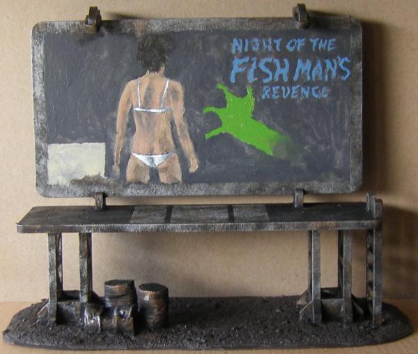
Ok, so I'm painting a billboard for Fallout advertising a movie as can be seen in the
WIP picture below and would like some input on the ad's composition.
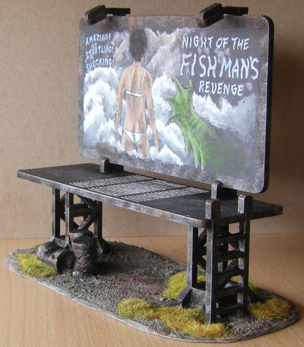
The girl and monster arm are taken straight from the movie trailer in Fallout 4, and I intend to make the background foggy to go with it. I thought the top right corner was a good place to put the movie's name. If everything works out, that corner will have a fairly dark backdrop with bluish white letters. The problem I'm stuck on is the lower left corner, which I reserved for some more writing. For lack of a list of actors like you usually see in a movie poster, I thought about doing the following:
Have "Watch it at" above the reserved space, with the space itself taken up by a Starlight Theaters logo.
So, first question: does this sound plausible for a billboard ad or is it something you just wouldn't see, like, ever?
The second question is about the left side of the ad in general. I don't want to overload the picture with colors. Got pink for the girl and green for the monster. The background will be a neutral white to dark grey, so that's not an issue. I went with blue for the name because blue is obviously watery, which fits the theme, and the letters should retain only trace amounts of blue around the edges with solid white cores and as smooth and thin a transition as I can manage. With much of the rest of the picture white, I think the blue should not stand out too much.
I'm not quite sure what to do with the logo on the left though. Fallout 4's Starlight Drive-In doesn't seem to have a notable color or logo. The main building seems to have been blue and the planet with rings on top is entirely rusted. Starlight Interstellar Theater in Nuka-World has a couple of yellow stars as part of the neon sign. So I was thinking of having blue and yellow there. Maybe with the yellow toned down to more of an off-white to not clash too much with the rest of the picture, similar to what you see in Nuka Cola ads
Opinions on this would be appreciated. Also, I'm not sure I should have that part at all. Perhaps it would be best to just leave it blank and fill the space with fog so as not to clutter the ad.